Next Case Study
Discover

Website and digital branding for a modern card-issuing platform


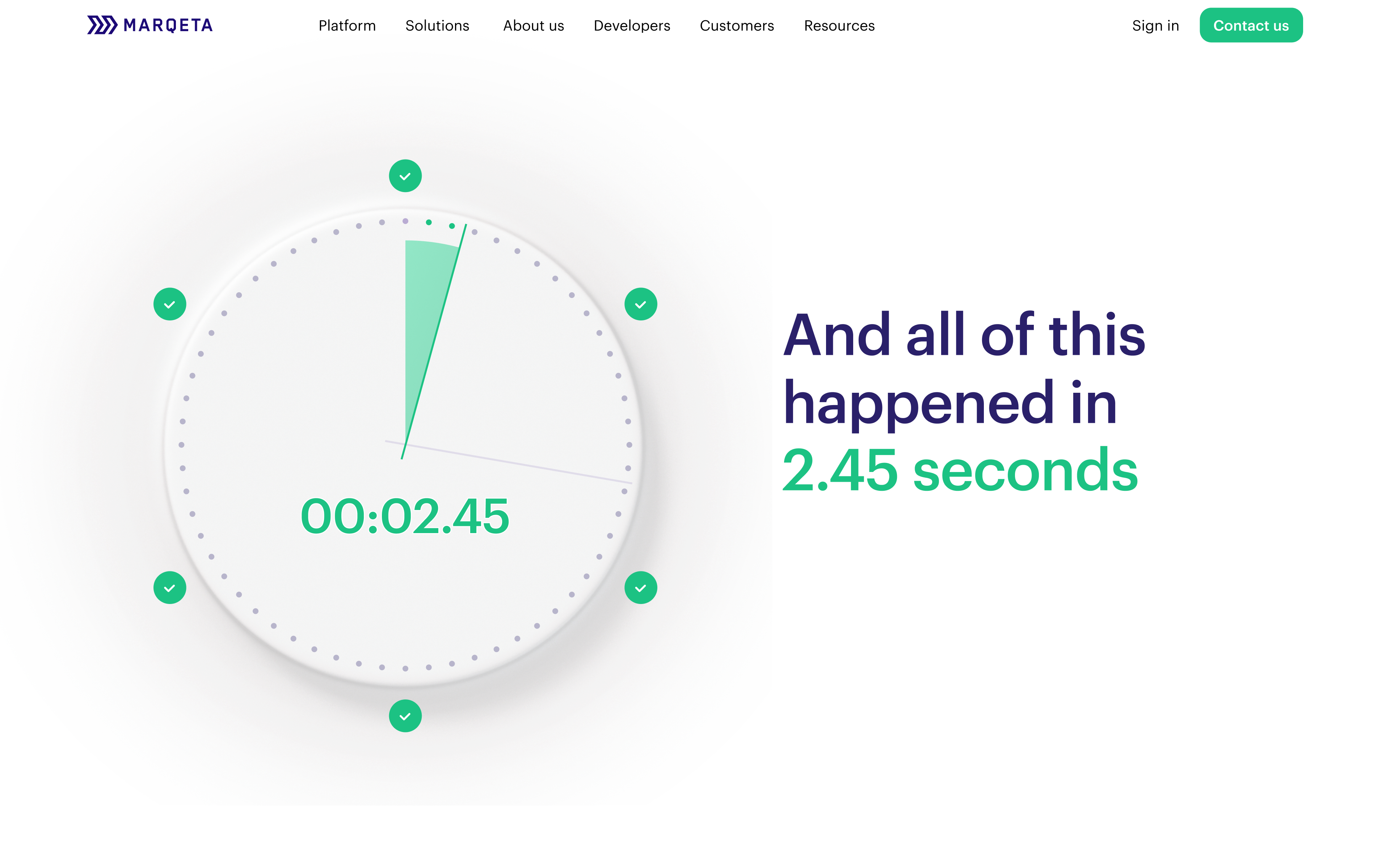
Companies use Marqeta to issue both physical and virtual cards. We sought to explain this offering with a simple visual language, which we achieved by drawing user attention to an evolving card across the homepage.
By maintaining the connection to the physical card, we demonstrated the key advantages, flexibility, and scalability of the services in a compelling way.
Our design approach harmonized realistic forms and materials along with vector and text objects. The result is a truly balanced UI, featuring proper distribution of accents and delightful animations.
The micro-animations were utilized to bring the objects into focus, showcasing Marqeta’s solutions through unique visual storytelling.
Incorporating visual vignettes to present different features was a key aspect of the homepage. For consistency, a similar content structure was applied to the inner pages of the site.
The fully responsive website was built and hosted on Wordpress VIP to ensure superior performance and convenience for updating.


Discover

Thank you for subscribing!
We'll send you a subscription every couple of weeks.