Next Case Study
JOKR

Branding and website for the next-generation search engine
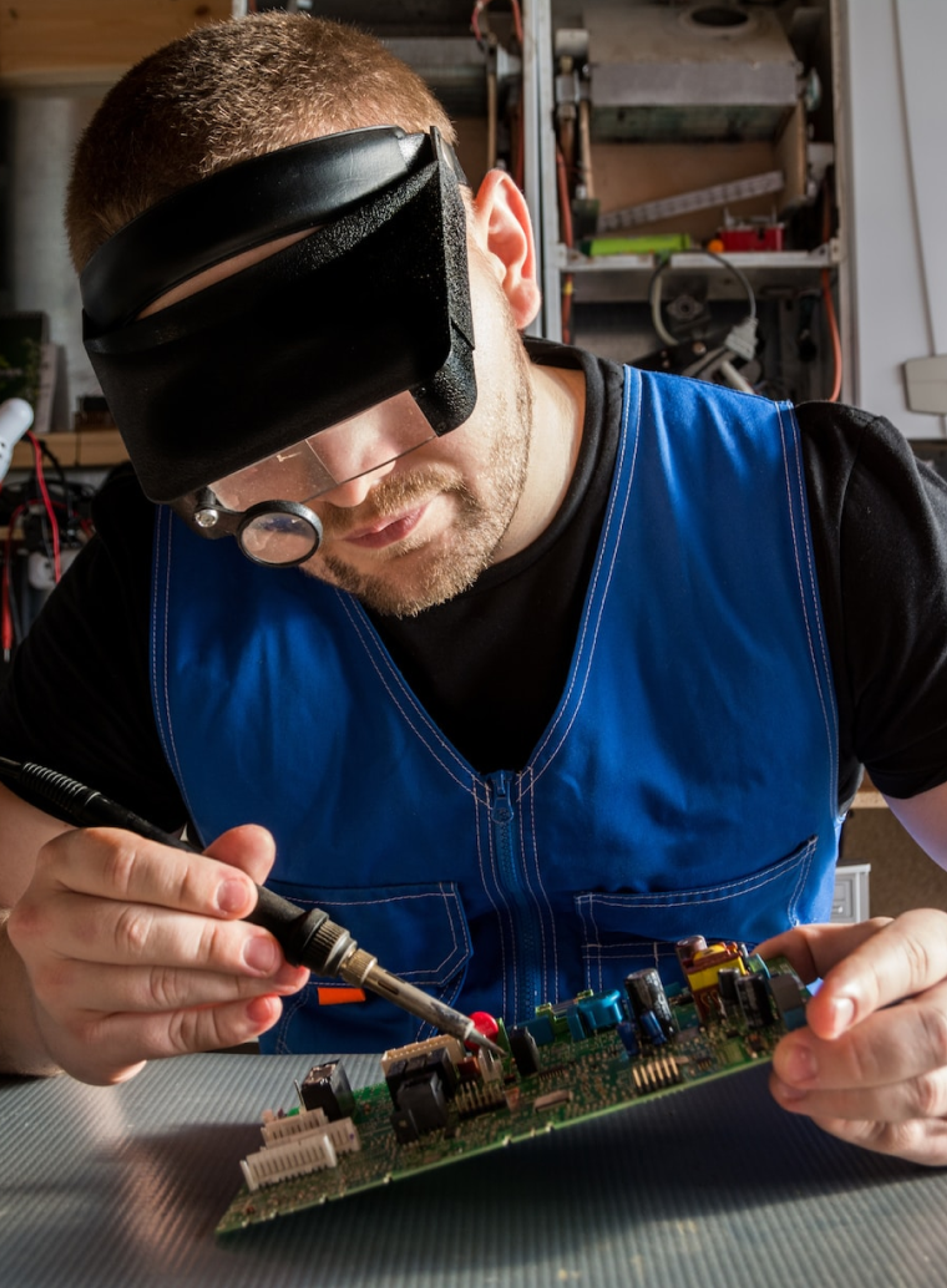
The Partstack search engine connects buyers and sellers of microchips and other board-level microelectronic components in one modern ecosystem, helping strengthen the supply chain.
Clay partnered with Partstack to evolve its visual identity, delivering a refreshed logo and a redesigned website aligned with strategic goals.
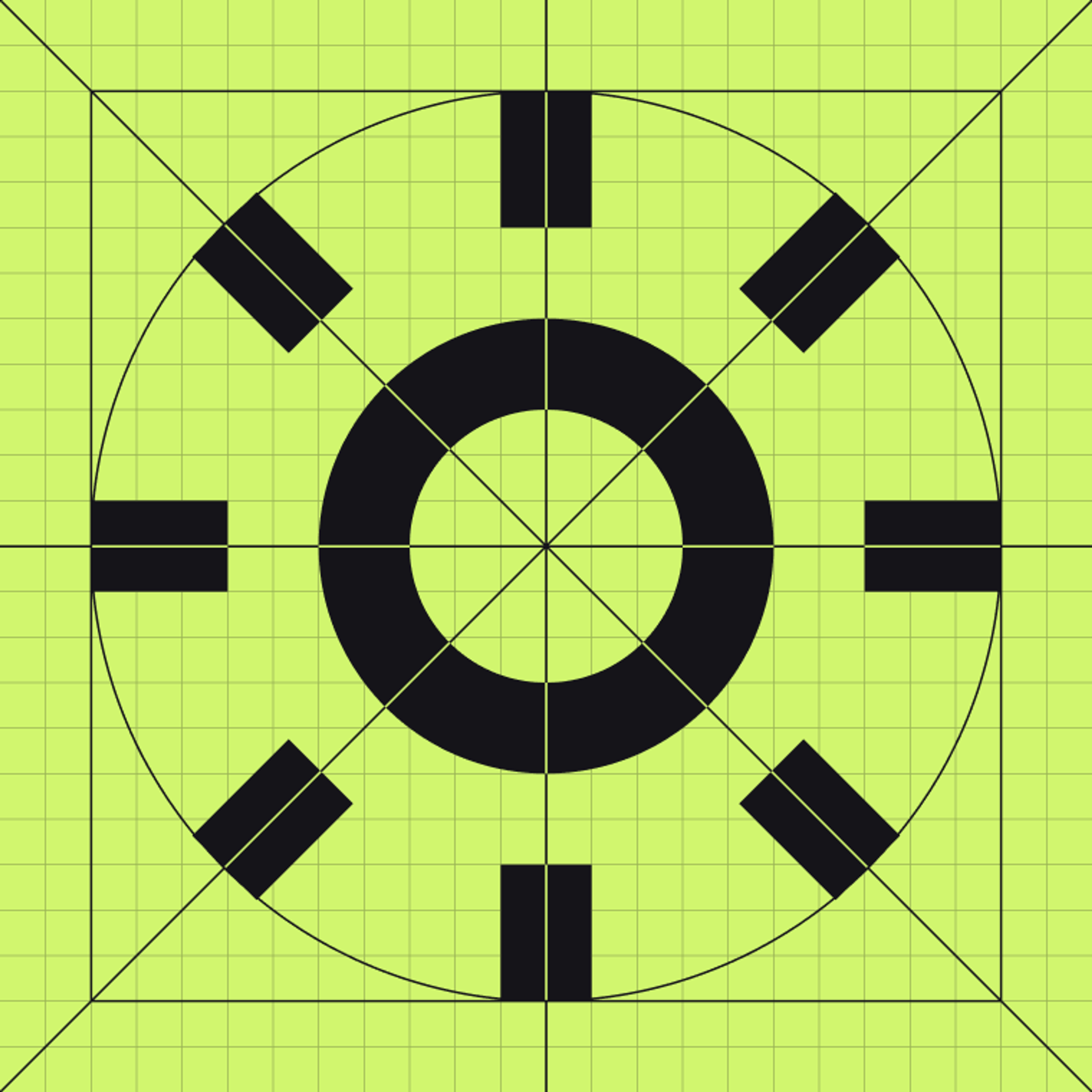
The updated logo offers a minimal, contemporary take on stacked elements, paired with a geometric, highly legible wordmark. The logomark gains personality through contrasting corner treatments, balancing sharp precision with a touch of playfulness.
Before

After
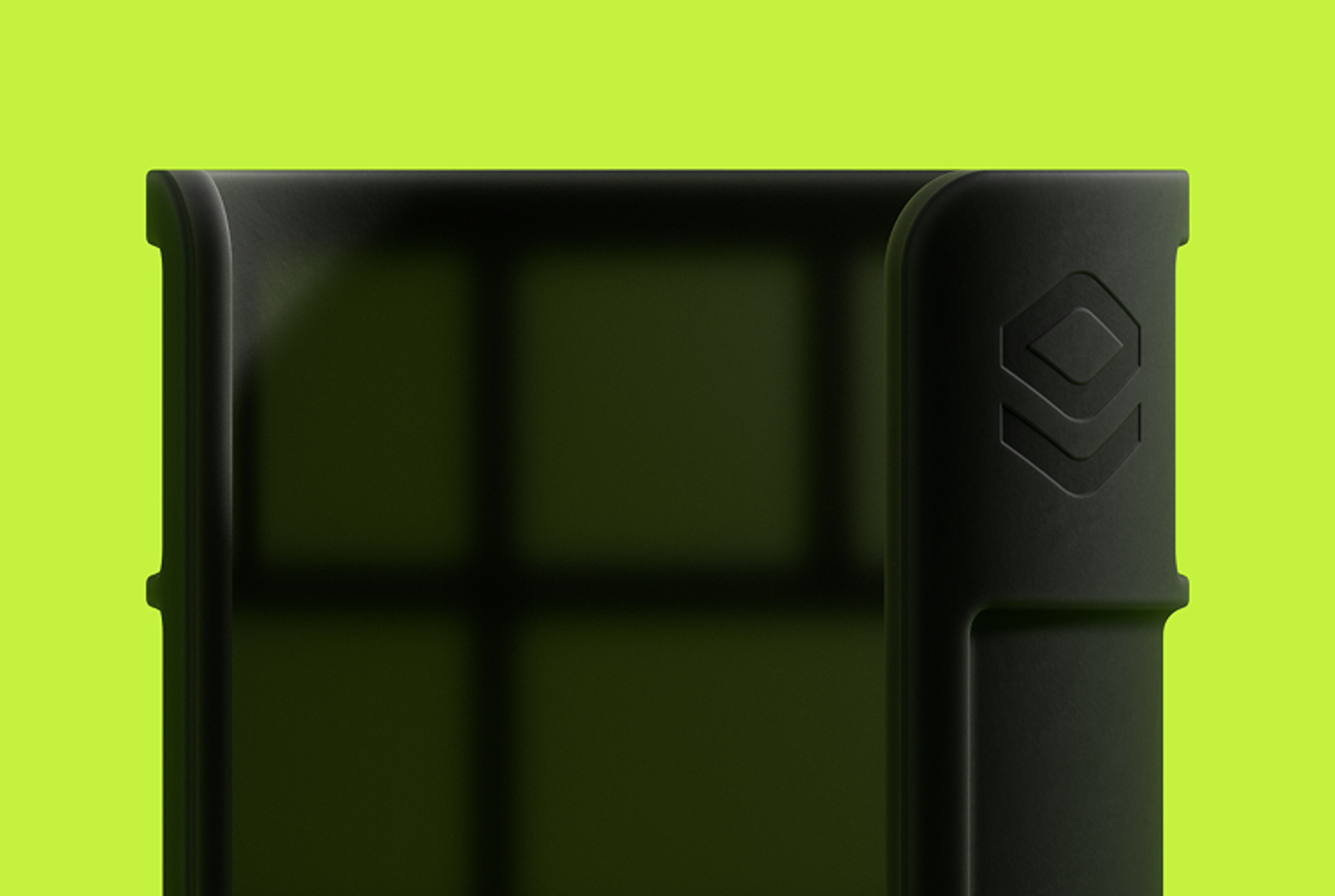
The illustrations blend clean linework, clay renders, and realistic product renders to create a precise yet expressive visual language inspired by engineering schematics and hardware aesthetics.
The icon set follows the same idea as the illustrations: simple, modular shapes with consistent lines and balanced proportions. Together, they form a unified visual system that improves usability and highlights the brand’s technical character.
The brand identity unites all visual elements into a single, well-organized system. It balances a clean technical aesthetic with a human touch, allowing the brand connect with engineers through direct, straightforward communication while remaining approachable and grounded.
Beyond the digital space, the identity comes to life through a set of objects follow the same principles: functional, minimal, and rooted in engineering culture.
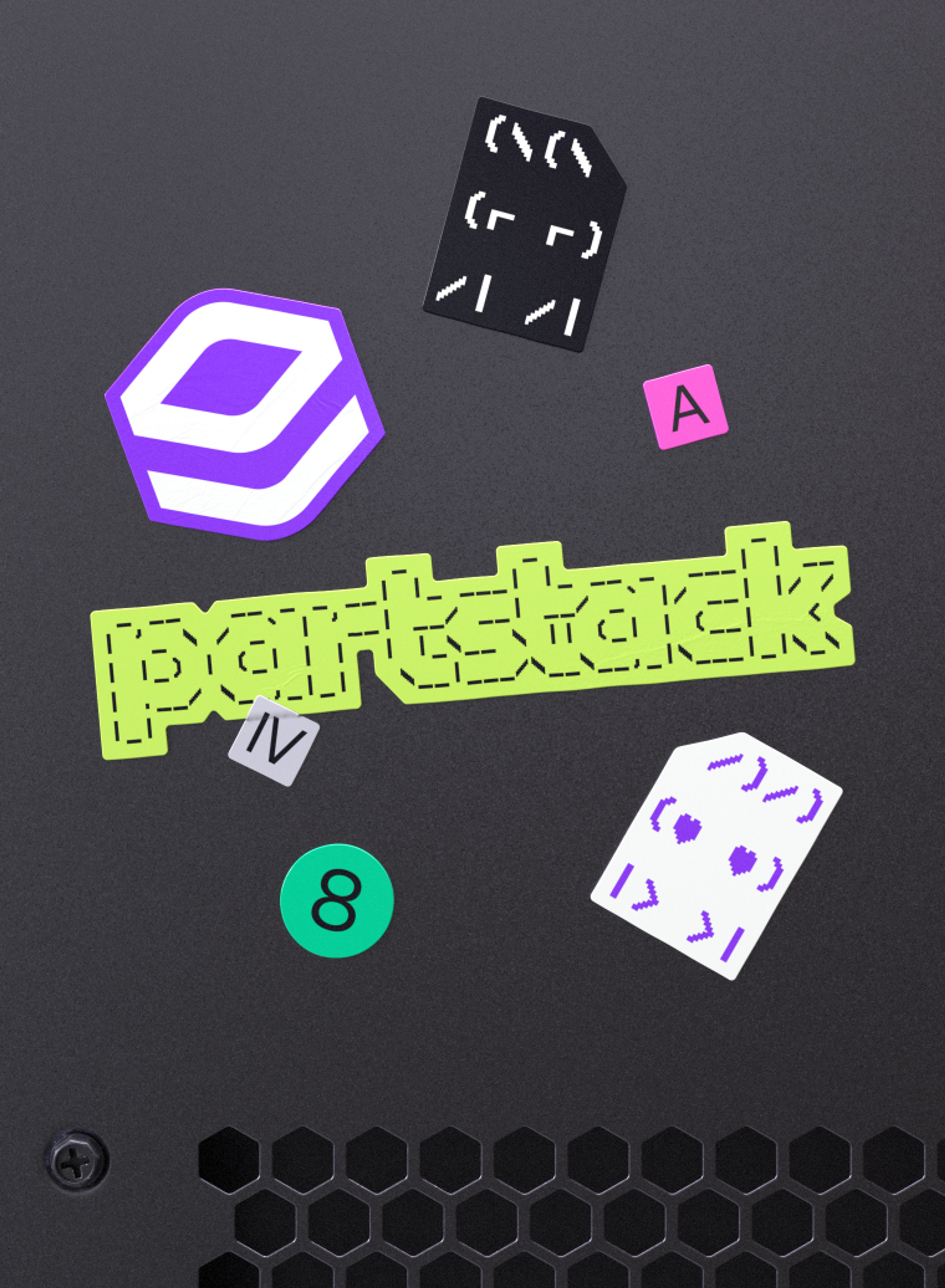
Together, these details create a shared visual language for people who value accuracy, curiosity, and the satisfaction of building.
The revamped website, which can be described as the “Google for the semiconductor industry”, now offers an unparalleled search experience, enhancing the overall supply chain for buyers and sellers in the microelectronics market.
We clarified Partstack’s offerings with a cleaner structure and more scannable layouts, making key services easier to understand at a glance.

Full desktop functionality was thoughtfully adapted across screen sizes, ensuring a seamless experience on any device.
JOKR
Thank you for subscribing!
We'll send you a subscription every couple of weeks.