

Next Case Study
Sky

Turning a complex digital banking ecosystem into a scalable web experience
Q2 is a financial experience company that provides digital banking technology for banks and credit unions, connecting financial institutions with a broad ecosystem of products, partners, and integrations.
We partnered with Q2 to redesign its website and create a visual system to explain a complex product ecosystem. Deliverables included 3D design, iconography, UI, and motion.
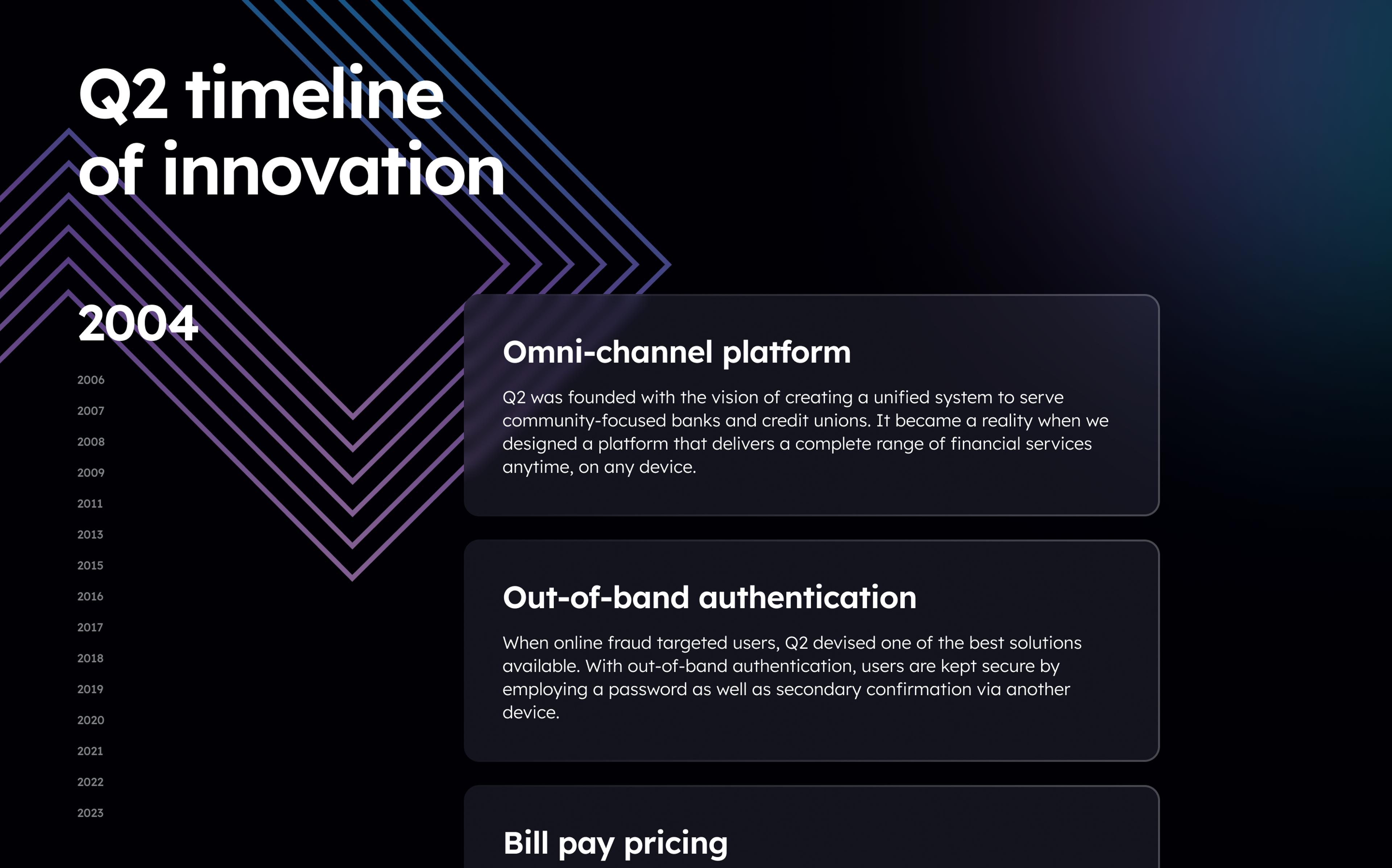
The new web system supports more than 100 pages and gives Q2 a consistent way to present complex capabilities across products, audiences, and devices.
The Clay team began by exploring particles as a visual metaphor for Q2’s connected ecosystem. Their movement, clustering, and interaction helped express how products, data, and integrations come together across the platform. This early direction established the idea of connectivity, which later evolved into a more structured visual language.
From explorations, a clear visual grammar emerged. Transparent surfaces represent the different layers of the platform, while directional lines reveal how information, products, and services connect across the ecosystem.
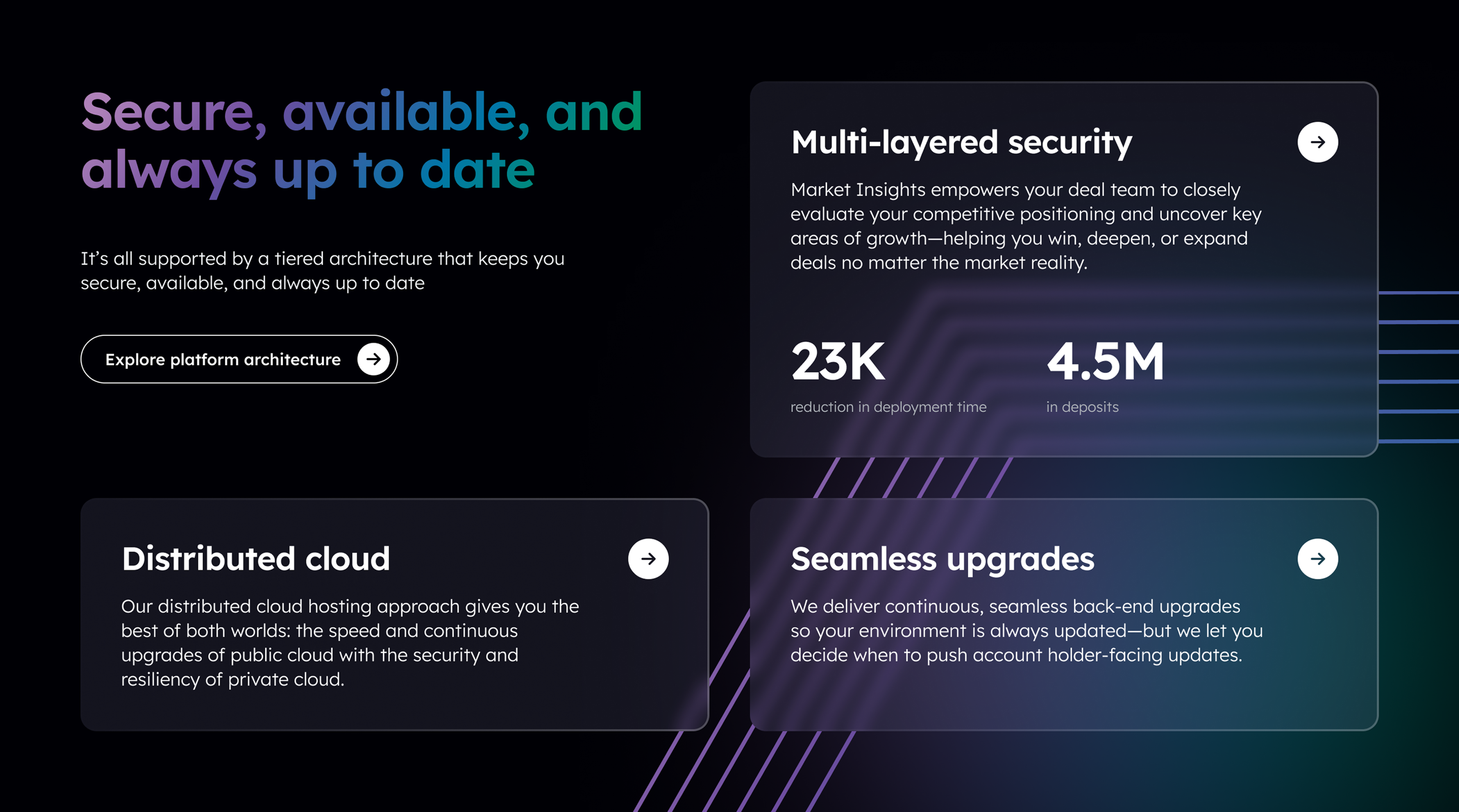
We extended this same visual logic into a custom iconography system, creating a toolkit that can evolve with the website. Each symbol represents a specific functionality of the Q2 platform.

The visual language was applied across the site, alternating dark and light sections to create rhythm and guide users through key content areas. Gradients and line graphics, together with layered 3D elements, carried the brand through the experience and kept the system visually consistent.

To support a black-and-white rhythm, we created section variants for both themes and developed complementary 3D glass assets in both dark and light styles.
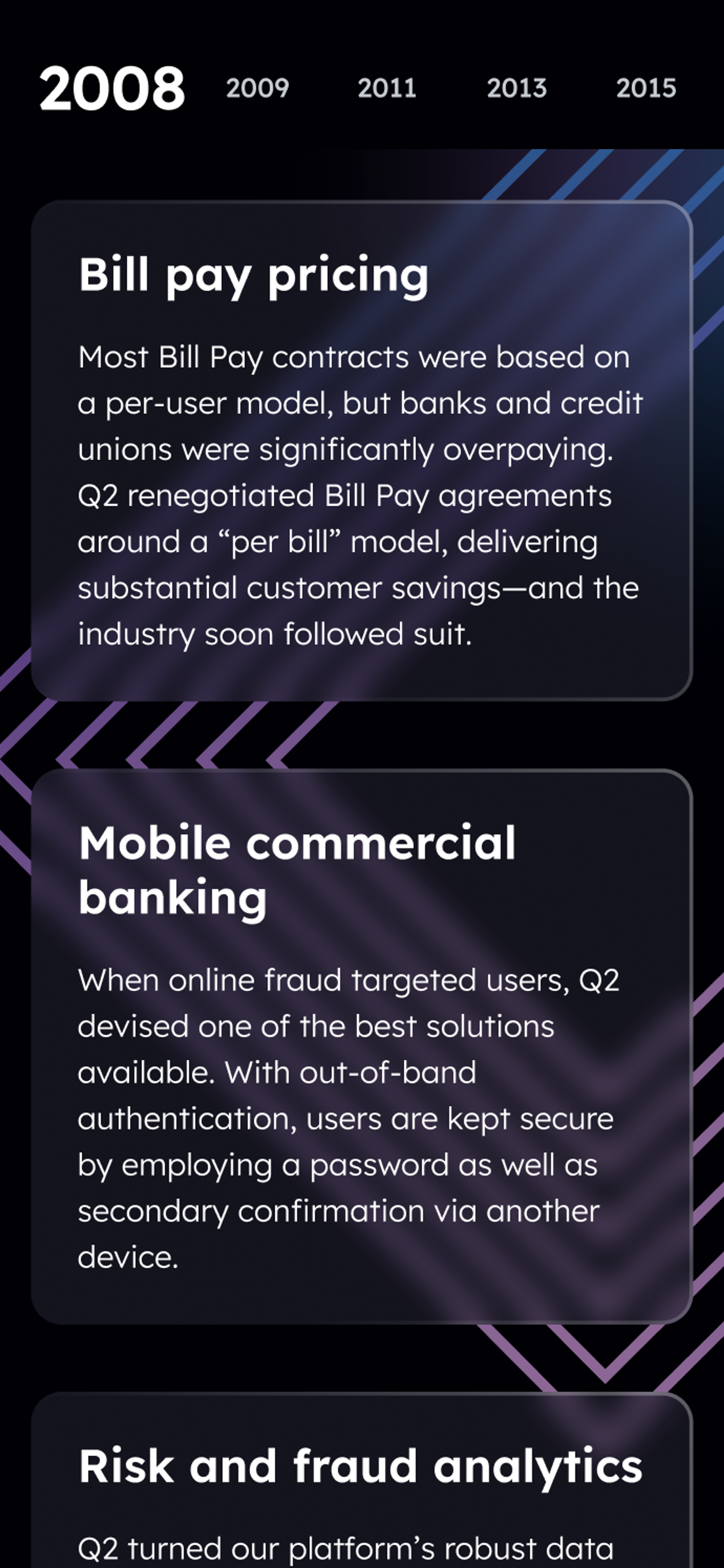
With many Q2 users accessing the site on their phones, responsiveness became a key consideration throughout the design. The system was built to perform consistently across screen sizes. Components, diagrams, and data-heavy modules adapt to smaller screens while keeping the same narrative and visual logic.
The Clay team understood our goals and pushed us to a crisp creative vision. And they collaborated with our in-house team at every step of our project, enabling us to implement that vision across a robust, sophisticated, 100-plus page site. Thank you, Clay!”

Sky
Thank you for subscribing!
We'll send you a subscription every couple of weeks.