

Next Case Study
Meta

Branding and website for a DeFi growth engine
Spark is the first subDAO within the Sky ecosystem, building the growth engine for USDS.
Together, we brought a distinctive identity to life through a memorable logo, unified sub-brands, expressive illustrations, and an engaging web experience. All backed by a clear strategy and practical guidelines.
As the first subDAO within the Sky ecosystem, Spark is defined by a star as its central symbol of energy, direction, and growth. A vibrant gradient system connects Spark to Sky while keeping a distinct and recognizable identity.
The star balances dynamics and structure. Its unconventional asymmetry, along with the mix of straight and angled lines, gives it a form that feels both precise and energetic.

SPK is Spark’s native token, designed to support participation across the ecosystem. It rewards contribution, aligns incentives, and gives people a more direct role in Spark’s growth. At the same time, it also supports the wider adoption and expansion of USDS.
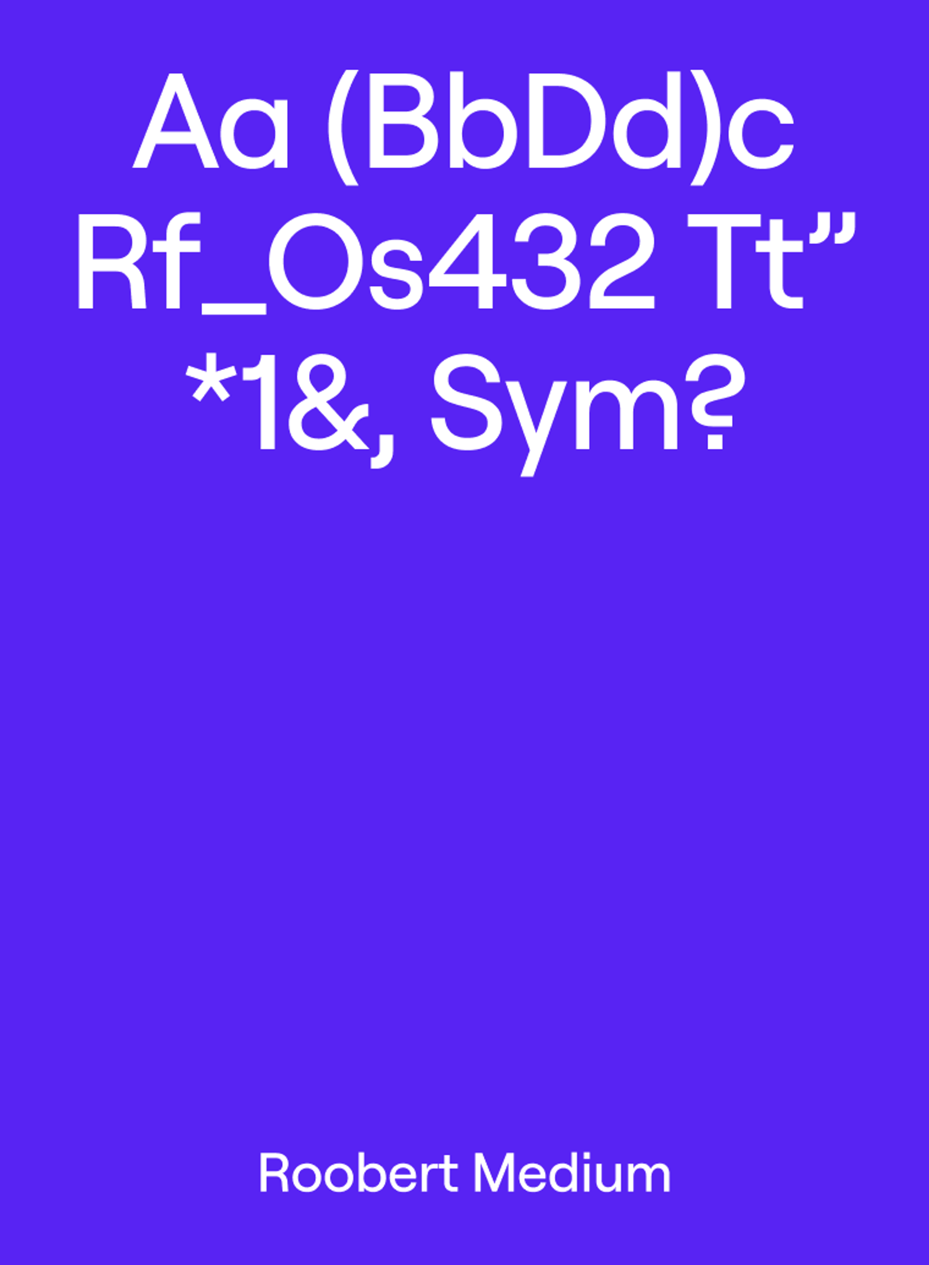
The visual identity is rooted in Spark’s positioning as a growth engine for DeFi. We placed growth at the heart of the identity and expressed it through a strong sense of progression. Every element moves in sync, from color and typography to linear graphics and motion.
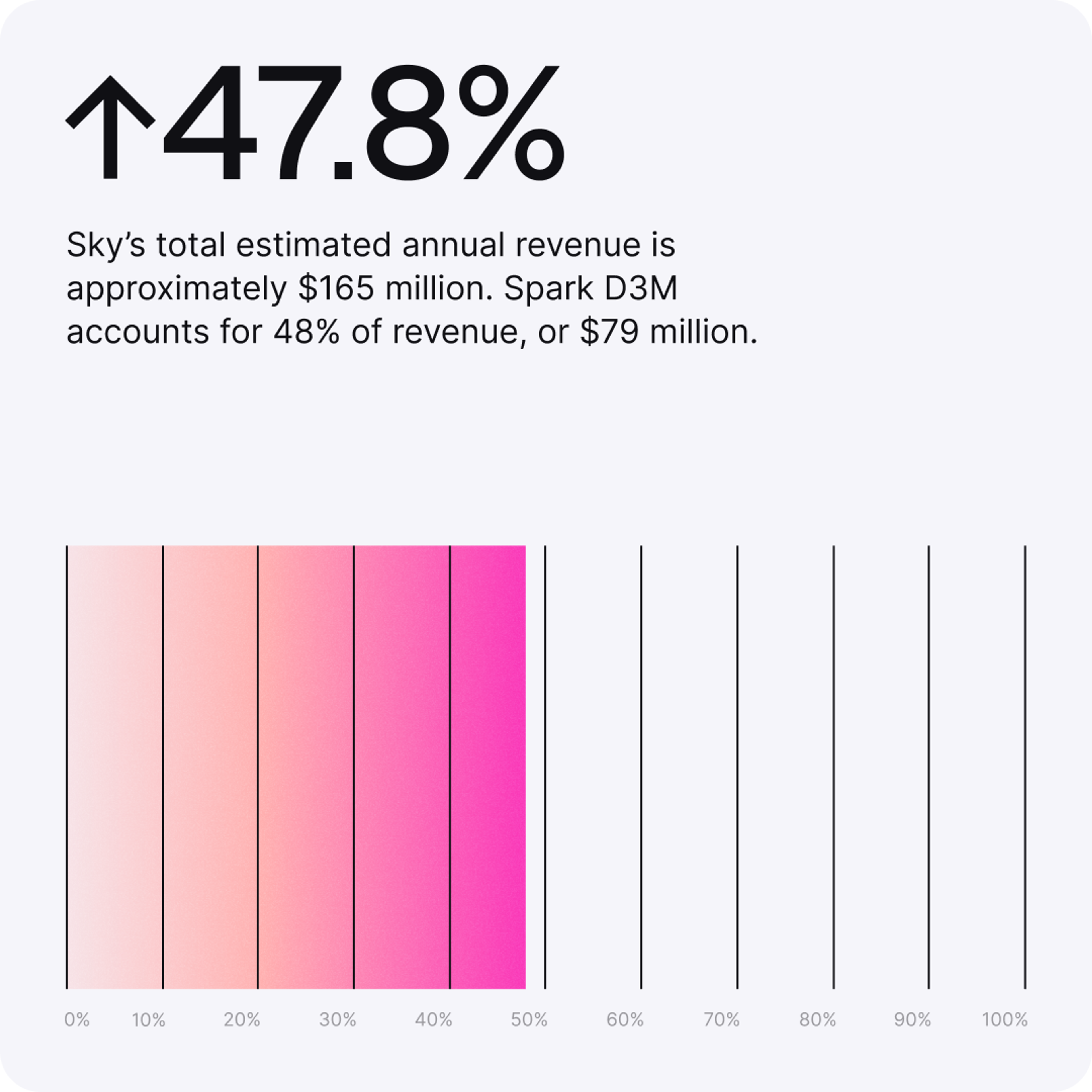
The infographic language follows the core system, keeping things clear without losing expression.
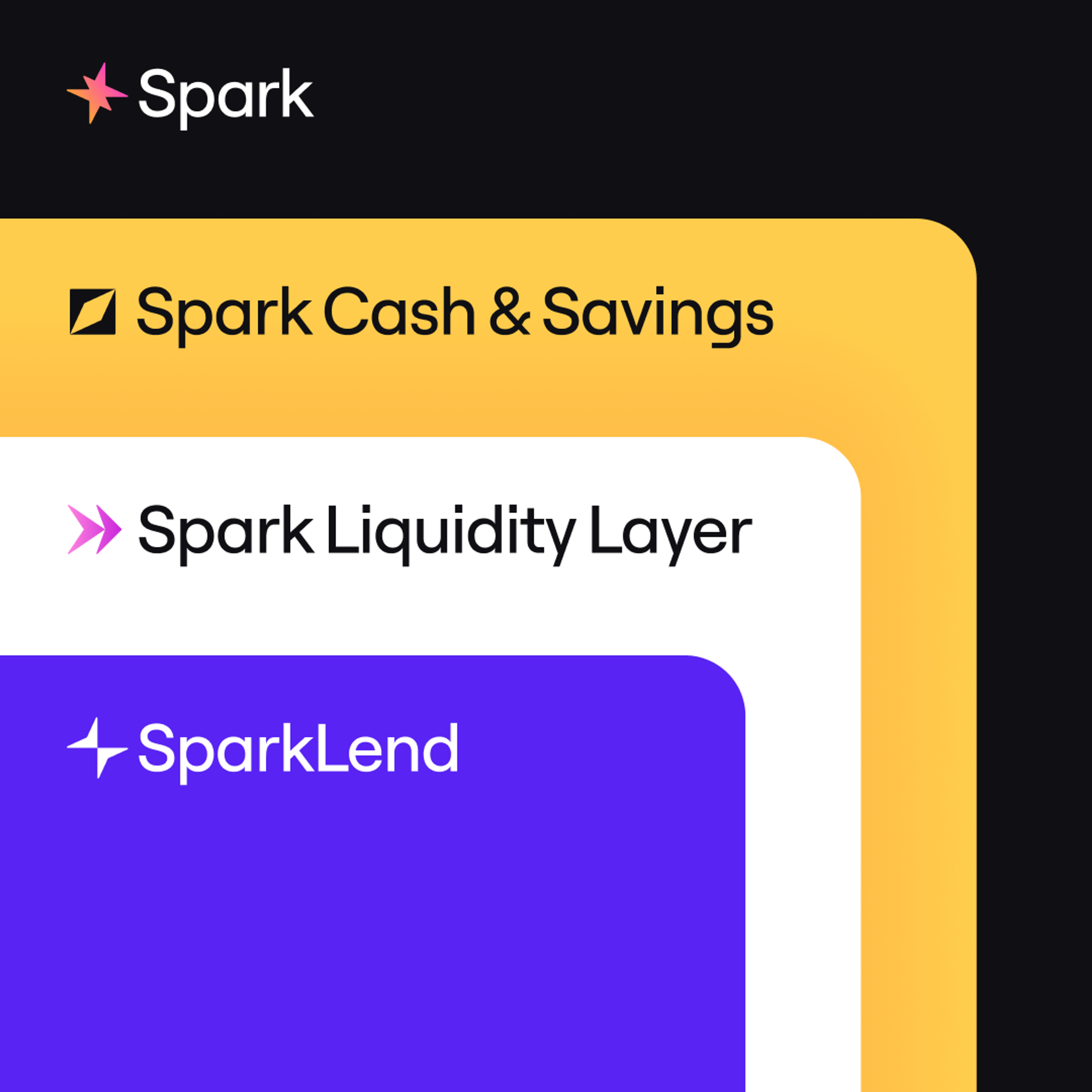
A family of subbrands defines the core products of Spark. We designed their logomarks around the Spark symbol, using two triangles to express different product metaphors, from savings and liquidity flows to access to capital. Color and positioning give each a clear and recognizable role within the system.
The gradient also extends into typography and appears in headlines when the message calls for stronger expression.
The identity comes to life across both digital and physical touchpoints. It remains instantly recognizable and evolves through real use by the people who engage with it.

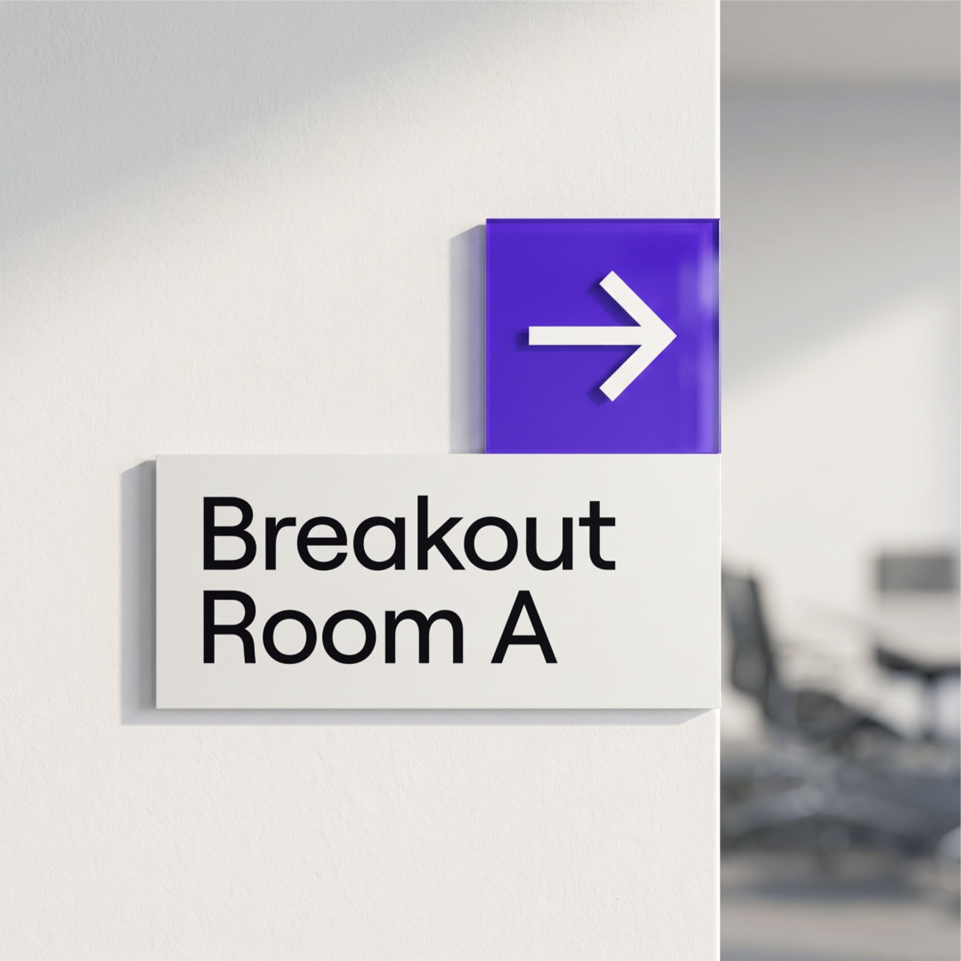
We extended the identity into physical space through environmental branding. From floor plans to wayfinding, each element is designed to guide and unify the experience.
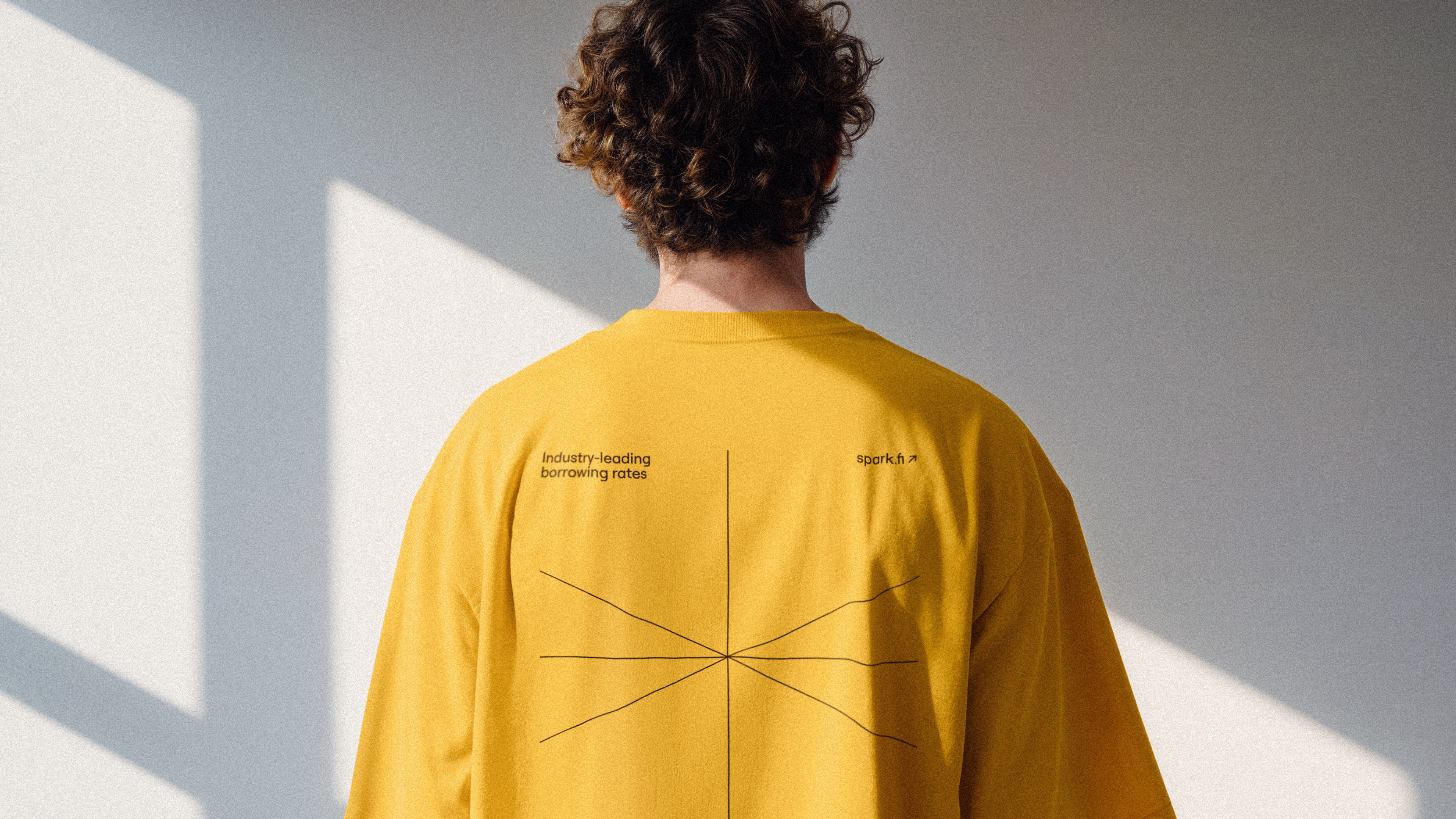
The Spark brand is deeply rooted in its community, shaped by active participation and shared ownership. From merchandise to collaborative initiatives, these touchpoints help build stronger relationships and a lasting sense of connection.
With Discord as the main space for community interaction, we created a set of branded emojis that make the identity part of everyday conversations.
Meta
Thank you for subscribing!
We'll send you a subscription every couple of weeks.