As a leading UX design agency, we’re often asked by prospective clients and fellow designers similar questions:
- “What deliverables do you provide at the end of a design project?”
- “Will it be enough for our development team to execute?”
- “Will our design team be able to maintain the designs you created?”
- “How hard will it be to add new features in the future?”
- etc.
To address all of these questions and shed some light on our design process, we present you a brief description of each deliverable and its purpose.
What is a UX deliverable?
Let’s start with the basics — what is a deliverable? Simply put, a UX deliverable is a design document that communicates ideas, research findings, and provides guidance for design and development teams. Regardless of the industry or platform, whether it’s a small startup or a worldwide enterprise, the list of deliverables for a standard UX design project is more or less the same, and mainly depends on the product requirements, budget and timeline.
At Clay this list usually consists of the following documents:
Research phase
- User research takeaways
- UI/UX research document
UX design phase
- Information architecture mind map
- User flow document
- Wireframes
- Interactive prototype
- User testing report
UI design phase
- Visual design mockups
- UI animations
- Design system
- Design specification
Now let’s take a look at each one of them in more detail:
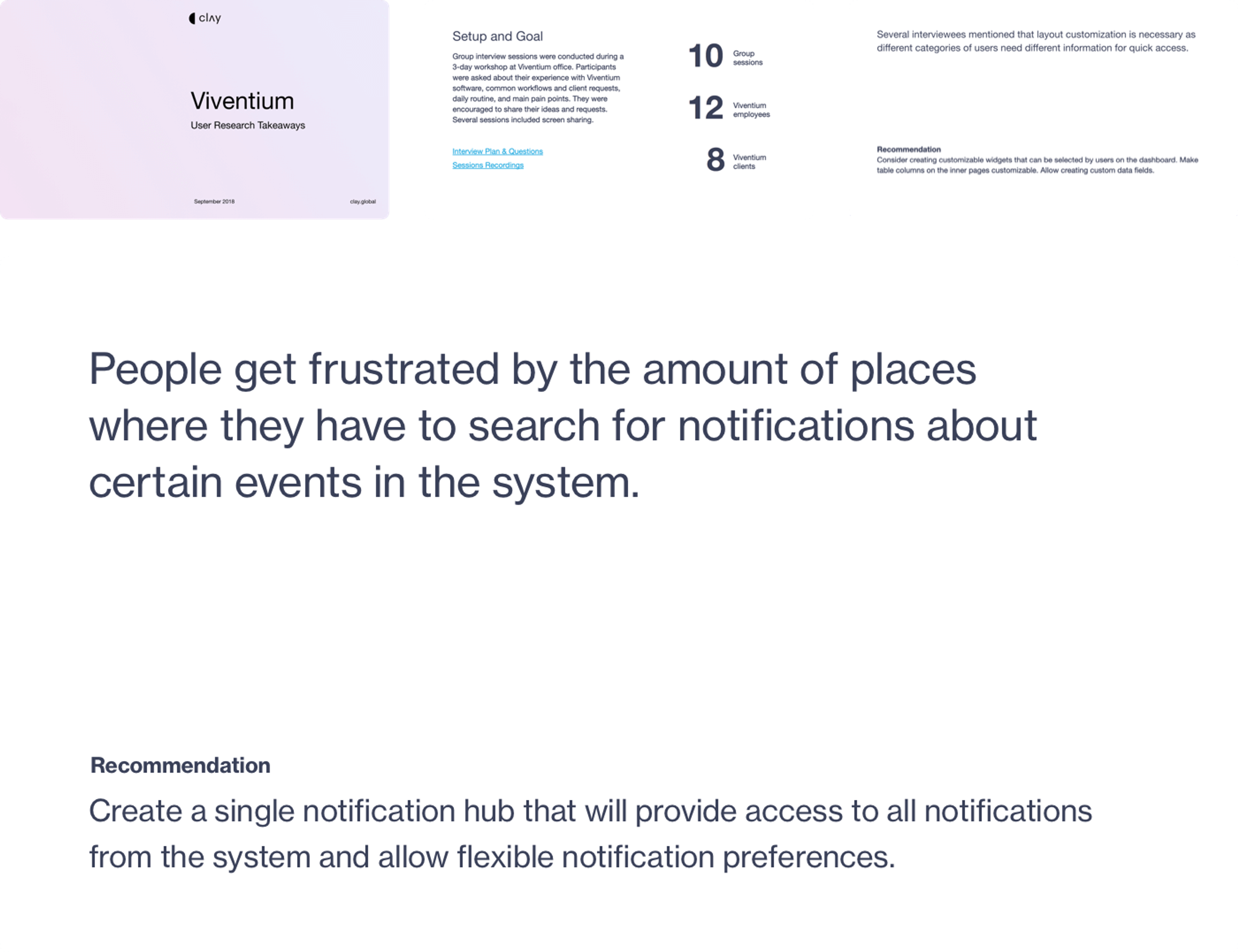
User research takeaways
User research is an integral part of any project. By utilizing various methods like individual interviews, field studies, and online surveys, we gain additional insights around the customers’ needs, emotions, behavior, and motivation.
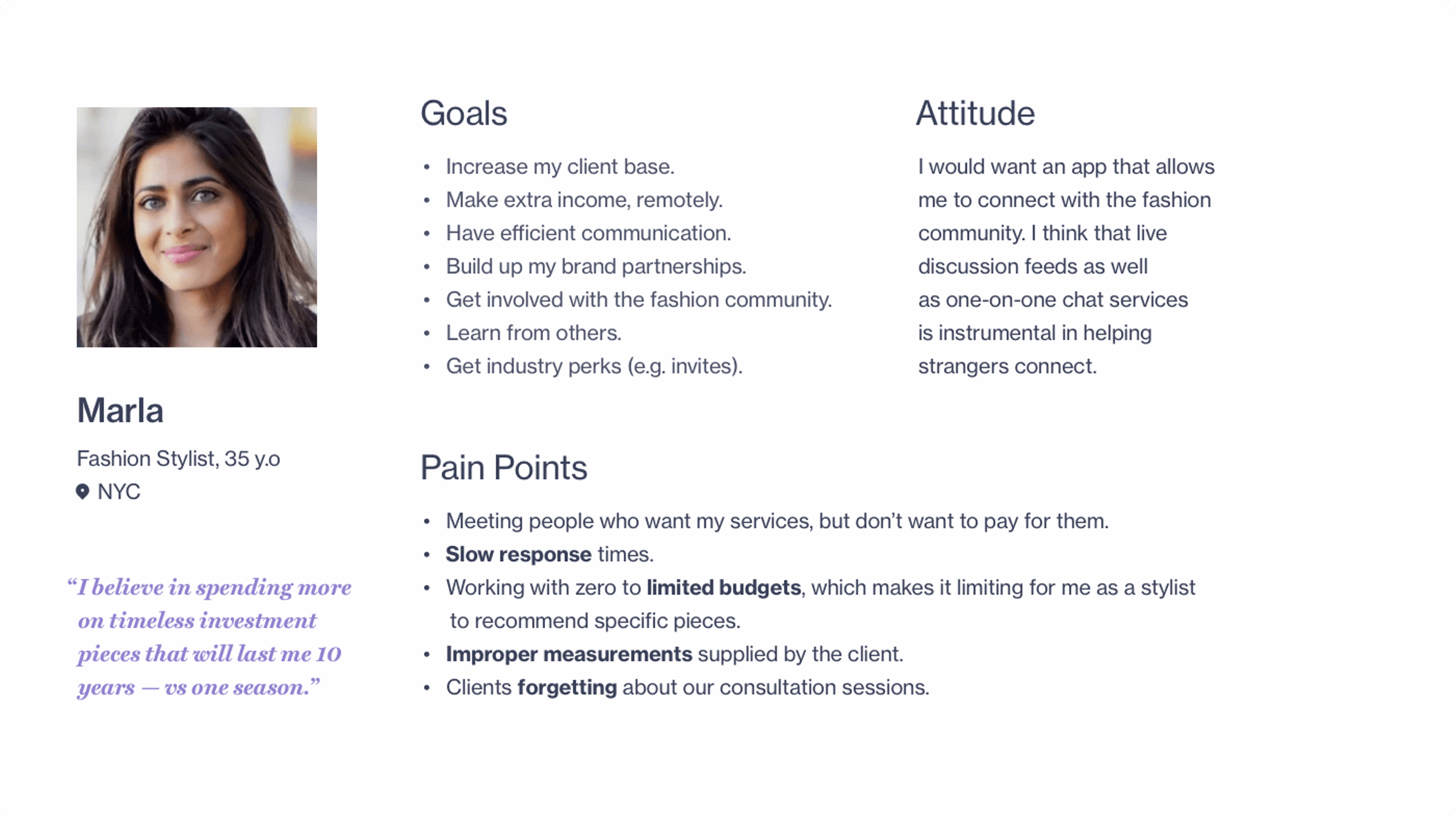
Besides interviews themselves, we also perform various activities like card sorting, mind mapping, collaborative wireframing, and so on. The results of these interviews and activities are consolidated in a takeaways document that includes main findings, personas, and high-level recommendations. This document helps us get key stakeholder buy-in regarding user goals and desired features.
User research takeaways document example
In addition to the final takeaways document we provide all the source material which may include things like a user research plan, spreadsheets with a results matrix, audio or video recordings, notes that were taken during interviews, etc.
Persona example
UI/UX research document
Competitive research is a valuable tool that helps us pinpoint competitors’ strengths and weaknesses. Usually, we pick 5-7 of the most appealing direct competitors and evaluate their solutions for problems and issues that we identified during user research and project discovery. We also take note of the terminology they use to make sure our solution utilizes industry-standard language and naming conventions.
UI/UX research document example
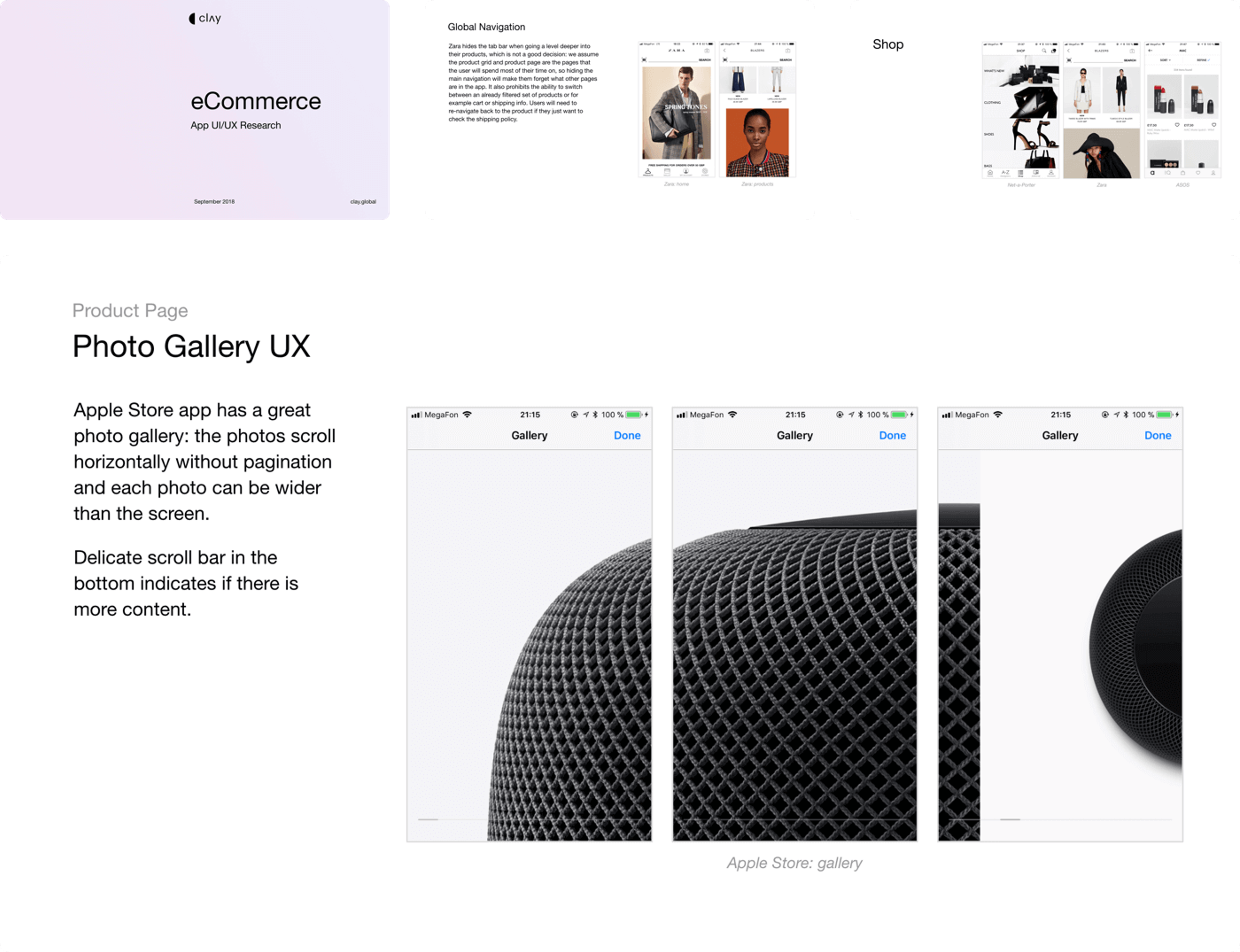
But we don’t stop there and expand our research to products that are not directly related to the project. After all, the end user experience is much more diverse and not limited to a single product.
During the research phase we may look at things like navigation, on-boarding experience, most common workflows and design patterns, types of visualizations used, etc. As a result, we create a final takeaways document that contains the main findings and is used throughout the project as a handbook to guide and support our design decisions.
UI/UX research document example
Information architecture
Once the main research phase is complete, we use all of the collected data to build an information architecture for the future product or revise the existing one to better fit the users’ needs and workflows. It is usually created in the form of a mind map that gives a bird’s eye view of the system and shows relationships between its parts.
This mind map exercise proved to be very effective when performed in collaboration with stakeholders. By visualizing overall project structure it is easier to understand the scope and define feature priorities.
Information architecture mind map example

The mind map helps us plan design work more accurately, organize the content in an effective and sustainable way, and create a more thought-through navigation. Over the years we tried a lot of online and offline tools to create mind maps, eventually ending up with MindNode as our tool of choice.
User flow document
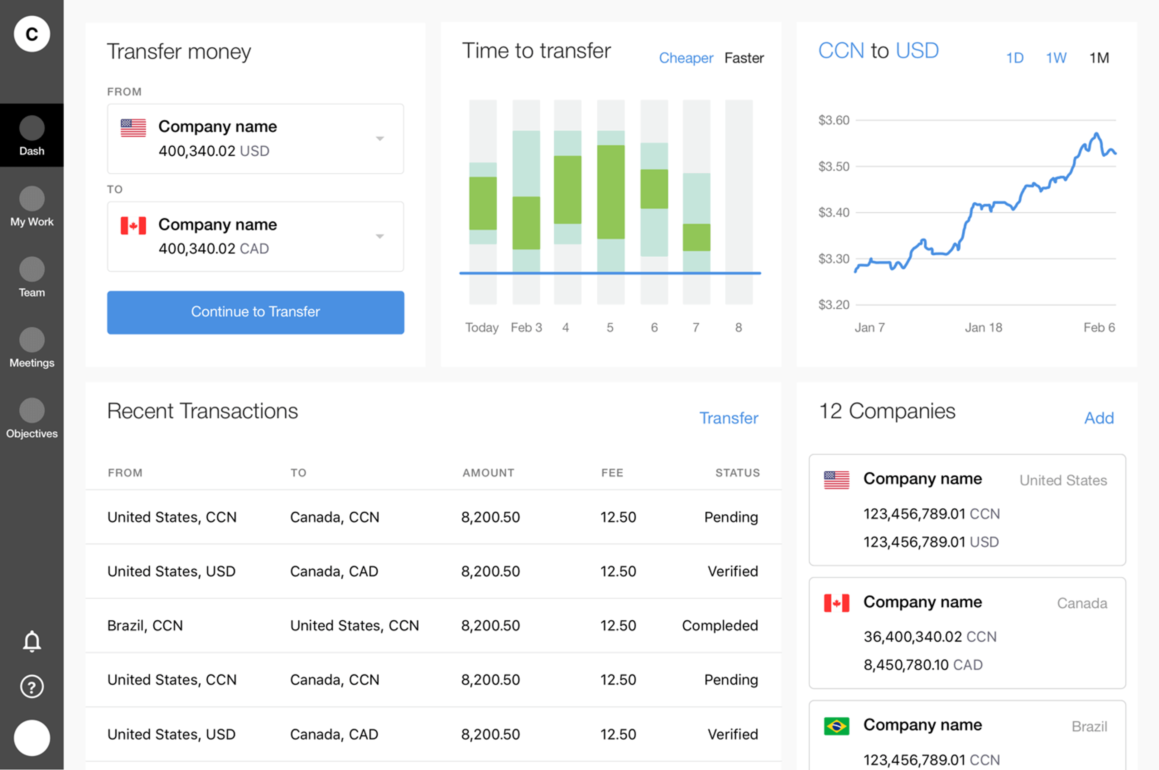
User flow is a series of user actions or system states that the user needs to go through to achieve a meaningful goal. We create it in a design-specification format that combines screen layout designs with a flowchart-like representation of user and system interactions broken down into simple scenarios. The main goal of this document is to provide developers with a detailed description of all possible user flows, including edge cases, errors, and various states.
Workflow draft with empty rectangles
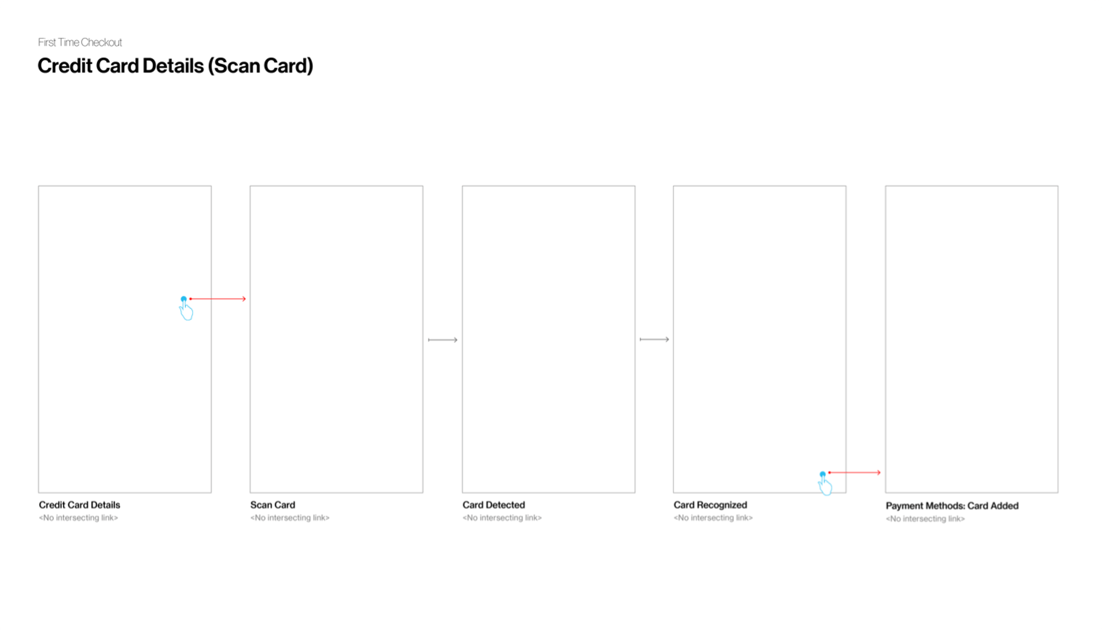
It is a living document — we constantly update it over the course of a project’s lifespan. It all starts with empty rectangles and arrows that outline core workflows.
Workflow filled with wireframes
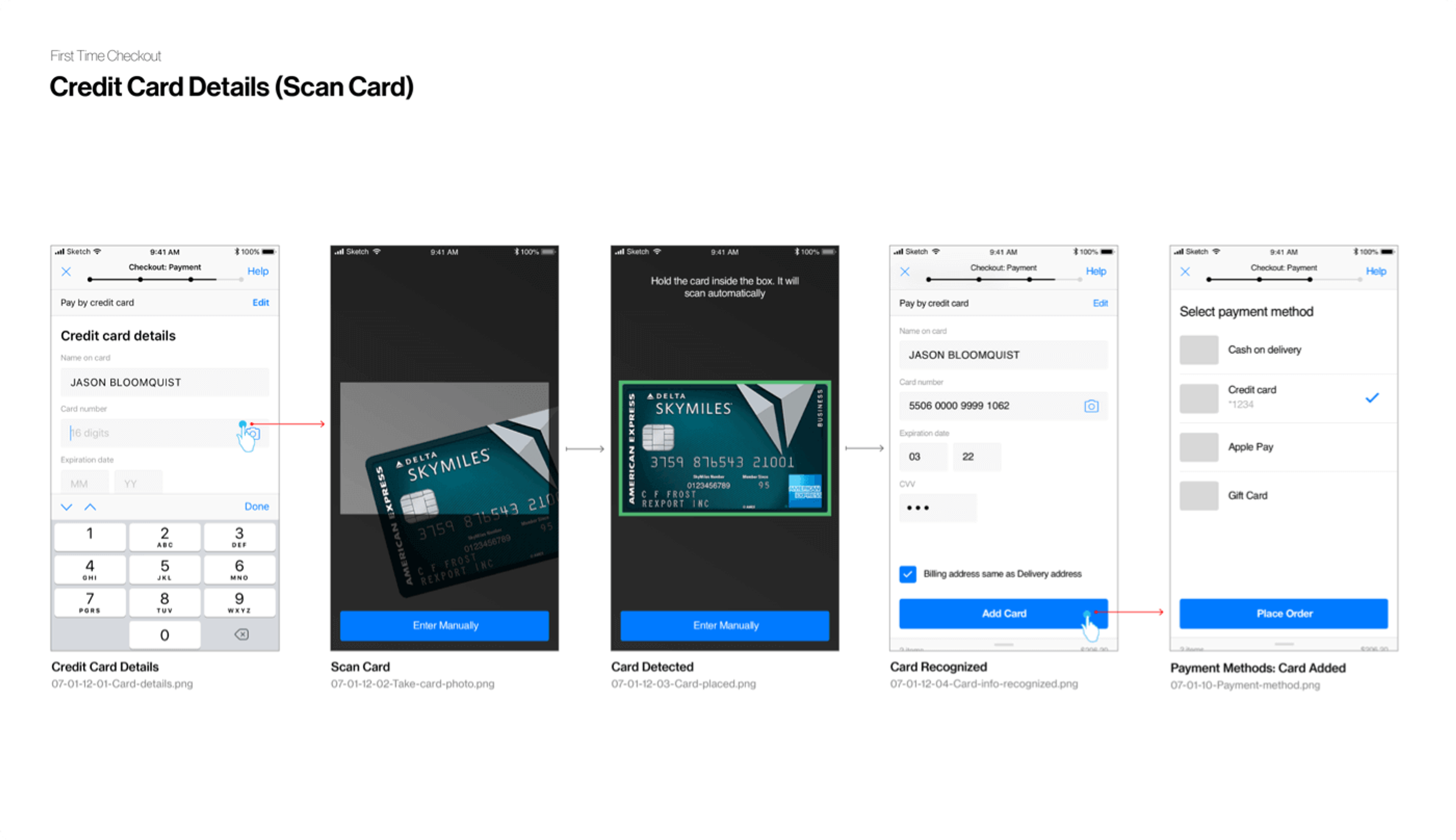
As soon as we have initial wireframes in place we add them to the document and replace them with the final visuals once the visual design production phase has kicked off.
Workflow filled with visual designs
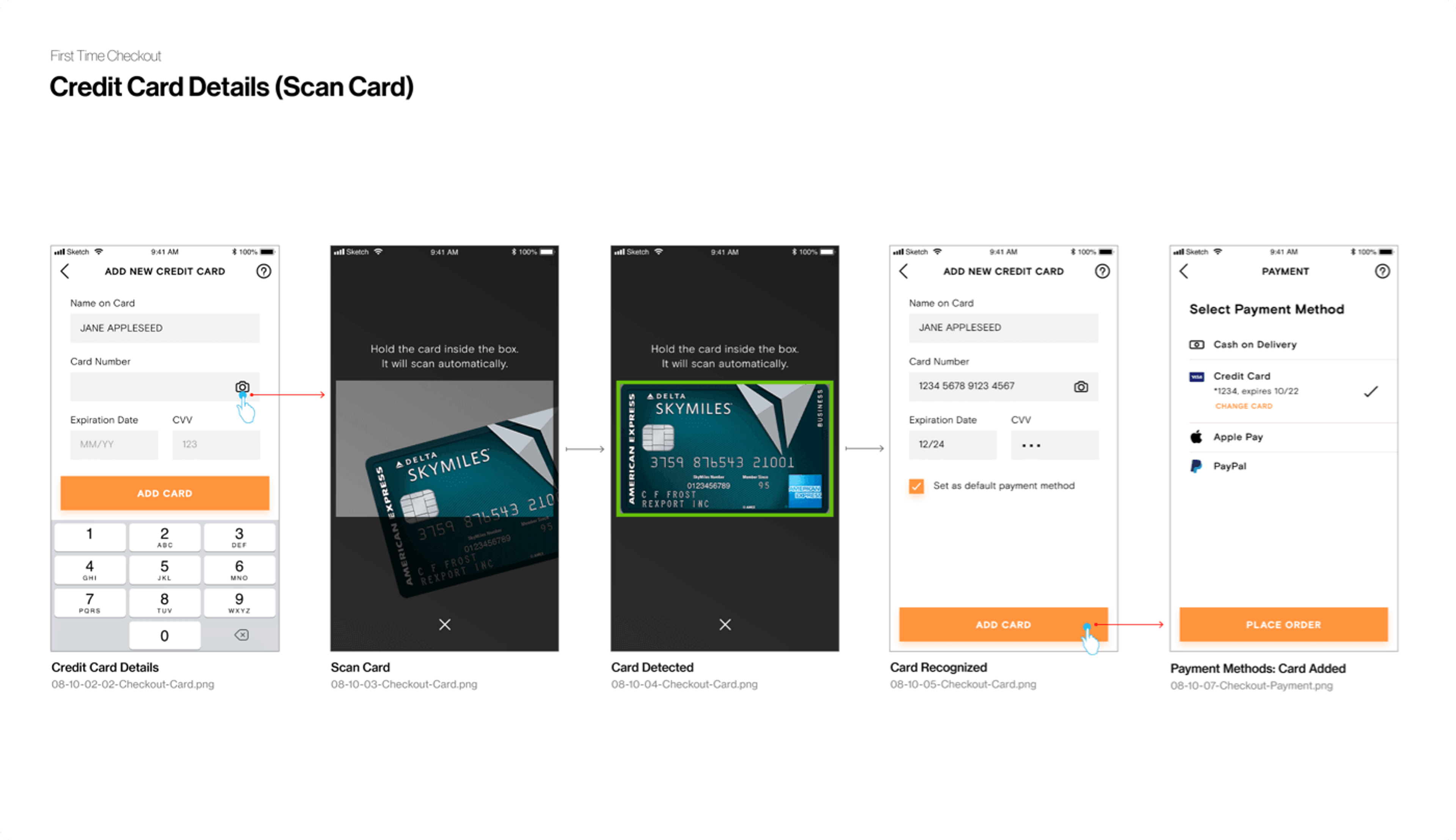
This process allows us to iterate on the user flows more efficiently, constantly monitor the project’s progress based on completeness of the document, and identify any frustrating or confusing points early-on.
Wireframes
Wireframes are essentially the skeletal framework of a website or app. They are designed to solidify the project requirements and define main layouts, UX workflows and content. They are easy to create and maintain, allowing us to quickly iterate on ideas, capture feedback from stakeholders and end users.
There is a never-ending debate in the design community whether one should create low-fidelity or high-fidelity wireframes. Both sides have their arguments, but we prefer the latter.
Based on our experience, stakeholders and users tend to understand them better. We don’t have to explain that “this grey block will be replaced with copy later” and a lot of questions are resolved by themselves when the wireframe is more detailed and looks more like a finished product rather than a sketch.
Low-fidelity Wireframe
High-fidelity Wireframe
However, in the beginning of the UX phase, when we just start working on overall layout and navigation, low-fidelity wireframes proved to be more efficient. We can quickly produce a set of options to discuss with the client, and once we agree on a certain solution we switch to high-fidelity wireframes which take more time to create, but are more beneficial for the project in the long run.
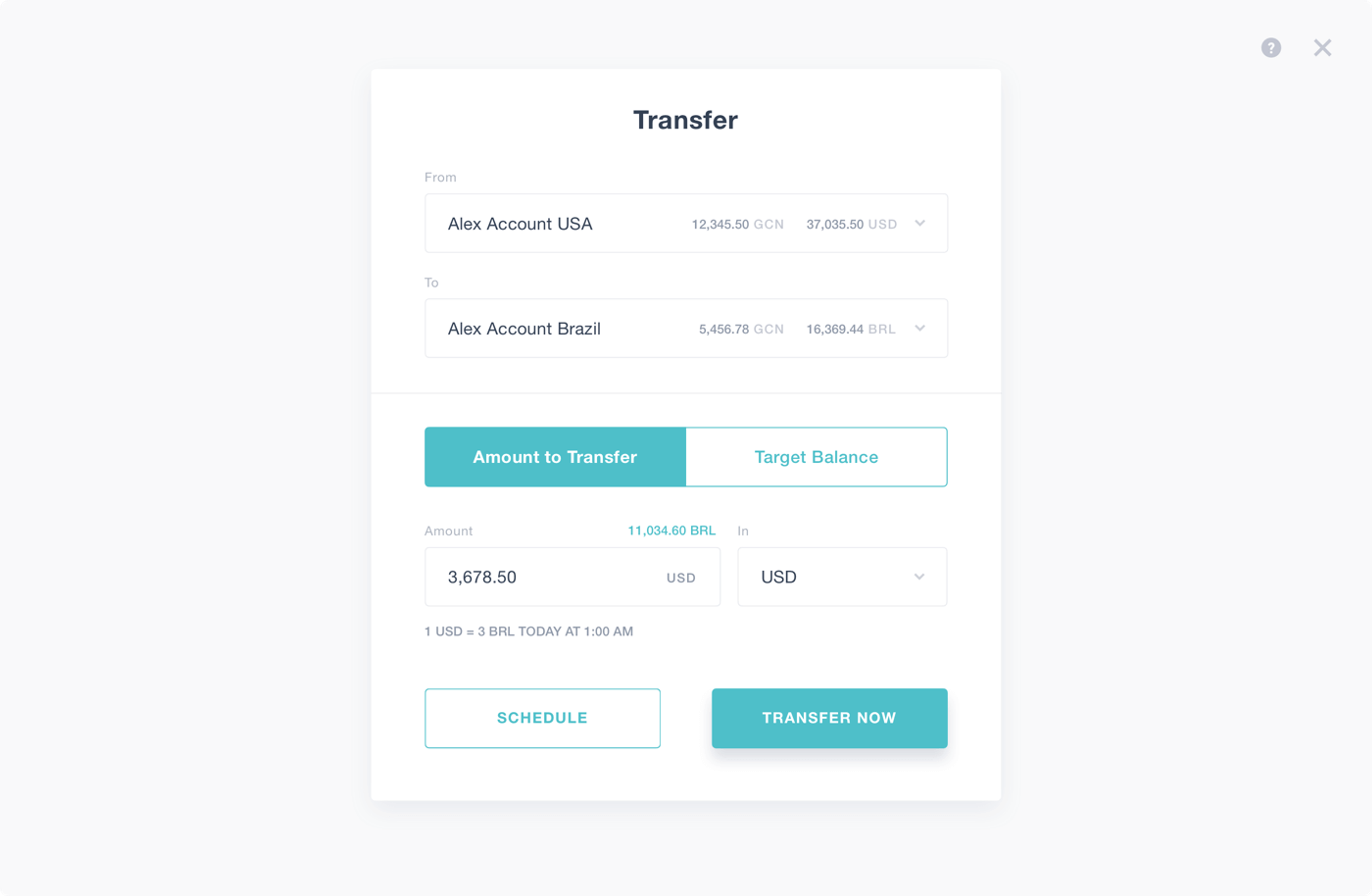
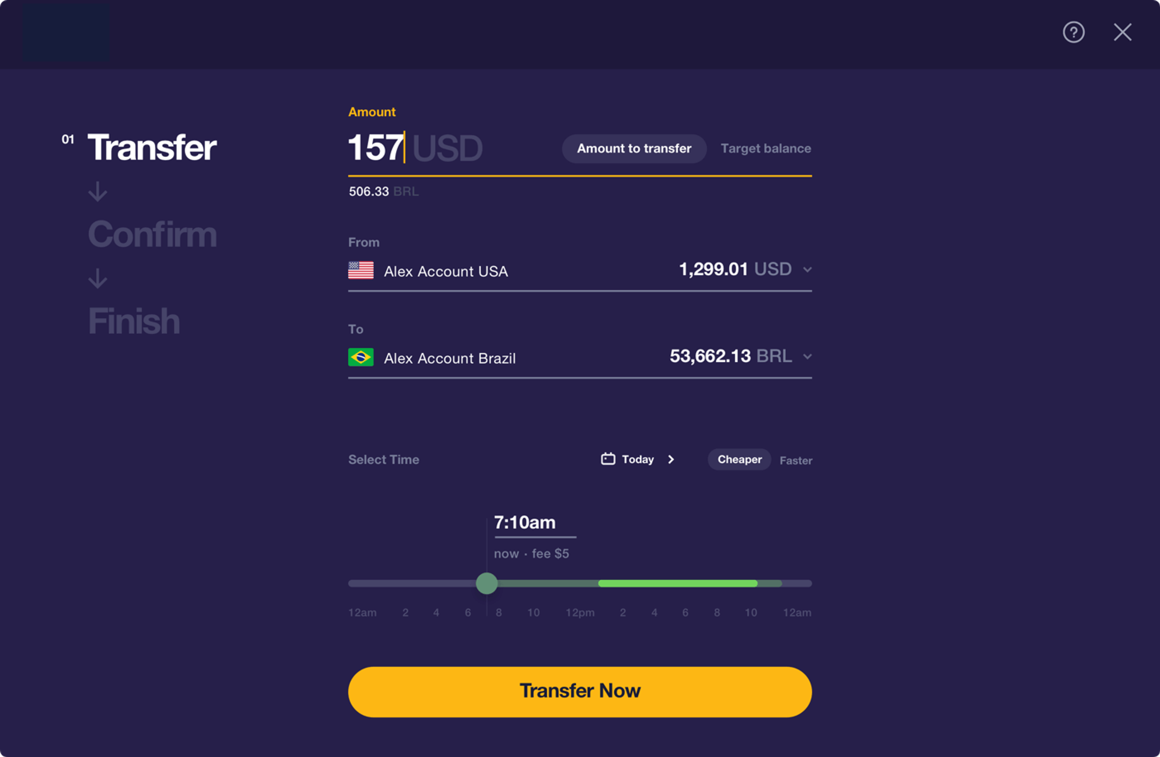
Interactive prototype
A picture is worth a thousand words. An interactive prototype is worth 10 times more. We create interactive prototypes as a part of both the wireframing and visual design processes. They help us identify weak spots in our designs, iterate on designs internally, validate assumptions, and test hypotheses.
More often than not, we use simple tools like InVision. It provides a full spectrum of functionality to conduct user testing sessions, present our work to clients or collect stakeholder feedback. When we want to test a more complex interaction or workflow, we may use something like Framer or create the prototype directly in HTML/CSS.
Interactive prototype made with InVision. See full version at https://invis.io/J7S72JY8Z4E
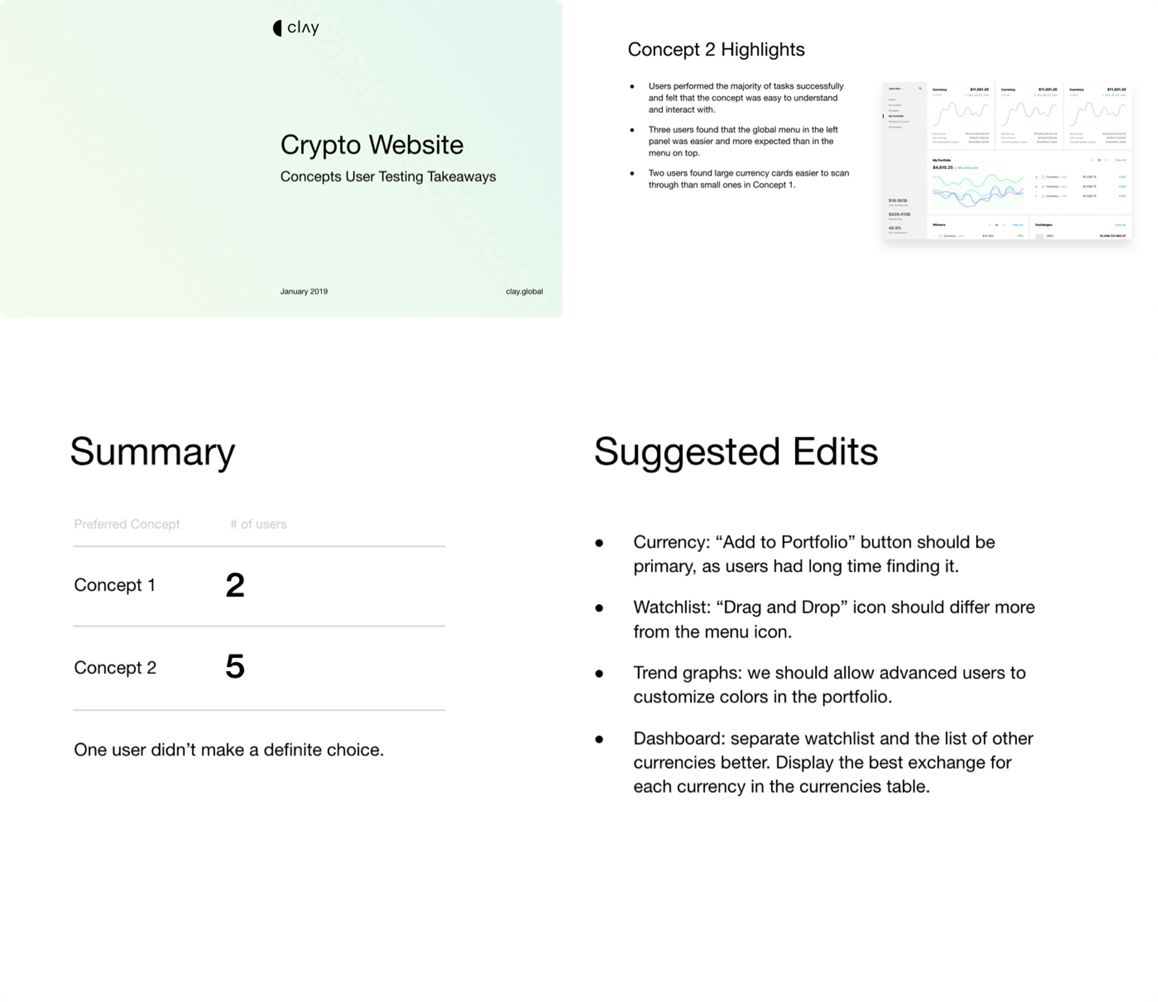
User testing report
When working on a design project it is always useful to make stops along the way to validate assumptions and design decisions. One of these stops is a usability testing. With the help of an interactive prototype (created using wireframes or final visuals), we conduct a series of user testing sessions.
As a result of this exercise we create a user testing report that contains a summary of our findings and recommendations on next steps. It also provides context to the testing by outlining overall testing goals, setup and participant demographics. We also share audio and video recordings along with other supporting materials.
User testing report example
Visual design mockups
As we finalizing the wireframes and workflows for the core features, we start working on the visual side of the project. Whether using branding guidelines (if provided), or coming up with the style from scratch, we always start with visual exploration. We create a set of visual design concepts accompanied by mood boards to illustrate our vision for the future style of the product.
Visual directions example
Visual directions example
Once we agree on the direction we move to the production phase — applying the styling to all required pages, and creating all necessary specifications so developers could start working on their side of the project.
Applied visual style example
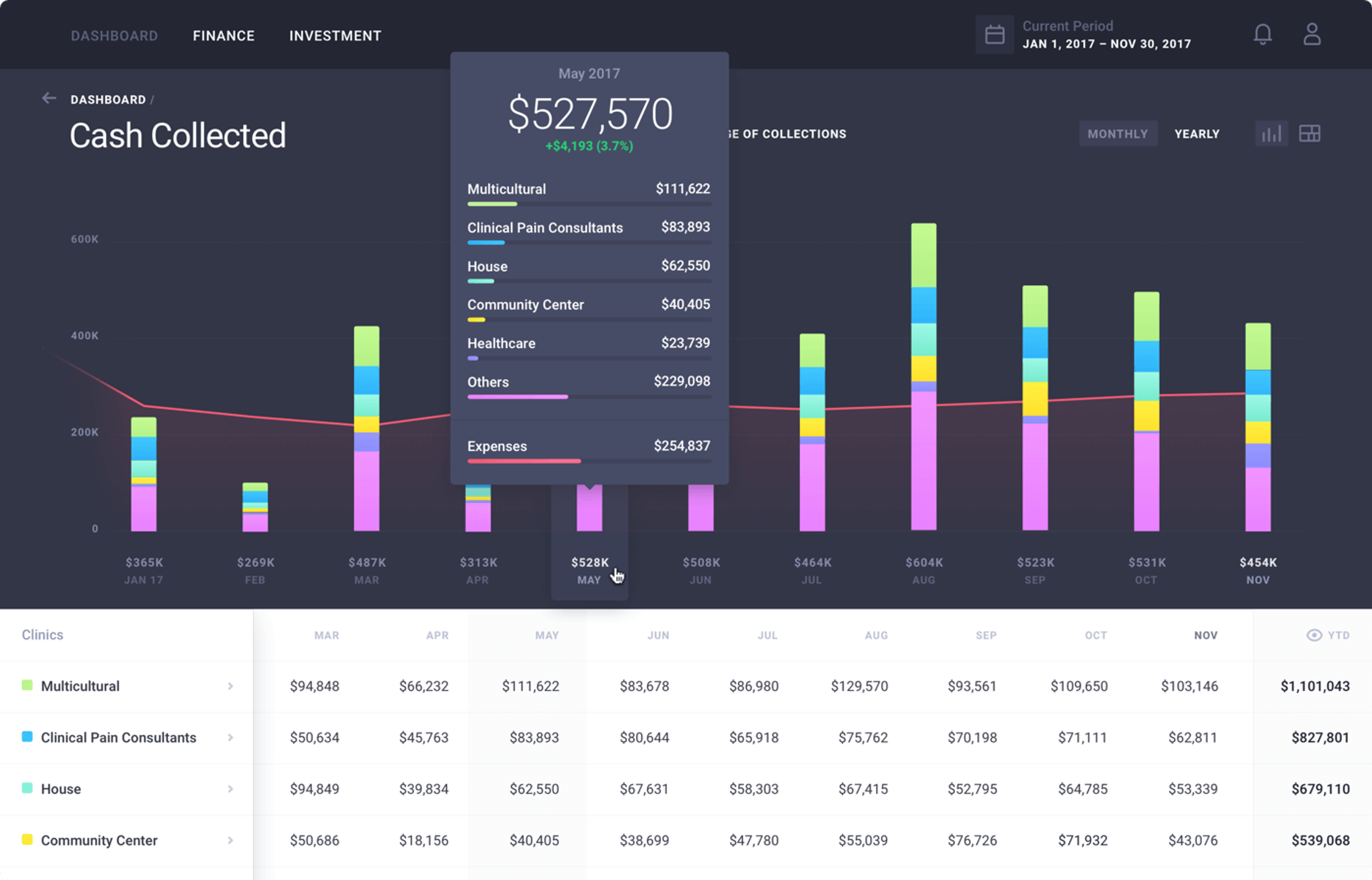
Applied visual style example
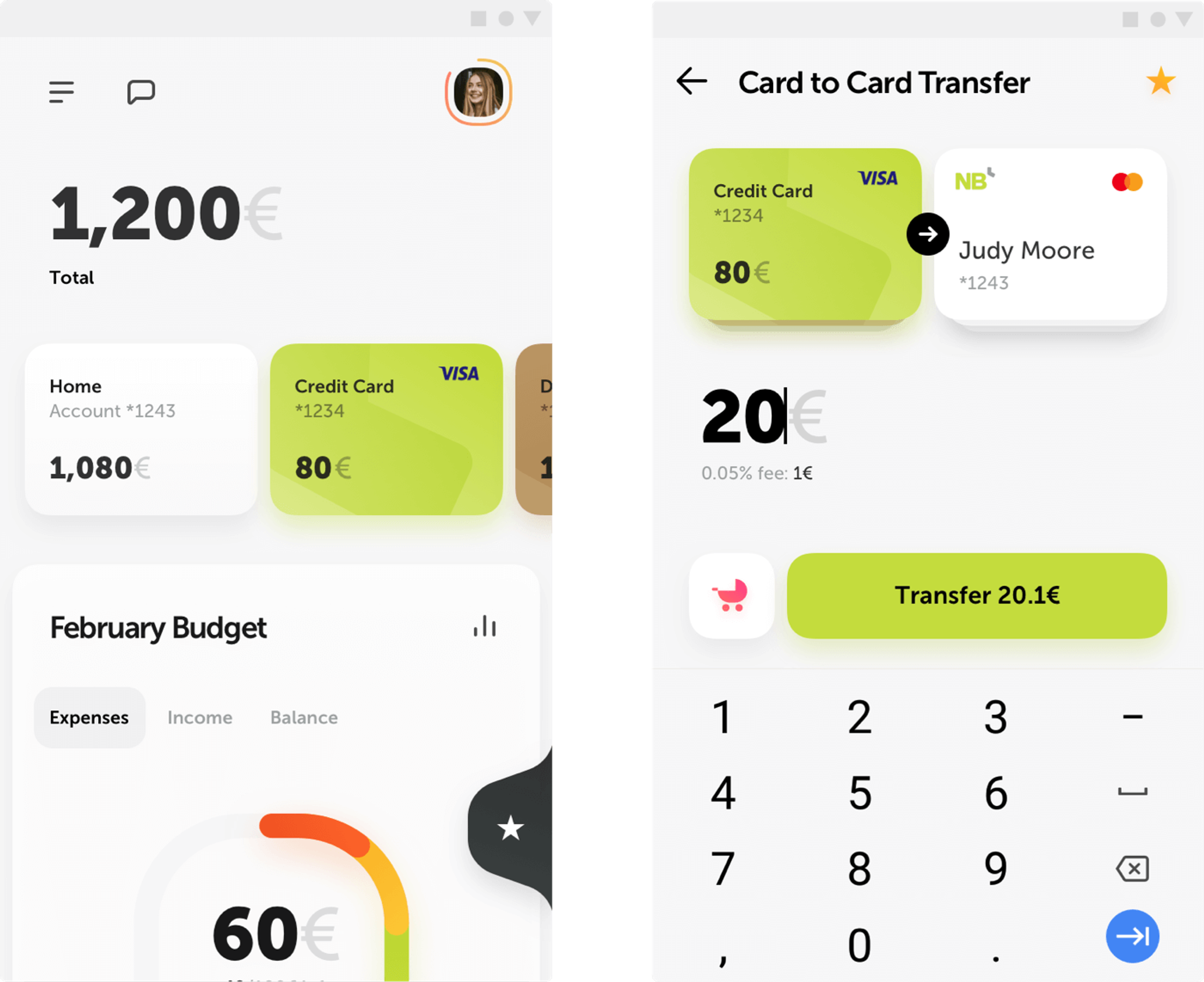
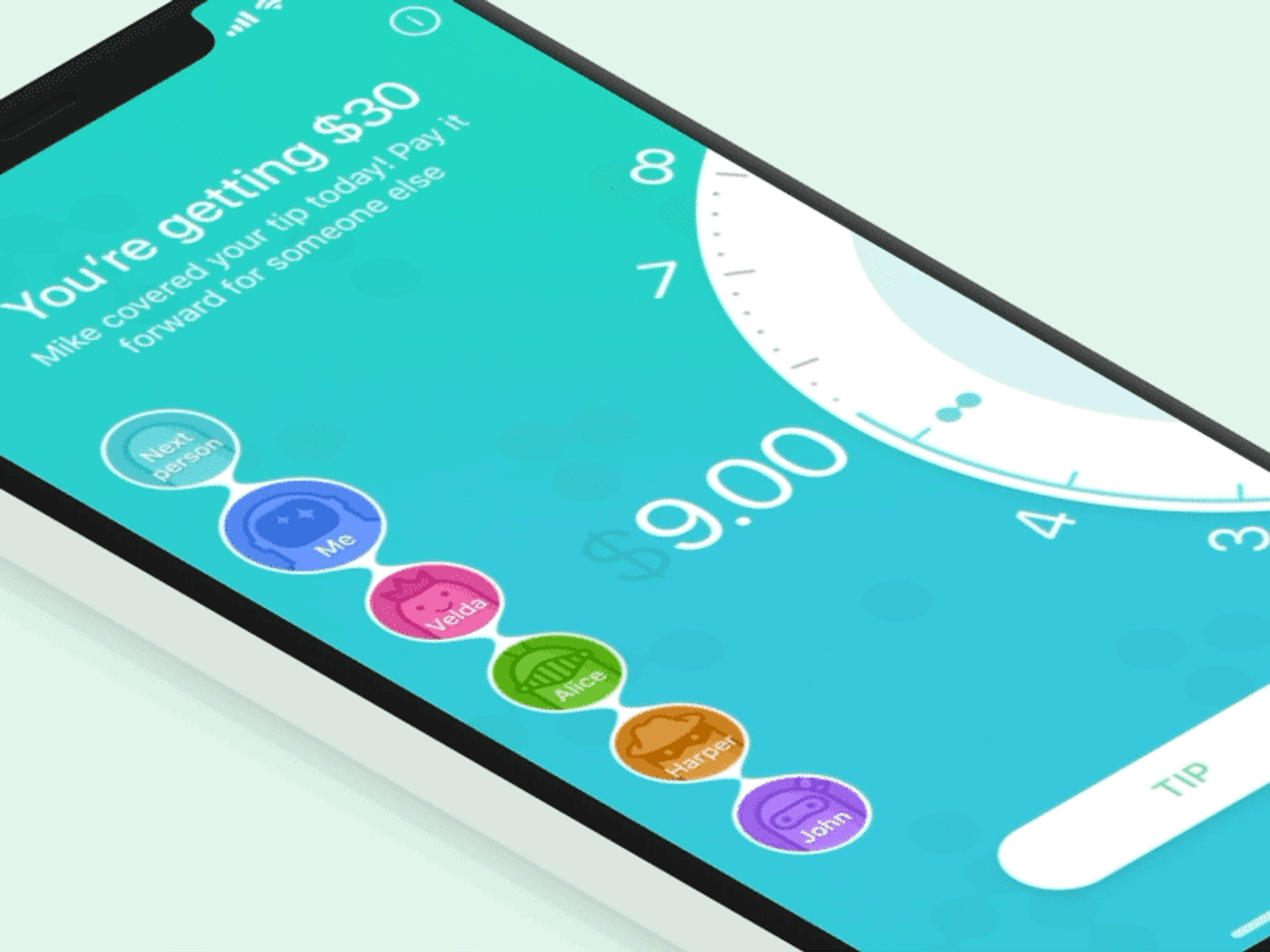
UI animations
As a part of the production phase we also deliver short video clips showing the main UI interactions and animations that add delightful moments to the user experience and guide users along the way. The videos and animation specifications are then used by developers as a guide to implement these interactions into the final product.
MoneyLion Homepage transition
Earnin app tip screen
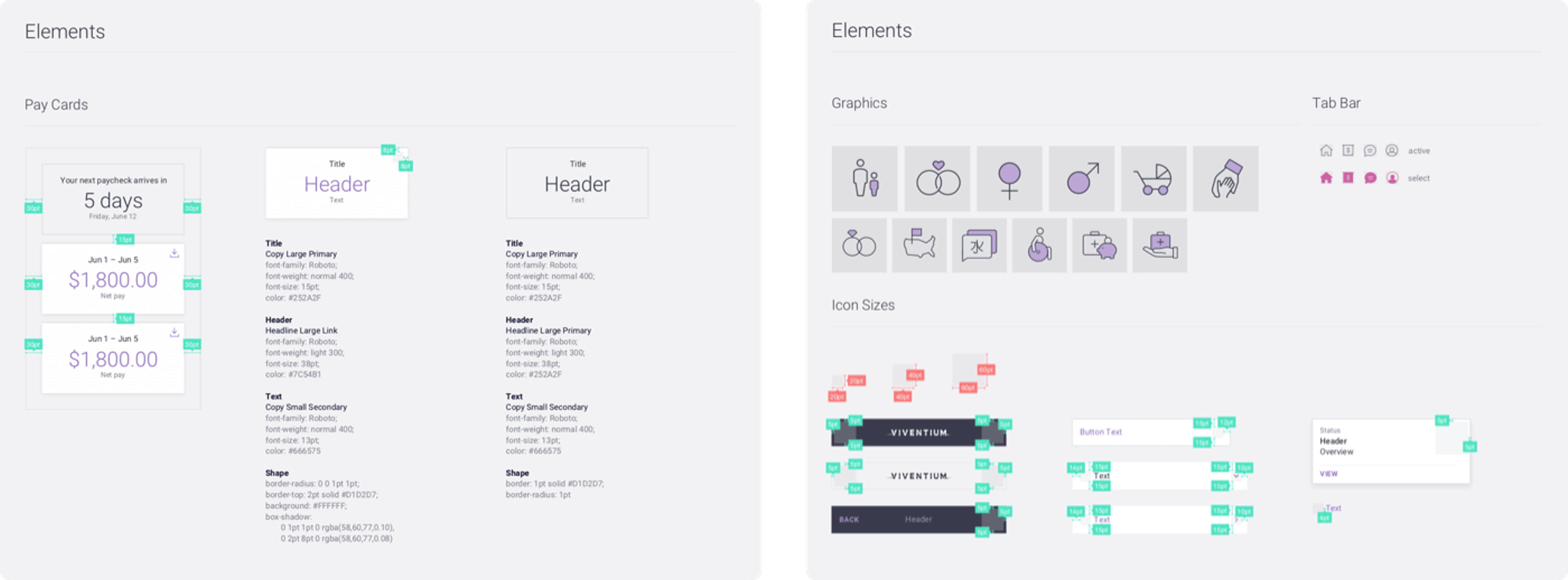
Design system
Design system is a set of design-specification documents that serve as a powerful toolkit for clients’ internal design teams or third-party agencies.
Design system example

- Style guide formalizes key design principles, describes visual identity, and sets ground rules for typography, colors, responsive behavior, products photos and visualizations style.
- Components library is a collection of UI elements in different states. It comes in a form of a Sketch file or any other software set by project requirements.
- UX guidelines document provides recommendations on navigation, describes used UX design patterns and how to apply them using components library.
Components Library example
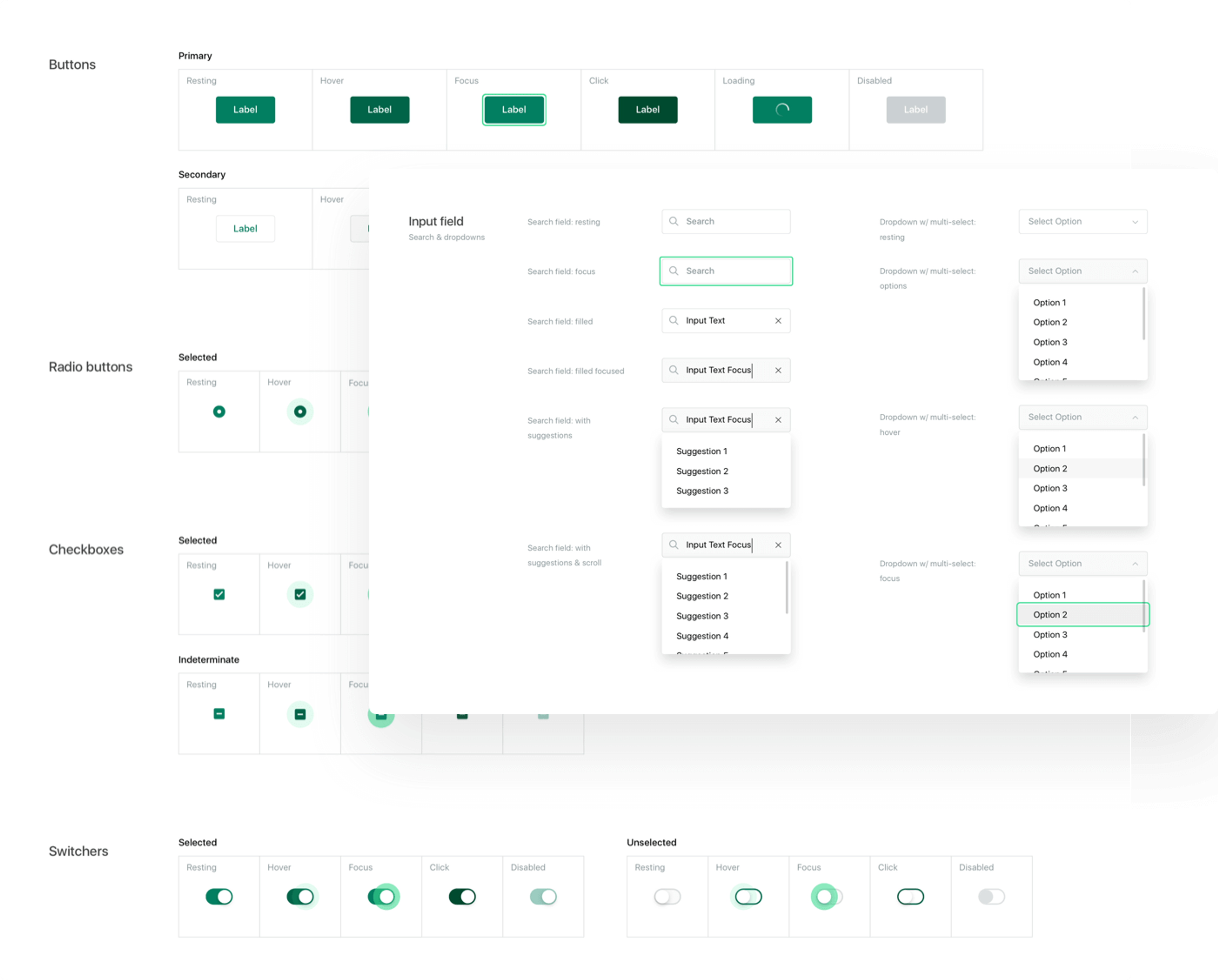
Design system helps maintain design and experience consistency of the product, and is used as building blocks to create new pages and add new functionality.
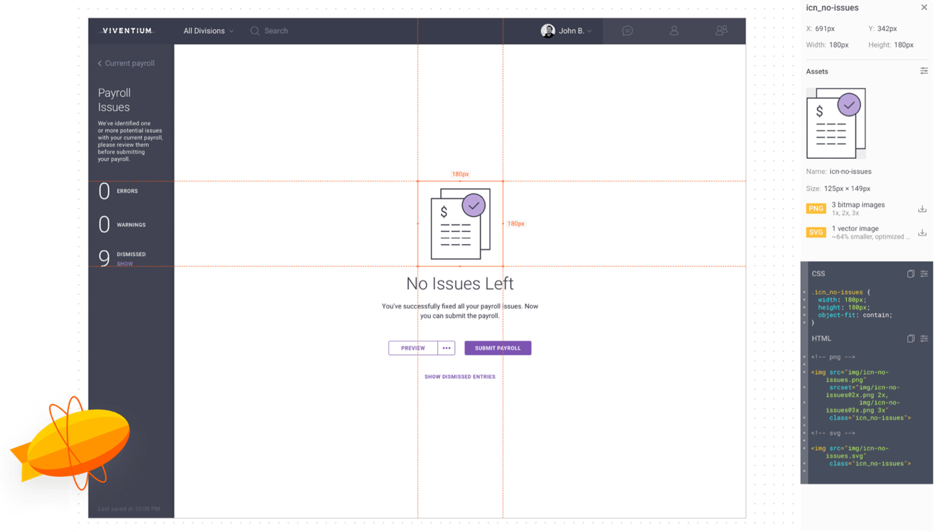
Design specification
When it comes to development, it’s always important to make sure that the design is implemented as intended. Often times developers willingly or unwillingly ignore small things that may not seem like a big deal, but these small discrepancies between the design and implementation have a snowball effect that may eventually drastically affect the final user experience.
In the past our team would provide a detailed, static PDF document with a description of all UI elements measurements, margins, paddings, etc. The production of this document was very time consuming and difficult to maintain due to constant design updates throughout the project. Developers would frequently complain that it was hard to quickly find needed information and in general navigate around the document.
Example of a static PDF specification that we created in the past
To solve these issues we decided to switch to an online solution — Zeplin.io. We now have a versatile interactive tool that provides developers with a convenient way of getting what they need when they need it.
Besides sizes and margins, Zeplin provides code snippets, allows quick exporting of assets to PNG or SVG formats, has а commenting system to support communication between development and design teams, and is easy to maintain throughout the project.
Zeplin.io screenshot
Read More
Conclusion
The process of creating these assets is not always linear and depends on the project priorities and schedule. Some parts of the documentation can be done in parallel, some could start earlier than others.
At the end of the project, we provide all final deliverables via shared Google Drive or Dropbox folder. We also transfer to clients ownership of all created projects in Zeplin and InVision.
After everything is delivered, we may continue our partnership by providing design support. It may be something like monitoring the development to make sure everything is implemented properly, acting as an in-house design team and providing constant design updates, or organizing workshops with clients’ teams to educate them on the new design system. But that’s a topic for another article.

About Clay
Clay is a UI/UX design & branding agency in San Francisco. We team up with startups and leading brands to create transformative digital experience. Clients: Facebook, Slack, Google, Amazon, Credit Karma, Zenefits, etc.
Learn moreAbout Clay
Clay is a UI/UX design & branding agency in San Francisco. We team up with startups and leading brands to create transformative digital experience. Clients: Facebook, Slack, Google, Amazon, Credit Karma, Zenefits, etc.
Learn more