
Understand how negative space can draw attention and create visual harmony while improving your website’s overall design. Learn why mastering white space should be integral to your web development strategy.
It is easy to think that emptiness, silence, wasted space, or lack of color is bad. Filling in the blank areas on a website is an intuitive way to maximize space. But this can appear overly complex, cluttered, and distracting. Many website design firms unintentionally create these busy, content-heavy websites. Still, the best web design agencies know negative space is key to creating a user-friendly website.
What Is Negative Space?
Negative space, also known as blank, means any unused space on the web page. The main defining feature is that negative space creates an empty environment outside the main content.
Far from being awkward empty areas on your website, negative space is a key design element that top web design firms utilize to direct the viewer's attention to the desired content and to create a seamless user experience.
Negative space in web design is a powerful tool that creates visual tension and adds interest to the page. Negative space creates contrast, draws attention to specific elements, and adds visual appeal. With strategic use of negative space, designers can create a more organized layout that facilitates easy navigation and an overall improved user experience.
Using negative space on your website allows you to reduce distractions by highlighting important elements and creating a visual hierarchy. It also divides content into manageable sections and draws visitors' attention away from non-essential information. Additionally, it emphasizes critical features like headings, images, or logo designs. The strategic placement of white space between elements creates an airy feel that helps keep visitors focused on the content instead of feeling overwhelmed.
To successfully utilize negative space in web design, designers must consider how much room they have available for each element on the page and prioritize the relative importance of each section. They should also consider details such as margin size, line height, font size, color palette, typography style, background image or texture, and any other design features that could affect the perception of the website’s content. By paying close attention to these factors and designing with intentionality and purpose, designers can create a website that effectively uses negative space that works harmoniously with its content.
What Is the Difference Between Web Design White Space and Negative Space?
There is no difference! The terms white space and negative space are interchangeable. Negative space does not necessarily have to be white; it can come in any color, image, or pattern.
Why, then, are there two different terms? This is because the terms come from various origins. White space comes from print design, as the pages used are white. In contrast, the negative expression space originates from photography, separating objects into those that attract attention (positive space) and the background (negative space).
Advantages of Using Negative Space In Web Design
While clients and some web design firms may wish to fill the web page with as much text and images as possible, this is often a mistake. Viewers want to avoid vast amounts of information being displayed at a time. Including too many elements or even a background image without space in between increases the distraction customers experience, making it more difficult for them to find the information they need. This is why it is imperative to embrace the blank.
The following are worth mentioning among the many benefits of a thoughtful approach to negative space in web design.
Improves the Readability of the Page
Negative space makes your web page easier to read without altering the font or text size. User experience is of the greatest importance when choosing a web designer; make sure they know to avoid clutter, as this can have a disastrous effect on how a customer interacts with your website. Blank space acts as a buffer between different elements, allowing consumers to easily find the content they care about.
Directs the Page Flow
Negative space dictates how users navigate the web page and the entire site. By carefully choosing the placement of negative space, a web designer can create a visual relationship between different page elements. This means the direction that users move through the site can be controlled. Users could be prompted to explore sections in a particular pattern or to move to a different landing page, depending on the business's goals.
Adds Style and Elegance to the Page
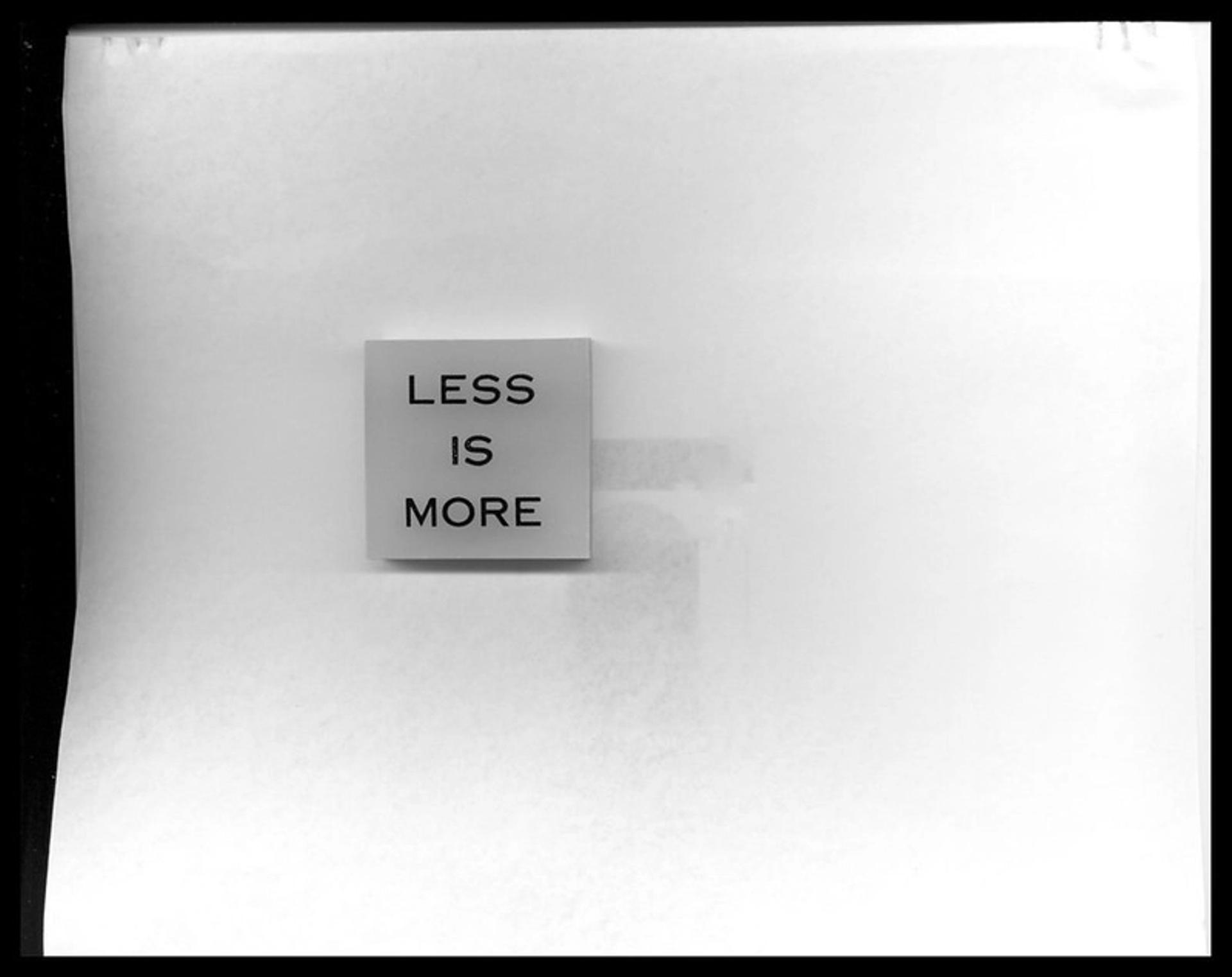
Negative space adds a feeling of sophistication and luxury to a website. Luxury brands work with the best web design agencies in the world to transform a general webpage into one that exudes an air that the product itself is more important than the website it's displayed on. Very little content is needed to communicate the features of the product. Just think of the "less is more" style choice opted for by many luxury tech, clothing, and car brands, who let the product speak for themselves.
Enhances the Visual Hierarchy
The use of negative space enhances the visual hierarchy of the web page. The visual hierarchy is the principle of arranging elements to show their order of importance. Including negative space allows users to focus on the critical elements of their choice and scan various blocks of content in seconds.
How to Use Negative Space to Create Compelling Websites
An experienced designer can use negative space in a way that supports the overall design of a page. Here are some tips web design firms utilize to create compelling websites using negative space.
Use Negative Space to Break Up the Page
One of the essential visual components in web design is breaking up the web page's content. The best website design firms know users need more information and space to perceive the message. Adding negative space gives users the time to process the information they see on the page.
Negative space can be used to create aesthetically pleasing designs that look modern and sleek. It can be employed as a way of balancing the overall composition of a web page by using white or negative space to bring out key visual elements together. Negative space also allows designers to guide the viewer’s attention to certain parts of the page by emphasizing certain sections with more blank space around them. By creating a clear visual hierarchy, users can scan the web page more easily and quickly identify what they are looking for.
Negative Space and SEO
Using negative space also has an advantage when it comes to SEO (search engine optimization). Since search engine crawlers rely on text-based content to index pages in their database, careful placement of negative space allows designers to strategically place keywords and phrases in areas that will be more visible to search engines. This helps drive traffic to the website through organic search engine results.

White Space for User Experience
Furthermore, effective use of negative space can improve user experience by simplifying the design process and making content easier for viewers to consume. By reducing clutter on a webpage, users are less likely to feel overwhelmed by too much information and instead focus on the most essential elements of the page, such as CTAs (calls-to-action) or text blocks containing pertinent information about services or products offered on that particular site.
Negative Space and Branding
Finally, negative space can help convey brand messaging and values if used consistently across different mediums such as websites, print materials, or social media posts. Utilizing the space surrounding it successfully creates harmony between all these platforms and provides users with a consistent look and feel from one channel/platform to another; this helps reinforce brand recognition and loyalty among customers and potential leads alike.
Remember that Negative Does not Mean White
Although negative space can be white, it's not a necessity. You can incorporate other colors, patterns, or images if they don't distract from the focus element(s).
Apple is a leading example of how effective use of negative space can help create compelling websites and reinforce brand messaging and values. Apple has been using white space in its user interfaces since its launch of the first iPhone in 2007, which has been essential to its success. Their minimalist approach emphasizes content by utilizing generous amounts of empty space between elements. This makes it easier for users to quickly scan the page and find the necessary information without feeling overwhelmed.

Apple takes this same approach across all its platforms, from web design to iOS app design to print materials. Its use of negative space helps create a unified look and feel that reinforces its brand recognition and loyalty among customers. Apple’s innovative use of negative space also helps draw attention to key elements such as product images or text blocks containing pertinent information about services or products offered on that site.
In addition to improving usability and aesthetics, Apple strategically uses negative space for SEO. By leaving ample room around important keywords or phrases, these become more visible to search engine crawlers, which helps drive traffic to the website through organic search engine results.
Overall, Apple's masterful use of negative space sets an example for other companies looking to create compelling websites with a modern aesthetic while still providing a positive user experience for target users. By taking advantage of the power within it, companies can be sure that their designs will stand out and help them easily reach their desired audience.
Choose Minimalism
Minimalism in white space has become increasingly popular in web design, as it helps reduce clutter and simplify the page to focus on the most critical elements. Negative space can give a website a sleek, modern look while providing more breathing room for viewers to take in the content. It also allows designers to use passive white space to create a visual hierarchy that guides readers’ attention toward certain page areas containing pertinent information or calls-to-action (CTAs).
Furthermore, adding white space can also benefit SEO since search engine crawlers rely on text-based content to index pages in their database. With careful placement of negative space, designers can strategically place keywords and phrases that will be more visible to search engines — helping drive traffic to the website through organic search engine results.
When considering white space for web design, it’s best to choose minimalism over maximalism. Using excessive negative space can make a webpage look empty and uninviting, while using too little will lead to an overcrowded page with no clear structure. An experienced designer should carefully balance whitespace with other elements while keeping all important page elements visible and legible for viewers.
Finally, white space doesn't have to be strictly white; other colors or patterns can also be used if they don't distract from the main element(s). Incorporating subtle changes like this can help reinforce brand recognition and loyalty among customers and potential leads.
Micro White Space & Macro White Space
When utilizing negative space in web design, designers must be aware of the differences between micro and macro white spaces. Micro white space is the small gaps between elements, such as letters, words, lines, or other design elements. It is important to pay attention to these smaller details when creating an aesthetically pleasing design that is easy for users to read and understand. Increasing letter spacing can make the text more legible while increasing line spacing can help readers quickly scan a page without feeling overwhelmed by too much information. Another example of why negative space is important:
Macro white space refers to the larger gaps between larger and smaller elements on a web page. This negative space communicates a sense of calm or order by helping viewers focus on specific content. Using this type of white space strategically helps designers create visual hierarchies that guide the viewer’s eyes around a page, emphasizing certain sections over others. It also allows designers to draw attention to key elements within the composition, such as CTAs or text blocks, by surrounding them with more blank space than other parts of the page.

Negative space should always be balanced with positive (filled) space; too much negative space can make a design look incomplete or lackluster, while insufficient active white space can lead to an overly cluttered and disorganized webpage that users find difficult to navigate. By understanding how micro and macro white spaces work together, designers can create aesthetically pleasing, functional, and informative designs.
The Bottom Line
Negative space is a significant feature in website design and one of the most powerful tools that can be used to create a quality user experience. By following the advice of the best web design agencies worldwide, you can create a visually appealing website that is appreciated by any viewer.

About Clay
Clay is a UI/UX design & branding agency in San Francisco. We team up with startups and leading brands to create transformative digital experience. Clients: Facebook, Slack, Google, Amazon, Credit Karma, Zenefits, etc.
Learn moreAbout Clay
Clay is a UI/UX design & branding agency in San Francisco. We team up with startups and leading brands to create transformative digital experience. Clients: Facebook, Slack, Google, Amazon, Credit Karma, Zenefits, etc.
Learn more