Introduction to Web Design
Web design has become increasingly important in today's world. With more people using the internet than ever, a visually appealing and easy-to-use website is vital for any business or organization looking to establish an online presence.
What Is Web Design?
“There are three responses to a piece of design – yes, no, and WOW! Wow is the one to aim for.” – Milton Glaser
Web design is the process of creating and maintaining websites. It involves various aspects such as layout, content management system, production, website structure, user interface design, navigation optimization, and search engine optimization. By harmonizing these elements through tools like Adobe Photoshop and HTML5 coding language, web designers create digital experiences that generate visibility for businesses or organizations while delivering enjoyable user experiences. Different web design services encompass responsive layouts, intuitive navigation, captivating visuals, and seamless user experiences, ensuring your digital presence is engaging and effective.

Why Is Web Design Important?
50% say they will only consider purchasing from a brand with a well-designed mobile site. (Google)
Web design helps businesses create attractive, user-friendly sites to reach potential customers. It also plays an integral role in SEO optimization, so their website ranks higher on search engine results pages. Here are a few reasons why well-designed websites are crucial:
- It boosts brand recognition among consumers while building trust.
- It helps businesses reach their target audience by meeting their needs when designing the site.
- Businesses can increase conversions by optimizing their sites for sales or lead generation while building them.
- By following accessibility standards such as WCAG 2.0 AA recommendations, sites can be made more accessible and user-friendly for people with disabilities or impairments.
Web Design Process Overview
The web design process is a series of steps and components that work together to create an effective website. It starts with defining its purpose, choosing a platform, and creating wireframes and mock-ups for the proposed site, and visual guides for the designer’s ideas. These wireframes are then used to create high-fidelity prototypes that reflect the look and feel of the website more accurately. The next step is coding through HTML, CSS, or JavaScript to create web pages that meet the design specifications. Written content must be optimized so search engine algorithms can easily find it based on SEO best practices.
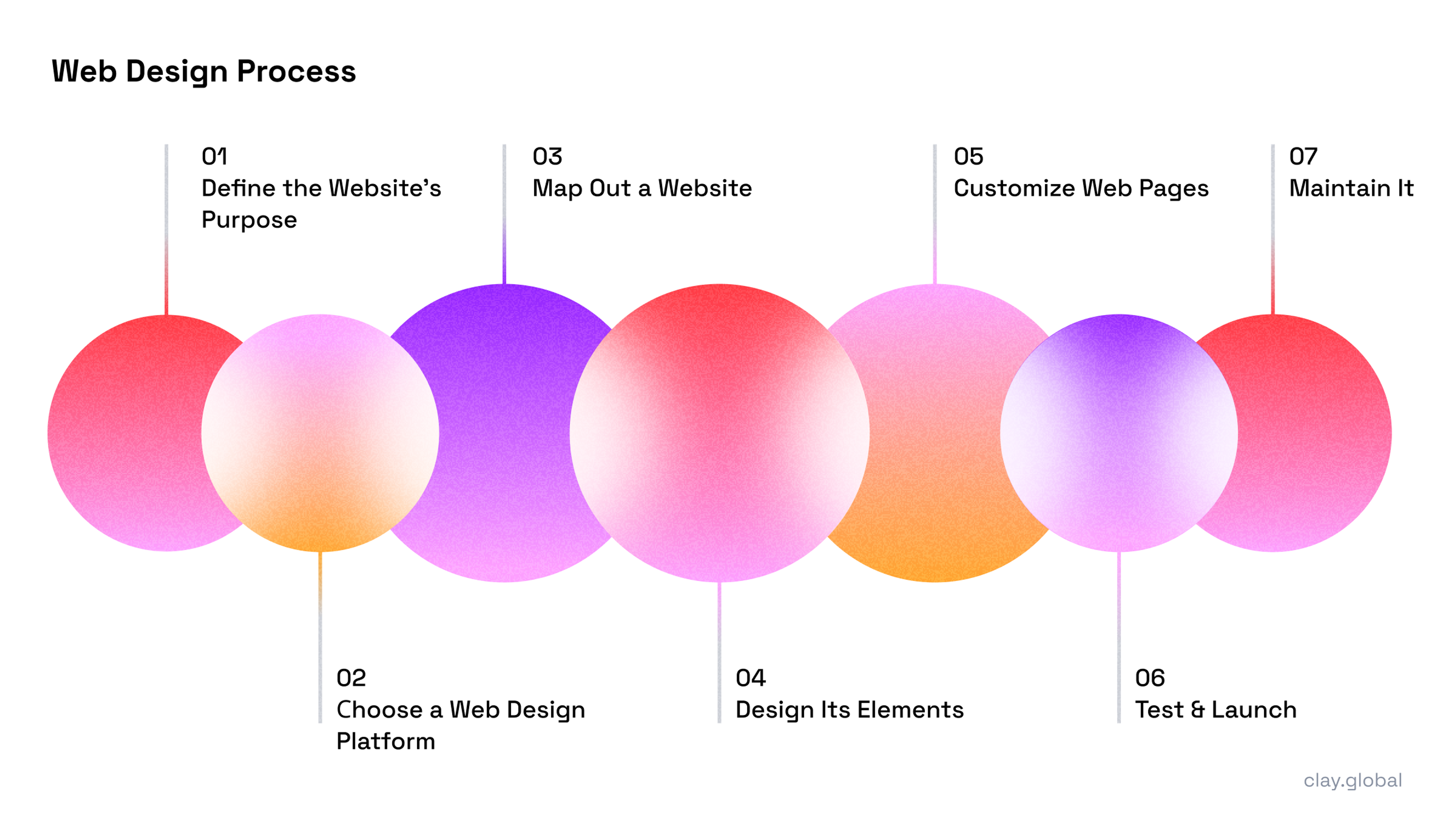
After creating the website, it’s time to go live. The creator will need to monitor its performance over time by keeping track of metrics such as page views, bounce rates, conversion rates, and any other factors that could optimize user engagement or sales. By doing so, designers can identify issues quickly and make changes to their designs to maximize the effectiveness of their web presence.
Key Roles and Responsibilities in Web Design
There are many roles and responsibilities involved in successful web design. One of the most critical is the designer, who creates the overall look and feel of the website.
Next is the front-end developer who brings those designs to life using HTML, CSS, and JavaScript code. Once complete, they’ll go back through it to check for potential problems or bugs before launching it on a live server. They may also be responsible for optimizing content based on SEO best practices so engines can find it.
Last but not least is the user researcher. This person helps designers understand what users will want from their site through research like surveys or interviews with current customers or visitors. Doing this helps creators get an idea of how people use websites as a whole and where they might be able to improve things in terms of usability and overall experience.
What Does a Website Designer Do?
“The role of the designer is that of a good, thoughtful host anticipating the needs of his guests.” – Charles Eames
A website designer’s main job is to create an attractive website that anyone can use without issue while delivering results for businesses. They put graphics, typography, and other visual elements together in a way that looks great and is easy to navigate. But they also have a lot more on their plate than just making pretty pictures.
They must consider page load times and mobile responsiveness while ensuring images are optimized correctly across platforms according to accessibility standards. They need technical knowledge like coding skills (HTML/CSS/JavaScript) to know how everything will come together during development. They should be current on trends and best practices to keep designs fresh, modern, and functional.
Web Design Principles and Fundamentals
75% of consumers judge a business's credibility based on its website design. (Stanford University)
Web design constantly changes and needs creative problem-solving to make stunning websites that give users the best possible experiences. No matter what device or platform they’re using. At its foundation, web design involves principles and fundamentals that guide successful website creation.
Web Design Color Theory
Choosing which colors you want to use for your website is a crucial decision. Different colors evoke different emotions in people and can impact how they perceive the message, brand, or usability of a site. Understanding the theory behind this idea can help designers make smarter decisions when putting together site visuals.
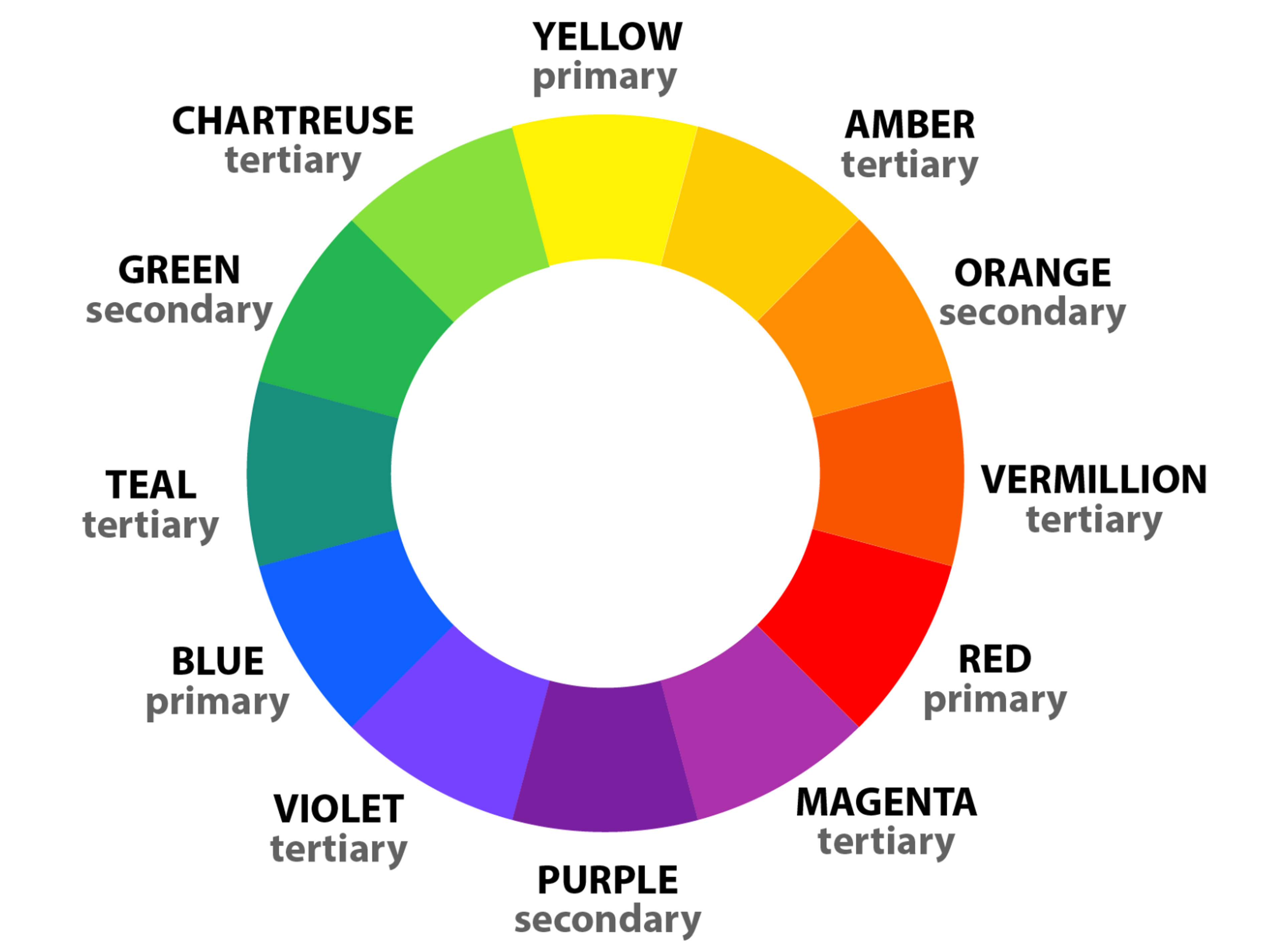
When deciding on colors for your own website, it is important to pick harmonious ones that work together rather than clash. Also, contrasting hues can be used against each other to make certain parts of the page pop. For example, using bright and bold yellow buttons against a muted gray background will make them stand out over other elements.
Web Layout, Composition, and Hierarchy
Web layout, composition, and hierarchy are crucial in good web design. The layout is how all elements fit onto a page, including size, shape, and placement. It is important that an eye can follow along with what you want them to see while still being able to access any information they need.
Visual hierarchy arranges each element on a page to show you what’s most important to the least important. This way, designers can control what users view first or last by increasing or decreasing the text or image size. For example, on this page, I ensured my headings were placed above the body copy so your eye would go there before scanning everything else.
White Space in Web Design
White space is essential in web design as it lets users’ eyes breathe throughout their experience on your site. It helps balance things out visually and gives them time to digest content and understand where things are placed. White space refers to areas without content like margins or spacing between buttons.

By incorporating more white space into key areas of your site, you can separate different sections from one another and let users focus better on what they’re reading or buying, etc.
Balance Contrast Alignment
These three principles are absolutely necessary when creating a good-looking web page that keeps users engaged throughout their visit. Balance ensures all elements have equal importance so nothing stands out too much compared to others. For example, if two large images were on either side of this article and only text was added to one side, it wouldn’t look balanced.
Contrast highlights some parts of a page to help it stand out. This could be bright colors for your buttons or headings. While alignment organizes everything in the design. When looking at a well-designed a website page, your eye will have no problem being able to follow along top to bottom and left to right without any thought.
Responsive Web Design
Over 60% of people are on mobile when browsing the web. (Statista)
Responsive web design is a design approach that creates websites tailored to fit any screen size, from small mobile devices to large desktop monitors. It aims to give users the best possible experience on their device, regardless of its size or platform. By leveraging HTML and CSS, responsive web design ensures that all content automatically adjusts depending on the device it’s being viewed on – so no matter what device or platform your visitors use, they will always have a great viewing experience.
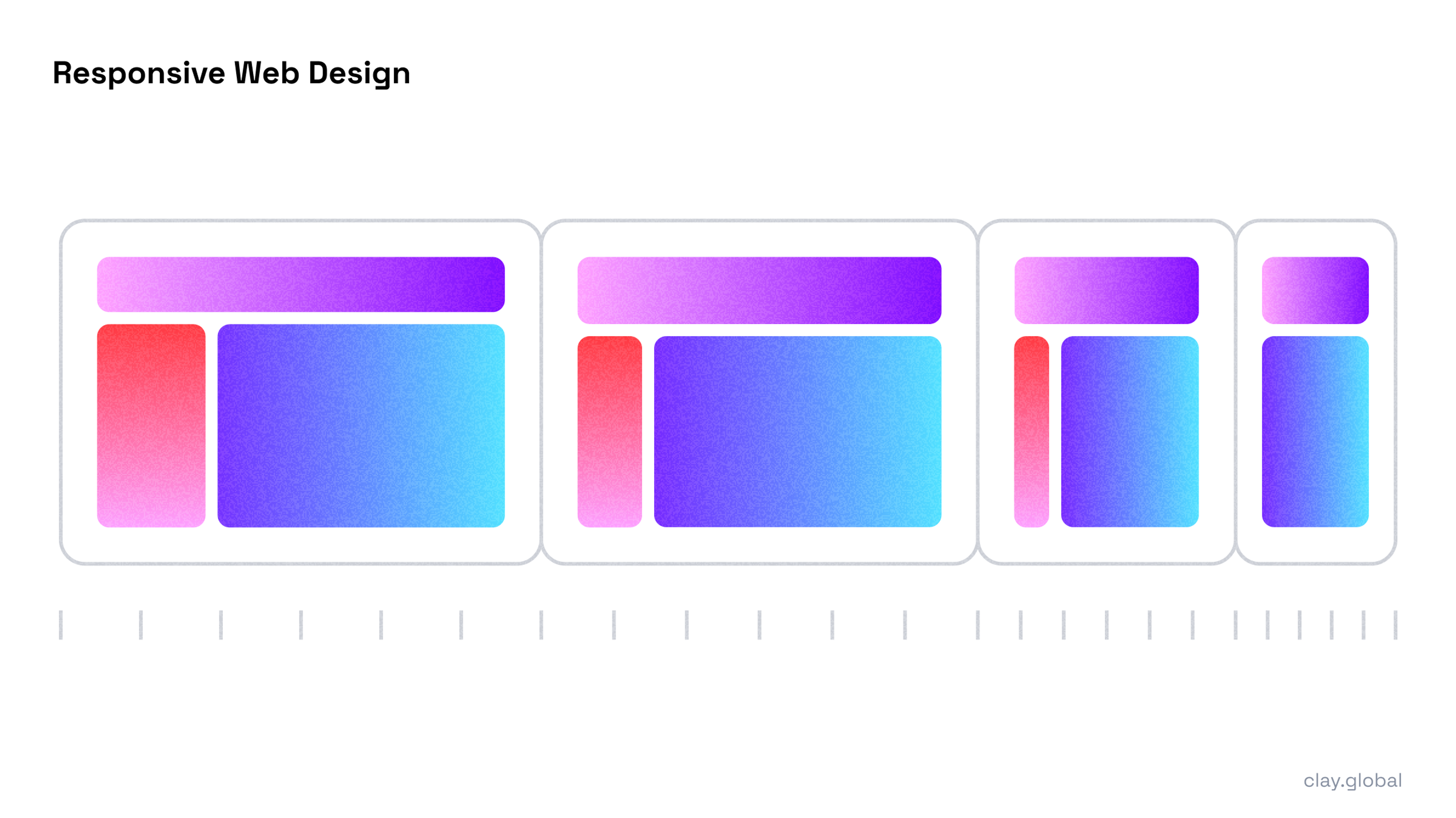
One of the primary objectives of responsive web design is to create a consistent and unified look and feel across all devices. To achieve this, designers must adopt fluid grids with flexible images that can resize based on browser sizes. Page elements can respond to different display sizes without breaking the layout or usability. Additionally, designers should incorporate media queries into their code, allowing custom styling when certain conditions are met, such as a specific browser width or orientation.
Web Designing for Conversion and Goals
“Great web design without functionality is like a sports car with no engine.” – Paul Cookson
When it comes to increasing conversions through web design, designers must consider how elements will impact the user experience – such as using visible calls-to-action buttons that stand out among other page elements, leveraging contrasting colors for headlines or button elements to draw user attention to them more prominently, creating well-structured page layouts.
Hence, users quickly understand what they should do next and use concise copywriting that conveys desired messages without taking up too much page space.
How to Design a Website
Designing a website requires careful consideration of both aesthetics and functionality. It is an art form that combines creativity with technical skills to create websites that are visually appealing, easy to use, and optimized for engine rankings. Here are some tips to achieve a better website design.
Define the Website's Purpose
Defining the purpose of a website is an essential step when designing. A website’s purpose should be informed by its target audience, marketing goals, and overall brand identity. This will help to inform the website’s design choices and organizational structure.
When defining the purpose of a website, it is essential to consider what types of content should be present on the site and how this content should be organized to meet user needs. This includes evaluating potential navigation structures, page layouts, and design aesthetics. Additionally, defining clear objectives for what users should accomplish when interacting with the site can provide further guidance in organizing content for optimal flow and usability.
Choose a Web Design Platform
When choosing a web design platform, designers can consider many options. Be it a drag-and-drop website builder or a popular content management system (CMS) like WordPress and Drupal – each offers unique features tailored toward different user requirements.
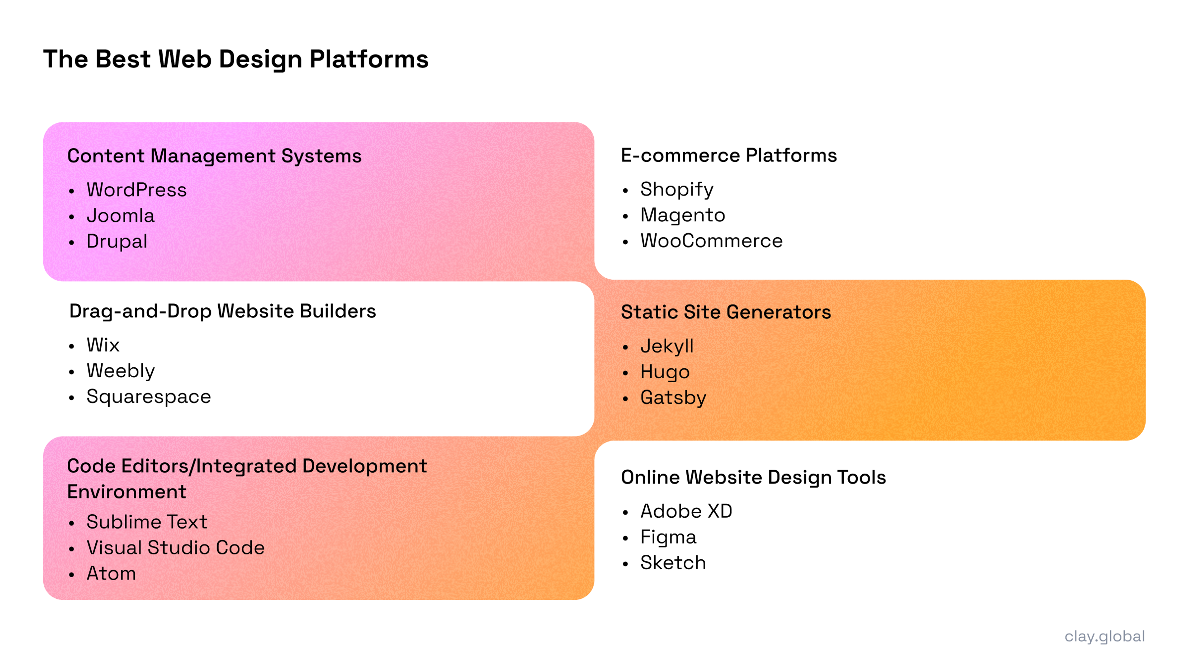
The web design platform you choose depends greatly on your requirements and preferences. For beginners, drag-and-drop website builders are the best option as they allow for easy setup and plenty of customization without any coding knowledge or experience required. Advanced developers may benefit more from using powerful CMSs like WordPress or Drupal, which can create anything compared to other platforms.
Map Out Your Website
Once you’ve decided what your website means and chosen a web design platform, it’s time to start mapping the site. This phase involves creating a detailed layout that outlines all page structures and hierarchies, providing guidance during development.
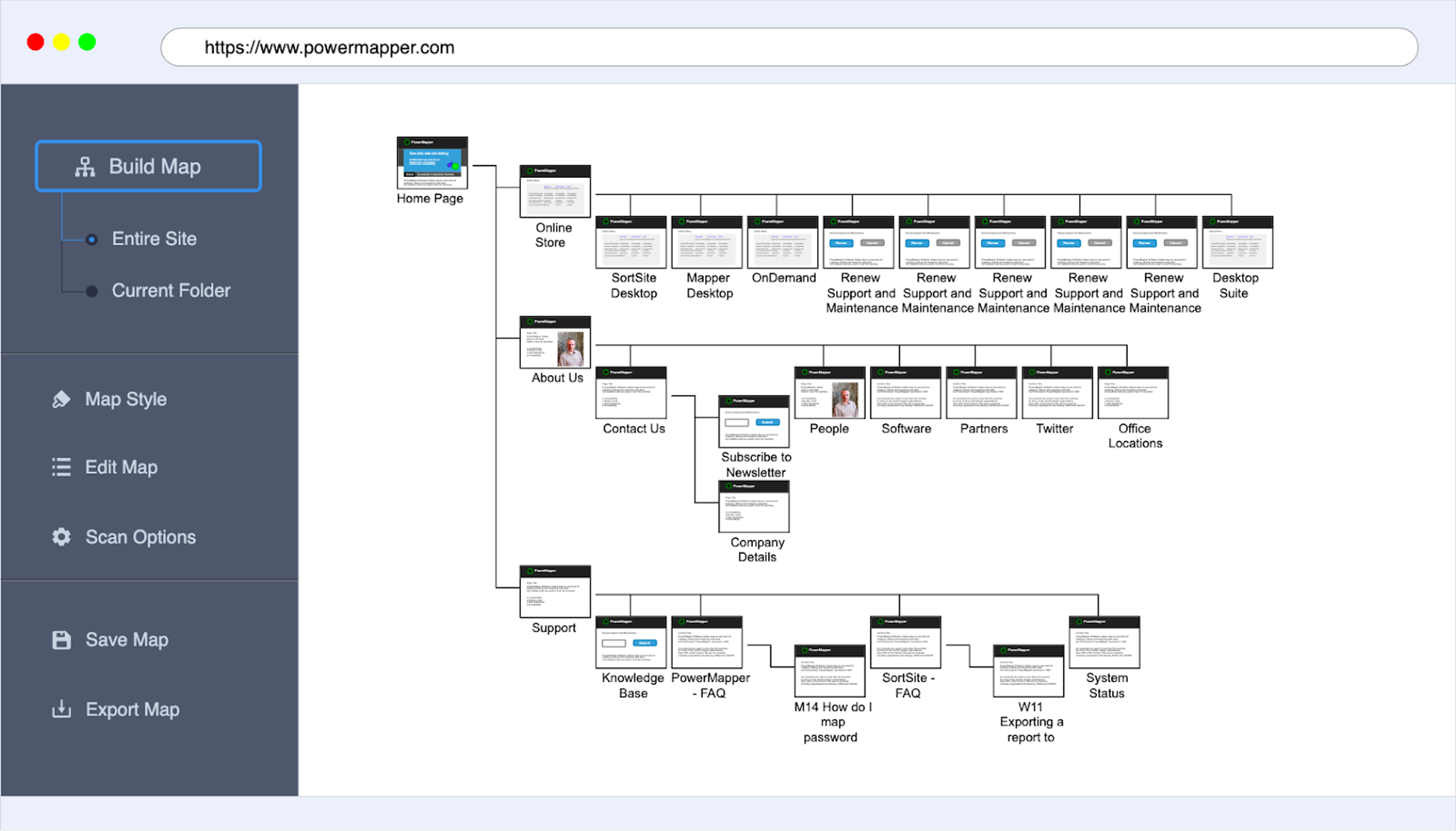
When making this map, think about how main pages or sections should be organized about each other first. Figure out an intuitive navigation scheme to make finding specific pages quick and easy for users. Then consider how content will be structured within each page — including internal navigation menus — to ensure everything's easy to find and logically organized.
Design Website Elements
Web Typography
“95% of web design is typography.” — Oliver Reichenstein at AI.net.
Web typography is one of the most vital elements of web design in terms of visual hierarchy. It structures and draws attention to particular content areas on the page by using appropriate font type, size, weight, spacing, and color.
Choosing Appropriate Web Fonts
When selecting multiple fonts for a website, consider sticking with one typeface (a family of related fonts) across all pages — this creates cohesion in the design while keeping things easier to read for visitors. On the other hand, combining two typefaces from families with similar characteristics or complementary traits can help achieve typographic contrast while maintaining a balanced look for different types of content on the page.

Lastly, keep font sizes and spacing consistent throughout when designing web typography. This ensures text areas don’t look too different from each other visually and cause confusion or annoyance among visitors who might notice the change. Similarly, try not to have too much space between lines when setting line-heights, as that can make reading difficult and cause increased fatigue while scrolling through long pages.
Website Readability and Legibility Considerations
Make sure the web fonts you choose look good on various devices and screen sizes. Select legible fonts optimized for the web — with enough font weights available — that appear clear in different sizes. Using one typeface across your site or combining two typefaces from families with similar characteristics helps create a cohesive look with typographic contrast.
To maximize your website's readability, consider how appropriate your font size and line spacing are. Font sizes should be consistent throughout pages so visitors don’t grow irritated by visual inconsistency when going from one section to another. Similarly, ensure enough space between lines of text so readers can follow along easily without struggling to read or getting tired quickly while scrolling through long sections of copy.
Visual & Graphic Design
Visual and graphic design are the two essential elements of web design. The former creates the website's look, while the latter figures out where everything goes. These two team up to deliver an attractive website that’s easy to use and will draw users in. Good visuals are also key to making a site more interactive for visitors and, at the same time, stand out from competitors. Ultimately, these two skills can make a site irresistible to visit and even revisit.

Choosing and Optimizing Images and Graphics
Selecting the right images can work wonders in terms of enhancing its appeal. However, designers should ensure they match their pages’ overall designs, color schemes, and purposes. The images must also be high resolution so they look good on every device without causing any lag in load times.
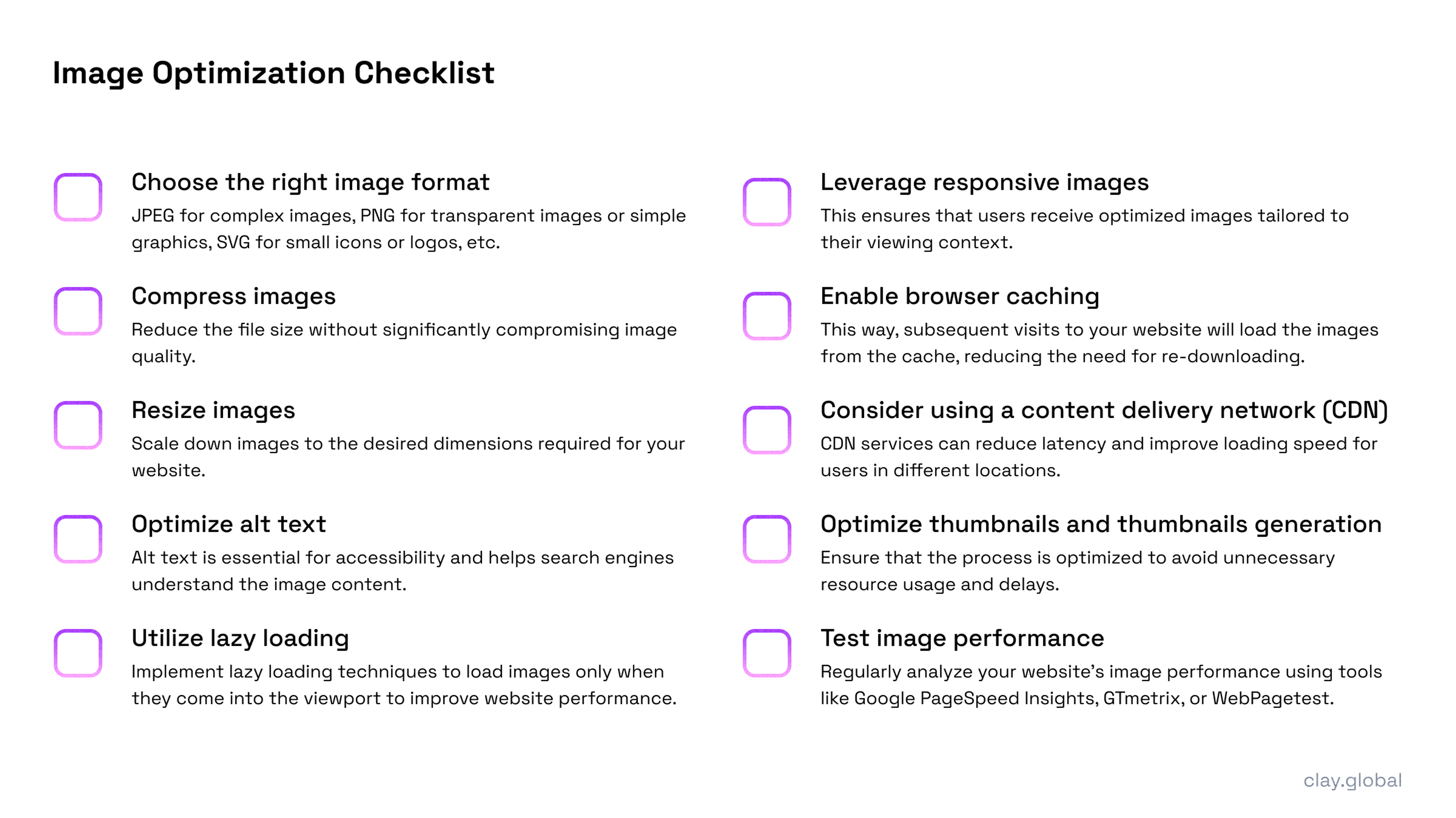
When compressing images, designers have space to reduce file size without sacrificing quality by using lossy compression algorithms such as JPEG or PNG-8. They work by deleting unnecessary data while keeping what’s important intact – though not ideal for sharp visuals that don’t appear pixelated or distorted. On another note, vector graphics are an excellent option for web design because they’re very small but can be scaled up or down without losing quality – SVG formats work well for logos or icons.
Creating Engaging Visual Content
94% of first impressions on websites are based solely on visuals (ResearchGate)
Animations bring life to websites by adding unique touchpoints throughout the user experience. They can help you easily draw attention, explain how different elements work together through interactions, or add another layer of seamlessness between page transitions. However, if you overuse them too much, it’d be a mistake that detracts from the main content or slows down loading times. Animations should only be used when necessary, such as enhancing user experience or guiding them through the site visually.

Popular animation techniques include hover effects, scrolling effects, parallax animations, and motion graphics.
Iconography and Web Design Illustration
Icons help users interact with websites better. They’re self-explanatory and do a better job than text alone – like search bars or social media links. Illustrations can make even more complex topics easier to understand, making your site look more attractive.

When you're working on designs that include iconography and web illustrations, user experience is key. You want to make sure your icons are easy to understand and not confusing. To do this, select images that differ enough from each other so users don't get overwhelmed when using your site. It's also important to consider sizes — if an image is too small, it won't be visible enough, but if you have too many large images on one page, the layout could get thrown off. Finally, colors play a big role in catching attention and making things accessible.
Customize Web Pages
By customizing your web pages, you can engage visitors more effectively through design tailored to certain goals or themes. Additionally, unique design elements can help create a cohesive design that further resonates with visitors.
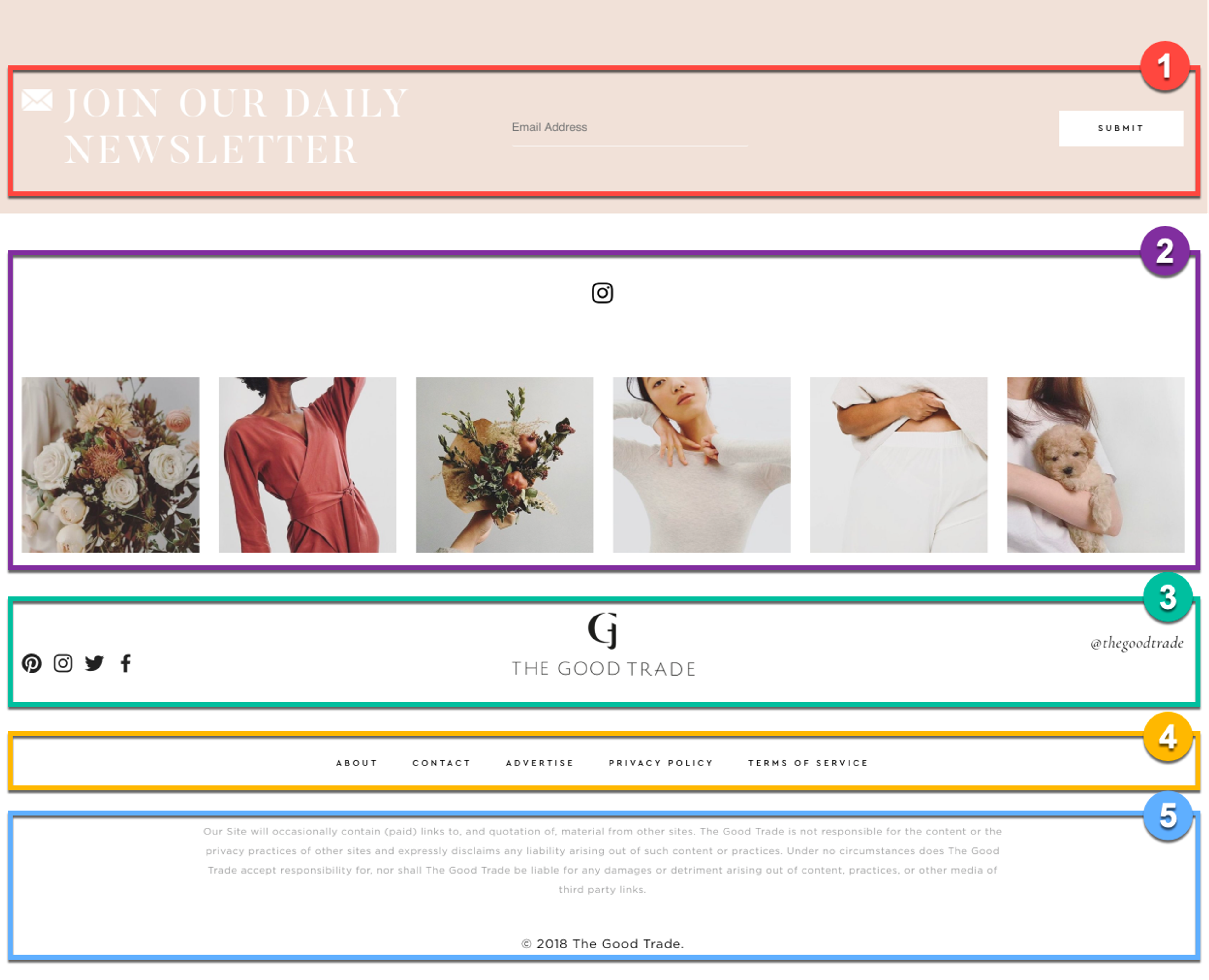
Headers & Footers in Web Design
Headers and footers do more than complete the site design – they create engaging user experiences. Headers give users visual cues to quickly orient themselves on the website by providing essential navigation links or call-to-action buttons at the top. Footers often provide additional information or resources such as contact information, legal disclaimers, terms of service, or social media links or contact page.
When designing these two sections of your website, it’s important to be mindful of how they will look across various devices and how they will affect visitor experiences if optimized incorrectly. It’s also essential not to use large files here since they’ll take longer to load and affect user experience negatively — vector graphics are a good option as they have a small file size and can scale easily without quality loss (SVG formats work well for logos or icons).
Web Navigation and Information Architecture
94% of negative website feedback is design-related due to navigation issues (Stanford University)
Web navigation is all about organizing content logically for users’ convenience – this means structuring pages with organized menus, dropdowns, breadcrumbs, or other navigational elements that let them quickly access specific areas within your website. When creating these pathways, think about how users will interact with the page and if it’s easy to find what they need without getting caught up anywhere. Mobile navigation is also something to pay close attention to since it could affect user experiences negatively if not properly optimized for all devices.
Web information architecture is another vital element in successful web design as it involves organizing data into meaningful categories so that site visitors can quickly understand their purpose on a page. This can improve satisfaction and potentially increase conversions if your site offers products. Additionally, considering goals or target audiences when designing with information architecture in mind allows you to structure your site more effectively based on the needs of different types of users!
User-friendly Website Navigation Design
Making websites easy to navigate is vital for a positive user experience. A website’s navigation design should make it effortless for users to find what they need quickly and efficiently. This can be achieved through well-organized menus, dropdowns, or other navigational elements that enable users to access specific areas in the fewest clicks possible. Designers should also pay attention to mobile navigation as this may impact user experiences.

Good web navigation and information architecture are applied to help users find what they’re looking for as quickly as possible. Designers must consider how users navigate their pages and develop pathways to access the content they want without confusion or frustration. To avoid confusion when navigating different website sections, all menus must be clearly labeled.
Scrolling in Web Design
Scrollbars have long been used on websites, but there are more creative approaches designers can take when adding scrolling features that boost usability and engagement. Parallax scrolling uses two-dimensional animations and creates multi-layered designs where each layer moves at different speeds as you scroll down the page. It’s visually interesting and makes one-page websites stand out from traditional ones.
Long scrolling is also an engaging way of organizing content into digestible chunks so visitors can easily access and navigate through everything your page offers.
Website design motion graphics or animations that engage viewers while allowing their eyes quick access to different sections of information or content are another way designers can use motion on a website.
Web Design Content Strategy
Content strategy focuses on planning, creating, delivering, and managing content in line with a brand's goals – so it serves its target audience effectively and consistently throughout time. Planning out your website with clear intentions will create a user-friendly site that gives people the information they want without any hassle.
Planning and Structuring Website Content for Site Visitors
Once you’ve identified why you want a website (purpose) and who you intend to use it (target audience), the content must be organized hierarchically. This means using clear sections or categories with recognizable names so visitors can understand where to find information. In addition, page designs should feature navigational elements such as drop-downs, menus, or breadcrumbs, making it easier for users to explore the website without getting confused.
Using Website Grids and Columns Effectively
Website grids are like sheets of graph paper placed over a design that helps organize different elements within a page layout. When used appropriately, these grids separate content visually while balancing the overall look and feel of the page. They give designers more control over how their visuals appear on desktop and mobile devices, allowing for a better user experience.

On the other hand, we have columns. They’re like the vertical divisions that help organize content into categories or topics. This makes it easier for users to navigate through different pages while also making it easier for them to understand complex information. When they can understand things better, it leads to increased user satisfaction, which could boost your sales. When designing a website, using both these grids and columns allows designers to create a more customized experience for website visitors based on their goals or target audience. On top of that, web grid systems also come with gutters or spaces between columns, creating a much more balanced layout.
Test and Launch
Before launching your site, you have to test everything first. This can be from checking its functionality and responsiveness to testing how fast images are loaded on the site. You might wonder the point since you’ve checked every nook and cranny on your site. Different devices might display elements differently, so users might be unable to view everything properly, which is why running tests is important.
Additionally, usability tests should be conducted to assess user experience across all platforms – this helps determine if elements are displayed correctly on all devices and if navigation works properly regardless of screen size or operating system used.
A one-second delay in page response can result in a 7% reduction in conversions (Akamai)
After thoroughly testing everything and confirming that it all works fluently without any issues, the last step is pushing down the throttle and launching! But remember that even though you’ve tested everything already, there will always be bugs that only appear after launch, which is why monitoring user feedback after launch is crucial since sometimes people tend not to notice some things until they’re live. Using tools such as analytics can help track usage metrics such as page views or engagement time which gives insight into how your visitors interact with your webpages while conducting surveys with visitors gives direct feedback about their experience using your site, what they like and dislike which can help you resolve any issues as quickly as possible.
Useful Takeaways for Web Designers
Web design is a field that’s constantly changing. Every new day, a new tool, template, or tip could make work twice as easy as the old ways. And with these things constantly being introduced, it can be tough to keep up. But don’t worry; below are some useful takeaways for web designers that would boost your skillset while helping you stay updated on the latest developments.
Introduction to Web Design Tools
To create stunning websites, designers need tools that help them lay down the bricks. The best web design tools offer a combination of features that allow users to customize their layout quickly and easily while still providing functionality.

Overview of Best Web Design Tools
One example is Adobe Photoshop, which has an interface with advanced editing tools that lets users quickly create beautiful illustrations and graphics. Other valuable tools include Figma and Sketch, which feature drag-and-drop designs, making creating mockups much smoother. User-friendly stuff, right? For those who like more code-based customization options, HTML5 editors such as Visual Studio Code provide syntax highlighting and code completion, which helps the coding process look cleaner.
The other must-haves for web design are tools like Invision, an amazing prototyping platform that lets designers create interactive prototypes without coding. Bootstrap is also a valuable resource: it’s a responsive framework used to develop mobile-ready designs with pre-built components and styles so developers can quickly and easily build responsive layouts.
HTML, CSS, JavaScript (Front-end Development Technologies)
HTML, CSS, and JavaScript are three languages essential to the modern web. HTML creates the structure of a website with tags defining content elements and sections on a page. CSS controls a site's appearance by controlling color, font size, layout, margins — everything you see! JavaScript brings interactivity to websites by enabling developers to create dynamic elements like navigation menus or animations that respond to user input.

These three languages work together harmoniously: HTML lays out the page’s structure, CSS makes it look beautiful and professional, and JavaScript adds interactivity so users can navigate or submit info using forms. This ensures visitors have an intuitive experience that’s visually appealing regardless if they’re on desktop or mobile devices.
How Do I Become a Web Designer?
“Every designers’ dirty little secret is that they copy other designers’ work. They see work they like, and they imitate it. Rather cheekily, they call this inspiration.” – Aaron Russel
Becoming a professional web designer requires technical skills as well as creativity. Aspiring web designers need to deeply understand HTML, CSS, and Javascript to make sites visually stunning and functional at their core. Knowledge of CMS platforms like WordPress is also necessary for modern web design — templates come with customizable WYSIWYG (what you see is what you get) editors.
Web designers should know how colors mesh with fonts, combining with images to form attractive sites that aren’t just pretty but easy to use. Designers need to understand User Experience (UX) principles and design their sites so that users can navigate them without problems. UX also helps when creating features or functionality, letting developers meet end-users' needs most effectively.
Must-know Web Design Templates
Web design templates allow anyone to create a website quickly and easily. Designers start with pre-made layouts that they can customize using their own images, text, and branding. Templates are perfect for busy folks who need a high-quality site fast but don’t have time to make it completely from scratch. Modern web design templates are also designed mobile-first — no matter how you choose to view it, your site will look amazing!

Additionally, web design templates are often created with popular content management systems (CMS) such as WordPress in mind. This way, users can easily edit their site's content without learning how to code. Popular web hosting template providers like ThemeForest offer hundreds of customizable themes and layouts for users to choose from – these themes come with everything from drag-and-drop page builders you can use to customize your site's look without writing code to powerful plugins that let you add things like ecommerce capabilities or contact forms with ease!
Best Web Design Practices
Web Accessibility and Inclusivity Considerations
Nowadays, developers must build websites accessible to all visitors, whether they have disabilities or not. This means ensuring the website layout and navigation are easy to understand and use, ensuring all images have appropriate alternative text descriptions, avoiding using Flash, and more.
Web designers should also be mindful when choosing colors and fonts – this includes choosing legible combinations while ensuring enough contrast between text and background for people with vision impairments.
Web Design and Search Engine Optimization
75% of users never scroll past the first page of search results. (HubSpot)
Effective web design nowadays incorporates search engine optimization (SEO), which involves optimizing a website to rank higher in search results on search engines such as Google or Bing. By using keyword research and ensuring your website shows up closer to the top of relevant searches, you can increase organic traffic and reach a wider pool of potential customers.

To optimize a website for search engines, developers should ensure they use well-structured HTML code and include relevant meta descriptions, image alt text, keywords, etc. Developers should also consider using caching solutions so pages load faster – this helps improve user experience while helping websites rank higher in search results. Finally, developers should also consider using an SEO analysis tool such as SEMrush to help identify potential issues that need fixing.
Performance Optimization and Page Speed
Performance optimization and page speed are two of the most important aspects of modern web design. Performance optimization refers to optimizing a website for speed by reducing the size of images, minifying CSS and JavaScript files, compressing HTML code, and utilizing browser caching and other techniques. By reducing the time it takes for a webpage to load, developers can improve the user experience and help websites rank higher in search engine results.
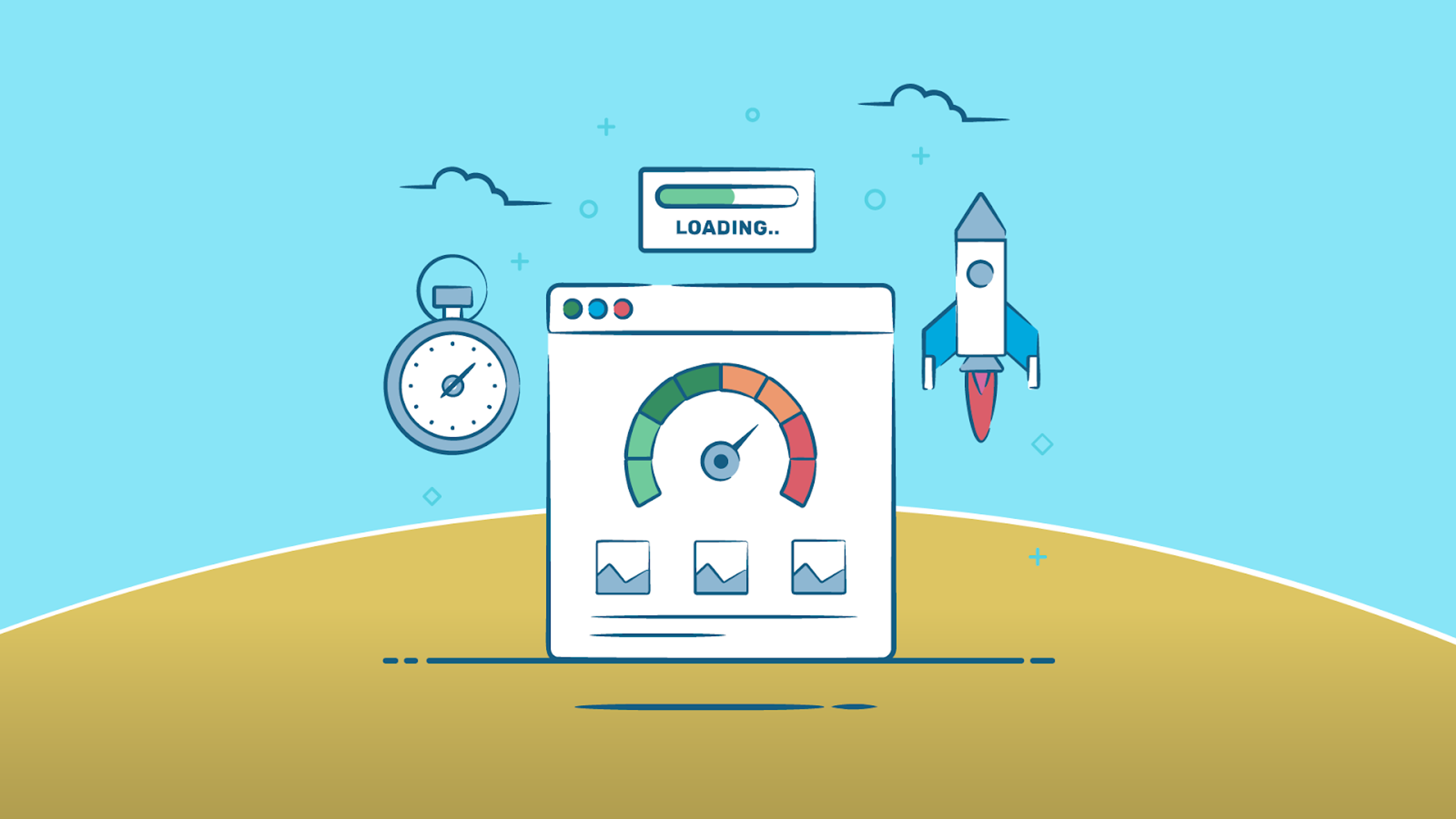
Page speed is also crucial for SEO – many search engines use it as a ranking factor when determining where to place websites in their results. This means developers should strive to make pages as fast as possible while maintaining high quality. By following best practices such as combining multiple files into one, using a content delivery network (CDN) to serve files from various locations worldwide, and utilizing Gzip compression, developers can ensure their websites are loading quickly while providing a great user experience.
Cross-browser Compatibility
Cross-browser compatibility is a crucial element of modern web design. Developers should ensure that their websites appear and function properly across browsers, as this will enhance the user experience. Web coding isn’t processed the same way by all browsers – some are more lenient with coding errors than others.

To guarantee cross-browser compatibility, developers should test their websites using different browsers and make changes accordingly. They should also try to use web standards like HTML5 and CSS3 when writing code to be compatible with more browsers. Feature detection tools such as Modernizr can also inform developers which features are supported on various browsers – they can then create fallback options for older versions of these browsers.
Conclusion
In conclusion, modern web design forces developers to stay up-to-date on new technologies and trends to keep their skills sharp. By considering best practices like accessibility and inclusivity considerations, SEO optimization, performance optimization & page speed, and cross-browser compatibility when designing websites, they can deliver a great user experience while improving search engine ranking. This strategy will help businesses organically reach more customers, increasing website traffic and sales!
FAQ: How to Design a Website
How Long Does It Take to Design a Website?
The duration of designing a website varies between projects that are only hours long or several weeks long, depending on complexity. The size of the site, the number of pages it has, the features being implemented, and the level of customization will all determine how long it takes to build. In general, a basic website with 10 pages or less should take no longer than two days to design.
However, if given enough time and effort, even complex projects can be finished within weeks! Additionally, web development tools such as template kits or rapid development frameworks like Bootstrap can greatly reduce production time while creating top-tier sites.
How to Design a Website From Scratch?
Designing a website from scratch is quite a feat, but creating a great site in weeks with the right strategy and dedication is possible. Every part of the project should be considered when designing a business website from scratch, including content creation, layout design, navigation structure, typography selection, and color palette choice. Cross-browser compatibility and search engine optimization (SEO) are important considerations to ensure the site meets all business goals.
First things first, though, when considering how to design a website from scratch, is prioritizing content… So before anything, developers should write copy for each page of their sites and then select or create images and graphics supporting each page’s message. Allowing content tailored specifically for your target audience will maximize user engagement. After developing content for site pages, you’ll move on to layout design which consists of creating wireframes for each page – this will outline how elements will be arranged on the page while ensuring that usability principles are followed.
When you think of web design, you probably think about how websites look. Color schemes, fonts, and images are all important factors in creating an aesthetically pleasing site that matches your brand identity — but they’re not the only things to consider.
Design is more than just appearance. It’s about how users navigate through your website and explore different pages. When designing a site, make your navigation logical and intuitive so users can quickly find what they’re looking for without getting lost or frustrated.
In addition to being useful, your website should also be accessible. This means considering features like legibility and size when choosing font families so everyone can easily read what’s on their screen. Your color scheme should also be selected carefully; colors impact user experience. Making sure everything looks good is one thing, but if it doesn’t work functionally, then it's useless.
However, before launching the site, developers must ensure cross-browser compatibility - this ensures that websites look correct across different browsers while providing an enjoyable user experience no matter which device they’re using to view it.
Finally, implementing SEO best practices will help your website rank higher in search results pages (SERPs), driving traffic and increasing conversions. These best practices include optimizing code structure using well-structured HTML code, including relevant meta descriptions & keywords throughout content, optimizing image alt text & file sizes for faster loading times, etcetera.
So Now That We Know What You SHOULD Do... What Shouldn't You Do?
One of the most common mistakes in web design is failing to consider user experience. Poorly designed websites can be difficult to navigate and hard for users to find what they want – this will drive them away fast! Additionally, websites that lack responsiveness and don’t look good on different devices, such as mobile phones, will frustrate visitors – nobody has time for slow sites anymore! Developers should always strive for high-quality user experiences that optimize sites for all devices while considering usability principles – remember that.
Another common mistake in web design is including too many distractions or irrelevant elements on a website. This can overwhelm users and make it hard to focus on key content or take desired actions. Additionally, websites that feature intrusive pop-ups, auto-playing videos, and excessive advertising are annoying and can hurt rankings in search engine results pages (SERPs) – yikes! Keep the site clean and simple...less is more.
Developers should also avoid using outdated technologies when designing websites. Using outdated coding practices such as HTML tables instead of modern HTML5 tags or relying on Flash plugins can result in slow loading times and poor performance – ain't nobody has time for that! Staying up-to-date with the latest coding techniques and technologies is essential for creating high-performance websites with a great user experience.
Finally, developers should keep accessibility considerations in mind when designing websites – this means ensuring their sites are accessible to people with disabilities or impairments (e.g., sight loss or hearing impairments). Ensuring all site elements are built with accessibility requirements (such as using alternative text for images) will help ensure people with disabilities have equal access to information and services online.

About Clay
Clay is a UI/UX design & branding agency in San Francisco. We team up with startups and leading brands to create transformative digital experience. Clients: Facebook, Slack, Google, Amazon, Credit Karma, Zenefits, etc.
Learn moreAbout Clay
Clay is a UI/UX design & branding agency in San Francisco. We team up with startups and leading brands to create transformative digital experience. Clients: Facebook, Slack, Google, Amazon, Credit Karma, Zenefits, etc.
Learn more