Make your web designs more captivating and increase user engagement by learning visual hierarchy.
Building a website is no small task. You must consider many elements, from the page's appearance to the user experience. However, one thing that can’t be overlooked is visual consistency and creating a solid visual hierarchy.
Visual hierarchy refers to the organization of on-page elements such as size, color, shape, and other factors so that users can easily understand the flow of information. It’s like building a roadmap for them – and when done right, it ensures that their experience with your site will be pleasant. This article will explain why understanding the principles of visual hierarchy is crucial for web design and how to take advantage of it while creating your next site.
What Is Visual Hierarchy?
By organizing on-page elements using size, color, shape, and other factors, designers can ensure that users can quickly find what they want. This technique works because it matches how people read websites - scanning pages instead of thoroughly reading them.
To ensure an effective visual hierarchy, designers should consider contrast, size, shape, and alignment. They should also pay attention to patterns or element repetition within objects or text elements, white space usage (or lack thereof), and proximity between objects and text elements.
For example, if you’re working on a website with multiple pages or sections on the same page, giving each one its own look or feel would be wise. A designer could use different colors or sizes for headings or paragraphs associated with each page or section – this way, people won’t have to scour through long bodies of text to find what they need.
Another common usage of visual hierarchy is when trying to emphasize specific features like “call-to-action” buttons by making them stand out from everything else on the page through their size and/or color scheme. Doing this makes these features more clickable, which drives user engagement.
Understanding and applying visual hierarchy to web design is key to a successful website. It keeps everything organized and laid out, makes information easy to scan through for people, and opens creative opportunities for designers.

Visual hierarchy is extremely important. It allows designers to create order and structure in their work. For instance, by making things easier for the user to find, more people will likely stay on your website and interact with it. You can use color, size, shape, alignment of objects, repetition of patterns or elements, white space usage, and proximity between objects and text elements to connect different parts of a website.
Building connections between two sections or pages within a website would allow visitors to feel a sense of familiarity when clicking around your website. This will make them feel at ease while reading your content and give them the confidence to click that ‘add-to-cart’ button.
Also worth mentioning is its branding value. Leveraging specific colors, shapes, or fonts affiliated with your brand can make it easier for people to trust what you’re offering even if they’ve never heard of you before today.
Elements and Visual Hierarchy Principles
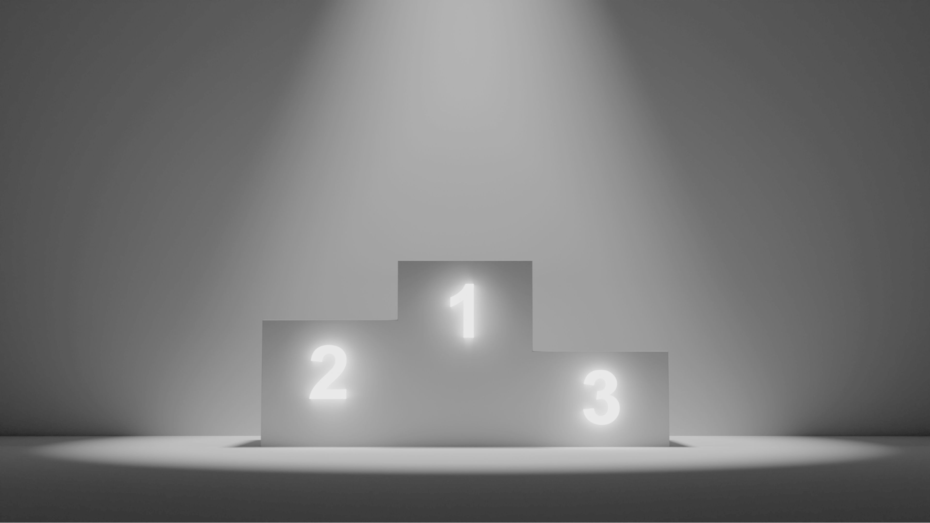
Creating an effortless flow from one page to another seems complicated, but it’s pretty simple! Utilizing various elements and principles, such as contrast, can be beneficial when deciding where each element should go on a page. Contrast refers to the difference between two elements, such as size or color (ex: big red “call-to-action” button against small plain text). This method lets users easily spot what they need immediately without searching too long.
To prioritize certain features over others, all you have to do is play around with their sizes! Making certain features larger than others makes it more challenging for the viewer to miss out on anything important.
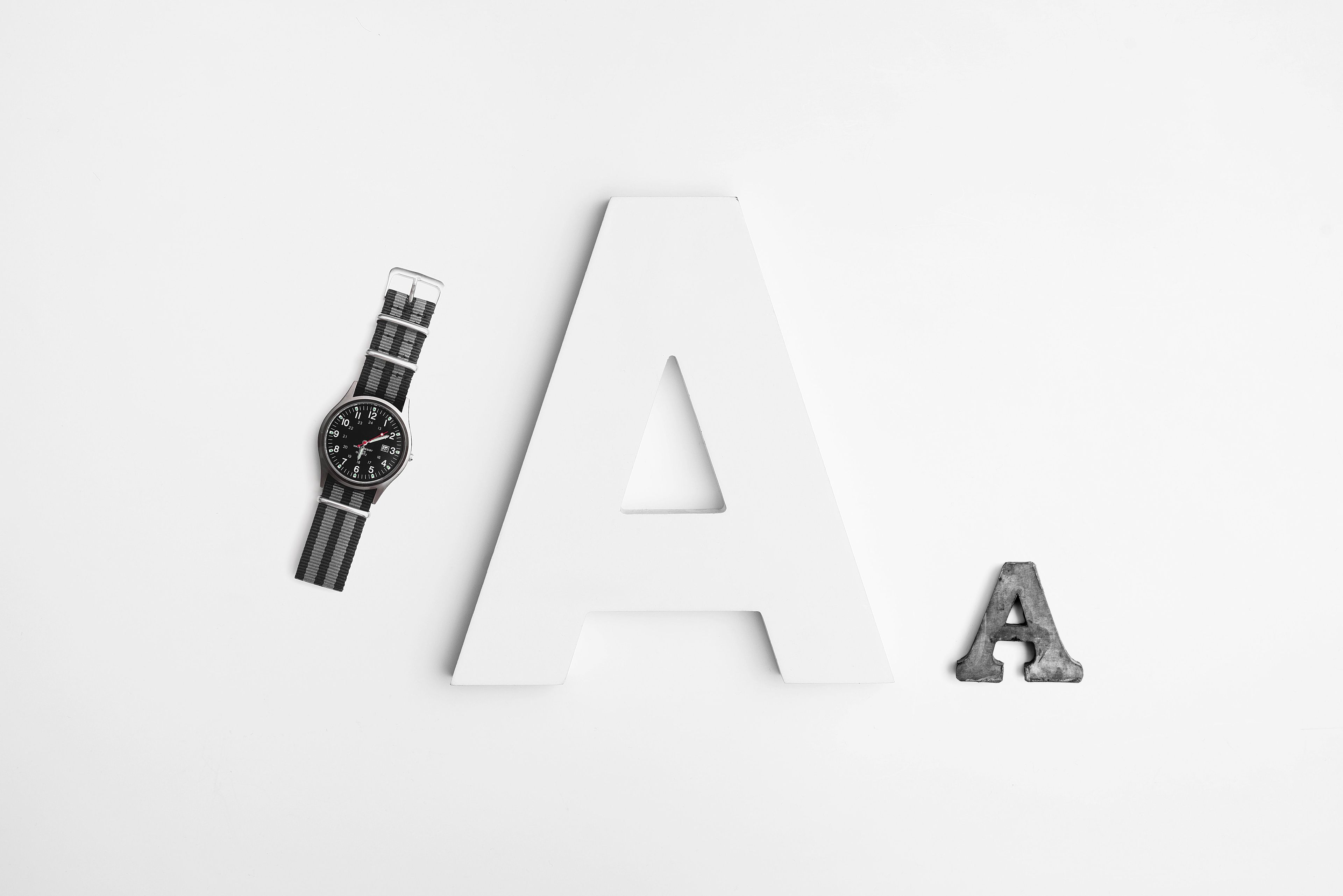
Shapes can also help prioritize information depending on how often you use them within your design layout. For example, making every section square except the ‘contact us,’ which happens to be circular, creates attention in that area by drawing attention and making it stand out.
Lastly, arranging elements and aligning objects within the space helps with organization. Without organization, people will likely quickly click off the site because they can’t find what they’re looking for fast enough.
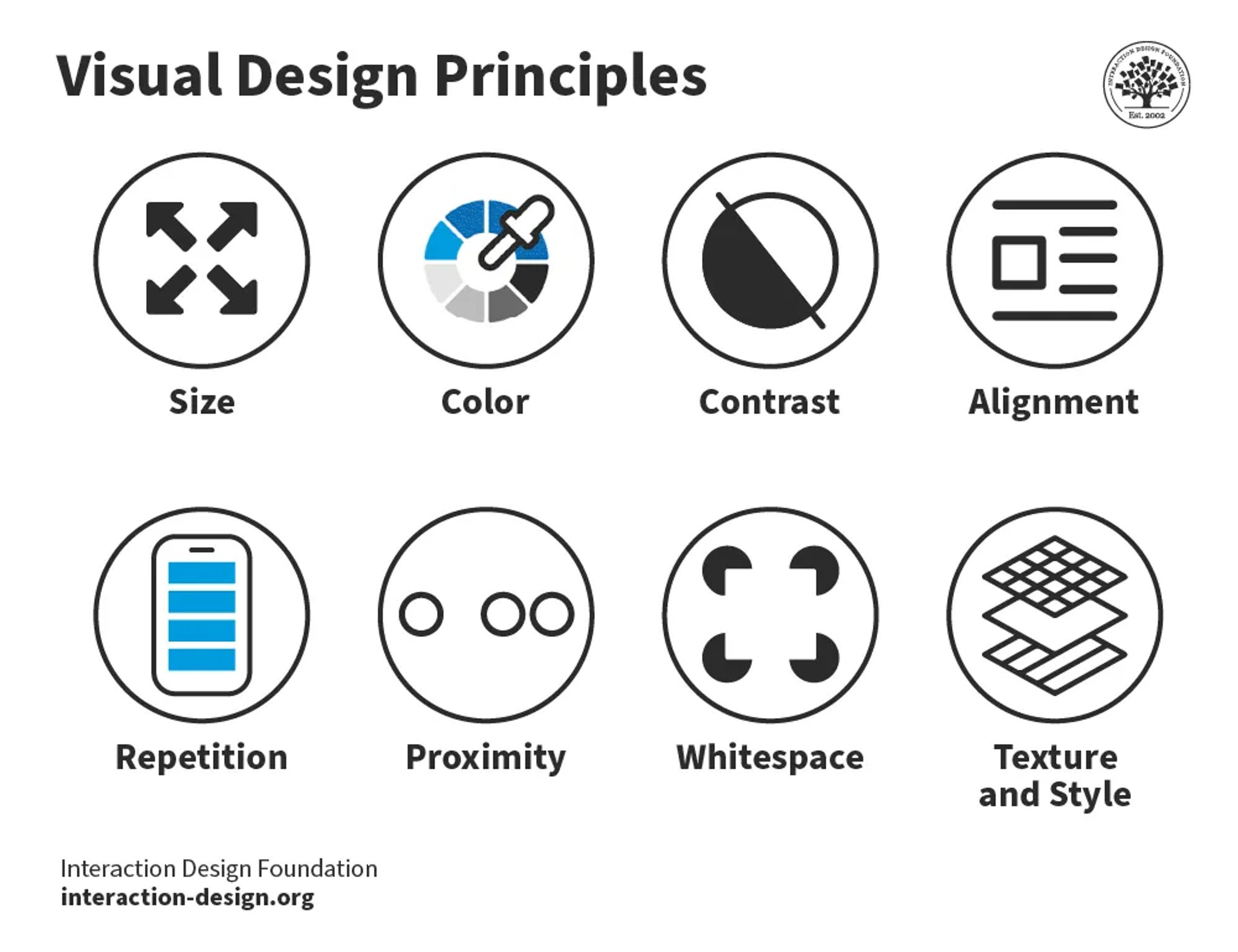
Repeating patterns or elements on a web page keeps things consistent while visually separating individual sections. This way, people know where they are and how different pieces of content relate to each other — it also makes them more comfortable since they’ll always know what to expect.
Negative space — also known as white space — is just as important when creating a visual hierarchy. Designers can use it to allow viewers to focus on specific content elements without being overwhelmed by everything else on the page.
Finally, proximity plays a big role in websites that have multiple sections. Keeping objects and text elements spaced accordingly will let visitors navigate your site faster and more easily, giving designers plenty of room to get creative with their layouts.
How to Create an Effective Visual Hierarchy
Size, Scale, and Proportion
These three factors decide which parts of your website stand out and blend in. Size draws attention to some features while making others less noticeable. For example, if you have a bright color against a plain background, it’ll be almost impossible for users not to see it — whereas if everything is loud and colorful, nothing will seem important. Scale can be used similarly by making specific components much bigger or smaller than the rest of the page. Proportion is about achieving balance in design by sizing objects appropriately relative to each other.
Contrasting colors isn’t the only way size helps create separate sections or pages within a website — different sizes for headings or blocks of text do, too. This way, people know what’s what even if unfamiliar with your site layout.
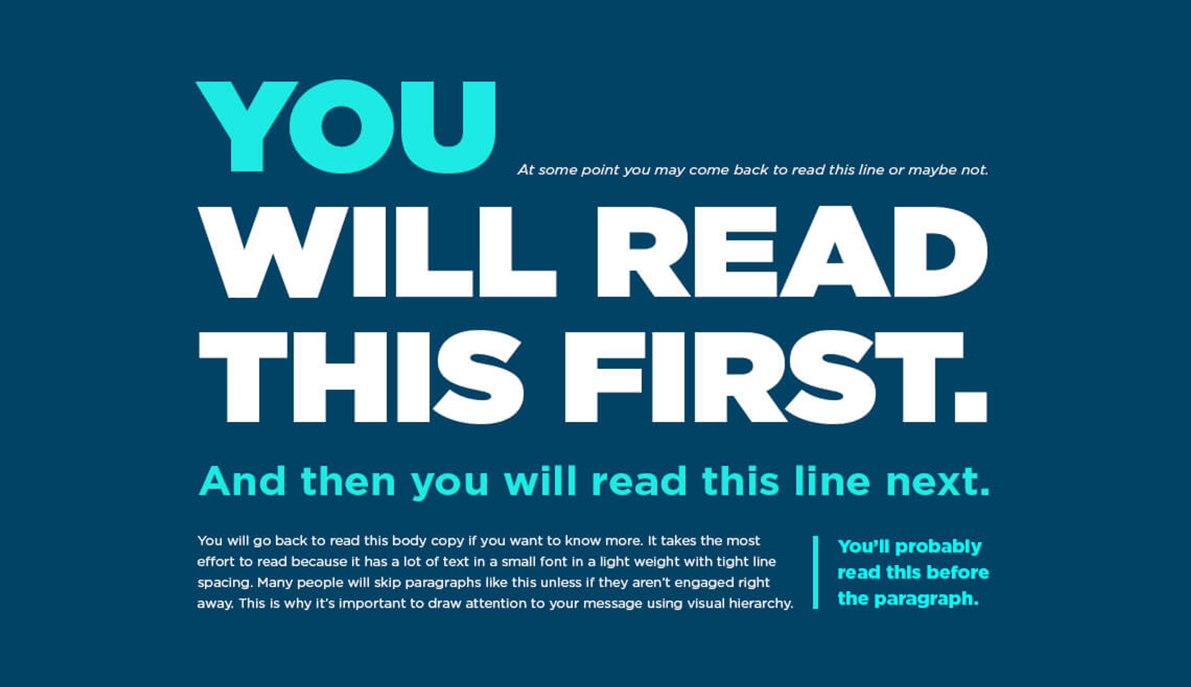
Scale can also make certain parts of your website appear more significant than others by making them look bigger or smaller (even without contrasting colors). There’s no one-size-fits-all answer for how much something should be scaled up or down because that depends on its original size — but if you want viewers’ eyes drawn toward something specific, you can always mess with it until you get the desired effect. The same concept can be applied to scaling things down: if there’s something you don’t want people to see right away, make it smaller and less noticeable than everything else.
Proportion is important for balance. You need to size objects relative to each other so that all elements look good next to one another regardless of their individual sizes or shapes. Suppose you don’t consider proportions when designing a website. In that case, your pages will look like different people put them together—this makes them confusing and frustrating for users, which is never good.
Alignment and Spacing
When used correctly, alignment keeps objects organized in a way that looks nice and makes sense. In web design, grids are usually used to create balance on a page; they also give viewers an idea of how much content they’ll be scrolling through. When things are laid out in such an organized way, it’s easier for people to find what they’re looking for—and when they do find it quickly, this makes them more likely to explore further out of curiosity or interest.
Spacing does the same thing as alignment by making websites less cluttered and more accessible for users to navigate naturally.
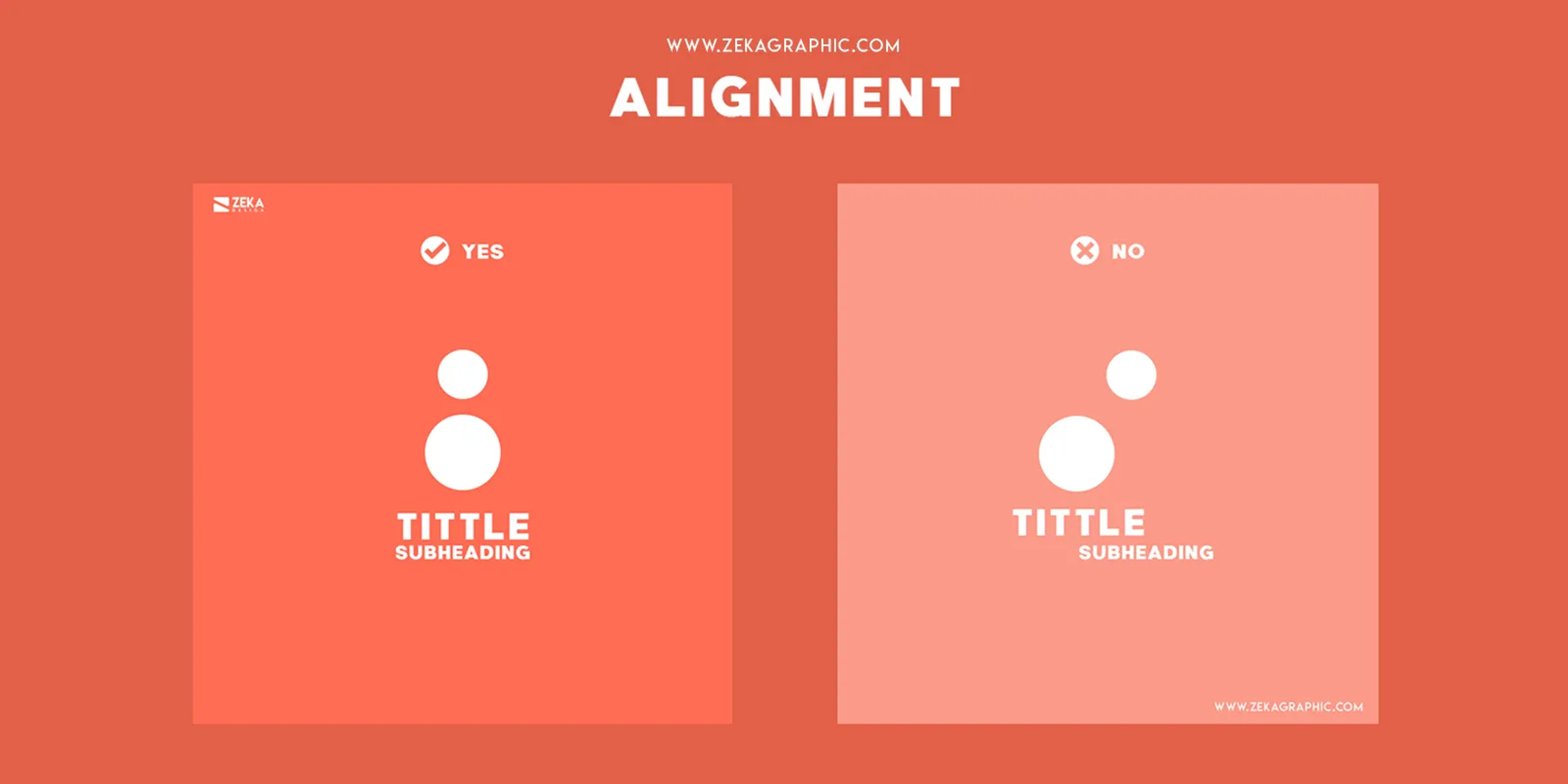
Spacing is also important to achieving effective visual hierarchy, which is the space between different components on a page. White space helps viewers focus on individual pieces without feeling overwhelmed by too much information at once. It also provides breathing room between design elements and emphasizes certain objects or text by surrounding them with space.
Grid Systems and Layout Principles
Grids help create a practical and visually pleasing visual hierarchy in web design. They organize a web page's structure with columns, rows, and gutters. By utilizing grids in design, designers can easily place objects and text elements on a web page in an orderly way that guides users through the website faster and more naturally. Grids also provide balance by ensuring all elements are sized appropriately relative to each other; this makes it easier for viewers to understand the layout without being overwhelmed.
Layout principles are key when creating an effective visual hierarchy as well. They guide how each element is placed on the page to create organization across all sections of a website or application. Some of these principles include proximity (placing related items close together), alignment (aligning objects within the space helps people read and comprehend quickly), repetition of patterns or elements (this allows for continuity while still being distinct visually), white space usage (allows viewers time to focus on particular things without too much information at once) and contrast (using different sizes, colors, shapes, etc., to draw attention).
By following these layout principles, designers can create a compelling visual hierarchy that prioritizes certain areas while keeping other content less noticeable. This visual structure helps visitors quickly understand your website’s different sections, encouraging them to explore further. Additionally, using grid systems ensures everything looks right next to one another, making it easier for people to understand what they’re looking at without having to search around tirelessly.
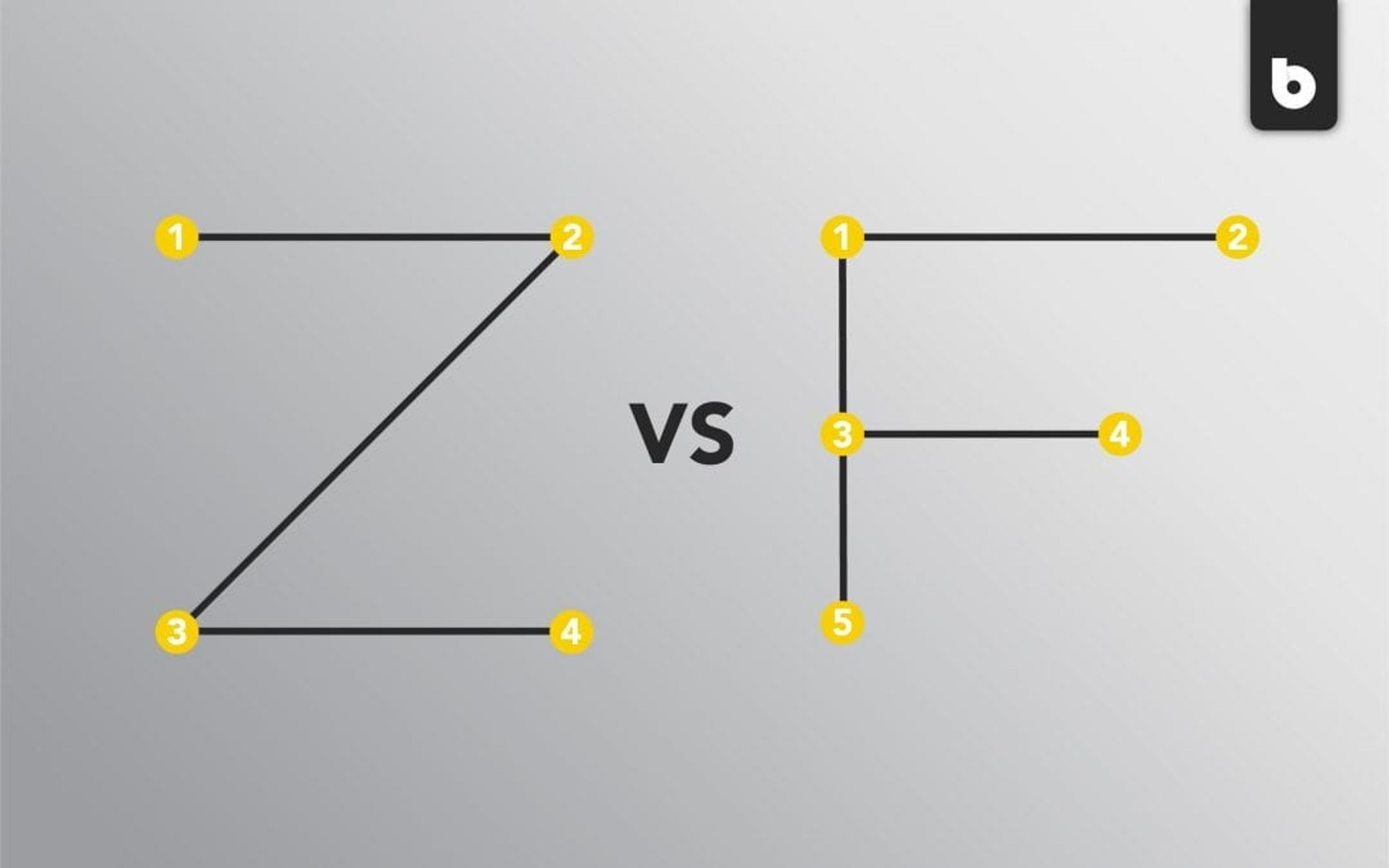
Visual Cues and Indicators
Visual cues are signals or messages that guide viewers through a website or application; indicators are the objects used to deliver those signals. Together, they create a full user interface experience that lets visitors quickly understand a page's content.
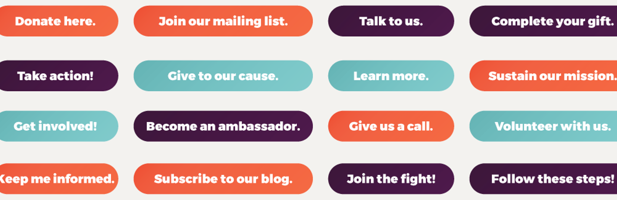
Visual cues help guide visitors through websites and applications by providing context about elements on the page. For example, they can suggest priority, draw attention to certain features, guide users through a workflow, or provide connections between different sections or pages. Examples of visual cues include arrows, lines, symbols, and shapes; these can all be used to direct users’ attention toward certain items while keeping other content elements less noticeable.
Objects used to communicate within a website or application are called indicators. Take icons, for example, and they are typically used to represent specific features or functions without the need to explain them in written form. This helps keep things straightforward and organized by providing information quickly and visually. Using color, designers can highlight certain elements on a page to draw attention toward them. For instance, red is commonly used for crucial items that require immediate user action.

By incorporating visual cues and indicators into web design, designers can create an eye-catching visual hierarchy that guides users’ gaze toward the most important elements and parts of the page while making less relevant content more discreet. This creates an intuitive user experience that’s easy for people to understand without becoming overwhelmed by too much information at once — making it easier for viewers to find what they’re looking for quickly and efficiently. Additionally, visuals allow individuals to comprehend what is being presented faster than if described in a text; this increases engagement with your website or application as visitors will feel encouraged to explore further.
Best Practices and Tips for Implementing Clear Visual Hierarchy
Consistency and Coherence in Design
Maintaining an effective visual hierarchy requires consistency and coherence in design. Consistency refers to maintaining structure across all site sections while creating a uniform look throughout; this ensures visitors can quickly understand how everything is laid out without being overloaded by information overload. On the other hand, coherence deals with how different visual elements interact within a page or website. Using similar colors, shapes, sizes, fonts, etc., makes it easier for viewers to navigate through everything.
In addition to creating visually consistent design elements, designers must consider how those components work together harmoniously; outputting an organized experience during all stages of navigating the site is key. Certain elements should be emphasized over others to emphasize importance — this can be done by spacing objects out accordingly from one focal point to another while still keeping everything evenly distributed.
Designers should also be mindful of their overall intentions when implementing visual hierarchy. They should ask themselves if each visual design element contributes to achieving those goals rather than distracting from them. If the goal is engagement with content, visuals should be used in a way that doesn’t distract visitors from reading. Similarly, if the goal is lead generation, visuals should encourage people to take action instead.
By adhering to these principles during the design process, designers can generate an engaging visual hierarchy that emphasizes certain aspects of their page while making other content less noticeable. This lets viewers quickly understand what they’re looking at and creates an intuitive user experience that encourages them to further investigate your website or application.
Responsive Design Considerations
One must embrace responsive design to generate an effective visual hierarchy for web design. It creates web pages that can properly adjust to and respond to specific devices or browsers. Adjusting includes maintaining the correct size of elements relative to each other regardless of how they appear. Optimizing content for various screen sizes and resolutions is another aspect that plays a massive part in making this good visual hierarchy more effective.
However, there are multiple complex considerations when building a responsive layout. Providing the same user experience across all devices and browsers should be established to bring usability regardless of what device visitors use. Designers must ensure that everything is sized correctly and appropriately spaced from one another and optimize content for each device. They also need to ensure that pages look good on all screens by making text readable even with small screens, scaling images accordingly, and making interactions functional despite using touchscreens.
Performance is something else they need to take into consideration. Mobile users often face slower internet connections than desktop users, so any page with heavy content needs to be optimized, especially for mobile devices. This can be done by compressing images faster, utilizing lazy loading techniques for larger images, optimizing JavaScript files, minifying CSS files, etc.

If these things are considered during web designing, designers will create visually appealing websites that work well on any device while still providing a consistent user experience; this helps visitors understand your website quickly without overwhelming them with too much information. Additionally, optimizing page performance ensures visitors don’t get frustrated with slow loading times – instead, it encourages them to explore your website further without being deterred by technical issues.
Conducting User Testing and Making Iterative Improvements
User testing and iterative improvements are vital in creating an effective visual hierarchy that meets user needs. These tests help designers gain valuable insights into how individuals engage with their websites or applications. They can then use this information to make iterations and improvements based on user feedback. It includes activities such as changing color schemes, adjusting the placement of elements, altering font sizes, and improving the content structure.
By conducting user testing and making iterative improvements, designers can ensure that their designs meet user expectations and provide an intuitive experience that encourages visitors to explore their website or application further. These tests also help identify any potential issues with the design before launch; this is a cost-effective way to save time and money from fixing broken features or correcting errors after launch.
Evaluating the effectiveness of visual hierarchy is another thing these tests do. By measuring how long visitors spend on different pages or how quickly they take action on call-to-actions (CTAs), designers can find out which graphic design elements are most impactful and what needs to be adjusted for a better user experience.
Visual hierarchy web design that meets user needs requires user testing and iterative improvements. By conducting regular tests and making adjustments based on feedback, designers can ensure that their designs work as intended while providing a positive experience for visitors. In addition to optimizing the website for desired results, these tests help identify potential issues before launch so that they can be resolved quickly without incurring extra costs or delays in development time.
Conclusion
Visual hierarchy is an essential element of web design. If done correctly, it can help create a positive user experience that encourages visitors to explore your website or application further. It involves considering how objects are spaced from one another and understanding the overall design goals for each page. Additionally, web designers must consider responsive design principles to create a visual hierarchy, such as optimizing content for different screen sizes and resolutions to ensure visitors have the same experience across all devices and browsers.
Finally, conducting regular user testing helps identify potential issues with visual hierarchy before launch while providing valuable insights into the user journey, which elements are most impactful, and what needs to be adjusted to achieve desired results. By taking these steps during the web design, you can create visually appealing websites that drive engagement, lead generation, or conversions – whatever you aim for!

About Clay
Clay is a UI/UX design & branding agency in San Francisco. We team up with startups and leading brands to create transformative digital experience. Clients: Facebook, Slack, Google, Amazon, Credit Karma, Zenefits, etc.
Learn moreAbout Clay
Clay is a UI/UX design & branding agency in San Francisco. We team up with startups and leading brands to create transformative digital experience. Clients: Facebook, Slack, Google, Amazon, Credit Karma, Zenefits, etc.
Learn more