Next Case Study
CafePay

Designing the digital experience for a revolutionary blockchain platform.
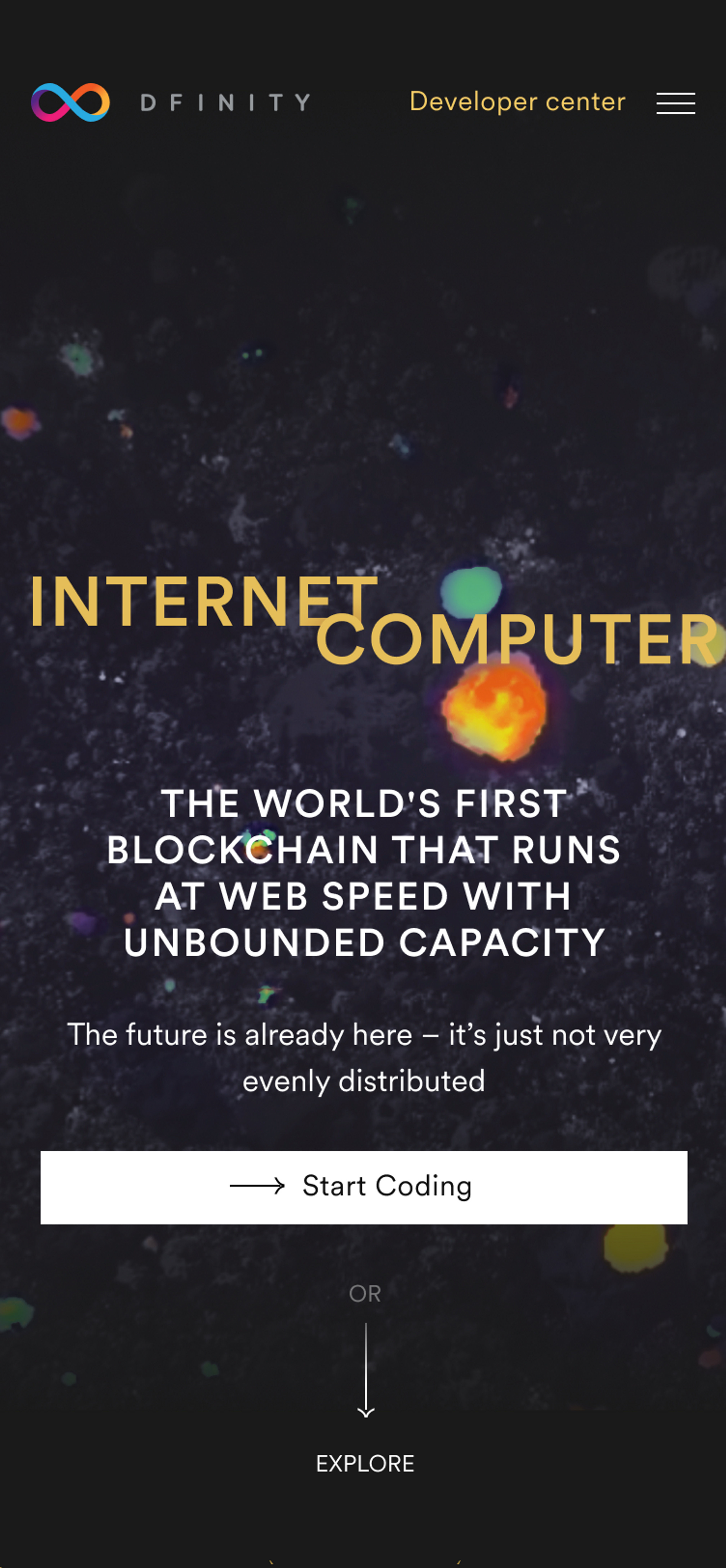
To highlight the significance of DFINITY’s global computer vision, our initial design was centered on the scale of the new computer. We utilized dynamic motion design and a bold color scheme across the website — ensuring an accessible and engaging exploration of the organization's offerings for new users.
Leveraging a clean visual metaphor to represent code, each cube signifies a fragment of code or an individual project. The design integrates cubes that can communicate with one another, highlighting the seamless exchange of information among websites and programs.

Determining how best to highlight the functionality of the global computer was a unique design challenge for our team.
Upon revisiting the design, our objective was to appeal to an audience of younger blockchain entrepreneurs. Through the innovation of a new visual aesthetic based on the interference effect, we quickly transformed the website, incorporating animated intersecting lines. This dynamic design approach resulted in a ripple effect, generating an endlessly evolving pattern as users scroll.
Given that the second version of the site implored a simpler visual language, the graphics were created with code and vector files only. This allowed us to implement the redesign efficiently.


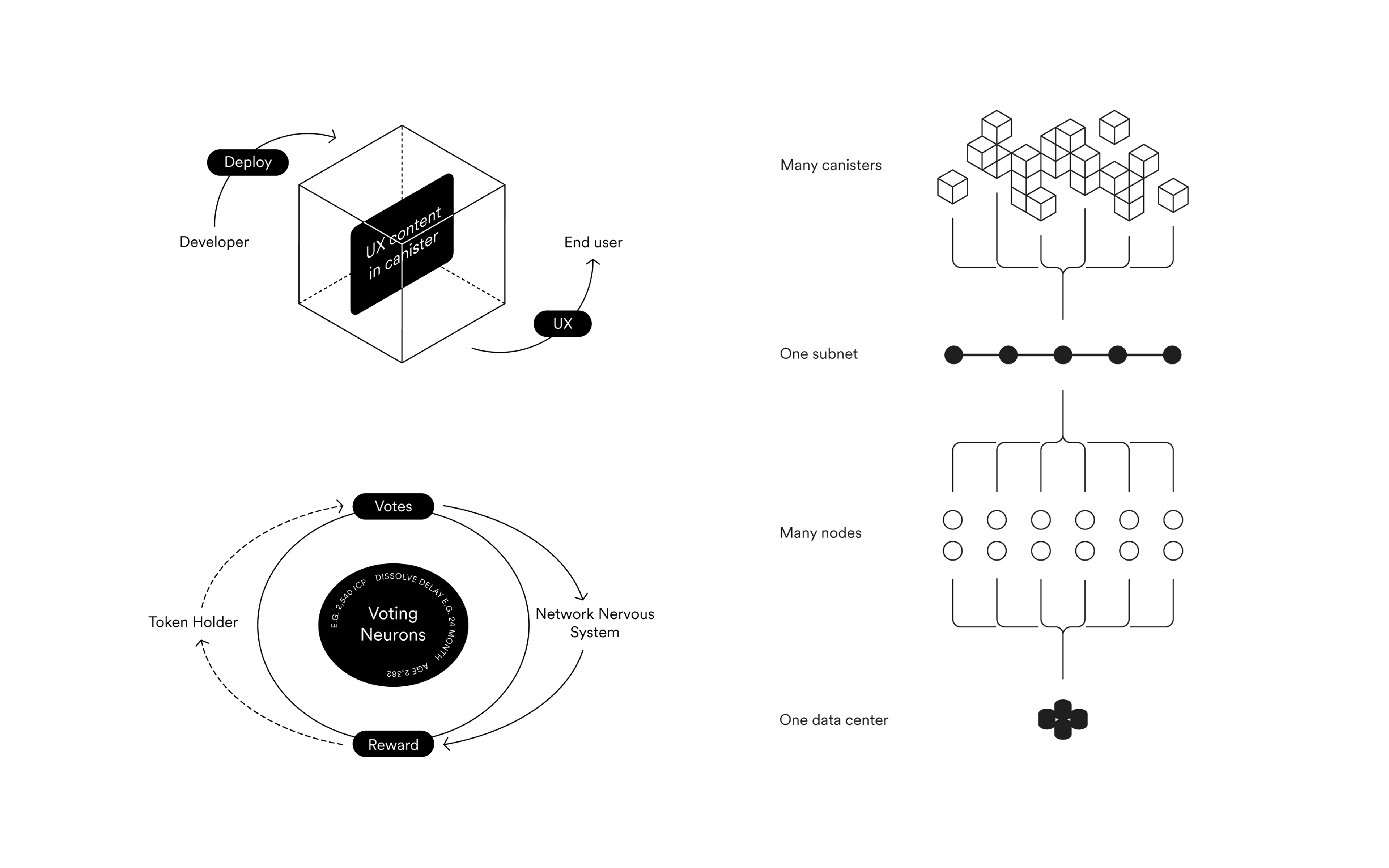
We designed custom 2D illustrations in a diagram style to effectively convey complex concepts — reinforcing the technicality of the project.

After gaining insight into the needs of the website, our latest iteration of the design is intended for a wider audience, including media and other organizations.
With a light background and simple object shapes, the minimal UX helps deliver key information to new audiences faster while exemplifying the foundation's progressive and trusted leadership in the public blockchain space.
CafePay

Thank you for subscribing!
We'll send you a subscription every couple of weeks.