Next Case Study
Grayscale
Designing and building Slack’s interactive demo experience
Our challenge was to design the demo in a way that would engage three completely different audiences. These audiences include individuals who are not familiar with Slack, users who aren’t aware of all the product’s features, and business leaders who are seeking a resource to improve company communication and collaboration.
We created an efficient and understandable onboarding process to allow users to easily navigate the product.
We paid special attention to breakpoints and screen resizing throughout the design and development process, ensuring users would be able to access the content no matter where or how.
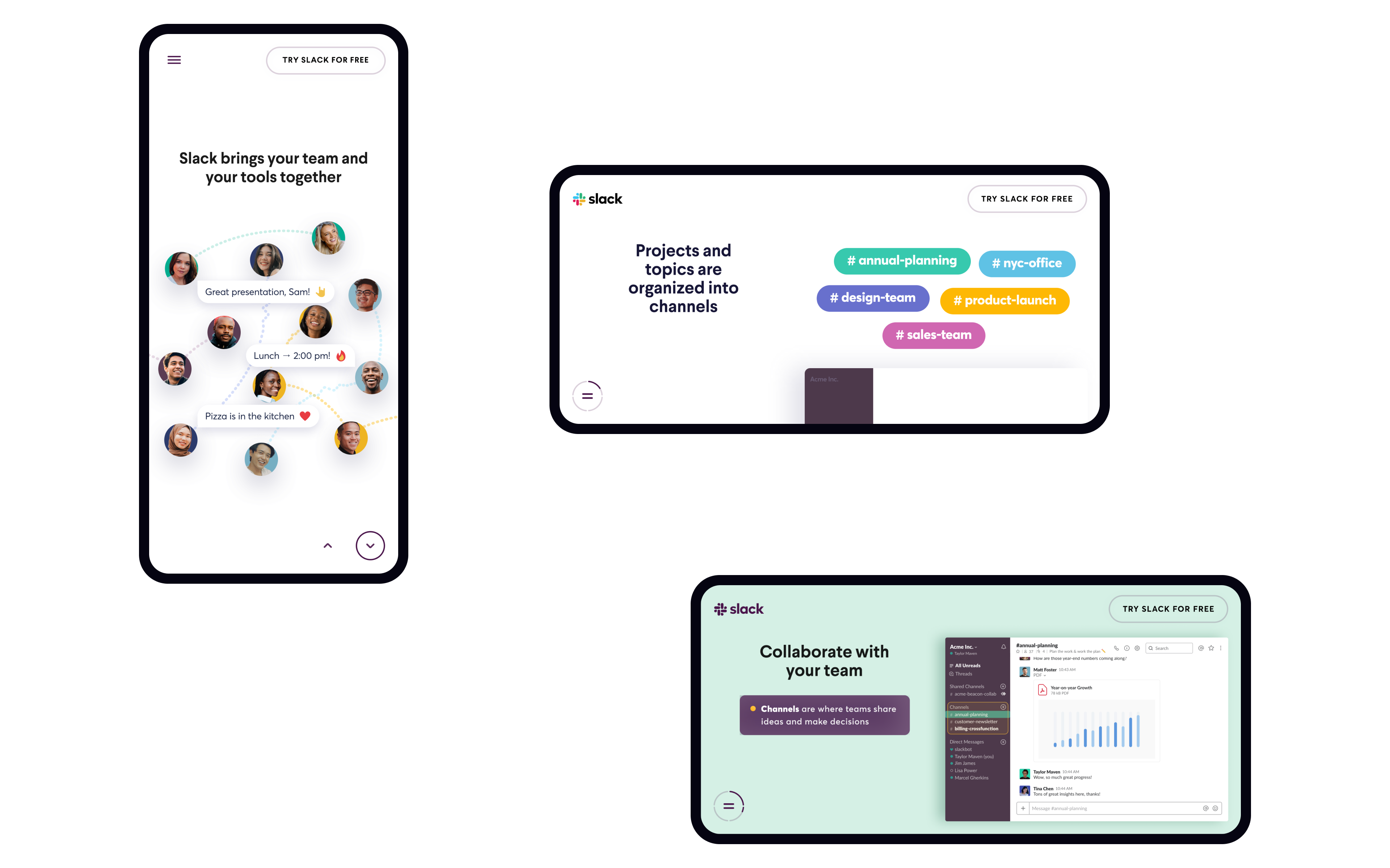
Using a landscape version can help leverage the full potential of smaller screens. In this instance, the product and its features occupy the majority of the screen, while accompanying text provides users with an overview throughout the demo.
Emojis are often used when people interact in channels and direct messages across Slack. It was a natural choice to add them within the design as not only an element of playfulness and interaction, but also a means of communication and general brand expression.

We developed several concepts to construct the visual narrative and create the best possible demo experience.
The design is elegantly simplified to communicate the benefits of the product with interactions that are strategic and minimal.
Throughout our multi-year partnership, we made modifications to the demo based on what we learned. As we gained insights, we were able to improve the demo to better meet the needs of the target audiences.
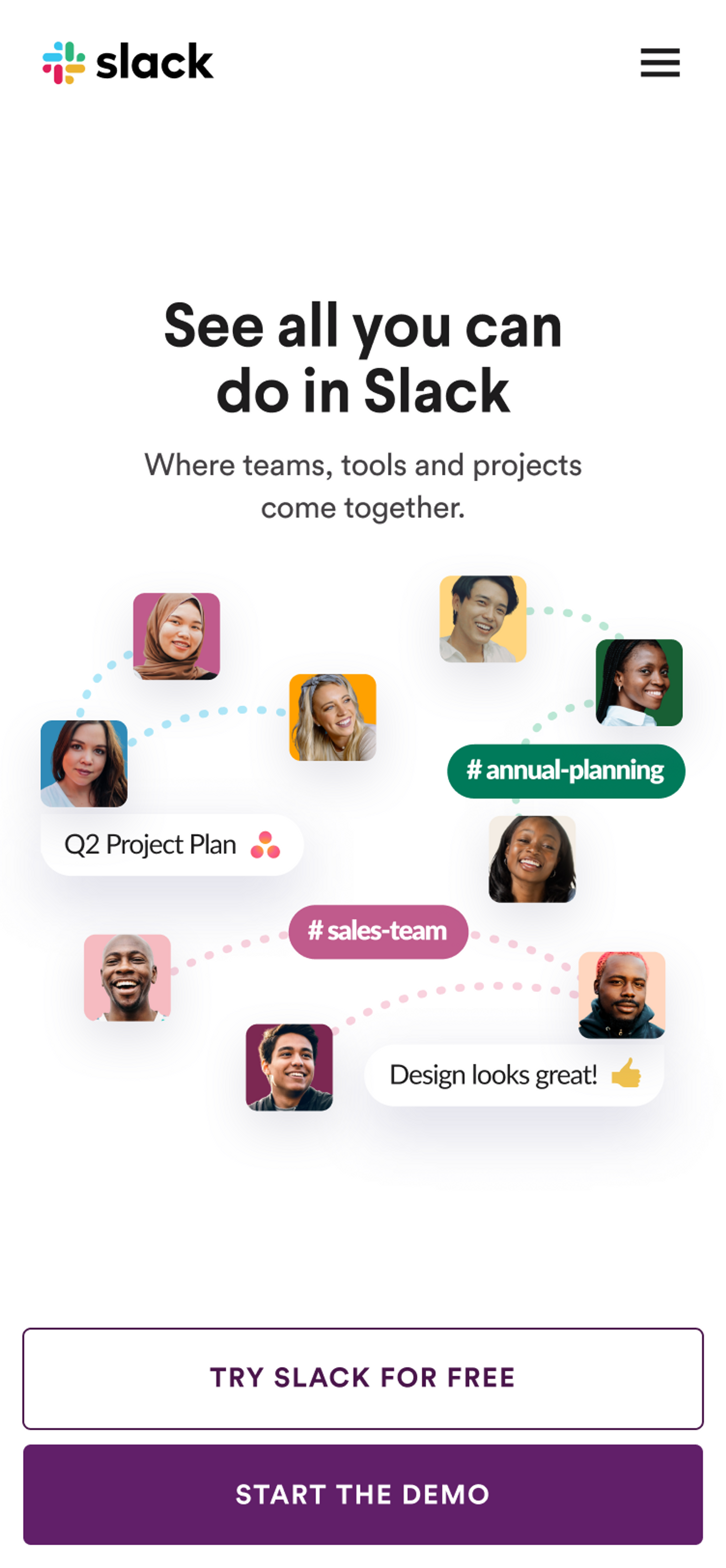
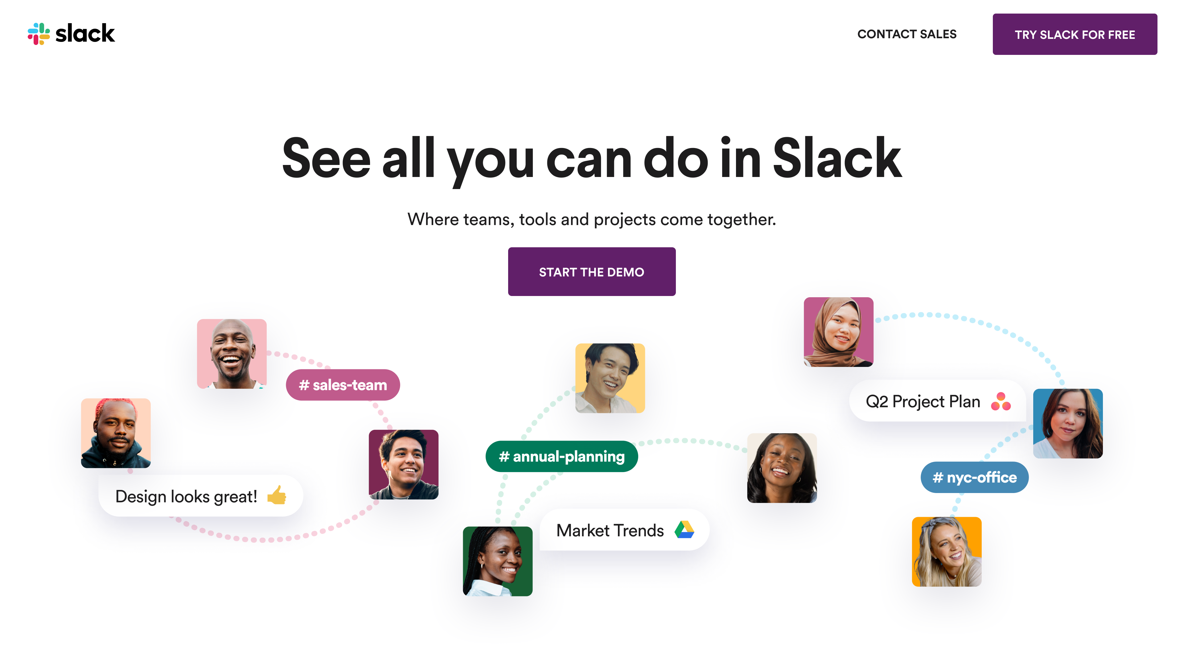
Localization involves not only translating content into other languages but also adapting it to align with design trends specific to the region. For this, we take UX patterns and even the size of the components into consideration.
Grayscale

Thank you for subscribing!
We'll send you a subscription every couple of weeks.