Next Case Study
Yahoo! Games

Elevating the mobile banking experience

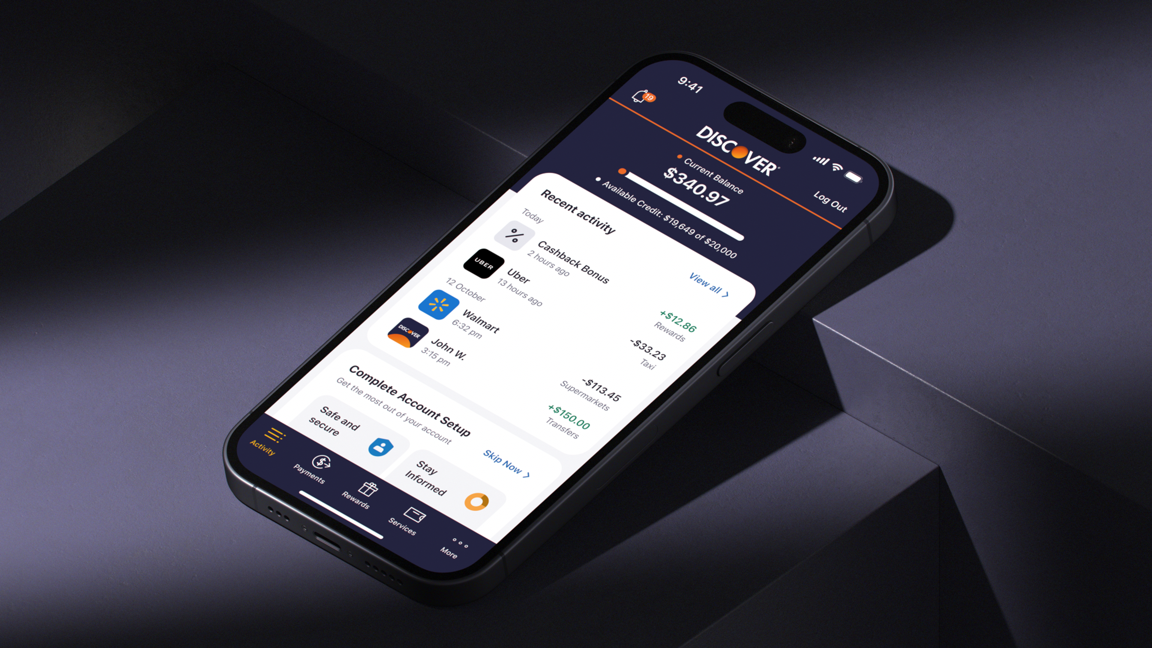
We partnered with Discover, a leading digital bank and payment services company, to enhance their mobile app experience.
Our collaboration involved refining core flows for onboarding and new card activation. Additionally, we improved new feature discovery and implemented a motivation system to prompt users to complete their profile setup.
To streamline the onboarding process for new users, we organized the app's features into four distinct groups. This categorization helped prioritize the most essential settings, creating an initial checklist for users.

We updated the main dashboard to aid users in tracking their progress while navigating the app’s capabilities.
This enhancement involves dynamically displaying new actions as users gain familiarity with the app.
During the UX phase, detailed flow diagrams were created to uncover all of the possible use cases for receiving and activating a credit card. The resulting charts helped us develop a scenario for testing the first UX prototypes.
For user testing, we prepared multiple iterations of the flow to find the most user-friendly approach. All prototypes were made in two versions — for iOS and Android systems.

Among the added brand elements, we also created custom icons and illustrations for improved user interaction and engagement.


All assets and mockups were organized with accompanying descriptions and implementation guidelines. The aim was to establish a scalable system to aid in gradually updating various portions of the app, and eventually, the entire ecosystem of web products and identity.
Yahoo! Games

Thank you for subscribing!
We'll send you a subscription every couple of weeks.