
Color is the first thing users register and the last thing most website designers think to audit. Before anyone reads a headline, clicks a button, or scrolls past the fold, they've already formed a judgment shaped almost entirely by the palette sitting in front of them. It's the result of hard-wired instincts that color theory has been mapping for centuries.
What's changed is the stakes. A website's color decisions now carry weight far beyond aesthetics. They affect everything from brand recall to search performance.
The goal is to understand what combinations signal to your audience and how to apply that knowledge without turning every page into a design school exercise.
Key Takeaways
- Color drives first impressions. Research shows users assess a site's visual appeal in as little as 50 milliseconds, with color as the primary trigger.
- The six main color scheme types (monochromatic, complementary, analogous, triadic, tetradic, and split-complementary) each serve a different emotional and visual purpose.
- A warm-to-cool color balance prevents palettes from feeling either too aggressive or too flat.
- The 60-30-10 rule is one of the most reliable frameworks for distributing color across a layout.
- Accessibility isn't optional. Low-contrast text remains the most common WCAG (Web Content Accessibility Guidelines) failure, found on the majority of all homepages.
- AI-driven adaptive color systems are reshaping how interfaces handle theming. Personalization and accessibility are now inseparable.
What Is Color Theory?
Color theory is a set of principles that explains how color combinations create emotional and visual effects. It draws from art, physics, and cognitive psychology. For web designers, it's practical. It tells you what mood a palette sets and why.
Users won't credit a palette that works. But they'll feel every mistake as a low-grade friction that undermines even the strongest content.
The Importance of Color Theory in Web Design
Grasping color theory is vital when you’re building a website or crafting any user interface. A good palette builds hierarchy without a word of copy. A brand that sticks after one visit. Color drives more of that than most designers account for.
Users form first impressions of a website in as little as 50 milliseconds, with color as the primary driver. An unaligned palette actively undermines trust before anyone clicks anything. Conversion rate follows directly from whether users feel at ease or alienated by what's in front of them.
Color Theory Terms and Fundamentals
Color Fundamentals
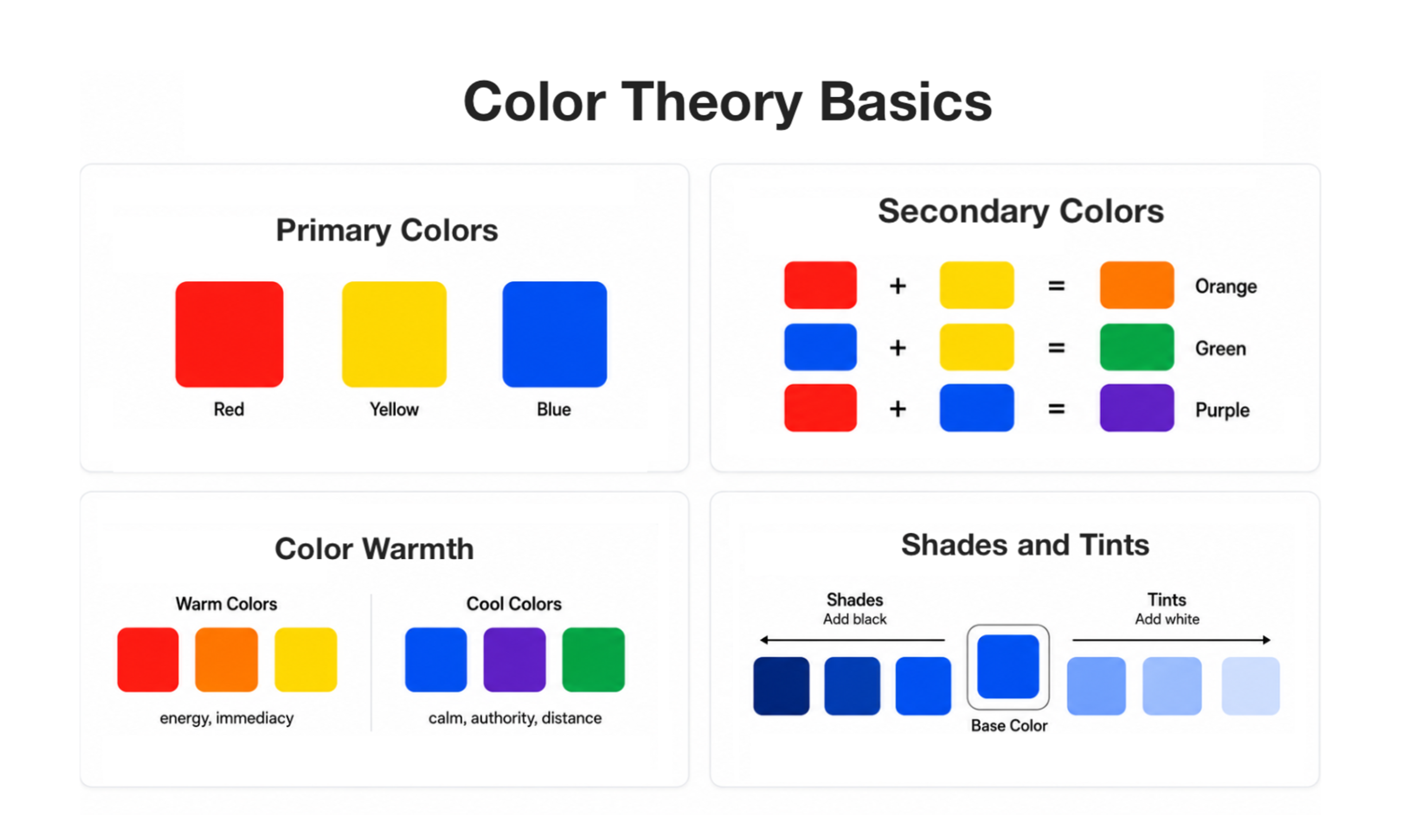
Primary Colors
Red, yellow, and blue are the primary colors. They can't be created by mixing others. Every other color on the wheel traces back to some combination of these three. Primaries are the anchors around which every palette is built.
Secondary Colors
Mix two primaries, and you get a secondary. Orange comes from red and yellow, green from blue and yellow, purple from red and blue. Secondary colors are generally softer in visual weight than primaries, which makes them natural for supporting roles like backgrounds.
Color Warmth
Colors fall into two broad temperature camps. Warm colors (reds, oranges, yellows) carry energy and immediacy. Cool colors (blues, purples, some greens) suggest calm, authority, or distance.
Neither is automatically better. The tension between them is where balanced palettes live. Lean too far warm, and the design feels aggressive. Lean too far cool, and it reads as clinical.
Shades and Tints
Adding black makes a color darker and heavier, creating a shade. Adding white makes it lighter and softer, creating a tint.
Extending a palette without introducing new hues works exactly this way. Tints and shades are the backbone of any monochromatic scheme.
Hue, Lightness, Saturation, Gradient, and Contrast
Main Color Properties
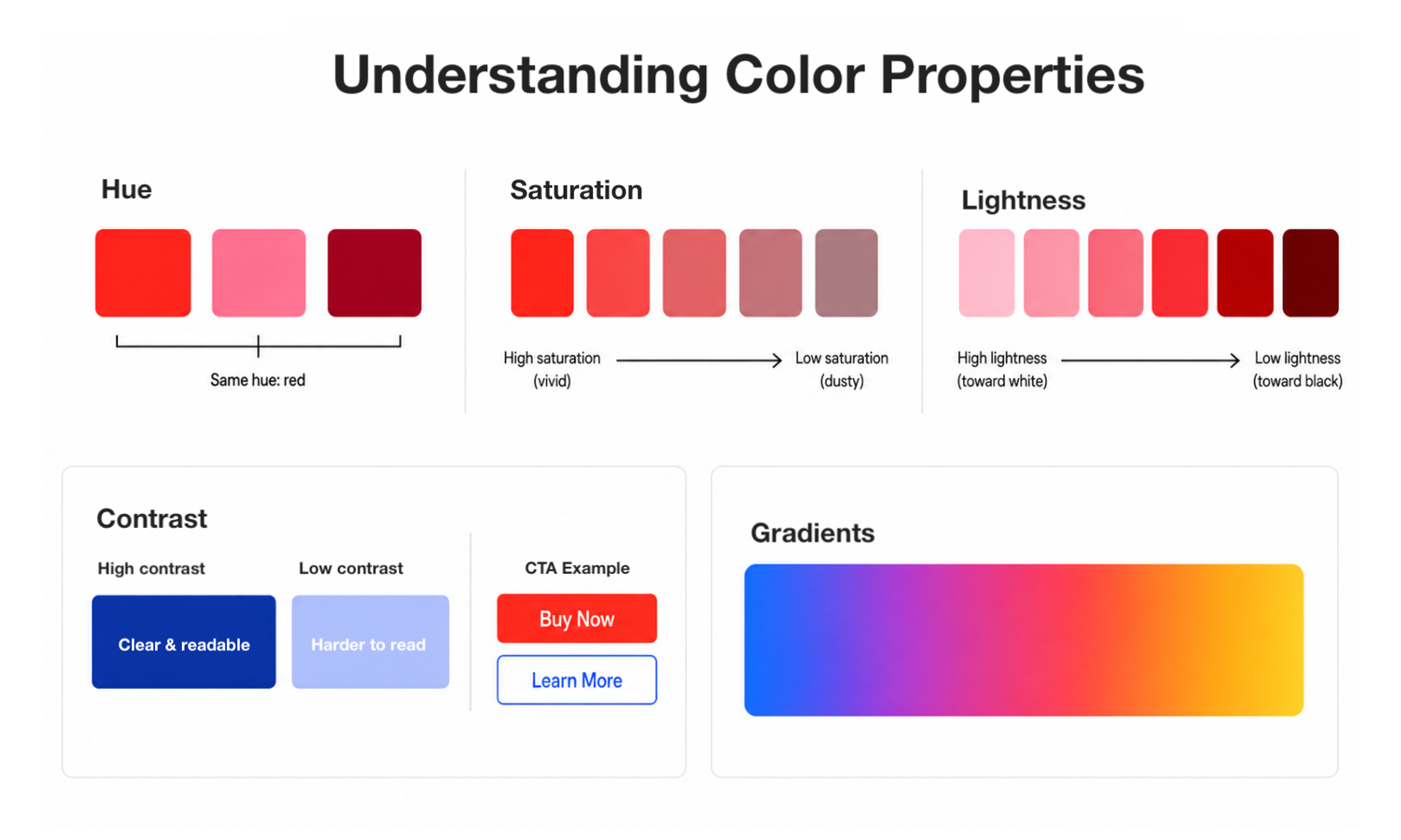
Hue is the color itself, its position on the wheel before any modification. Whether you tint it pink or shade it maroon, the underlying color stays red.
Saturation measures how intense or muted a color reads. Crank it up, and it becomes vivid and eye-catching. Pull it back, and the same hue reads as dusty or subdued. It's one of the most effective tools for creating visual hierarchy.
Lightness describes how light or dark a color appears. A color with high lightness looks almost white, while low lightness pushes it toward black. Together with saturation, lightness shapes the overall feel of a color.
Contrast is how distinct two colors appear when placed next to each other. For body text, it's non-negotiable. For CTAs, it's a conversion tool. Getting it wrong affects all users, but hits hardest for those with low vision or color blindness.
Gradients blend color values across a transition. After years out of fashion, they've returned to contemporary web design, appearing in hero sections and buttons where a flat fill would feel static.
Building a Palette That Works
How to Use the Color Wheel
The color wheel is a map of relationships. Start with temperature, whether that's warm energy, cool restraint, or tension between the two.
Color Wheel Illustration by Clay
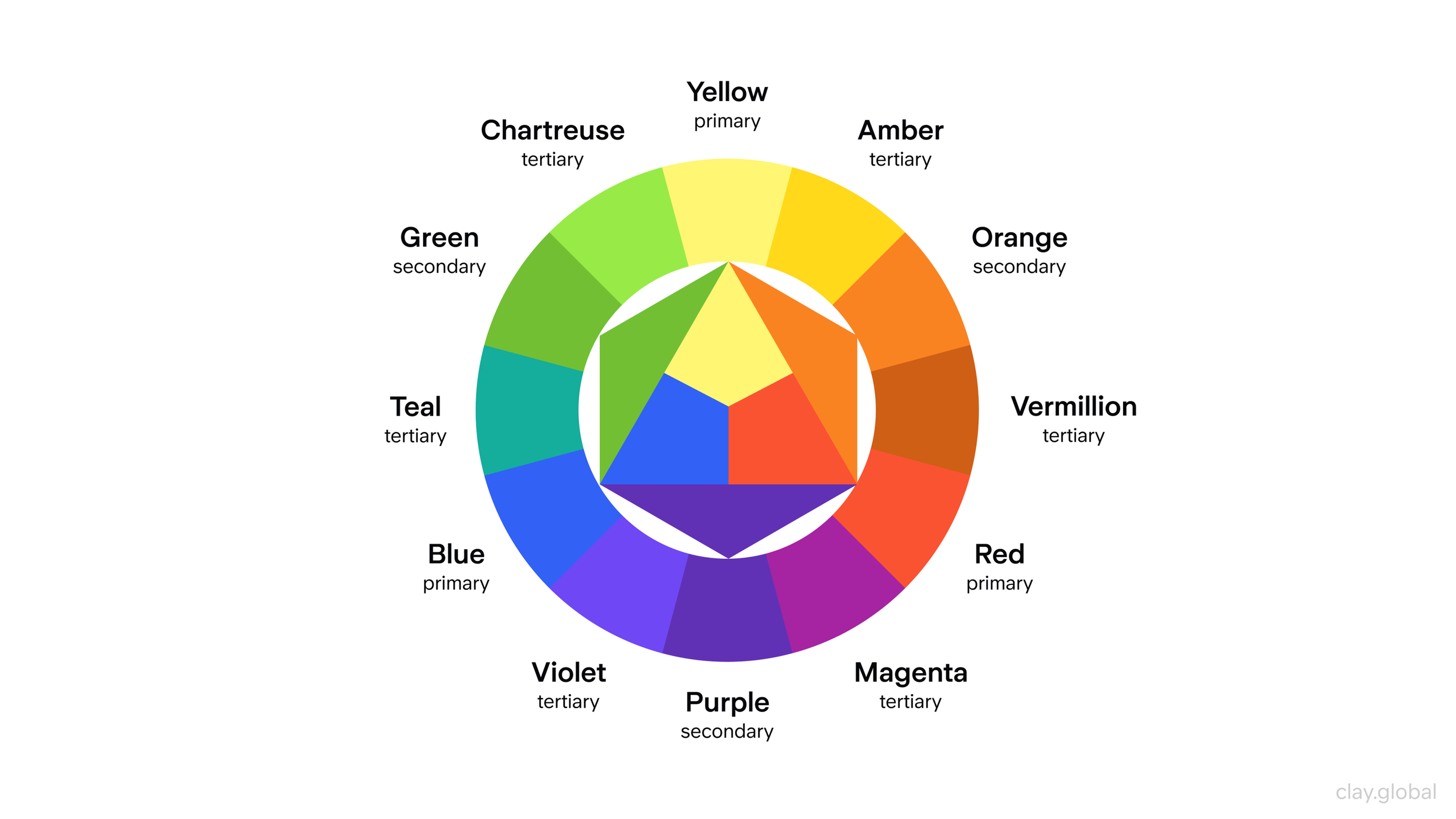
That single decision narrows your starting hue before you've made any technical choices. From there, the wheel's structural relationships (complementary, analogous, triadic) give you the framework for everything else, covered in detail below.
Saturation is your volume knob. High saturation for anything that needs to be noticed. Lower saturation for backgrounds and secondary content. That contrast in intensity does more to create hierarchy across interface elements than size or weight alone.
Primary Colors vs Secondary Colors
Primaries carry more visual weight and tend to dominate bold brand identities. Secondaries are more approachable. Used alongside primaries, they soften the palette and give it room to breathe.
Color Harmony
Color harmony is the condition where every color earns its place. Every element that needs attention gets it, and every supporting element stays in the background.
Four principles govern it:
- Balance distributes visual weight so no single element overwhelms. A large neutral block can offset a small saturated accent.
- Contrast tells the eye what to look at first and helps create website navigation that feels instinctive rather than learned.
- Emphasis elevates CTAs and key headlines, while warm colors naturally pull the focus.
- Unity ensures the palette looks deliberate rather than assembled by accident.
The fastest path to all four is to commit to a scheme type and vary within it. The palettes that stick in memory are rarely the obvious ones.
Types of Color Schemes
Monochromatic Color Scheme
One hue, varied across tints, shades, and tones. The most controlled scheme available, elegant and low-risk.
Monochromatic Colors

The challenge is generating enough variation to establish hierarchy without everything blending together. Typographic contrast and near-white/near-black tones carry most of that load.
Complementary Color Scheme
Two colors from opposite sides of the wheel. Maximum contrast and energy, but exhausting at equal weight.
Complementary Colors
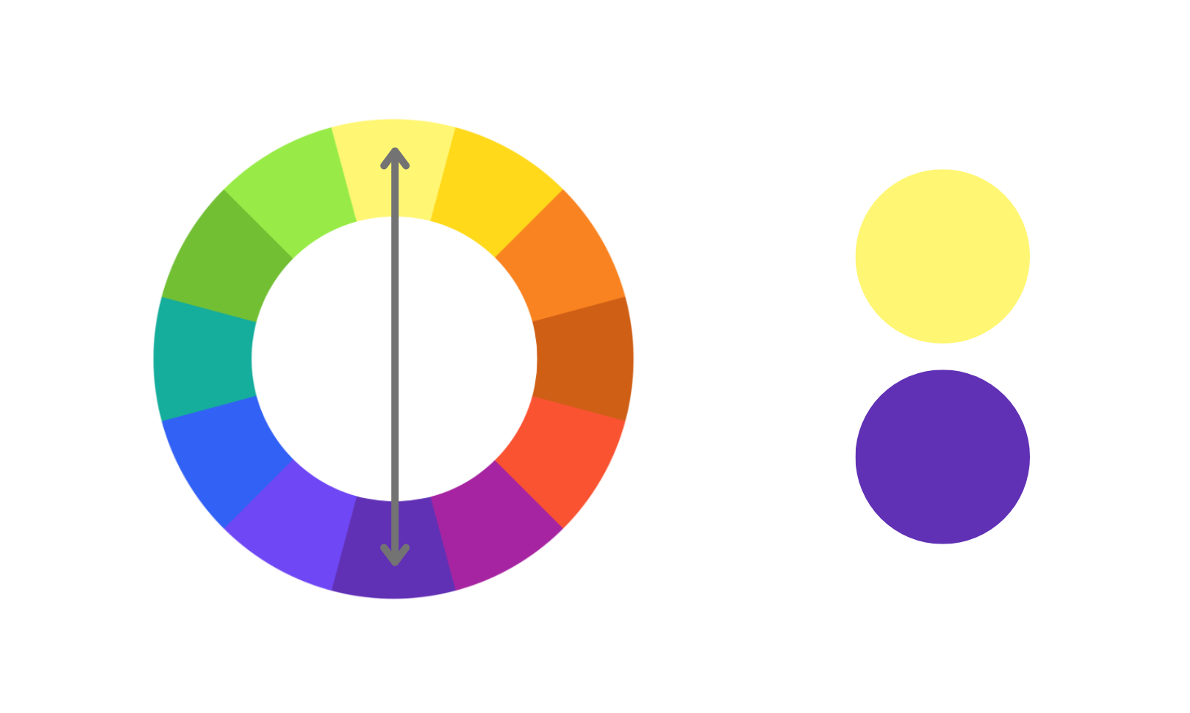
Let one color hold 70-80% of the palette and use the complement as an accent. Neutrals between them prevent the optical vibration that happens when saturated complements sit directly adjacent.
Analogous Color Scheme
Three or four neighboring hues. Naturally cohesive, which makes analogous schemes popular wherever comfort matters more than provocation.
Analogous Colors
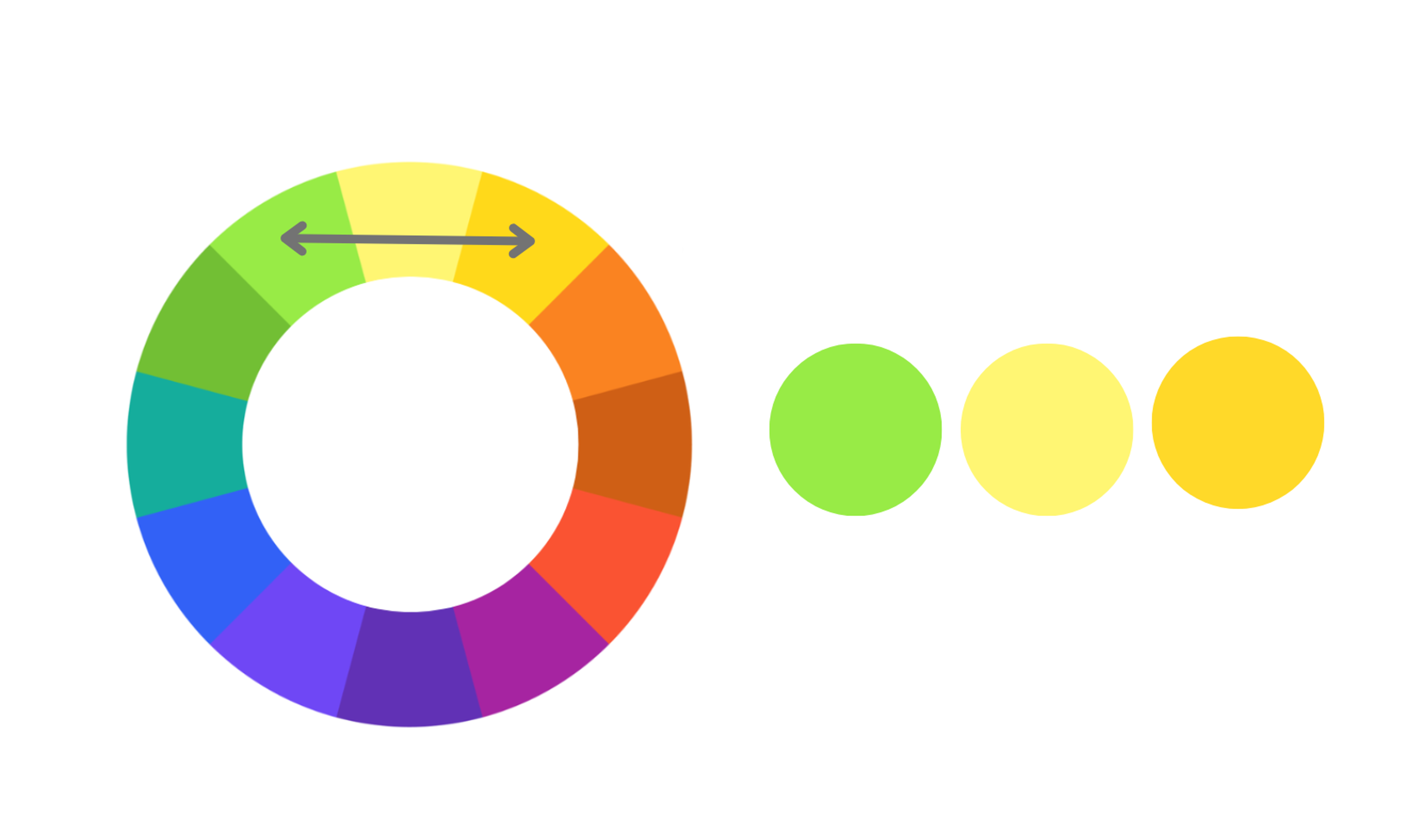
The risk is monotony. Varying saturation and lightness within the range keeps it from going flat. Analogous palettes are a reliable foundation for intuitive interfaces because the eye moves through them without resistance.
Triadic Color Scheme
Three hues equidistant on the wheel. Lively and balanced, but harder to control than analogous.
Triadic Colors
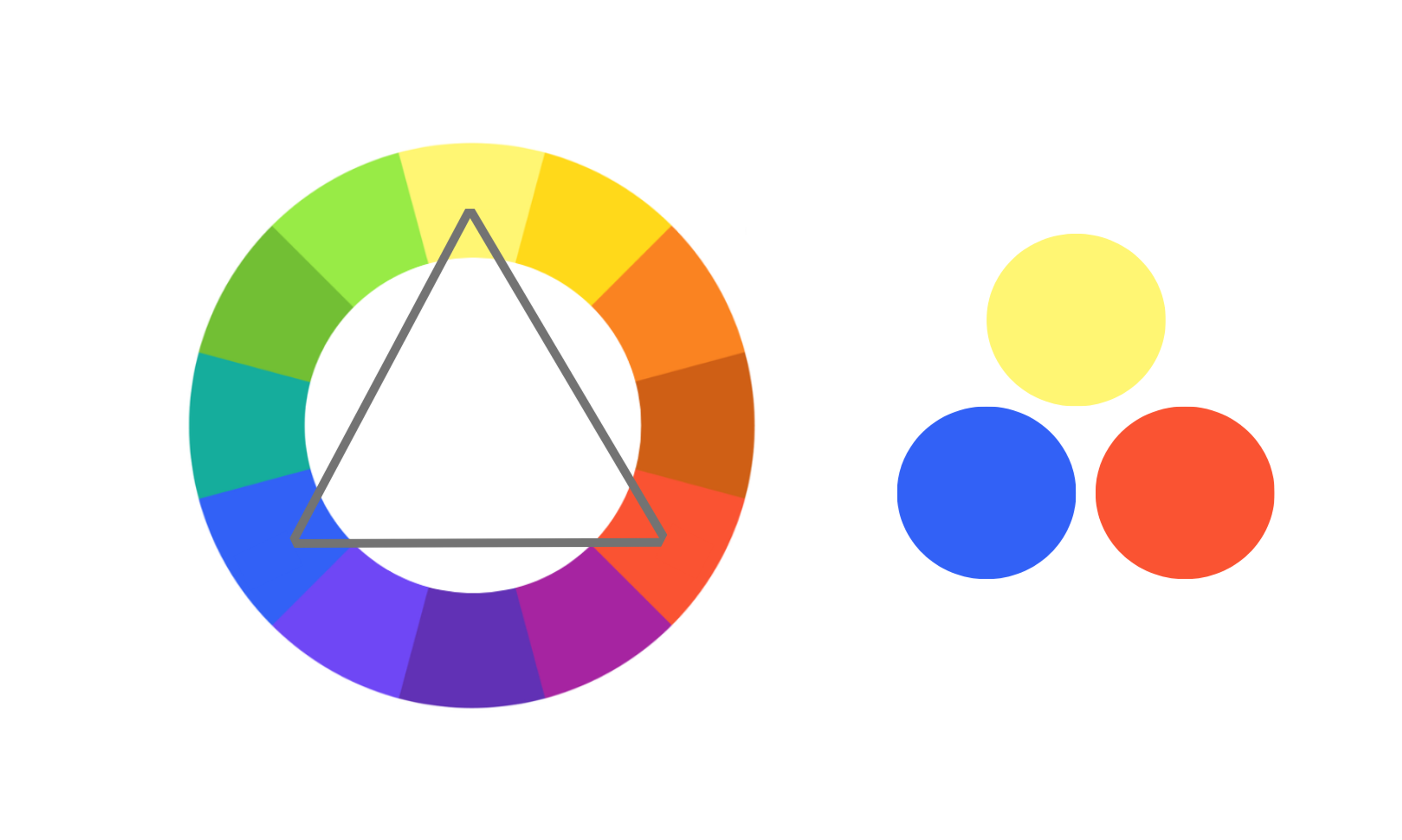
A triadic scheme works best when one color leads at roughly 60%, one supports at roughly 30%, and one accent at roughly 10%. That hierarchy is what keeps a triadic palette feeling controlled.
Tetradic Color Scheme
Four colors arranged as two complementary pairs. Real variety and depth, but it demands tonal discipline.
Tetradic Colors
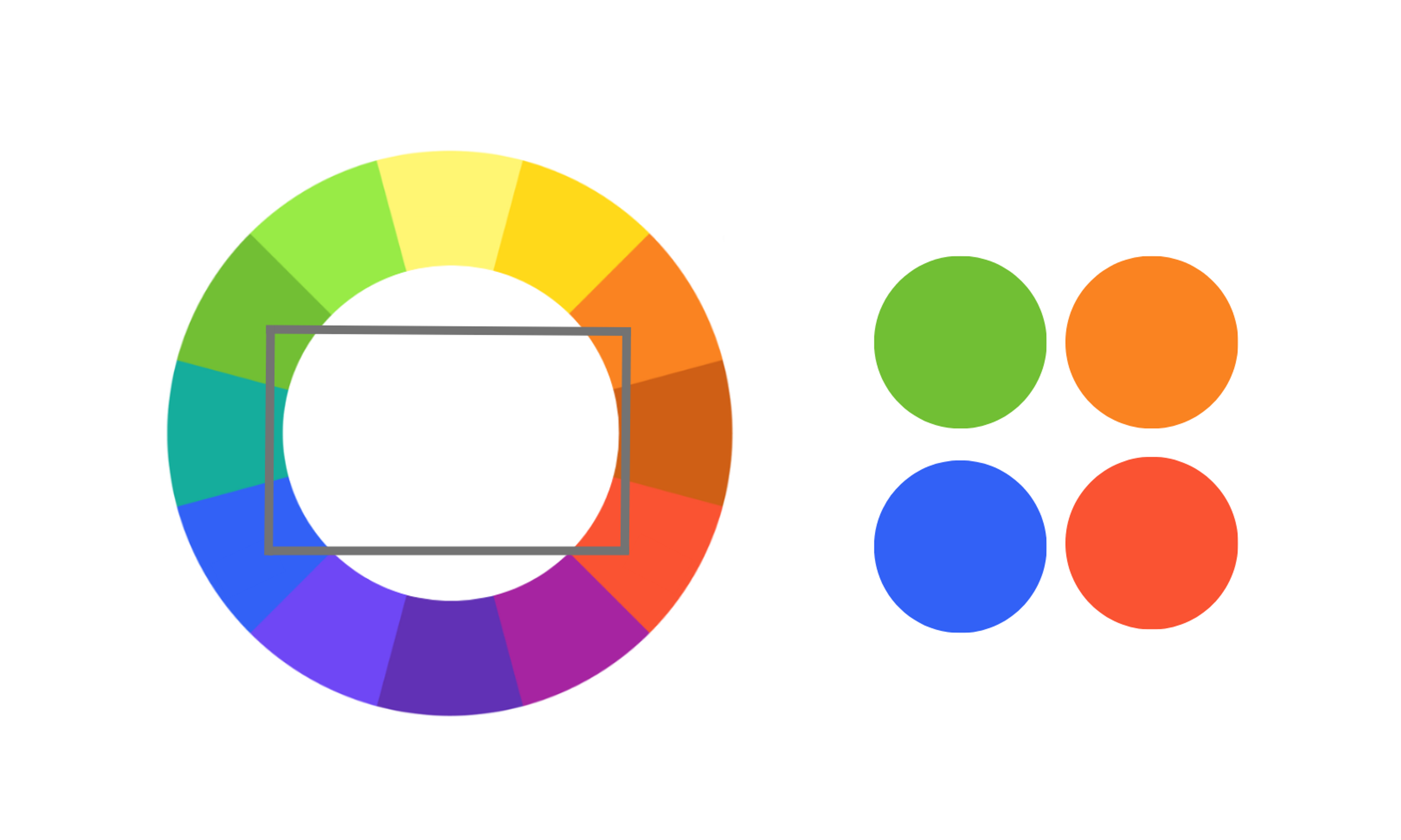
Choose one dominant color, keep the others restrained, use neutrals liberally. Tetradic schemes suit structured layouts where each section can carry its own color without collision.
How Different Colors Trigger Emotions
Color associations are real but conditional.
- Blue is the global default for trust. It dominates finance and technology branding precisely because it holds up across so many different contexts.
- Red signals urgency and lands naturally in warning states.
- Yellow skews warm but can tip into caution depending on what surrounds it.
- Green reads as permission.
- Purple holds its associations with luxury and creativity.
- Orange, sitting between red and yellow, comes across as friendly without the edge.
These associations aren't universal. Cultural context shifts color meaning significantly. International audiences require palette decisions grounded in their specific markets, not solely in Western conventions.
Tiffany & Co.
Tiffany & Co. builds its web presence around a monochromatic scheme using different shades of its iconic Tiffany Blue. The result is an elegant, exclusive feel that carries consistently from the homepage to product pages.
Tiffany & Co.’s Color Scheme

Fanta
Fanta's dedicated web page and digital campaigns lean on orange and blue as two complementary colors to drive visual impact. The contrast between these two vibrant hues catches the eye immediately and keeps the energy high across every touchpoint.
Fanta’s Color Scheme

Subway
Subway's web design uses an analogous scheme built on green and yellow, two neighboring hues that read as fresh and natural. The palette reinforces their focus on healthy eating purely through color.
Subway’s Color Scheme

Phenom
Our design for Phenom’s website effectively uses vibrant shades of blue to convey a trustworthy, dependable brand image. The coolness of blue provides a relaxing feel for users, making the site both inviting and professional.
Phenom Website by Clay
By increasing the saturation, the design ensures the blue appears lively and dynamic, avoiding a pale or sad tone. This strategic use of blue demonstrates how color can enhance user experience and reinforce brand perception, making the website both aesthetically pleasing and emotionally engaging.
At Clay Global, we build color systems grounded in strategy, accessibility, and brand intent. Learn more about us here.
What Are the Three Systems of Colors that Designers Use?
The medium determines the color model.
- RGB (Red, Green, Blue) blends red, green, and blue light at different intensities to produce a wide range of colors. It's based on light, which is why it's called an additive color model. The more light you add, the closer the result gets to white.
- CMYK (Cyan, Magenta, Yellow, Key/Black) is based on mixing four ink colors and works as a subtractive model. By absorbing light through cyan, magenta, yellow, and black inks, designers can create the rich colors seen in printed materials.
- HSL (Hue, Saturation, Lightness) is based on how we naturally see and think about colors. HSL looks at three things: Hue (the actual color), Saturation (how intense or faded the color is), and Lightness (how light or dark the color is). Designers often use HSL in digital tools because it’s an intuitive way to adjust and play around with colors without getting too technical.
What to Consider When Choosing Web Design Colors
Accessibility is no longer optional. 94.8% of the top one million homepages had accessibility errors, with low-contrast text as the most common issue, present on 79.1% of pages. Those errors have real consequences, and most websites are actively failing a significant portion of their users, including the estimated 300 million people globally with some form of color vision deficiency.
Color is one of the most studied topics in the user interface research process, and accessibility is where that knowledge matters most.
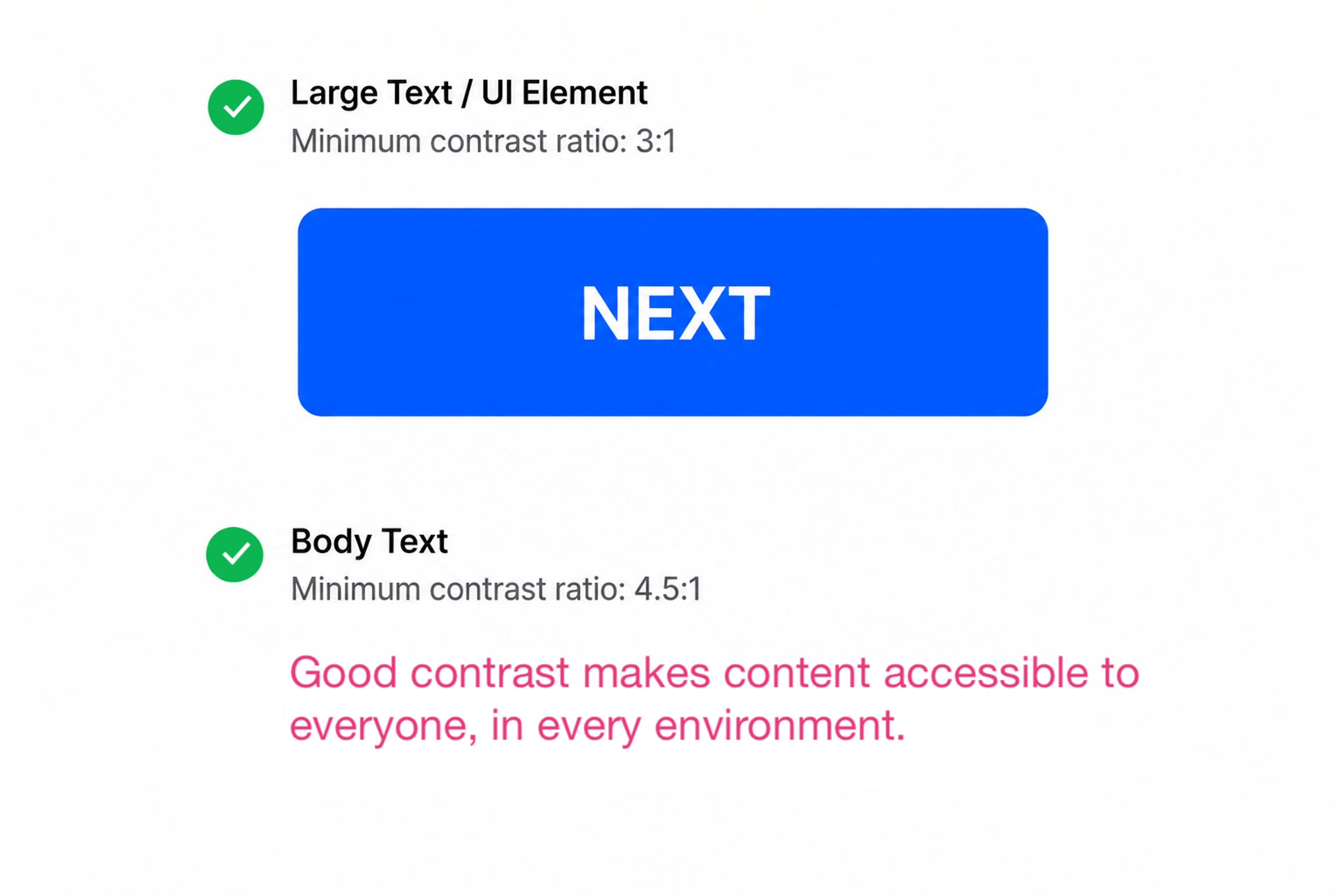
WCAG (Web Content Accessibility Guidelines) requires a contrast ratio of at least 4.5:1 between body text and its background, and 3:1 for large text. In plain terms, that means dark text on a light background or light text on a dark one, with enough difference between them that anyone can read it comfortably. These numbers are grounded in what users with low vision can actually see.
Accessibility Contrast
Emotional intent matters as much. Decide how you want visitors to feel before picking a single color. A fintech startup and a children's toy company can both use blue, but the surrounding palette will look completely different. One will feel serious and trustworthy, the other playful and warm. Contrast keeps key elements readable across every device and lighting condition.
Practical Tips for Using Colors Effectively in Website Design
- Limit your palette. Three to four primary hues is an effective ceiling for most projects. That constraint forces discipline and prevents the fragmented feel that comes from a palette assembled without a plan. Know what effect you're reaching for before picking colors.
- Test for dark mode. Dark mode is now a design expectation. Dark mode-first design is now specified in 30% of new web projects, up from just 8% in 2021. A color system that only works in light mode is incomplete.
- Treat white space as a color. Empty space elevates everything around it. Think of it as the neutral that makes the rest of the palette land.
- Use the 60-30-10 rule. As covered earlier, one dominant color covers roughly 60% of the layout, a secondary takes roughly 30%, and an accent covers roughly 10%. It creates natural reading flow without requiring strict grid enforcement.
- Check contrast before you ship. Run every color combination through a WCAG contrast checker or Figma's built-in checker in the Inspect panel before the design goes live. What looks readable on a calibrated studio monitor can fail badly on a phone screen in daylight.
- Pull your accent color from the dominant hue. A tint or shade of your main color often makes a more cohesive accent than a second hue introduced from elsewhere. The palette feels intentional rather than assembled from separate decisions.
- Borrow from the brand, then push. Start with the colors already established in the brand guidelines and identify where the palette feels underused. Small adjustments to saturation or lightness within the existing hues tend to land better than introducing something new.
Applications for Developing Color Palettes
The best palette tools remove the busywork without removing the judgment.
Adobe Color generates palettes based on harmony rules (complementary, analogous, triadic), exports HEX, RGB, and HSL values, and includes an accessibility checker.
Coolors.co is built for rapid iteration. Lock what works, regenerate everything else. The browser extension lets you pull palettes directly from live websites.
Khroma uses machine learning trained on your personal color preferences to generate curated suggestions. It's less about starting from scratch and more about zeroing in on a style you've already shown you like.
Eagle is built for asset management, keeping approved color assets organized across large visual libraries. AI palette tools grew fast between 2024 and 2026, driven by better suggestions and the pressure on design teams to move quickly.
Want a web design color palette that works as hard as your brand does? Let our team handle all the work. Get in touch.
Read more
- Slack Interactive Demo Website Design by Clay Global
FAQ
Does color choice affect a website's SEO rankings?
Color doesn't directly influence rankings, but it shapes the user signals that do.
Poor contrast and jarring palettes drive up bounce rates and cut dwell time, both of which signal low value to search engines.
Better color decisions move those metrics, which indirectly supports ranking.
What's the difference between a color scheme and a color palette?
A color scheme is the underlying structure (complementary, analogous, triadic).
A palette is the specific colors you pick within it. Scheme is the plan, palette is what users actually see.
How do I choose a color palette for a brand I'm designing from scratch?
Start with the feeling the brand needs to own, not the aesthetic you personally like. Ask what the audience should feel and whether the brand skews warm or cool. Use those answers to pick a base hue and build from there.
Should I design dark mode separately, or handle it within the same palette system?
Treat dark mode as a first-class context, not an afterthought.
Colors that work in light mode can become aggressive or disappear entirely against a dark background.
CSS custom properties and design token systems make it practical to manage both within a single coherent palette system.
How many colors should a website use?
Three to four hues is a reliable ceiling, and most web design principles point to the same number. One dominant, one secondary, one accent, and typically a neutral.
A broader palette is possible but requires clear system rules. More colors create more decisions that can go wrong.
Does the color of a CTA button affect conversion rate?
Yes, but the specific hue matters less than contrast. A high-contrast CTA that stands apart from the page will outperform a low-contrast one regardless of its color.
Context (surrounding colors, page intent, audience) determines what actually resonates.
Can ChatGPT do a color analysis?
Yes. ChatGPT can analyze colors from an uploaded image or from hex codes directly, and return suggestions in either format. For web design, you can feed it a brand image or your existing color values and ask for palette recommendations, harmony rules, or contrast suggestions.
How does color perception vary across cultures?
Significantly. In several East and South Asian cultures, white signals mourning, not purity. Red carries luck and celebration in China, but reads as danger elsewhere. Green lands positively across most Western markets yet carries negative associations in parts of Latin America and the Middle East.
Any site targeting international audiences needs its palette checked against those specific cultural contexts.
What is the easiest color scheme to start with?
Monochromatic is the safest starting point. Pick one color you feel confident about, then build the palette using lighter and darker versions of it.
There are far fewer decisions to make and far less that can go wrong. Once that feels comfortable, analogous schemes are a natural next step. Neighboring colors on the wheel tend to work well together, leaving little room for bad combinations.
How do I avoid color banding in gradients on the web?
Color banding happens when there aren't enough color values to produce a smooth shift, typically in low-saturation areas or where lightness values are too similar.
To minimize it, add subtle noise to the gradient layer and test across display types, since cheaper panels are more prone to banding.
Final Thoughts
Color theory gives you a framework. What you do with it depends on knowing what you need the design to do.
The final objective is a design that earns trust. Color is how you get there.

About Clay
Clay is a UI/UX design & branding agency in San Francisco. We team up with startups and leading brands to create transformative digital experience. Clients: Facebook, Slack, Google, Amazon, Credit Karma, Zenefits, etc.
Learn moreAbout Clay
Clay is a UI/UX design & branding agency in San Francisco. We team up with startups and leading brands to create transformative digital experience. Clients: Facebook, Slack, Google, Amazon, Credit Karma, Zenefits, etc.
Learn more