Art Bridges is one of our proudest achievements, and we’re excited to share how it has earned recognition from some of the most prestigious platforms, including Awwwards, The FWA, and the CSS Design Awards. These accolades reflect the creativity, hard work, and passion that went into making the project truly special.
But beyond the awards, what made Art Bridges stand out? Through the lens of Dmitry Tsozik and Aleksandr Ratasep, our two awesome Design Leads, we uncover the processes, challenges, and creative decisions that shaped the Art Bridges website.
Designing Around the Artwork
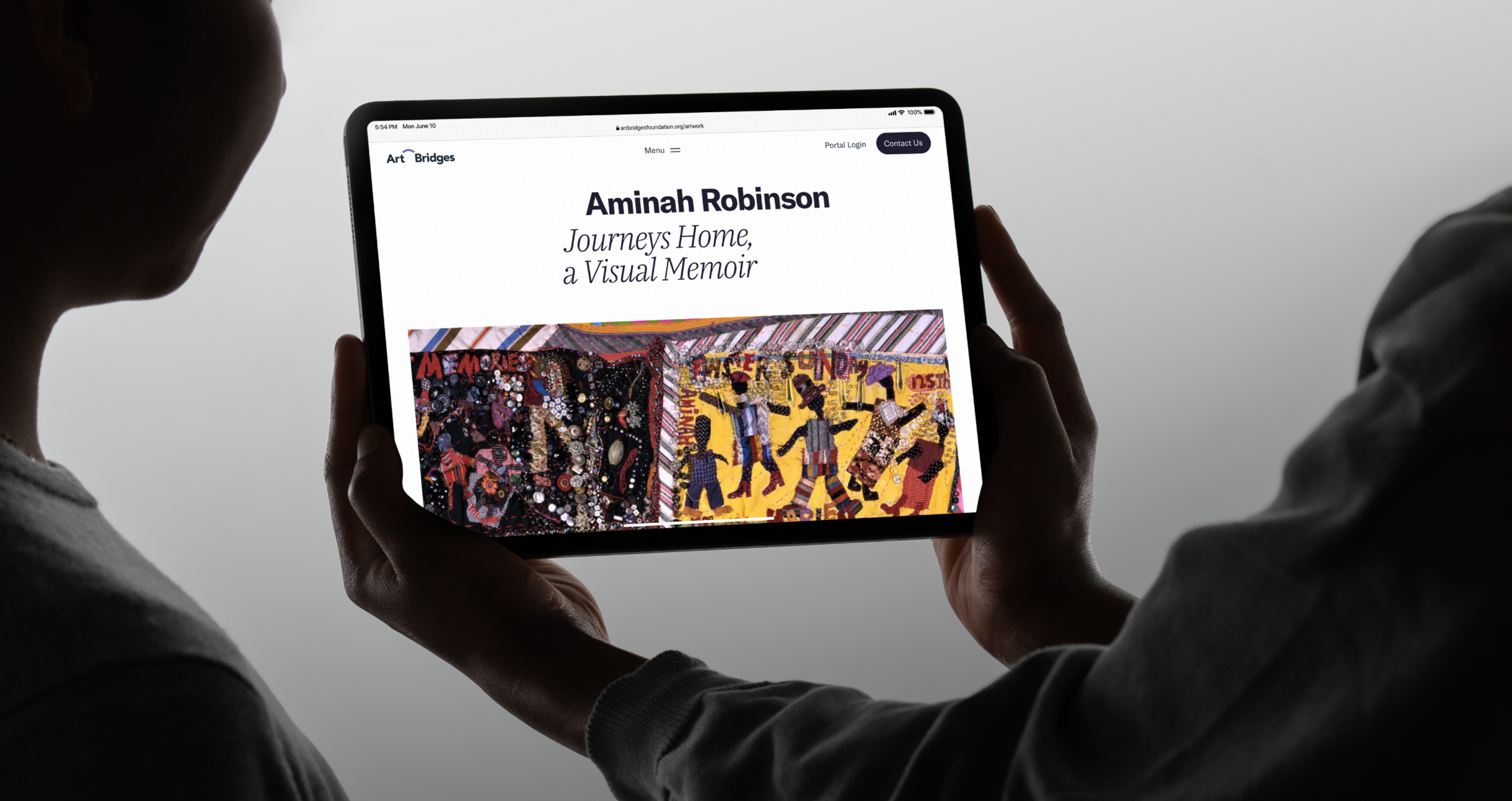
From the very beginning, Art Bridges has always been about one thing: the artwork.
The idea was simple but powerful — ‘artwork first.’ We knew that the design had to highlight the art and create the right context for it. Everything else needed to support that vision.
Instead of drawing from typical web design references, the team looked to the physical world of museums for inspiration. “We focused on things like catalogs, brochures, and exhibition spaces — where the artwork was the star,” Aleksandr explains.
Art Bridges Website by Clay
The first weeks often involve a lot of technical discussions and wireframe work, which can be quite abstract. However, because of the strong relationship and open communication with Art Bridges, any necessary pivots were always grounded in constructive, joint discussions.
This “artwork first” mindset influenced every design detail, from layout choices to the user interface. The goal was clear: to ensure that the artwork would always be the focal point while still helping the foundation achieve its goals.
It was one of the reasons why Awwwards highlighted Art Bridges for its cutting-edge design and seamless user experience. We even got an Honorable nomination!
Known for setting high standards in the industry, Awwwards praised the balance we achieved between modern artistry and accessibility. The project brings together visual design and functionality in a way that feels both beautiful and intuitive. It's a true reflection of our team's commitment to creating designs that are as accessible as they are visually striking.
Typography: More Than Just Fonts
Selecting the right typography was another critical decision in the design process. The team chose a combination of serif and sans-serif fonts to create contrast and harmony. Aleksandr explains,
The fonts needed to reflect the foundation’s values — connection, partnership, and clarity. It’s about creating a balance between the modern and the classic, just like how Art Bridges connects museums and artists across time and space.
The result is a pair of beautiful fonts that serve a functional purpose: they make the site easy to read while maintaining a sense of sophistication. This was a deliberate choice to ensure the content didn’t compete with the art but complemented it.
One of the recognitions came from the CSS Design Awards, which celebrated Art Bridges for its user-centric design and its focus on accessibility.
As Dmitry shared,
Subtle animations and moments of surprise throughout the design kept the user experience engaging. At the same time, we had to keep accessibility and usability front of mind.
Art Bridges Card by Clay

We’ve always believed that great design isn’t just about looking good — it’s about making sure everyone can interact with it. The CSS Design Awards highlighted how our design choices allowed the website to not only be visually captivating but also functional and inclusive.
Balancing Beauty with Purpose
One of the most important goals was to create a design that didn’t just showcase art but also communicated the foundation’s mission.
From the start, we knew that the website had to be a tool for the foundation's programs. We structured the content to help visitors easily navigate through the site and learn about Art Bridges’ work — whether they were looking to rent artwork, organize an exhibition, or explore the collection.
The balance between aesthetics and functionality was key. “We needed to build trust and engagement with users. The gallery, in particular, had to be immersive, while the program pages had to provide clear, actionable steps,” Aleksandr says. Thoughtful content distribution ensured that visitors could easily find the information they needed without feeling overwhelmed.
Art Bridges is not simply an online gallery, but rather a tool that prioritizes functionality and accessibility over digital reproductions.
Art Bridges also caught the eye of The FWA, a platform that celebrates the best in digital innovation. The project stood out for its unique combination of artistic design and technological excellence, breaking new ground in how we think about digital experiences. The team’s creative approach brought a sense of wonder and engagement while still delivering a site that’s easy to navigate and accessible to all.
In addition, Mindsparkle also recognized Art Bridges for its innovative and visually striking design. It was described as a perfect blend of artistic expression and digital sophistication. Mindsparkle acknowledged how the project makes the art world more accessible to users, offering a seamless and immersive experience.
Homepage That Feels Like a Gallery
One site feature that Aleksandr particularly loves is the homepage slider, which showcases the artwork right from the start.
We wanted visitors to feel like they were walking into a gallery. As soon as they land on the page, they see the best works. The smooth transitions and responsive design ensure the artwork is always presented in the best possible way, whether you're on a phone, tablet, or desktop.
It was all about creating a clean, tranquil space for exploration — one that mirrored the feeling of moving through a gallery, where each piece commands attention.
Art Bridges Homepage by Clay
CSS Winner also recognized Art Bridges for its meticulous design and user experience. The project’s clean aesthetic and detailed attention to interactive elements were key in earning this accolade. It’s always about getting the little things right — whether it’s animation, transitions, or the overall flow of the site — that make a design truly unforgettable.
We worked closely with the team at Art Bridges to examine the content structure of every page, ensuring that each sentence, statement, and visual element aligns with the overall mission. We focused on how design, content, and animation could work together to inspire action and bring the mission to life.
We were excited to see Orpetron highlight Art Bridges for its creative use of digital art. The platform noted how we combined cutting-edge technology with artistic flair, creating a visually stunning, interactive, and engaging experience. Art Bridges demonstrates how the digital world can bring art to life, inviting users to explore the creative process from a fresh perspective.
Future Growth for Art Bridges
What’s exciting about Art Bridges is that it’s built to evolve. The site’s modular design allows us to easily update and add content as the foundation's needs grow. As new priorities emerge, the visual principles we established — like clean, open space and a focus on the artwork — will continue to guide the site's evolution. This ensures that Art Bridges stays fresh, dynamic, and true to its mission for years to come.
The collaboration between design and development teams was key in maximizing efficiency. For example, we worked closely on animations and found ways to create an elevated user experience using relatively simple techniques. Instead of opting for more complex animations, we refined a few key elements to add dynamism without overwhelming the site. It was a challenge, but one that pushed us to think outside the box.
Finally, Abduzeedo took a deep dive into how Art Bridges pushes the envelope in terms of accessibility and creative design. The project’s success lies in balancing complex design elements with an accessible, user-first approach. Abduzeedo’s feature emphasized how we’ve redefined the role of accessibility in the design world, making sure that beauty and usability go hand in hand.
Read More
Final Thoughts
Art Bridges is a testament to what happens when thoughtful design, user-centric thinking, and a passion for art come together. The project’s success lies in its ability to balance beauty and functionality, creating an experience that is not only visually stunning but also accessible and purposeful.
As we continue to evolve the site, we’re proud to know that Art Bridges has impacted the art world and will continue to inspire creativity for years to come.

About Clay
Clay is a UI/UX design & branding agency in San Francisco. We team up with startups and leading brands to create transformative digital experience. Clients: Facebook, Slack, Google, Amazon, Credit Karma, Zenefits, etc.
Learn moreAbout Clay
Clay is a UI/UX design & branding agency in San Francisco. We team up with startups and leading brands to create transformative digital experience. Clients: Facebook, Slack, Google, Amazon, Credit Karma, Zenefits, etc.
Learn more