Clay partnered with Grayscale, a leader in cryptocurrency investment, to give the website a fresh, user-centered look. Grayscale wanted a site that could engage both traditional finance professionals and crypto enthusiasts, presenting them as a trusted bridge between these worlds.
We had the chance to sit down with our Design Director, Olga Mikhailenko, and Head of Design, Dmitry Tsozik, to dive into the creative journey behind recent redesign of Grayscale’s website. In our conversation, Olga and Dima shared the vision, design decisions, and thoughtful details that brought this project to life. Dive in!
What Was the Main Challenge of Redesigning Grayscale’s Website?
Apart from creating the general corporate website, our scope included individual landing pages for Grayscale products that are unique to the market. To ensure the product pages stand out from the main website experience, we proceeded with a restrained color palette for the general pages and an extended palette for all products.
From the start, our challenge was to capture Grayscale's unique identity in a digital space, making it feel familiar yet innovative. Olga emphasized that the new website should showcase Grayscale’s unique position at the intersection of traditional finance and crypto. We aimed for a design that felt modern yet approachable, striking a chord of trust without becoming overly complicated.
Grayscale Website by Clay
We leaned into a minimalist style, with thin outlines, precise placements, and a unified color palette to create a sense of stability and sophistication.
“Accent headlines and a bold animated brand pattern” added an energetic touch, while subtle adjustments ensured the site was accessible across all devices without sacrificing aesthetics.
Product-Specific Experiences
Our scope extended beyond Grayscale’s primary website, creating individual landing pages for each of Grayscale’s product offerings. We used distinct color schemes for each product, allowing them to stand out while remaining cohesive with the main site. Olga mentioned that each product page was color-coded to have a unique theme.
Take the Grayscale Dynamic Income Fund (GDIF) page, for example. It utilizes a distinct color scheme that sets it apart from other product pages. This deliberate use of unique color themes for each product page not only aligns with Grayscale's overarching brand identity but also enhances user navigation by providing clear visual cues.
GDIF Page

This allowed each product to shine uniquely while the core site design remained sleek and minimalist. The tailored approach helped distinguish Grayscale’s unique investment products, making it easy for users to explore offerings aligned with their interests.
Blending Simplicity and Functionality
Our primary goal was to craft a web experience that exudes simplicity and power, resonating with Grayscale’s diverse audience. While competitors dive headfirst into flashy, futuristic designs, we chose to keep Grayscale grounded and authentic.
What Was Your Approach to Designing Micro-interactions on the Grayscale Website?
Grayscale, by nature, is the closest crypto can get to traditional finance in terms of trustworthiness and reliability. So, we strived to come up with a minimalist approach that builds trust and looks grounded.
We opted for a refined design to bolster this credibility, steering clear of excessive animations. Instead, we embraced simple yet purposeful transitions that introduced a touch of dynamism without overwhelming our users.
Grayscale Website Pages

For instance, we animated the logo with folding triangles symbolizing shares, echoing Grayscale’s mission to democratize financial access. Slow-moving ticker animations evoked the classic Wall Street feel, keeping the experience grounded while still engaging. Additionally, understated hover effects complemented the brand’s sleek visual style, ensuring functionality remained at the forefront.
What Sets Grayscale’s Site Apart from Competitors?
Unlike competitors who may lean heavily into futuristic or ‘crypto-hackers’ designs, Grayscale's site stays grounded with a modern aesthetic that’s familiar yet innovative. The minimalistic approach combined with carefully curated animations enhances usability and reinforces a sense of stability and trust. By balancing clarity with sophisticated design elements, we created an intuitive and engaging experience without overwhelming users.
Future-Ready and Modular Design
To ensure the site could evolve with Grayscale’s growth, we focused on a modular design that’s flexible and future-ready. Olga explained that the "navigation was redesigned to take up less space but remain functional."
Key components were crafted to work seamlessly across the main site and product-specific pages, making it easy to adapt as Grayscale’s offerings grow. Olga also noted that these components were designed to adjust to ever-changing information, which underscored our focus on keeping the site visually engaging and future-ready.
What Is One Aspect of the User Experience on the Grayscale Site that You Feel Particularly Proud of?
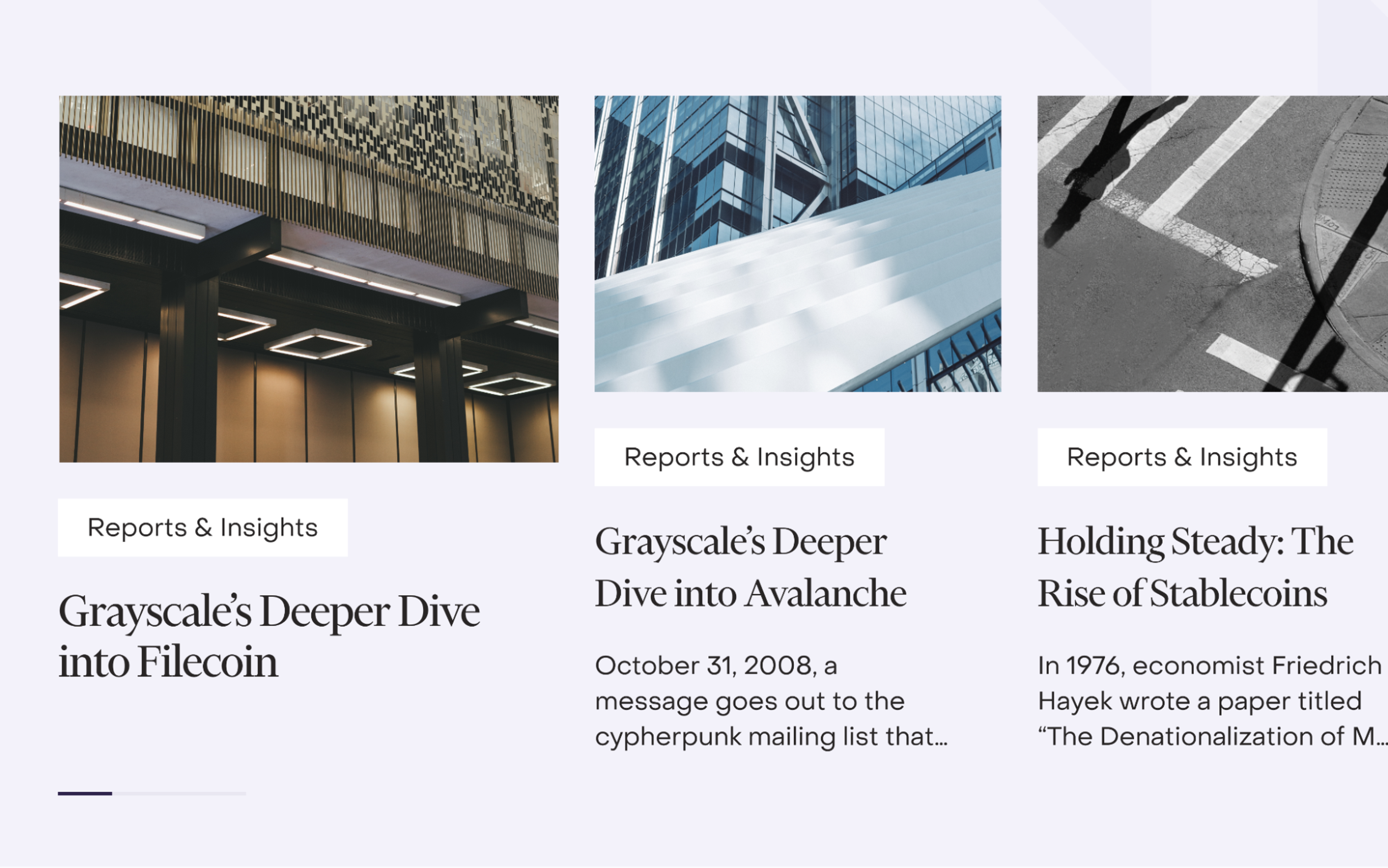
Grayscale actively shares information about crypto, so we created a dedicated section for the learning resources. Within it, we created several information streams — news, webinars, and articles. The Clay team crafted flexible modular layouts that cater to different formats of the cover images and marked all resource cards with clear tags to make learning structured, not scary.
An Educational and Accessible Resource Hub
We also helped Grayscale fulfill its commitment to crypto education by developing a comprehensive resource hub with news, webinars, and articles. Olga mentioned that the team crafted flexible modular layouts to accommodate different cover image formats and clearly tagged all resource cards, ensuring the hub was both structured and approachable.
Grayscale Resource Hub
Even data-heavy areas, like tables and lists, were designed with readability in mind, turning complex financial data into visually digestible content. Organizing the resources effectively made learning accessible and engaging for users of all backgrounds.
Read More
Conclusion
With a focus on simplicity, functionality, and future-readiness, we transformed Grayscale’s digital presence into a sleek, premium experience for traditional finance professionals and crypto enthusiasts.
This new design captures Grayscale’s dual identity as a stable, reliable leader and a forward-thinking innovator. The result is a unique, intuitive platform that positions Grayscale as a powerhouse in the crypto investment industry, setting a new standard for digital finance experiences. Check out the full case study on our website for more exciting details.

About Clay
Clay is a UI/UX design & branding agency in San Francisco. We team up with startups and leading brands to create transformative digital experience. Clients: Facebook, Slack, Google, Amazon, Credit Karma, Zenefits, etc.
Learn more

About Clay
Clay is a UI/UX design & branding agency in San Francisco. We team up with startups and leading brands to create transformative digital experience. Clients: Facebook, Slack, Google, Amazon, Credit Karma, Zenefits, etc.
Learn more