
Modern web design faces a contradiction. CSS has never been more powerful, yet styling production interfaces feels more demanding than ever. We need fluid layouts, accessible forms, dark mode, data-dense dashboards, and global design tokens. Meanwhile, product teams ship faster than ever.
A CSS framework comprises a collection of predesigned CSS stylesheets, components, and layout tools that streamline web development by providing ready-made solutions for common UI elements and consistent styling.
CSS frameworks still matter because they formalize how teams build. They are not a crutch. They have an agreement on spacing scales, typography defaults, component structure, and the path from design decisions to UI at a rapid pace. The right choice reduces decision fatigue and prevents style drift.
This article shows how to choose for your team, product, and constraints, and how to adopt without mess, making it essential for web development.
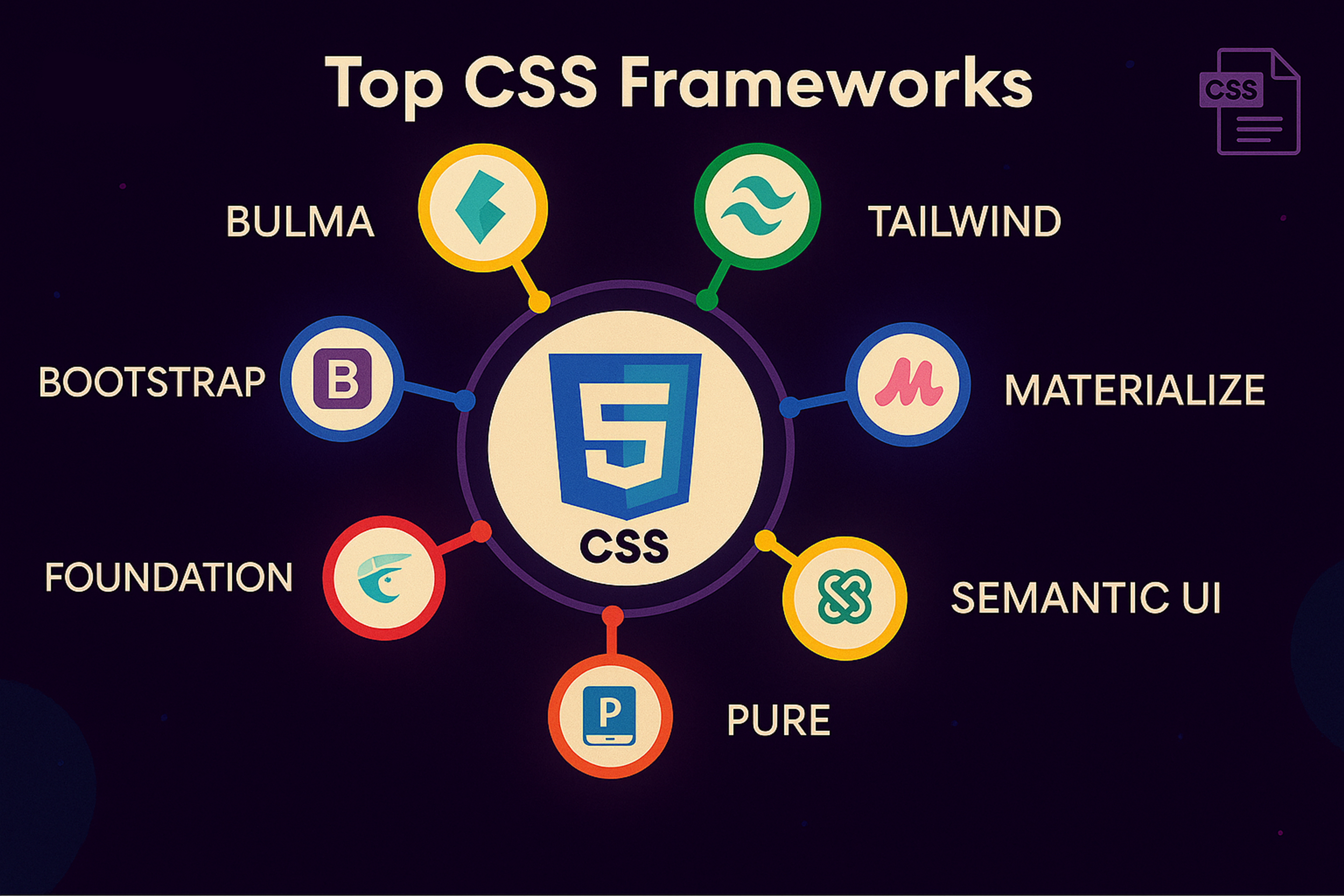
Top CSS Frameworks
What Modern Web Design Requires from CSS Frameworks
A modern UI scales. You need consistency, so the same button doesn't end up with five different paddings across your app. You need them because users expect dark mode. You need performance because CSS blocks rendering, and heavy stylesheets hurt startup time on real devices.
You need accessibility because an accessible UI is better. You need a toolchain fit because an awkward framework leaks complexity everywhere. You also need cross-browser compatibility to ensure your designs render and function reliably across all major browsers.
Most importantly, you need longevity. Your CSS framework will likely outlive the people who picked it. Most CSS frameworks are designed to support responsive websites and responsive web design, ensuring consistent experiences across devices and browsers.
When evaluating "top CSS frameworks," we're essentially asking how each option meets these requirements.
How to Choose a CSS Framework
Before we list anything, decide what you’re optimizing for. Most teams fail here. They pick based on popularity, then wonder why it clashes with their workflow. Choosing the proper CSS framework is essential - consider your project’s requirements and your team’s experience to ensure the best fit.
Understanding how to choose the proper CSS framework for your project is crucial. Consider approach, customization, community support, and compatibility to ensure it fits your needs. Extensive documentation and strong community support are also vital, as they make learning and troubleshooting much easier.
While it’s essential to evaluate multiple frameworks, focus on selecting the proper CSS framework for your needs rather than combining several, as using more than one can lead to unnecessary complexity and conflicts. Extensive customization is another key factor.
Some frameworks offer more flexibility in tailoring styles and components than others. Additionally, keep in mind that the learning curve varies between frameworks, which can impact how quickly new developers can adopt them.
So, here is the top:
1. Тailwind CSS
Tailwind is a utility-first framework known for its highly composable, atomic classes. It lets you “rapidly build modern websites without ever leaving your HTML”. Instead of pre-styled components, Tailwind provides low-level utility classes (such as flex, mt-4, and text-center) that can be combined to create any design.
This enforces consistent design tokens (colors, spacing, fonts) via its configuration. Tailwind’s on-demand JIT engine (especially in v4) generates only the CSS you use, keeping bundles small. It excels for large multi-page apps or dashboards where developers need fine-grained control.
Tailwind CSS
Everyone shares the same vocabulary of utility classes, ensuring that spacing and typography remain uniform across the UI. Tailwind is also mobile-first and features built-in dark mode support, making it easy to apply responsive and theme variations directly in the markup.
2. StyleX
StyleX is a new, statically compiled styling system developed by Meta (formerly Facebook). It is “an expressive, deterministic, reliable, and scalable styling system” that blends CSS-in-JS with static atomic CSS.
In practice, you write style objects or tagged templates in your React components, and a Babel plugin transforms them at compile time into atomic CSS class names. StyleX avoids runtime style injection and specificity wars. It ensures that the generated CSS contains no conflicting rules.
This yields a fast, predictable output even in huge codebases (the CSS bundle size tends to plateau as the app grows). StyleX is fully type-safe (TypeScript checks styles) and supports merging styles across files or components, which is useful when building design-system libraries.
It’s designed for ambitious applications that need both developer ergonomics and minimal runtime CSS overhead.
3. Radix UI
Radix UI is an open-source component primitives library focused on accessibility and ease of use. It provides unstyled, headless components (e.g., Dialog, Dropdown, Slider) that implement correct ARIA attributes and interaction patterns out of the box.
As the Radix site puts it, it’s “optimized for fast development, easy maintenance, and accessibility” – you can “just import and go - no configuration required”. Because Radix components have minimal styling by default, you pair them with your own CSS or utility classes.
This design makes Radix ideal when you want strong accessibility guarantees but also complete control over visual design. Teams often use Radix in conjunction with CSS-in-JS or utility frameworks (such as Tailwind) to rapidly build custom-styled components without handling the low-level accessibility details themselves.
Radix UI

4. Tokenami
Tokenami is a modern CSS-in-JS toolkit designed for type-safe design systems. It bills itself as “CSS-in-JS reinvented for type-safe design systems”. Tokenami’s key idea is to use atomic CSS custom properties (CSS variables) instead of many utility classes.
In Tokenami, you define design tokens and style objects in TypeScript, and it outputs static CSS with variables at build time. There is no runtime-style injection – dynamic values are applied via inline styles or variables, thereby avoiding typical runtime costs.
This approach provides developers with the benefits of CSS-in-JS (component co-location, theming, and type-checked tokens) alongside the performance of plain CSS.
In effect, Tokenami bridges utility-first and CSS-in-JS paradigms: you get consistent, token-driven styling with zero-runtime costs, and markup stays clean since each component uses its unique class name
5. Base UI
Base UI is an unstyled React component library for building accessible UIs. From the creators of Radix (and used within companies like Paper and GitHub), it offers a set of fundamental components (buttons, inputs, dialogs, etc.) that have no enforced style – hence “unstyled UI components”.
The library emphasizes composability and consistent accessibility patterns. You can pair Base UI with any styling method (CSS-in-JS, utility classes, plain CSS), because it doesn’t dictate look and feel.
It only provides structure and behavior. For example, you could use Base UI with Tailwind or your own theme to implement the visual design. This makes Base UI a solid foundation for a custom design system, as it ensures accessible defaults while allowing developers to make the UI distinctive and brand-specific.
Base UI
6. Pigment CSS
Pigment CSS is a new CSS-in-JS engine from the Material-UI (MUI) team. It is a “zero-runtime” styling library that extracts styles at build time. In practice, you write styles in a familiar API (such as CSS or Styled), but Pigment compiles them into static CSS files during your build (for example, in Next.js or Vite).
This makes it fully compatible with React Server Components and dramatically reduces runtime overhead. Pigment aims to combine the ease of writing JS-style code with the performance of plain CSS – you get colocation and theming just like other CSS-in-JS, but with none of the style-injection slowdown.
Since it’s still in its early stages, MUI promotes Pigment for new projects that want scoped, component-level styles without the usual runtime costs.
7. Shadcn/UI
Shadcn UI (often written shadcn/ui) is an open-source React component collection designed as a “foundation for your design system.” It provides ready-made, accessible components built with Radix primitives and Tailwind CSS styling.
You can scaffold a new project using the shadcn CLI, which allows you to select from various templates, including dialogs, tables, forms, and more. The key idea is full code ownership: every component’s source code is in your repo, so you can tweak markup or replace Tailwind classes with your own styles.
This makes shadcn/ui ideal for teams that want a jumpstart on a design system but need to adapt the look & feel. Its components are “beautifully designed” by default, yet since they are open source and minimally opinionated, you remain in control of theming and implementation.
Shadcn

8. Bootstrap
Bootstrap is a classic front-end toolkit that remains widely used, especially for rapid prototyping or internal tools. It is a mobile-first CSS (and JS) framework with a robust 12-column grid, form controls, buttons, navbars, and many other components out of the box.
As the Bootstrap site emphasizes, you can “build fast, responsive sites with Bootstrap” using its Sass-driven customization and extensive prebuilt UI elements. Bootstrap v5 is the current major version, and it has strong documentation and a predictable upgrade path.
While some consider it less trendy than utility-first frameworks, it “remains the fastest path to a professional and predictable UI” when you need common patterns (forms, modals, carousels) quickly.
Teams often pick Bootstrap for admin dashboards or marketing pages because it works reliably with minimal setup and has broad browser support.
9. Chakra UI
Chakra UI is a modern React component library focused on developer speed and accessibility. It describes itself as “a component system for building products with speed” and provides accessible, themeable components by default.
Chakra’s building blocks (buttons, form elements, layout primitives) come with sensible defaults and support dark mode out-of-the-box. It uses a props-based styling approach (via Styled System) and a design-token theme (colors, fonts, spaces) that you can customize.
Because its components are engineered for proper focus states and ARIA attributes, you get a high-quality baseline accessibility. The result is that teams can quickly build UIs with a consistent look and feel, while still having the freedom to adjust the theme.
Chakra UI is popular among startups and enterprises alike, thanks to its balance of flexibility, ease of use, and built-in design system features.
Chakra UI

10. Material UI (MUI)
Material UI (MUI) is a comprehensive React framework that implements Google’s Material Design system. It offers hundreds of components (cards, buttons, menus, dialogs, icons, etc.) styled according to Material guidelines.
MUI components are production-ready out of the box, and the library includes advanced components like data grids, pickers, and layout tools. Importantly, MUI offers extensive theming and customization options, allowing you to override styles, define design tokens, and even switch to its unstyled counterparts (Base UI) if needed.
With a large contributor base (thousands of developers) and many organizations using it, MUI is a battle-tested choice for building user interfaces. It is beneficial if you want Material Design aesthetics by default or need a broad set of well-documented React UI components.
How to Make any Framework Succeed
Choosing a framework is a beginning, not a solution. Most teams run into trouble because they skip conventions.
Step 1: Define Tokens Before You Define Components
Even if you do not call them "design tokens," decide early. Define the spacing scale with allowed values, the typography scale with sizes mapped to contexts, the radii and shadows, and the semantic colors: background, surface, text, border, accent, and danger.
In 2026, CSS custom properties are the most practical mechanism for distributing tokens, as they cascade and can be swapped per theme. Many teams export design tokens from Figma as JSON, then transform them into CSS variables or framework config files. This creates a single source of truth.
Step 2: Choose Where Styling Decisions Live
This sounds abstract, but it's the difference between a clean codebase and chaos.
If you choose utility first, agree on when to use raw utilities and when to extract components. Establish a naming convention for components and variants. Create a policy for one-off styles and limit their availability.
If you pick a component framework, agree on what you override. Variables and tokens first, then component styles, and last resort deep overrides. Decide how you create custom components without duplicating patterns.
If you pick a semantic or classless framework, agree on what parts remain classless and what parts are allowed to use classes for layout and structure. Determine how to introduce more complex UI patterns without creating a patchwork of elements.
Step 3: Document Your Conventions on One Page
Not a giant wiki. One page. "What we do in this codebase." That is the highest ROI styling documentation you'll ever write.
Step 4: Set Up Your Build Pipeline Properly
Most modern frameworks compile to PostCSS, transforming utilities or components into optimized CSS. Understanding this Foundation helps you debug, build issues, and customize transforms.
Configure purging correctly to remove unused styles. Set up code-splitting if your framework supports it.
Tools like Vite bundle CSS frameworks efficiently. npm distributes framework packages to your team. Ensure your build process is reproducible and your team understands how CSS gets generated.
Step 5: Guard Against Lock-in
Lock-in is real, but it's also over-feared. The practical risk is not "we can never migrate." The risk is "our UI architecture became dependent on framework quirks, and now every change is painful."
The cure is to keep your domain components framework agnostic. Button, Card, Modal, and FormField should be yours, not the framework's. Keep tokens separate from the framework configuration. Prefer composition over deep overrides.
Doing this and switching frameworks is still expensive, but it becomes possible.
FAQ
How Do CSS Frameworks Impact Core Web Vitals?
They impact LCP and CLS primarily through CSS size and render blocking. Purge unused styles and ship only critical CSS.
Can I Use Multiple CSS Frameworks Together?
Usually, no, because of conflicts. If you must, scope them by pages or components with strict rules.
How Do I Export Design Tokens From Figma To CSS?
Export tokens to JSON using a plugin, then convert them to CSS variables or a framework configuration in your build.
Which CSS Framework Is Best For Accessibility?
No framework guarantees it. Choose solid defaults and test with keyboard and screen readers.
How Do I Learn And Troubleshoot CSS Frameworks?
Use official docs first, then devtools to inspect styles. Reproduce issues in a minimal example.
Read more:
Conclusion
Choosing a CSS framework is really selecting a workflow that your team can maintain. Select the styling model that aligns with how you build, validate theming, and manage browser support early, and prioritize performance and accessibility as non-negotiables. Once you commit, lock in tokens and conventions to ensure the UI remains consistent as the product evolves.

About Clay
Clay is a UI/UX design & branding agency in San Francisco. We team up with startups and leading brands to create transformative digital experience. Clients: Facebook, Slack, Google, Amazon, Credit Karma, Zenefits, etc.
Learn moreAbout Clay
Clay is a UI/UX design & branding agency in San Francisco. We team up with startups and leading brands to create transformative digital experience. Clients: Facebook, Slack, Google, Amazon, Credit Karma, Zenefits, etc.
Learn more