Most UI fails the same way. Mainly, through bad decisions about which elements to use, when to use them, and how they should behave.
Getting UI elements right is about understanding why each element exists and having the judgment to match the right tool to the right moment.
Key Takeaways
- Every UI element serves a specific function. Choosing the wrong one forces users to work harder than they should.
- Cognitive load is the silent killer of usability. The more decisions your interface forces, the more users disengage.
- Input, output, navigation, informational, and container elements each play a distinct role, and mixing them up creates friction.
- Visual hierarchy is a decision and a system approach. Where the eye lands first should always be intentional.
- Design systems don't slow teams down. They stop inconsistency from creeping back in.
- Mobile-first isn't a layout strategy. It's a discipline that forces you to prioritize ruthlessly.
Why the "Right" UI Element Changes Everything
Interfaces fail because individual decisions compound - a yes/no question forced into a free-text field, a navigation bar trying to surface eleven equal priorities at once, a card grid where nothing signals what matters more than anything else.
Each choice adds to the user's cognitive load, the mental effort required to process and act on what's in front of them.
Research from the Nielsen Norman Group consistently shows that reducing cognitive load directly increases task completion rates. Every unnecessary element, ambiguous label, or unexpected behavior chips away at the user's focus.
The goal is to use each element deliberately, in a context that matches how users already think about similar interactions. That's what makes an interface feel obvious rather than learned.
How People Actually Read Interfaces
Before touching a single component, you need to understand the mental model your users bring to the screen.
Users don't read interfaces - they scan them. Eye-tracking research from Baymard Institute has shown that most users follow an F-pattern on content-heavy pages and a Z-pattern on visually oriented ones. They glance at the top-left, sweep across, then drop down in shorter and shorter horizontal passes. Anything below the fold that isn't clearly signaled rarely gets attention on a first visit.
Gestalt principles explain why certain layouts feel immediately coherent. Four of them do most of the heavy lifting in UI:
- Proximity groups related elements. A label floating far from its input feels disconnected because the brain expects nearby elements to belong together.
- Similarity links elements sharing visual traits. Same color, weight, or shape implies the same function, which is why giving secondary actions the same button style as primary ones creates confusion.
- Closure lets users understand incomplete relationships. People naturally fill in gaps to perceive complete patterns, which is why icon-only navigation can work when the icons are familiar enough.
- Contrast directs attention and signals importance. Size, weight, and color differences tell the eye where to go first.
Micro-interactions work at a level users rarely consciously register. The slight depression of a button, the glow around a focused field, the animated checkmark after a save - strip those out and the interface starts to feel inert, like filling in a paper form.
These moments don't add features, but build the sense that the system is alive and responsive. Interfaces without them feel like kiosks.
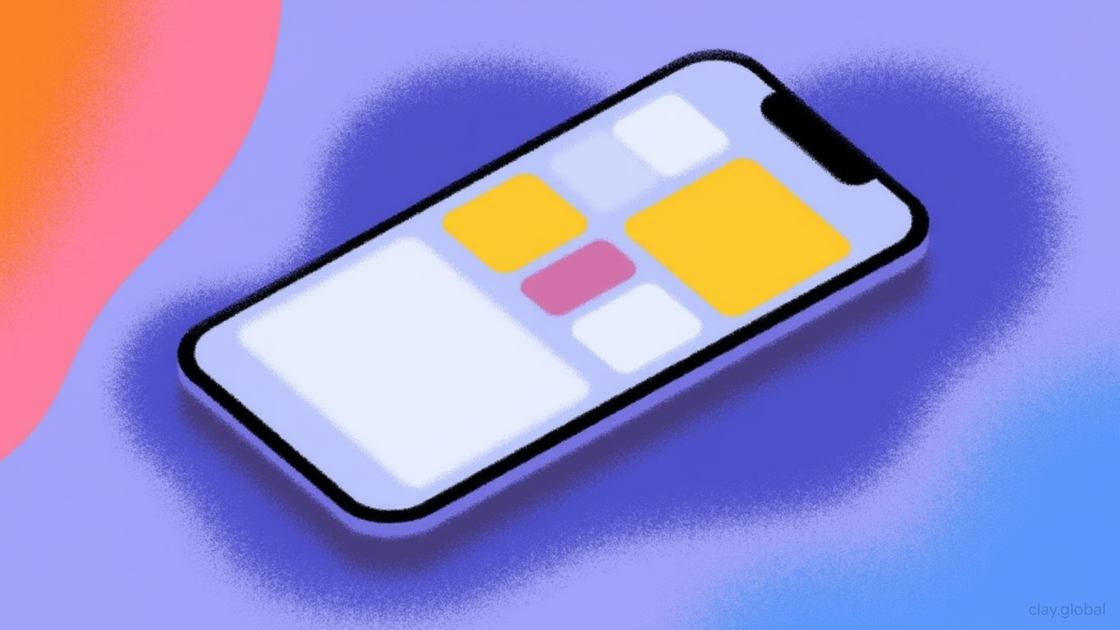
Input Elements
Input elements are where users enter data. Every extra step, every ambiguous label, every mismatch between the element and the expected behavior creates resistance.
Buttons
The most common interactive element in any interface, and the one designers think least carefully about. A button does one thing: it triggers an action. How it looks tells users how important that action is.
Buttons in UI by Clay
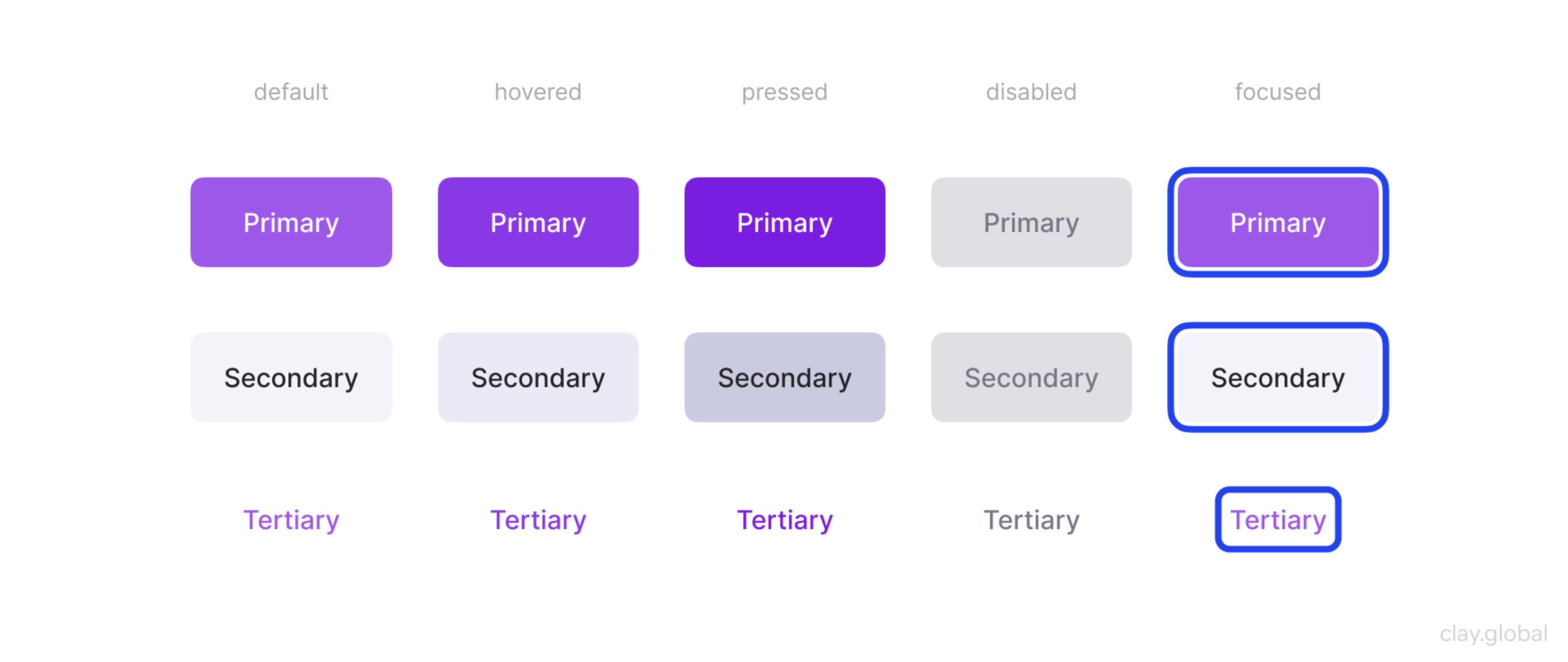
Most design systems distinguish three tiers:
- Primary buttons (filled, high contrast) are for the main action on a given screen: "Save," "Submit," "Continue." There should rarely be more than one primary button in a single view.
- Secondary buttons (outlined or ghost) are for alternatives that matter but shouldn't compete.
- Tertiary buttons (text-only) are for low-stakes actions like "Cancel" or "Learn more."
The mistakes are predictable: multiple primary buttons fighting for attention, disabled states with no explanation of why, and button labels so vague ("Click here," "Submit") that users can't predict what will happen.
A good button label names the outcome, not the interaction. "Delete account" beats "Confirm" every time.
Toggle Switches
Toggles are for binary settings that take effect immediately, and no submit button is needed. Think notification preferences, dark mode, feature flags. They're not a substitute for checkboxes.
The difference is timing: a checkbox is a selection that gets submitted as part of a form, while a toggle fires the moment it's flipped.
Toggle Switches in UI by Clay
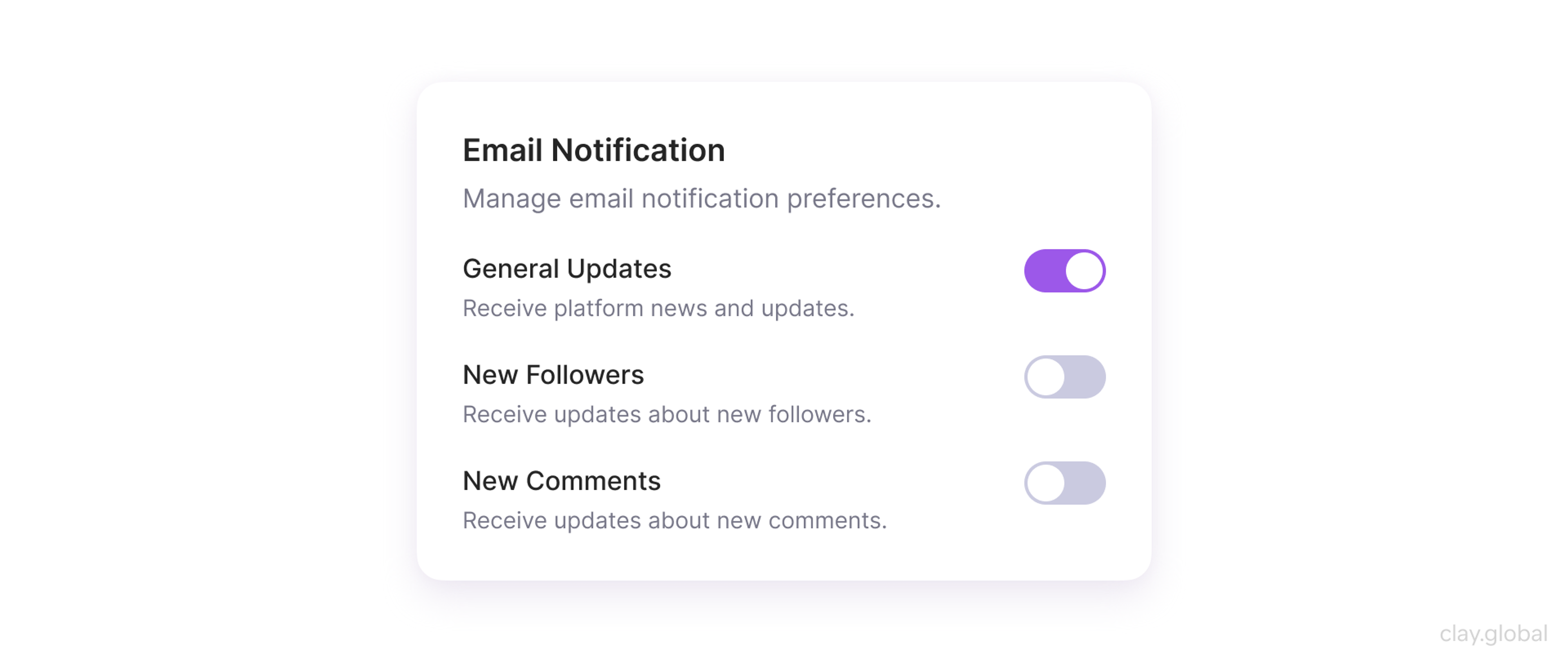
Label toggles clearly with the setting name, not the state. "Email notifications" is the right label. "On / Off" as the label forces users to decode the control rather than just read it.
Text Fields and Textareas
The default workhorse of forms. Use them when you need free-form text: names, search queries, messages, descriptions.
The distinction between a single-line field and a textarea matters more than it looks. A textarea signals "write as much as you need," while a single-line field signals "keep it brief."
Using a textarea for a first name field implies the question is complicated. It isn't.
Text Fields in UI by Clay
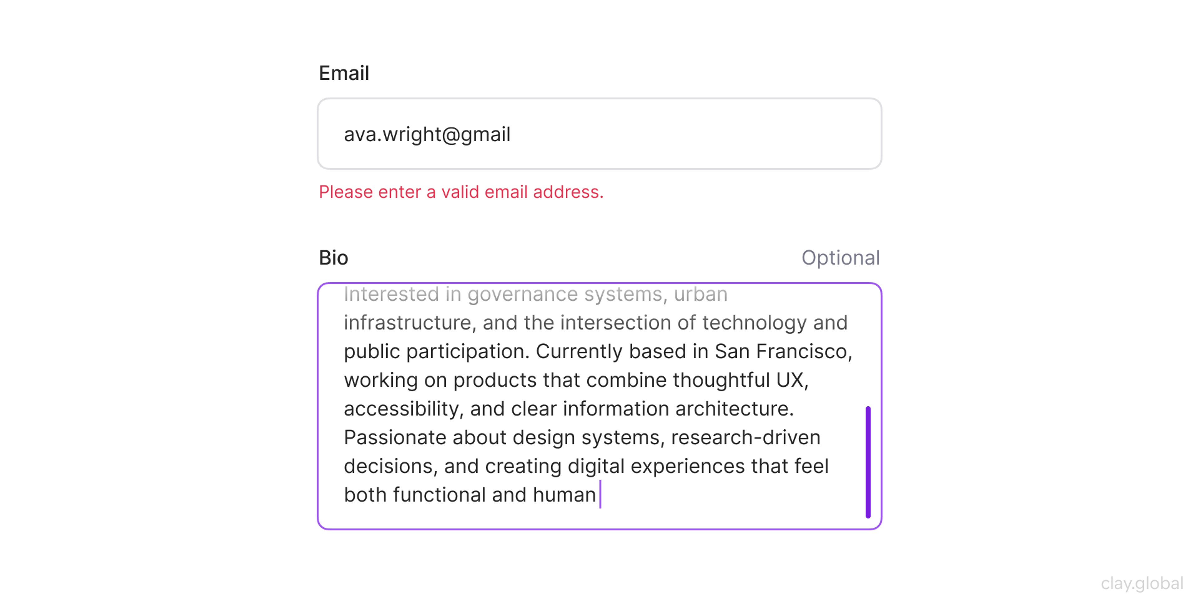
Effective text fields follow a short checklist:
- Label sits above the field, not only inside it as placeholder text
- Placeholder text shows an example, not a repeat of the label
- Real-time validation catches errors as users move between fields, not only after they hit submit
- Keyboard navigation between fields works without requiring a mouse
Telling users they've entered an invalid email address after they hit submit is a decade out of date.
Checkboxes and Radio Buttons
These get swapped constantly, and the swap always creates confusion. The rule is straightforward: checkboxes for multiple selections, radio buttons for one.
If the user can pick "Email" and "SMS" for notification preferences, use checkboxes. If they're choosing a plan tier, use radio buttons.
Checkboxes and Radio Buttons in UI by Clay
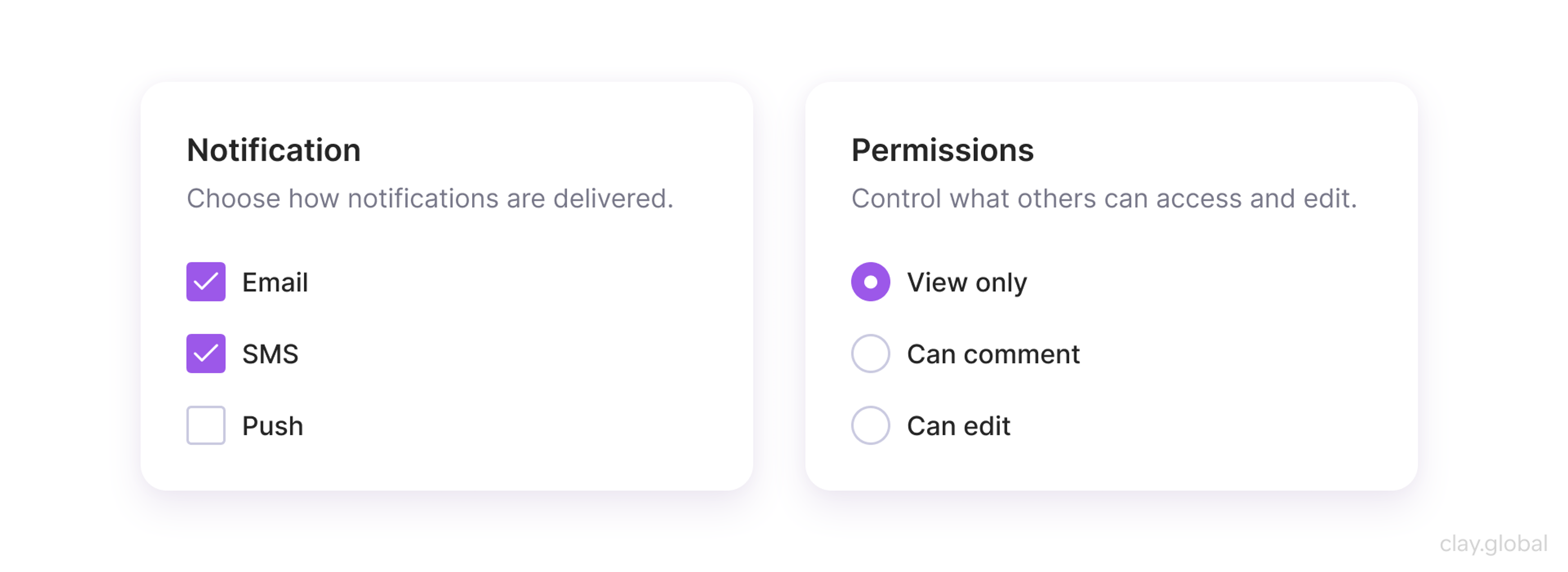
Make the entire label area clickable, not just the 16×16px control. Users shouldn't have to aim. And don't force a selection when no default exists.
Instead, pre-selecting a radio option on the user's behalf (especially in consequential contexts like billing) erodes trust.
Dropdowns
Dropdowns solve a specific problem: showing many options without consuming screen space. They're not a default input format.
If your list has three items, use radio buttons. If it has four or five, consider a segmented control.
Dropdowns earn their place when options exceed six or seven, especially when those options are well-defined and stable.
Dropdowns in UI by Clay
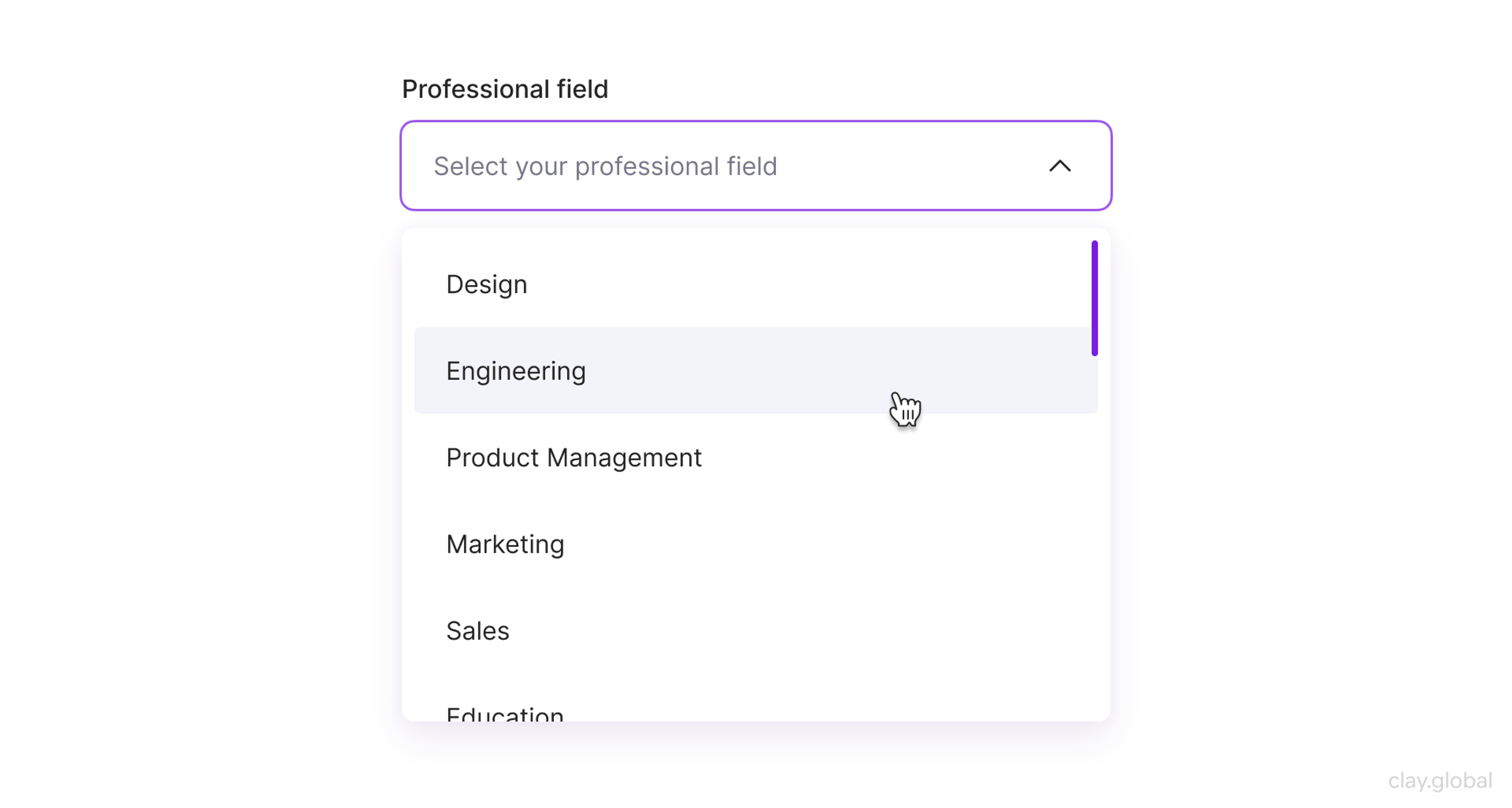
For long lists (country selectors, currency pickers, timezone inputs), add autocomplete filtering. Asking a user in Uganda to scroll through 195 country options is a failure, not an interface.
Sliders and Date Pickers
Sliders work when the precise value matters less than the range: volume controls, price filters, and opacity settings.
When users need to specify an exact number, a text input with validation is almost always faster. Don't use sliders to look dynamic. Use them when approximate selection is genuinely the right interaction.
Date pickers prevent a specific class of errors: invalid dates, wrong formats, and ambiguous month-day ordering. They're especially valuable in booking flows and deadline-setting.
Sliders and Calendars in UI by Clay
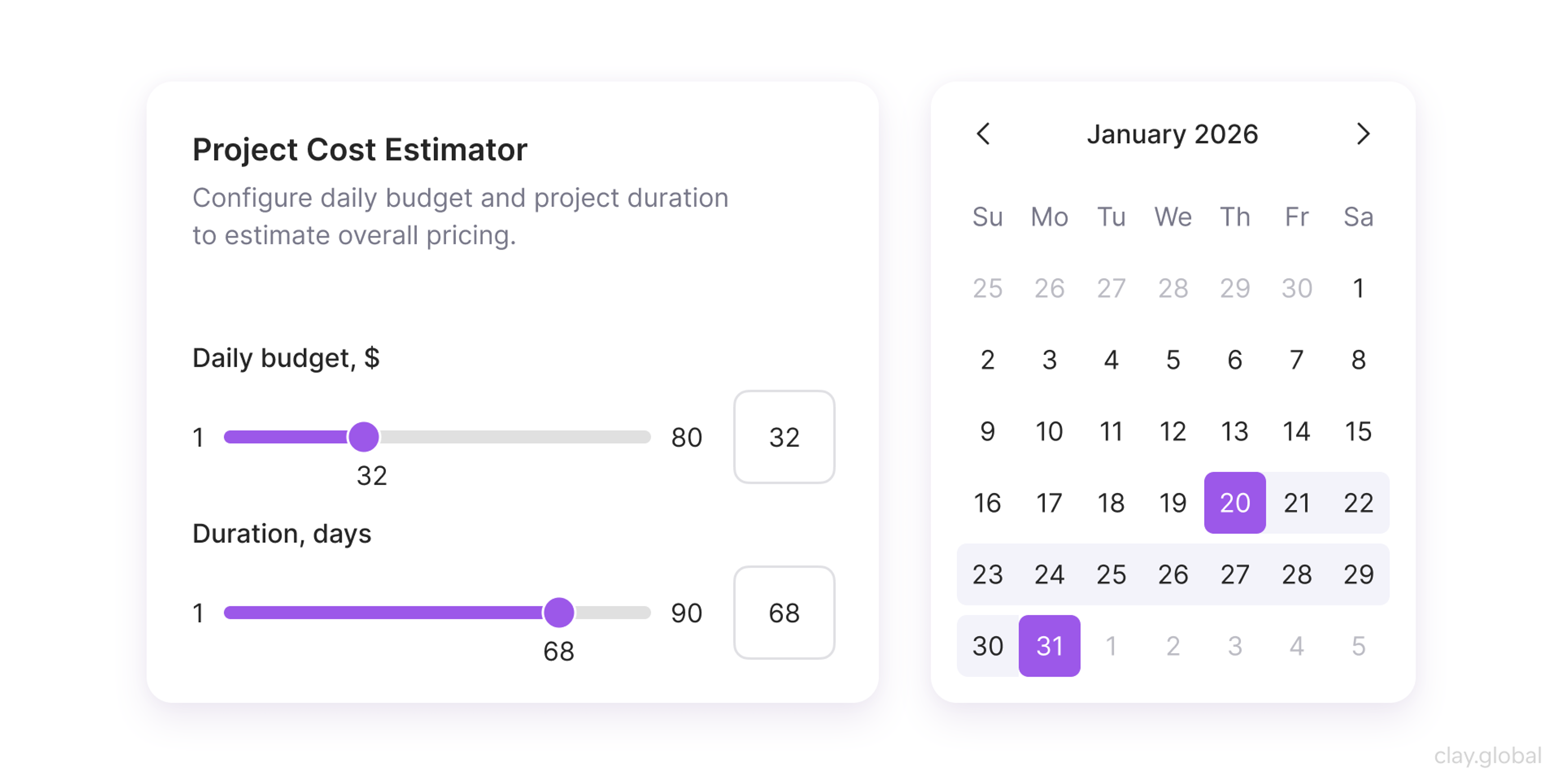
Follow native platform conventions wherever possible. A custom date picker that works differently from the OS calendar just adds learning time without adding value.
Output Elements
Inputs without feedback feel like shouting into a void. Output elements close the loop and tell users what happened, what's happening, and what they should know.
We've built comprehensive web experiences for Slack, Stripe, Grayscale, and Marqeta - companies that needed more than a pretty site. If yours does too, let's talk.
Alerts and Notifications
Not all alerts are equal. Destructive errors (something went wrong, data wasn't saved) demand immediate, prominent treatment: high contrast, clear iconography, action-oriented language.
Informational notices (a new feature is available, a background sync completed) can sit unobtrusively at the edges.
The most common mistake is over-alerting. When every event generates a notification, users start ignoring them all, including critical ones. Notification fatigue is measurable.
Alert Banners in UI by Clay
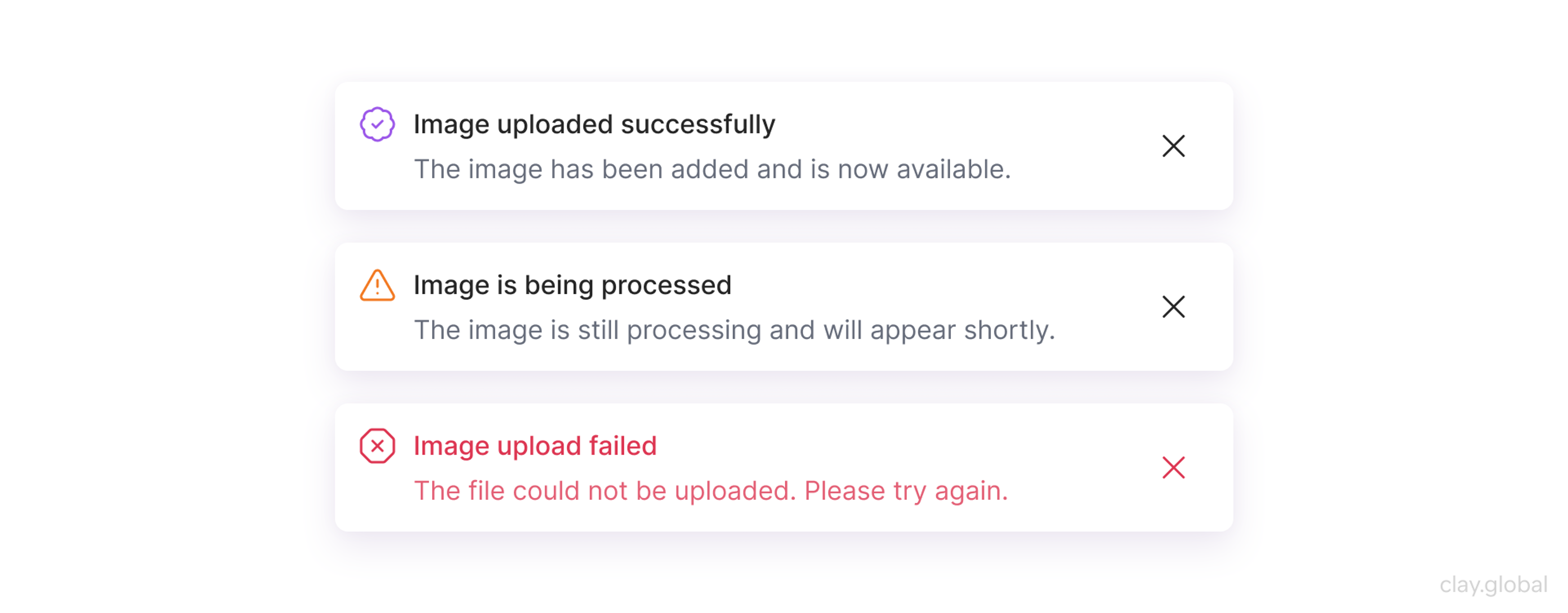
A 2024 Amplitude report on product engagement found that notification-heavy products saw significantly higher opt-out rates, with users disabling permissions after receiving five or more notifications in a single day. Design notification hierarchies with that ceiling in mind.
Progress Indicators
Any operation that takes longer than a second needs visible progress feedback. It prevents users from assuming the system has frozen and taking destructive action (closing a tab, clicking again, or refreshing).
Progress Indicators in UI by Clay
For short waits of 1 to 5 seconds, a spinner or an indeterminate progress bar is sufficient.
For longer operations like file uploads, video processing, or multi-step workflows, show percentage, estimated time remaining, and a clear indication of what's happening.
Skeleton screens handle content loading particularly well. They reduce perceived load time by giving users a structural preview of the incoming content rather than a blank container with a spinning icon.
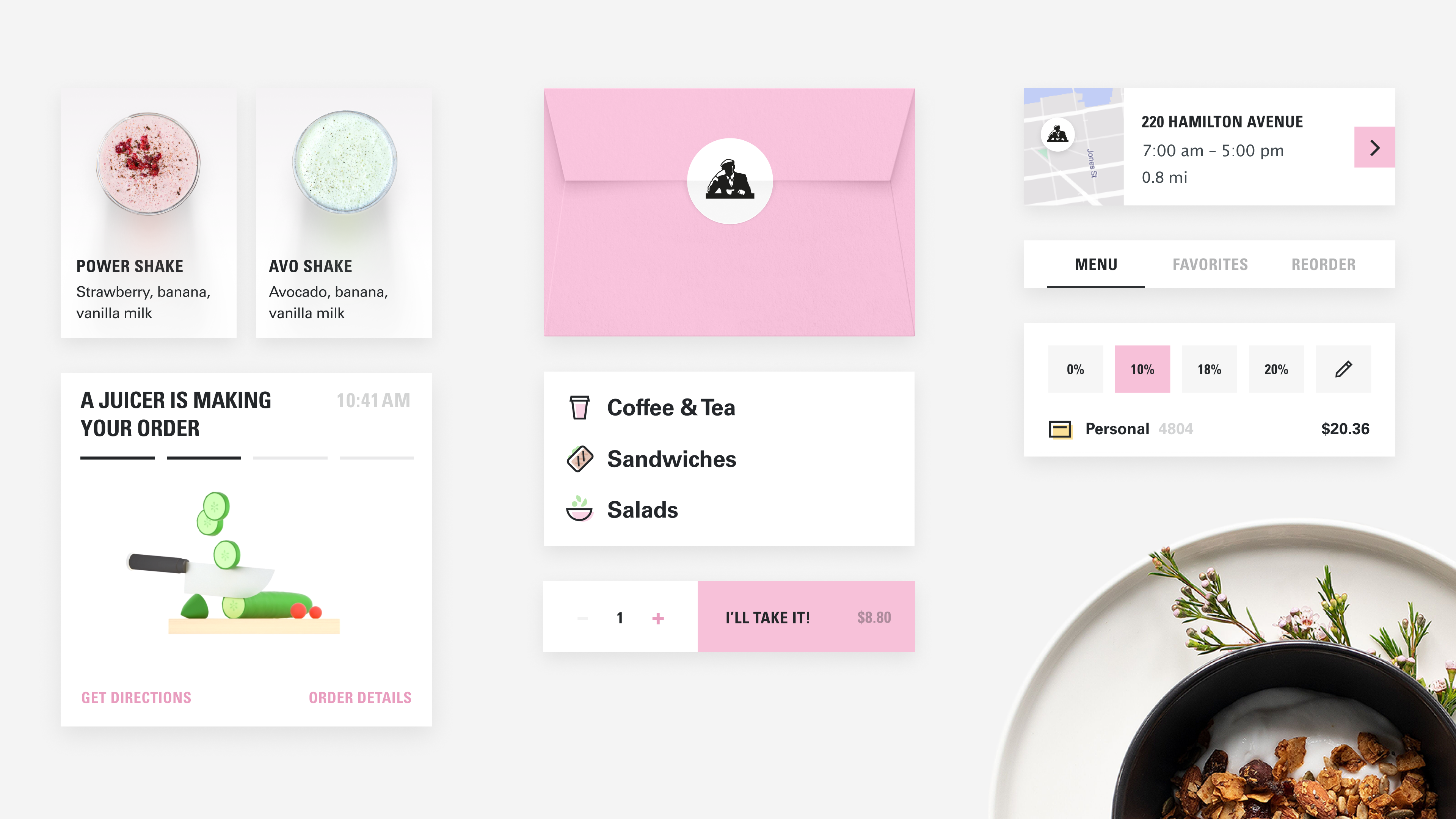
The wait is the hardest part of any user experience. For Joe & The Juice, we built an animated tracker that shows customers where their order is at every stage - not just a spinner, but a real sense of progress. Knowing you're two minutes away from your cold brew lands differently than staring at a loading screen.
Joe & The Juice Elements by Clay
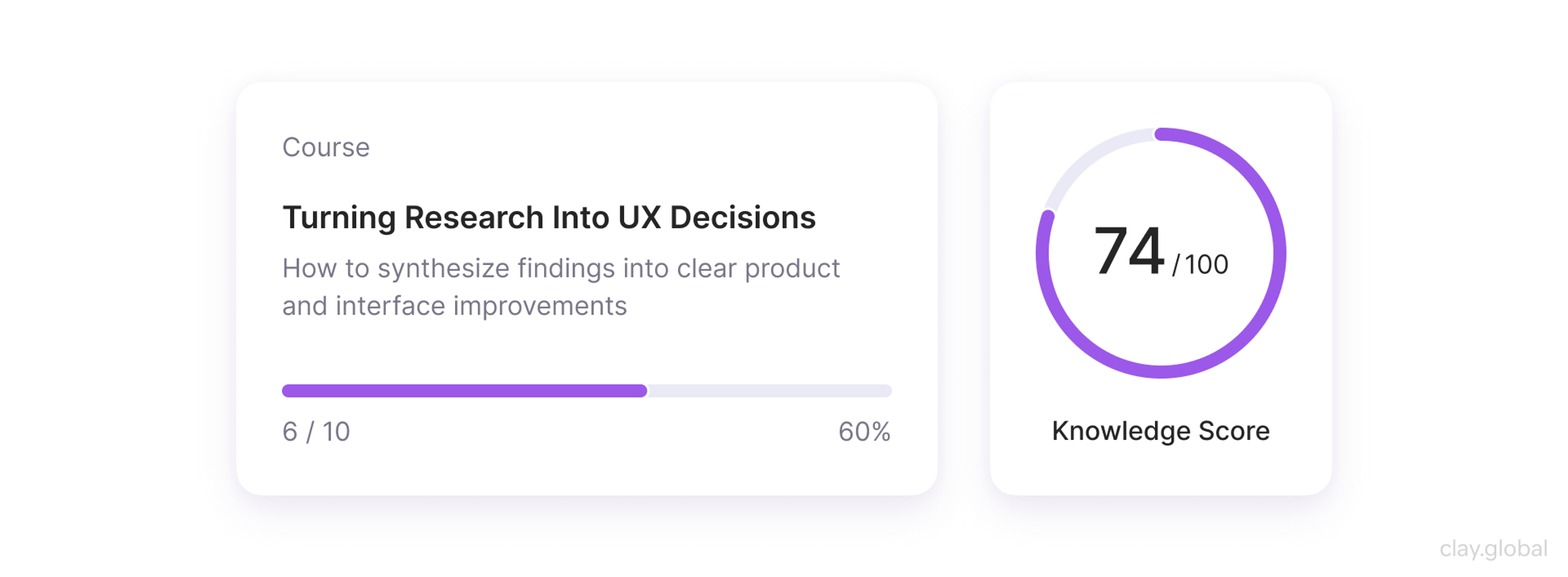
Badges and Data Visualization
Badges do one thing well: surface status at a glance. A notification count, a "New" flag, and a status indicator. Use them sparingly. If everything has a badge, nothing stands out.
Data visualization is its own discipline, but the core principle holds across chart types: match the visual form to the relationship you're showing.
Data Visualization in UI by Clay
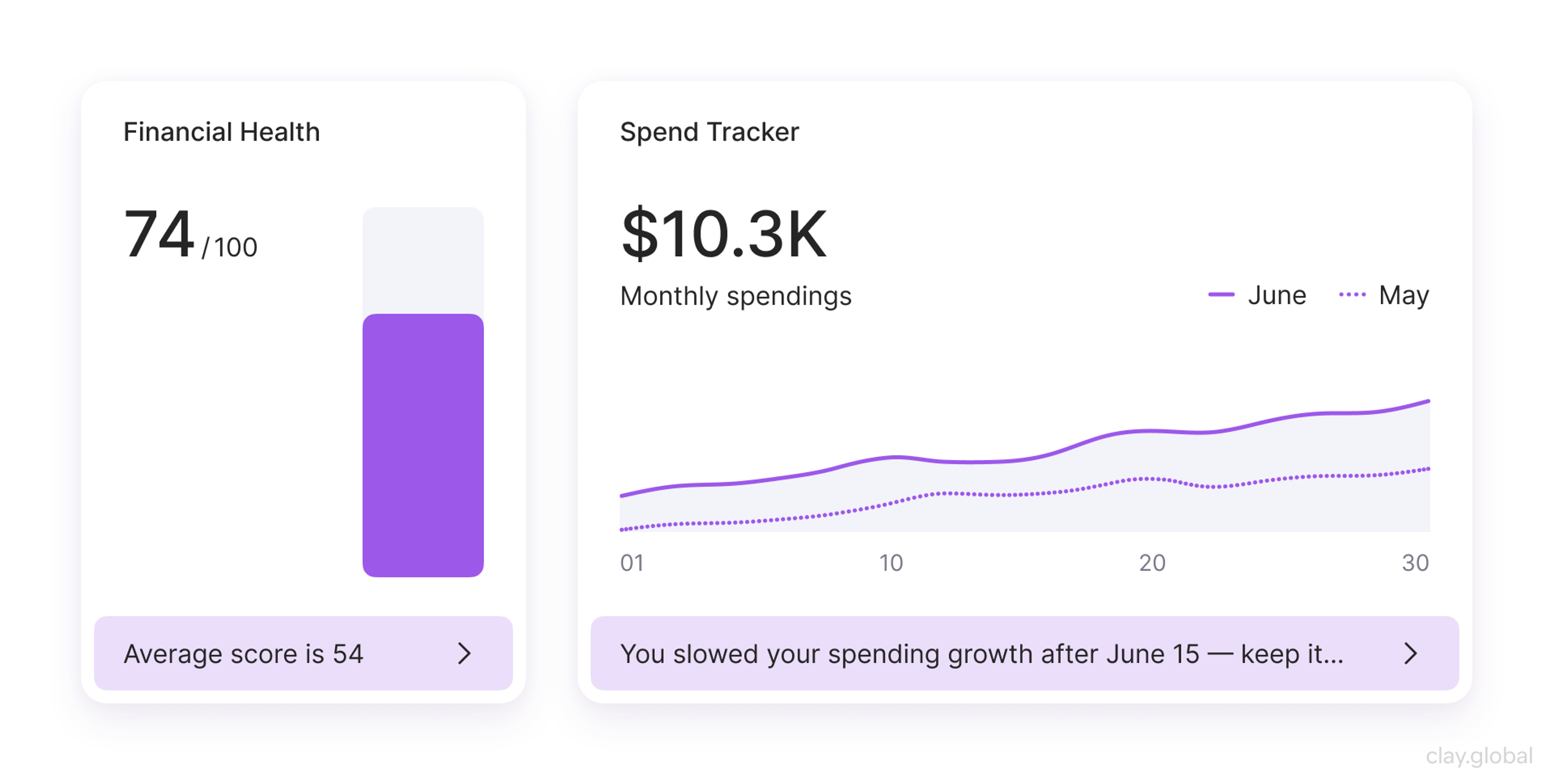
- Comparison over time: line or bar chart
- Part-to-whole breakdown: donut or pie (use pie charts with restraint; they become hard to read beyond five segments)
- Distribution: histogram or box plot
- Correlation between two variables: scatter plot
Never use a chart type because it looks sophisticated. Use it because it makes the relationship obvious at a glance.
Navigation Elements
Users tolerate many design imperfections. Disoriented (not knowing where they are or how to get back), they genuinely don't.
Primary Navigation
Top navigation works for products with broad, flat content structures. Side navigation works for deep, hierarchical ones. The key variable is how many top-level sections you have and how often users need to jump between them.
Either way, limit primary navigation to seven items or fewer. Beyond that, you're not organizing content, but avoiding a harder decision about what actually matters.
Primary Navigation in UI by Clay
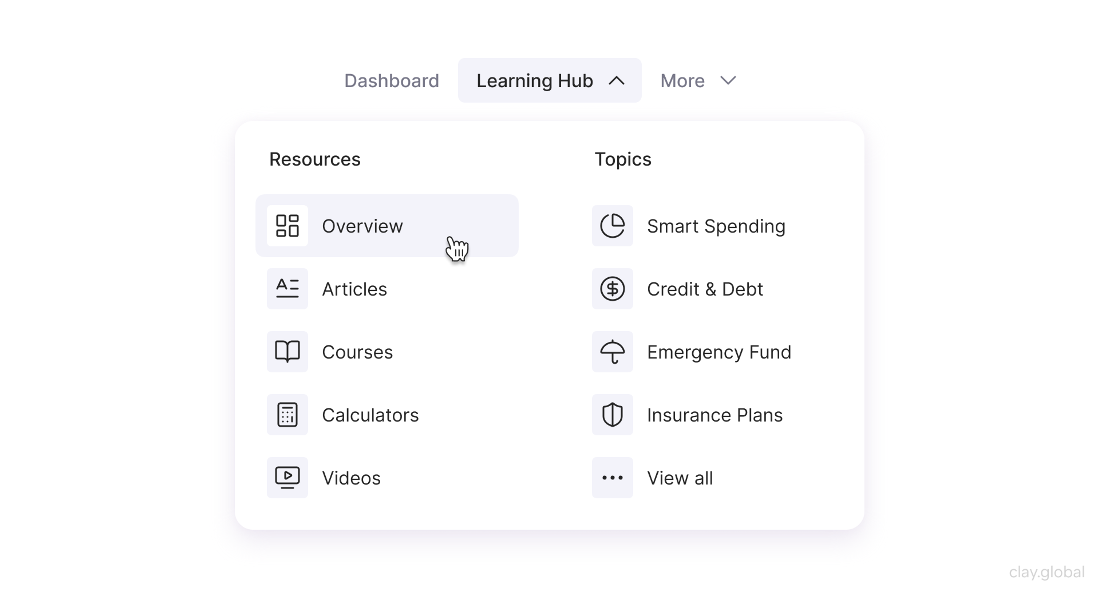
Labels should reflect how users think about your content, not how your internal team categorizes it.
For example, "Resources" means something to your marketing org. To a user, it's a guess. "Guides," "Templates," and "Case Studies" are navigable. "Resources" is a drawer.
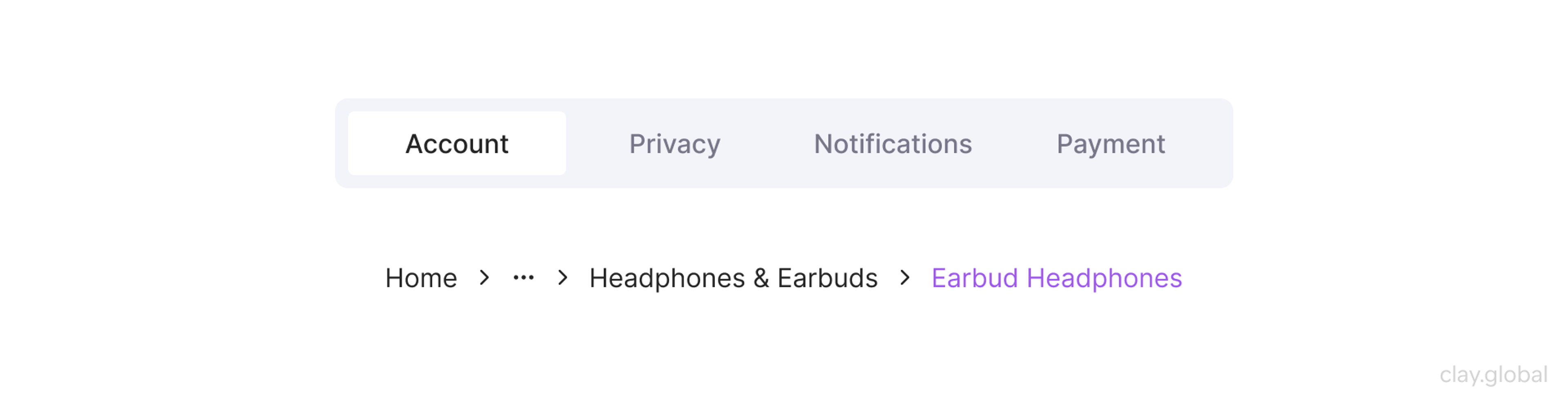
Breadcrumbs and Tabs
Breadcrumbs earn their place on deep hierarchical sites: e-commerce categories, documentation portals, and file systems. They provide a recoverable path without requiring back-button logic.
Keep them short, make every level clickable, and position them near the top of the content area, just below primary navigation.
Breadcrumbs in UI by Clay
Tabs are used to switch between peer-level sections within a single page or tool. Browser tabs, settings panels, multi-step forms.
Active states need to be unambiguous. Users should never have to look twice to know which tab they're on.
Pagination vs. Infinite Scroll
This debate has been running for years, and the right answer depends on context. Search results and data tables benefit from pagination because users can navigate to a specific page, share a URL, and orient themselves within a finite dataset.
Social feeds and discovery surfaces work better with infinite scroll because the user's goal is exploration, not retrieval.
Pagination vs. Infinite Scroll in UI by Clay
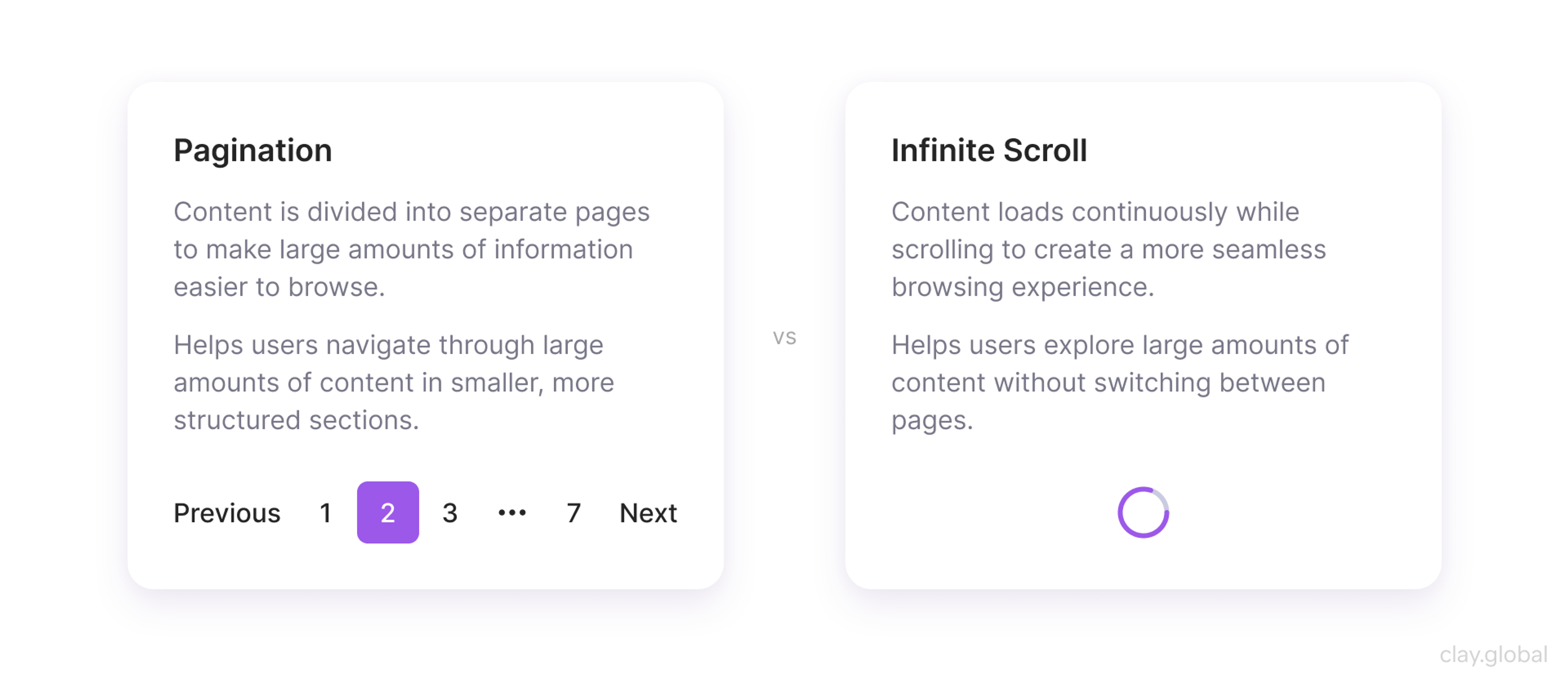
The failure mode of infinite scroll is well-documented: users lose their place, can't return to what they saw earlier, and often overshoot.
If you use it, provide a "back to top" mechanism and, where possible, remember scroll position on navigation.
Informational Elements
These elements don't collect input or trigger actions. They orient users, explain what they're looking at, and fill the gaps that would otherwise leave people guessing.
Tooltips
Tooltips surface extra context on demand, typically on hover or focus. They're useful for clarifying icon-only buttons, explaining field requirements, or providing a short definition without bloating the main interface.
The failure modes are consistent. Tooltips that hide information users actually need to proceed: those belong in persistent help text, not a tooltip.
Toolpits in UI by Clay
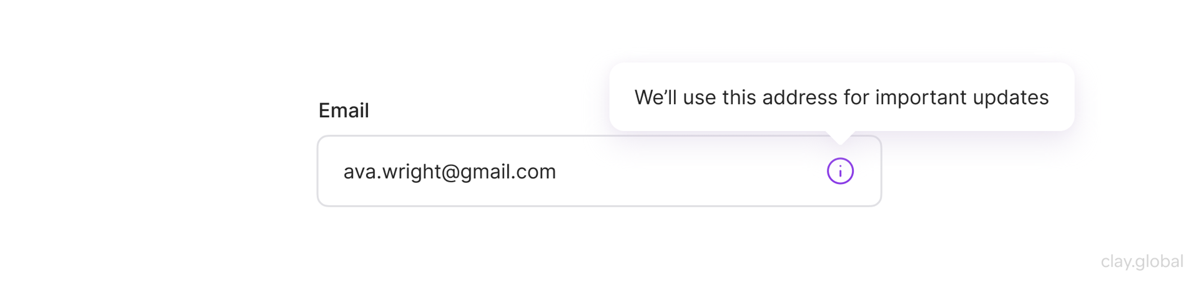
Tooltips that only appear on hover, leaving keyboard and touch users without the information. And the tooltip copy is so vague that it adds noise without adding meaning. If the tooltip just restates the label, it shouldn't exist.
Keep tooltip text to one or two short sentences. If you need more than that, the UI itself has a clarity problem that a tooltip won't fix.
Icons
Icons communicate meaning at a glance, which makes them valuable - and even dangerous. An icon without a label is a gamble on how universally that symbol reads.
The hamburger menu, the magnifying glass for search, and the floppy disk for save: these have been used long enough to be reliably understood. Most others haven't.
The practical rules:
- Pair icons with text labels whenever the icon is doing real navigational or functional work.
- Reserve icon-only treatment for elements where the symbol has near-universal recognition and screen space is genuinely scarce (mobile toolbars, for instance).
- Consistency matters more than cleverness: an icon set that mixes styles, weights, and metaphors is harder to read than plain text.
Empty States
Every interface has them: the dashboard with no data yet, the inbox with nothing in it, the search that returned nothing. Empty states are easy to overlook in design and can be disproportionately damaging when handled poorly.
A blank screen with no explanation creates anxiety. Users assume something broke.
An effective empty state does three things: it explains why the content is absent, tells users what to do next, and makes that next action easy to take.
Empty States in UI by Clay
For example, Dropbox's empty folder view names the problem, explains the solution, and puts an upload button right there. That's the template.
Empty states are also an underused opportunity. First-time users who haven't added data yet are at a critical moment in onboarding. A well-designed empty state can convert confusion into action.
Container Elements
Container elements give visual form to content relationships. Use them to group things that belong together, not to impose structure where none exists.
Cards
Cards are among the most overused patterns in modern UIs. They're genuinely useful when content units are peer-level, scannable, and benefit from visual separation: product listings, article previews, and user profiles.
They become a crutch when designers apply them to everything as a default container style.
Cards in UI by Clay
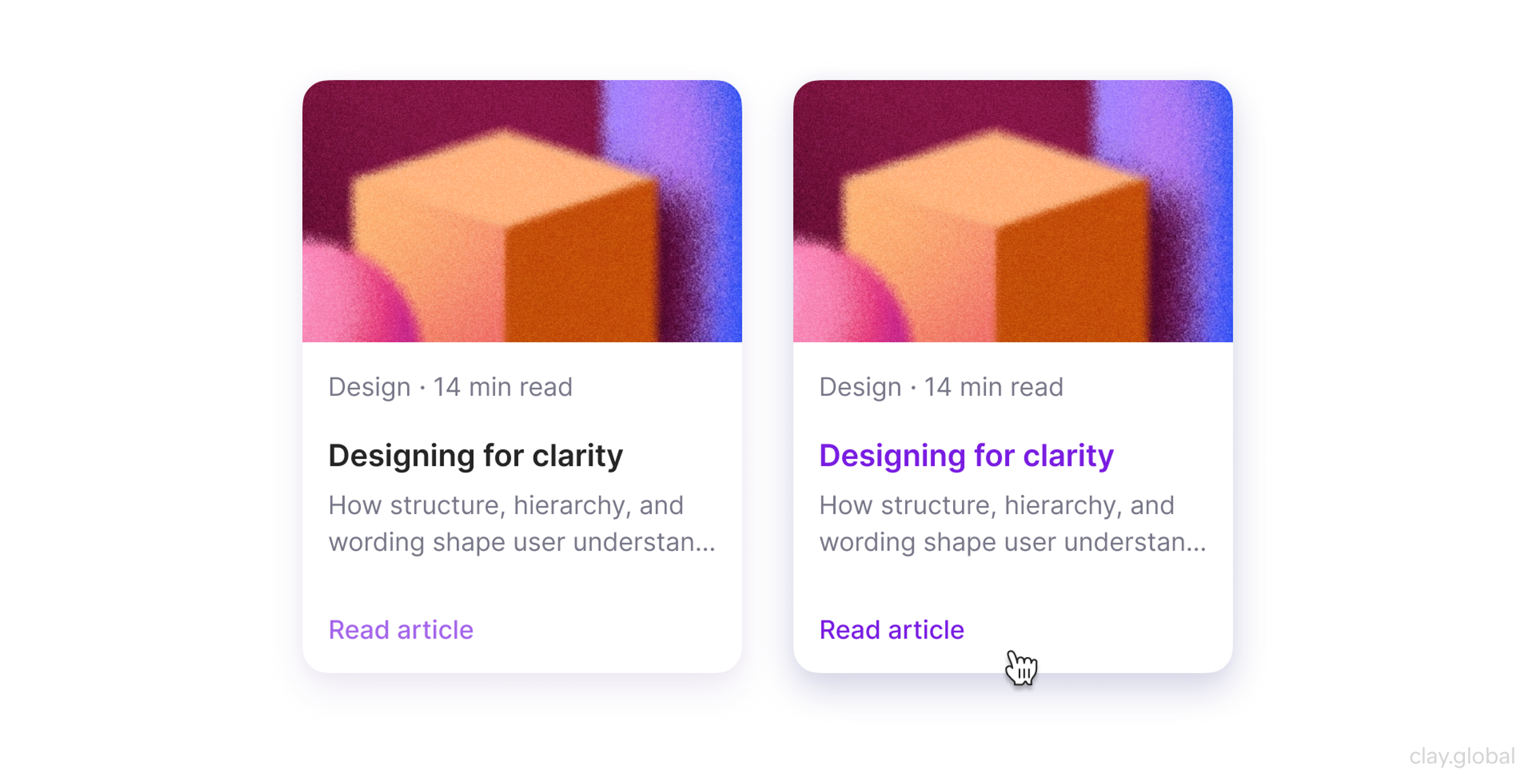
A grid of identical cards with identical information density creates visual monotony. Vary image sizes, headline lengths, and metadata to create a rhythmic grid. Make interactive cards feel interactive with a hover state, a slight elevation shift, or a cursor change.
Modals
Modals interrupt. That's their function. Use them only for interactions that genuinely require the user's full attention and a discrete decision: confirming a destructive action, completing a focused task, displaying critical information that can't be ignored.
Modals in UI by Clay
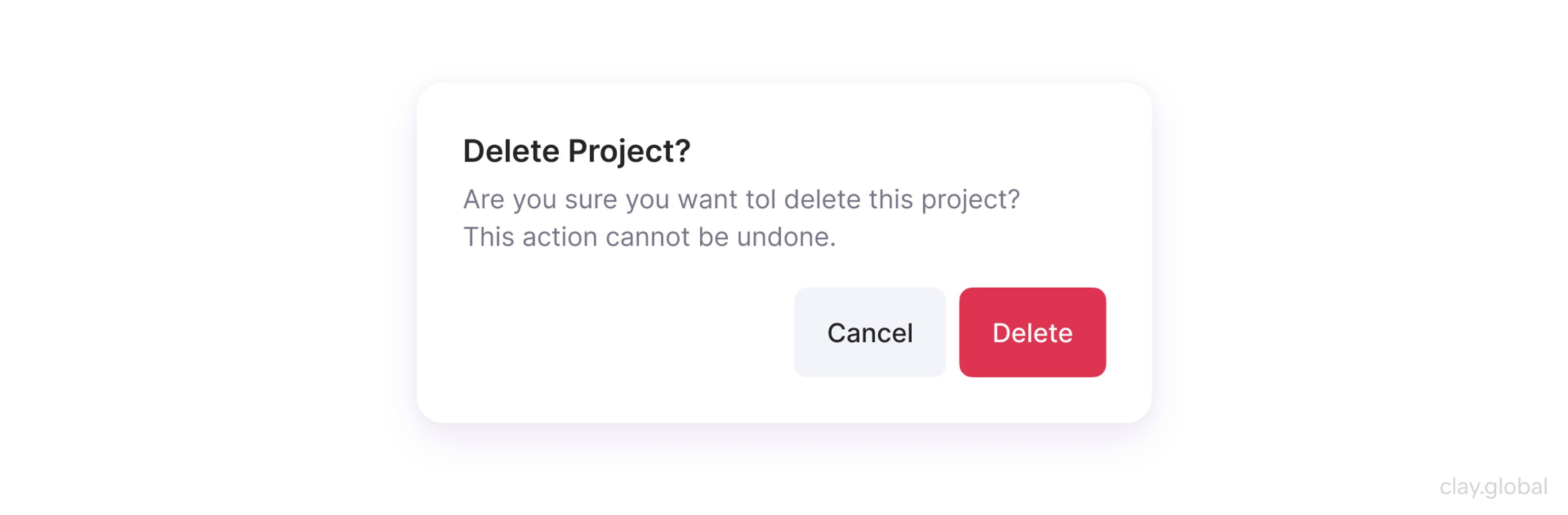
A few hard rules:
- Don't use modals for content that could live on a dedicated page
- Don't trigger them on page load unless there's an exceptional reason (age verification, legal requirement)
- Always give users an obvious way out: an X button, an Escape key handler, a click-outside dismissal
Accordions
Accordions compress space by hiding content behind expandable headers. They work well in FAQ sections, settings panels, and specification tables where users need to browse and selectively expand rather than read everything.
Accordions in UI by Clay
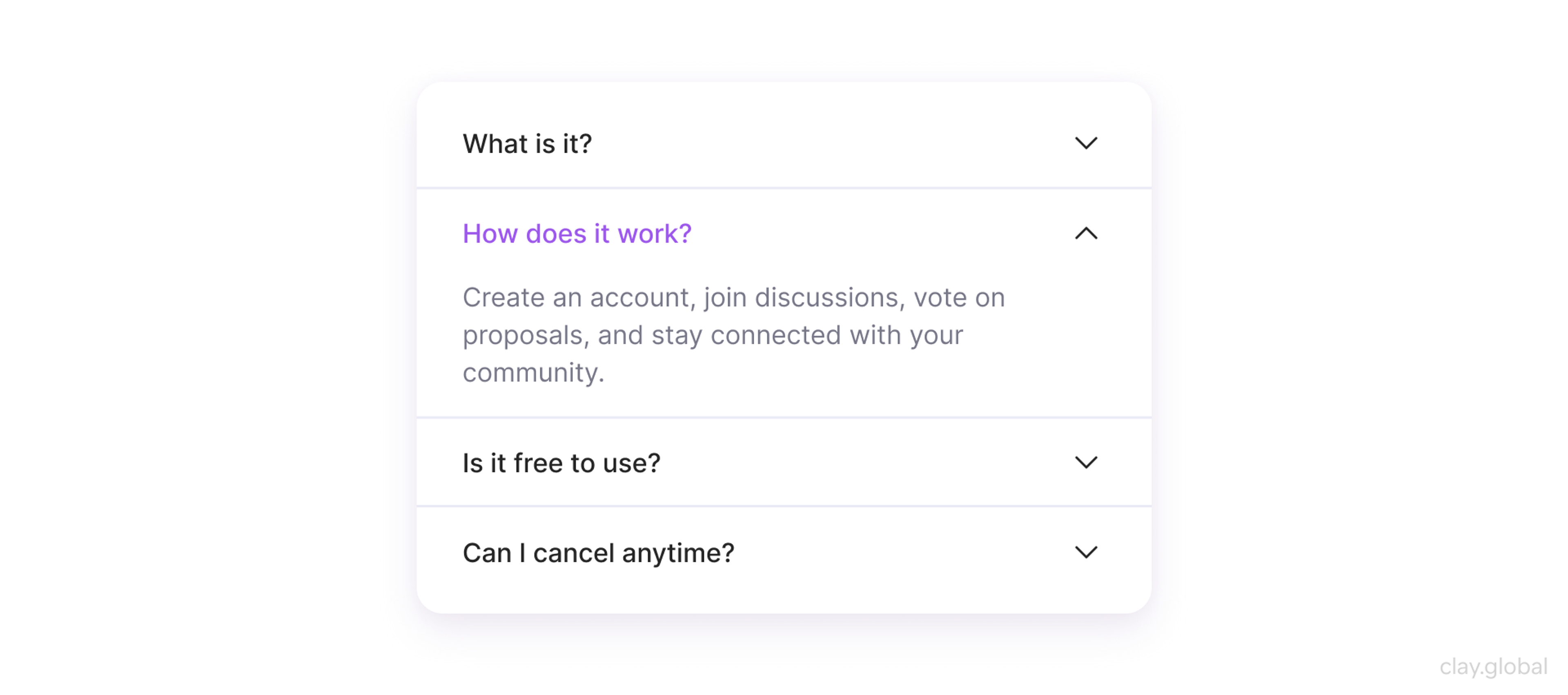
They fail when the hidden content is critical to a decision. If users need to read it to proceed, it shouldn't be hidden.
Visual Design and Hierarchy
Typography and color are communication tools.
A type scale without clear differentiation between headings, subheadings, body text, and captions forces users to infer hierarchy from context.
A color system without sufficient contrast fails accessibility standards and, more practically, fails in low-light environments and on degraded screens.
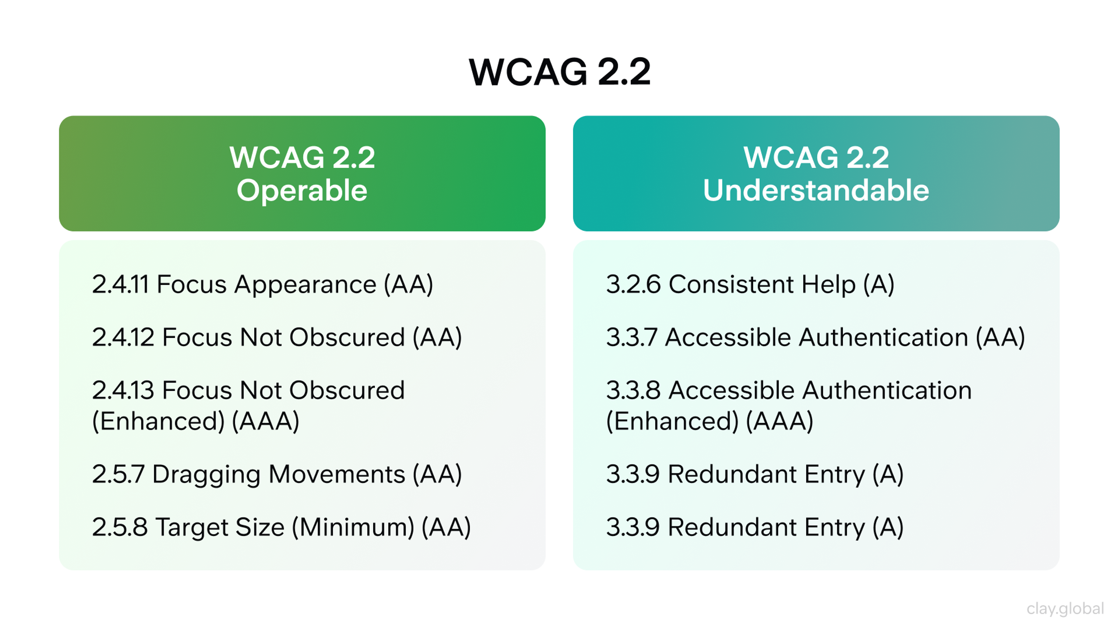
The Web Content Accessibility Guidelines (WCAG 2.2) require a minimum contrast ratio of 4.5:1 for normal text, a standard that a surprising number of production interfaces still fail to meet. Accessibility isn't a compliance checkbox. It's table stakes for reaching your entire audience.
WCAG 2.2 Recommendations by Clay
White space is the most underused element in UI. It doesn't just separate things- it groups them. Tight spacing between a label and its input says "these belong together."
Generous spacing between sections says "this is a new thought." Most designers use too much whitespace in hero areas and too little in functional ones.
Design Systems
A design system is a shared language: the agreed-upon rules about how buttons behave, how spacing scales, how color communicates states, how components compose into patterns.
The component library is the output, while the system is the thinking behind it.
The atomic design methodology, introduced by Brad Frost, provides a useful mental model:
- Atoms are individual elements like buttons and inputs.
- Molecules combine atoms into functional units like a search bar.
- Organisms are larger sections, like a navigation bar or a product card grid.
- Templates and pages are assembled from those organisms.
The value is the discipline of building from small, composable pieces rather than designing page-by-page.
Teams that invest in design systems ship faster over time because they stop redesigning solved problems. According to a 2025 survey by Figma, teams using a mature design system reported 40% faster design-to-development handoff compared to those working without one. The upfront cost is real. So is the compounding return.
Mobile and Platform Considerations
Touch targets need to be at least 44×44 pixels, the minimum recommended by Apple's Human Interface Guidelines and reinforced by Google's Material Design specs. The average adult fingertip covers roughly 44-57 pixels. Elements smaller than that invite misclicks.
Design for thumb reach. Most users hold phones one-handed at least some of the time. Place primary actions in the lower third of the screen where they're reachable without a grip shift. Put destructive or rarely-needed actions in less accessible zones.
Responsive design is a priority exercise: what content and functionality matters most at the smallest viewport, and what can be progressively disclosed as space allows?
A desktop design compressed into a phone-sized container isn't responsive. It's deferred.
Where Good Becomes Great
No element, layout, or interaction pattern is correct until users confirm it. Usability testing with five representative users will surface the majority of significant issues in a given flow, a finding from Jakob Nielsen's foundational research that holds as true in 2026 as it did twenty years ago.
Watch what users do, not just what they say. Users are polite. They'll describe a confusing flow as "a little unclear" and then abandon it entirely. Screen recordings and session replays show where hesitation, rage-clicks, and unexpected paths accumulate.
A/B testing answers what (this button color outperforms that one) but not why. Pair quantitative results with qualitative research. When a change improves completion rate, understanding the mechanism is worth the effort, because that understanding generalizes to future decisions.
From e-commerce redesign to immersive 3D experiences, we know that no two websites should feel the same. Tell us what yours needs to do.
Read more
- Vantara Web Design & Development Case Study by Clay
FAQs
What's the difference between UI elements and UI components?
UI elements are the fundamental building blocks: a button, a text field, a checkbox. Components are assembled from elements and carry their own behavior and state logic.
A search bar, for example, is a component made up of a text input element, a button, and possibly a dropdown for autocomplete suggestions.
When should I use a modal versus a dedicated page?
Use a modal for focused, contained interactions where context from the underlying page matters: confirming a deletion, editing a single field, completing a quick form.
Use a dedicated page when the interaction is complex, requires significant input, or when the user benefits from a clean context rather than an overlay.
How many navigation items are too many?
Research from the Nielsen Norman Group suggests primary navigation should stay within seven items, and ideally five or fewer. Beyond that, users struggle to hold all options in working memory and start guessing rather than scanning. If you're above seven, the problem isn't navigation, but a content architecture.
Should I use infinite scroll or pagination?
Depends on the goal. Pagination works best for search results, tables, and content where users need to retrieve something specific or return to a known position. Infinite scroll works better for exploratory, feed-style content where the goal is discovery rather than retrieval.
What makes an empty state effective?
An effective empty state explains why the space is empty, tells users what to do next, and provides a direct path to that action. Dropbox's empty file view explains that no files exist here yet and offers an upload button in the same view. A plain "No results" message with no action is a dead end.
How should I handle form validation - inline or on submit?
Inline validation on blur (when a user leaves a field) is generally preferred for complex forms. It catches errors early, before the user has mentally moved on. Submit-time validation is acceptable for very short forms of two to three fields where the overhead of inline logic isn't justified.
What's the right way to use color in UI?
Color communicates three things in UI: hierarchy (what's most important), state (active, disabled, error, success), and brand. Never use color as the only signal. Always pair it with a secondary cue like an icon, label, or position. This satisfies accessibility requirements and ensures the interface works in grayscale and high-contrast modes.
Are tooltips accessible?
Standard hover-based tooltips are not accessible to keyboard-only or touch-screen users. For critical information, make it permanently visible or use a more accessible pattern like a disclosure button or inline help text. If you do use tooltips, ensure they trigger on focus as well as hover, and that they're readable by screen readers.
How do I decide between a dropdown and a radio group?
If you have two to five mutually exclusive options and screen space allows, use a radio group. It shows all options at once without requiring an extra interaction. Use a dropdown when you have six or more options, limited space, or when the list is dynamic (populated from a database, for example).
What are skeleton screens, and when should I use them?
Skeleton screens show a low-fidelity structural preview of content while it loads. They reduce perceived load time by giving users a sense of what's coming rather than an empty container. Use them for content that loads asynchronously and has predictable structural layouts: article feeds, user profile cards, dashboard widgets.
How should error messages be written?
Error messages should tell users what went wrong, why it happened (if knowable), and what they should do next, in plain language and without blame. "Invalid input" fails all three tests. "Your password must be at least 8 characters and include one number" passes. Avoid technical language and never attribute errors to user mistakes unless the solution is entirely within their control.
What's the difference between a notification and an alert?
Notifications are asynchronous; they inform users of events that happened outside their immediate action (a message received, a task completed, a new feature). Alerts are synchronous; they respond directly to something the user just did or to a system state requiring immediate attention. Mixing the two styles causes users to treat urgent alerts with the same dismissal reflex they use for background notifications.
When does animation add value rather than distract?
Animation adds value when it communicates state change (a panel sliding in to show it’s contextually related, not a new page), confirms actions (a success checkmark after saving), or guides attention toward a newly loaded element. It distracts when it's purely decorative, when it's slow, or when it delays access to content without providing meaningful information in return.
What's the minimum touch target size for mobile?
Both Apple and Google recommend a minimum touch target of 44×44 pixels. For targets smaller than this, provide sufficient padding so the tappable area meets the minimum, even if the visual element appears smaller.
How do I know if my navigation is working?
The clearest signal is navigation abandonment data: sessions where users click through multiple items without landing on a destination, or where they return to the home page repeatedly. Pair this with search query analysis. If users are searching for terms that should be findable through navigation, your labels or structure don't match their mental model.
The Bottom Line
The best interfaces don't call attention to themselves. Every element does its job, the visual hierarchy tells users where to look, and feedback arrives before anyone wonders if something went wrong.
That level of clarity doesn't come from following a checklist. It comes from understanding why each element exists and having the discipline to use it only when it earns its place.

About Clay
Clay is a UI/UX design & branding agency in San Francisco. We team up with startups and leading brands to create transformative digital experience. Clients: Facebook, Slack, Google, Amazon, Credit Karma, Zenefits, etc.
Learn moreAbout Clay
Clay is a UI/UX design & branding agency in San Francisco. We team up with startups and leading brands to create transformative digital experience. Clients: Facebook, Slack, Google, Amazon, Credit Karma, Zenefits, etc.
Learn more