Learn how to select fonts, create a hierarchy, and enhance readability for optimal user experiences
At its most basic level, website typography design is about selecting and styling text on a web page to create an attractive, legible design. Many factors are involved in web typography design, including typeface selection, text hierarchy, and readability. A strong approach follows typography principles to ensure clarity and consistency across digital environments.
Using website typography correctly can have many benefits for website design. It can improve your website’s look and feel, communicate essential information more effectively, and help you engage with viewers. Good web typography makes your website easier to use by improving navigation and search engine optimization (SEO) rankings. It all starts with understanding and applying typography fundamentals.
What Is Website Typography?
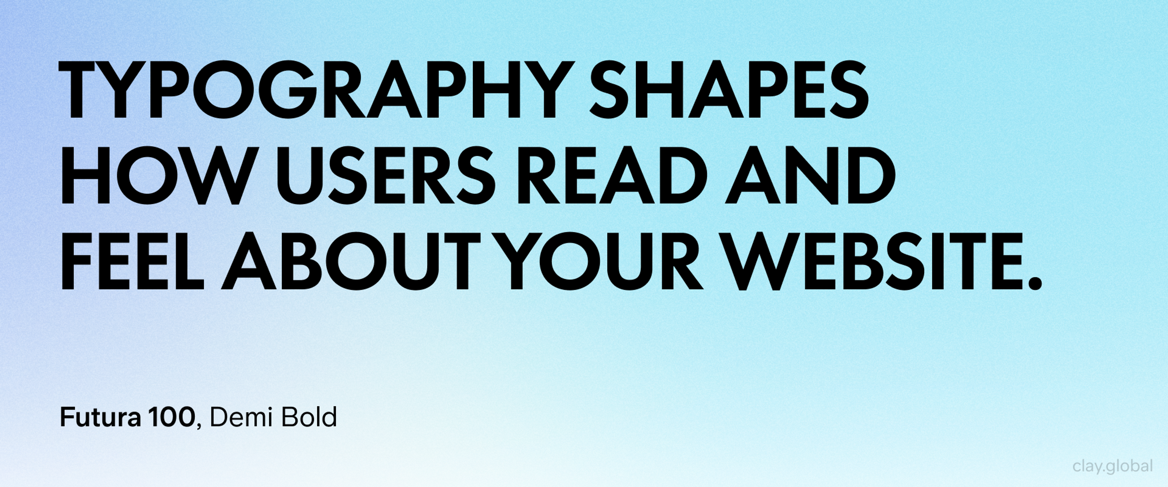
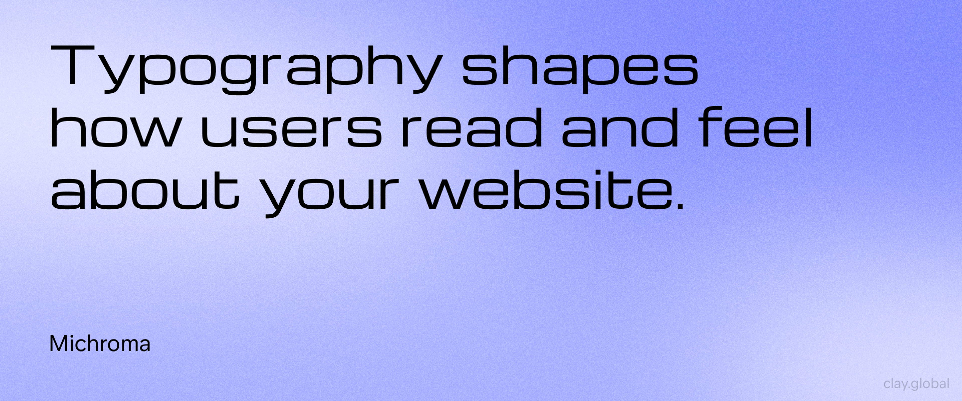
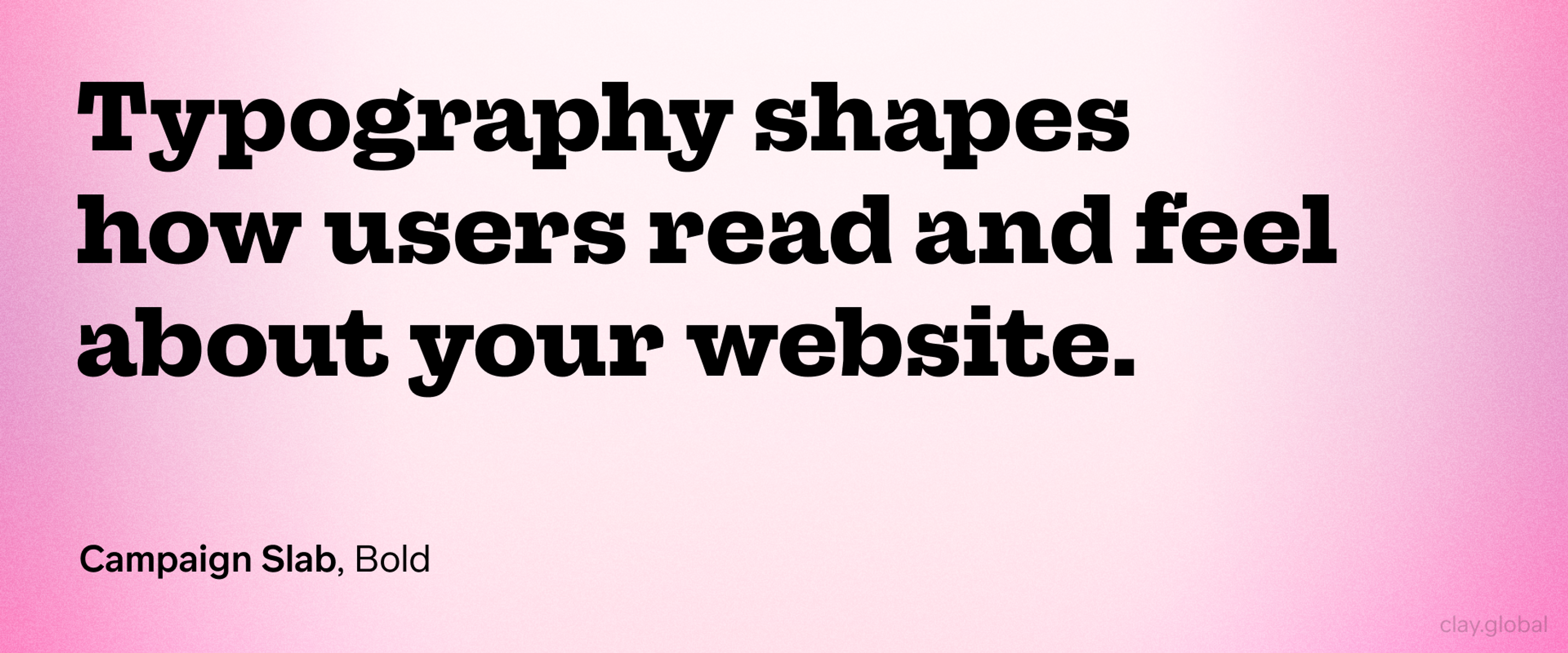
Typography shapes how users read and feel about your website. Good typography guides readers through your content smoothly. It makes your brand memorable and your message clear.
Web typography goes beyond picking pretty fonts. It affects how long people stay on your site. It influences whether they trust your brand. Most importantly, it determines if they can actually read your content.
What Makes Web Typography Different
Web typography faces unique challenges that print never encounters. Your text must look great on a 5-inch phone screen and a 32-inch monitor. It needs to load quickly while staying readable.
Typography Anatomy by Clay
Unlike print, web typography adapts to different devices automatically. Readers zoom in and out. They change their browser settings. Your typography must handle all these changes gracefully.
Google Fonts revolutionized web typography by offering free, high-quality fonts that load fast. These fonts work across all browsers and devices. They give designers professional options without licensing fees.
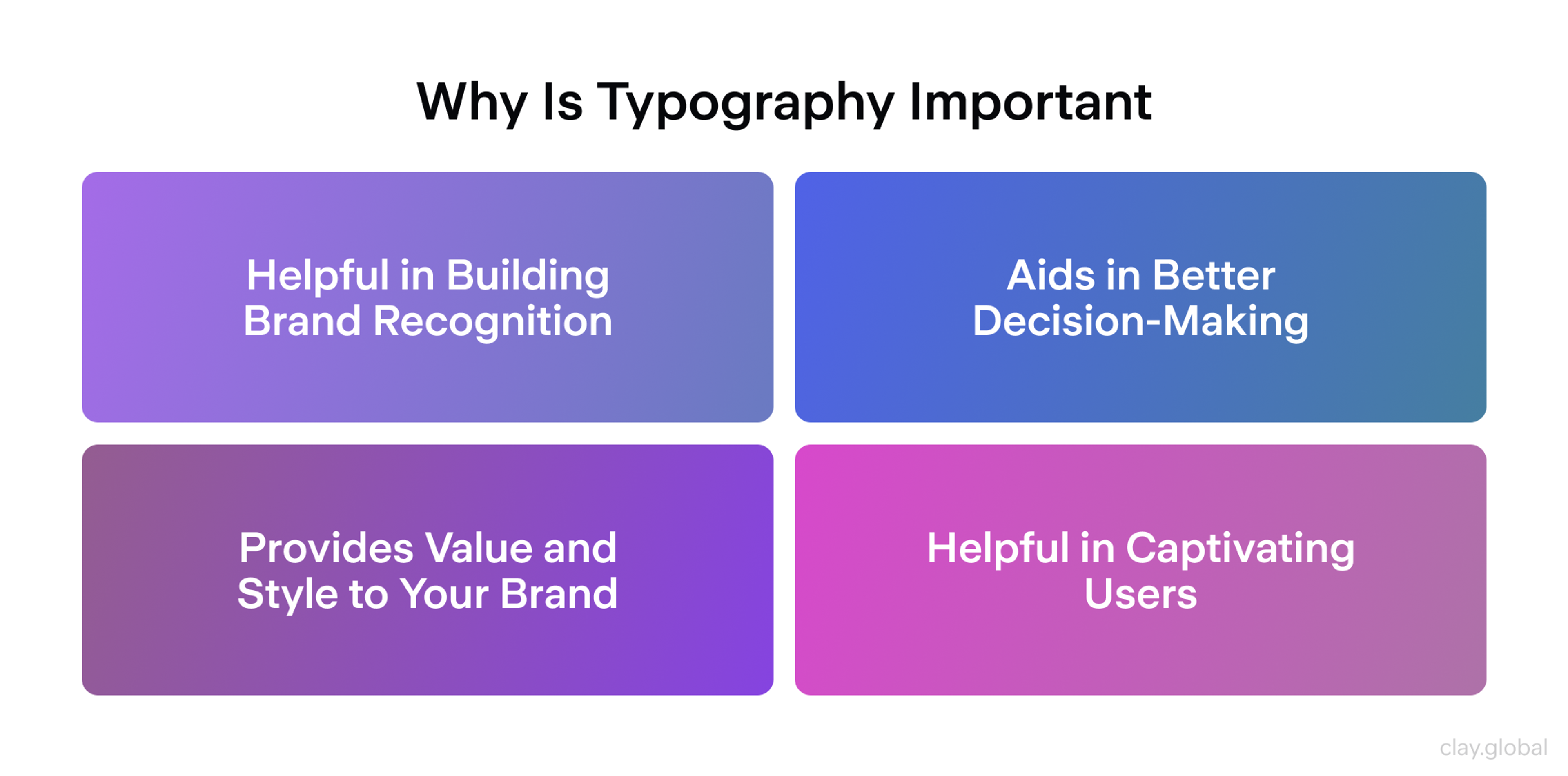
Why Is Typography Important in Web Design?
Typography directly impacts your website's success. Here's how:
Readability comes first. If people can't read your content easily, they leave. Poor typography creates eye strain. Good typography design feels effortless.
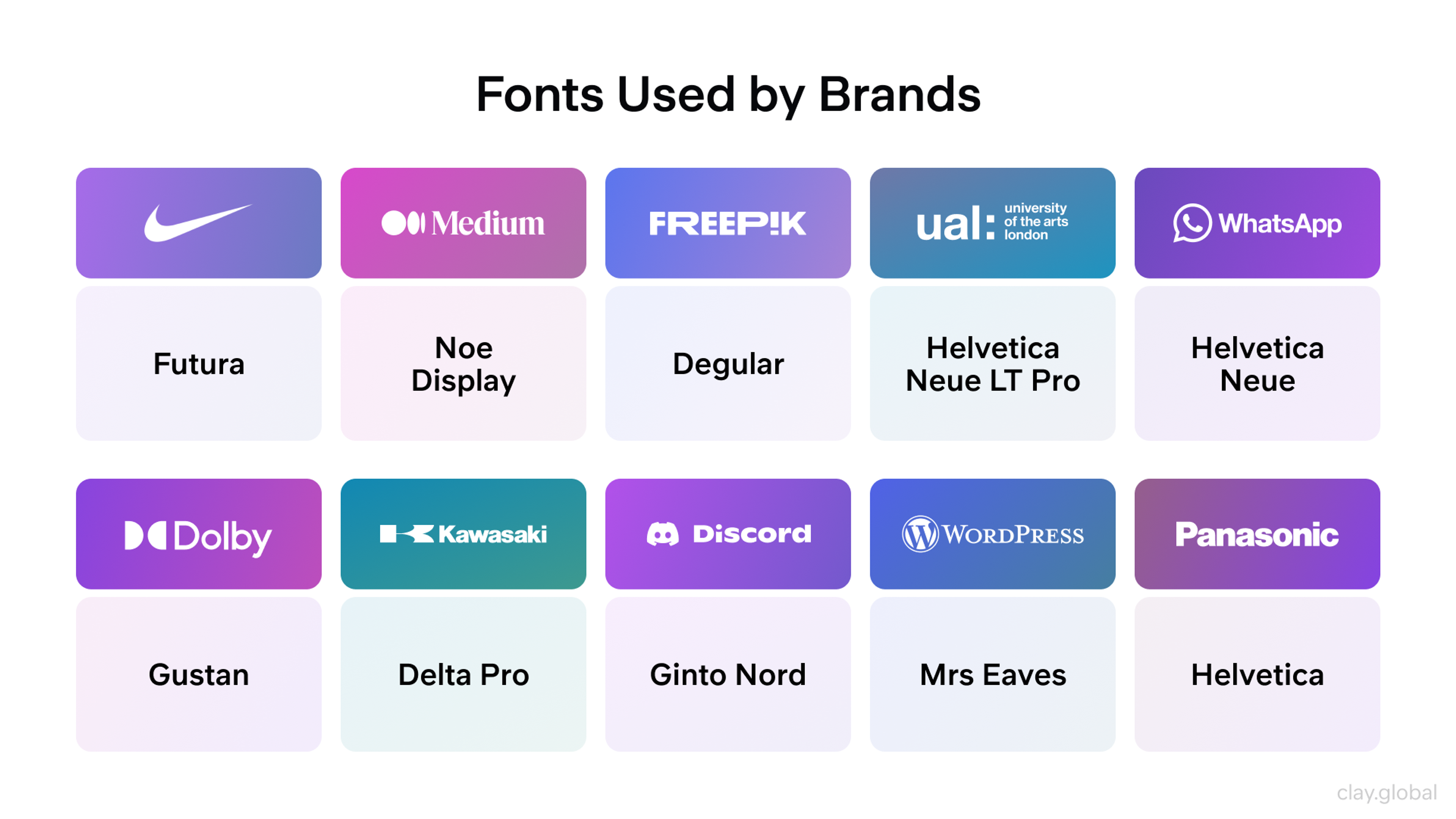
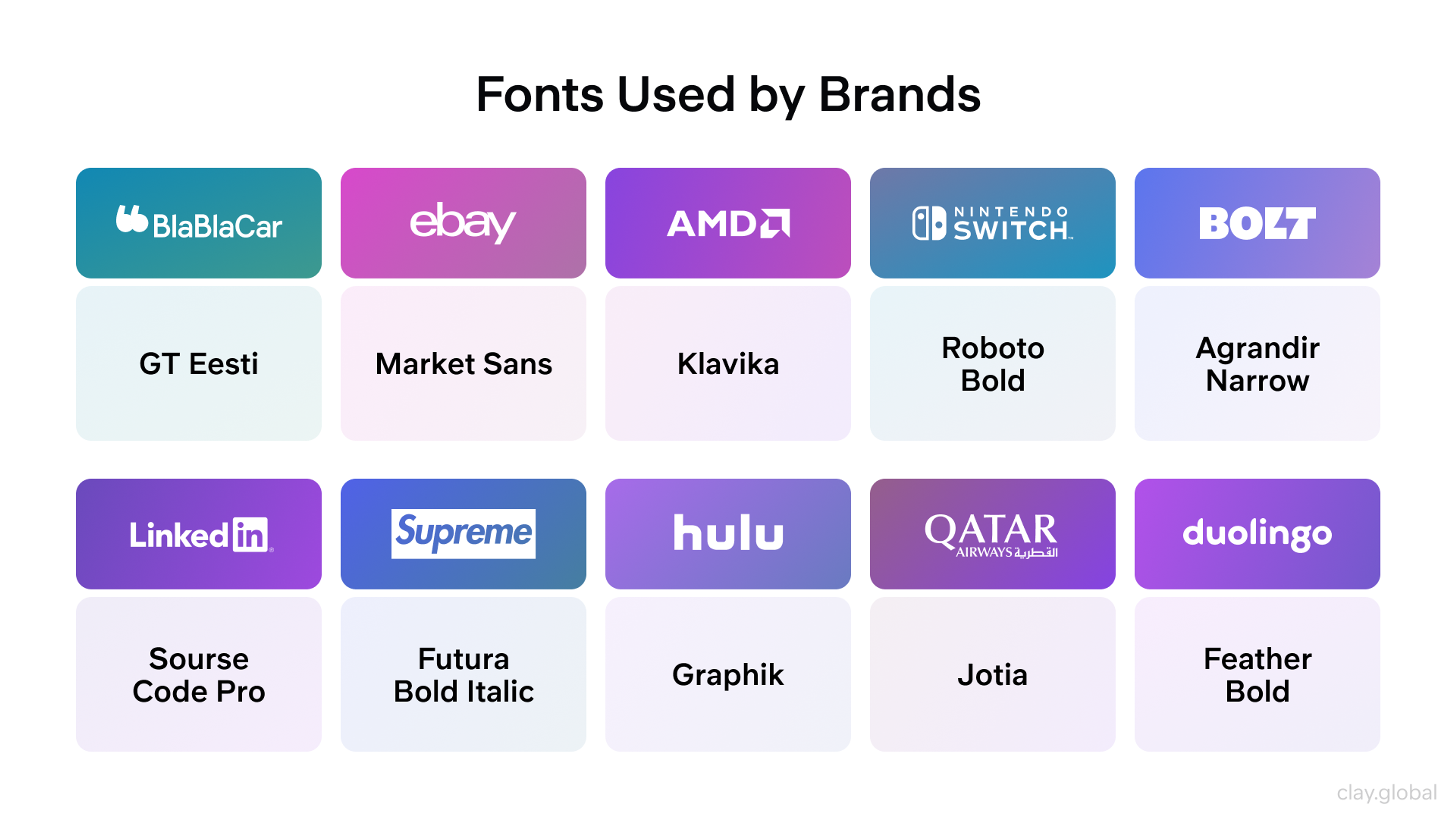
Branding happens through fonts. Your font choices tell people who you are. A law firm needs different fonts than a creative agency. Typography communicates your personality before people read a word.
Accessibility affects everyone. Good typography helps people with vision problems, makes content clearer for older adults, and improves reading for people with dyslexia.
Search engines notice typography. Fast-loading fonts improve your site speed. Readable content keeps people on your pages longer. Both factors boost your search rankings.
Typography Importance by Clay
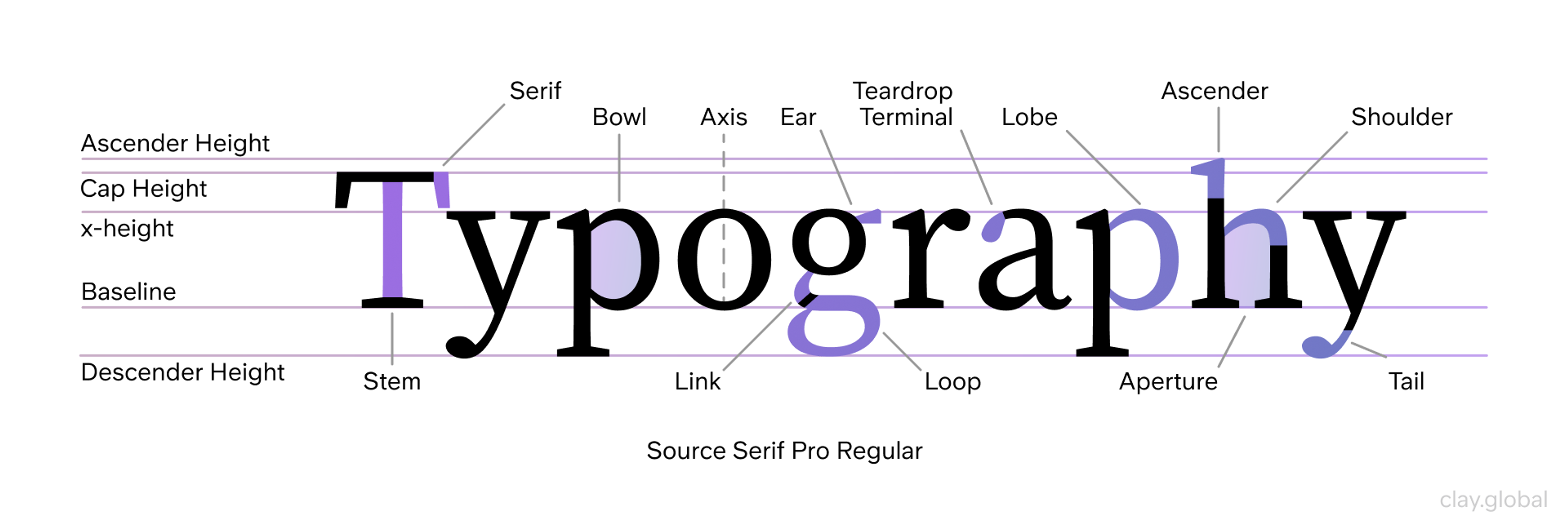
Essential Typography Terms You Need to Know
Understanding typography starts with knowing the key terms:
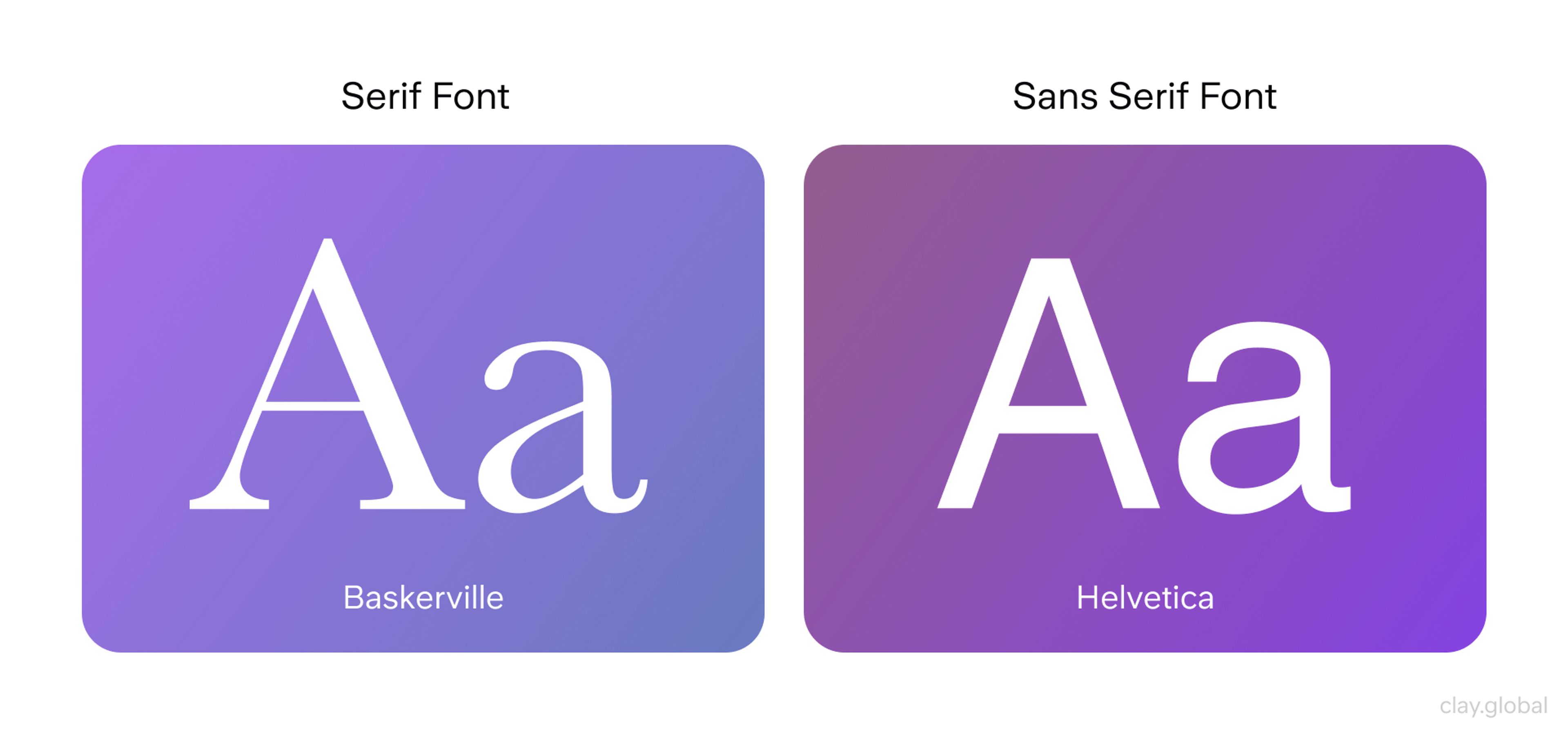
Serif vs Sans-serif
- Serif fonts have small lines at the end of letter strokes (like Times New Roman)
- Sans-serif fonts lack these extra strokes (like Arial or Helvetica)
- Sans-serif fonts usually read better on screens
Spacing Controls Everything
- Kerning adjusts the space between individual letter pairs
- Tracking changes in spacing across entire words or sentences
- Leading (pronounced "led-ing") controls the space between lines
Font vs Typeface
- A typeface is the overall design family (like Helvetica)
- A font is a specific version (like Helvetica Bold 16px)
Weight and Style Options
- Weight refers to thickness (light, regular, bold, heavy)
- Style includes italic, condensed, or extended versions
- Most typefaces offer multiple weights and styles
Typeface vs. Font
These terms are often used interchangeably, but they have distinct meanings. A typeface is the overall design or style of the text (e.g., Helvetica or Times New Roman), while a font refers to a specific size, weight, and style within that typeface (e.g., Helvetica Bold 12pt). A typeface, also referred to as a font family, encompasses a collection of various font styles, weights, and sizes.
Font vs Typeface by Clay

To further clarify:
- A typeface is like a family of related fonts. It encompasses all the variations of a particular design.
- Fonts are specific instances within a typeface. For example, “Arial” is a typeface, while “Arial Bold 14pt” is a font.
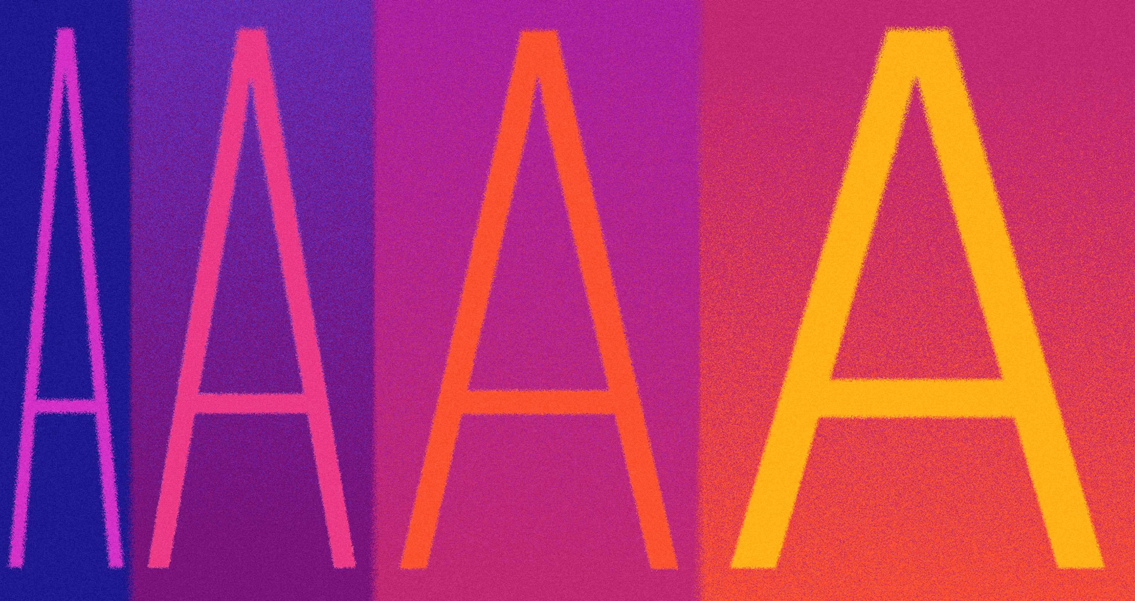
Serif vs. Sans Serif
Serif fonts have small lines or strokes attached to the end of a larger stroke in a letter or symbol. Times New Roman is a classic example. Sans-serif fonts, like Arial or Helvetica, lack these extra strokes, resulting in a cleaner, more modern look. In digital environments, sans-serif fonts are often preferred for their improved screen readability.
Serif vs Sans Serif by Clay
Additional points to consider:
- Serif fonts are often associated with tradition, formality, and elegance. They're commonly used in print media and for long-form content.
- Sans-serif fonts are perceived as modern, clean, and minimalist. They're popular in digital design and for short, punchy text.
- The choice between serif and sans-serif can significantly impact the mood and readability of your content.
Kerning, Tracking, and Line Spacing
These terms refer to the spacing in typography:
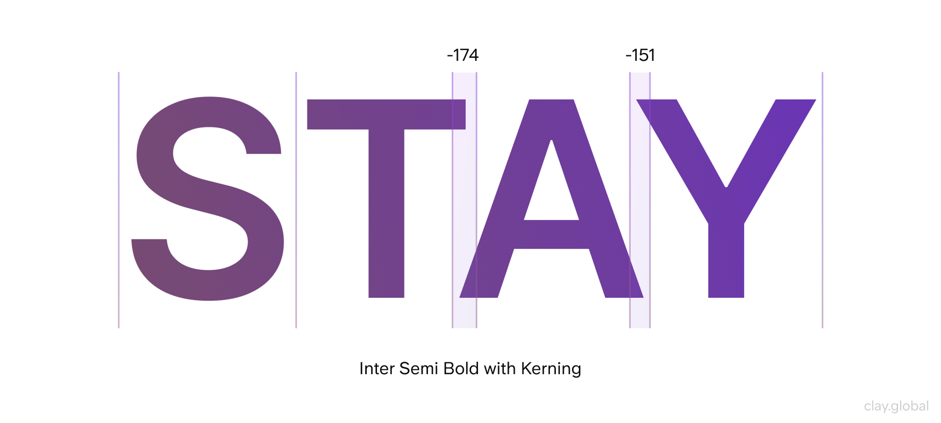
- Kerning is the process of adjusting the space between individual letters. Good kerning ensures that letter pairs like "AV" or "To" appear visually balanced.
Kerning by Clay
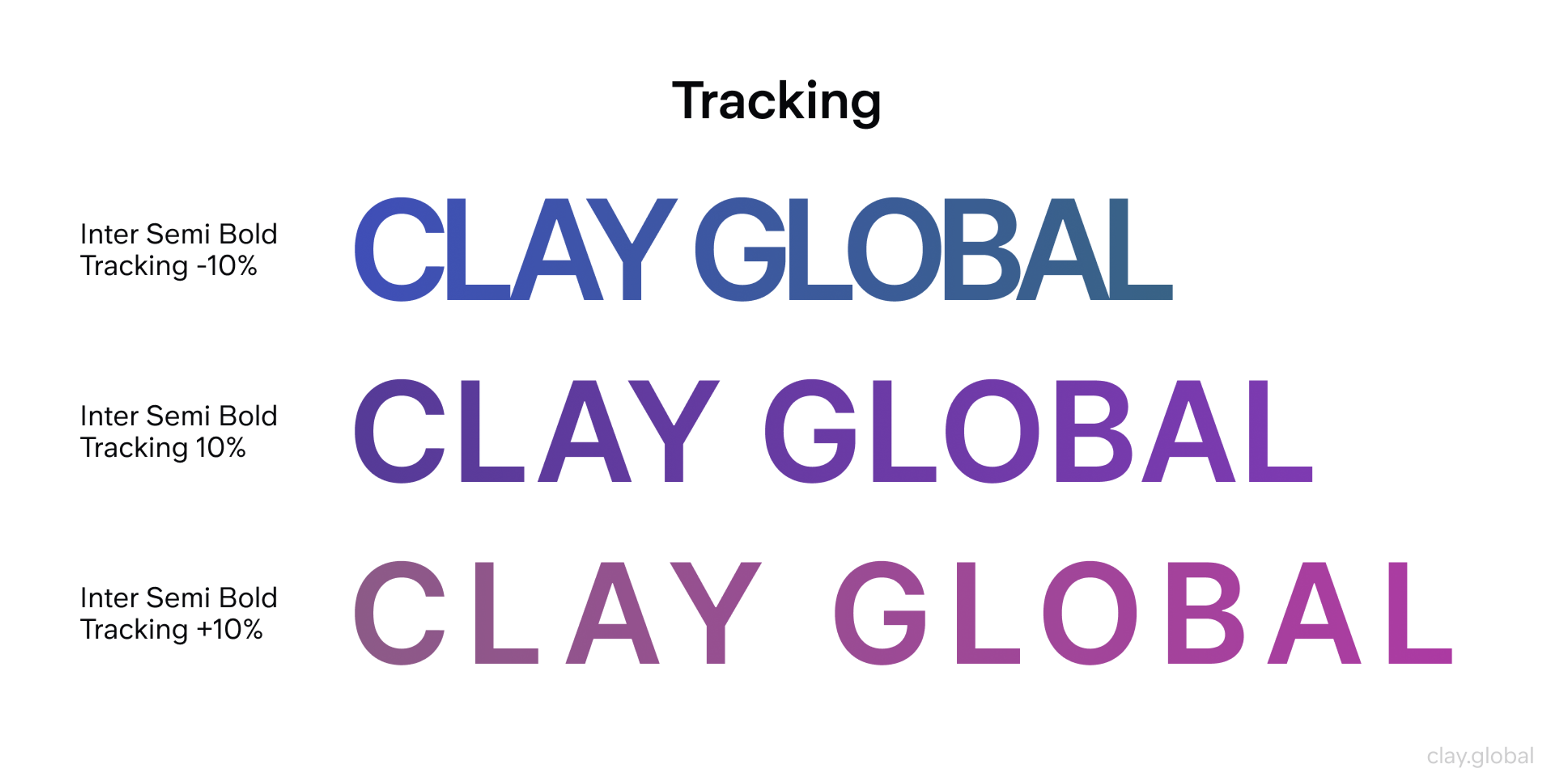
- Tracking refers to the overall spacing between groups of letters. It affects the density of text and can be adjusted to make text appear looser or tighter.
Tracking by Clay
- Leading (pronounced "ledding") is the vertical space between lines of text. It's named after the lead strips that were once used to separate lines of type in printing presses.
Illustration of Baseline and Leading in Typography by Clay

Proper adjustment of these elements can significantly improve your text's readability and aesthetic appeal.
Additional Typography Terms
To further enhance your typography vocabulary:
- X-height: The height of lowercase letters in a font, typically measured by the height of the lowercase 'x'. Fonts with larger x-heights tend to be more readable at small sizes.
- Baseline: The invisible line upon which most letters sit. Understanding the baseline is crucial for aligning text and creating a cohesive design.
- Ascender and Descender: Ascenders are the parts of lowercase letters that extend above the x-height (like in 'h', 'k', 'l'). Descenders are the parts that extend below the baseline (like in 'g', 'j', 'p'). These elements contribute to the overall character of a typeface.
- Weight: Refers to the thickness of a font's strokes. Common weights include light, regular, medium, bold, and heavy. Varying weights can create contrast and hierarchy within your design.
- Contrast: In typography, contrast refers to the difference between thick and thin strokes within a typeface. High-contrast fonts (like Bodoni) have dramatic differences between thick and thin strokes, while low-contrast fonts (like Arial) have more uniform stroke widths.
- Ligature: A character consisting of two or more letters combined into a single glyph. Ligatures are often used to improve the appearance of certain letter combinations, like 'fi' or 'fl'.
For Cornerstone, we made colorful typography to enhance the user experience. By carefully selecting and implementing fonts, we ensure that the site’s content is readable and visually appealing.
The typography complements the overall design, reinforcing the brand’s identity and enhancing navigation. This thoughtful approach to typography, combined with other design elements, creates a cohesive and compelling web experience that meets the needs of both the business and its users.
Cornerstone Typography by Clay
Understanding these terms will allow you to communicate more effectively about typography and make more informed decisions in your web design process. Remember, good typography balances these elements to create a harmonious, readable, and visually appealing design.
Typography Fundamental Principles That Actually Work
Choose Readability Over Beauty
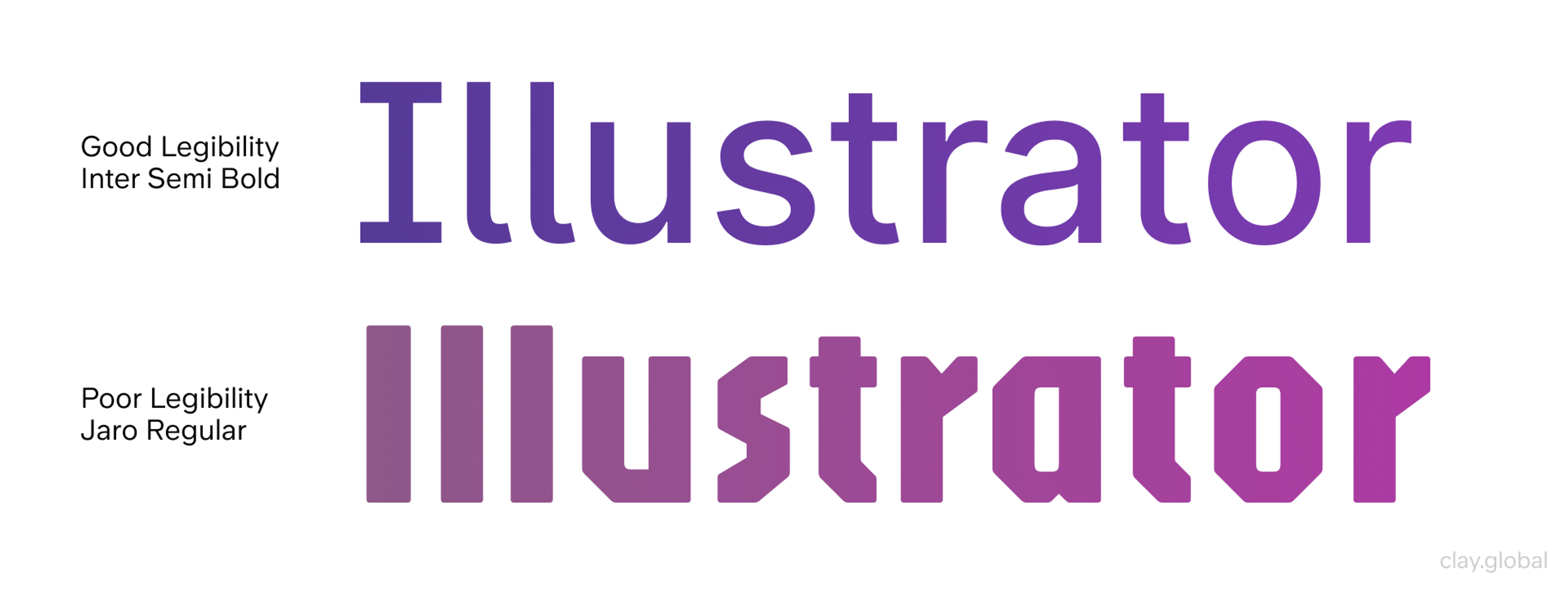
The primary goal of typography is to make text easy to read. An optimal line length, ideally between 40 and 80 characters, is crucial for enhancing readability by preventing eye strain and maintaining reader engagement. Using too many fonts can clutter the design and hinder readability, making it essential to limit the number of fonts used.
For body text, sans-serif fonts like Arial, Helvetica, or Verdana are often recommended due to their clean lines, which render well on digital screens. The font size should be large enough to read comfortably – typically 16-18px for body text on most devices. Typography adaptation ensures these choices remain effective across different contexts.
Good and Poor Legibility and Readability in Typography by Clay
Body text guidelines:
- Use 16-18px for body text on most devices
- Keep line length between 40-80 characters
- Choose fonts with clear letter shapes
- Ensure good contrast against backgrounds
Popular readable fonts include:
- System fonts (your device's default fonts)
- Inter (designed specifically for screens)
- Open Sans (clean and versatile)
- Roboto (Google's signature font)
Visual Hierarchy and Structure
A clear typographic hierarchy guides users through your content. Use different heading styles (H1, H2, etc.), sizes, and font weights to create a visual structure. This helps users quickly scan and understand the organization of your content.
Create hierarchy through:
- Size - Bigger text draws attention first
- Weight - Bold text stands out from regular text
- Color - Different colors create emphasis
- Spacing - White space makes elements feel important
Heading structure matters:
- H1: Your main page title (largest)
- H2: Major section headings
- H3: Subsection headings
- H4-H6: Smaller organizational headings
Limit Your Font Choices
Use no more than 2-3 typefaces per website. Too many fonts create visual chaos. They make your site look unprofessional.
Smart font pairing strategies:
- Pair a serif heading with sans-serif body text
- Use different weights from the same font family
- Combine fonts with similar proportions
- Test combinations across different devices
Accessibility
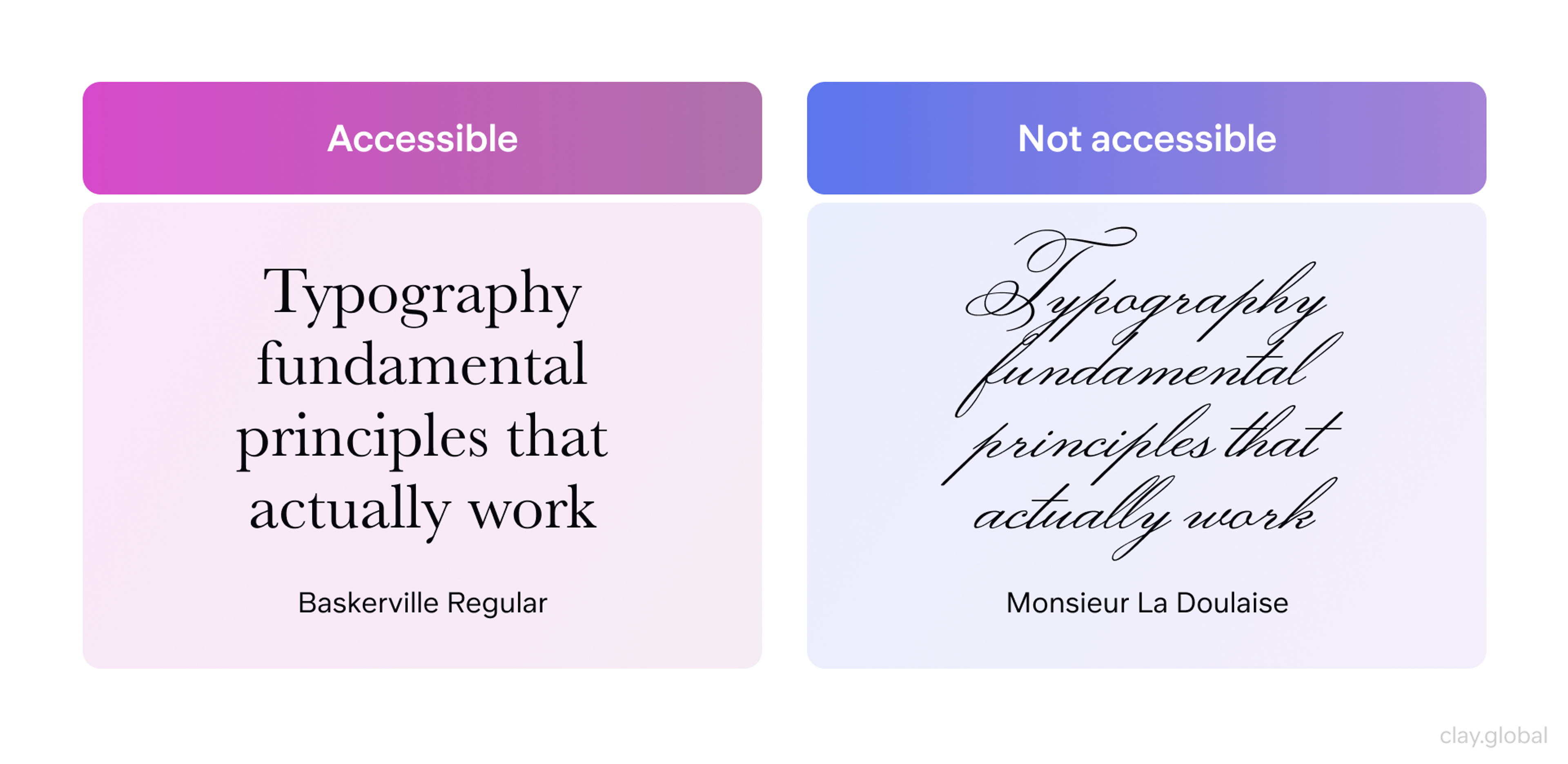
Ensuring your typography is accessible to all users is crucial. This includes using adequate font sizes, maintaining sufficient contrast between text and background colors, and ensuring your design adjusts responsive typography to accommodate users on different devices or with different visual abilities.
Accessible and not Accessible Fonts for Readability by Clay
Accessibility requirements:
- Maintain a 4.5:1 contrast ratio between text and background
- Allow users to zoom text up to 200% without breaking the layout
- Avoid using color alone to convey information
- Choose fonts with clear letter shapes
Testing your accessibility:
- Use browser zoom to test at 200%
- Check contrast with online tools
- Test with screen readers when possible
- Ask people with vision differences for feedback
Advanced Typography Techniques
Selecting the right fonts and implementing them effectively is crucial for creating a visually appealing and user-friendly website. Here are some expanded best practices to guide your typography choices:
Performance Optimization
Fonts affect your site's loading speed. Slow fonts hurt user experience and search rankings.
Font loading best practices:
- Limit the number of font files you load
- Use font-display: swap in your CSS
- Preload critical fonts in your HTML head
- Choose variable fonts when they make sense
Variable fonts save bandwidth by combining multiple weights and styles into one file. They're perfect for sites that use many font variations.
Web-Safe Fonts
Web-safe fonts are universally compatible across browsers and devices. Examples include Arial, Helvetica, Times New Roman, and Verdana. Using these fonts ensures that your design remains consistent for all users. Additionally, organizing fonts in a CSS file enhances consistency and maintainability across multiple pages.
List of Web-safe Fonts by Clay

Additional considerations for web-safe fonts:
- While web-safe fonts guarantee consistency, they may limit your design options.
- Consider using web-safe fonts as fallbacks for more unique font choices.
- Some other widely supported web-safe fonts include Georgia, Courier New, and Trebuchet MS.
Custom Typography
Custom fonts help your brand stand out. But they require extra planning and resources.
When to consider custom fonts:
- Your brand needs a unique personality
- You have a budget for font licensing
- Your team can handle the technical implementation
- Page speed won't suffer significantly
Appropriate Font Sizing
While specific sizes can vary based on the typeface and design, a general rule of thumb is to use 16-18px for body text. Headings should be proportionally larger, with the main heading (H1) being the largest.
Additional sizing considerations:
- Use relative units (em or rem) instead of fixed pixel sizes to ensure better device typography responsiveness.
- Consider implementing a modular scale for consistent and harmonious size relationships between different text elements.
- Don't forget about line height (leading). A good starting point is 1.5 times the font size for body text.
Font Weight and Style
Varying font weights and styles can help create hierarchy and emphasis:
- Use bold weights for headings and important information.
- Italic styles can be used for emphasis or to denote specific types of content (like quotes or citations).
- Be cautious with light font weights, especially for body text, as they can be difficult to read on some screens.
Adaptive typography helps ensure readability across devices and screen sizes. Good design adapts responsive typography to deliver optimal legibility and user experience regardless of context.
Color and Contrast
The color of your text plays a crucial role in readability:
- Ensure high contrast between your text and background colors. The Web Content Accessibility Guidelines (WCAG) recommend a contrast ratio of at least 4.5:1 for normal text.
- Be cautious with light text on dark backgrounds, as it can cause eye strain over long periods. If used, consider slightly increasing the font weight.
- Remember that some users may have color vision deficiencies. Avoid relying solely on color to convey information.
Responsive Typography
Your typography must adapt to different screen sizes. What works on desktop might fail on mobile.
Responsive strategies:
- Use relative units (em, rem) instead of fixed pixels
- Use media queries to adjust font sizes, line heights, and even typefaces for different screen sizes
- Adjust font sizes for different breakpoints
- Increase line spacing on smaller screens
- Consider different fonts for mobile vs desktop
How to Design Fonts?
Font design is a blend of creativity and technical precision, requiring careful planning and refinement. The process begins with research and inspiration, followed by sketching letterforms to define their style and structure.
Using software like Glyphs or FontForge, designers digitize and refine characters, ensuring consistency in stroke width, alignment, and spacing. Kerning and adjustments help improve readability and balance. Testing across different layouts ensures versatility before exporting the final font in formats like OTF or TTF.
Start with a Type Scale
A type scale creates consistent size relationships between your headings and body text. It makes your typography feel harmonious and professional.
Popular type scale ratios:
- 1.125 (Major Second) - Subtle and conservative
- 1.2 (Minor Third) - Balanced and versatile
- 1.25 (Major Third) - Noticeable but not dramatic
- 1.333 (Perfect Fourth) - Bold and attention-grabbing
Document Your Choices
Create a typography style guide that your team can reference. Include font families, sizes, colors, and spacing rules.
Your style guide should specify:
- Primary and secondary font families
- Font sizes for all heading levels
- Line height and spacing standards
- Color combinations and contrast ratios
- Usage rules for different font weights
Test Everything
Typography decisions affect real users. Test your choices with actual people, not just design tools.
Testing methods:
- User interviews about readability
- A/B testing different font choices
- Analytics on time spent reading
- Accessibility testing with real assistive technologies
Typography in Branding
Typography plays a crucial role in establishing and reinforcing your brand identity. Your font choices can convey your brand's personality, values, and positioning as effectively as your color palette or logo. Here's a deeper look at how to leverage typography in branding:
Reflecting Brand Personality
Your typography choices should reflect your brand's personality. Different font styles evoke different emotions and associations:
- Serif fonts (like Times New Roman or Baskerville) often convey tradition, respectability, and elegance. Luxury brands, academic institutions, and traditional media outlets commonly use them.
- Sans-serif fonts (such as Helvetica or Arial) are perceived as modern, clean, and straightforward. They're popular among tech companies, startups, and brands aiming for a minimalist aesthetic.
- Script fonts can suggest creativity, elegance, or a personal touch. Brands in the fashion, beauty, or creative industries often use them.
- Display fonts, which are more decorative, can be used to create a unique, memorable brand identity, but should be used sparingly and consistently.
For example, a luxury brand might opt for elegant serif fonts, while a tech startup might prefer modern, minimalist sans-serif fonts. A children's brand might use a playful, rounded sans-serif font to appeal to its target audience.
Typography Trends Worth Following
Typography in web design is constantly evolving, influenced by technological advancements, design philosophies, and changing user preferences. As of 2026, several key trends are shaping the landscape of web typography:
Minimalism and Sans-Serif Dominance
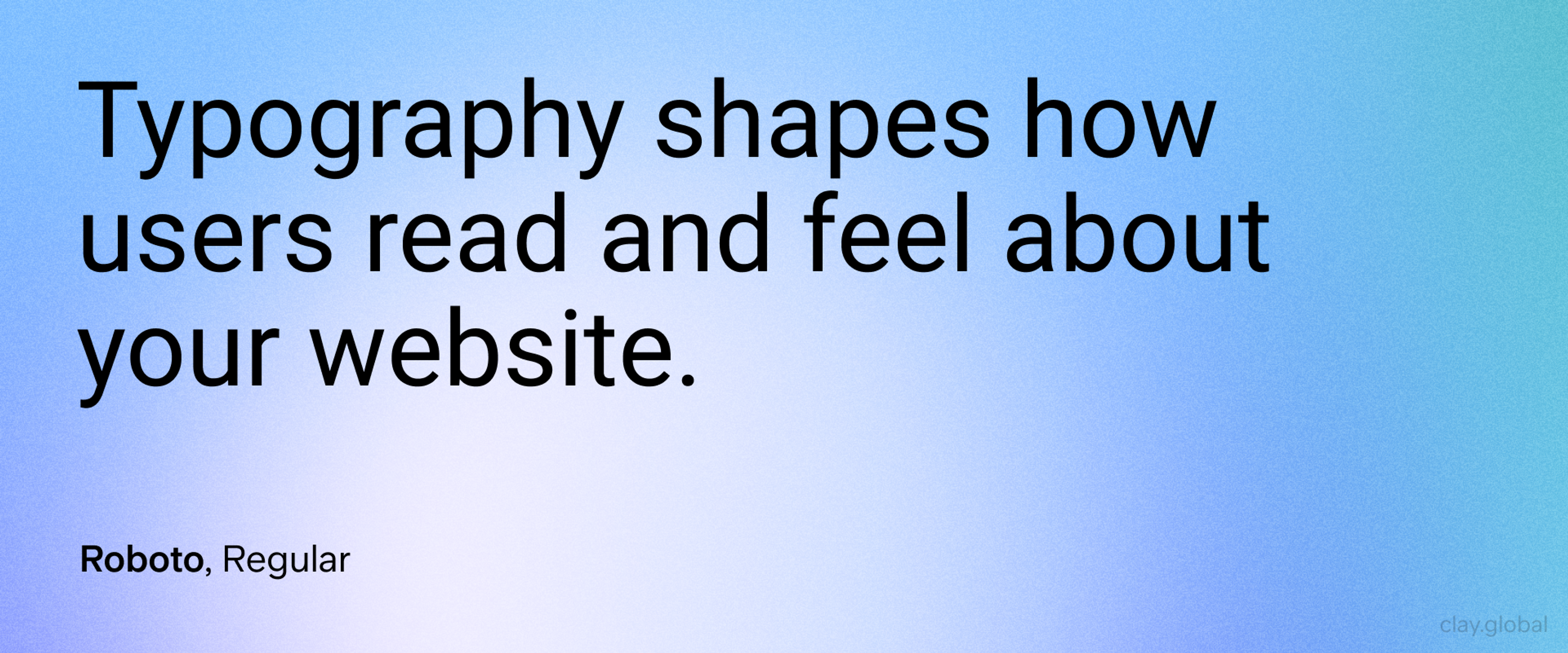
Minimalist sans-serif fonts like Inter, Roboto, and Open Sans continue to dominate web design. Their clean, modern look aligns well with the current preference for uncluttered, user-friendly interfaces. These fonts offer excellent readability across devices and sizes, making them a go-to choice for body text and user interface elements.
Minimalistic Font Example by Clay
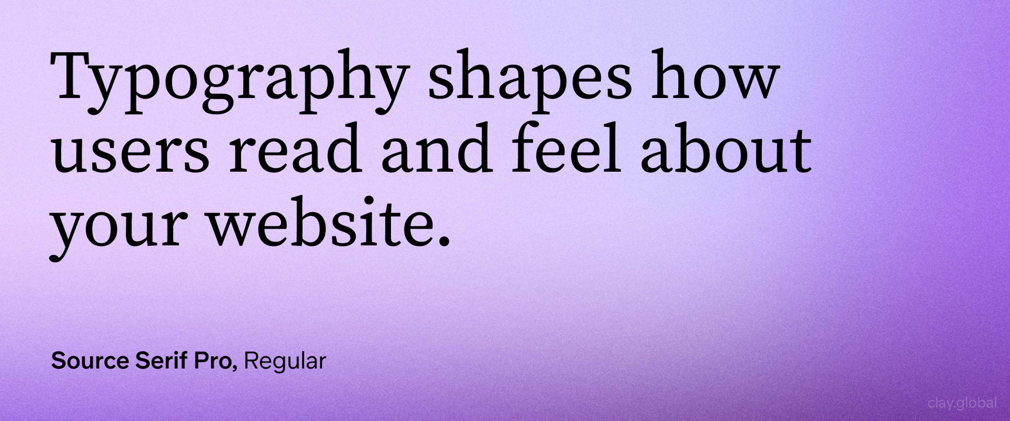
The Return of Serif Fonts
Modern serif fonts are making a comeback on the web. Improved screen technology makes serifs more readable than ever. They add warmth and personality to digital designs.
Popular modern serifs:
- Merriweather (designed for screens)
- Playfair Display (elegant and distinctive)
- Source Serif Pro (Adobe's open-source serif)
This trend reflects a desire to balance the sleek modernity of sans-serif typefaces with the warmth and character often associated with serif typefaces. It's not uncommon to see websites pairing a serif font for headlines with a sans-serif font for body text, creating a pleasing contrast.
Serif Font Example by Clay
Oversized Typography
Giant text is becoming a design element itself. Large typography creates immediate impact. It works especially well for hero sections and landing pages.
Oversized typography guidelines:
- Make sure text remains readable at all sizes
- Balance large text with plenty of white space
- Consider loading performance with large fonts
- Test across different devices carefully
Oversized Typography Example by Clay
Experimental Text Effects
Creative typography pushes boundaries while maintaining readability. This includes subtle animations, custom letter spacing, and artistic layouts.
Keep experiments accessible:
- Ensure text remains selectable and readable
- Provide alternatives for motion-sensitive users
- Don't sacrifice performance for effects
- Test with assistive technologies
Experimental Font Example by Clay
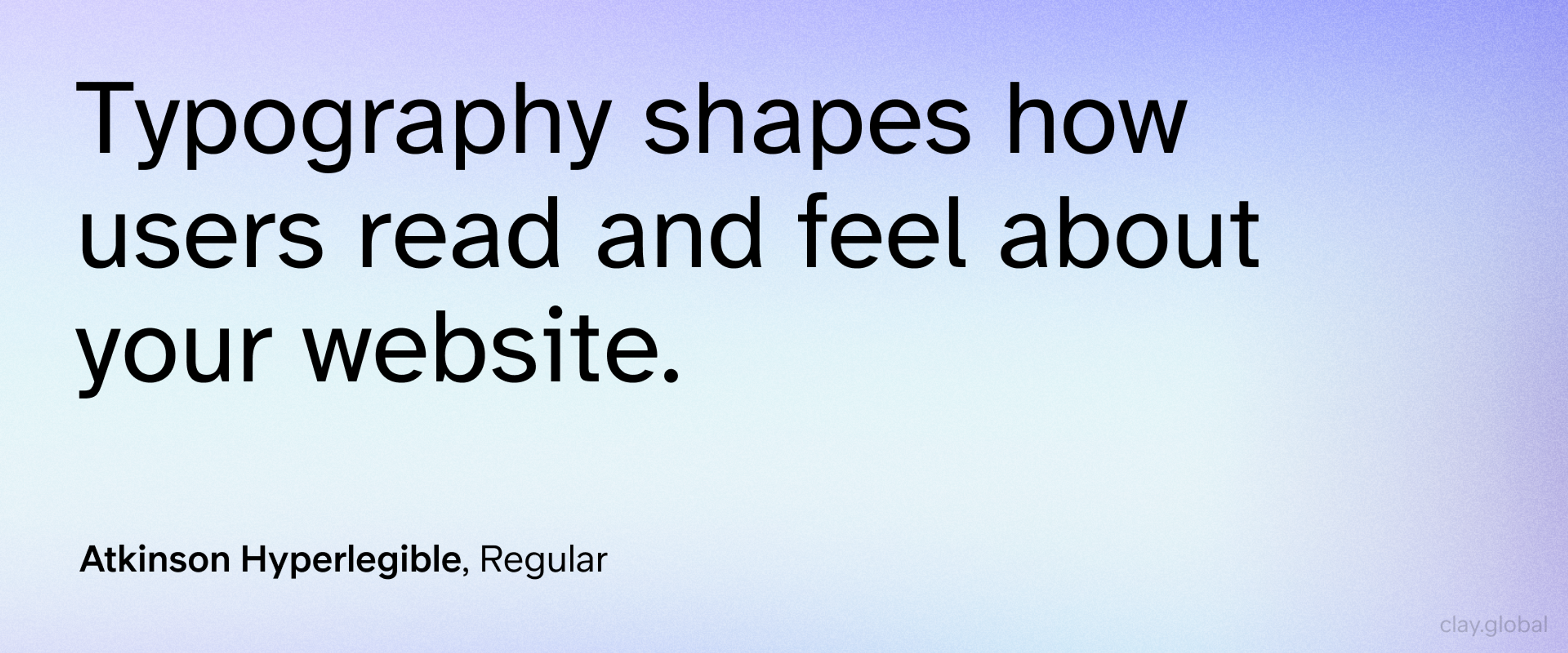
Accessibility-Driven Choices
With an increased focus on web accessibility, designers are making more conscious choices about typography. This includes selecting fonts with clear letterforms, ensuring sufficient contrast, and providing ample sizing and spacing.
Fonts designed specifically for improved legibility, like Atkinson Hyperlegible, are gaining popularity.
Accessible Font Example by Clay
Retro and Nostalgic Fonts
In contrast to the minimalist trend, some designers are embracing retro-inspired typography. This includes revivals of classic serif and slab serif fonts, as well as playful, nostalgic display fonts that evoke specific eras or styles.
As we move forward, we can expect these trends to evolve further, driven by advancements in web technologies, changing design philosophies, and the ever-present need to balance aesthetics with functionality and accessibility.
Retro Font Example by Clay
Future of Web Typography
Typography technology continues evolving rapidly. New CSS features give designers more control. Variable fonts offer unprecedented flexibility.
Emerging trends include:
- AI-powered font pairing recommendations
- Dynamic typography that adapts to user preferences
- Advanced OpenType features in web browsers
- Better support for international scripts and languages
Accessibility drives innovation. New tools help designers create more inclusive typography. Standards continue improving to help everyone read web content better.
Getting Started with Better Typography
Start small and improve gradually. You don't need to redesign everything at once.
Quick wins for immediate improvement:
1.
Increase your body text size to at least 16px2.
Improve contrast between text and backgrounds3.
Add more line spacing for easier reading4.
Choose one high-quality font family for body text5.
Create consistent heading sizes across your site
Long-term typography improvement:
- Conduct user testing on readability
- Create a comprehensive style guide
- Train your team on typography basics
- Regularly audit and update font choices
- Stay current with accessibility standards
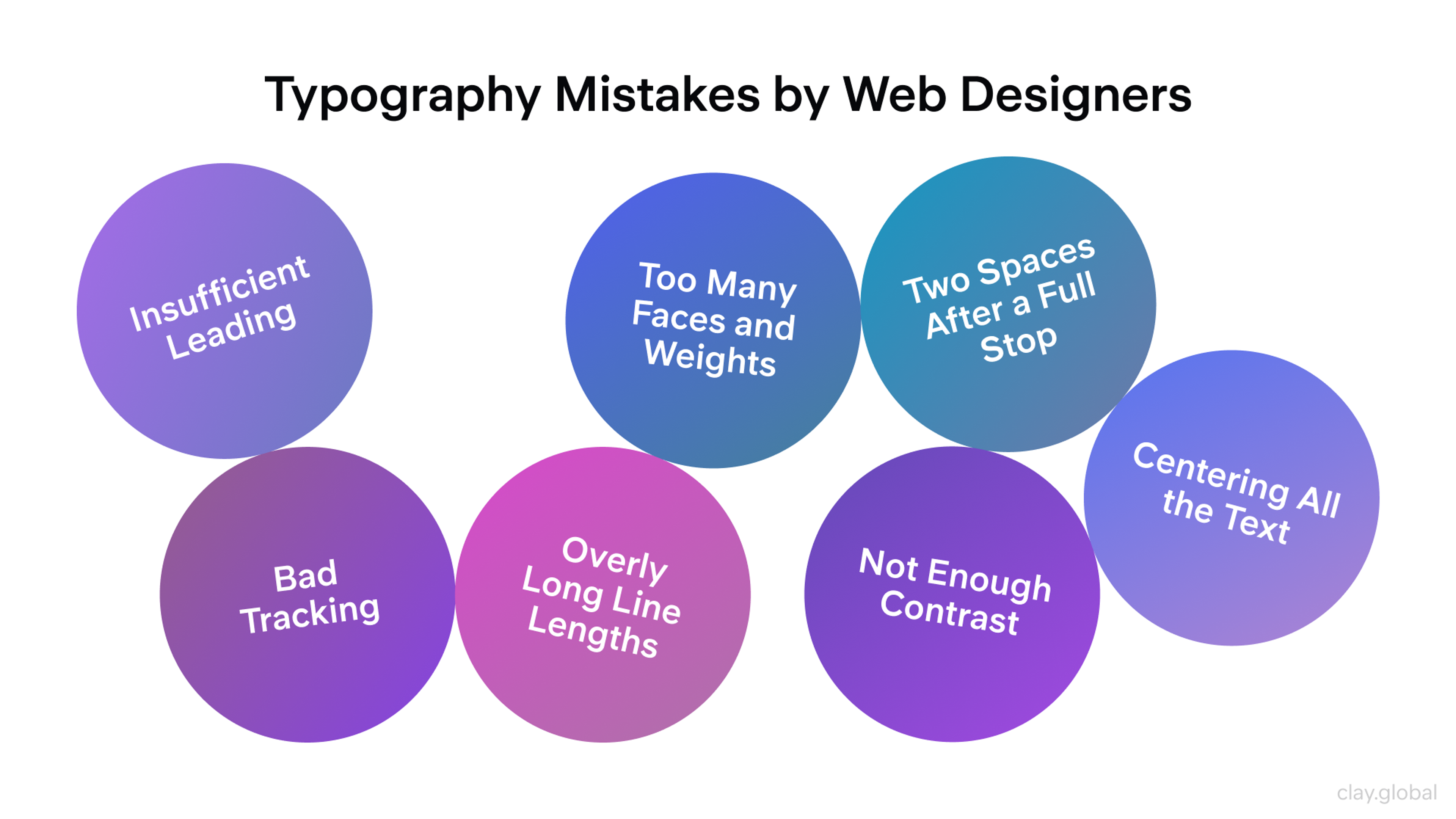
Common Typography Mistakes to Avoid
- Using too many fonts - Stick to 2-3 typefaces maximum
- Ignoring line length - Keep lines between 40-80 characters for best readability
- Poor color contrast - Always test contrast ratios, especially with colored text
- Inconsistent spacing - Maintain consistent margins, padding, and line heights
- Forgetting mobile users - Test typography on actual mobile devices, not just browser tools
- Loading too many font weights - Each font file slows down your site
- Using decorative fonts for body text - Save fancy fonts for headings only
Typography Mistakes by Clay
Tools for Better Typography
Design Tools
- Figma - Excellent for typography design and prototyping
- Adobe Fonts - Large library of high-quality fonts
- Google Fonts - Free fonts optimized for the web
Testing Tools
- WebAIM Contrast Checker - Test color contrast ratios
- Font Pair - Find fonts that work well together
- Type Scale - Generate harmonious font size systems
Performance Tools
- Google PageSpeed Insights - Check font loading performance
- Font Display Playground - Test different font loading strategies
- Glyphhanger - Optimize font files by removing unused characters
Read More
Conclusion
Good typography works invisibly. It guides readers without getting in their way, supporting your content instead of fighting for attention.
The best typography decisions balance beauty with function. They consider all users, not just those with perfect vision. They adapt to different devices and contexts.
Start with readability. Build a clear hierarchy. Choose accessible fonts. Test with real users. Your typography will improve your website's success in measurable ways.
Remember: typography is not just about fonts. It's about creating the best possible reading experience for your audience.

About Clay
Clay is a UI/UX design & branding agency in San Francisco. We team up with startups and leading brands to create transformative digital experience. Clients: Facebook, Slack, Google, Amazon, Credit Karma, Zenefits, etc.
Learn moreAbout Clay
Clay is a UI/UX design & branding agency in San Francisco. We team up with startups and leading brands to create transformative digital experience. Clients: Facebook, Slack, Google, Amazon, Credit Karma, Zenefits, etc.
Learn more