Typography is one of the few design choices users “feel” before they can explain it. The right type can make a product sound confident, calm, playful, or premium in a single glance.
But in 2026, picking a beautiful font is only half the job. The other half is delivering it fast, keeping layouts stable, and staying friendly to accessibility and privacy expectations.
This article covers what web fonts are, how font tech evolved, and what modern teams do to make typography consistent across devices - without sacrificing performance.
What Are Web Fonts
A web font is a typeface delivered to the browser as part of your site experience, so your text renders the way you designed it - even if the user doesn’t have that font installed locally.
That consistency matters because typography carries hierarchy (what to read first), tone (how it should feel), and usability (how easy it is to scan, read, and navigate).
Benefits of Using Web Fonts
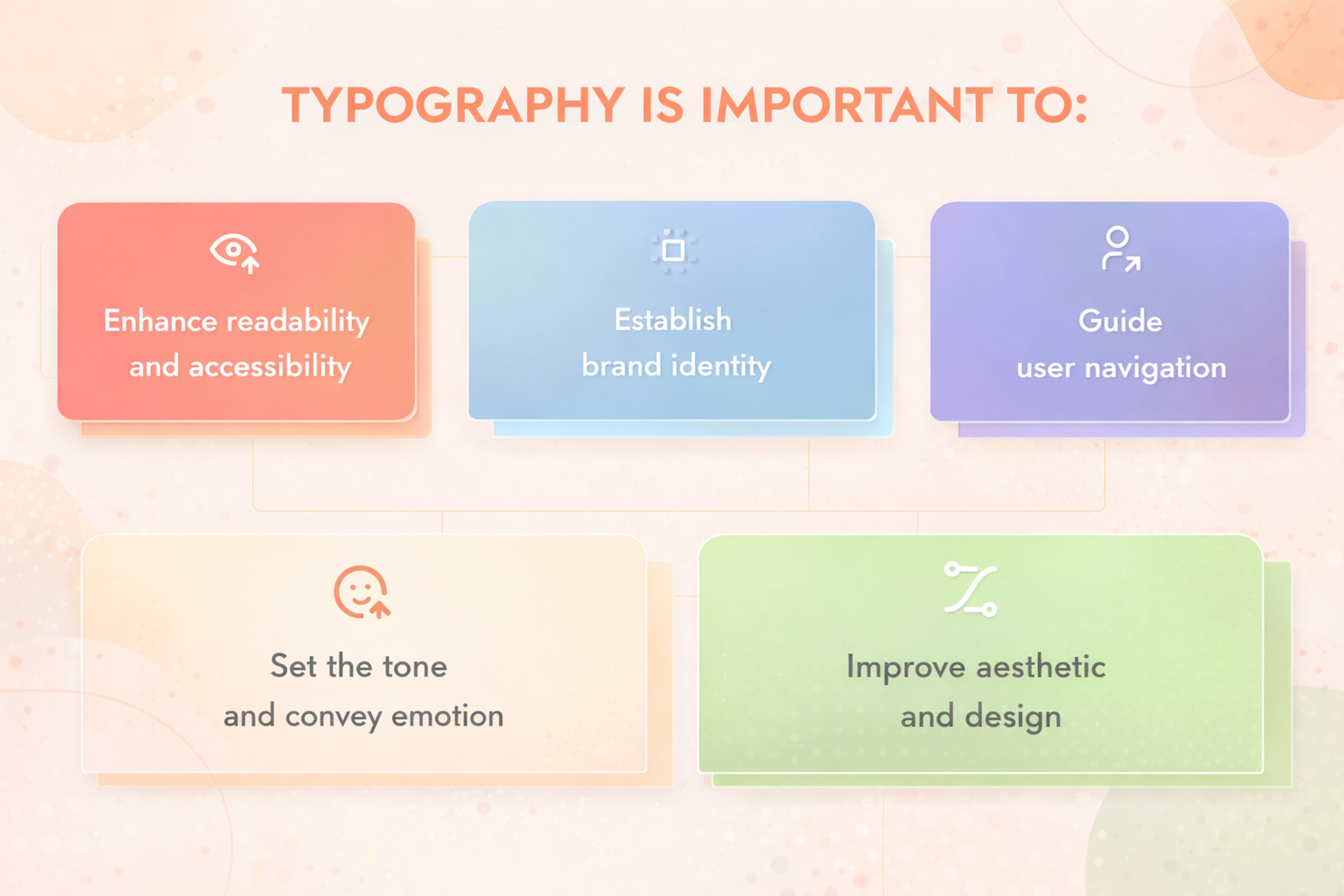
Incorporating web fonts into your designs can unlock a multitude of benefits, enhancing both the visual appeal and functionality of your website. Here are some of the most significant advantages:
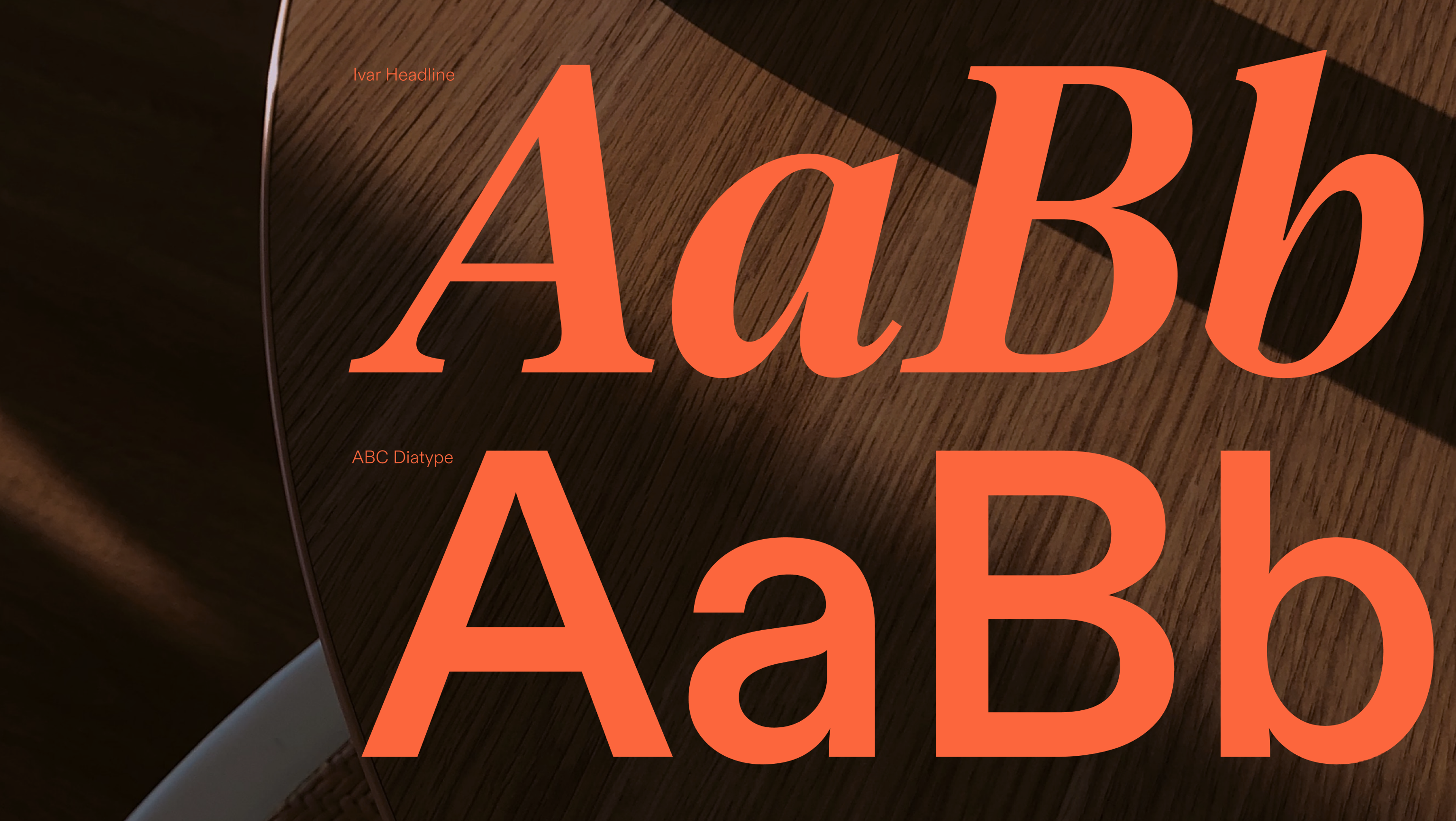
- Increased Creativity: With thousands of web fonts at your disposal, you have a vast palette to choose from, allowing you to craft unique and visually captivating designs. This variety empowers you to break free from the constraints of default fonts and explore new typographic possibilities. A versatile font can adapt to different design needs, making it suitable for both headings and body text across various mediums.
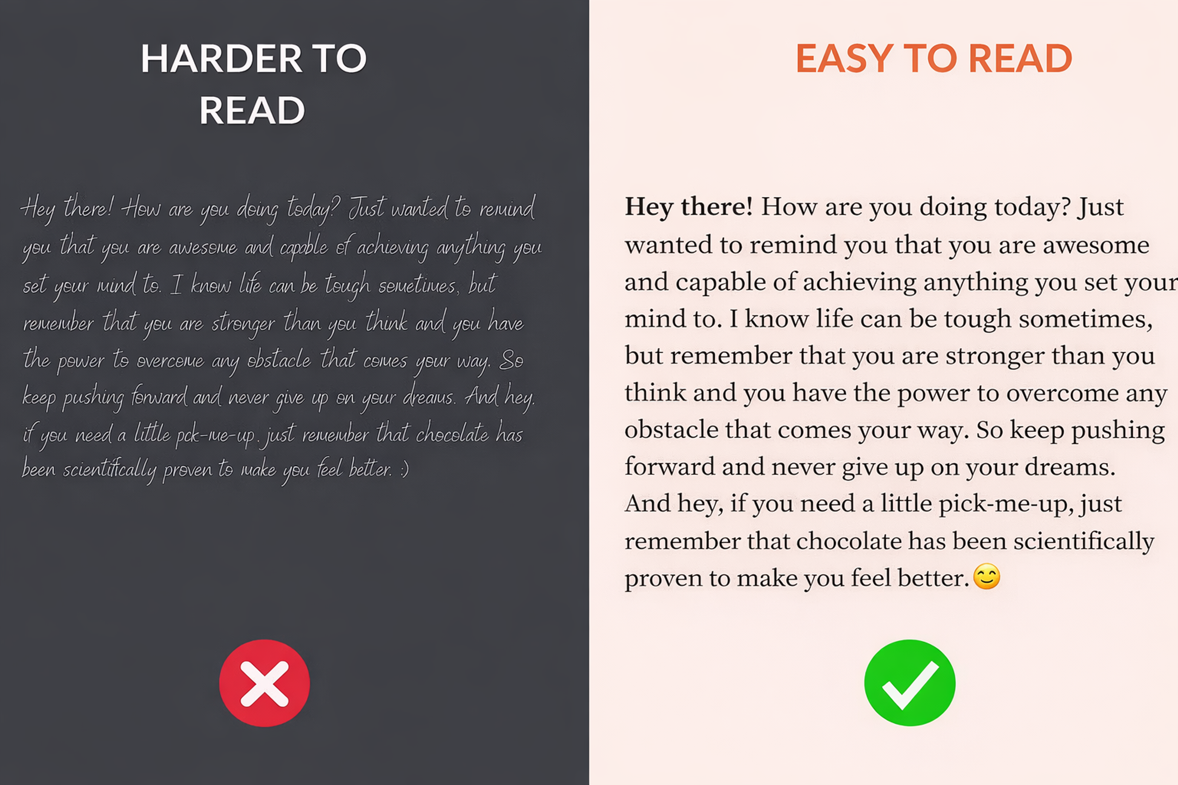
- Improved Readability: Web fonts can be optimized for screen readability, ensuring that your content is easy to read and comprehend. This is particularly important for maintaining user engagement and delivering a seamless reading experience.
Good and Bad Readability Examples
- Consistency: Web fonts ensure that your design looks consistent across different devices and browsers. This uniformity is crucial for maintaining a cohesive visual identity and providing a reliable user experience.
- Branding: Custom web fonts can reinforce your brand identity, creating a consistent visual language across all your marketing materials. By using distinctive fonts, you can make your brand more recognizable and memorable.
- Accessibility: Web fonts can enhance accessibility by providing clear and readable text for users with visual impairments. This inclusivity ensures that your content is accessible to a broader audience, aligning with best practices in web design.
The Roles Fonts Play In A Design System
Fonts work best when they have jobs, not just styles. A simple system usually needs three roles:
1) UI workhorse
Used for navigation, buttons, forms, tables, and dense screens. It should stay crisp at small sizes, with clear distinctions between similar characters (I/l/1, 0/O).
2) Reading companion
Used for long-form content. Prioritize comfortable rhythm, clear punctuation, stable spacing, and strong readability on a variety of screens.
3) Display accent
Used for headlines, brand moments, and marketing highlights. These fonts can be expressive, but they should be used sparingly so they don’t exhaust the reader or create inconsistency.
A design system becomes easier to scale when typography choices are tied to roles (tokens), not one-off pages.
Benefits of Fonts in Web Design
Good Fonts for Websites
Choosing the right font for your website is essential for enhancing aesthetics and readability, creating a great user experience. The right typography can set the tone and make your site look more professional.
Inter
Inter is a modern, versatile sans serif font designed by Rasmus Andersson, a former Figma designer. Tailored specifically for user interfaces and screens, this free, open-source typeface is trusted by industry leaders like GitHub and Mozilla.
As a variable font family, Inter offers exceptional flexibility, allowing precise control over styles and weights. Its advanced OpenType features, including contextual alternates and tabular numbers, ensure enhanced readability across diverse applications, making it a go-to choice for digital design.
Roboto (+ Condensed and Slab)
Sans serif Roboto has become a top choice among web designers, thanks to its versatility, readability, and clean, modern design. Originally developed by Google, it has been widely adopted for its ability to adapt seamlessly to various design styles and digital interfaces.
Its Condensed and Slab variations have also gained significant popularity, offering additional flexibility for different design needs. These features have made Roboto a go-to font for Webflow users in recent years, helping creators craft polished and professional-looking websites with ease.
Source: Inferno986return, CC BY-SA 4.0, via Wikimedia Commons

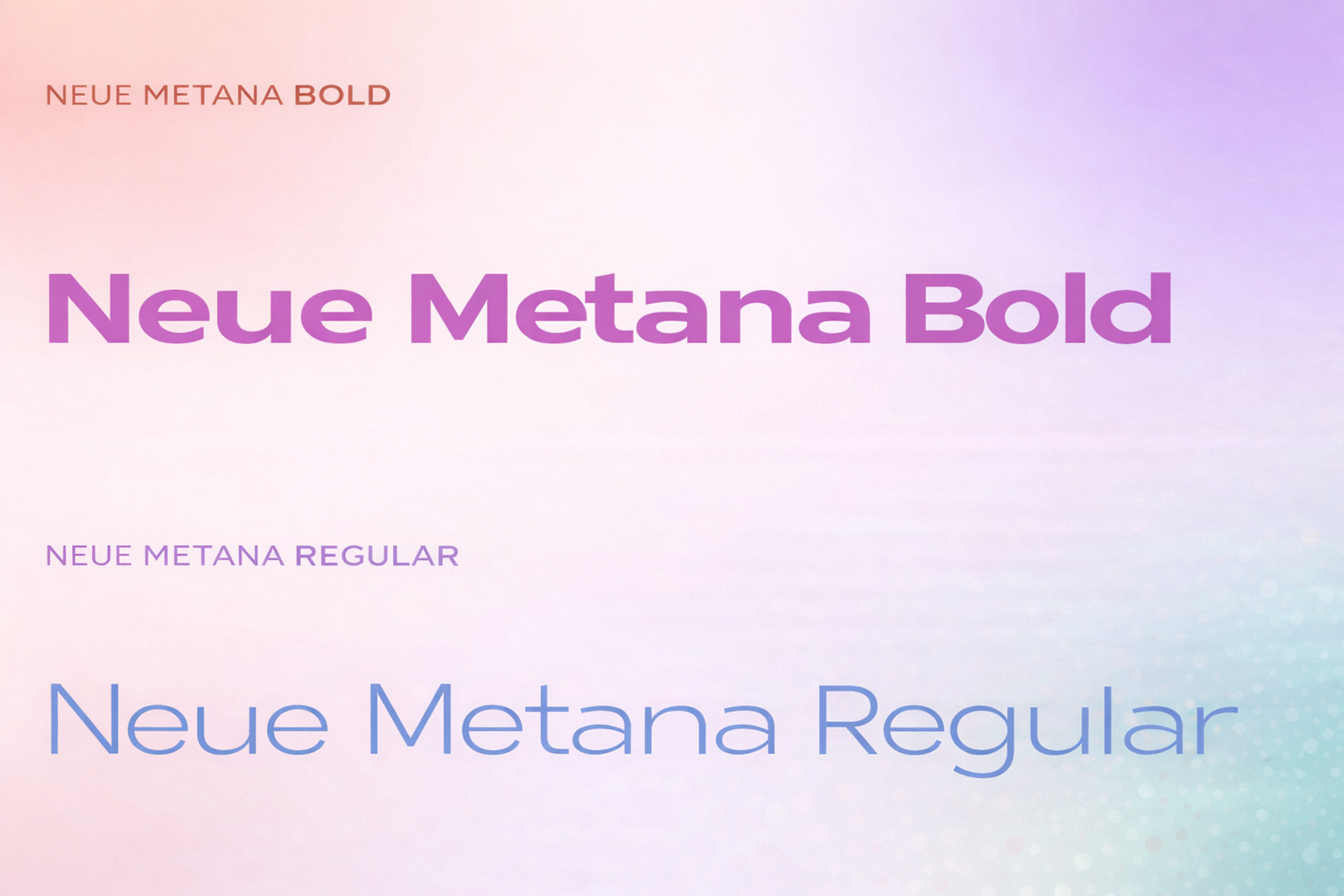
Neue Metana Font
Neue Metana is a sleek, minimalist typeface that redefines modern design with its geometric structure, alternative characters, and unique ligatures. Drawing inspiration from urban culture and contemporary lifestyle trends, this font effortlessly adapts to any project, whether you need a light, delicate look or bold, striking impact.
Crafted through a collaboration between Aulia Rahman, Jeje Yuhardi, and Wildya Balqis, Neue Metana brings versatility and character to websites and designs alike, making it the perfect blend of style and sophistication for any creative endeavor.
Neue Metana Bold
Migha Font
Migha, a free variable font by Seniors Studio, combines modern and retro styles, making it a flexible option for web design. This display font family includes six weights, four widths, and various stylistic features, totaling 96 font files.
Script fonts, which mimic handwriting styles, are another category of display fonts often used for titles rather than body text due to readability concerns. They play a significant role in web design by enhancing brand identity and visual impact.
It’s perfect for a variety of uses, including branding, magazines, posters, and logos, and offers a complete set of uppercase letters, numbers, punctuation, and multilingual support. With its wide range of styles, Migha is one of the most adaptable fonts for websites, ideal for any project that needs a unique, standout design.
Migha Font

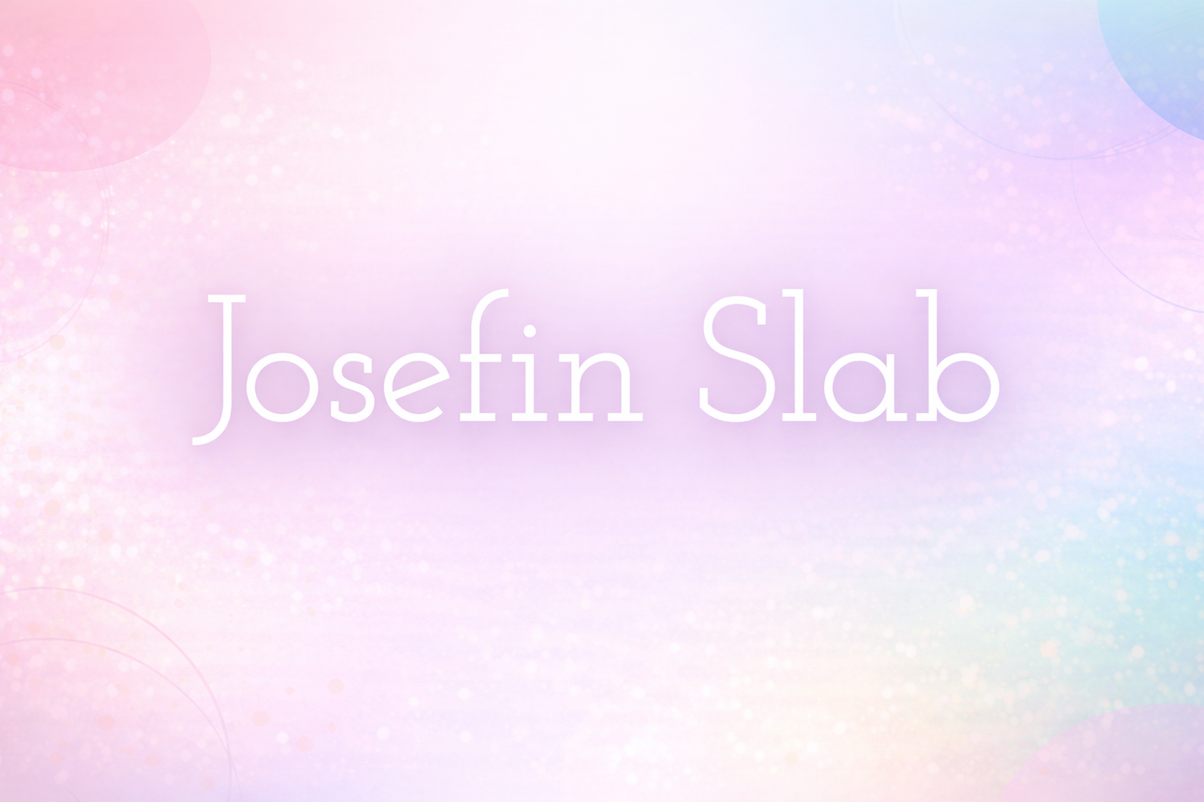
Josefin Slab
Josefin Slab is a modern slab serif font that offers a clean and elegant design with a touch of retro charm. It’s part of the larger Josefin family, which is known for its geometric and stylish look. Josefin Slab stands out with its sharp, strong lines and balanced proportions, making it perfect for both headlines and body text.
The font’s versatility makes it suitable for a variety of design projects, from editorial layouts and websites to branding and posters. Its distinctive, yet readable design ensures it can deliver both sophistication and clarity, making it a popular choice for projects aiming for a refined, timeless aesthetic.
Josefin Slab Font
Popular Web Font Services
Several services are available for embedding web fonts, and designers and developers can utilize them. Below are some of the major sellers and their merits and demerits.
Google Fonts
Google Fonts is one of the most popular free web font services that can help you get thousands of font families. Clients can quickly use the service by making straightforward fonts for their website owners.
However, when it comes to picking fonts, many have to choose from the more popular ones, and some designers may also use other types of fonts.
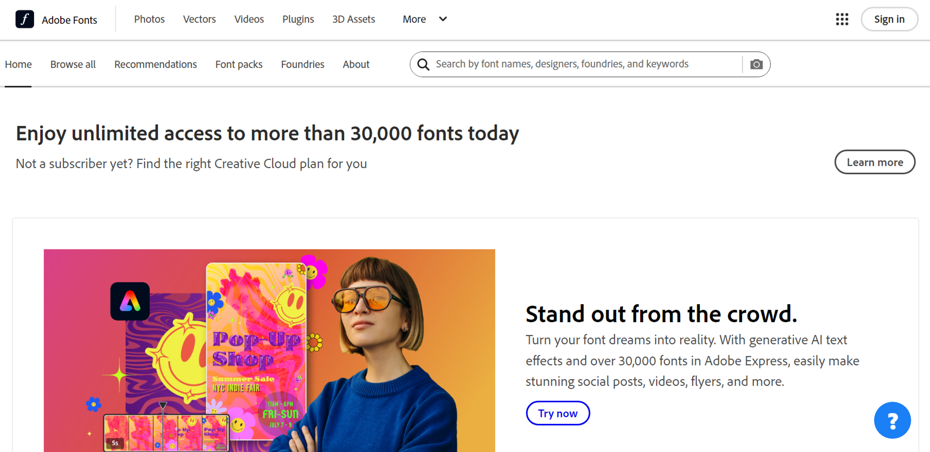
Adobe Fonts
Adobe Fonts, also known as Typekit, provides Adobe Creative Cloud Subscribers with a rich gallery of high-quality fonts. It has great features that allow it to be easily integrated within Adobe software and superb typographical control.
Even though the fonts available at Adobe Fonts are quite diverse in many aspects, they are also enclosed within a subscription. This may also be a downside for designers working on low budgets.
Source: fonts.adobe.com
Custom Font Hosting Services
Custom font hosting services assist designers in uploading their fonts on their servers, as they have control permission on the font files.
This option often attracts domain owners who wish to have a proprietary typeface or optimize their pages' performance for specific requirements. However, dealing with font licenses and adherence to web standards may burden the project.
Pros and Cons of Each Service:
- Google Fonts: The pros include a reasonable price and a simple interface, while Strike Out's number of fonts is not outstanding.
- Adobe Fonts: The pros include a vast collection and integration with the Adobe suite; the only significant con is the price.
- Custom Hosting: Pros are customization and control, whereas cons include greater complexity and licensing management.
The Near Future
Web typography is becoming increasingly powerful with fewer sacrifices. Variable fonts are stabilizing, color fonts add bursts of managed color, and smart delivery loads only what devices actually need.
Ethical personalization will soon adjust reading ease based on surroundings, not just screen size. Constant goals stay: keep both clarity and character working together.
FAQ
What Is A Web Font?
A web font is a typeface served with your webpage so every visitor sees the same letterforms, spacing, and metrics — independent of what’s installed on their device.
Should I Use Variable Fonts Or Static Files?
Use variable fonts for flexible weight/width in one file, smoother responsive steps, and fewer requests. Use static files for very simple type hierarchies or when strict legacy compatibility is required.
How Do I Prevent Invisible Text And Layout Shifts When Fonts Load?
Set font-display:swap so text renders immediately, use metric-compatible fallbacks (similar x-height/width), and preload only critical fonts needed above the fold.
How Do I Choose Fonts For Body Text vs. Display?
Pick text-optimized families for paragraphs (clear I/l/1, comfortable rhythm, good punctuation) and reserve expressive display faces for headlines, short labels, and accents.
Do I Need A License For Web Fonts?
Yes. Verify web embedding rights for each family, document the license where teams can access it, and prefer reputable open-source licenses when appropriate.
Read more:
Conclusion
Web fonts gave the web its unique voice. When used wisely, they lace product, personality, and language together, ease cognitive load, and support global audiences without drifting visually.
View typography as a holistic system: set roles, pick families that fulfill them, and plan for speed, accessibility, and worldwide use. The aim isn't to showcase letterforms. It's to make every piece of your content instantly recognizable and super easy to read.

About Clay
Clay is a UI/UX design & branding agency in San Francisco. We team up with startups and leading brands to create transformative digital experience. Clients: Facebook, Slack, Google, Amazon, Credit Karma, Zenefits, etc.
Learn moreAbout Clay
Clay is a UI/UX design & branding agency in San Francisco. We team up with startups and leading brands to create transformative digital experience. Clients: Facebook, Slack, Google, Amazon, Credit Karma, Zenefits, etc.
Learn more