Web accessibility is no longer a side requirement for enterprise teams or a legal box to tick late in the process. In 2026, it sits at the center of good digital product work because the same things that make a page easier for people to use also make it easier for search engines, assistive technologies, and AI systems to interpret correctly.
When a site is accessible, people can read it, navigate it, complete tasks on it, and trust it. When it is not, the problem is rarely limited to one audience. Confusing forms, weak contrast, missing labels, vague headings, and broken keyboard states create friction for everyone.
Key Takeaways
- Web accessibility means making digital content perceivable, operable, understandable, and robust for people with a wide range of disabilities and access needs.
- WCAG 2.2 remains the practical standard to use in 2026, with added focus on keyboard visibility, touch target size, redundant entry, consistent help, and accessible authentication.
- Accessibility improves usability and discoverability together because semantic HTML, descriptive alt text, clear headings, and strong information architecture help both users and machines understand content.
- In Europe, the European Accessibility Act has been in effect since June 28, 2025, and covers services including e-commerce. In the United States, web accessibility remains tied to ADA obligations, with a specific Title II rule for state and local governments.
- Automated tools help, but they do not replace manual testing with keyboards, screen readers, zoom, reduced motion settings, and real users.
What Is Web Accessibility?
Web accessibility means designing and building websites so people with disabilities can perceive content, move through it, understand it, and use it successfully.
The formal framework behind this is WCAG, the Web Content Accessibility Guidelines, which covers a broad range of needs, including visual, auditory, physical, speech, cognitive, language, learning, and neurological disabilities. WCAG also notes that following these guidelines often improves usability more broadly, not only for disabled users.
Accessibility Elements by Clay
In practical terms, accessibility is what allows someone to use a keyboard instead of a mouse, understand a form without guessing, read text at higher zoom levels, use captions instead of audio, or complete a login without a memory test disguised as security. It is the difference between content being technically online and actually available.
Why Accessibility Matters More in 2026
The first reason is simple. More of life happens online now, from shopping and banking to public services, education, travel, and healthcare. When those experiences are inaccessible, people are excluded from basic participation. That is the human reason, and it is enough on its own.
Integrating accessibility early into client conversations and project workflows supports digital accessibility standards, fosters genuine inclusivity from the start, as highlighted by our Head of Strategy, Margarita Polishchuk, in the Zenyth Group article.
The second reason is legal and operational. In the EU, the European Accessibility Act is now in force and explicitly covers services such as e-commerce. In the US, the Department of Justice continues to state that the ADA applies to web accessibility, and state and local governments now have a formal Title II rule with a specific technical standard. Teams that still treat accessibility as optional are increasingly out of step with how digital products are expected to work.
The third reason is discoverability. Google’s own documentation says websites should be built with users in mind, while also making it easier for search engines to crawl, index, and understand content. That same logic now matters beyond traditional search.
A page with clear headings, meaningful image descriptions, proper HTML elements, and clean relationships between sections is easier not only for Googlebot, but also for retrieval systems and AI interfaces that summarize or quote pages. That last point is an inference, but it follows directly from the way both search engines and assistive technologies rely on structure and context.
The Standard That Matters Right Now: WCAG 2.2
If your team wants a practical answer to “What should we follow?”, the answer in 2026 is still WCAG 2.2. W3C advises using the most current version of WCAG, and WCAG 2.2 adds nine success criteria on top of WCAG 2.1. Those additions focus on issues that real teams often miss, especially around focus visibility, touch interactions, repeated input, help consistency, and authentication barriers.
That matters because many accessibility failures no longer happen on static marketing pages alone. They happen in product flows, account creation, checkout, dashboards, and support journeys.
WCAG 2.2 Guidelines by Clay
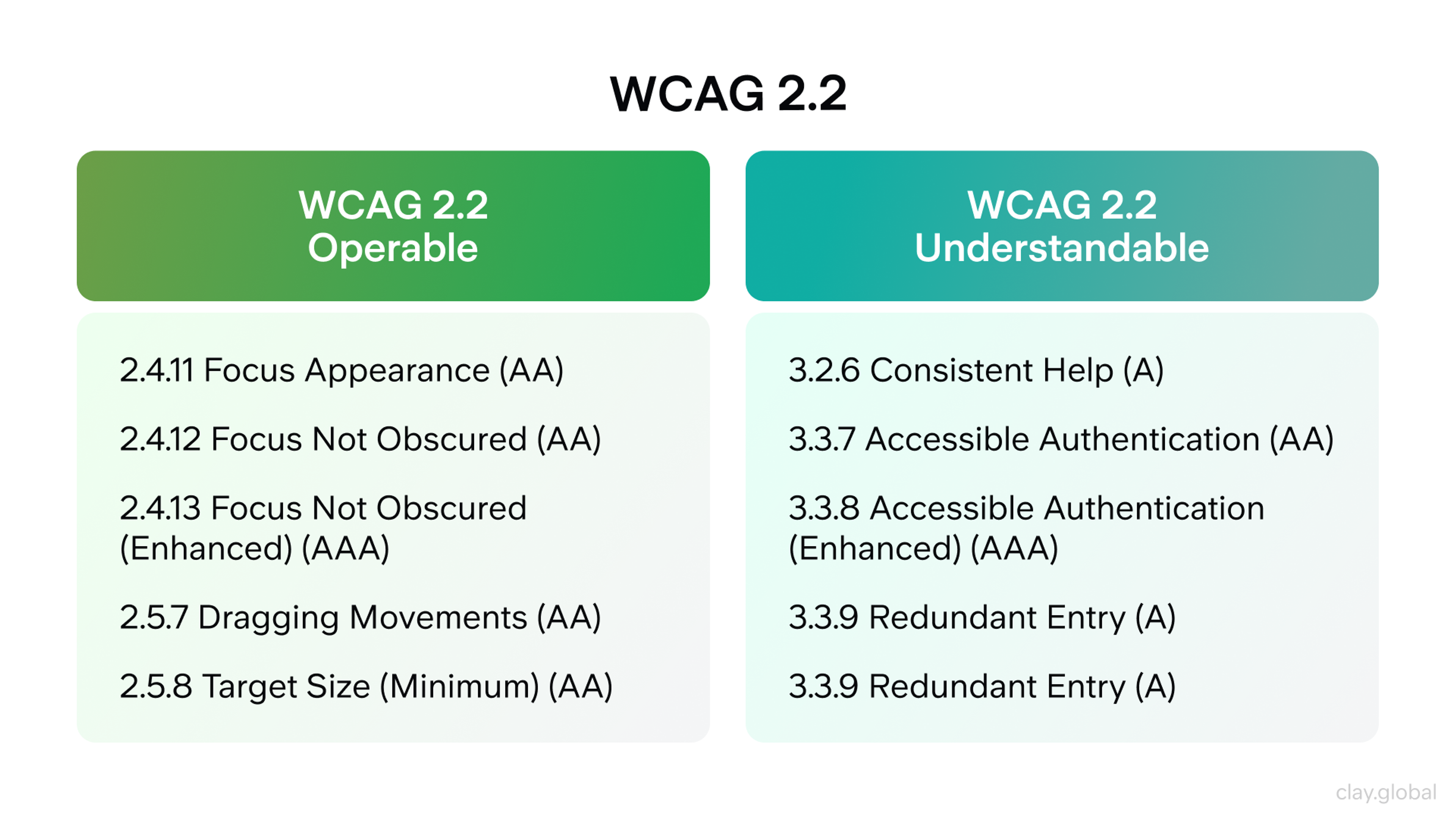
WCAG 2.2 reflects that reality. It pushes teams to think beyond alt text and contrast and toward the friction people actually face when using modern interfaces on mobile devices, with assistive tech, or under cognitive load.
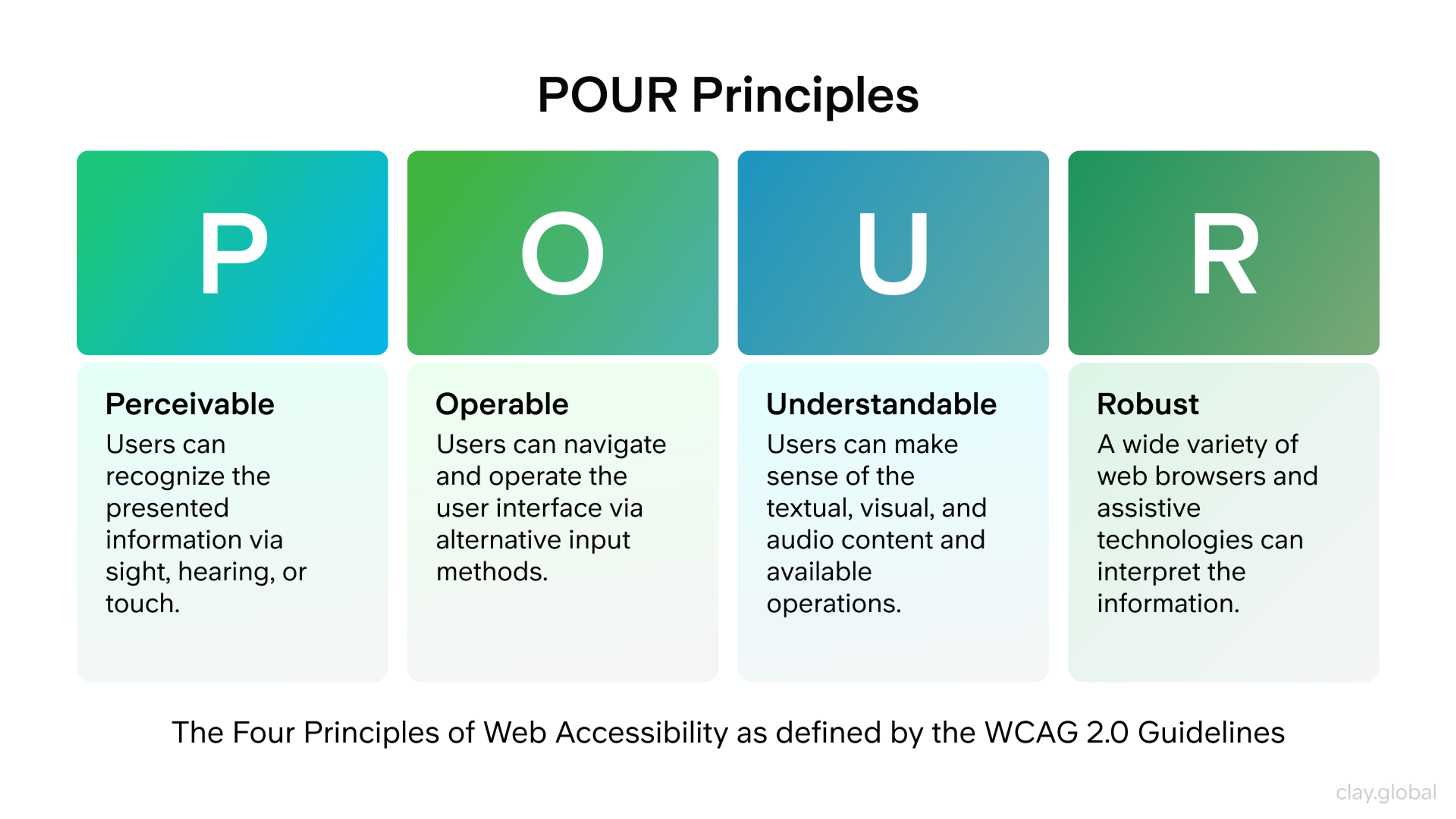
The Four Principles Still Explain Almost Everything
Perceivable
Users must be able to detect the information on the page. That means text should have enough contrast, images should have appropriate text alternatives, audio and video need captions or transcripts when relevant, and layouts should survive zoom, resizing, and different devices.
Google’s image guidance is especially clear here. Alt text helps accessibility and also helps Google understand image subject matter and page context.
Operable
People must be able to interact with the site using more than one input method. Keyboard access is the baseline. If users cannot tab through navigation, open menus, submit forms, or see where focus is, the interface is broken.
WCAG 2.2 sharpens this further with criteria like Focus Not Obscured and Target Size Minimum, which reflect common failures in sticky headers, cramped controls, and complex mobile layouts.
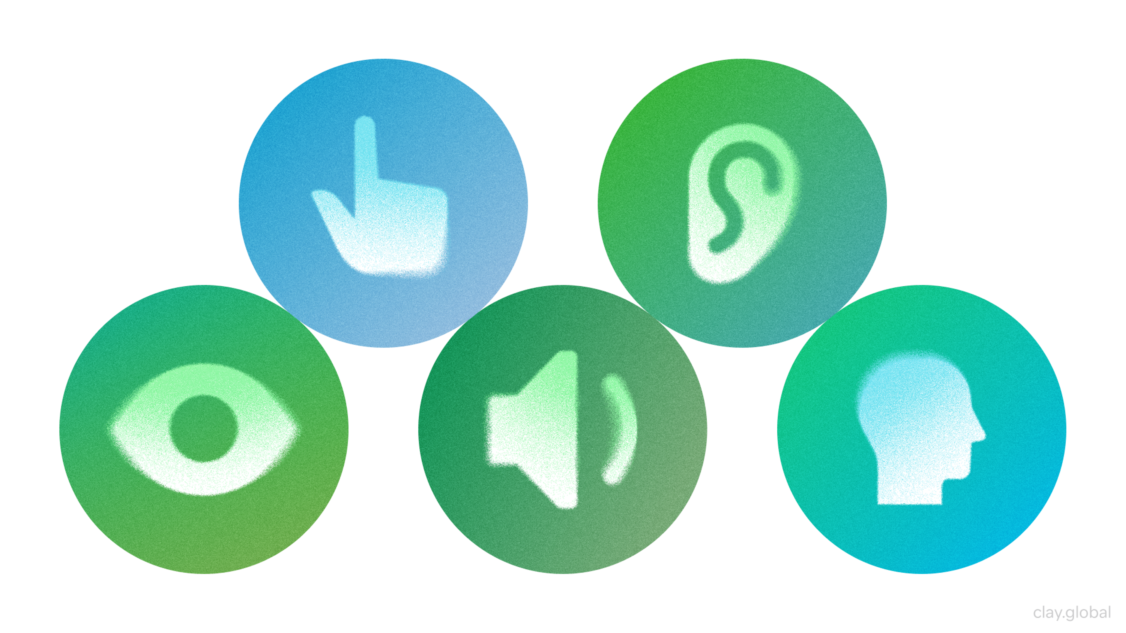
Common Disability Types by Clay
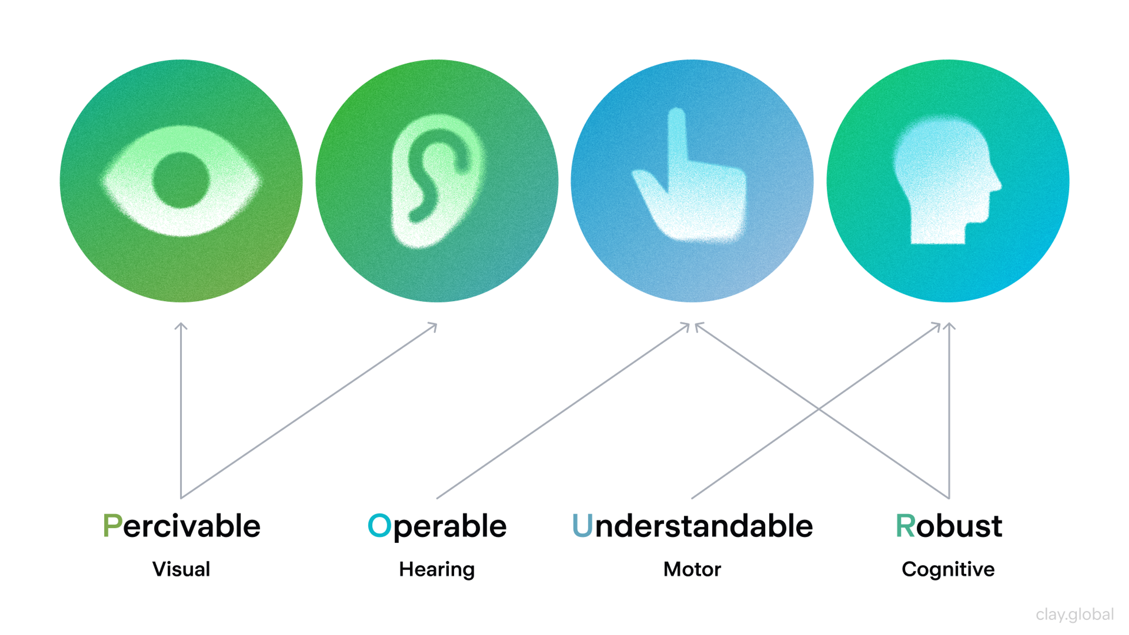
Understandable
Content and interface behavior need to make sense. Labels should say what the fields mean. Error messages should explain what went wrong and how to fix it. Navigation should stay consistent. Help should not appear in one place on one screen and disappear on the next.
Plain language matters here, not because users are unsophisticated, but because clarity reduces cognitive effort for everyone. MDN also emphasizes plain language, good link text, and accessible form labels as foundational practices.
Robust
Content should work reliably across browsers, devices, and assistive technologies. This is where semantic HTML matters more than many teams realize. MDN notes that a great deal of accessibility comes from using the correct HTML element for the correct purpose.
W3C makes a related point with a sharper warning. No ARIA is better than bad ARIA. In other words, do not try to patch weak markup with roles and attributes you do not fully understand. Build on solid HTML first.
What Accessible Design Looks Like in Real Projects
Accessible design starts long before QA. It begins with content models, page templates, and component decisions. If your design system does not define heading logic, focus states, error behavior, skip links, dialog patterns, and keyboard support, the team will end up improvising accessibility on a screen-by-screen basis.
That is expensive, inconsistent, and hard to fix later. The better approach is to make accessibility part of the design language itself.
The strongest accessible websites also tend to have better editorial structure:
- Headings follow a visible hierarchy
- Buttons sound like actions
- Links tell users where they are going
- Images support meaning instead of acting as decorative clutter
- Forms explain expectations before users make mistakes
Accessible Content Infographic by Clay
Search engines benefit from that clarity too. Google repeatedly frames SEO as helping search engines understand content and helping users decide whether to visit a site. Improving accessibility benefits both sides of that equation.
It also changes how teams think about media. Video without captions, motion without controls, charts without text explanations, and icon-only buttons without labels all create silent failure points. If a user has to guess what something means, the design is not elegant. It is incomplete.
Accessibility and Discoverability Now Reinforce Each Other
A decade ago, teams often treated accessibility and SEO as separate checklists. In 2026, that split feels outdated. Semantic structure, descriptive alt text, logical internal linking, and clearly organized sections help both human navigation and machine interpretation.
Google explicitly recommends descriptive alt text and notes that it helps the engine understand images and their relationship to the page. It also recommends logical organization so users and search engines can understand how pages relate to one another.
POUR principles by Clay
That does not mean “optimize accessibility for bots.” It means good accessibility produces cleaner signals. A strong heading hierarchy makes page topics easier to follow. Clear labels make interactive elements easier to parse. Useful alt text adds context without stuffing keywords.
Plain language improves comprehension and increases the chance that the right sentence gets quoted or summarized accurately in answer engines and AI overviews. The goal is not to write for machines. The goal is to remove ambiguity so machines do less damage when they interpret you.
The Most Common Accessibility Mistakes Teams Still Make
The first is treating accessibility as a plugin problem. Overlays and quick fixes rarely solve the underlying issues in markup, focus handling, labels, reading order, or component behavior.
If the foundation is weak, the experience stays weak. W3C’s guidance on evaluation tools makes the same broader point in another way. Tools can help determine whether content meets guidelines, but they are not the whole answer.
The second is overusing ARIA to imitate native behavior. If a div is acting like a button, menu, tab, or dialog, the team is often creating complexity it did not need. Native controls come with built-in accessibility support. Custom controls must be recreated carefully, which is where many products break.
The third is limiting accessibility to content pages while ignoring transactional flows. Teams may fix article templates but leave checkout, onboarding, account settings, support widgets, and authentication untouched.
In practice, those are the moments where accessibility matters most because users are trying to complete something that affects money, time, or access. WCAG 2.2’s newer criteria make that especially clear.
How to Test Accessibility Without Fooling Yourself
Automated testing is useful, but it only gets you part of the way. W3C describes accessibility evaluation tools as software and services that help determine whether content meets accessibility guidelines.
Chrome’s Lighthouse accessibility score is based on weighted automated audits, and even its own documentation makes clear that it is an audit score, not a full human judgment of usability. WAVE similarly highlights issues while facilitating human evaluation rather than replacing it.
Manual Testing Process Infographic by Clay
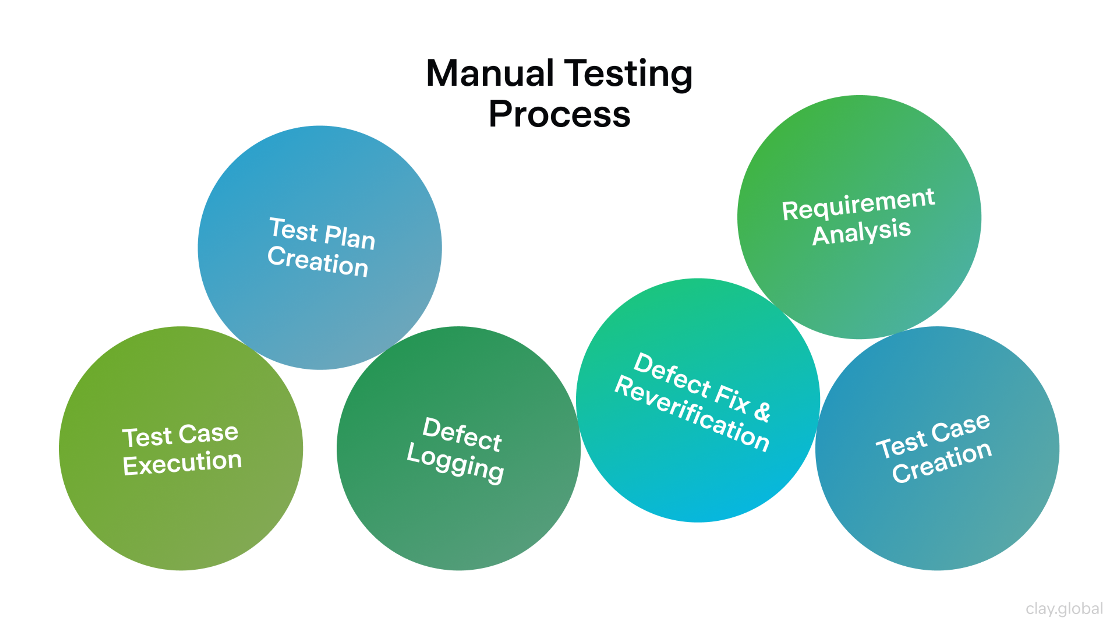
A serious accessibility review should include keyboard-only navigation, screen reader checks, zoom testing, color schemes and contrast validation, reduced motion review, form completion, and testing of common user journeys on real devices.
It should also include content review, because inaccessible writing is still inaccessible even when the code passes. The strongest teams add these checks to design reviews, QA, and release workflows instead of running them only during remediation projects.
Accessibility Is a Product Habit, Not a One-Time Fix
The most useful shift a team can make is this one. Stop thinking of accessibility as a final audit and start treating it as an operating principle. That means accessible components in the design system, content standards for editors, acceptance criteria for developers, and regression checks in QA. It also means deciding who owns what. If everyone “cares” but nobody is responsible, the work will drift.
The payoff is bigger than compliance. Accessible sites are usually calmer, clearer, easier to navigate, and easier to maintain. They age better because they depend less on hacks and more on a durable structure.
They also travel better across surfaces, from search results to voice interfaces to AI summaries, because their meaning is easier to recover from the markup and the content itself. In 2026, that is not a niche advantage. It is part of modern web quality.
Best Web Accessibility Websites Examples
Reyes Beverage Group
Our redesign of Reyes Beverage Group's website showcases how accessibility accessibility guidelines can enhance usability and brand trust. We engineered a flexible, component-based design system that ensures intuitive navigation, clear content structures, and responsive, adaptable layouts — all critical factors for web accessibility.
By focusing on accessibility early in the design and development phases, we created a cohesive digital experience that serves diverse audiences while aligning with WCAG guidelines and supporting Reyes' business goals, from recruitment to brand storytelling.
This project highlights how accessibility and high-end design coexist seamlessly, enhancing user experience and business performance.
Reyes Beverage Group by Clay
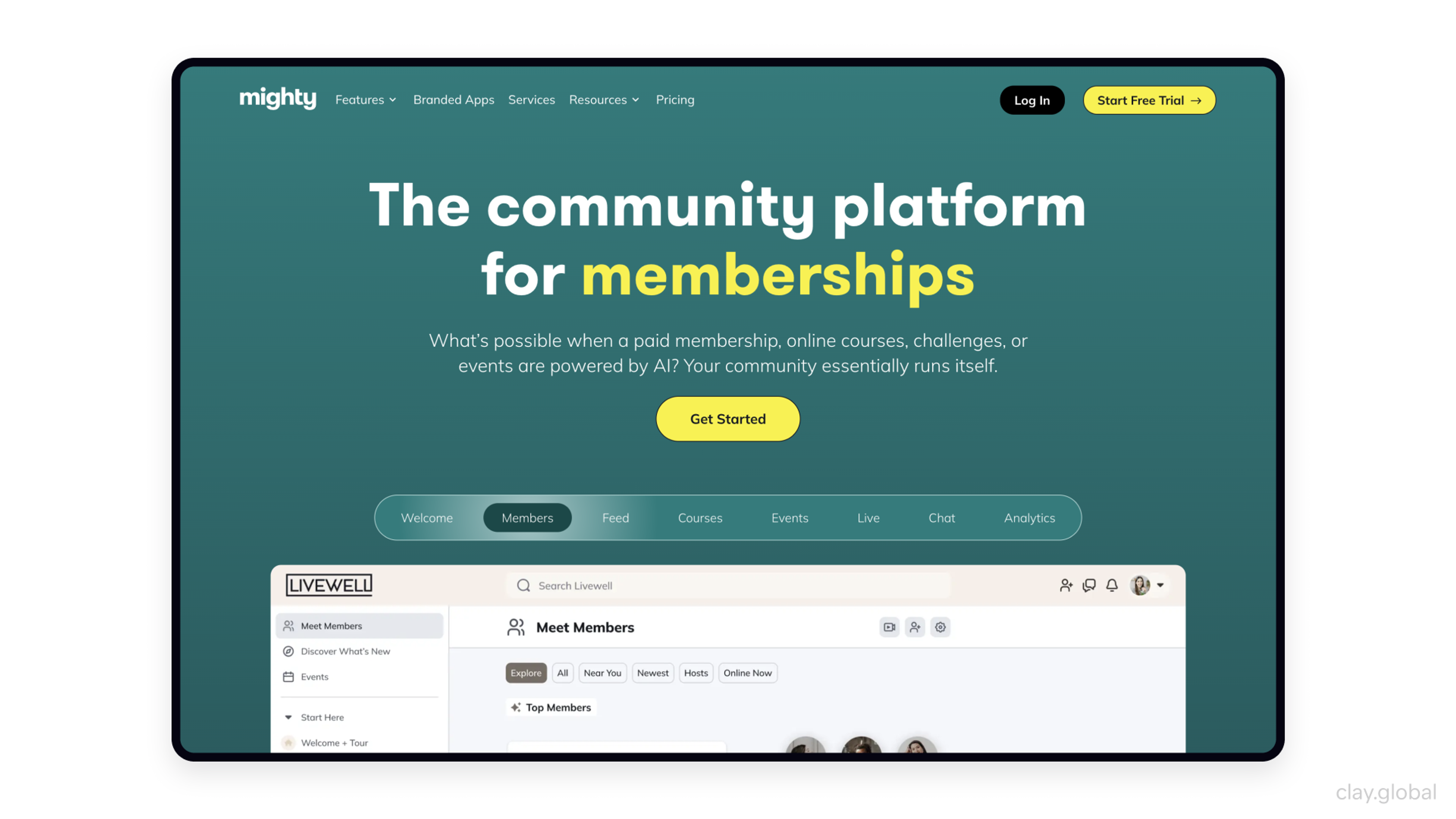
Mighty Networks
Mighty Networks is a standout example of web accessibility implementation and a user-friendly community-building platform. For a deeper look at its accessibility features, running it through an accessibility checker like WAVE can provide valuable insights.
The homepage balances clean, legible typography with engaging animations and videos that enhance the experience without overwhelming users. Thoughtful implementations of accessibility requirements, such as ARIA tags and alt text, ensure smooth navigation for screen reader users.
Source: mightynetworks.com
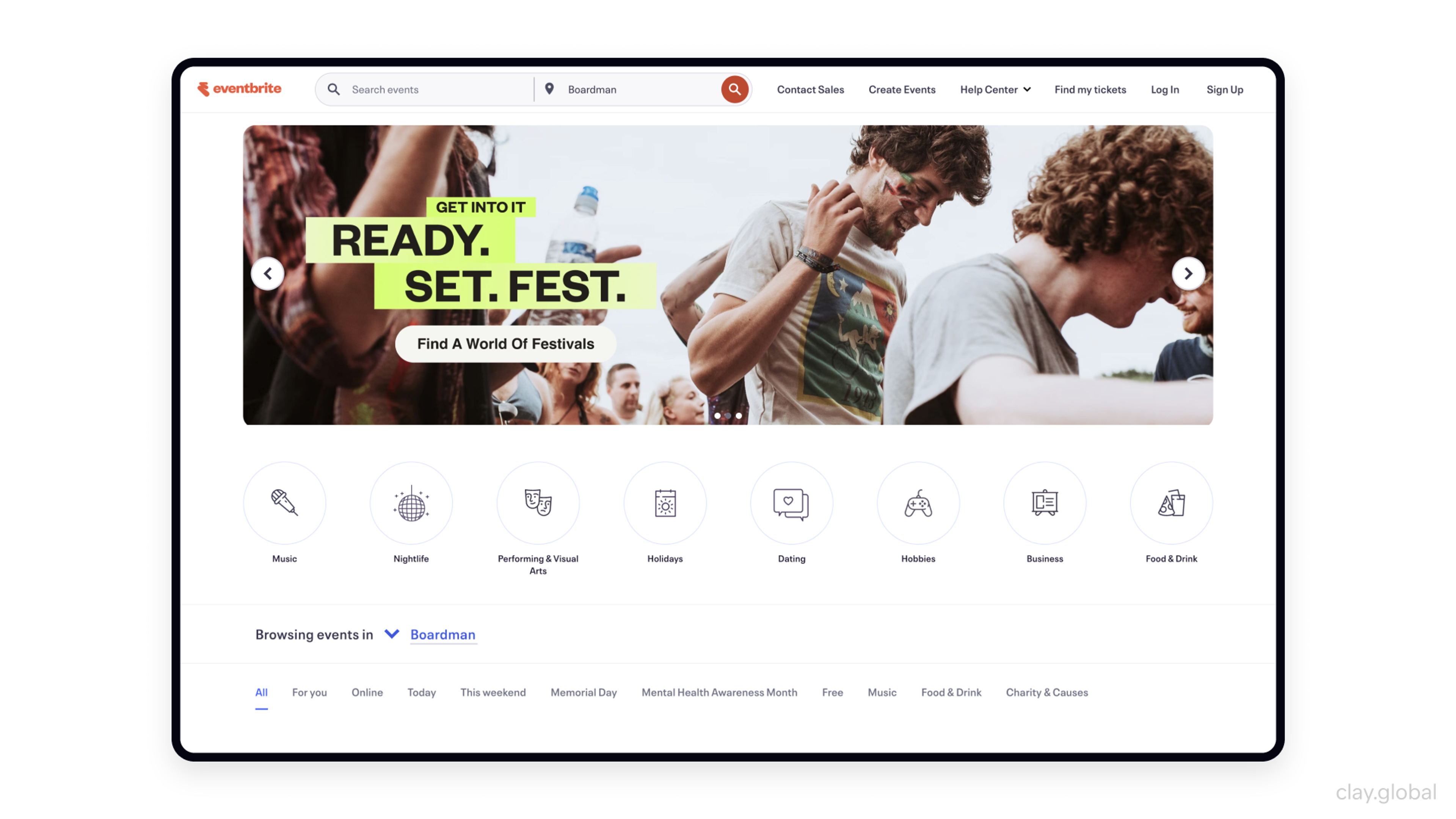
Eventbrite
Eventbrite, a top event management platform, prioritizes accessibility with a clean, easy-to-navigate site. Users can skip directly to content, enhancing screen reader navigation, while its intuitive layout follows WCAG guidelines and caters to both sighted users and those with low vision.
The company adheres to web accessibility guidelines and remains committed to refining accessibility, continuously testing and improving its digital experience.
Source: eventbrite.com
FAQs
Is web accessibility just about blind users and screen readers?
No. Accessibility covers a much wider range of needs, including hearing loss, limited mobility, cognitive and learning disabilities, speech disabilities, low vision, photosensitivity, and combinations of these. WCAG is designed around that broader reality.
Is WCAG 2.2 legally required everywhere?
No. WCAG itself is a technical standard, not a universal law. But laws and regulations often use WCAG as the benchmark or reference point. In 2026, teams commonly use WCAG 2.2 as the working standard even when a regulation references an earlier version.
Does the European Accessibility Act apply to websites?
It applies to certain products and services, including e-commerce. For many digital businesses serving EU consumers, that makes website and checkout accessibility a real compliance issue, not just a brand choice.
Does the ADA set one official website standard for all US businesses?
Not in one simple, universal way. The DOJ states that the ADA applies to web accessibility, but its guidance also says it does not have a regulation setting out detailed standards for businesses in general. State and local governments are different because Title II now has a specific rule tied to WCAG 2.1 AA.
Is WCAG 2.1 still relevant if WCAG 2.2 exists?
Yes. WCAG 2.2 builds on 2.1 rather than replacing the entire model. Content that conforms to 2.2 also conforms to earlier 2.x versions, with the exception of the obsolete Parsing criterion. In practice, teams updating or launching sites should aim for 2.2.
How long should alt text be?
There is no perfect character count. The better question is whether the alt text is useful, specific, and relevant to the page context. Google recommends information-rich alt text that describes the image naturally and avoids keyword stuffing. Decorative images should not be forced into verbose descriptions.
Do captions and transcripts both matter?
Yes, but they solve different problems. Captions help people follow spoken content in video. Transcripts make audio content easier to read, search, quote, and repurpose. For editorial teams, transcripts can also improve discoverability because they expose more textual context. WCAG treats text alternatives and media accessibility as core accessibility practices.
Can accessible design still feel premium or visually bold?
Absolutely. Accessibility does not ban strong branding, rich visuals, or motion. It requires that meaning, navigation, and interaction remain clear. The best premium interfaces feel more refined because they remove confusion instead of relying on it. This is a design quality issue, not a creativity limit.
Are accessibility overlays enough?
Usually not. They can sometimes add superficial controls, but they do not reliably fix broken semantics, poor focus order, missing labels, inaccessible forms, or faulty component behavior. Accessibility has to be built into the code, content, and interaction model.
What should a small team fix first on an existing site?
Start with the pages and flows that matter most. Homepage, navigation, key landing pages, forms, sign-up, checkout, support, and account access. Then fix structural issues that repeat across the site, such as heading hierarchy, button labels, focus states, contrast, form errors, and image alternatives. That approach improves both risk and usability faster than polishing isolated pages.
Do accessibility and SEO ever conflict?
Not usually. In most cases, they reinforce one another. Semantic HTML, useful alt text, good link text, and clear page organization help both accessibility and search understanding. The real conflict tends to come from bad optimization, such as stuffed alt text or vague headings written for keywords instead of people.
How often should accessibility testing happen?
Continuously. Run automated checks during development, review designs before handoff, test important user flows during QA, and re-audit after major releases or content changes. Accessibility breaks through regressions very easily, especially in component libraries and JavaScript-heavy interfaces.
What about PDFs, documents, and embedded third-party tools?
They count. If important content is locked in inaccessible PDFs or delivered through inaccessible booking, chat, payment, or form tools, the user still hits a barrier. Accessibility needs to cover the whole journey, not just the visible HTML shell around it.
Do single-page apps and React sites need different accessibility rules?
The principles stay the same, but implementation gets trickier. Dynamic updates, custom components, dialogs, and route changes can easily break announcements, focus management, and semantics. That is why native elements, correct source order, and disciplined component patterns matter even more in app-like interfaces.
Is accessibility worth doing even if lawsuits are not a concern for my company?
Yes. Accessibility improves usability, content clarity, reach, and long-term product quality. It helps more people complete tasks successfully, and it often reduces the friction that hurts conversions and trust for everyone else, too. In 2026, that is reason enough.
Read more:
Conclusion
Web accessibility in 2026 is not a niche concern or a final-stage compliance task. It is part of what makes a website genuinely usable, trustworthy, and effective.
When people can navigate your content easily, understand your interface clearly, and complete tasks without friction, accessibility stops feeling like an extra layer and becomes part of good web design itself.

About Clay
Clay is a UI/UX design & branding agency in San Francisco. We team up with startups and leading brands to create transformative digital experience. Clients: Facebook, Slack, Google, Amazon, Credit Karma, Zenefits, etc.
Learn moreAbout Clay
Clay is a UI/UX design & branding agency in San Francisco. We team up with startups and leading brands to create transformative digital experience. Clients: Facebook, Slack, Google, Amazon, Credit Karma, Zenefits, etc.
Learn more