
Pick up your phone and open the last website you visited on your laptop. If it loads cleanly, scales to fit your screen, and lets you tap through without squinting or zooming, that's responsive design doing its job invisibly.
Do it with an older or poorly built site, and you'll immediately understand why responsiveness isn't optional anymore.
Responsive web design (RWD) is how we build websites that work across every screen without maintaining separate versions of the same product. One codebase, one URL, one design system adapting to whatever device your visitor brings.
Key Takeaways
- Responsive web design uses fluid grids, flexible media, and CSS media queries to make layouts adapt to any screen size or orientation.
- The original three-pillar framework (fluid grids, flexible images, media queries) has expanded to include responsive typography and container queries for component-level control.
- Google's mobile-first indexing means your site's mobile experience directly affects your search rankings.
- Common breakpoints cluster around 320–425px for mobile, 768–1024px for tablet, and 1280–1920px for desktop. Content should drive those decisions, not device categories.
- A single responsive site is easier to maintain, more consistent for users, and better for SEO than a separate mobile subdomain.
- Testing responsiveness isn't a one-time step. It needs to be part of your regular design QA.
What Responsive Web Design Means
The term was coined by Ethan Marcotte in his 2010 A List Apart article, where he argued that designers should stop building fixed-width layouts and start treating the web as a fluid medium.
The core idea: a single design should respond to its environment rather than dictate it.
Responsive Example by Clay
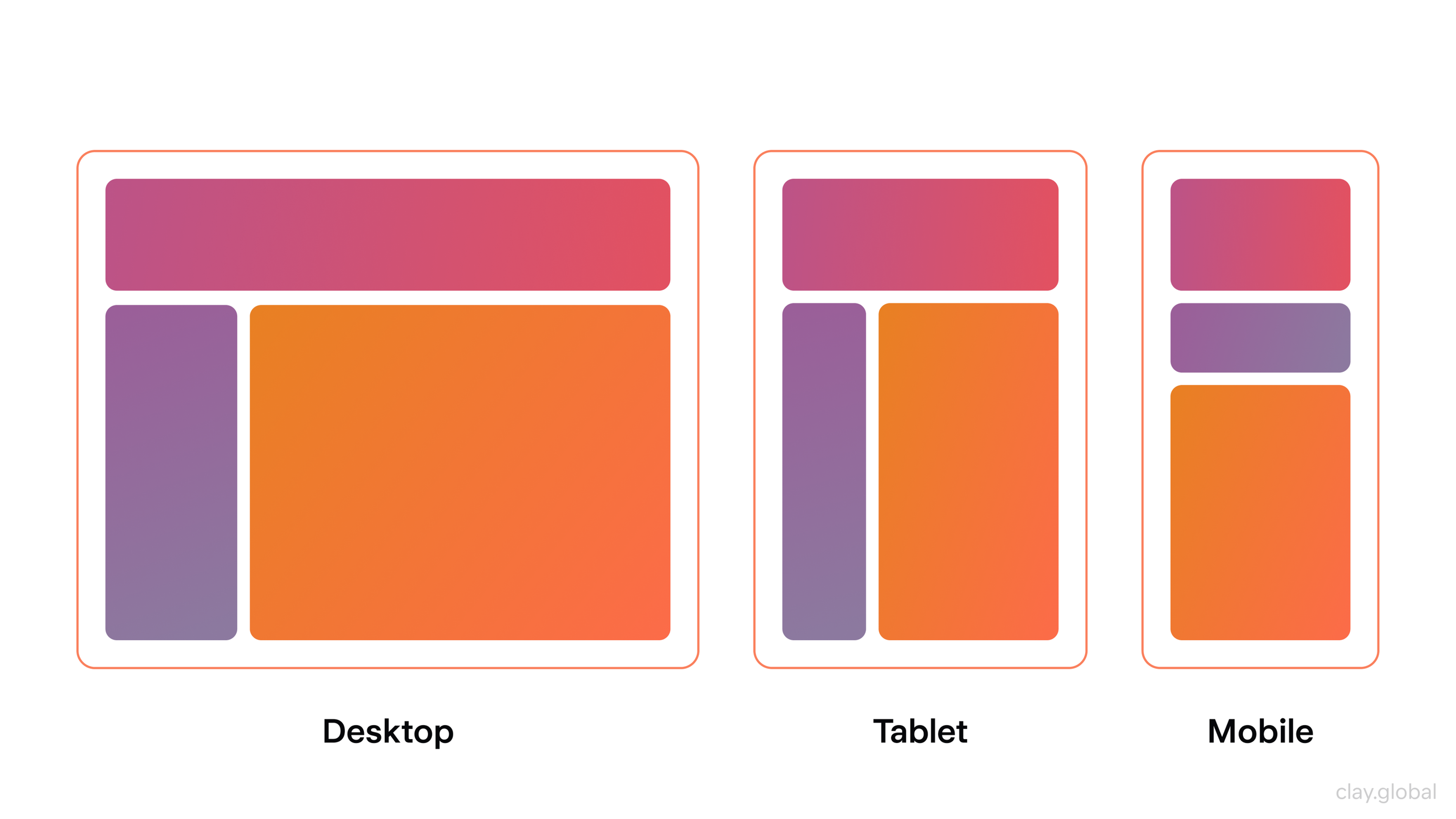
In 2026, that definition has gotten more complex. Responsive design now needs to account for foldable smartphones, split-screen multitasking, notched displays, dynamic browser toolbars, and components that live inside containers of unpredictable sizes. A layout that reflows at 768px is a starting point, not a finish line.
The practical definition: a responsive website adjusts its layout, typography, images, and navigation based on the size and capabilities of the screen displaying it, without requiring a separate URL, codebase, or content strategy.
The Four Pillars of Responsive Design
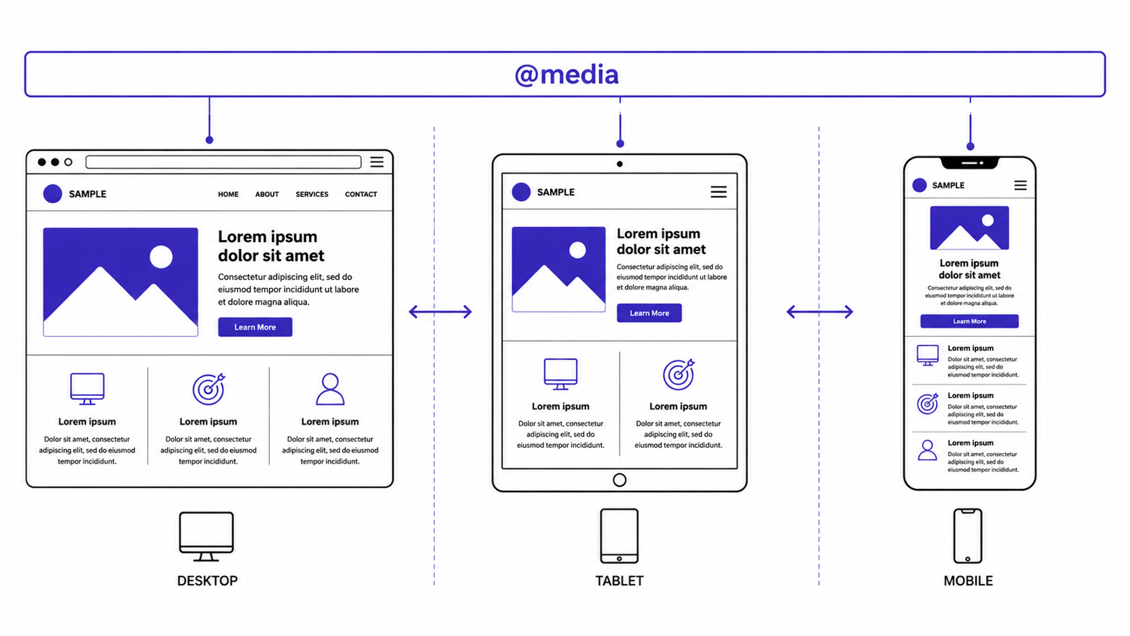
Media Queries
Media queries are the conditional logic of responsive CSS. They let you write rules that only apply when certain conditions are true: screen width, orientation, resolution, or display type.
The syntax is straightforward:
@media screen and (max-width: 480px) {
/* styles for small screens */
}
That rule tells the browser: apply these styles only when the screen is 480px wide or narrower. Stack a few of these at strategic breakpoints, and you have a layout that reshapes itself across device categories.
Media Queries Example
Modern CSS has pushed this further with @container queries, which let individual components respond to the size of their parent element rather than the viewport. A card component inside a narrow sidebar can now behave differently than the same component in a full-width grid, with no viewport logic involved.
This is the shift from page-level responsiveness to component-level responsiveness, and it's how complex design systems stay maintainable at scale.
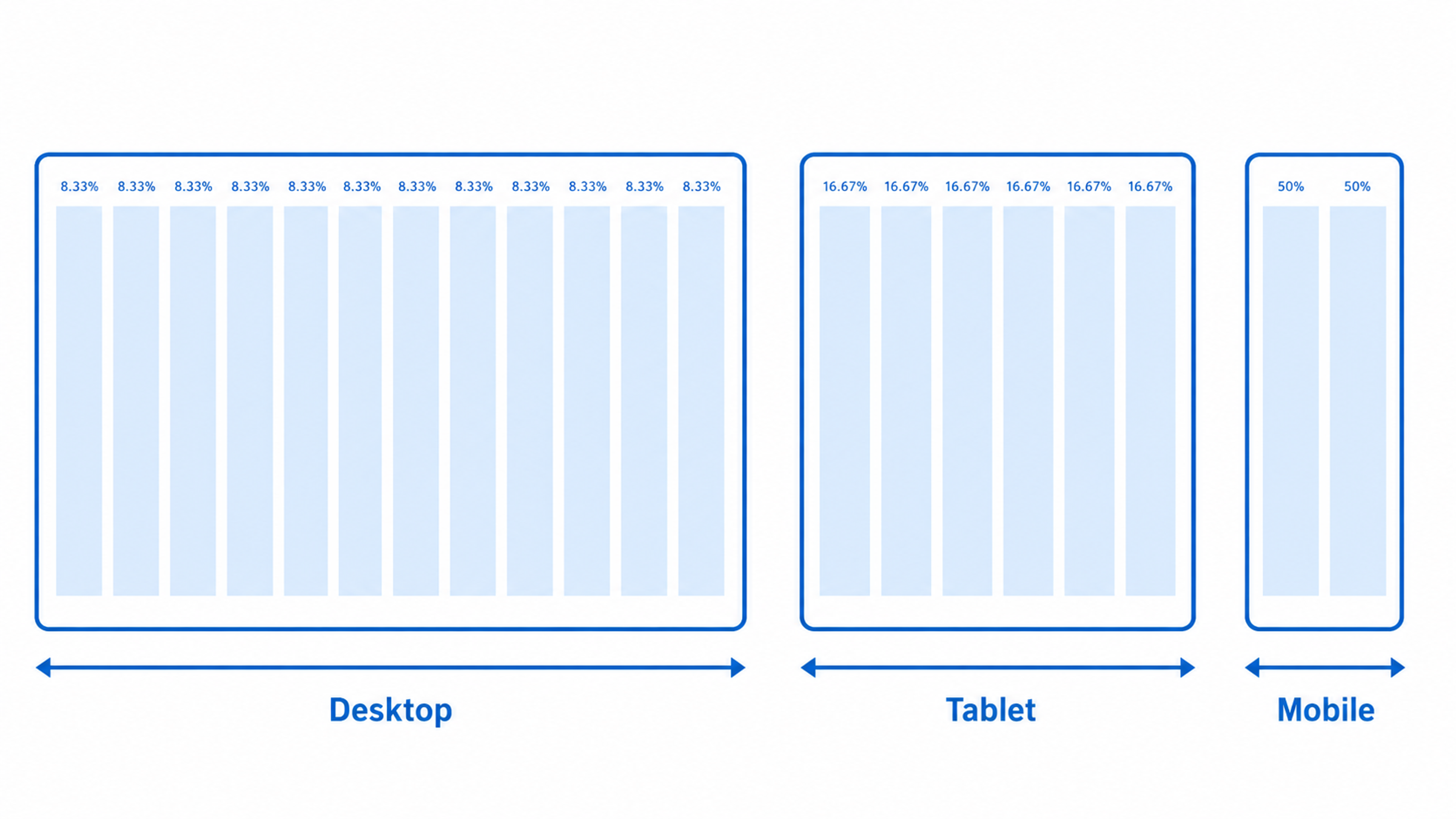
Fluid Grids
A fluid grid replaces fixed pixel widths with proportional units: percentages, fr units in CSS Grid, or flexible flex values. Instead of saying "this column is 300px wide," you say "this column takes up 30% of its container."
Marcotte's original formula (target ÷ context = relative size) still holds conceptually, even if CSS Grid and Flexbox have made the manual math unnecessary.
The principle is the same: columns and containers should scale with the space they're given, not break outside it.
As Marcotte puts it:
Fluid layouts [….] put control of our designs firmly in the hands of our users and their browsing habits.
Fluid Grids Example
This matters especially for orientation changes. A user flipping their tablet between portrait and landscape isn't switching devices. They're resizing your layout. Fluid grids handle that gracefully. Fixed-width grids don't.
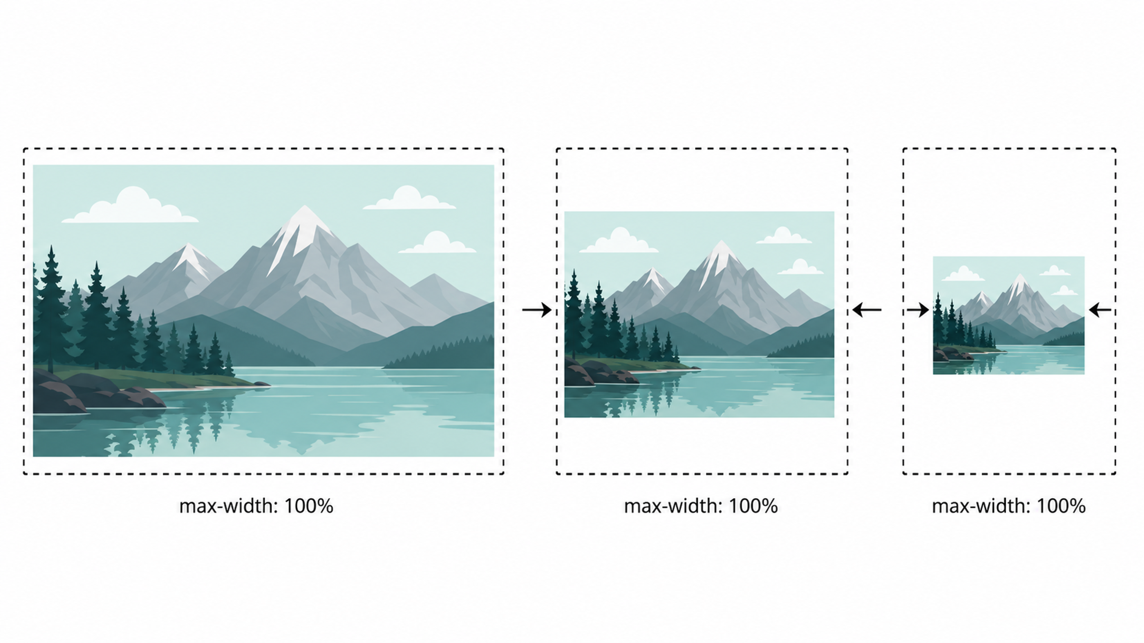
Flexible Media
Images and videos that don't scale cause some of the most common responsive failures: images that overflow their containers, videos with fixed dimensions that create horizontal scroll, or hero images that look fine at 1440px and terrible at 390px.
The fix is usually a few lines of CSS:
img, video {
max-width: 100%;
height: auto;
}
Flexible Media Example
But modern responsive media goes further. The srcset attribute lets you serve different image files at different resolutions, so a mobile user isn't downloading a 2MB hero image designed for a 27-inch monitor.
The <picture> element lets you specify different crops for different aspect ratios. These aren't edge-case optimizations. They have a real impact on load time, and page load time directly affects bounce rate.
Responsive Typography
Font size isn't just an aesthetic choice. It's a usability decision. Apple's Human Interface Guidelines recommend a minimum body text size of 16px on mobile to ensure readability without zooming. Go below that, and you're forcing users to work harder to read content you presumably want them to read.
The challenge is scaling type intelligently across device sizes. A headline that looks commanding at 64px on a desktop looks absurd at the same size on a 390px phone screen. CSS clamp() solves this elegantly:
font-size: clamp(1.25rem, 4vw, 2.5rem);
That single line sets a minimum, a preferred fluid value, and a maximum, letting the type scale smoothly with the viewport instead of jumping between hard breakpoints.
Combined with a well-considered type scale, it eliminates most of the manual typographic juggling that used to require multiple media query overrides.
Why Responsive Design Matters for SEO
Google switched to mobile-first indexing as its default in 2019. What that means practically: Google primarily uses the mobile version of your site to determine rankings.
If your mobile experience is broken, slow, or stripped of content, your search visibility takes a hit regardless of how polished the desktop version is.
According to Statista, mobile devices account for roughly 60% of global web traffic. That's not a niche use case. It's the main way people encounter your site for the first time. A poor mobile experience doesn't just frustrate users - it actively works against your discoverability.
A single responsive site also consolidates your link equity. When you run a separate mobile subdomain (m.yoursite.com), external links are split between two URLs. A unified responsive URL structure keeps all that authority in one place.
Choosing the Right Breakpoints
Breakpoints are the screen widths at which your layout changes. The conventional starting point is to group them around common device categories:
Mobile: 320px, 375px, 425px
Tablet: 768px, 834px, 1024px
Desktop: 1280px, 1440px, 1920px
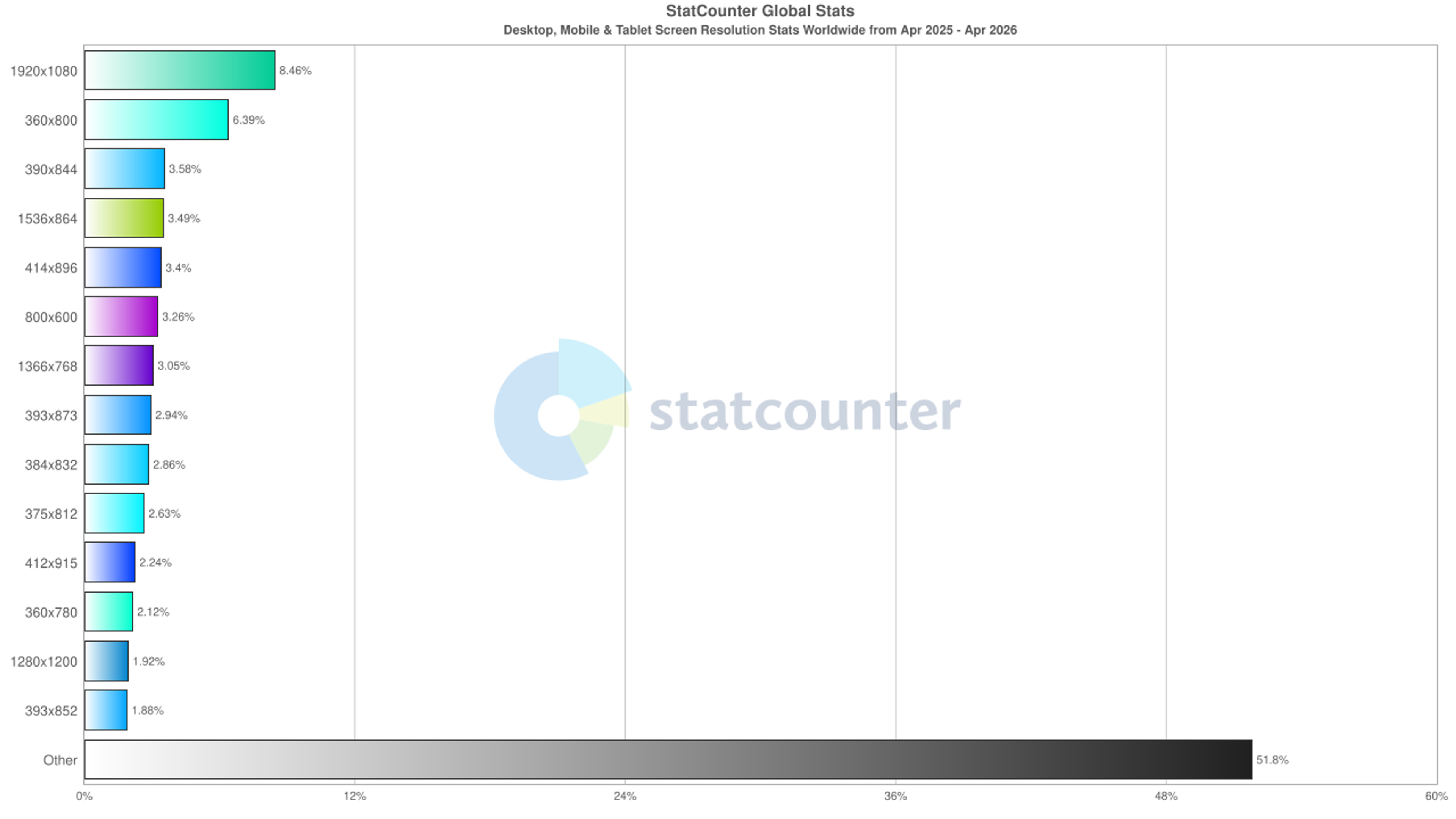
These numbers come from real-world screen resolution data, which currently shows 1920×1080 (8.9%), 360×800 (6.8%), and 390×844 (3.9%) among the most common resolutions globally.
The better approach is to let your content drive breakpoint decisions rather than device categories. Resize your browser from wide to narrow and watch where the layout starts to break.
Add a breakpoint there, not at some arbitrary pixel value because it matches a popular device. Designs built around content breakpoints tend to age better because they're not coupled to specific hardware.
GitHub is a useful case study because it handles complex functionality across a wide range of devices without dumbing down the experience.
On desktop, the homepage uses a two-column layout with sign-up alongside marketing copy. On a tablet, that collapses to a single column with copy stacked above the form. On mobile, the sign-up form itself is hidden behind an action button.
Users tap to reveal it rather than seeing a dense form immediately. Each decision is deliberate: the layout adapts to what users on each device are most likely to need.
That kind of nuance, asking not just "does it fit?" but "does it make sense?", is what separates a technically responsive site from a well-designed one.


Our project for Echo Street involved creating an immersive, responsive website for a modern asset management firm.
The frontend design utilized out-of-the-box solutions such as shaders to make the mobile version as engaging as the desktop version.


Tips for Building a Responsive Site
Start with mobile. Design for the smallest screen first, then scale up. This forces hierarchy decisions early. You can't hide behind whitespace and large viewports when you're working in 390px. Mobile-first layouts tend to be cleaner because they can't afford to be bloated.
Structure your layout elements in order. Header, navigation, main content, sidebar, footer. Each of these needs defines behavior at every breakpoint. Sketch out how each block reflows before writing a line of CSS.
Use relative units consistently. rem for typography, % or fr for widths, em or rem for spacing. Hard-coded pixel values in layouts create fragility, while relative units create resilience.
Test on real devices, not just browser devtools. Devtools viewport simulation is useful but imperfect. Touch target sizes, system font rendering, and browser chrome behavior (particularly in iOS Safari) behave differently on actual hardware.
Run Google's Mobile-Friendly Test. Enter your URL at search.google.com/test/mobile-friendly for a quick audit. It won't catch everything, but it flags the issues that directly affect your Google rankings.
Don't neglect orientation. Portrait-to-landscape transitions are easy to overlook until a user flips their tablet and your layout breaks. Test both orientations on mobile and tablet during QA.
Standard Webpage Wireframe Layout

Responsive vs. Adaptive Design
These terms are sometimes used interchangeably but describe different approaches. Responsive design uses fluid layouts that adjust continuously across any screen size. Adaptive design uses a set of fixed layouts, typically five or six, and serves the most appropriate one based on the detected screen size.
Adaptive design can deliver more precisely tailored experiences for specific sizes and can load faster because each template is purpose-built. The trade-off is maintenance: you're managing multiple layout versions instead of one.
Responsive vs Adaptive Design
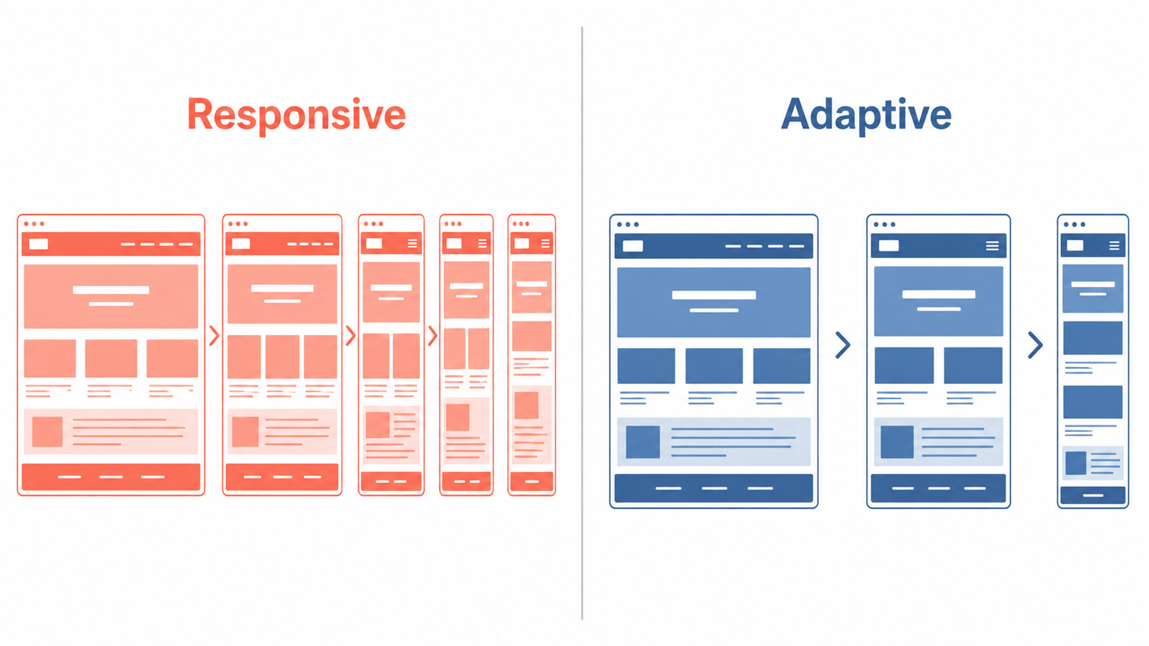
For most projects, the maintenance overhead of adaptive design outweighs its benefits. Responsive is the default choice, while adaptive makes sense for products where the desktop and mobile experiences are genuinely distinct enough to warrant separate design thinking.
Read more
FAQ
What is responsive web design in simple terms?
Responsive web design means your website automatically adjusts its layout and content to look good and work properly on any screen size, whether that's a phone, tablet, laptop, or large monitor. You build one site, and it adapts to every device, rather than maintaining separate versions.
Is responsive design still relevant in 2026?
More than ever. Mobile accounts for roughly 60% of global web traffic, Google indexes the mobile version of your site first, and the range of devices people use continues to expand. Foldables, tablets, and ultra-wide monitors all have different display characteristics. Responsive design is the standard, not an enhancement.
What's the difference between responsive and mobile-first design?
Responsive design is the technique: layouts that adapt across screen sizes. Mobile-first is a design philosophy where you start by designing for the smallest screen and progressively enhance for larger ones. Most responsive sites today are built mobile-first because it results in cleaner, better-prioritized layouts.
How does responsive design affect page speed?
Done well, responsive design can improve speed by serving appropriately sized images and loading only the CSS relevant to a given device. Done poorly, serving oversized images or loading all breakpoints' worth of CSS simultaneously, it can slow things down. Techniques like srcset, lazy loading, and CSS containment help keep responsive sites fast.
What are container queries and why do they matter?
Container queries are a newer CSS feature that lets components respond to the size of their containing element rather than the overall viewport. This is a meaningful shift: a card component in a narrow sidebar can now behave differently from the same component in a full-width section, without any viewport-level logic. It makes design systems significantly more flexible and modular.
What breakpoints should I use for responsive design?
Common starting points are 480px, 768px, 1024px, and 1280px, but the best approach is to add breakpoints where your specific content breaks, not at preset device widths. Resize your browser slowly from wide to narrow and add a breakpoint wherever the layout starts to feel cramped or awkward.
Does having a responsive website help with Google rankings?
Yes. Google uses mobile-first indexing, meaning it predominantly uses your mobile layout to determine rankings. A site that performs poorly on mobile, whether due to slow load times, a broken layout, or hard-to-tap elements, will rank lower regardless of the desktop experience.
Can I test if my website is responsive without buying multiple devices?
Browser devtools (in Chrome, Firefox, or Safari) let you simulate different screen sizes and orientations. Google's Mobile-Friendly Test gives you a quick pass/fail on mobile usability. For the most accurate results, test on real devices when possible. iOS Safari, in particular, has historically had unique rendering quirks that devtools won't surface.
What's the minimum font size for mobile?
Apple's Human Interface Guidelines recommend 16px as a minimum for body text on mobile. Going smaller forces users to pinch-zoom to read, which is a poor experience and signals accessibility problems. Use clamp() in CSS to scale type fluidly rather than setting hard sizes for each breakpoint.
What's the easiest way to make an existing site responsive?
Start by auditing your CSS for fixed pixel widths and replacing them with percentages or fr units. Add max-width: 100%; height: auto; to images. Then introduce media queries at key breakpoints to adjust layout, navigation, and font sizes. It's more surgical work than a fresh build, but achievable without a full redesign.
How does responsive design interact with accessibility?
The two are closely related. Responsive design ensures content is readable and usable across screen sizes; accessibility ensures it's usable for people with disabilities. Both require attention to text size, tap target sizing (minimum 44×44px is Apple's recommendation), sufficient color contrast, and logical DOM order. A well-built responsive site is typically a better foundation for accessibility than a fixed-width one.
Should navigation change on mobile?
Usually, yes. Desktop navigation often works as a horizontal menu bar. On mobile, that same navigation almost always needs to collapse into a hamburger menu or a bottom navigation bar. The key is making sure the collapsed navigation is discoverable. Users shouldn't have to hunt for how to get around your site.
What's the role of CSS Grid and Flexbox in responsive design?
Both are modern CSS layout tools that make responsive design significantly easier than older float-based approaches. Flexbox excels at one-dimensional layouts, rows or columns of items that need to wrap or align. CSS Grid handles two-dimensional layouts, rows, and columns together. Most modern responsive layouts use both, often Grid for overall page structure and Flexbox for component-level alignment.
Is a separate mobile site (m.yoursite.com) ever better than a responsive design?
Rarely. A separate mobile subdomain splits your link equity across two URLs, doubles your maintenance burden, and can create inconsistencies in content between versions. The cases where it makes sense are narrow, usually large platforms where the mobile and desktop products are genuinely different enough to warrant distinct codebases. For the vast majority of sites, responsive is the right call.
Final Thoughts
Responsive design isn't a feature you add at the end of a project. It's a constraint you design from the start. Get it right and users never think about it. Get it wrong, and every visitor on a phone is reminded that your site wasn't built with them in mind. Given that more than half your traffic likely arrives on a mobile device, that's a costly oversight.
The technical fundamentals haven't changed since Marcotte laid them out: fluid grids, flexible media, media queries, and typography that scales intelligently. What's changed is the scope. Container queries, foldable displays, and AI-indexed content have raised the bar on what "responsive" means in practice. The designers and developers who treat that bar as a moving target, rather than a box to check, are the ones building things that hold up.

About Clay
Clay is a UI/UX design & branding agency in San Francisco. We team up with startups and leading brands to create transformative digital experience. Clients: Facebook, Slack, Google, Amazon, Credit Karma, Zenefits, etc.
Learn moreAbout Clay
Clay is a UI/UX design & branding agency in San Francisco. We team up with startups and leading brands to create transformative digital experience. Clients: Facebook, Slack, Google, Amazon, Credit Karma, Zenefits, etc.
Learn more