Most design failures aren't failures of creativity. They're failures of timing. Teams discover the wrong thing too late, after the code is written and the budget is spent. Prototyping is how you move that discovery earlier, when changing course costs almost nothing.
Done right, prototyping isn't a phase in your UX design process. It's a habit: a continuous loop of building rough models, testing them against real people, and using what you learn to sharpen the next version.
Teams that commit to this approach ship products that hold up in the real world. Teams that skip it end up with expensive surprises.
Key Takeaways
- Prototypes exist on a spectrum, from paper sketches to pixel-perfect interactive models, and knowing which type to build at each stage is as important as knowing how to build it.
- Low-fidelity prototyping is underused. Most teams jump to high-fidelity too early, wasting time polishing concepts that haven't been validated yet.
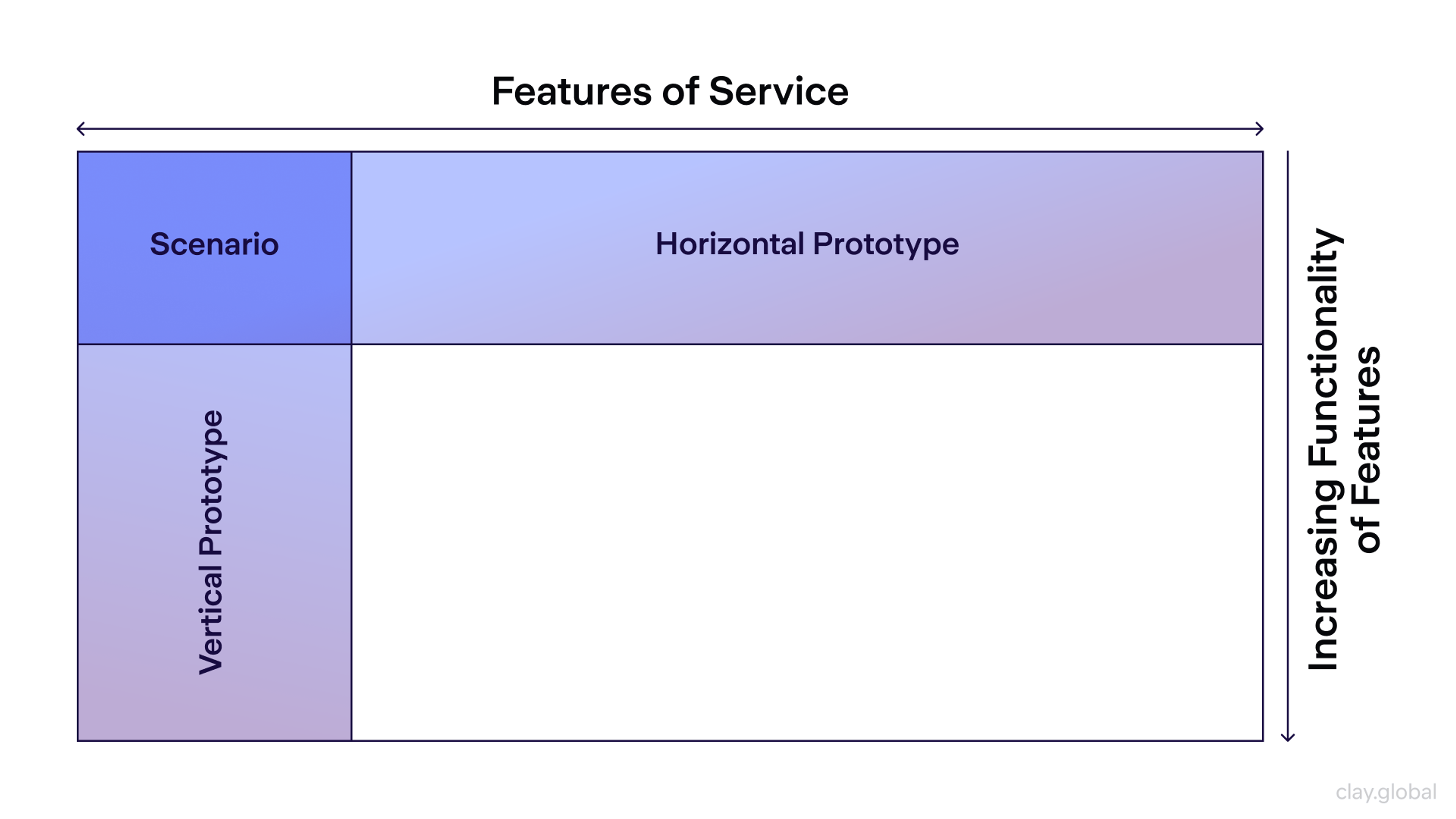
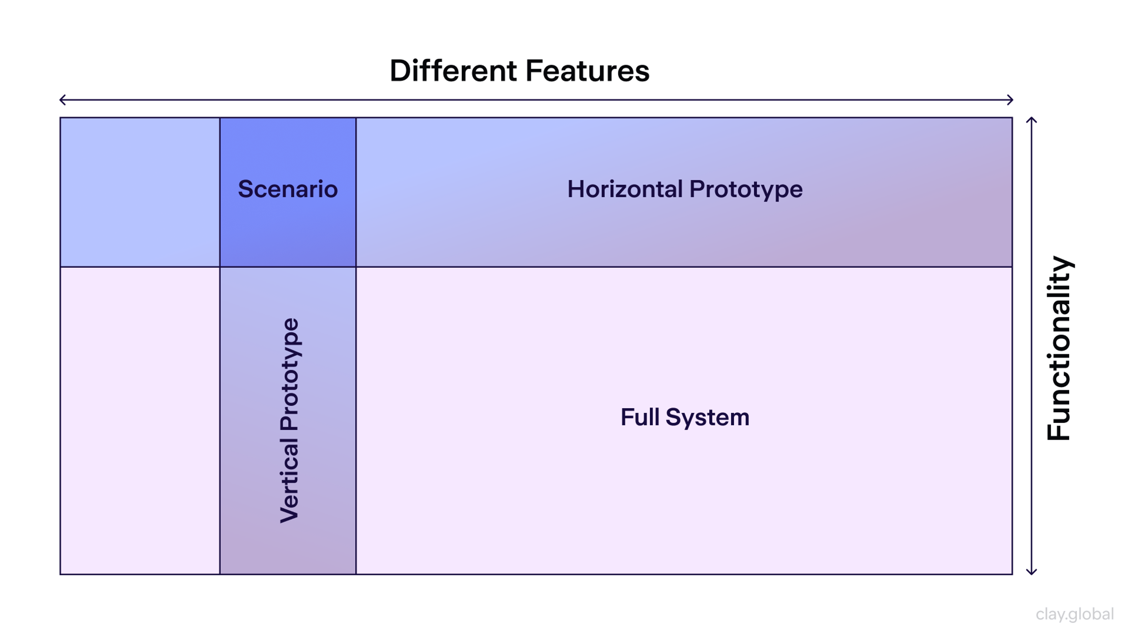
- Horizontal prototypes test breadth (navigation and structure), while vertical prototypes test depth (specific feature logic). Both serve distinct purposes.
- User testing doesn't require a lab or a budget. Guerrilla testing with five participants can surface most critical usability issues.
- The most common prototyping mistake isn't bad execution. It's not testing at all, then wondering why the product missed the mark.
- AI is changing how fast teams can move from concept to testable prototype, but the underlying process of define, build, test, and learn hasn't changed.
What Is UX Prototyping?
A prototype is a working model of something that doesn't yet fully exist. In UX, that means creating a version of your product, or a piece of it, that's tangible enough to test with real users before any serious development begins.
What a prototype is not is a deliverable. It's not something you hand off to a client to admire. It's a research tool, and its value comes entirely from what it teaches you.
The prototype design process typically moves from rougher to more refined. Early sketches give way to wireframes, wireframes give way to interactive prototypes, and interactive prototypes give way to high-fidelity models that closely resemble the finished product. You don't have to move linearly, though.
Many teams cycle back to paper prototyping when they hit a dead end in a late-stage design, because sometimes that's the fastest way to explore a new direction without sunk-cost pressure.
What connects every format is intent. As Don Norman writes in The Design of Everyday Things, good design is "actually a lot harder to notice than poor design." Prototyping is how you learn where the friction is before your users learn it for you.
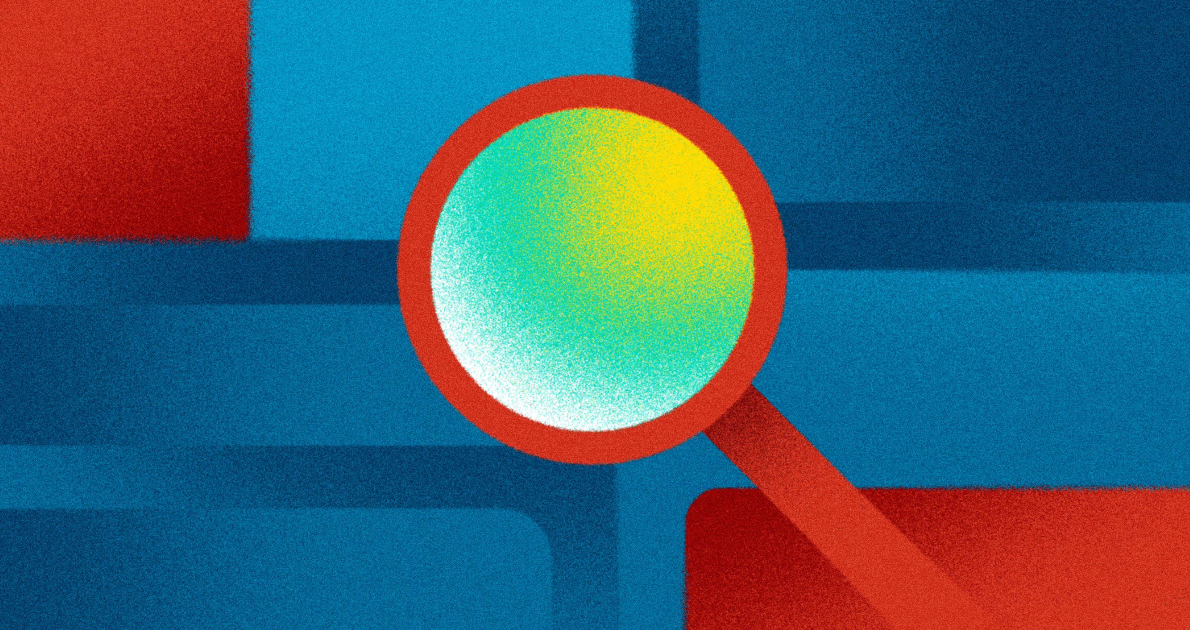
Mockup vs Wireframe vs Prototype by Clay

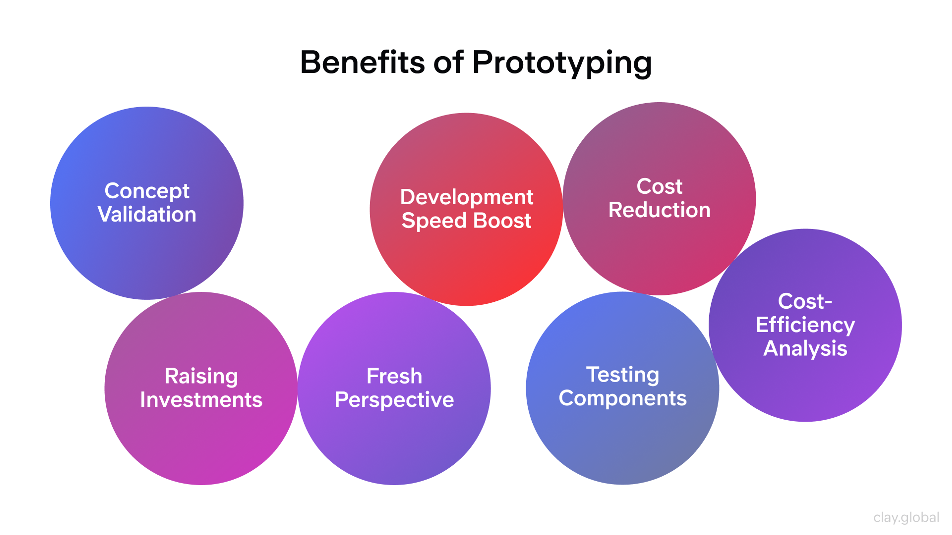
Why Prototyping Pays Off
The business case is straightforward. Companies that prototype effectively reduce development costs by up to 50–60% by catching problems before they're baked into working code.
But the more compelling argument is speed. Prototyping compresses the feedback loop between an idea and a validated insight.
Here's what that looks like in practice:
Early validation means you're testing whether a concept actually solves a user problem. A sketch pinned to a wall and shown to five users can answer that question in an afternoon.
Reduced rework follows naturally. When you validate concepts before development begins, you're not patching problems after launch. You're designing them out earlier in the process, when changes cost minutes rather than months.
Sharper team alignment is a quieter benefit but a real one. Prototypes give stakeholders, developers, and designers a shared reference point. Debates about what the product should do become much shorter when everyone can see what it actually does.
User-centered outcomes aren't an accident. Teams that test with real users throughout the design process build products that match how people actually think and behave, not how designers imagine they do.
Benefits of Prototyping by Clay
Types of Prototypes (And When to Use Each)
Low-Fidelity Prototypes
Low-fidelity prototypes are fast, cheap, and disposable, which makes them exactly right for early-stage design. Their purpose isn't to look like the final product. It's to get an idea out of your head and into a testable form as quickly as possible.
Paper prototypes are the most stripped-down version: hand-drawn screens on paper or index cards. You can sketch, test, tear up, and redraw in under an hour. This sounds primitive until you see someone interact with a paper prototype and realize they're giving you the same quality of insight they'd give with a polished Figma file. Often more, actually, because they're focused on the concept rather than the visual design.
Wireframes take that sketch one step further into a digital format. They map layout, hierarchy, and navigation without introducing color, type, or imagery. Good wireframes communicate structure and intent. They're not beautiful, and they're not supposed to be.
Flowcharts and storyboards work at the level of user journeys rather than individual screens. Flowcharts map the paths a user might take. Storyboards add narrative context, showing how a user's goals and environment shape their interaction with the product.
Usability expert Steve Krug, author of Don't Make Me Think, has long advocated for informal, lightweight testing with low-fidelity prototypes. The point isn't rigor. It's learning fast enough to steer the work.
Low-Fidelity Wireframe by Clay
High-Fidelity Prototypes
High-fidelity prototypes belong at a different stage: when the concept is validated, and you're testing specific interactions, visual hierarchy, and the finer details of the experience.
Where low-fidelity prototypes use placeholder text and rough shapes, high-fidelity versions include real content, actual visual design, working navigation, and often device-specific interactions.
A high-fidelity mobile prototype should be tested on an actual device rather than a desktop browser, because touch interactions, screen size, and real-world performance are part of what you're evaluating.
Interactive Prototypes
Creating interactive prototypes for mobile apps requires special attention to touch interactions and device constraints. Modern rapid prototyping techniques help teams simulate real mobile experiences.
Essential mobile prototype elements:
- Touch Gestures - Swipe, pinch, and tap interactions that feel natural on mobile devices.
- Screen Transitions - Smooth animations between app screens that match user expectations.
- Device Features - Camera access, GPS, and other mobile-specific functionality.
- Performance Testing - Prototypes that reveal potential speed issues on actual devices.
Interactive Prototype Flow Example

Horizontal Prototypes
Horizontal prototypes prioritize breadth over depth. They show many screens and surface-level features across your product, enough to test navigation patterns, information architecture, and visual consistency, without building out the logic behind any individual feature.
Common uses for horizontal prototypes include:
- Navigation Flow – Users can click through menus and screens to test how easily they move around your product.
- Information Architecture – Teams can validate whether categories, labels, and groupings make sense from the user’s perspective.
- Layout Consistency – Designers can explore how visual components are reused and aligned across multiple screens.
Horizontal Prototype by Clay
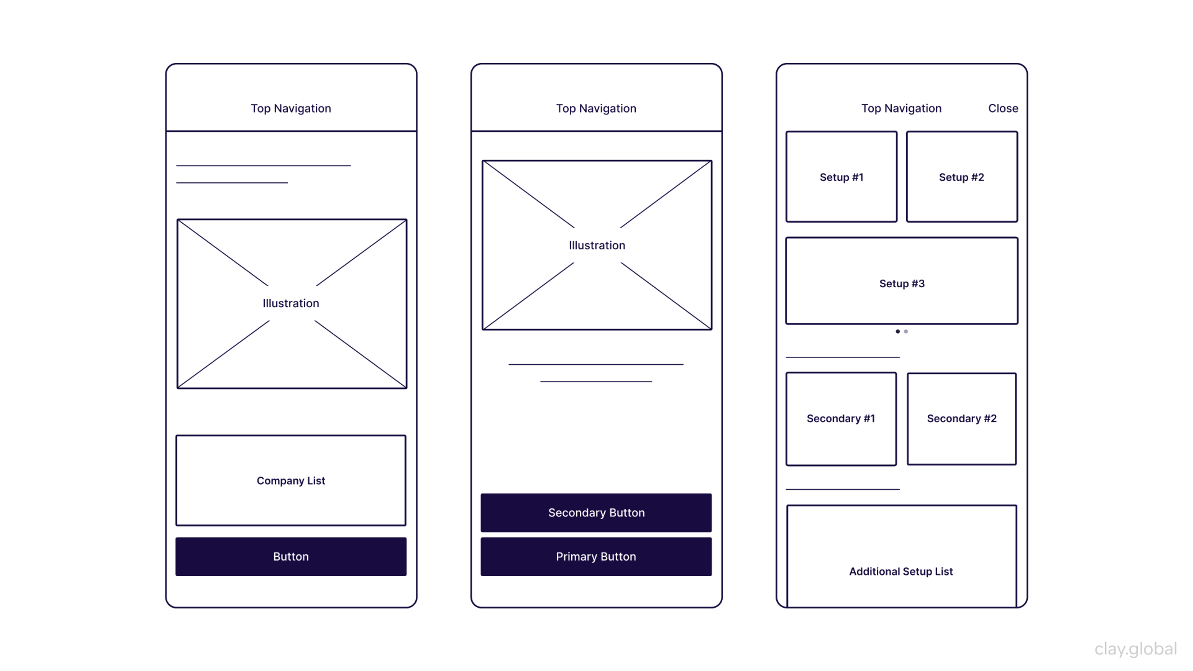
Vertical Prototypes
Vertical prototypes do the opposite. They go deep on a single feature or user flow, simulating the full experience of completing one task from start to finish. Think about booking a flight, submitting a support request, or completing an onboarding sequence.
Common uses for vertical prototypes include:
- Feature Validation – Teams can simulate an end-to-end task, like booking a ticket or submitting a form, to test its effectiveness.
- Behavior Testing – Designers can study how users respond to feedback elements like loading states, error messages, and confirmations.
- Performance Insight – Even without live data, vertical prototypes can hint at potential speed, complexity, or friction in interactions.
Vertical Prototyping by Clay
The Prototyping Process
Start with Research, not Screens
Effective prototyping begins before anyone opens a design tool. User research defines the assumptions you're testing, the audience you're designing for, and the problems worth solving.
Jakob Nielsen's research established that testing with five users identifies roughly 85% of usability problems, a finding that holds up across decades of practice. You don't need dozens of participants. You need the right five people and the right tasks.
Useful research inputs at this stage include user interviews (to surface pain points and mental models), competitive analysis (to understand existing patterns and expectations), and analytics from existing products (to see where users actually struggle, not where you think they do).
Build Personas that Guide Decisions
User personas aren't decoration. When built from research rather than assumptions, they serve as a decision-making filter throughout the design process, helping teams prioritize features, evaluate tradeoffs, and resolve disagreements about direction.
Alan Cooper, who pioneered the modern approach to persona development in About Face, argues for building a small number of realistic, research-based profiles rather than a large cast of loosely defined archetypes.
Three to five primary personas is a practical ceiling. Beyond that, the personas start working against you by adding complexity without adding clarity.
User Persona Example by Clay

Each persona should capture goals, frustrations, and behavioral patterns in enough detail to be genuinely useful in a design discussion. "Would Maya do this?" is a more productive question than "Will users do this?" because Maya is specific.
Define What You're Testing Before You Build
Unclear objectives produce unclear prototypes. Before building anything, establish what question you're trying to answer.
What assumption about your users, your design, or your product are you testing?
What would success look like?
This sounds obvious, but it's easy to skip under the pressure to start building. Teams that skip it end up with prototypes that demonstrate rather than test, polished models that confirm what the team already believes rather than challenging it.
Test, Then Iterate
User testing isn't a gate at the end of the design process. It's a recurring activity throughout it. Different testing methods serve different purposes:
Moderated testing puts a researcher in the room (or on a call) with the participant. It's more resource-intensive, but it allows follow-up questions and surfaces the reasoning behind user behavior, not just the behavior itself.
Unmoderated testing lets participants complete tasks in their own environment, without a researcher present. It's faster and scales better, though it produces less contextual insight.
A/B testing compares two design alternatives to see which performs better on a specific metric. It's useful for refining validated designs, but less useful for testing concepts.
Guerrilla testing is the most accessible form. Find people in a coffee shop or a coworking space, have them complete a task on your prototype, and watch what happens. It won't yield statistically significant data, but it will almost certainly surface problems you hadn't noticed.
Google's HEART framework offers a structured way to measure UX outcomes across five dimensions: Happiness, Engagement, Adoption, Retention, and Task completion. It's a useful lens for defining what success looks like before testing begins.
Prototype Example

Don't Skip Accessibility
Accessibility testing belongs in the prototyping process, not as a final audit before launch. Screen reader compatibility, keyboard navigation, color contrast ratios, and cognitive load are all easier and cheaper to address when you're still in a prototype than after the product is built.
The WCAG 2.2 guidelines provide concrete, testable criteria. Tools like Stark and Able plug directly into Figma and surface accessibility issues before a single line of code is written.
Tools Worth Using
The right prototyping tool depends on where you are in the process.
Figma has become the default for most teams, and for good reason. Real-time collaboration, a robust component system, and interactive prototyping in a single environment make it well-suited to both low-fidelity wireframing and high-fidelity interactive work. Its Variables and Advanced Prototyping features, introduced in 2023, significantly expanded what's possible without writing code.
Adobe XD integrates tightly with the rest of the Creative Cloud ecosystem, which makes it a natural choice for teams already working in Illustrator or Photoshop.
ProtoPie is worth knowing for complex interaction design. It handles sensor-based interactions, conditional logic, and multi-screen flows that would require code to replicate in most other tools.
InVision has lost ground to Figma over the past few years, but its collaboration features for stakeholder reviews and design handoff remain solid.
UXPin stands apart from the others by letting you build prototypes directly from live code components, bridging the gap between design and development in a way the other tools don't.
Prototyping Programs
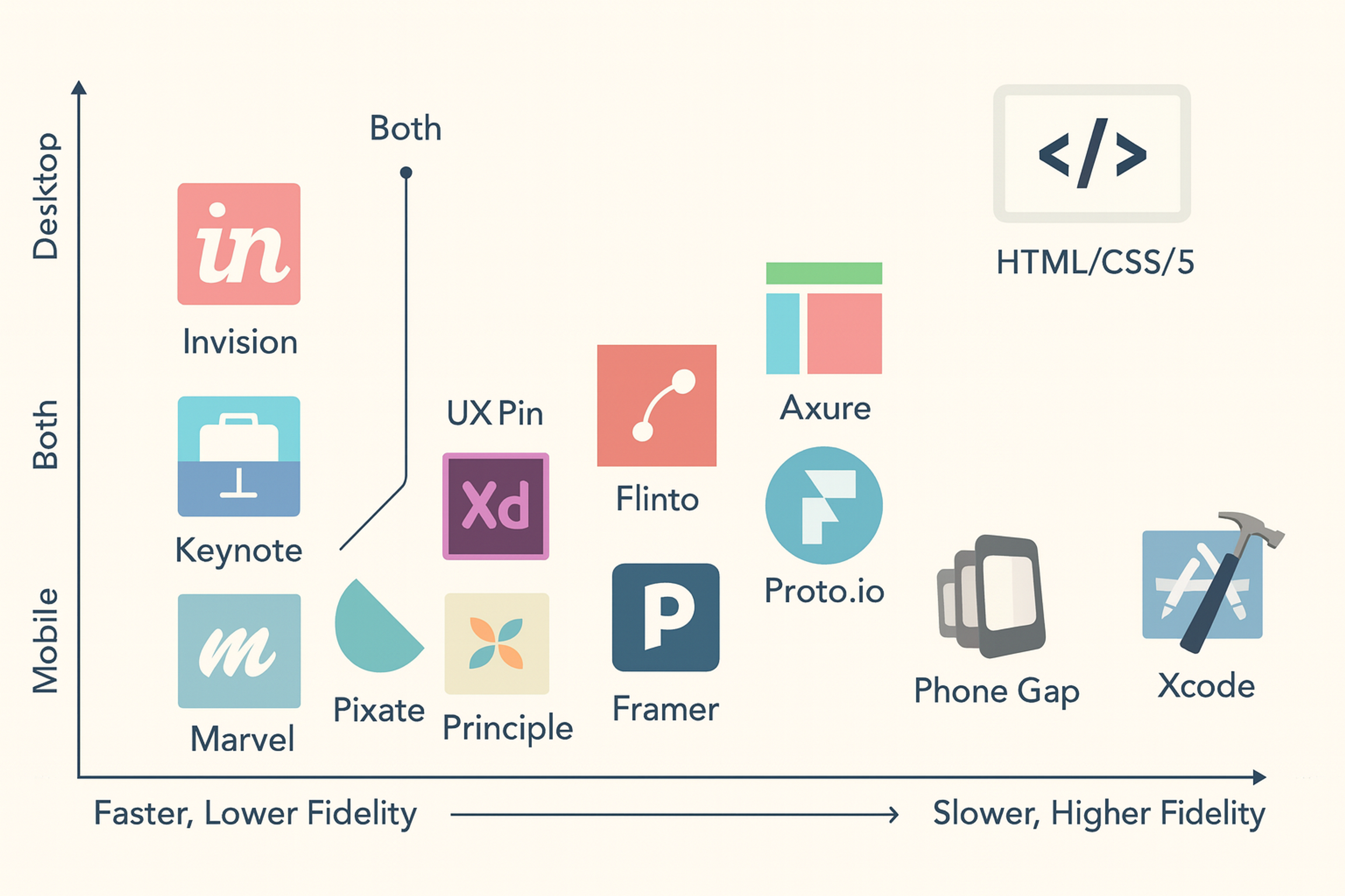
For early-stage exploration, don't overlook the basics. Pen, paper, and a whiteboard still produce faster initial prototypes than any software.
UX Prototype Examples
Aircall (Interactive Call Center Dashboard)
Aircall teamed up with Geckoboard to build interactive, real-time dashboards that give customer support teams clear visibility into call activity and performance. These prototypes allowed them to experiment with different dashboard layouts and interactions, directly improving how their teams handle incoming calls and manage productivity. You can explore their approach on Geckoboard's website.
Ledger (Crypto Hardware Wallet App)
Ledger's development team used advanced prototyping techniques while building their crypto wallet application. They created realistic, high-fidelity interactive mockups to ensure secure and intuitive user experiences, especially around onboarding and security verification processes. Ledger openly shares their prototyping guidelines and examples in their Developer Portal.
Source: Ledger

Notion (Collaborative Workspace Tool)
Notion emphasizes rapid experimentation through sketches and basic wireframes to quickly test new ideas. Although detailed public case studies are limited, various interviews and discussions within the design community reveal that Notion's iterative prototyping approach helps them continually align the platform with user needs and expectations.
Common Mistakes That Kill Good Prototypes
1.
Jumping to high-fidelity too early. Visual polish creates false confidence. When a prototype looks finished, users and stakeholders react to the aesthetics rather than the underlying design decisions. Test rough before testing refined.2.
Skipping user testing entirely. Internal reviews are not a substitute for watching real users interact with your prototype. Your team already knows how the product is supposed to work, which is exactly why they can't reliably tell you whether it does.3.
Ignoring technical constraints. Prototypes that couldn't exist in production create unrealistic expectations and erode trust with engineering teams. Work with developers early to understand what's actually buildable.4.
Only testing the happy path. Real users don't follow perfect scenarios. They make mistakes, misread labels, and take unexpected routes. Design for those moments, and test for them.5.
Testing on the wrong device. Mobile prototypes need to be tested on mobile devices, in realistic conditions. Desktop testing misses the context of touch accuracy, screen size, and one-handed use that determines whether a mobile experience actually works.
Where Prototyping Is Heading
AI is changing the early stages of the prototyping process faster than most teams expected. Tools like Vercel v0, Galileo AI, and Figma's AI features can generate draft UI from a text prompt, compress the time between concept and testable prototype, and automate repetitive layout work. The practical effect is that teams can run more cycles in less time, which means more learning, faster.
What AI doesn't change is the underlying logic. You still need to know what you're testing, why it matters, and how to interpret what users do with the prototype you've built. A faster build cycle is only valuable if you're asking the right questions.
Voice interfaces, AR, and spatial computing are creating new demands for prototyping tools and methods. Testing a conversational interface or an AR overlay requires different approaches than testing a screen-based app, and most teams are still figuring out what those approaches look like in practice. Expect that to evolve quickly over the next few years.
Design systems have also become a meaningful part of the prototyping process. When teams build prototypes from a shared component library, changes made in the design system propagate through prototypes automatically. That consistency between prototype and product, and between design and code, significantly reduces the friction of moving from a tested concept to a shipped feature.
Read more
FAQ
What's the difference between a wireframe and a prototype?
A wireframe is a static representation of a screen's layout. It shows structure and hierarchy, but doesn't respond to interaction. A prototype connects screens together and simulates how a user moves through the product, making it testable in a way a wireframe isn't.
When should I use a low-fidelity prototype instead of a high-fidelity one?
Use low-fidelity when you're still validating whether a concept makes sense. Use high-fidelity when you're testing specific interactions, visual design decisions, or the detailed behavior of a feature. Moving to high-fidelity too early is one of the most common and costly prototyping mistakes.
How many users do I need to test a prototype?
For qualitative usability testing, Jakob Nielsen's research suggests five participants will surface approximately 85% of usability problems. You don't need a large sample. You need the right tasks and the willingness to act on what you observe.
Can I prototype without a design tool?
Yes. Paper prototypes are often more effective than digital ones in early stages because they're faster to build, easier to modify, and don't give users or stakeholders the impression that the design is more final than it is.
What's the best prototyping tool for beginners?
Figma is the easiest entry point for most people. It's free for individual use, well-documented, and widely used enough that tutorials and community resources are easy to find. For pure click-through prototyping without visual design work, Marvel is even simpler.
What's the difference between horizontal and vertical prototypes?
Horizontal prototypes show many screens at a surface level, useful for testing navigation and overall structure. Vertical prototypes go deep on a single feature, simulating its full logic and interaction flow. Most products need both at different stages of development.
How do I test a prototype on mobile?
Export it to a tool that delivers the prototype directly to a device. Figma Mirror, ProtoPie's app, or InVision's mobile viewer all work well. Watch users interact with it on the actual device rather than on a desktop browser. Scrolling behavior, touch targets, and real-world speed all behave differently on mobile.
What is guerrilla testing?
Guerrilla testing is lightweight, informal usability testing conducted in everyday settings like a café, a library, or a coworking space. You approach people, ask if they'll spare five minutes, and watch them complete a task on your prototype. It's low-cost and surprisingly effective for surfacing obvious usability problems early.
How does prototyping differ for mobile apps versus web products?
Mobile prototypes require attention to touch gestures (swipe, tap, pinch), device-specific features (camera, GPS, haptics), and real-world performance constraints. They should always be tested on actual devices, since desktop browsers don't replicate the conditions that shape mobile usability.
What is the HEART framework?
HEART is a measurement framework developed at Google for evaluating user experience quality. It tracks five dimensions: Happiness (user satisfaction), Engagement (depth of product use), Adoption (new users), Retention (returning users), and Task success (completion rates). It's useful for defining UX success metrics before you begin testing.
Should developers be involved in the prototyping process?
Yes, and earlier than most teams involve them. Developer input helps identify what's technically feasible, surfaces constraints that should shape the design, and reduces the gap between what the prototype promises and what the product delivers.
How do I know when a prototype is ready to test?
When it's testable. That means a user can attempt the task you've designed around it, and their behavior will tell you something meaningful. Perfection is not the threshold. Many teams wait too long, polishing prototypes that would have taught them the same lesson in a rougher state.
What is an interactive prototype?
An interactive prototype responds to user input (clicking, tapping, swiping) and transitions between screens as a real product would. It can range from simple click-through connections to sophisticated simulations with conditional logic, animations, and form behavior.
How does AI affect the prototyping process?
AI tools can now generate draft UI layouts from text descriptions, accelerating the early stages of prototype creation. Tools like Figma's AI features, Galileo AI, and Vercel v0 are the most developed examples. They compress the time between concept and testable artifact, though defining the right question to test still requires human judgment.
What's the most important thing to get right in UX prototyping?
Testing with real users. The prototype is only a vehicle. What you do with what you learn from testing it is what separates products that work from products that don't.
Conclusion
The core logic of prototyping hasn't changed in decades: make something, test it, learn from what you observe, and make the next version better. What has changed is how quickly you can move through that cycle, and how much you can learn along the way.
The teams building the best digital products aren't building more carefully. They're testing more frequently and treating every prototype as a question rather than an answer.

About Clay
Clay is a UI/UX design & branding agency in San Francisco. We team up with startups and leading brands to create transformative digital experience. Clients: Facebook, Slack, Google, Amazon, Credit Karma, Zenefits, etc.
Learn moreAbout Clay
Clay is a UI/UX design & branding agency in San Francisco. We team up with startups and leading brands to create transformative digital experience. Clients: Facebook, Slack, Google, Amazon, Credit Karma, Zenefits, etc.
Learn more