
Web3 design must hide complexity while keeping users in control. People sign with wallets, not passwords, and smart contracts, not servers, carry out actions. You must make these flows feel simple, safe, and fast.
When designing for new users who may be unfamiliar with blockchain and Web3 technology, it's essential to understand the target audience and provide user friendly and intuitive onboarding experiences. For foundational patterns and real-world examples, see our Web3 & Crypto page.
This article is for product and UX teams building wallets, DeFi, NFT, DAO tools, and decentralized apps. You will explain networks and transactions with everyday language. You will create patterns that work across chains. You will pick metrics that show users succeed, not just that they clicked. Creating user friendly and intuitive flows is essential for adoption among new users entering the Web3 space.
Data UX for Blockchains
Users need to feel the network’s pulse. Show its state in plain English: current fees, expected wait, and any recent bumps. Keep these indicators on every screen where a decision is made. Use colors and icons, but always back them with words. If the network is slow, say that out loud and offer next steps.
This clarity-first approach also shaped our work on Nuant — a crypto asset intelligence platform that combines decentralized and traditional finance, where we designed an elegant fintech experience with robust data visualization, customizable widgets, and a versatile design system across light and dark modes.
Nuant web app by Clay

Logs alone won’t cut it. Break it down step-by-step from approval to the last confirmation. Show the user what they send, what they get back, and what they pay. Users interact with core blockchain functions such as execution, settlement, and consensus, so the interface should help them navigate these processes with clarity.
If the transaction hops across contracts or chains, illustrate the entire path. Highlight key checkpoints and list common failure points. Attach exact evidence — like block numbers and timestamps — inline and everywhere.
Let folks explore without worry. Build bite-sized interactive explainers. Using sample data, let anyone simulate a swap, a loan, or a vote. Start with the result. Let users toggle and uncover formulas, rates, and edge cases. Define jargon on the spot or skip it entirely.
Map the ecosystem only when it guides a decision. Connect every graph to a single action, like “Where can I earn with this token?” or “Which bridge is the cheapest right now?” Keep filters dead simple and labels short. Clarity always wins over crunching too much data.
Visual Language and Components
Make every asset instantly recognizable, everywhere. Stick with the same icons, tickers, and decimal places across the app. Use verified markers and tooltips that explain what “verified” actually means.
Include fiat estimates with clear currency labels and plain rounding rules. Always choose legibility over fancy design. High contrast text and thoughtfully chosen backgrounds are essential for accessibility and readability, ensuring all users can easily interact with your web design.
Show who you are without clouding the experience. Let the logo and color shine in illustrations, brief motions, and empty space. Incorporate subtle animations, curved sections, and circle motifs as design elements to create a cohesive and immersive web design.
Keep the main buttons and sliders simple and always the same. Use one font size and a consistent grid everywhere. Make changes clear: waiting, done, error, reversed.
Harmonize everything on-chain. Trim the middle of long hashes, but leave the start and end. Use a fixed-width font for addresses. Let users copy with one tap and always show a “view details” link. Don’t switch screens unless they ask.
Check how users spot network icons and labels. Watch for misclicks on similar assets. Log how often people check verification info before they tap.
Good design and the thoughtful use of visual elements — such as backgrounds, high contrast text, subtle animations, and curved sections — are essential for effective Web3 web design, fostering trust, usability, and engagement.
Elements of Web3

Patterns That Ship
1) Chain Context & Flow Control
Chain Context Badge
- Purpose: Constant awareness of the active chain.
- Design: Persistent badge near primary actions showing chain name, icon, and a short fee hint. On switch, explain what changes (addresses, balances, pending actions) and offer a safe cancel.
- Metrics: Wrong-chain errors and drop-off during chain switch.
Multi-Step Flow
- Purpose: Guide users through approvals, swaps, bridges, and settlement.
- Design: Show all steps in one view. Advance only after completion. On failure, state the cause, cost so far, and the next safe step. Keep context during wallet pop-ups and leave a transcript.
- Metrics: Completion per step, average total time.
Transaction Safety & Recovery
Simulate Before Commit
- Purpose: Reduce fear and failures with a clear preview.
- Design: “You will send X, receive Y, and pay Z,” plus risks (price impact, slippage). If approval is required, explain why and how to revoke later. Let users adjust inputs and see live outcomes.
- Metrics: Drop-off shifts, revert rates, average cost per successful action.
Typed Signature Clarity
- Purpose: Human-readable signing that prevents mistakes.
- Design: Before signing, show who is asking, for what purpose, and for how long. Highlight risky fields, name the domain, and link to the source/contract.
- Metrics: Declines on suspicious requests; “I didn’t mean to sign” complaints.
Speed Up / Cancel
- Purpose: Relief for stuck transactions.
- Design: Expose “Speed up” and “Cancel” with a plain-language nonce and fee explanation. Preview new ETA and cost before replacement. Confirm outcomes with receipts.
- Metrics: Share of stuck transactions resolved without support; time-to-relief.
Recover & Revoke
- Purpose: Safe ways to undo risky permissions and actions.
- Design: A visible “Approvals & Security” view listing allowances, scope, and age. Support inline revokes with clear impact. Provide guidance after scams or mistakes.
- Metrics: Support tickets about approvals; monthly review/revoke rates.
Assets & Governance
NFT Gallery & Collections
- Purpose: Celebrate art. Make management easy.
- Design: Flexible grids with strong fallbacks. Sorting by date, price, or trait; ownership history and creator splits. License notes when relevant; batch actions with clear confirmation.
- Metrics: Time to find a piece; listing success rate.
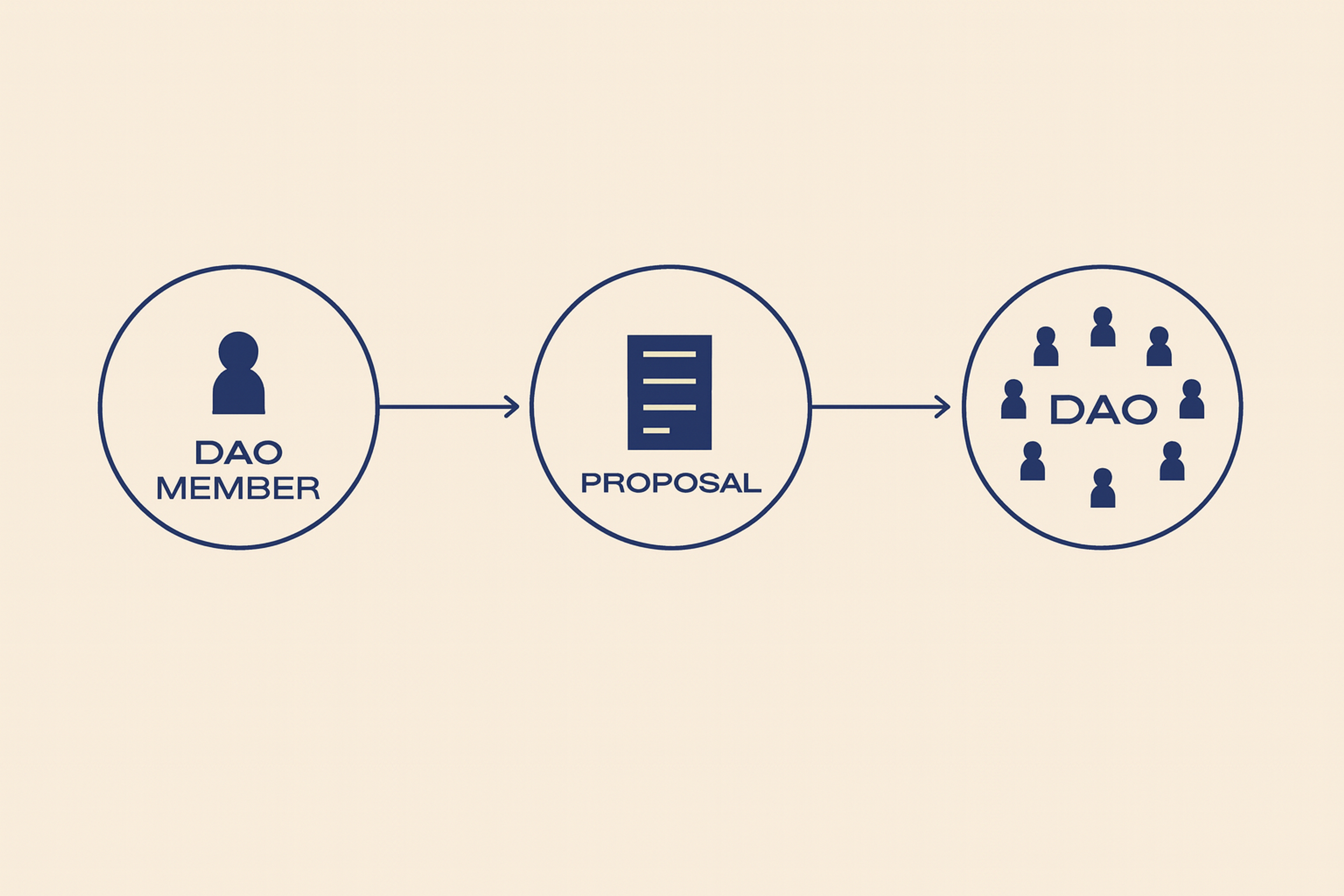
DAO Proposals and Voting
- Purpose: Turn reading into action.
- Design: One-line question; two-line impact; quorum and window up front; neutral summary with links to debate; fast paths to delegate or acquire voting power. Confirm with a readable receipt.
- Metrics: Conversion from view to vote; late votes due to unclear deadlines.
DAO Proposals and Voting
Behavior & Psychology
Build Trust with Small Wins
Why: Most users fear irreversible mistakes.
How: Start with low-risk actions; celebrate quick success. Invite the next step with a clear benefit. Keep risk language consistent — never alarmist, never vague.
Respect Ownership and Responsibility
Why: People feel strong ties to assets and identity.
How: Use careful copy for sales, burns, and transfers. Offer dry-run modes and reversible steps where possible. Put recovery tips inline at the moment of need.
Community Without Hype
Why: Social proof helps — pressure hurts.
How: Show relevant stats with dates and sources. Mark opinions as opinions. Surface informed dissent when it improves decisions. Let users follow trusted curators, not raw feeds. Engaging community features can help convert visitors into active participants, enhancing overall website engagement.
Modern, Seedless Onboarding
Why: MPC/social recovery can remove seed phrases and reduce drop-off.
How: Explain recovery in simple steps and set clear limits. Offer a structured course or tutorial to help new users understand onboarding and recovery processes. Sponsor initial gas where possible or explain costs upfront. Do not bury trade-offs.
Measure Confidence, Not Clicks
Why: Early signals predict long-term retention.
How: Track first-week retention after a small success. Monitor regret actions and “confusing” support tickets. Watch usage of recovery tools after incidents.
Foundations That Prevent Pain
Accessibility is mandatory. Use strong color contrast everywhere. Every action must be reachable by keyboard. Highlight what’s focused, and speak progress to screen readers. Combine icons and text as status cues that don’t rely on color.
Choose large QR codes and add clear captions. Emerging technologies like AI and blockchain technologies are shaping the future of accessible and user-friendly Web3 website design by enabling smarter interfaces and more secure, decentralized experiences.
Transaction speed matters. Operations will take a moment, but the interface must feel alive. When it’s safe, use hopeful updates and label them as such. Save known data and load what’s probably next. Don’t lock the form while pending a signature. If a confirmation will be slow, say how long it will take and why.
Handle language and money with care. Use local formats for dates, numbers, and currencies. Show the labeled fiat estimates and state how often they refresh. Support all languages, including right-to-left. Translate legal and risk information using people, not machines.
Privacy and media rights must be obvious. Collect the least data you can. Clearly say what you collect and why. Let users opt out without breaking basic use. For media and NFTs, show license info when it matters. Never expose addresses or balances in images that can be shared.
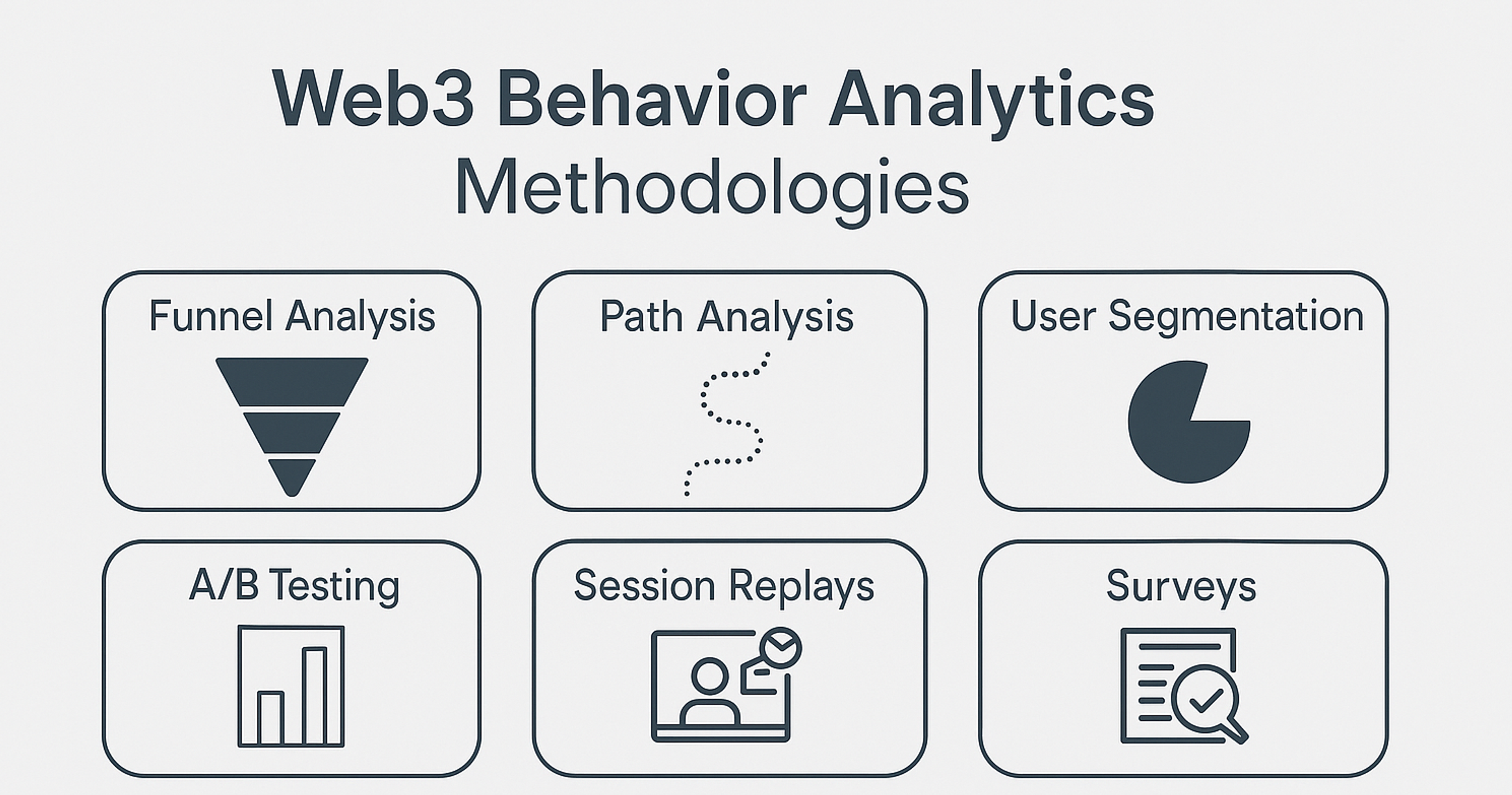
Testing and Analytics for Web3
Diversify your testing wallets and chains. Builders must ensure their platform is robust and reliable across different environments. Ensure your flows work on the main wallets, popular browsers, and standard devices. Check that switching chains, changing accounts, and disconnecting behave as expected.
Run the tests under bad conditions: slow connections, high latency, and drop-out. Intentionally take the network offline, then follow the recovery steps. Don’t forget hardware wallets in your tests.
Push your multi-chain edges. Run scenarios on both mainnet and testnet. Make sure fee estimates on every chain match what the user sees. If your app calls other protocols, simulate their errors — rate limits, timeouts, and outdated data. Design soothing fallback messages that guide users through the problem.
Use privacy-friendly analytics. Blend on-chain events with your web data, but never track users across different sites. Track funnels, not pageviews. A clear sequence works best: wallet_connect, approval_view, approval_sign, simulate_view, tx_submit, tx_confirm, revoke. Keep only aggregated totals, not individual histories. Share public metrics that users can verify, not personal information.
Run an editorial checklist before launch. Double-check names, features, and terms. Keep “Web3,” “dApp,” and “DAO” consistently cased. Swap out hype for cold facts, or cut the line. Date any market number. Clarify what any “audit” really covered. Review risk warnings and fee copy for total accuracy.
Web3 Behavior Analytics
Good Examples of Web3
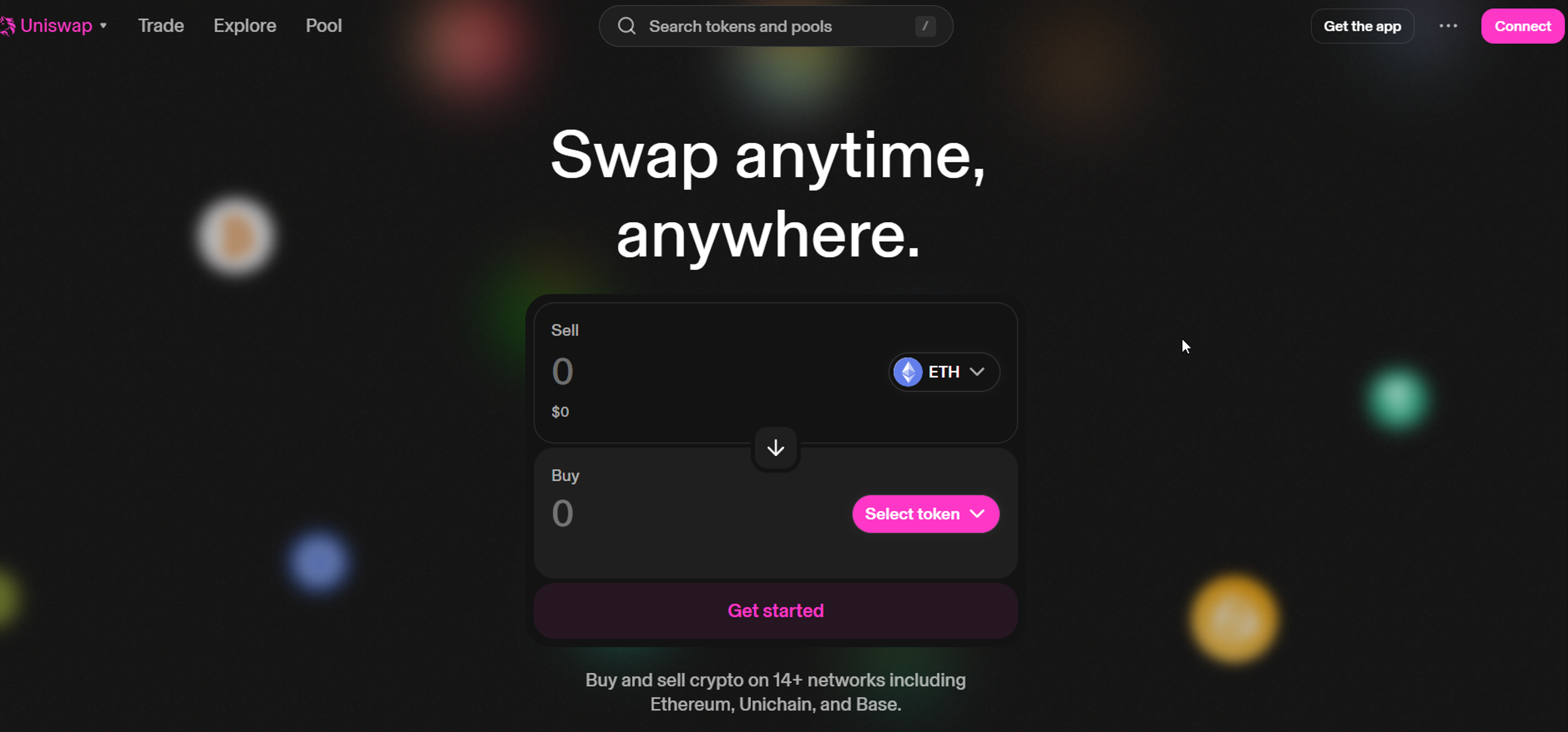
Uniswap
The Uniswap demonstrates excellent design by combining a sleek, minimal interface with strong usability. Its layout is clean, intuitive, and free of clutter, which helps users focus on essential actions like swapping, pooling, or checking balances.
The use of consistent colors, smooth transitions, and clear hierarchy builds trust while reflecting the brand’s identity. Every element feels purposeful, from typography that enhances readability to interactive components that guide the user naturally through complex crypto transactions.
Source: app.uniswap
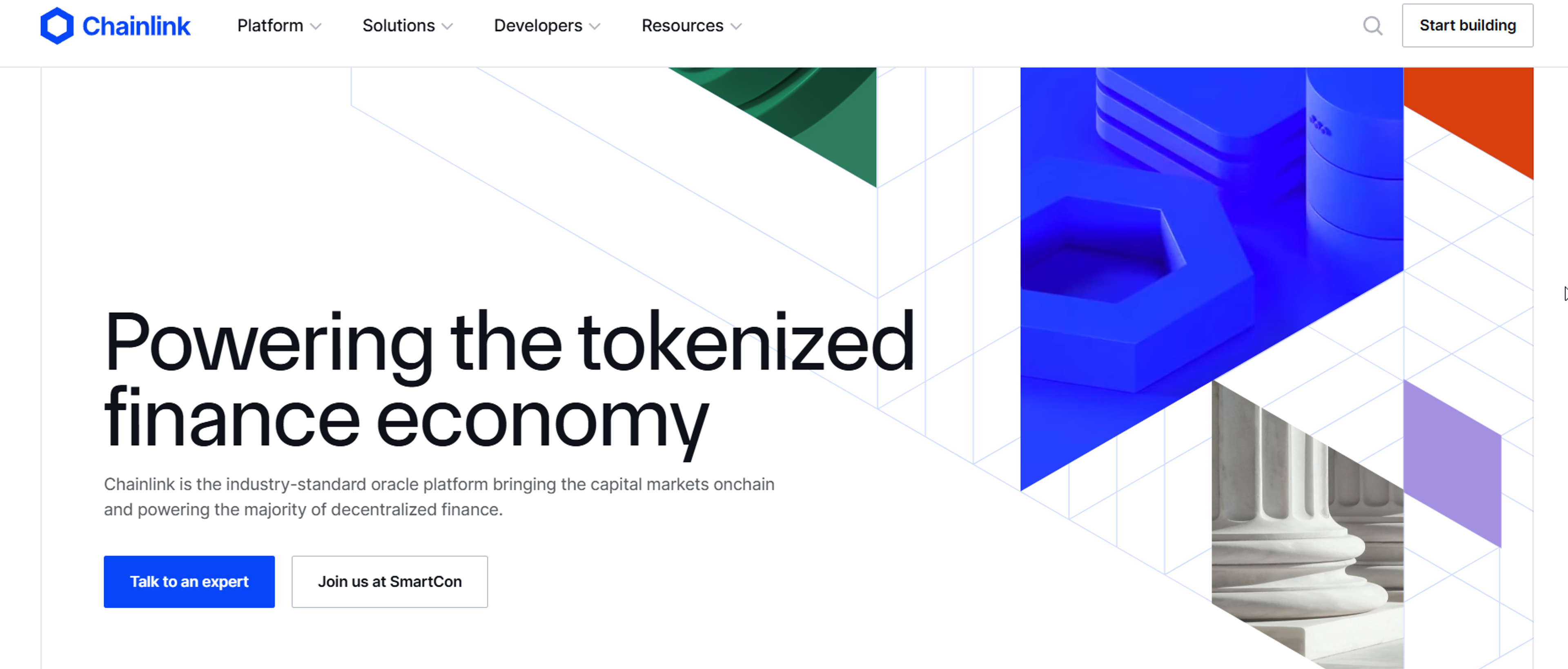
Chainlink
Chainlink’s site stands out for its polished, professional design that reflects trust and authority in the blockchain space. The visual style is clean and modern, with bold typography and subtle gradients that highlight key messages without overwhelming the viewer.
Clear navigation and structured content make complex topics like oracles and cross-chain infrastructure approachable, while interactive visuals and consistent branding reinforce credibility. The design balances sophistication with clarity, making advanced technology feel accessible and reliable.
Source: chain.link
FAQ
What Are Web3 Websites?
Web3 websites are decentralized applications (dApps) built on blockchain technology. Unlike traditional sites hosted on centralized servers, Web3 sites use smart contracts and distributed networks, giving users more control over data and identity.
What Is An Example Of A Web3?
Examples of Web3 applications include Uniswap (decentralized finance), OpenSea (NFT marketplace), and Decentraland (virtual world). These platforms run on blockchain and allow peer-to-peer interaction without traditional intermediaries.
What Is Web 3.0 For Dummies?
Web 3.0, or Web3, is the next generation of the internet where users own their data, apps run on blockchain, and transactions are peer-to-peer. It’s like today’s web, but more secure, transparent, and user-driven.
What Is Web3 In Layman’s Terms?
In simple terms, Web3 is the “decentralized internet”. Instead of companies controlling platforms, users interact directly using blockchain technology, making the web more open and community-owned.
Is Google Using Web3?
Google is not a Web3 company, but it is exploring blockchain and Web3 technologies, which reflects its vision for the future . Google Cloud has partnered with Web3 projects to provide infrastructure support, showing growing interest in decentralized applications.
Read more:
Conclusion
Web3 is about giving people control, but without clear, straightforward guidance, control can feel confusing and scary. Your app should take complicated systems and make them feel easy to hold, drawing inspiration from user-friendly design. Turn uncertainty into clear choices and long waits into steps that lead somewhere. When folks see what's coming and why, they can move ahead without second-guessing.
Stick to three promises: clear the context, show honest previews, and build strong safety nets. Do this across different networks using sturdy tools and everyday language. Count real results instead of flashy numbers.
Honor privacy and make access open to everyone. If you do, you'll win trust from your clients . People will finish more tasks, mess up less, and invite others to join. That's how thoughtful Web3 design grows the community — one confident click at a time.

About Clay
Clay is a UI/UX design & branding agency in San Francisco. We team up with startups and leading brands to create transformative digital experience. Clients: Facebook, Slack, Google, Amazon, Credit Karma, Zenefits, etc.
Learn moreAbout Clay
Clay is a UI/UX design & branding agency in San Francisco. We team up with startups and leading brands to create transformative digital experience. Clients: Facebook, Slack, Google, Amazon, Credit Karma, Zenefits, etc.
Learn more

