
Website navigation is not just a menu. It's the whole system that helps people understand where they are, what's available, and how to reach the next step with confidence.
In 2026, this system has to work across more contexts than ever: mobile-first browsing, keyboard-heavy power users, accessibility expectations, and AI-driven discovery that brings visitors in on particular questions.
Good navigation reduces friction, increases trust, and quietly improves everything downstream: engagement, conversion, and retention.
Why Navigation Matters More in 2026?
People arrive with sharper intent. AI-assisted search is pushing users toward longer, more specific queries and follow-up exploration, which means your pages must be easy to scan, easy to understand, and easy to move through.
To optimize usability and user experience, it's essential to understand what your site visitors and website visitors expect to see in the navigation bar and tailor your navigation structure to their needs.
At the same time, industry research still shows that many sites underperform on basic wayfinding. For example, large-scale UX benchmarking in ecommerce continues to find that a majority of sites deliver mediocre or poor navigation and search experiences - a reminder that fundamentals still win.
What Is Website Navigation?
Website navigation is the system that allows users to move through a website using menus, links, and buttons. At its core, website navigation structure organizes content so visitors can find what they're looking for quickly and intuitively. A strong navigation structure is essential for a positive user experience, as it reduces frustration and helps users accomplish their goals efficiently.
Beyond just helping users, effective website navigation also plays a vital role in search engine optimization. Search engines like Google rely on a clear navigation structure and descriptive labels to understand your site's hierarchy and content.
This understanding can improve how your pages are indexed and ranked, making it easier for potential visitors to discover your site through search. By prioritizing clarity and organization in your website navigation, you not only guide users but also support your site's visibility and performance in search results.
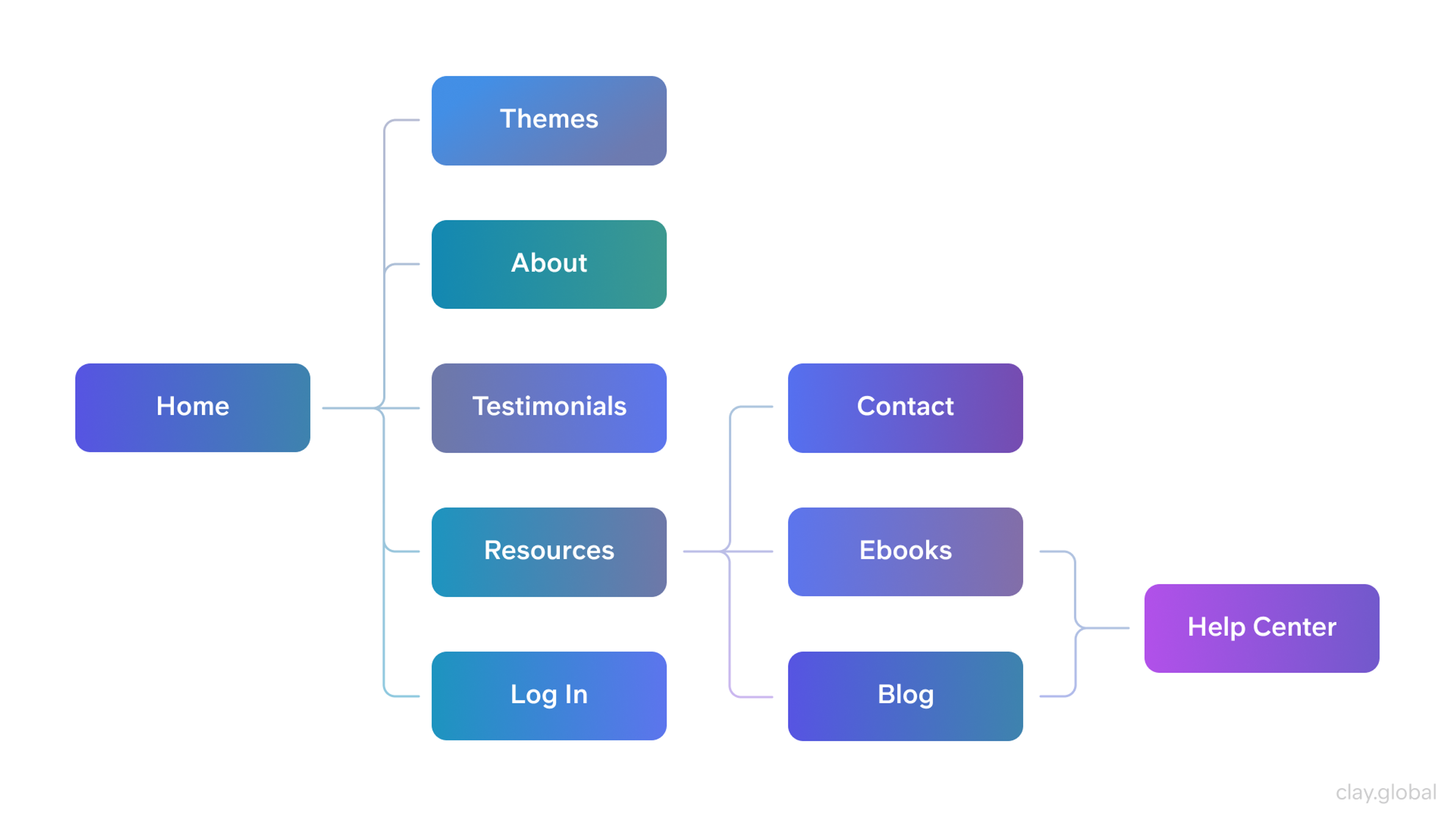
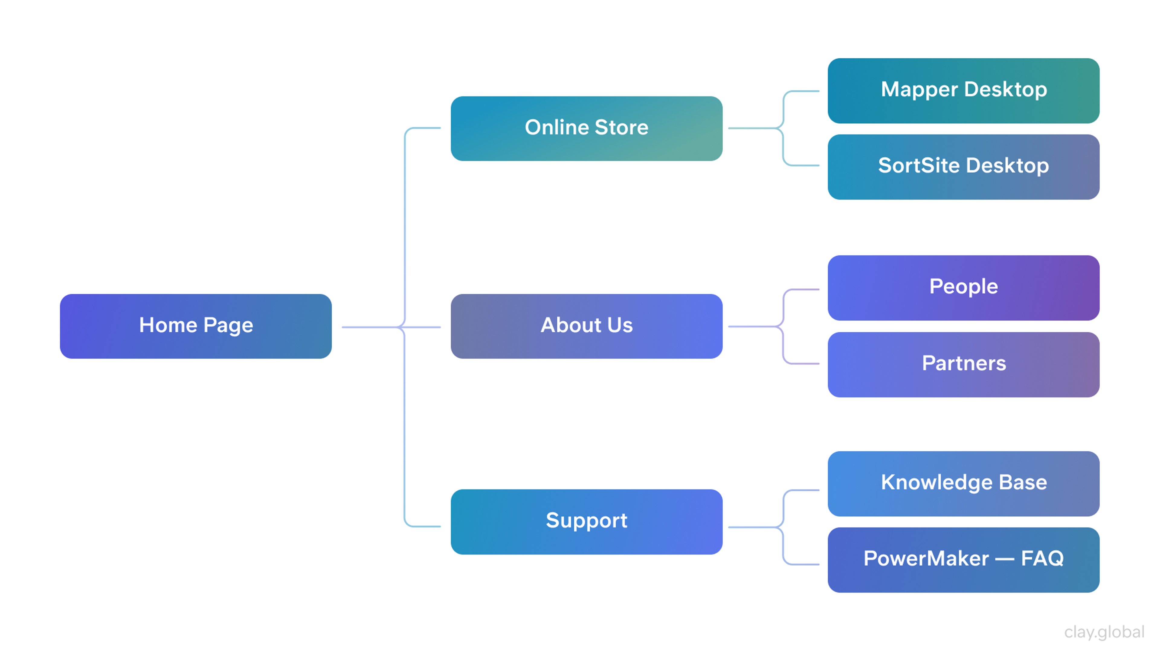
Website Sitemap Structure by Clay
What Is a Navigation Menu?
A navigation menu is a website’s main tool for guides navigation design to key sections like the homepage, services, or contact page. It can appear as a top bar, sidebar, dropdown, or mobile-friendly hamburger menu.
A well-structured navigation menu improves navigation design, accessibility, and SEO, ensuring visitors can quickly find what they need without frustration.
What Are the Types of Website Navigation?
Understanding the different types of website navigation is key to making your site user-friendly. Navigation helps visitors find what they're looking for and interact with your content in just a few clicks. Here are a few navigation tools that can really boost usability:
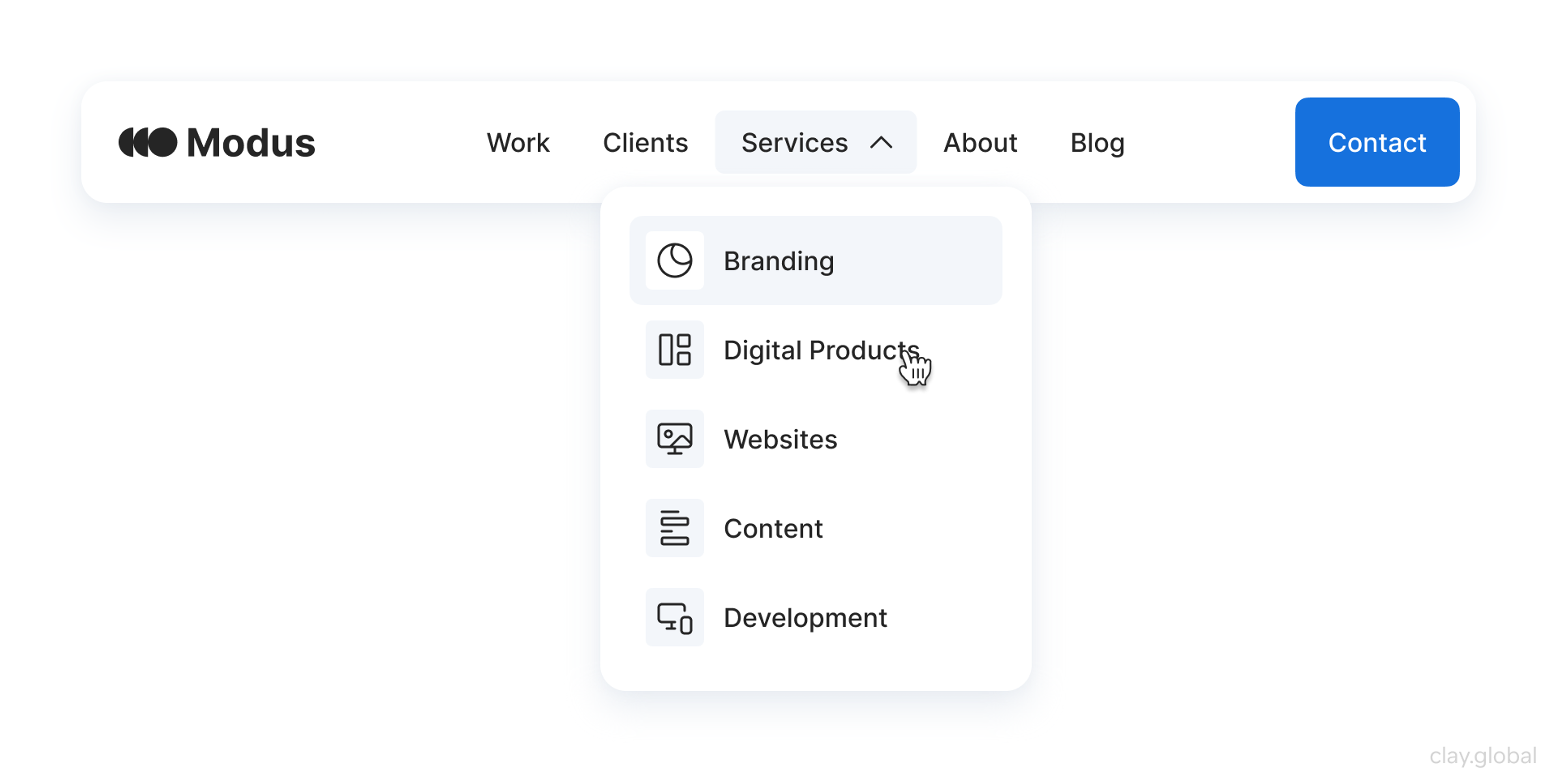
A mega menu is a dropdown that opens what feels like a mini-website the moment someone hovers over a menu link. This is great for sites with a lot of content. All the categories and subcategories appear in one big box, so visitors can glance and choose right away — no extra clicks needed, and the dropdown doesn't get cramped like a regular menu.
Examples of website navigation can teach a lot. Look at different sites that nail it and notice the small details. You'll find the same navigation tools applied in clever, slightly different ways, showing that good design sticks to proven patterns and tailors them to the content.
Sticky navigation solves the problem of scrolling. When visitors move down a long page, the header menu, side menu, or tabs move with them, practically "sticking" to the top or side of the screen. This way, they can jump to a new section whenever they want, without needing to scroll back up. Stick to your key categories — too many items will clutter, so keep it neat for a better user journey.
Top Navigation Bar
The top navigation bar sits right at the top of almost every website you visit. It usually showcases the site's main sections — like Home, About, Services, and Contact — so you can jump wherever you need in just one click. To keep things tidy, many bars offer dropdown menus.
Hover over a primary link, and a list of related pages appears, letting you dive deeper without overflowing the design. This method keeps the website sleek and organized, perfect for brands that want a professional vibe while still serving up every corner of the site in seconds.
Website Navigation Example by Clay
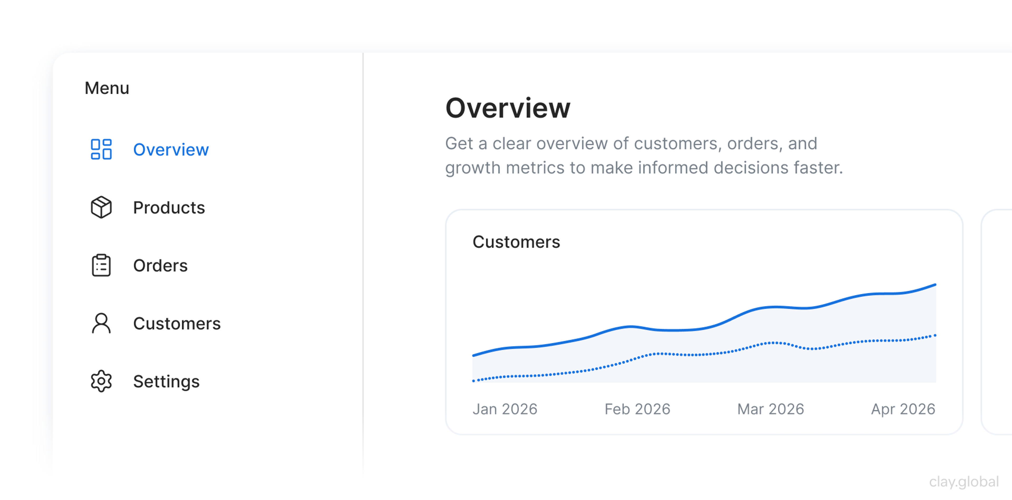
Vertical Sidebar Navigation Menu
A vertical sidebar navigation menu pops up on a page's left or right edge and is a lifesaver for sites packed with categories or nested information. These menus can hide main categories, expanding only on click to reveal deeper layers of links.
This neat folding keeps the page tidy, making related sections easy to browse. You'll often find side navigation in e-commerce shops, blogs, and knowledge bases, where visitors want to sift through many related topics to find specific information without getting lost.
Vertical Sidebar Navigation Menu by Clay
Breadcrumb Navigation
Breadcrumbs offer users a path of hyperlinks displaying their cutting-edge web page's location inside the website structure. This no longer allows users to recognize their role on the internet site but also provides for smooth backtracking to preceding sections, enhancing the surfing experience.
Breadcrumbs are specifically beneficial on big websites with multiple tiers of hierarchy, as they reduce the wide variety of clicks needed to navigate via particular layers of content material.
Breadcrumb Navigation by Clay

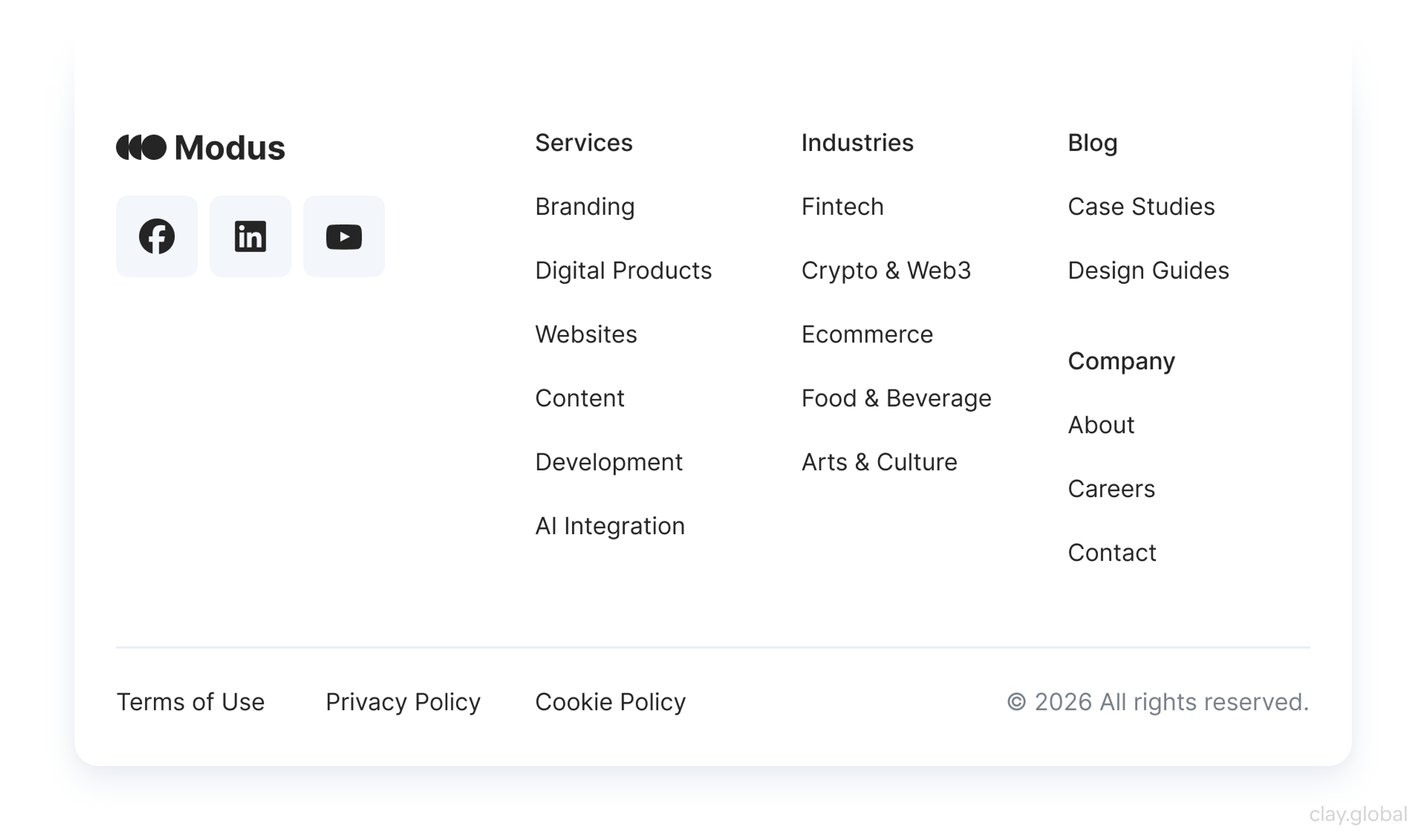
Footer Navigation
Often unfairly ignored, the footer menu appears at the very base of a page, but its signals matter a lot. Usually, the section carries essential links — contact details, privacy texts, site maps, and social feeds — ensuring essential info is never far away.
It is quietly classified as a backup route, handy for anyone hunting down specific records without needing to scroll back to the top. It also offers space to slide in extra calls to action or short promos, gently nudging users along.
Footer Navigation by Clay
Hamburger Menu
You usually spot the hamburger menu in mobile layouts; the icon is a compact group of three horizontal stripes. Tap it, and the menu expands, showing links that would otherwise clutter the screen.
By tucking options out of sight, designers keep the small canvas tidy, yet the approach rests on user knowledge. People need to recognize the symbol for it to help. In confined mobile layouts, it’s smart to keep vital destinations handy without crowding the screen or distracting the eye.
The Hamburger Menu by Clay
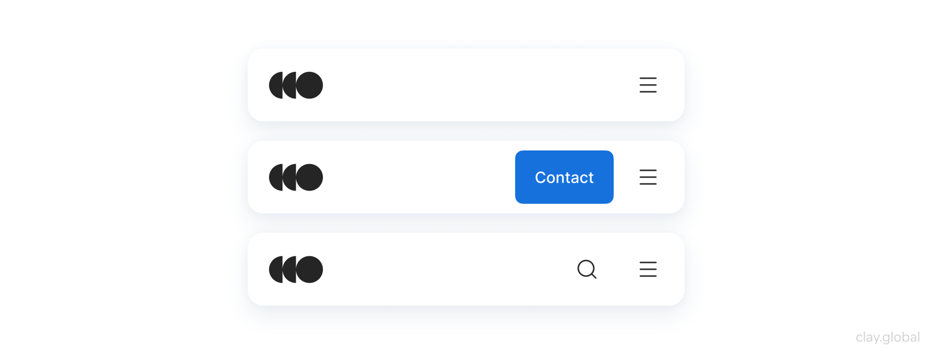
Search Bar Functionality
A search bar doesn’t play the traditional navigation role, yet its quiet power is undeniable. Place a search box in the interface, and users can access relevant content by typing a keyword — no hunting through menus or footers is needed.
This approach shines on bigger sites where consumers prefer skipping layer upon layer of categories or where metrics are buried several layers deep. A streamlined on-page search lets shoppers type what they want and get straight there, trimming navigation time and boosting satisfaction.
Search Bar by Clay

When designers fold this clean search feature and a layered navigation mix into a single interface, they build a more straightforward, faster route that feels second nature. Clear pathways multiply the chances that browsers become buyers, and the site thrives.
Techniques for Creating an Intuitive Site
Creating an intuitive site ensures users can navigate effects and discover their desired statistics. A properly designed internet site enhances consumer delight and encourages them to spend more time exploring your content. Here are vital techniques to don't forget to make your site more person-pleasant:
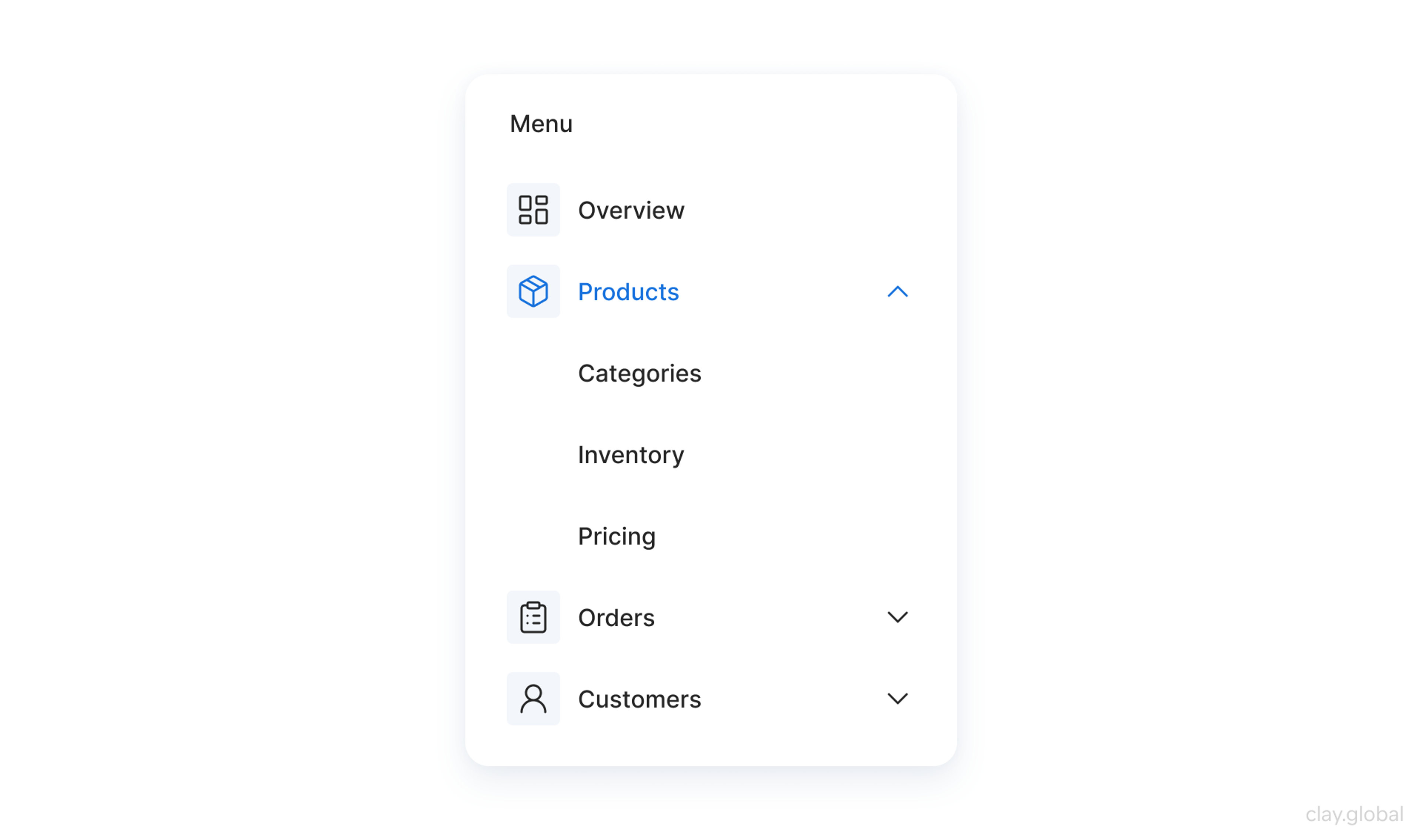
Navigation Menus
Navigation menus function as the principal manual for customers as they discover your internet site. A nicely-dependent menu needs to be clear and logical, organizing hyperlinks into classes that reflect the float of the site.
It's crucial to ensure that the labels used are intuitive and descriptive so customers immediately recognize what to expect after clicking on a link.
Dropdown Navigation Menu by Clay
Utilizing drop-down menus can help declutter the central navigation place while nevertheless offering clean get entry to subcategories. This method lets customers reach favored pages without overwhelming them with options.
Consistency in menu placement throughout all pages, in addition, complements usability, permitting users to familiarize themselves with navigation fast and decreasing cognitive load.
Breadcrumbs and Site Maps
Breadcrumbs offers a secondary navigation solution that displays the consumer's path from the house web page to their modern-day vicinity within the website's online hierarchy.
This allows users to retrace their steps easily and helps them recognize the website's structure at a glance. Breadcrumbs are, in particular, beneficial on complicated websites with deep navigation trees, as they provide context to users and assist in saving them from getting lost.
Sitemap Illustration by Clay
Meanwhile, a well-designed site map provides a complete overview of all to-be-had content, allowing users to locate statistics efficiently. Site maps can be particularly beneficial for first-time visitors, offering them a holistic view of what your web page gives.
Including each breadcrumb and a website, a map can substantially beautify the consumer's delight by supplying multiple avenues for navigation that cater to specific consumer alternatives.
Search Functionality
A strong search experience keeps shoppers happy on content-heavy sites. Put a clear search bar on every page so people can find what they need fast.
Add auto-suggest to show results as users type. It reduces typing, speeds up discovery, and lowers mistakes, especially on large stores. Suggestions can also surface popular content and related items users didn’t think to name.
Use filters or an advanced search option to narrow results by things like date, category, or popularity. In results, bold key terms and show short summaries so users can scan and choose quickly.
How to Design Clear and Consistent Navigation Menus
Designing clear and consistent navigation menus, such as a horizontal navigation bar, is essential to improving a person’s enjoyment, as a properly-dependent menu serves as a roadmap for site visitors exploring your web page. Here are the main factors to remember in element:
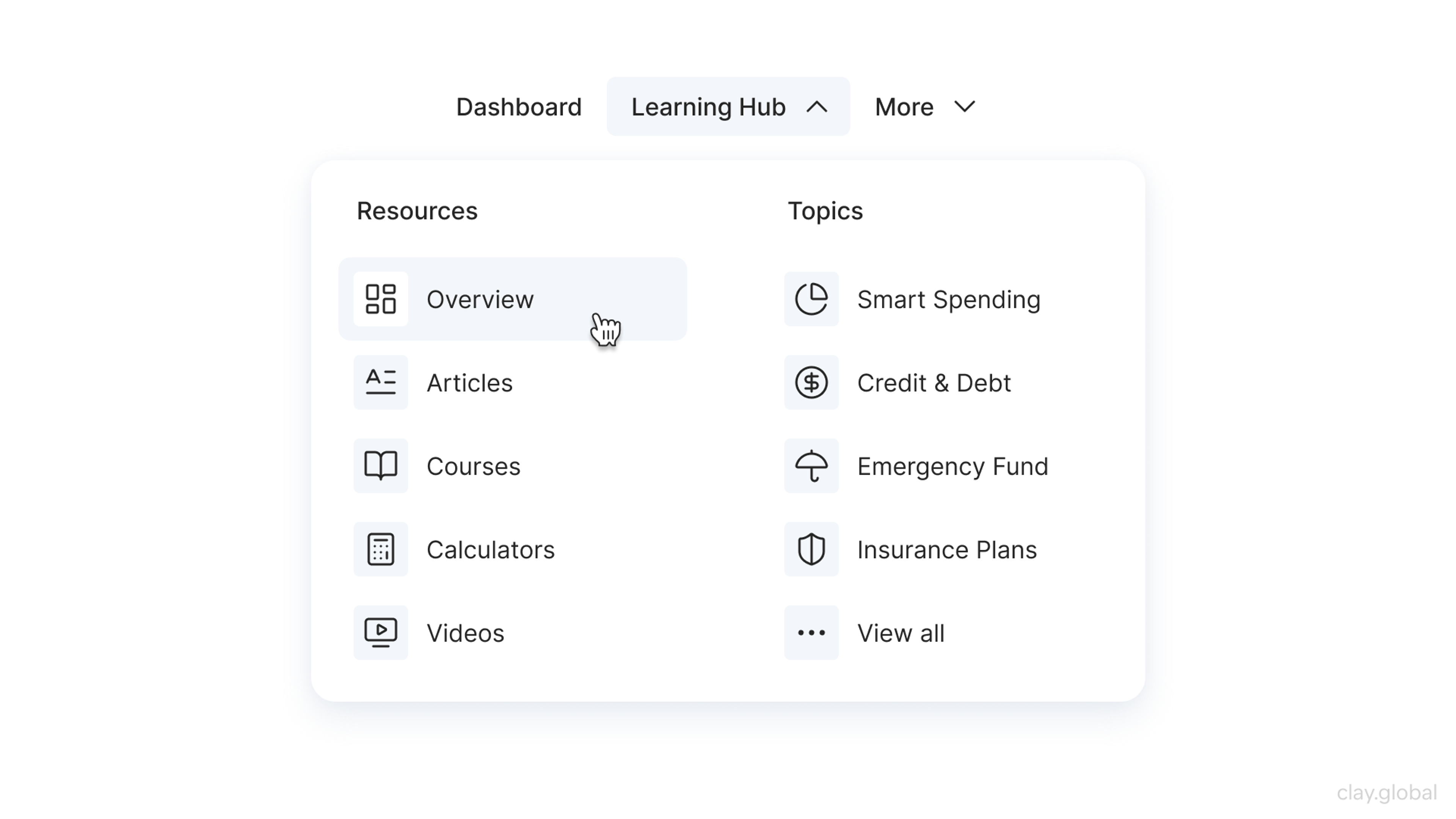
Implement Dropdown Menus for Subcategories
Dropdown menus can assist in preparing associated subjects without cluttering the main navigation. By categorizing sub-gadgets inside dropdowns, users can quickly get admission to unique content, enhancing usability while preserving a smooth format.
This business enterprise permits customers to recognize the hierarchy and courting among exceptional sections, which is helpful for websites with widespread content.
Dropdown Menu by Clay
Maintain Consistent Styling
The design factors of navigation menus must continue to be regular throughout the website. This includes uniformity in typography, colorations, and button styles. Consistency fosters familiarity, enabling customers to navigate your website online results easily.
By keeping a regular fashion, you help build a visual language that users can easily understand and expect, reducing cognitive load and enhancing average navigation performance.
Best Website Navigation Examples
An intuitive user experience is critical for website achievement in today's digital landscape. Users count on seamless navigation and easy access to information, influencing their engagement and satisfaction.
Web developers can meet those expectations using efficient design elements like navigation menus, breadcrumbs, site maps, and robust seek functions. Have a look at some good examples:
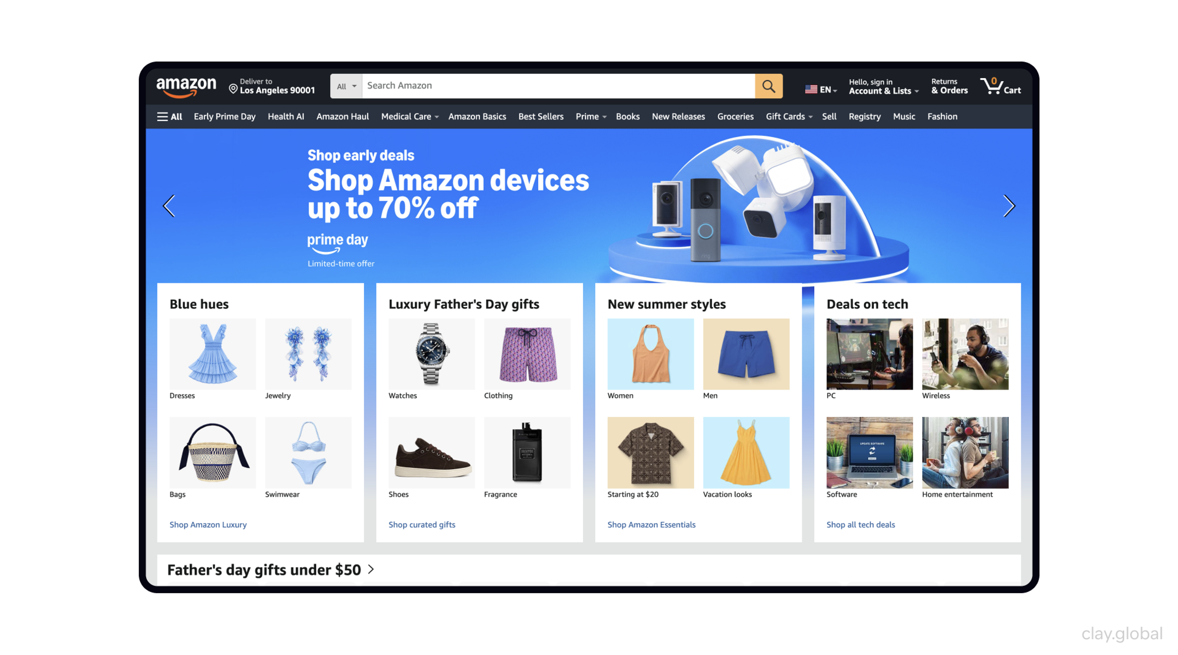
Amazon Bar Menu
Amazon showcases a highly effective navigation menu with a clear and comprehensive categorization of products. The main menu bar is prominently displayed at the top of the page, providing easy access to various departments such as Electronics, Clothing, Home, and more.
When you hover over these department tabs, a detailed dropdown menu appears, revealing subcategories and popular items, streamlining the browsing experience and helping users find exactly what they're looking for with minimal effort. The search bar is also strategically placed for those who prefer to search for specific products directly.
Source: Amazon
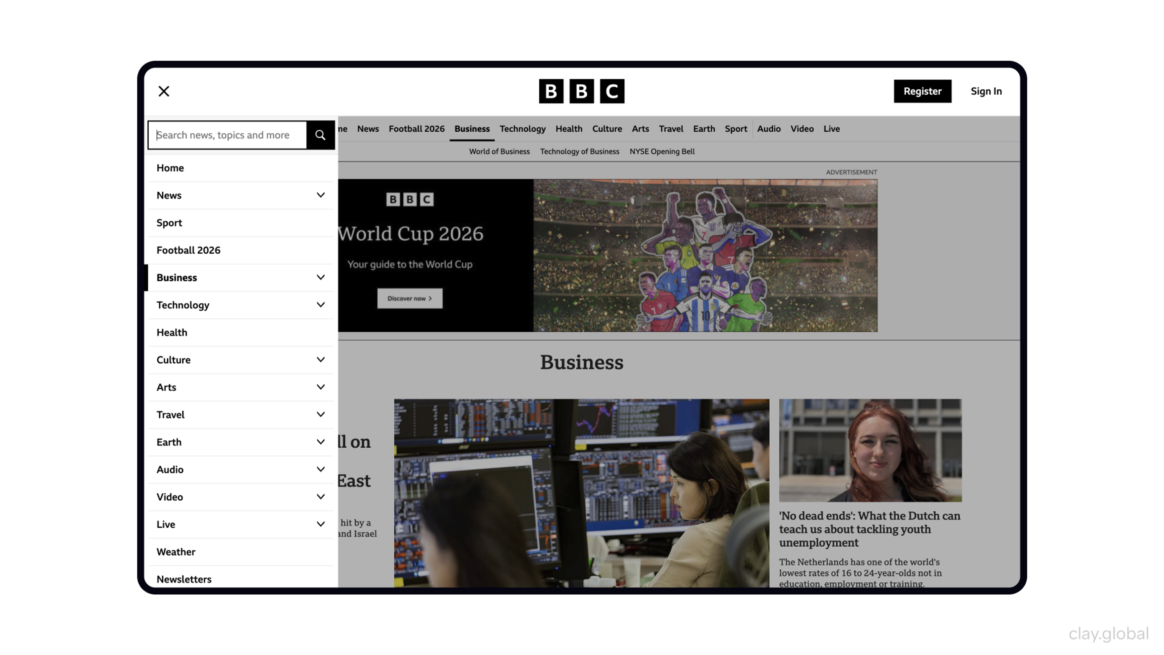
BBC Sidebar Navigation Menu
The BBC website features a user-friendly and straightforward navigation menu that employs a horizontal layout. This design allows access to various sections, including News, Sports, and Weather. Each main section is prominently displayed, ensuring users can quickly find what they want.
Additionally, the dropdown menus provide a seamless way for users to delve into subcategories, such as Politics or Football under News and Sport, respectively, without cluttering the interface.
This thoughtful design enhances the overall browsing experience by maintaining a clean and organized layout while offering comprehensive content access.
Source: BBC
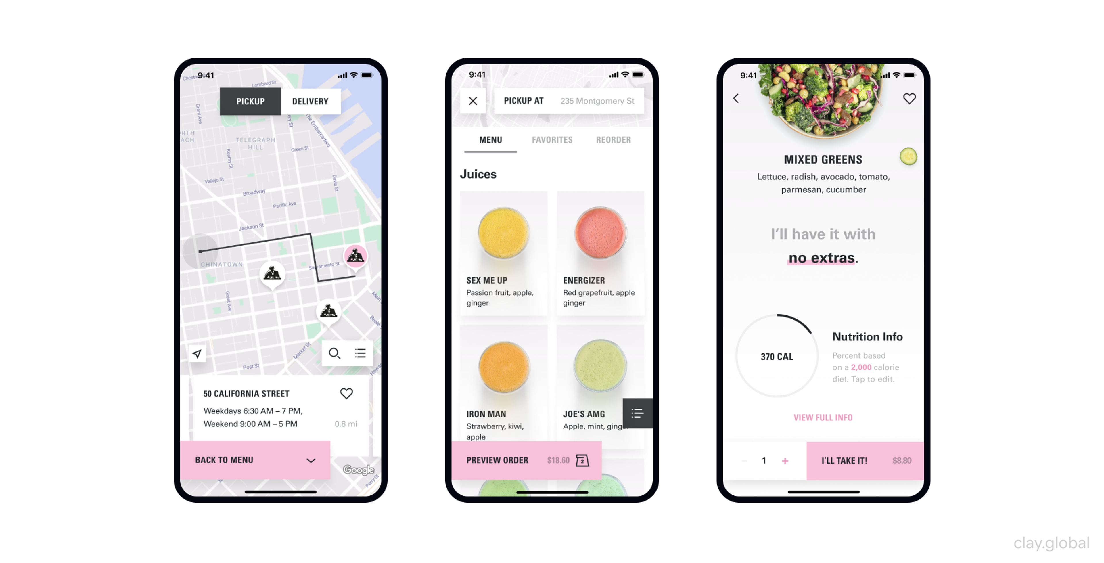
Joe & The Juice Breadcrumb Navigation
The Joe & The Juice app we developed features a breadcrumb navigation system that enhances the user experience by providing a precise and intuitive path through the various sections.
This design element helps users quickly return to their navigation steps, making the process of ordering and accessing other features simple and efficient. Navigation is consistent with the app's vibrant magazine-style interface, providing a smooth and engaging user journey while maintaining the app's distinct visual identity.
Joe & The Juice mobile app by Clay Global
Website Content Writing Tips for Seamless Navigation
Creating seamless website navigation goes beyond design - it requires strategic, well-structured content that guides users effortlessly.
Well-Structured Website Content Example by Clay
Here’s how to optimize your content for better usability and engagement:
- Keep Menu Labels Clear and Concise: Use simple, intuitive wording for navigation menus to help users find information quickly. Avoid jargon or overly creative names that might confuse visitors.
- Use Action-Driven Microcopy: Clear and persuasive button text, CTAs, and tooltips help users navigate effortlessly while improving engagement and conversions.
- Prioritize a Logical Content Flow: Organize content in a way that follows a natural progression, ensuring users can move through your site without confusion.
- Reduce Cognitive Load: Avoid excessive text and unnecessary information. Focus on what users need to take action or find answers quickly.
By integrating these content strategies, you can create a website that feels effortless to navigate, improving both user satisfaction and overall engagement.
FAQ
What Is The Purpose Of Website Navigation?
The purpose of website navigation is to help users find information quickly and easily. It organizes content into menus, links, and pathways that guide visitors through a site.
What Does It Mean When A Website Has Good Navigation?
Good navigation means a website is clear, consistent, and intuitive. Users can easily locate pages, understand menu labels, and move through the site without confusion or frustration.
What Is The Purpose Of Navigation?
The purpose of navigation is to provide direction and access. In websites, it allows users to move between pages; in general terms, it ensures people can reach their intended destination efficiently.
What Happens When You Navigate To A Website?
When you navigate to a website, your browser sends a request to the server, retrieves the webpage, and displays it. Navigation menus and links then allow you to move to other parts of the site.
What Are The Disadvantages Of Online Navigation?
Disadvantages of online navigation include overly complex menus, slow loading times, broken links, and poor mobile design. These issues can frustrate users, increase bounce rates, and reduce conversions.
Read More
Conclusion
Improving navigation boosts user experience and engagement. Use visual cues, user testing, and behavior tracking to make browsing more intuitive.
Navigation is an ongoing process, not a one-time task. Review and update it regularly to match user expectations and new technology, improving satisfaction and overall site performance.

About Clay
Clay is a UI/UX design & branding agency in San Francisco. We team up with startups and leading brands to create transformative digital experience. Clients: Facebook, Slack, Google, Amazon, Credit Karma, Zenefits, etc.
Learn moreAbout Clay
Clay is a UI/UX design & branding agency in San Francisco. We team up with startups and leading brands to create transformative digital experience. Clients: Facebook, Slack, Google, Amazon, Credit Karma, Zenefits, etc.
Learn more