Your logo needs to be instantly recognizable. It represents your brand, so it needs to make an excellent first impression and be memorable. The right logo shapes are crucial as they convey specific emotions or feelings, develop brand recognition, and influence customer perception. The shape is one of the main factors influencing how unique your logo is, so you need to give your logo’s shape enough thought.
Creating a powerful logo using basic shapes is difficult; not all brands do it successfully. Animated logos, which incorporate motion and visual effects, can add an extra layer of engagement and memorability to a brand's identity, making them a powerful tool for capturing the audience's attention and creating a lasting impression.
When designing a logo, you need to consider many things, and this article will cover what you need to know to craft a powerful logo shape.
Understanding The Power Of Geometric Shapes in Logo Design
Depending on the shape, people can feel different emotions. Abstract shapes' unique and versatile nature can create original, meaningful, and intriguing brand representations. For instance, using shapes thoughtfully for crypto and Web3 brands can help simplify complex concepts and evoke feelings of innovation, security, and trust — key factors in fostering user engagement in these emerging technologies
Understanding what shapes represent and how they can make people feel a certain way is essential to designing successful logos for your brand.
An experienced logo designer will know how to use geometric shapes to design a logo that accurately reflects the brand identity. If you don’t have any experience with logo design, hiring a brand design agency is a great option.
Source: Shubham Dhage on Unsplash

Circles: Unity, Harmony, and Inclusivity
Circle logos are often associated with unity, harmony, and inclusivity. They are popular in logo design due to their association with wholeness, femininity, continuity, unity, and mystery.
Circle logos are seen as friendly, welcoming, and nurturing shapes, making them popular for brands that want to convey a sense of community, love, support, and togetherness.
The USA Today logo features a bold blue circle symbolizing balance, stability, and excellence — perfectly reflecting the newspaper’s reputation for reliability. Though minimalist in design, the logo carries deep meaning, representing the publication’s commitment to clear, trustworthy journalism.
Clay Logo
Square and Rectangles: Stability, Reliability, and Professionalism
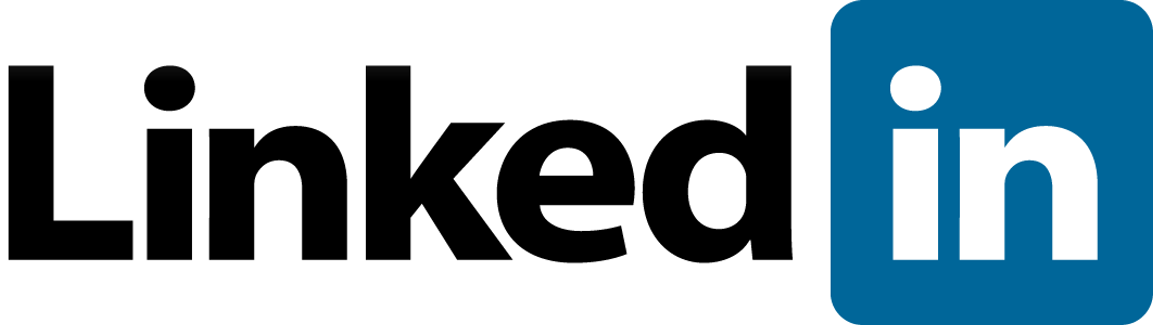
Squares and rectangles are often associated with stability, reliability, and professionalism. These shapes convey a sense of structure, order, and efficiency, making them ideal for finance, technology, and real estate brands.
Square logos, such as those used by Microsoft, Dropbox, LinkedIn, Dominos, 7-Eleven, The Home Depot, and Ritter Sport, communicate a sense of dependability and security.
Source: Sisa3213, CC BY-SA 4.0, via Wikimedia Commons
Triangles: Power, Innovation, and Direction
Triangle logos are dynamic and powerful shapes often associated with innovation, progress, and direction. They can convey a sense of movement and energy, making them a popular choice for sports, technology, and transportation brands.
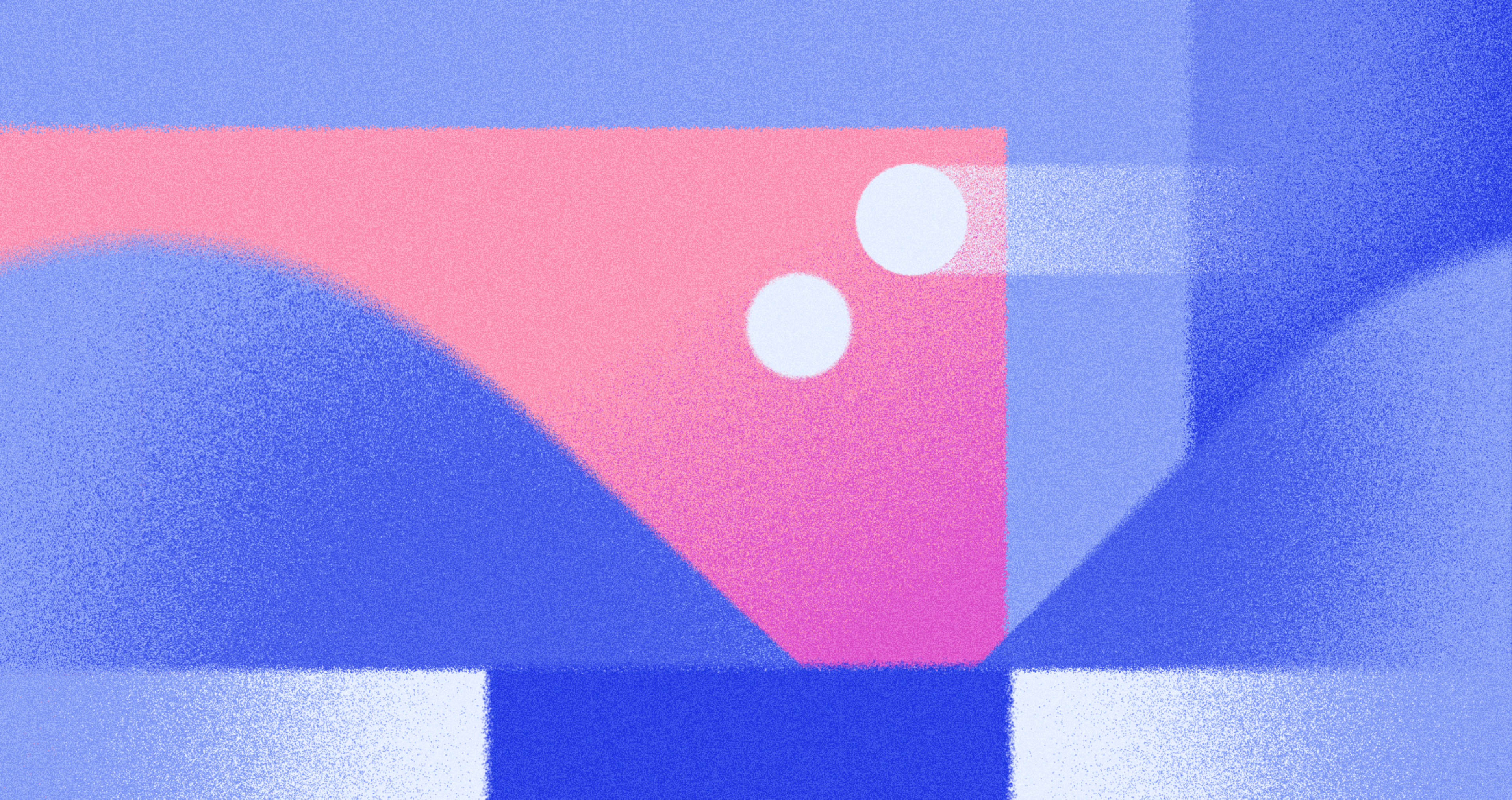
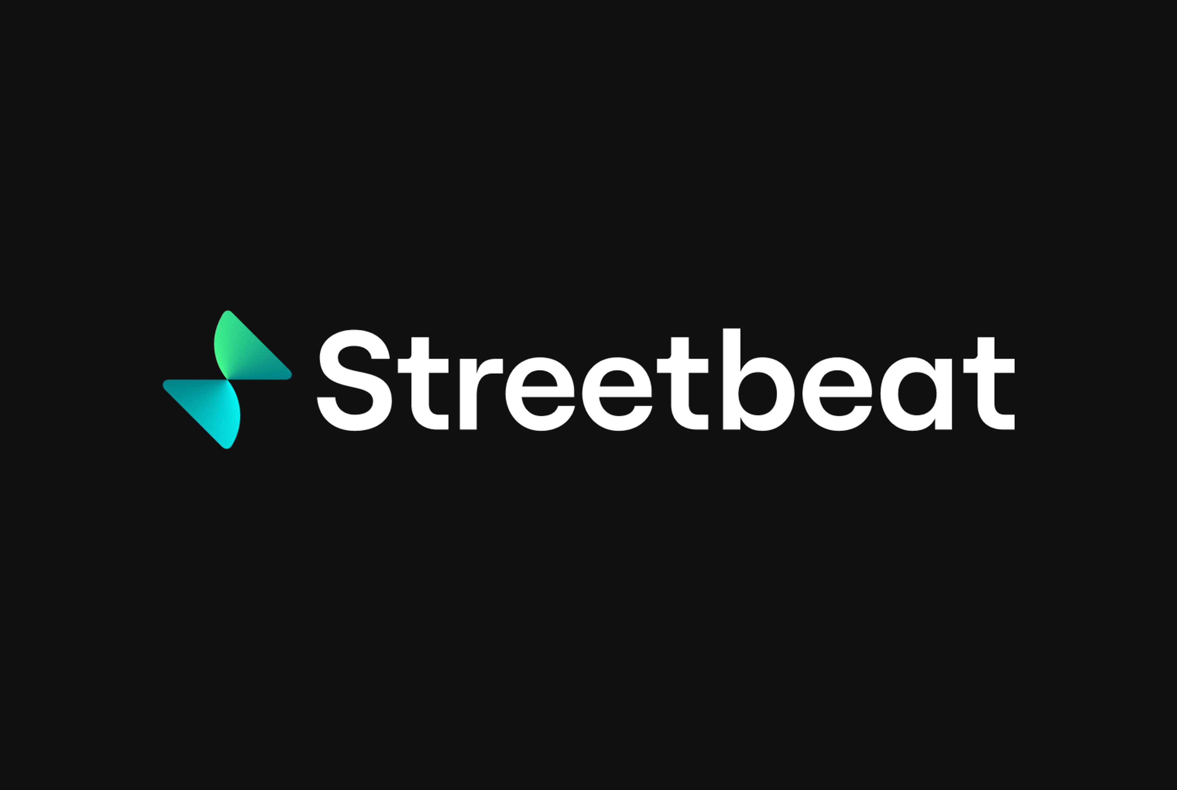
For example, we used triangular elements in Streetbeat's branding to symbolize financial markets' dynamic and ever-evolving nature. The triangle’s sharp angles and upward orientation reflect progress and innovation, reinforcing Streetbeat’s commitment to providing cutting-edge financial insights and tools. This design choice enhances their brand identity, making it recognizable and impactful within the fintech industry.
At Clay, we employ unique design strategies such as layered typography and motion elements to reflect the dynamic shifts within the crypto landscape.
Just as the triangle in Streetbeat’s branding symbolizes growth, we design with the intent to visually capture the transformative potential of blockchain technology - creating designs that are both forward-thinking and grounded in the ever-evolving nature of digital currencies.
Streetbeat logo by Clay
The Impact of Shape Orientation
In addition to the inherent meanings associated with different shapes, a shape’s orientation can also significantly affect how a logo is perceived. Curved shapes, such as circles, ovals, ellipses, and spirals, are often used in logo design for their psychological effects, conveying feelings of harmony, unity, and flexibility.
Upward-Pointing Triangles: Growth, Aspiration, and Positivity
Upward-pointing triangles are often associated with growth, aspiration, and positivity. They convey a sense of upward movement and progression, making them ideal for brands that want to inspire and motivate their customers.
For instance, the upward-pointing triangle in the Airbnb logo suggests a sense of adventure and exploration, which aligns with the company's mission to help people belong anywhere.
Downward-Pointing Triangles: Stability, Grounding, and Practicality
Downward-pointing triangles, on the other hand, can evoke feelings of stability, grounding, and practicality. They convey a sense of solidity and reliability, making them a good choice for brands in industries such as construction, manufacturing, and agriculture.
Source: Sebasvilcafj, CC BY-SA 4.0, via Wikimedia Commons
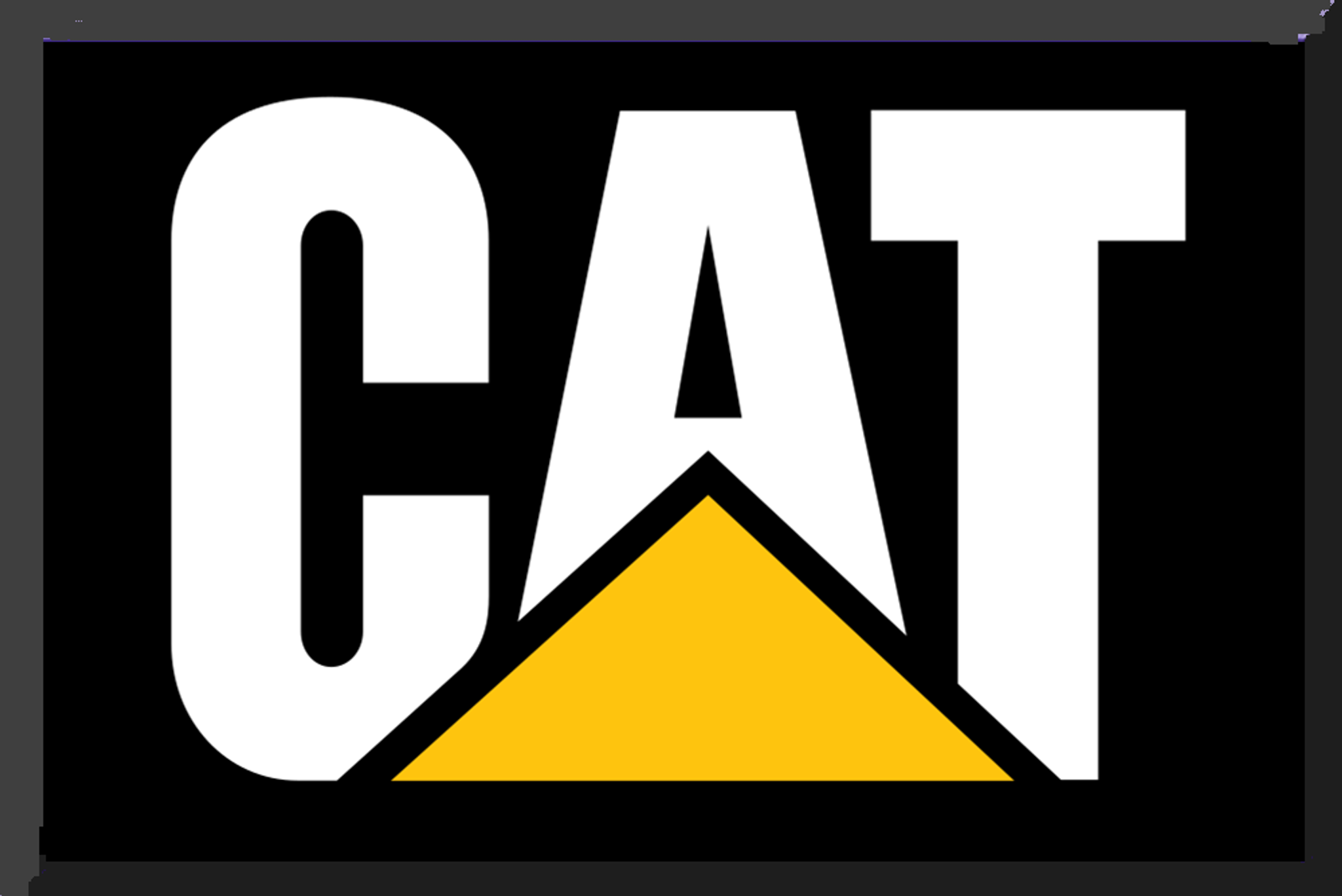
For example, the downward-pointing triangle in the Caterpillar logo communicates a sense of strength and durability, which is essential for a company that produces heavy machinery and construction equipment.
Combining Shapes for a Unique Brand Identity
While each shape has distinct meanings and associations, combining different shapes can create a unique and memorable brand identity. Organically shaped logos, which represent naturally occurring shapes of nature, can convey soft, fuzzy feelings and earth-oriented qualities, making them appealing due to their representation of the natural world and ability to convey a sense of familiarity and brand intimacy. Designers can create logos communicating a brand’s values, personality, and mission by carefully selecting and arranging shapes.
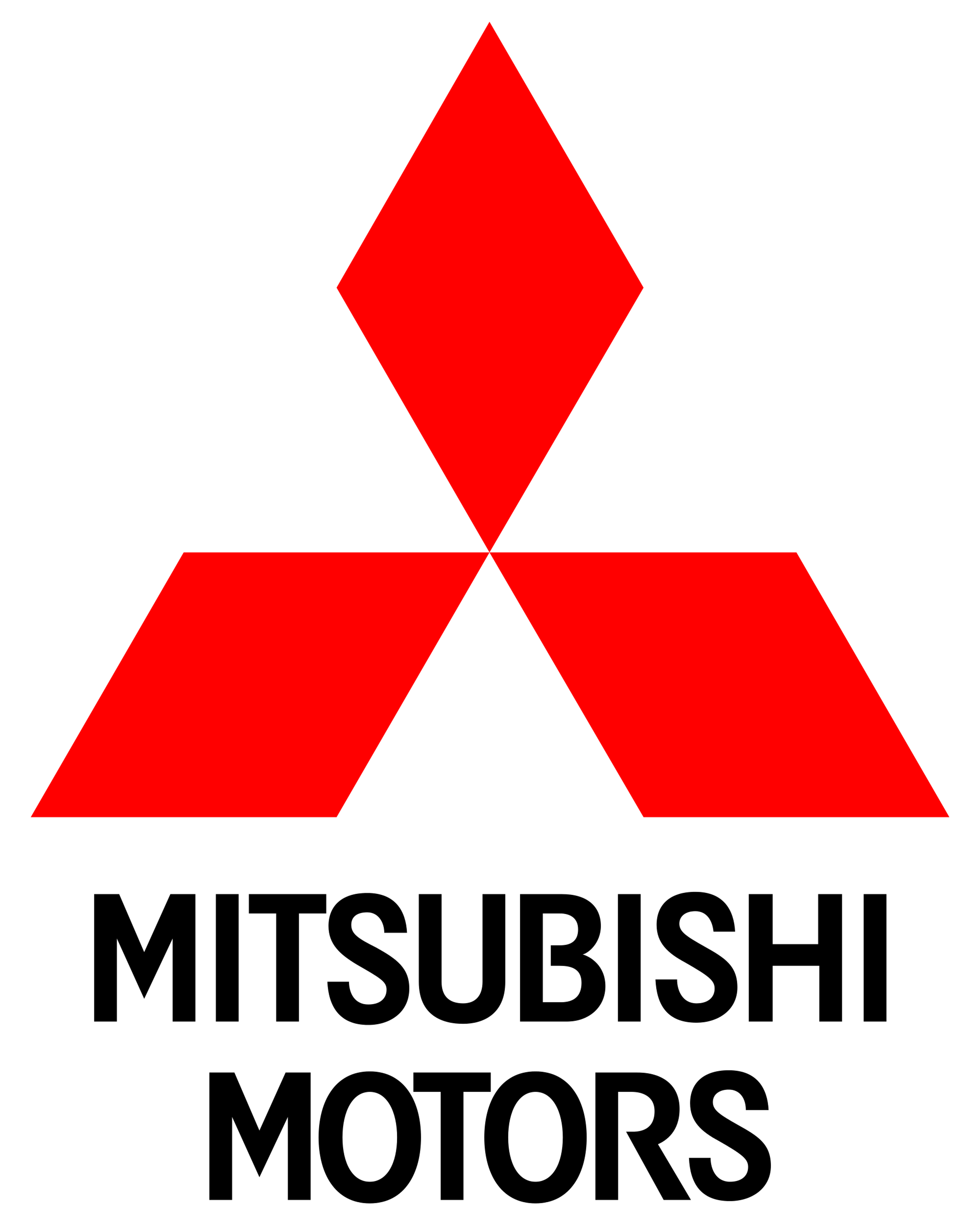
The Mitsubishi logo merges two family crests: the three rhombuses from founder Yataro Iwasaki’s family and the trio of oak leaves from the Tosa Clan, his first employers. This clear and symbolic design has become globally recognizable. The bold red color stands for passion, strength, and energy — qualities that define the Mitsubishi brand.
Source: Mitsubishi
Best Practices in Logo Design
We'll explore the best tips and practices for choosing logo shapes that effectively communicate your brand identity.
Understand Your Brand's Personality
Before selecting a logo shape, it’s essential to understand your brand’s personality clearly. Natural shapes, which are unique and adaptable, can symbolize various emotional communications and are particularly effective in industries like health, wellness, and food.
Ask yourself questions like, “Is your brand playful or serious? Traditional or modern? Luxurious or affordable?” Once you fully grasp your brand’s personality traits, you can choose shapes that align with those characteristics.
For example, if your brand is friendly and approachable, circular shapes may be a good choice as they evoke feelings of unity and inclusivity. On the other hand, if your brand is focused on stability and professionalism, square or rectangular shapes may be more appropriate.
Consider Your Industry and Target Audience
Your logo shape should also be relevant to your industry and target audience. Organic shapes, naturally occurring and freeform, can be particularly appealing in industries such as health, wellness, and food.
Research your competitors’ logos and identify common shapes and trends within your industry. While you don’t want to copy your competitors, understanding industry norms can help you create a relevant and distinctive logo.
Additionally, consider your target audience’s preferences and expectations. For example, if you target a younger, tech-savvy audience, a modern, abstract shape may resonate better than a traditional, classic shape.
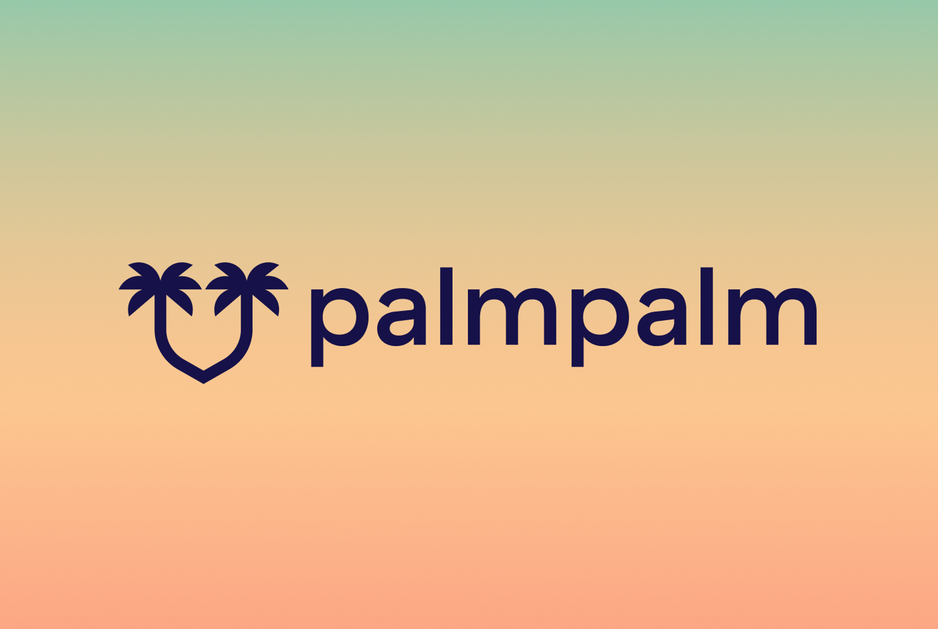
In the case of PalmPalm, we designed its brand identity for this sanitization product line with its industry and target audience in mind. Emphasizing a cool SoCal vibe, the logo and visual elements drew inspiration from Venice Beach's sunset, appealing to a health-conscious, active audience.
This approach ensured the brand stood out in the competitive health and wellness market, effectively resonating with consumers seeking both functionality and a trendy, lifestyle-oriented product.
PalmPalm logo by Clay
Simplicity Is Key
Regarding logo design, simplicity is often the most effective approach. Horizontal lines can be crucial in creating simple yet effective logos by conveying calmness, stability, speed, and community.
A simple, memorable shape is easier for customers to recognize and recall. Avoid overly complex or detailed shapes that may be difficult to reproduce across various media or at different sizes.
Some of the most iconic logos, such as the Nike swoosh or the Apple logo, are simple yet powerful shapes that effectively communicate the brand’s identity.
Use Negative Space Creatively
Negative space, or the space around and between the main elements of your logo, can be used to create hidden meanings or visual interest. Vertical lines in logo design are often associated with strength and stability, making them versatile for conveying a bold and innovative image.
By cleverly incorporating negative space into your logo shape, you can add depth and complexity to your design without sacrificing simplicity.
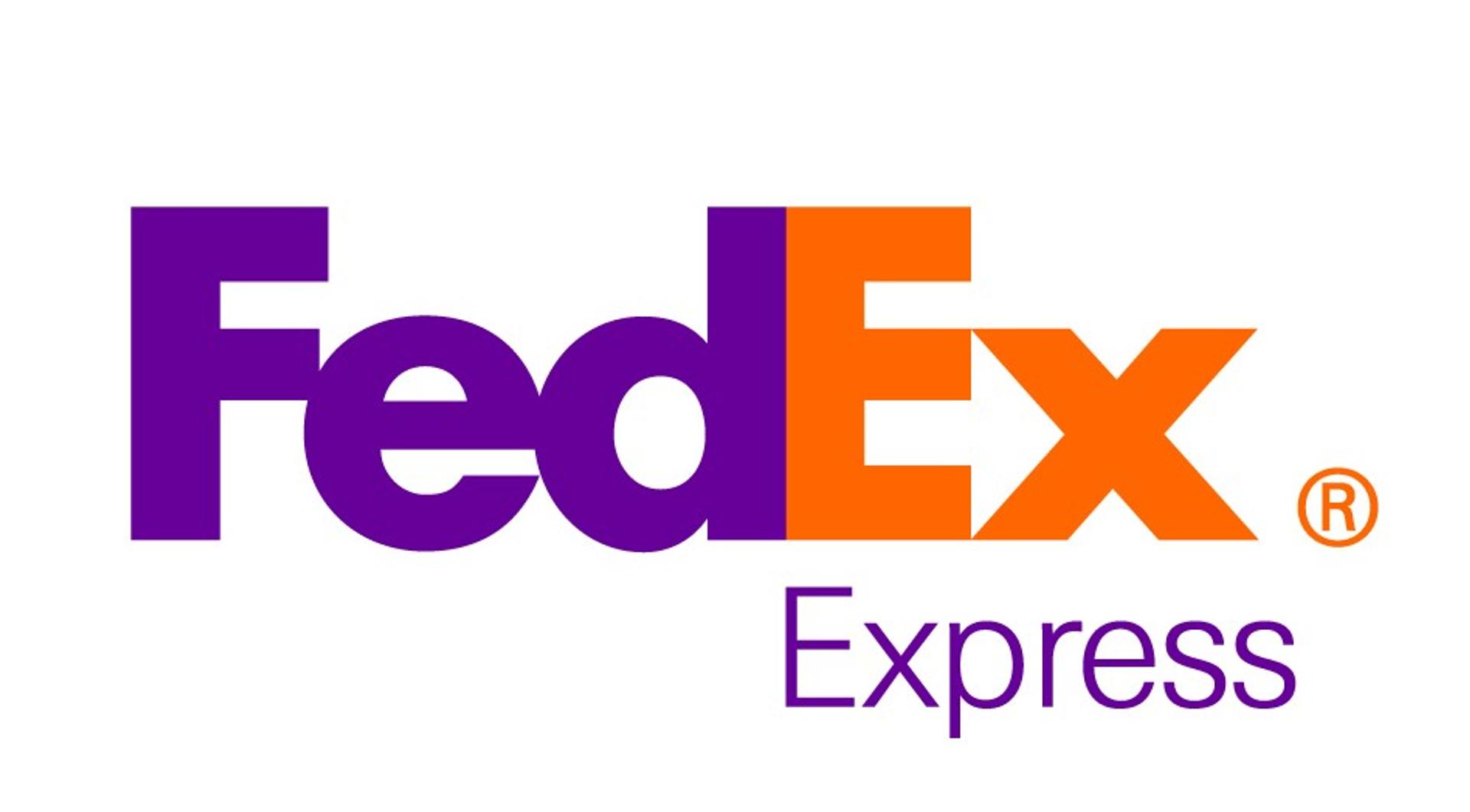
The FedEx logo is a classic example of creative negative space use, with the arrow formed between the “E” and “X” suggesting forward motion and efficiency.
Source: Bəhram Camalov, CC BY-SA 4.0, via Wikimedia Commons
Ensure Scalability and Versatility
Your logo will be used across various media, from business cards and websites to billboards and merchandise. Choosing a scalable and versatile shape to work well in different contexts and sizes is crucial. A circle logo, for instance, is highly effective in maintaining its integrity and recognizability across different sizes and contexts.
Avoid shapes with intricate details or thin lines that may become lost or distorted when scaled down. Test your logo shape at various sizes and contexts to ensure it remains recognizable and effective.
Combine Shapes Thoughtfully
While each shape has its inherent meaning and associations, combining shapes can create a unique and memorable logo. However, it's essential to combine shapes thoughtfully and with purpose.
Each shape in your logo should contribute to the overall message and identity you want to convey. Avoid adding shapes for decorative purposes, as this can create visual clutter and dilute your brand message.
Test and Refine Your Logo Shape
Once you have created a logo shape that aligns with your brand identity, testing it with your target audience is important. Conduct focus groups, surveys, or user testing to gather feedback on how well your logo shape communicates your brand's values and personality.

Refine and adjust your logo shape as needed based on the feedback received. This iterative process ensures that your final logo shape effectively represents your brand and resonates with your target audience.
Read More
FAQ
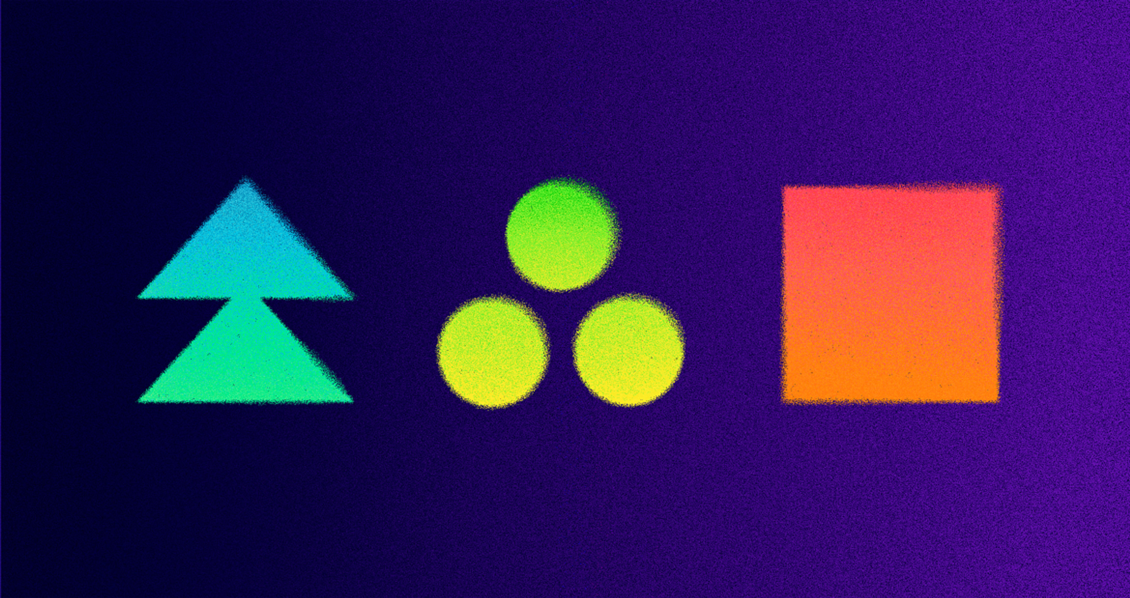
What Are the 5 Types of Geometric Symbols?
The five main types of geometric symbols are circles, squares, triangles, rectangles, and polygons.
- Circles represent unity, community, and continuity.
- Squares/rectangles convey stability, trust, and structure.
- Triangles suggest movement, hierarchy, and innovation.
- Polygons (hexagons, octagons, etc.) symbolize complexity, balance, or collaboration.
- Lines and grids function as supporting symbols, creating order and clarity.
What Is the Difference Between Geometric and Organic Logos?
Geometric logos use clean shapes like circles, squares, and triangles to convey precision, order, and modernity.
Organic logos rely on free-flowing, irregular, or natural forms to evoke warmth, creativity, and a human touch.
In short, geometric design feels structured and systematic, while organic design feels natural and approachable.
What Shapes Go Well Together?
Shapes work best in pairs that balance contrast and harmony:
- Circle + Triangle → unity with forward motion (community + innovation).
- Square + Circle → stability with openness (trust + inclusivity).
- Triangle + Rectangle → energy with order (progress + reliability).
- Organic + Geometric → natural warmth with structured clarity.
The key is combining shapes that complement emotional meaning while keeping the design simple and recognizable.
Conclusion
Choosing the perfect logo shape for your brand identity requires careful consideration of your brand's personality, industry, target audience, and design principles. Following the tips and practices outlined in this article, you can create a logo shape that effectively communicates your brand's values and mission.
Remember, simplicity, versatility, and purposeful design are key to creating a memorable and effective logo shape. Test and refine your logo based on feedback from your target audience to ensure it resonates with them.
Investing time and effort into selecting the right logo shape will pay off in the long run, as a well-designed logo is a powerful tool for building brand recognition, trust, and loyalty.

About Clay
Clay is a UI/UX design & branding agency in San Francisco. We team up with startups and leading brands to create transformative digital experience. Clients: Facebook, Slack, Google, Amazon, Credit Karma, Zenefits, etc.
Learn moreAbout Clay
Clay is a UI/UX design & branding agency in San Francisco. We team up with startups and leading brands to create transformative digital experience. Clients: Facebook, Slack, Google, Amazon, Credit Karma, Zenefits, etc.
Learn more