Color is one of the first things people notice when they land on your website — and it can make or break their experience. The right color scheme doesn’t just look good. It guides emotions, builds brand identity, and keeps users engaged.
In this article, we’ll explore 21 eye-catching color combinations that can elevate your design, make your site unforgettable, and help you connect with your audience in powerful ways.
Key Takeaways
Color choices can deeply impact how users experience your website. A strong color palette helps build brand identity, guide user emotions, and improve visual appeal. Understanding color harmony and psychology allows designers to craft combinations that not only look good but also support the website’s purpose and user goals.
Using well-planned color schemes — from simple pairings to advanced combinations — can make a site more engaging and memorable. By aligning colors with your brand and using accessible, well-balanced palettes, you increase usability, boost trust, and make a stronger impact on your audience.
Color Harmony
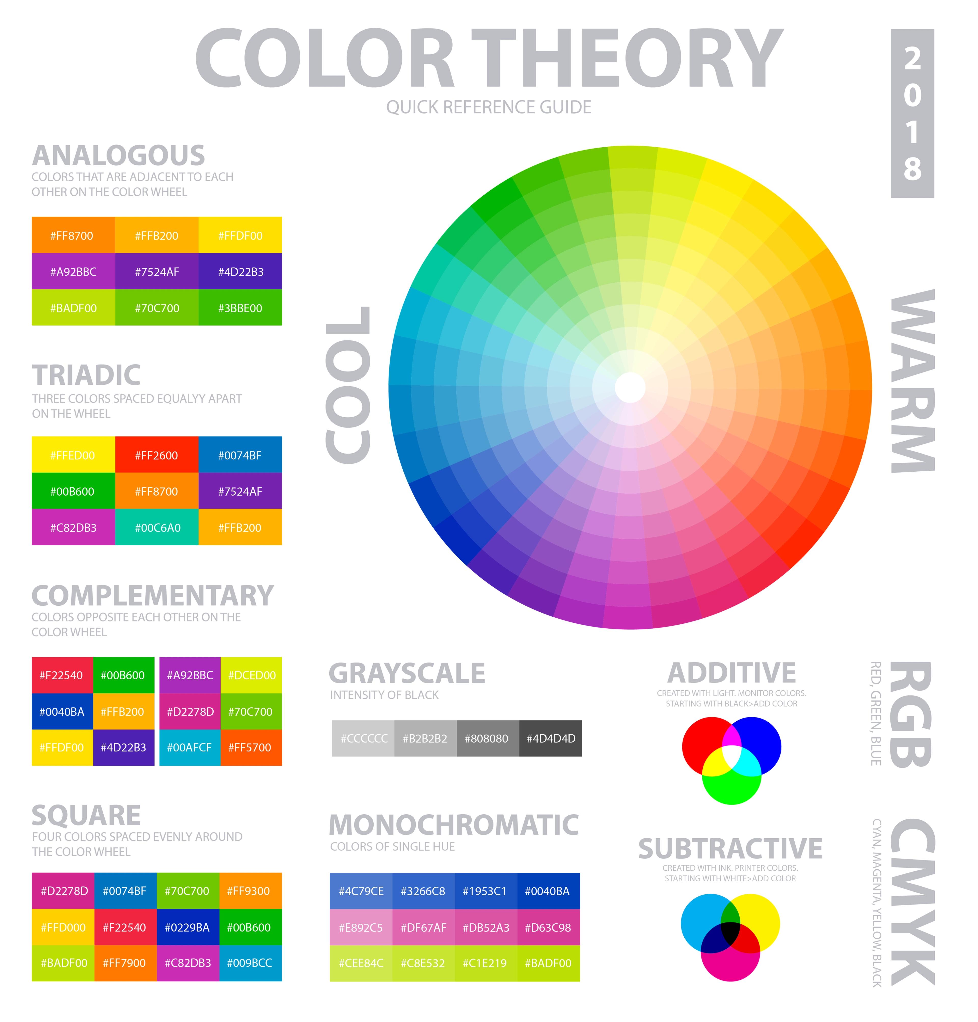
Color harmony refers to the way colors work together to create a visually appealing effect. It is a crucial aspect of design, as it can make or break the overall aesthetic of a project. There are several principles of color harmony that designers can use to create stunning color combinations:
- Monochromatic: This approach uses different shades, tints, and tones of a single color to create a cohesive and harmonious look. For example, a website using various shades of blue can evoke a sense of calm and professionalism.
- Complementary: Complementary colors are opposite each other on the color wheel, such as blue and orange or red and green. Pairing these colors creates a high contrast and vibrant look, making elements stand out and grab attention.
- Analogous: Analogous color schemes use colors that are next to each other on the color wheel, such as blue, blue-green, and green. This creates a harmonious and soothing effect, perfect for designs that aim to be visually pleasing without being too bold.
- Triadic: Triadic color schemes involve three colors that are evenly spaced around the color wheel, such as red, yellow, and blue. This combination creates a balanced and vibrant effect, adding energy and dynamism to the design.
- Tetradic: Tetradic color schemes use four colors that are equally spaced on the color wheel, creating a rich and complex palette. This approach allows for a lot of variety and can make a design look more intricate and interesting.
By understanding and applying these principles of color harmony, designers can create color combinations that are both visually appealing and effective in communicating their message.
Understanding the Color Wheel and Color Theory
Before diving into specific color combinations, reviewing some basic color theory concepts, including the role of primary colors, is essential. The color wheel is a valuable tool that organizes colors into primary (red, blue, yellow), secondary (green, orange, purple), and tertiary (combinations of primary and secondary) colors.
Blue-green, a tertiary color known as teal, is created by mixing unbalanced quantities of the primary colors. Understanding the relationships between these colors can help you create harmonious and visually appealing palettes.
Source: FreeSVG

Color harmonies, such as complementary (colors opposite each other on the wheel), analogous (colors adjacent to each other), and triadic (colors evenly spaced on the wheel), provide guidelines for selecting colors that work well together.
The Psychology of Color
Colors have the remarkable ability to evoke emotions and influence human behavior on a subconscious level. Dark blue is often associated with sophistication and professionalism, making it a preferred choice for elite institutions and financial services.
Understanding the psychological impact of different colors can help you select color combinations that align with your website’s purpose and desired user experience. Light blue evokes feelings of serenity and professionalism, making it a calming and trustworthy choice for various designs.
For example, blue is often associated with feelings of trust, reliability, and professionalism, making it a popular choice for corporate and financial websites.
Hot pink, with its playful and creative vibe, is reminiscent of ‘90s color palettes and is perfect for unconventional and striking branding.
On the other hand, red is known to signify passion, excitement, and urgency, making it effective for call-to-action buttons and attention-grabbing elements.
Green is commonly linked to nature, growth, and serenity, making it suitable for health, wellness, and sustainability websites. Forest green, in particular, evokes calm and natural vibes and is often used in eco-friendly and sustainable products, outdoor apparel, and interior design.
Purple, often associated with luxury, creativity, and spirituality, can be effective for high-end brands or artistic ventures.
Understanding the emotions and associations tied to different colors allows you to make strategic choices that resonate with your target audience and reinforce your brand message.
Key Principles for Choosing a Color Palette
Several key principles must be remembered when selecting color combinations for your website. Firstly, ensure sufficient contrast between text and background colors to maintain readability and establish a clear visual hierarchy.
High contrast combinations, such as black text on a white background or white text on a dark background, ensure your content is easily legible across different devices and lighting conditions.
Secondly, aim for harmonious color combinations that create a visually pleasing aesthetic. Colors that look good together, such as those found in complementary color combinations or analogous color schemes, can create a sense of balance and unity throughout your website.
Different shades of a single color can also create visually appealing palettes that evoke trustworthiness, professionalism, and tranquility. Adding a daring tone like lime green can introduce freshness and vitality to your color scheme, making it trendy and impactful.
Source: Image by macrovector on Freepik
Thirdly, consider aligning your color choices with your brand identity and values. Your color palette should reflect your brand personality and evoke the desired emotions associated with your brand.
Lastly, prioritize accessibility by selecting color combinations that include users with visual impairments or color blindness. Tools like the WebAIM Contrast Checker can help ensure that your color choices meet accessibility guidelines and provide sufficient contrast for all users.
21 Best Color Combinations Design
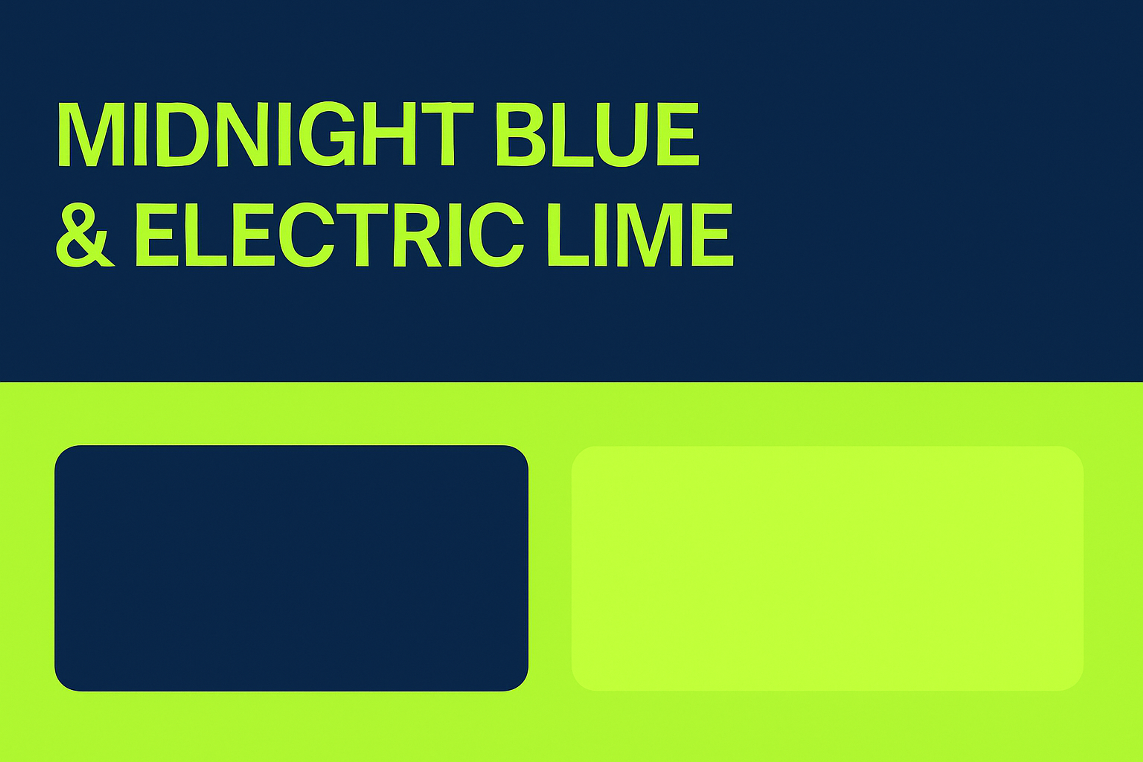
1. Midnight Blue & Electric Lime
- Hex Codes: #191970 & #CCFF00
- Mood: Striking and futuristic
- Use Case: Ideal for tech startups or SaaS websites that want to feel cutting-edge. Use midnight blue as a deep background, and let electric lime highlight buttons, icons, or CTAs for an energetic punch.
2. Charcoal & Coral
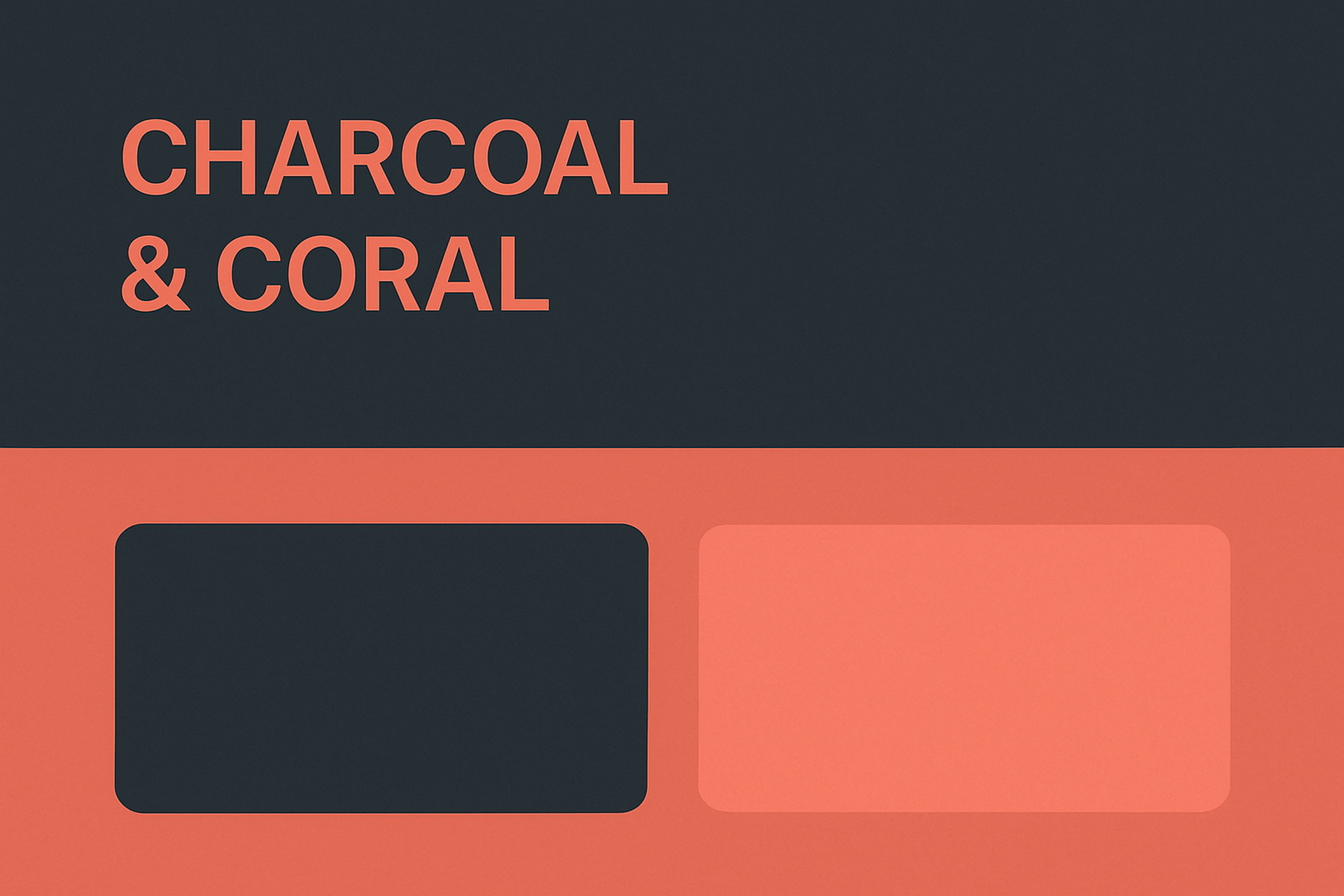
- Hex Codes: #264653 & #F46B61
- Mood: Warm, stylish, modern
- Use Case: Great for creative agencies or portfolio sites. Use charcoal as the primary color for a sleek layout, while coral can accentuate hover states, text highlights, or hero section typography.
Charcoal & Coral
3. Evergreen & Ivory
- Hex Codes: #228B22 & #FFFFF0
- Mood: Organic and calming
- Use Case: Works well for conservation projects, eco friendly brands, and nonprofits that want a grounded, trustworthy feel. For example, Vantara, an animal conservation center, uses earthy greens to signal harmony with nature. Pair ivory as a clean backdrop with evergreen for logos, buttons, and key highlights to keep the look modern and organic.
Vantara Website Design
4. Black & Neon Pink
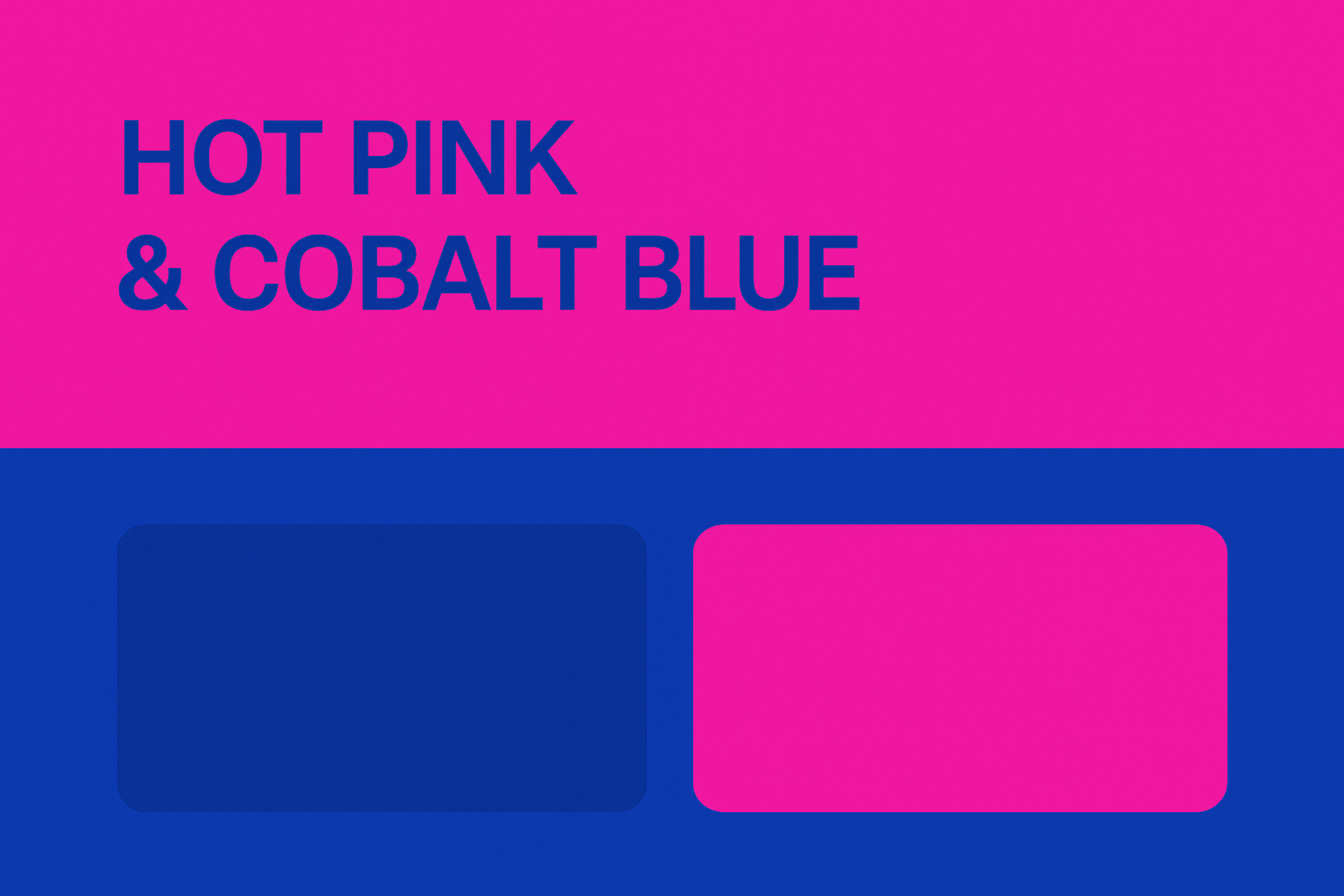
- Hex Codes: #000000 & #FF1493
- Mood: Loud, confident, nightlife aesthetic
- Use Case: Ideal for fashion or music sites. Use black as your canvas and inject neon pink into buttons, transitions, or headline text for maximum attention.
Black & Neon Pink
5. Twilight Blue & Sunrise Orange
- Hex Codes: #2F3B62 & #F78E0E
- Mood: Bold, optimistic, and innovative
- Use Case: Ideal for tech or finance platforms that want to signal innovation and energy. A deep twilight blue provides a stable, night-sky backdrop, while a burst of sunrise orange adds excitement. Sky, a DeFi ecosystem, embraces a celestial palette from dawn to dusk to symbolize a new chapter.
Sky Branding
6. Lavender & Gold
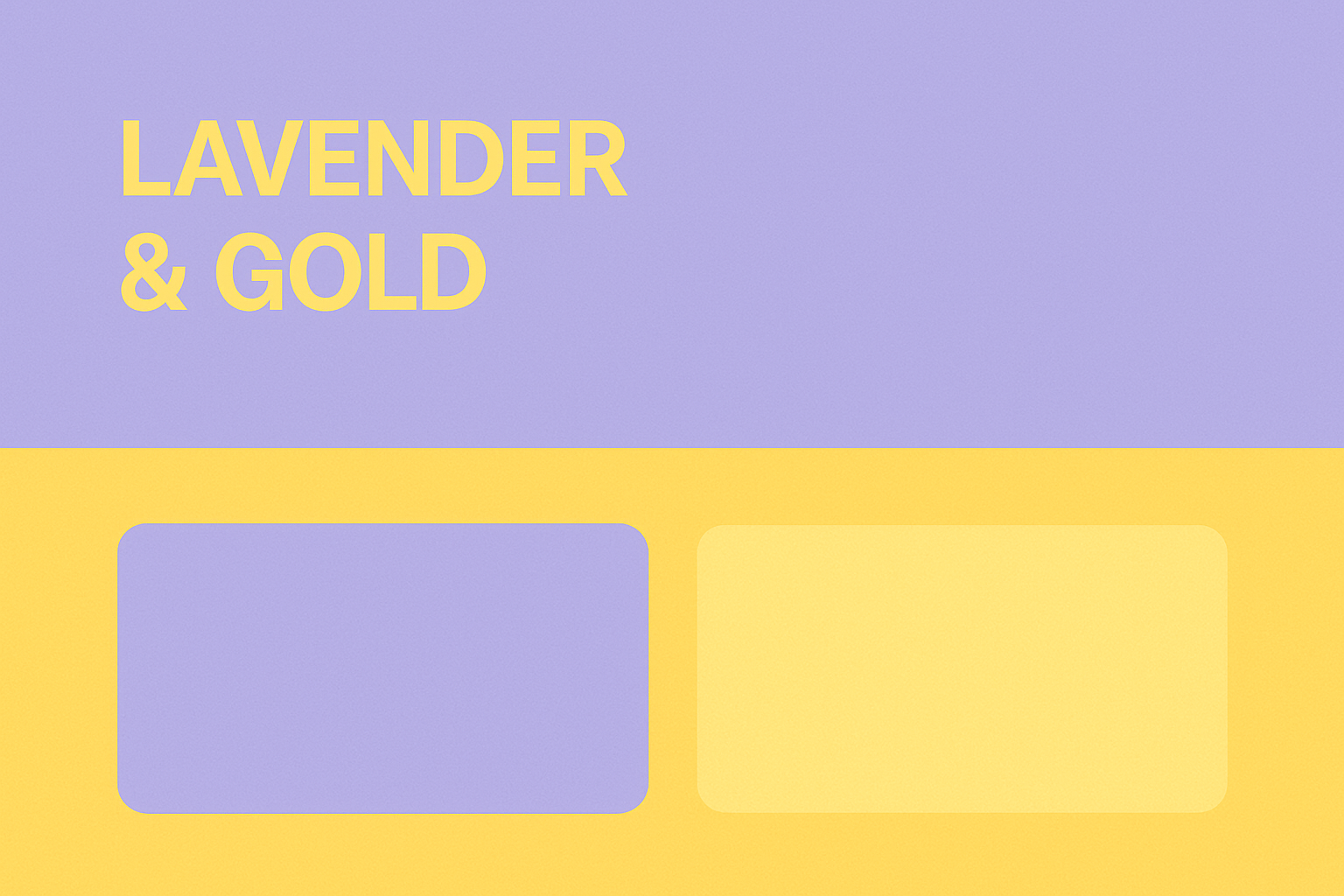
- Hex Codes: #E6E6FA & #FFD700
- Mood: Delicate, elegant, dreamy
- Use Case: Use lavender in hero backgrounds or sections, with gold for call-to-actions and minimal icons — ideal for beauty, lifestyle, or boutique ecommerce sites.
Lavender & Gold
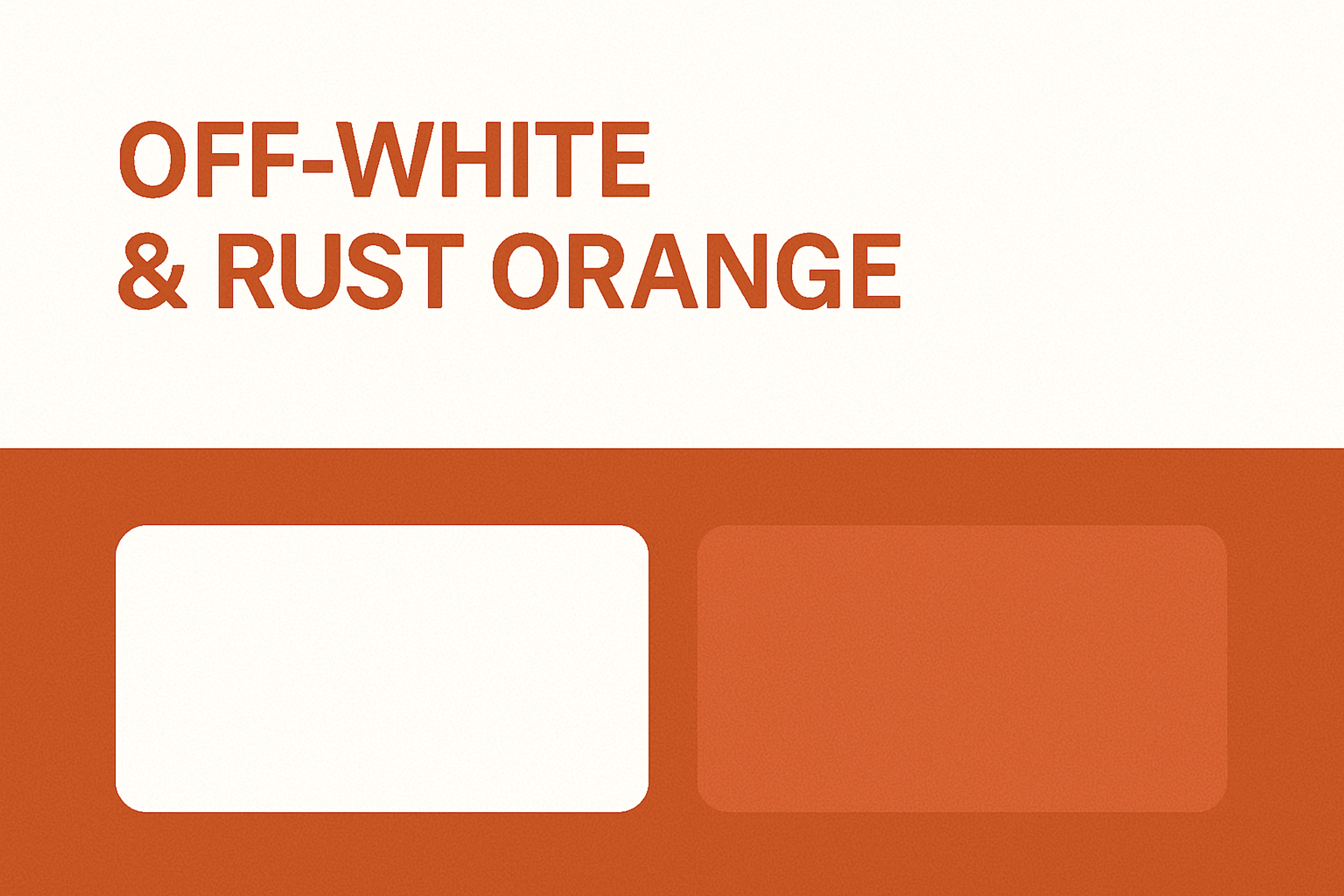
7. Off-White & Rust Orange
- Hex Codes: #FAF9F6 & #B7410E
- Mood: Rustic, grounded, retro-modern
- Use Case: Great for editorial or storytelling sites. Use off-white as your base and rust in headlines, icons, or section borders to convey warmth and trust.
Off-White & Rust Orange
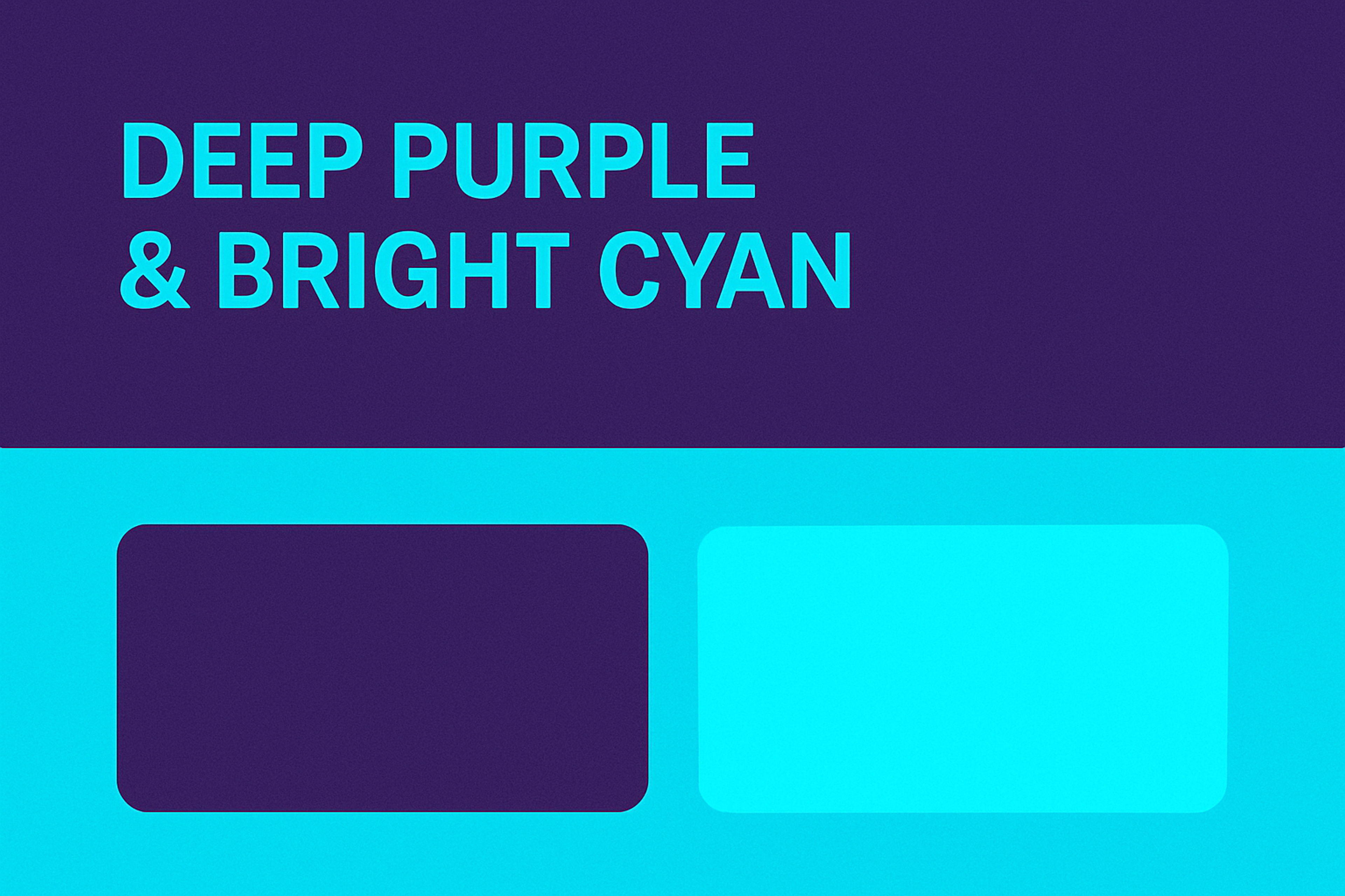
8. Deep Purple & Bright Cyan
- Hex Codes: #4B0082 & #00FFFF
- Mood: Sci-fi, vibrant, edgy
- Use Case: Awesome for blockchain, gaming, or AI projects. Use deep purple for your background and let cyan animate buttons or headings.
Deep Purple & Bright Cyan
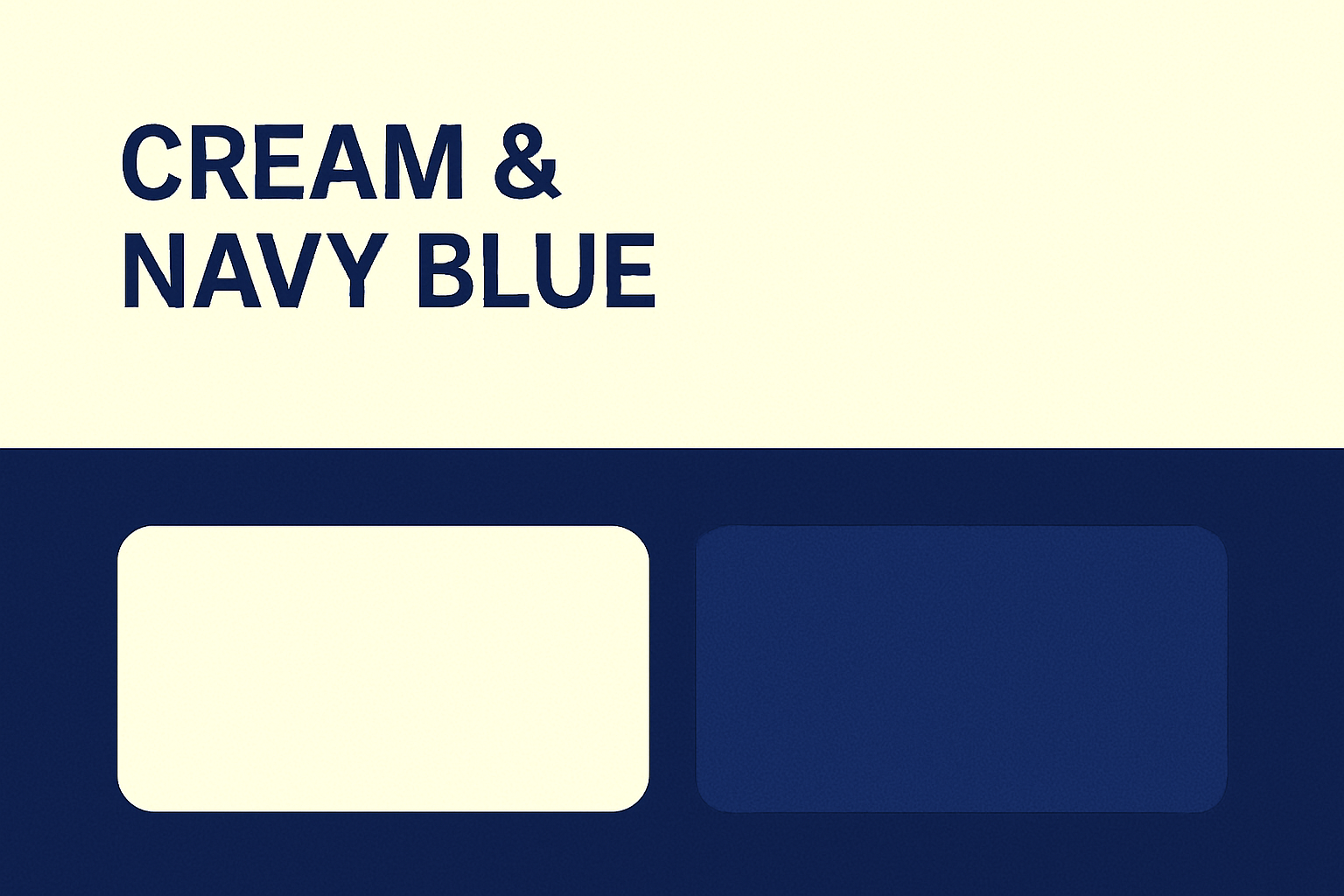
9. Cream & Navy Blue
- Hex Codes: #FFFDD0 & #000080
- Mood: Trustworthy, minimal, classic
- Use Case: Ideal for law firms, consultants, or fintech brands. Use cream as a soft base and navy to structure menus, headlines, and key actions.
Cream & Navy Blue
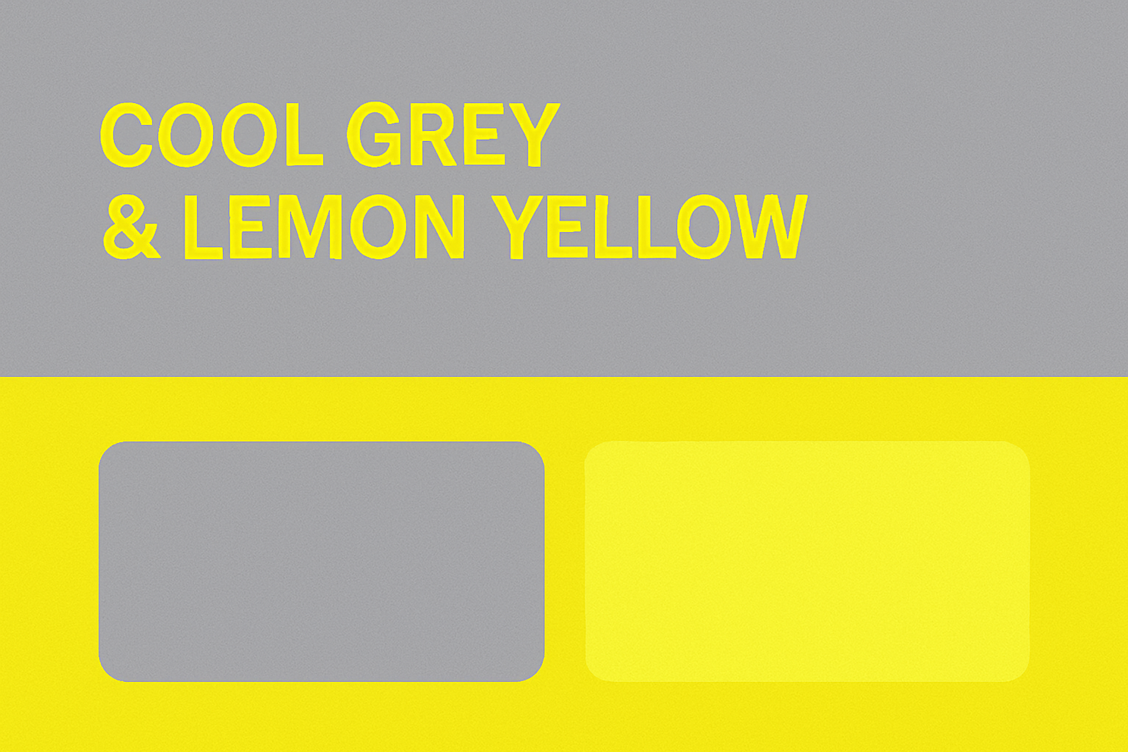
10. Cool Grey & Lemon Yellow
- Hex Codes: #D3D3D3 & #FFF44F
- Mood: Minimalist with a pop of play
- Use Case: Perfect for modern apps or ecommerce brands. Grey sets the tone, and yellow brings life to CTAs, badges, and notifications.
Cool Grey & Lemon Yellow
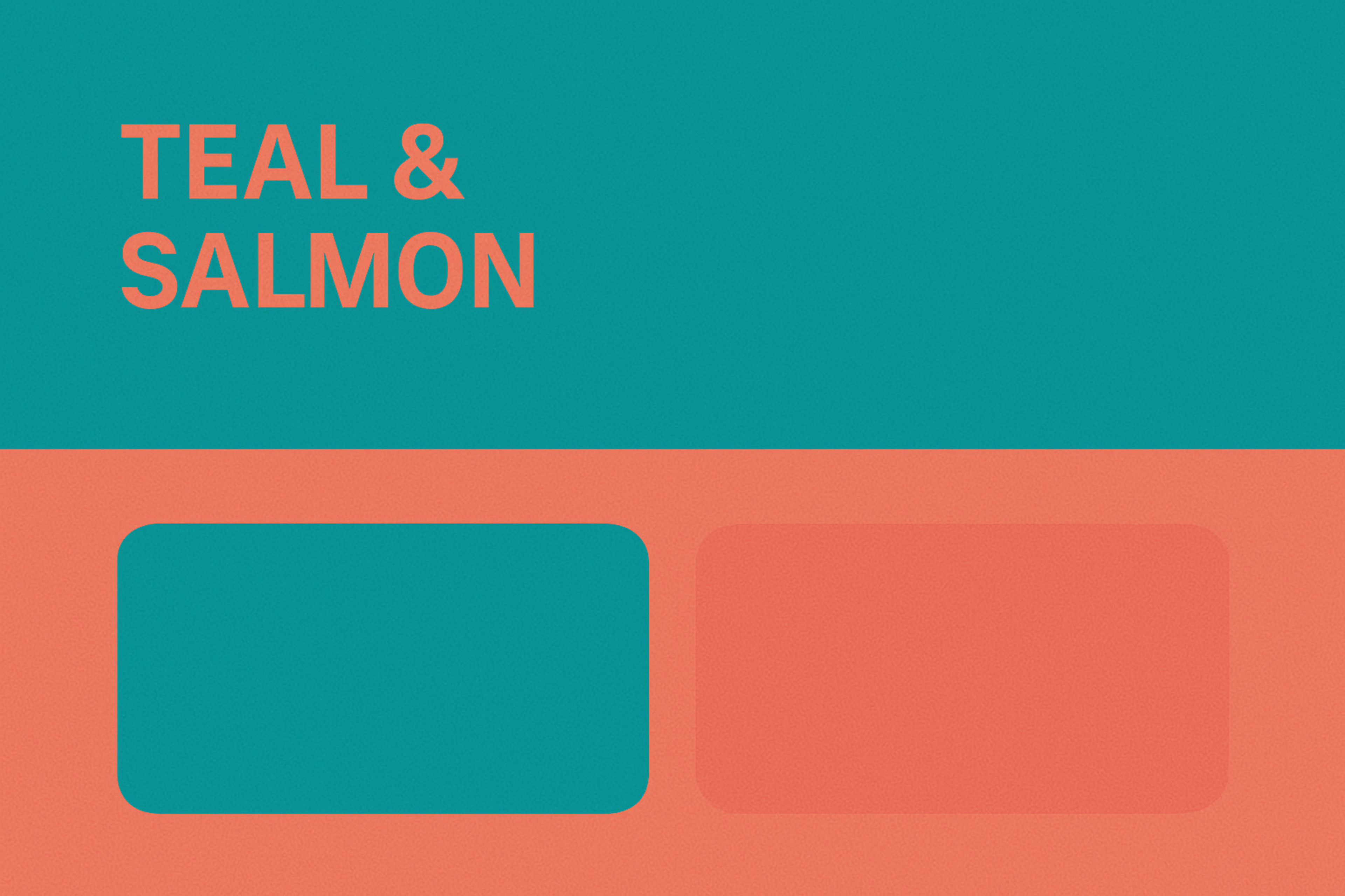
11. Teal & Salmon
- Hex Codes: #008080 & #FA8072
- Mood: Bright, relaxed, breezy
- Use Case: Use teal for navigation and typography, and salmon to highlight services or pricing blocks on product-driven websites.
Teal & Salmon
12. Deep Violet & Ice White
- Hex Codes: #6000D3 & #FFFFFF
- Mood: Playful yet confident
- Use Case: Great for consumer tech or entertainment platforms that want to balance creativity with trustworthiness. White keeps the interface clean and open, while a deep violet infuses a bold, creative flair. Yahoo! Games applies this scheme, leveraging the brand’s vibrant purple with plenty of white space for a fun but polished user experience.
Yahoo! Games Website Design
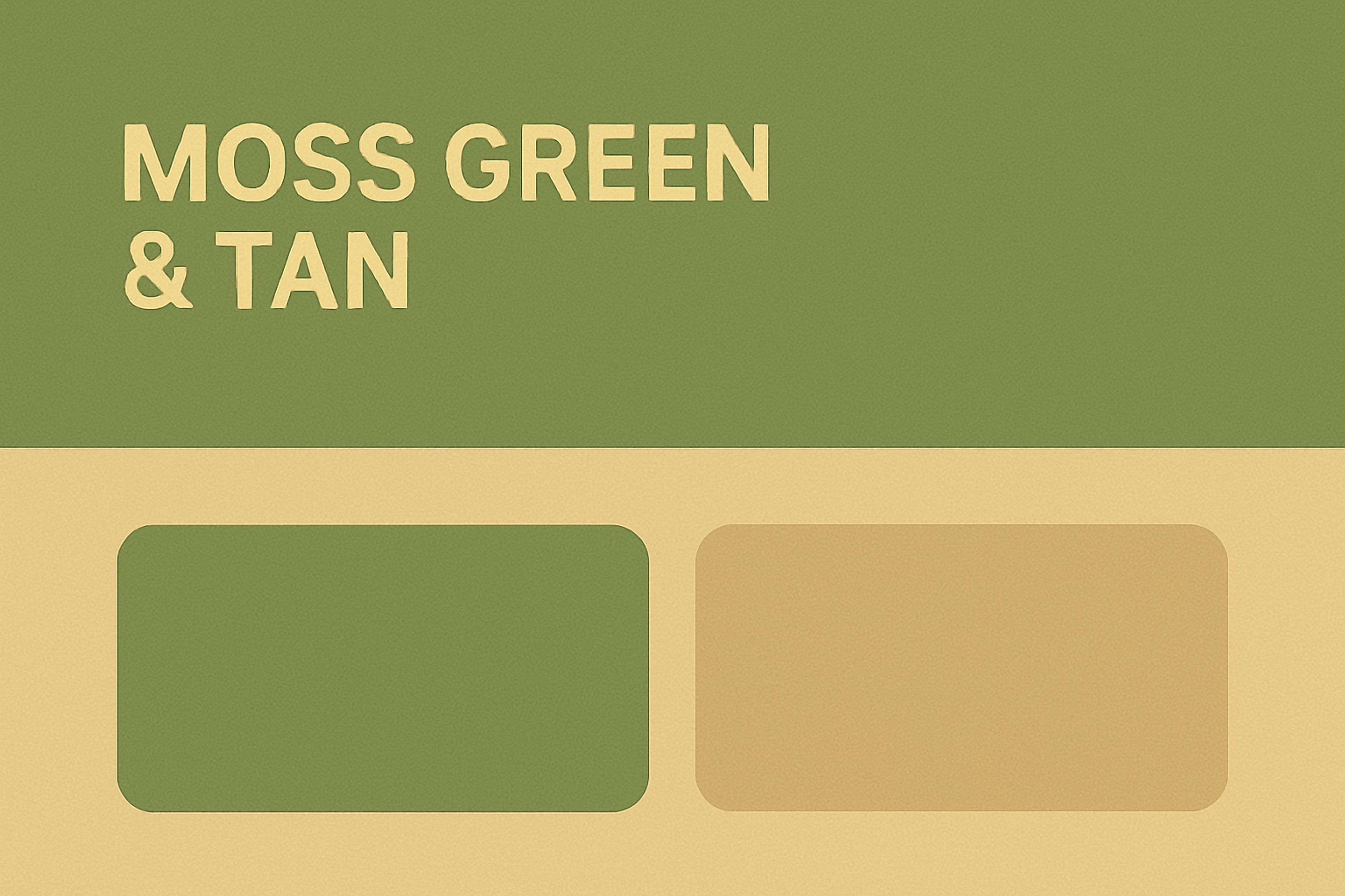
13. Moss Green & Tan
- Hex Codes: #8A9A5B & #D2B48C
- Mood: Natural, peaceful
- Use Case: Works beautifully for lifestyle, garden, or sustainable living brands. Use moss in headers and tan in backgrounds or cards.
Moss Green & Tan
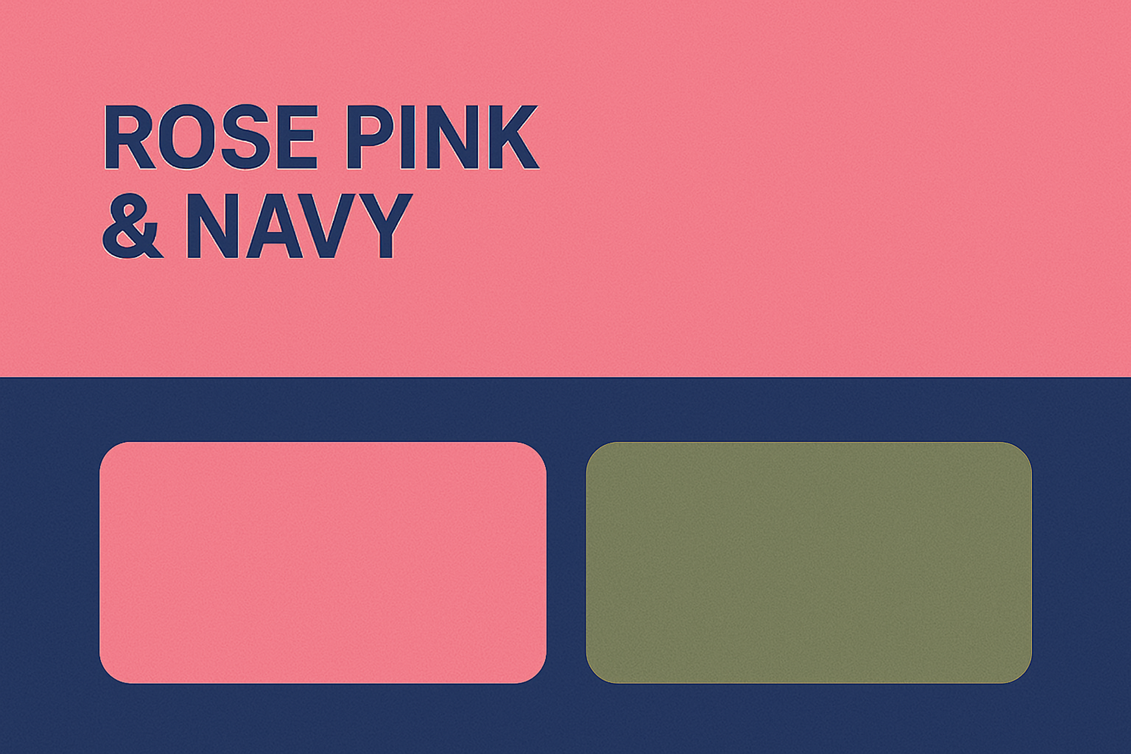
14. Rose Pink & Navy
- Hex Codes: #FF66CC & #001F54
- Mood: Romantic meets bold
- Use Case: Excellent for brands targeting a feminine but professional audience — such as coaching, fashion, or wellness platforms.
Rose Pink & Navy
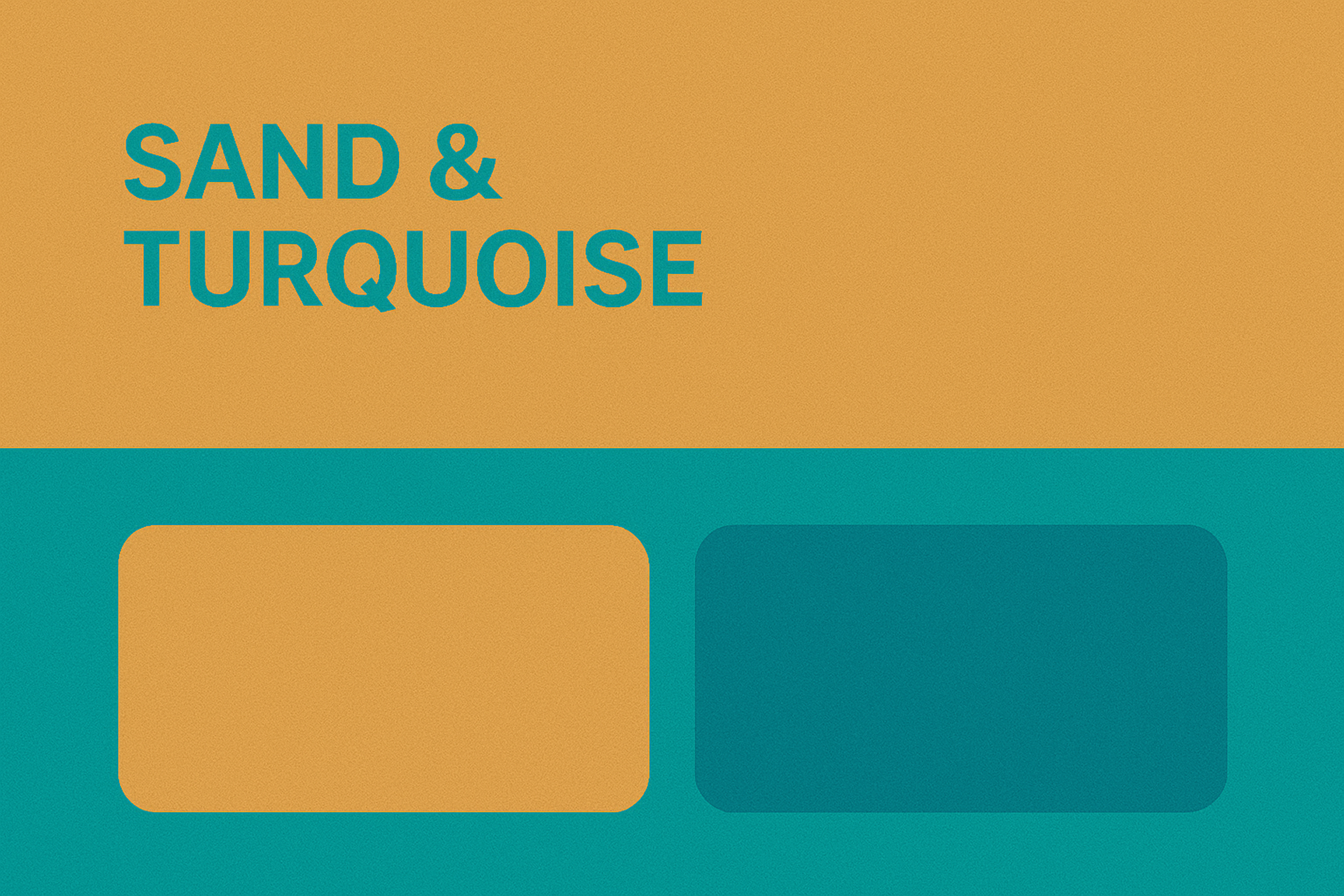
15. Sand & Turquoise
- Hex Codes: #F4A460 & #40E0D0
- Mood: Tropical, fun, youthful
- Use Case: Works great for travel blogs, summer promotions, or event sites. Use sand as the main layout color and turquoise for bright, clickable elements.
Sand & Turquoise
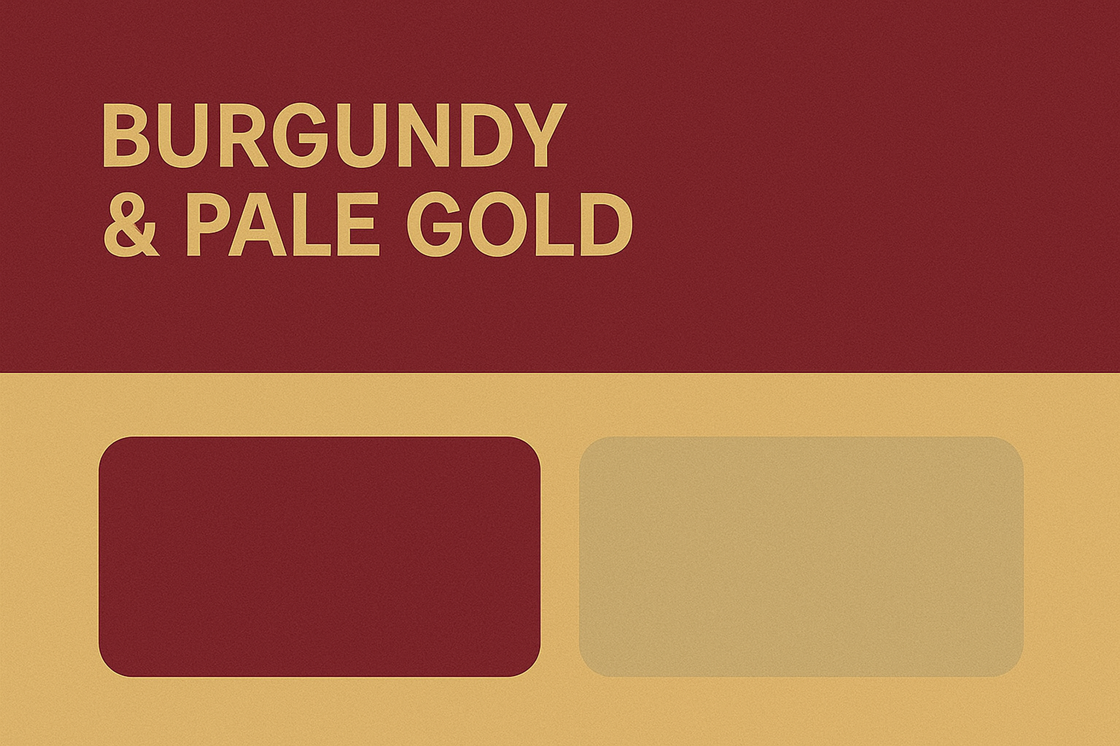
16. Burgundy & Pale Gold
- Hex Codes: #800020 & #ECD9B0
- Mood: Rich, vintage elegance
- Use Case: Luxury fashion, jewelry, or wine brands can lean into burgundy for depth and pale gold to accent premium features.
Burgundy & Pale Gold
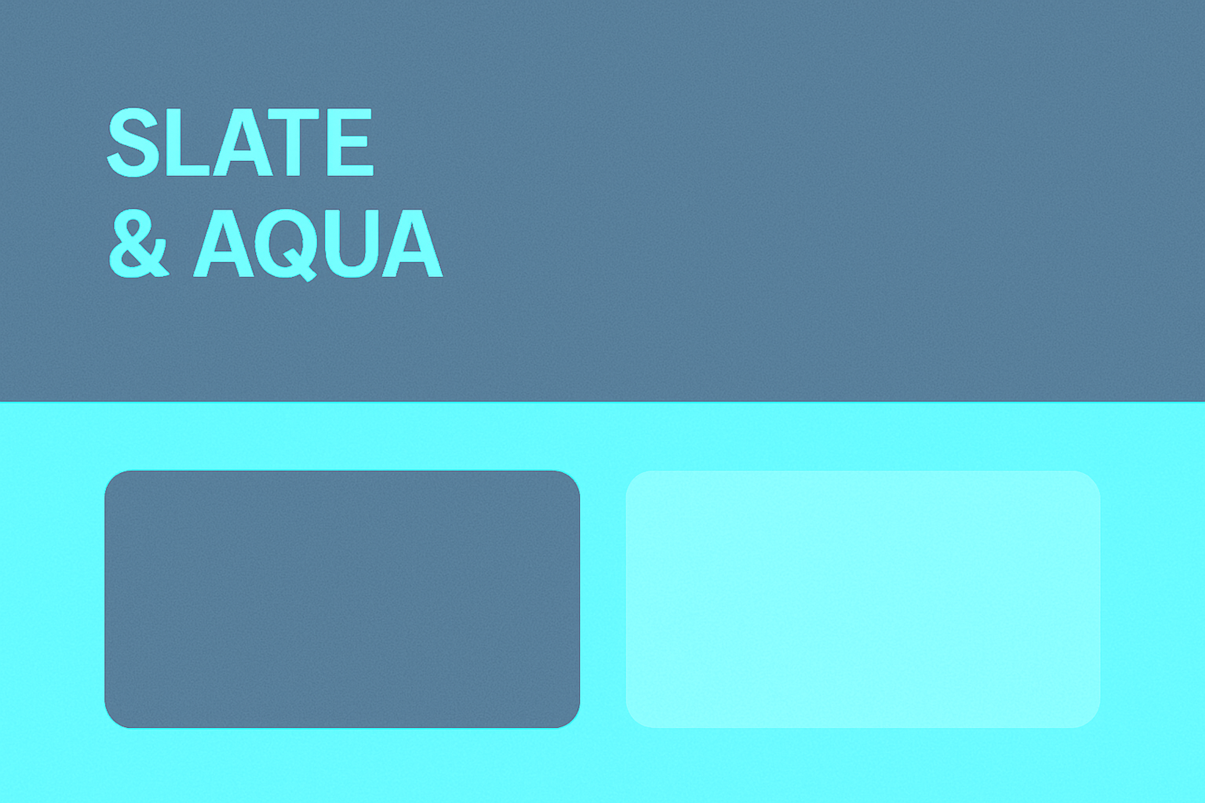
17. Slate & Aqua
- Hex Codes: #708090 & #00FFFF
- Mood: Cool and clear
- Use Case: Perfect for dashboards or minimalist product UIs — slate for structure and aqua to direct user focus.
Slate & Aqua
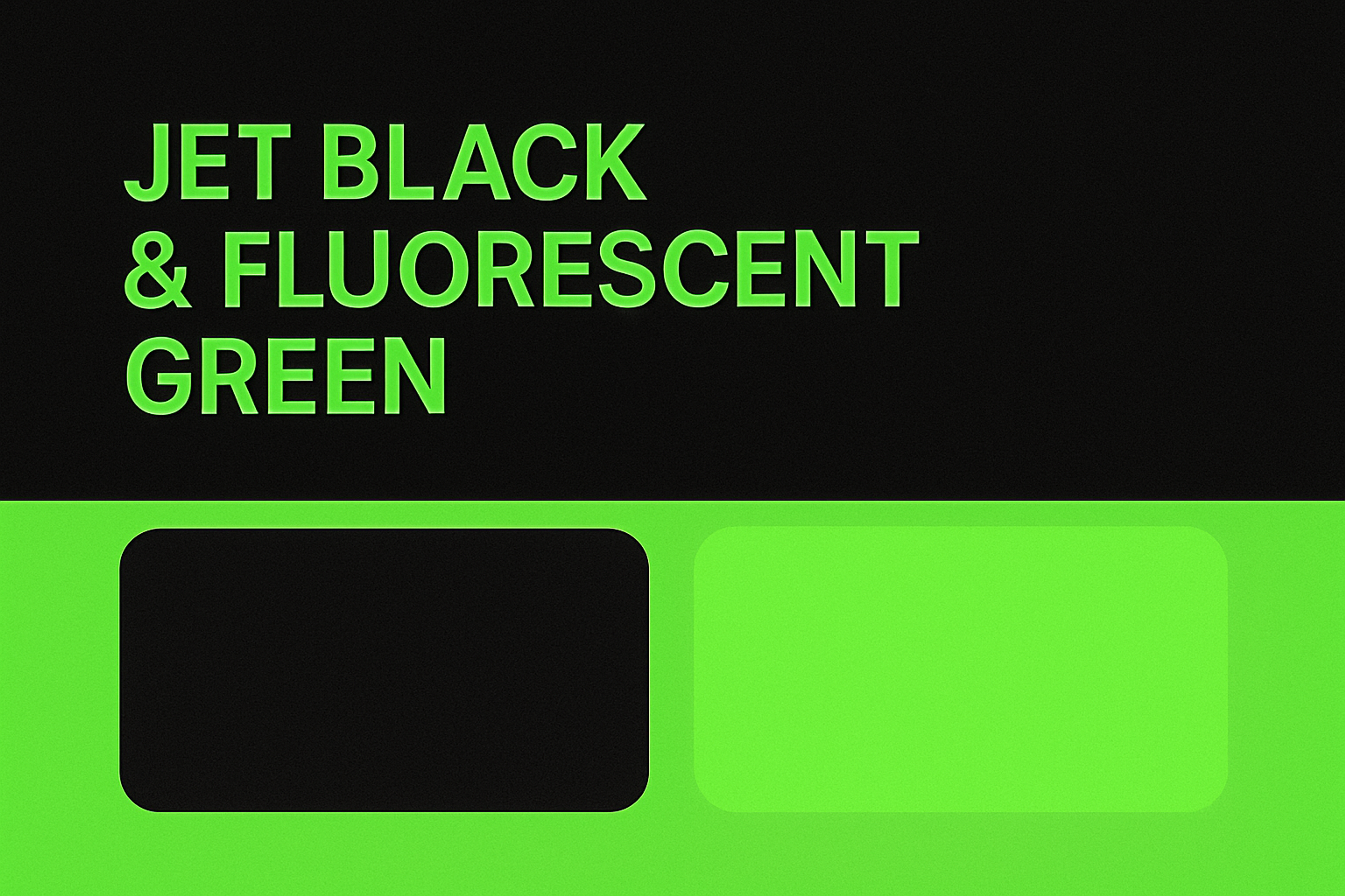
18. Jet Black & Fluorescent Green
- Hex Codes: #0A0A0A & #39FF14
- Mood: Hacker mode, digital-first
- Use Case: Use jet black as the backdrop of your landing pages or product intros, and let fluorescent green pop out for tech CTAs and sliders.
Jet Black & Fluorescent Green
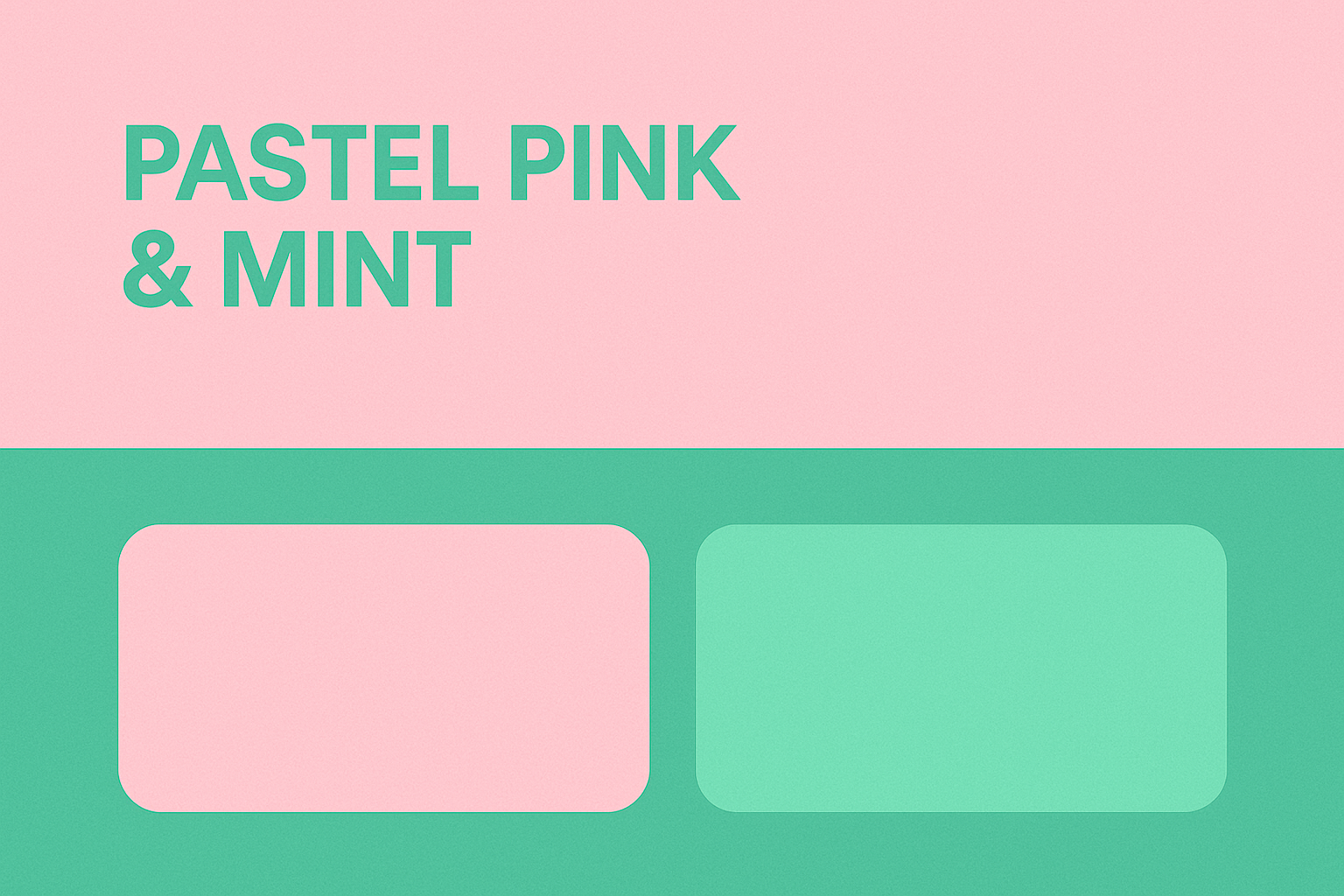
19. Pastel Pink & Mint
- Hex Codes: #FFD1DC & #AAF0D1
- Mood: Soft, playful, modern
- Use Case: Ideal for DTC brands, kids’ products, or personal creators. Combine pink in UI containers and mint in illustrations and links.
Pastel Pink & Mint
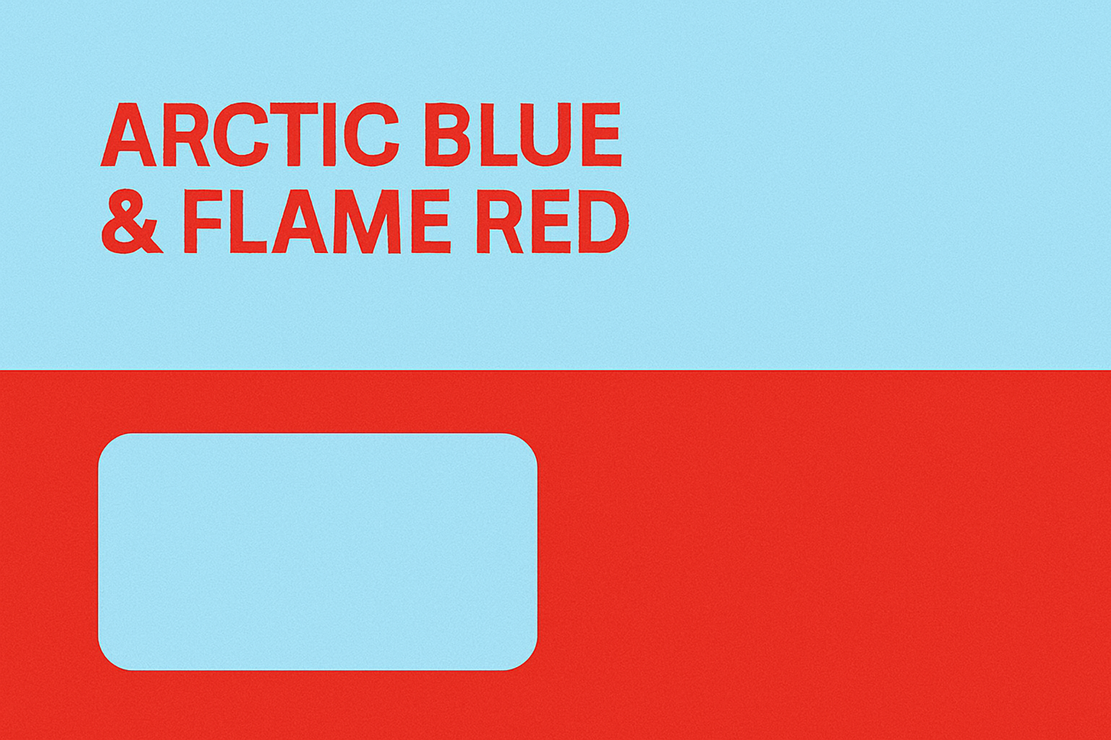
20. Arctic Blue & Flame Red
- Hex Codes: #E0FFFF & #E25822
- Mood: Cold fire — energetic and dynamic
- Use Case: Excellent for contrast-heavy interfaces — arctic blue as the neutral space and flame red for primary interactions and visual weight.
Arctic Blue & Flame Red
21. Royal Purple & Ice White
- Hex Codes: #6C3BAA & #F0F8FF
- Mood: Regal and clean
- Use Case: A bold, high-contrast scheme perfect for modern fintech or education sites that want to exude innovation and trustworthiness. Use royal purple for impactful branding and CTAs, and ice white for clarity and balance.
Marqeta website by Clay
Advanced Color Combinations
Advanced color combinations involve using attractive two-color combinations design to create a unique and visually appealing effect. These combinations go beyond the basics and can add a sophisticated touch to your design. Here are some examples of advanced color combinations:
- Split-Complementary: This scheme uses a base color and the two adjacent colors of its complementary color on the color wheel. For instance, if your base color is blue, the split-complementary colors would be yellow-orange and red-orange. This combination offers high contrast while maintaining balance.
- Tetradic and Analogous: Combining tetradic and analogous schemes can create a complex and interesting effect. For example, a tetradic combination of blue, orange, red, and yellow can be paired with the analogous colors of blue-green, blue-violet, orange-red, and yellow-green. This results in a vibrant and balanced palette.
- Monochromatic with a Twist: This approach uses different shades of a single color but adds a pop of a complementary color to create contrast and visual interest. For example, a monochromatic blue palette with a touch of orange can make certain elements stand out while maintaining overall harmony.
By experimenting with advanced color combinations, designers can create unique and eye-catching effects that set their designs apart from the rest.
Logo Design and Color Combinations
Logo design is a crucial aspect of branding, and color combinations play a key role in creating a visually appealing logo that effectively communicates a brand’s message. The right color combinations can make a significant impact on logo design.
A well-chosen color combination can convey the brand’s personality, values, and industry. For instance, a tech company might use cool blues and silvers to convey innovation and reliability, while a children’s brand might opt for playful pinks and navies to evoke fun and creativity.
Primary and Complementary Colors in Logo Design
Primary and complementary colors are two powerful combinations that can be used in logo design to create a bold and attention-grabbing effect. Primary colors — red, yellow, and blue — are the building blocks of all other good color schemes and can be used to create a strong and memorable logo.
Complementary colors are those that are opposite each other on the color wheel, such as blue and orange or red and green. Using these best two color combinations together creates a high-contrast and vibrant look that can make a logo stand out.
For example, a logo that uses a primary color like blue and pairs it with a complementary color like orange can create a bold and attention-grabbing effect. This combination draws the eye and conveys a sense of balance and harmony.
Tips for Implementing Complementary Color Combinations
When implementing a vibrant and visually appealing color combination on your website, there are several helpful tools and practices to remember. Firstly, color palette generators like Adobe Color or Coolors can experiment with different color schemes and find combinations that work well together. These tools allow you to explore various color harmonies, adjust hues and saturation, and see how colors interact.
Secondly, always check your color combinations for accessibility using tools like the WebAIM Contrast Checker. This ensures that your color choices provide sufficient contrast for visually impaired users and meet web accessibility guidelines.
Lastly, gather feedback from users and stakeholders to validate your color choices and ensure they resonate with your target audience. Conduct user testing, surveys, or focus groups to gain insights into how your colors are perceived and make adjustments accordingly.
FAQ
Q: How Do I Choose a Website Color Scheme That Aligns with My Brand Personality?
Choose colors that reflect your brand’s values and emotions. Use tools like the color wheel to create palettes that match your tone and resonate with your target audience.
Q: Can Color Combinations Affect Website Conversion Rates?
Yes. Strategic color use can draw attention to key elements like buttons, improving user engagement and boosting conversions.
Q: How Often Should I Update My Website’s Color Scheme?
Update your color scheme every few years or when rebranding to keep your website visually current and aligned with your evolving identity.
Q: Are Certain Color Trends More Effective for Mobile Design?
Yes. Mobile-friendly designs often use high contrast, bold accents, and simplified color palettes for better readability and faster recognition.
Read More
Conclusion
Choosing the right color combination for your website can significantly impact its success. By understanding the principles of color theory, considering the psychological impact of colors, and applying key principles like contrast, harmony, and accessibility, you can create visually appealing and effective color schemes that captivate your audience.
The 10 stunning color combinations explored in this article provide a starting point for inspiration and demonstrate the diverse range of possibilities available.
Remember to align your color choices with your brand identity, experiment with different combinations, and iteratively refine your selections based on user feedback and data-driven insights. By leveraging the power of color strategically, you can elevate your website’s visual appeal, reinforce your brand message, and leave a lasting impression on your visitors.


About Clay
Clay is a UI/UX design & branding agency in San Francisco. We team up with startups and leading brands to create transformative digital experience. Clients: Facebook, Slack, Google, Amazon, Credit Karma, Zenefits, etc.
Learn more

About Clay
Clay is a UI/UX design & branding agency in San Francisco. We team up with startups and leading brands to create transformative digital experience. Clients: Facebook, Slack, Google, Amazon, Credit Karma, Zenefits, etc.
Learn more