Great logos tell stories in seconds and embody your brand identity. They carry your brand’s promise across memory and culture. The marks that last don’t depend on flashy trends.
They thrive because a clear promise connects with human instincts and stands firm in everyday life. Logo theory plays an important role in shaping brand perception and overall business success by ensuring that design choices align with the brand’s values and market goals.
This article will show you how to turn brand positioning into shapes, colors, and fonts that represent the logo design process, allowing people to spot quickly, remember for years, and trust in any culture or context.
Effective logos foster strong connections between brands and their audiences, which is essential for building recognition, loyalty, and long-term success.
Part 1: Strategy First
How Logos Shape What People Think
Logos don’t just stand for your brand. They steer what people think about you. A logo acts like a mental shortcut, sparking feelings and expectations in the first 200 to 300 milliseconds, reflecting the psychological implications of design. In that tiny window, a simple form, bold contrast, and smooth flow are visual elements that draw attention and influence what viewers notice first, shaping their perception of your brand.
Think in three layers. First comes instant identification. Certain visual elements are designed to ensure viewers notice the intended message immediately. Next, personal meaning kicks in, filtered through what people already know.
Finally, real-life experience either backs up or shatters the promise you show. If your logo shouts innovation but the service feels 10 years old, the lack of connection chips away at trust.
Design for that split second. Boost processing ease with simple, legible shapes that include geometric shapes. Make sure the metaphor matches the promise. Test originality against the whole category, not just other brands in isolation.
Logo Science
Building Stories Into Symbols
A logo worth its salt narrates a tale without spelling it out. Your brand steps into a character in the customer’s story — wise mentor, daring pathfinder, gentle guardian, or any archetypal cast.
Each character hints at its design path: the wise mentor cloaks itself in sharp lines and firm type. The daring pathfinder dances between bold curves and the hint of motion. The gentle guardian wraps itself in soft, encircling shapes that whisper comfort.
Excellent marks crush wide plots into tight shapes. Southwest shares its “travel is love” via a simple heart, skipping the jet. Look at Apple: its journey from a busy fruit to a sleek outline shifts the drama from “computers that care” to “technology that inspires.”
Finish every design quest with a single, crystal-clear line: what feeling should the symbol plant in a viewer’s heart in one heartbeat? If the reply is fuzzy, the tale still needs more sharpening.
Standing Out From Competitors
Differentiation is anything but random. Start by mapping your category’s Distinctiveness Matrix using three simple axes: shape family, dominant color, and metaphor. Check what your top competitors commonly use. Creating a unique logo that is instantly recognizable is essential for standing out and ensuring your brand is memorable.
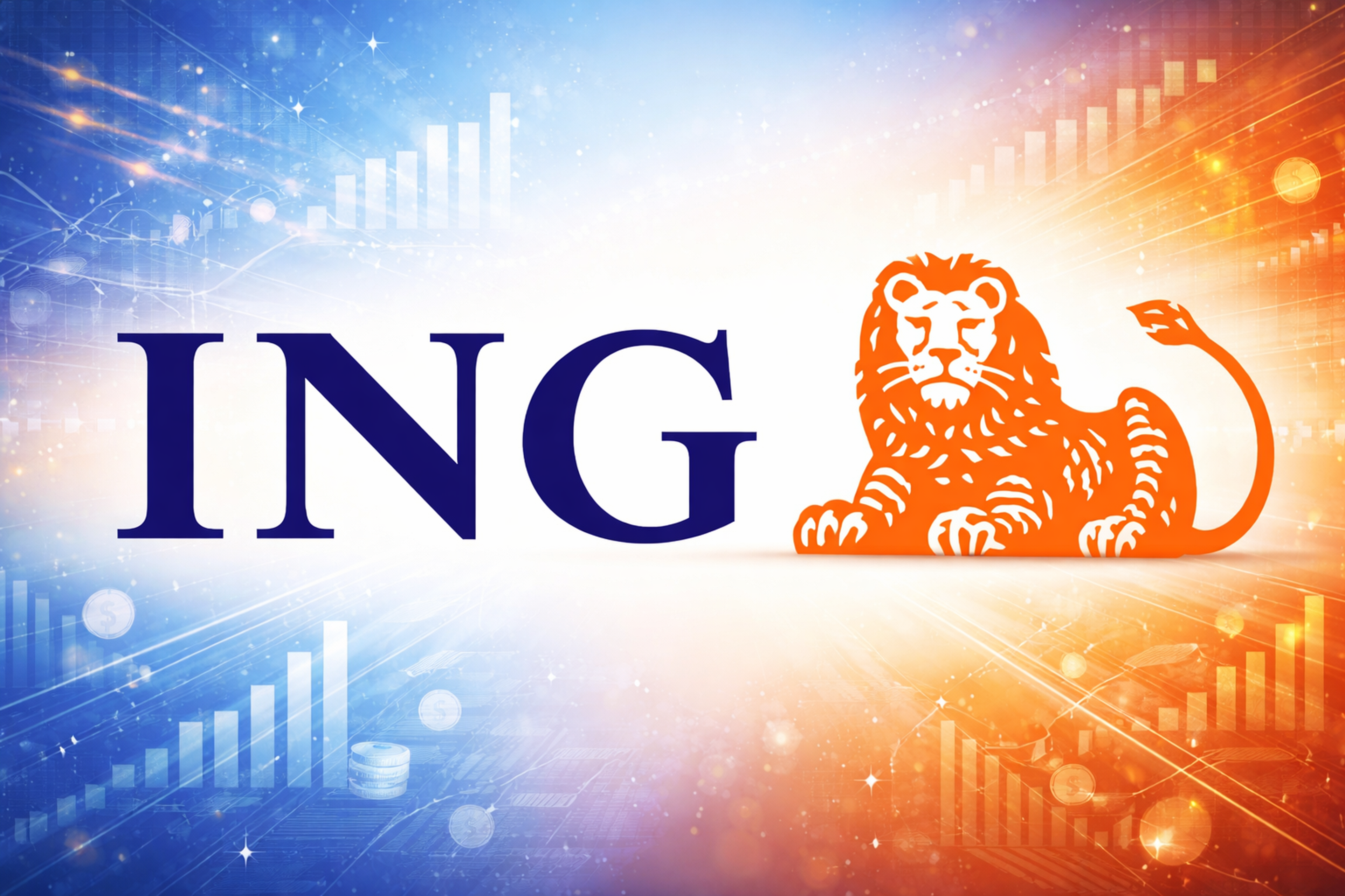
Your goal is to find a rare-but-relevant mix, not to grab attention with weirdness. For example, when banking was blue everywhere, ING’s bright orange reframed the idea of energy and optimism.
ING Logo
Mapping Fast
Hit the personal library and find the twenty most prominent players. For each one, note three things: the basic shape (circle, square, triangle, or fluid form), the primary color (key it to a simple HSL bin), and the guiding metaphor (leaf, shield, star, arrow, or initials).
Count how often each pops up, then grab the lonely but fitting combo to land your brand in the market. The best logos are those that remain recognizable and distinct even in crowded markets.
Keeping the Choice Alive
Claiming to color your only works when you use it the same way. Composed badge systems only connect if people dive in and keep looking. Pick differences your teams can use in every meeting, every product, and every ad.
Part 2: Culture and Research
Understanding Different Cultures
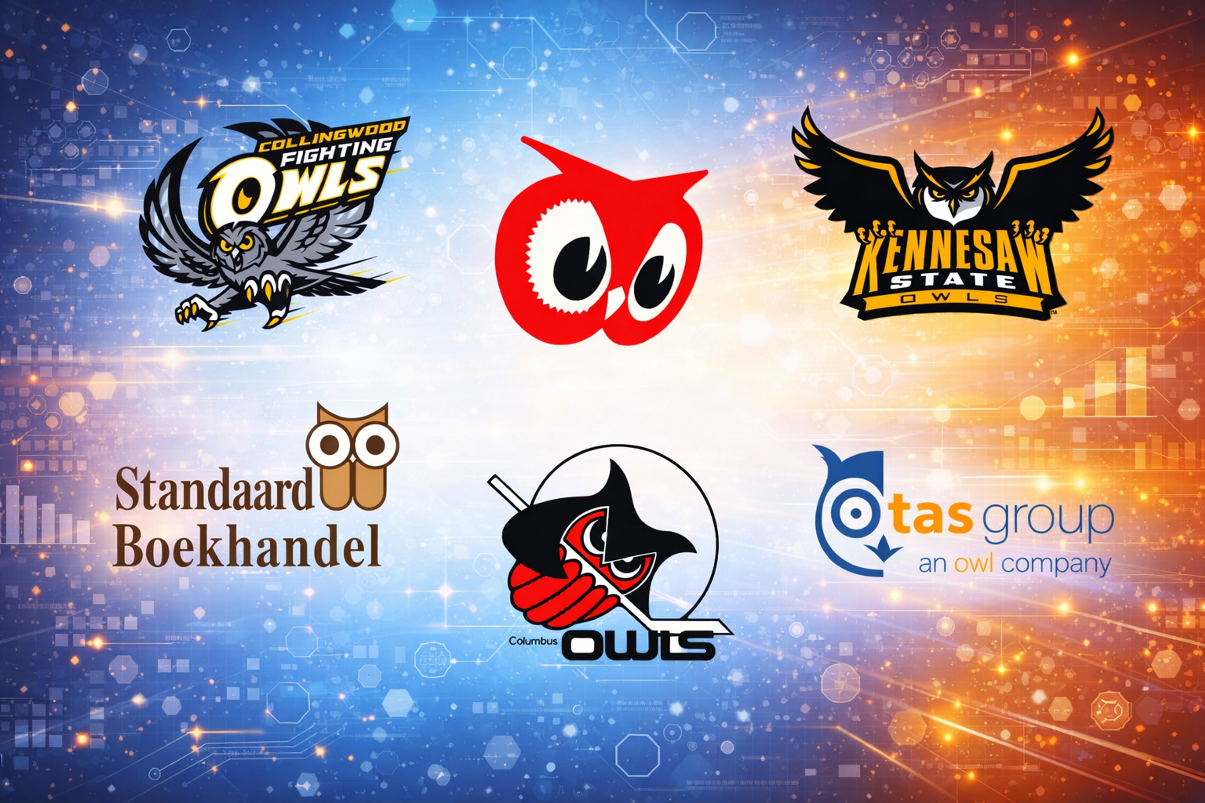
Symbols carry different weights depending on where you sit or how many birthdays you have counted. In most of the West, white is a signal of purity. In parts of East Asia, it’s for mourning. Understanding these cultural differences helps ensure that specific elements in a logo design align with the brand's values, so the logo accurately reflects the brand identity and resonates with the intended audience.
Owls might mean wisdom in one culture and carry a death warning in another. Designers select specific elements — such as colors, shapes, and symbols — not only for their cultural meaning but also to reflect and communicate brand values. Separate culturally relevant patterns from sacred symbols. Patterns rooted in Islamic geometric art can be respectful. The specific crescent or star without a story is not.
Owl Logos
Generational reading of style also shifts. To one bracket, retro is pure authenticity. To another, it’s dust. Always test your ideas beyond the internal circle and across the key segments that matter to you.
Testing What Actually Works (Foundations)
Move beyond what people like. Run speedy exposure tests to see if people recognize the mark and use quick pairs of adjectives to check how it’s understood. Sit your logo next to rivals and watch if the audience reads the traits you mean.
Effective logo design is measured by its ability to capture the brand's intended message and resonate with diverse audiences. For worldwide brands, check if awareness and feeling track the same way in each country. Stronger marks climb the learning curve faster when they meet people repeatedly.
Part 3: How Minds Read Marks
Logos states its case in a heartbeat. Rounded edges feel friendly, and jagged lines feel dynamic and exact. The balanced layout and clear ranks signal trust and steadiness. The key elements of effective logo design — such as simplicity, visual balance, and the use of negative space — work together to create a sense of clarity and trustworthiness in how a logo is perceived.
Dual coding helps you remember: words and images back each other up. Your brand name turns on language cells; the icon fires up sight and feeling. Smoother, simpler shapes are read as more trustworthy because they feel easier to process.
Gestalt rules start grouping, splitting, and finishing shapes before you know you’re thinking. Round forms tug on soft sounds. Sharp forms tease out edgy sounds — pair the shape’s feel with the sound you want.
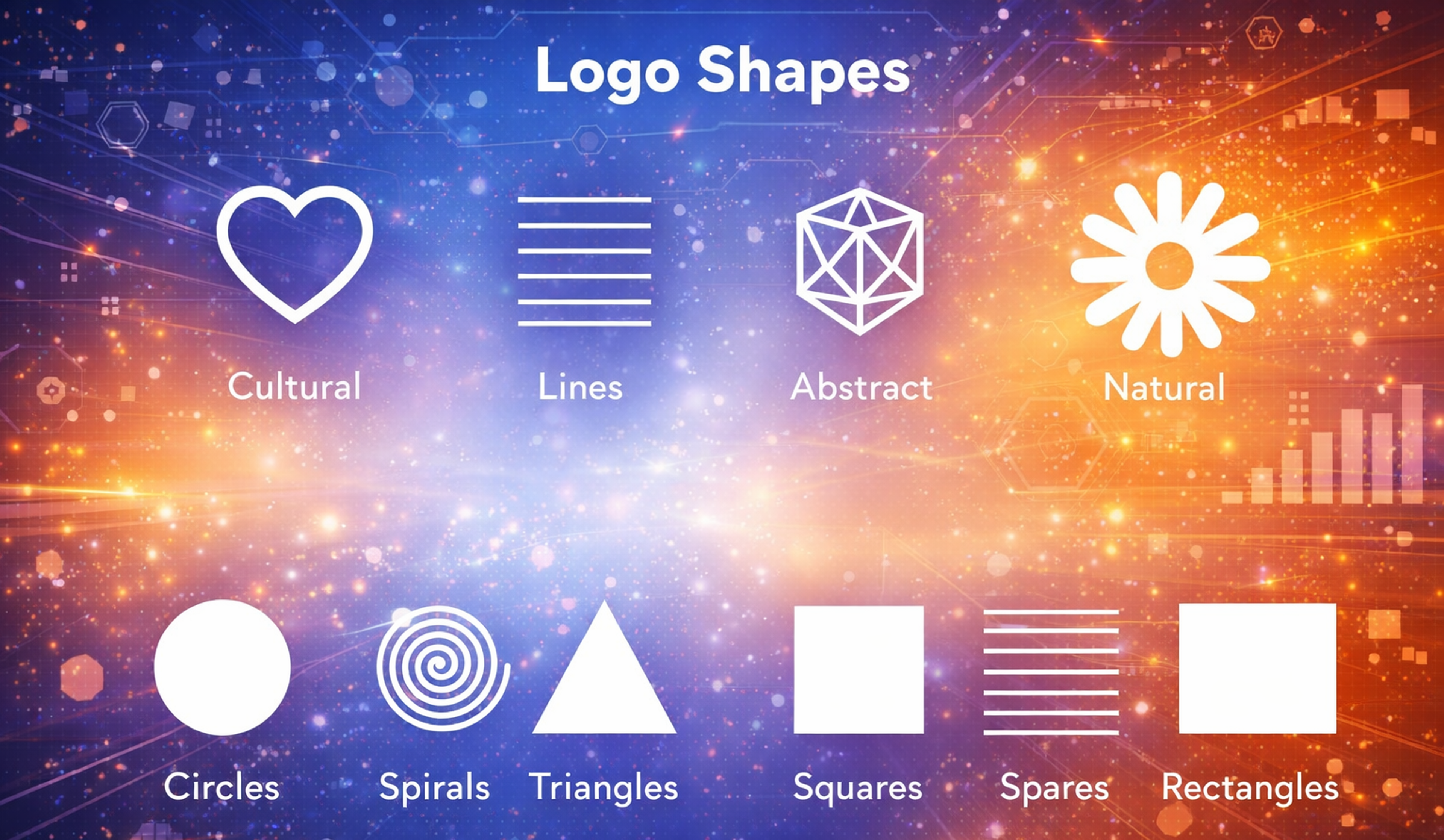
Logo Shapes
Part 4: How Symbols Communicate
Semiotics hands you three helpful tools for making meaning. Icons look like what they stand for and catch the eye first. The catch? They can turn cliché if overused.
Indexes signal through a reasoned link — smoke hints fire, an arrow shows the way — bringing more depth. Symbols earn meaning through learned agreement — think heart for love — so they bend and grow, provided you keep using them the same way.
Mix in a metaphor for extra lift. When you vow to guide, a star, a compass, or a path can borrow weight from a known thing and carry it to a hidden business good. Step above the plain, literal level to dodge the clip-art feel.
Quick self-check. If a person can sketch your mark from memory and still say what you promise without color or type being in play, you’re working at the symbol or index layer, not just a surface icon. That’s a sign the mark is sticking.
Next, pressure-test the meaning. Write down five nouns and five verbs describing your mark, but skip your industry name. If the words slip into broad guesses like “quality” or “service,” your metaphor needs a sharper cut.
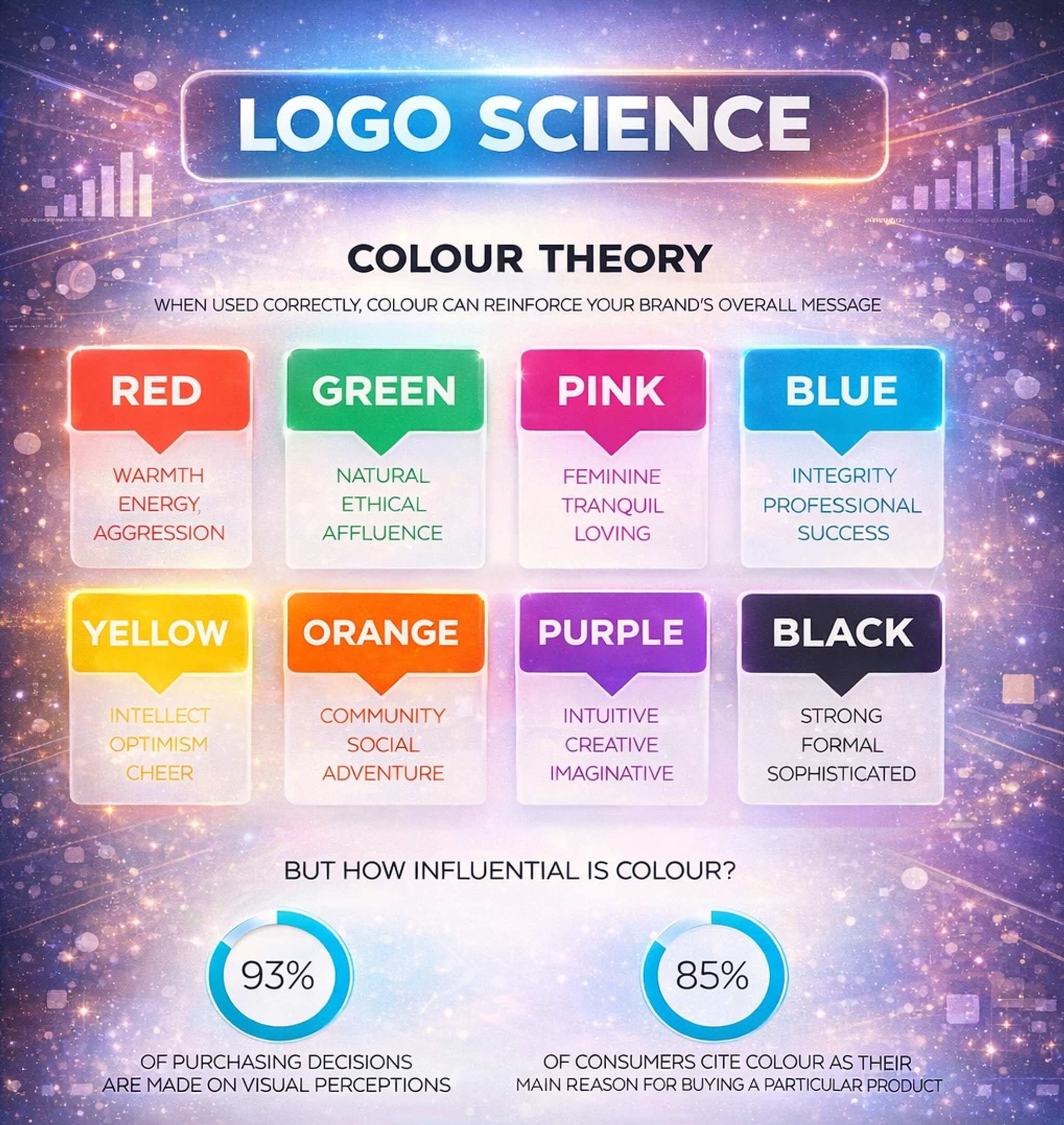
Part 5: Color and Type Strategy
Color triggers feelings and promises before a person thinks. Warm colors pump up energy, while cool colors ease it. How bright a color is and how it clashes set how strong it feels, which is crucial for effective logos. Color theory guides the selection of harmonious and psychologically impactful color palettes, ensuring the result is both memorable and aesthetically pleasing.
Meanings change from culture to culture, so double-check in every market. Always run the design first in grayscale. If it sinks without color, you’ve added a pretty layer, not a lasting mark.
We created and maintained Terragraph’s marketing website while establishing the visual identity. The team used a custom color palette to unite Terragraph’s visual foundation with the Meta/Facebook brand, and showcased the technology embedded in an urban setting with animation.
To help two different audiences — government officials and engineers — understand the product, the site combined a clear content structure with interactive diagrams and visualizations.
Terragraph website by Clay
Type is a signaling tool. Geometric sans looks sculpted, humanist sans feels friendly, and a classic serif shouts tradition. The choice of font and careful spacing between letters (kerning) both contribute to an aesthetically pleasing and readable logo. Letters can suggest meaning through ligatures and negative space, but clarity beats all. If a form hints at deeper ideas, make sure the word is still clear in small sizes.
Factor in access from the start: check contrast ratios for headline and paragraph pairs, design for dark mode, and ensure legible sizes in the tiniest surfaces.
Part 6: From Strategy to Symbol
Ground all design on three cores: brand character, competitive landscape, and cultural signals. Creating a logo requires the expertise of a designer or logo designer who can translate strategy into visual form.
Designers use both creative intuition and strategic thinking throughout the process to ensure the logo conveys the intended message. Shrink the brand idea to a single line that states the emotion you want people to feel. Match visual metaphors to that feeling.
Then drill with a method. Set a ten-second timer, study ten rival logos, and put away the screen. Sketch from memory. Look for shared forms and decide to leave those behind. Slide through abstraction levels from a clear image to a hint. Verify that the meaning still matches the promise at every stage.
Rate every idea with this five-point lens: distinctiveness, semantic fit, fluency, scalability, and accessibility. Give each a 1–5 mark.
Shortcut:
- Distinctiveness checks the category map
- Semantic Fit links metaphor to promise
- Fluency measures first and second read
- Scalability stretches from 24 px to a billboard
- Accessibility checks contrast, mono, and dark mode
Only move to production if the overall average is 4.0 or higher and no column dips under 3.0.
Part 7: Testing That Matters
Use short, repeatable protocols.
Rapid Recognition (1-Second Test)
Flash each mark for one second. Immediately ask what viewers recall, collecting just two adjectives. Track three metrics: Recall@1 (correct category/brand name), Target-Trait Score (how intended traits rank versus rivals), and the Misattribution Rate (confusion with other brands). Repeat the test after controlled exposure to see the learning curve.
Decision Thresholds
Target a Recall@1 of 50% or higher on the first exposure in the lineup. The Target Trait Score should exceed the category median by 0.5 on a 7-point scale. Aslo, Limit Misattribution have to be below 10%. If you miss something, simplify the silhouette and boost the form contrast.
Competitive Line-Up
Position your logo among key rivals. Rate on three traits tied to your desired positioning for your target audience (for example, trustworthy↔untrustworthy). Look for a statistically clear lead.
Context Checks
Always test in real placements: email headers, app icons, favicons, social avatars, and packaging mockups. Context alters perception and legibility.
Advanced Methods
Eye tracking shows entry points and fixations. EEG data may reveal emotional response and memory storage, but only use this when the budget justifies the complexity.
Part 8: Make It Work in the Wild
Design for reality.
Accessibility
Always check contrast according to WCAG AA standards as the basic level. Use AAA when you can. Decide how your design behaves in light and dark modes and set the smallest sizes needed to keep the design readable in print and on screens. Also, consider where touch targets go and how to simplify small icons without losing meaning.
WCAG 2.2 by Clay

Minimums in Practice
Ensure the primary logo stays clear at 24 px high on screens, and steer clear of lines thinner than 1.5 px at that size. Test the favicon at 16 px in plain and inverted versions. For print, let key strokes stay at about 6–7 pt or thicker. Adjust the negative space to keep the balance if a small detail vanishes.
Legal
Target a level of distinctiveness that can be protected: fanciful or arbitrary marks are strongest, suggestive are okay, and descriptive are usually weak. Check clearance screens at the start to spot crowded symbol families, like hearts or shields.
Different regions — USPTO, EUIPO, and UKIPO — have different rules for judging conflicts and protectability. Purely descriptive marks, like “PAY FAST” for a payment service, are tough to register.
Production
Give teams vector master files in SVG and PDF format along with Pantone, CMYK, RGB, and HEX color values, a clear-space grid, and safe-area guides. If motion design is part of the brand, write down animation rules. Track asset names and versions so everyone can use the files similarly.
Pantone Colors
RTL Adaptation
Directional cues like arrows, paths, or progress bars should point the other way in Arabic or Hebrew interfaces. Flip shapes and animate in a way that keeps “forward” and “back” clear and consistent for the user.
Common failure patterns:
- Over-Literal Clichés: Sticking too rigidly to tired phrases. Those will kill originality.
- Gradient Over-Reliance: Using gradients to mask design flaws instead of clear choices.
- Hairline Details: Elements so thin they vanish at 24 px. Keep the most minor strokes at least 1 px.
- Dark-Mode Clashes: Colors that pop in light, then disappear in dark. Always check both views.
- Descriptive Weakness: Overly legal language that loses the audience. Clear wins over clever.
- Sacred Symbols: Using culturally loaded symbols without respect. Always ask the source first.
Catch these early to save your design.
Part 9: Real-World Examples
Here are some examples:
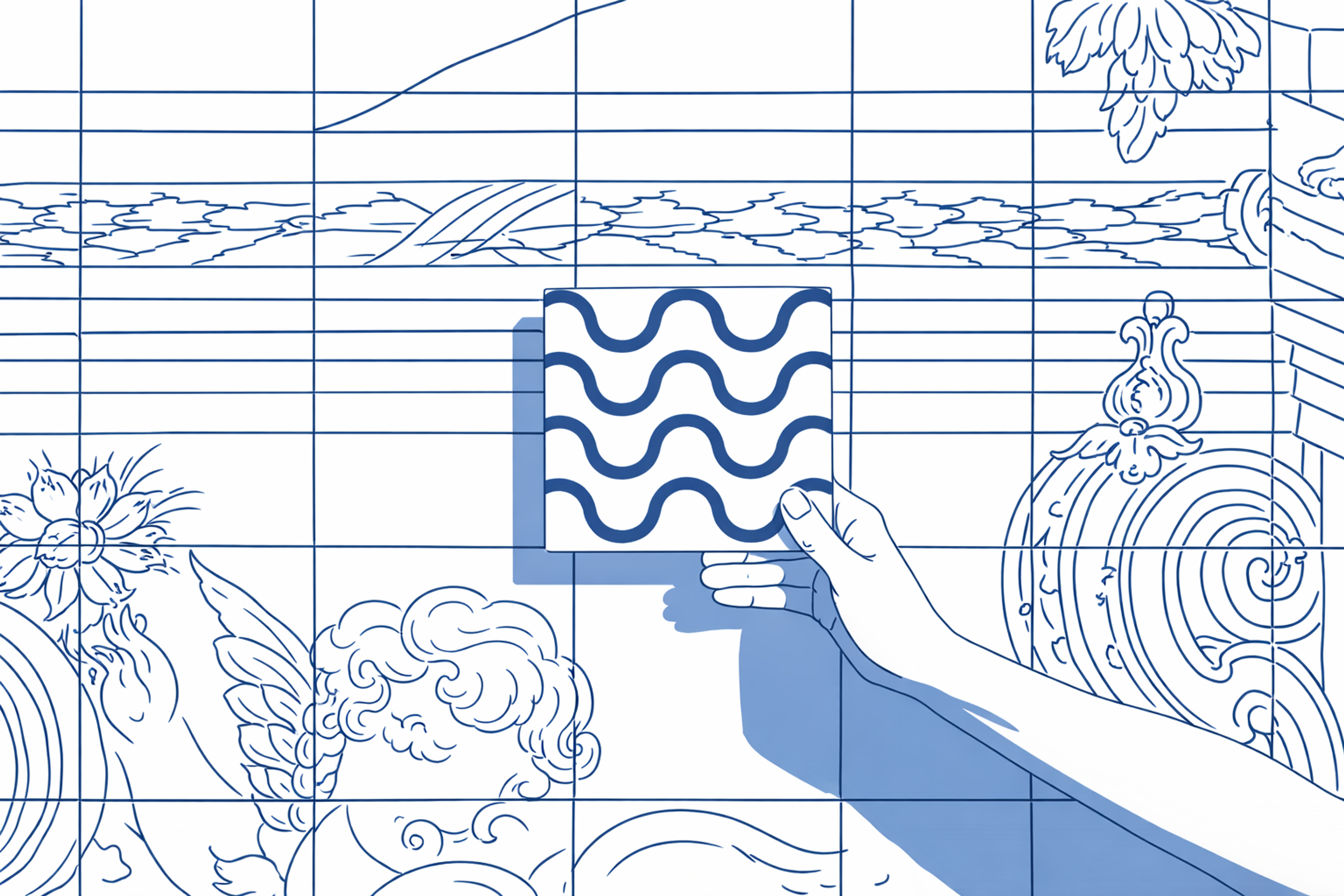
City of Porto
Concept. The identity draws on Porto’s azulejo tile culture without falling into literal illustration. A solid monogram sits inside a grid system that spins out patterns, icons, wayfinding, and merch. The overall design leverages geometric shapes within the grid and tile logic to create a cohesive identity for the company or institution behind the brand. The core idea isn’t “a logo with decorations,” it’s a rule set (grid + tile logic) that produces all brand assets.
Why it works. Distinctiveness comes from the shape family (square/tile grammar) and a culturally grounded metaphor (city fabric), not from a unique color alone. Semiotics lean symbolic/indexical: the tiles point to Porto’s civic texture rather than depicting landmarks. Because the silhouette is simple and orthogonal, it survives at 16–24 px, in mono, and on rough physical substrates (banners, stone, enamel).
City of Porto
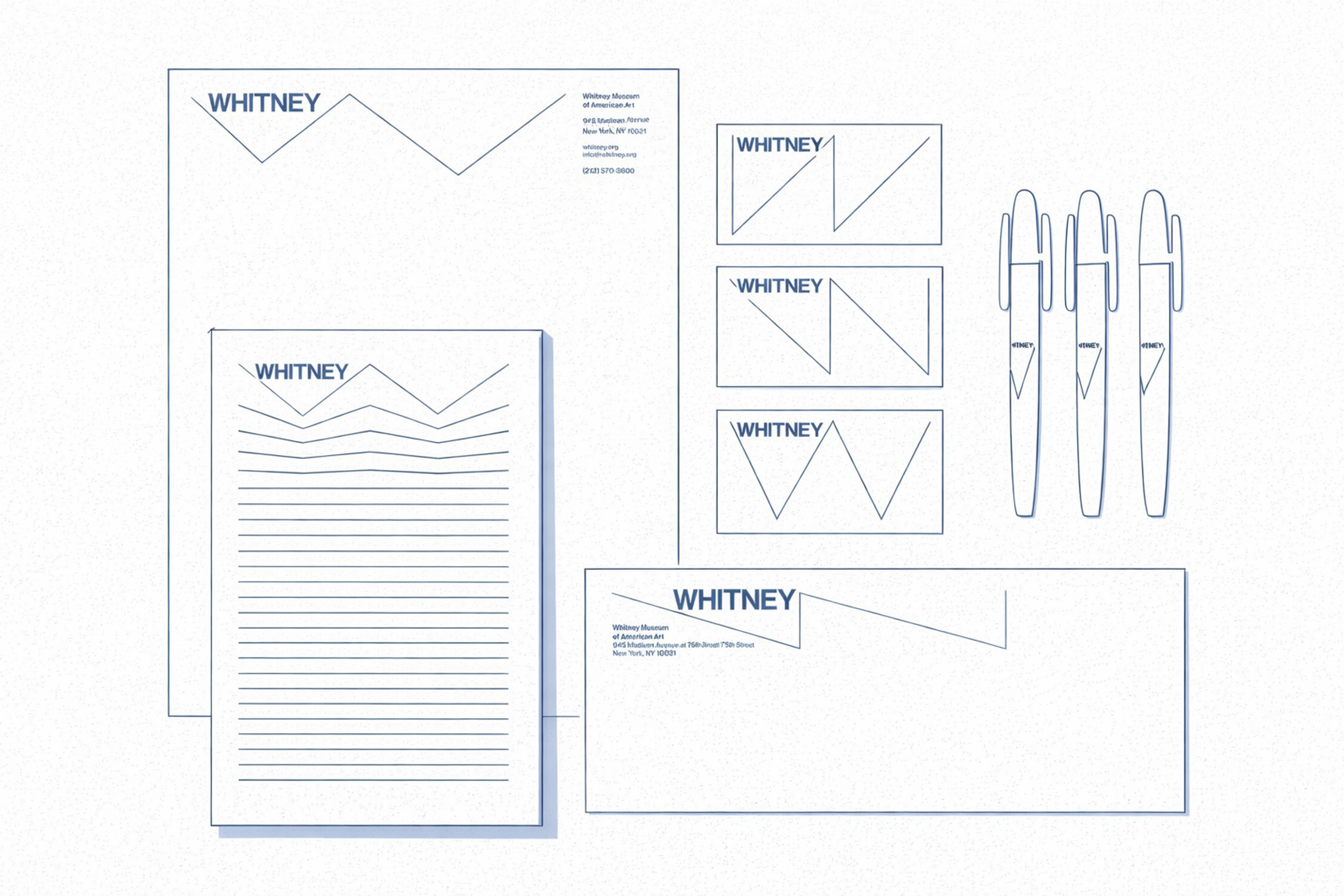
Whitney Museum
Concept. A broken-line “W” doubles as a layout device — a zigzag cursor that stretches, compresses, and aligns across media. The museum didn’t just get a wordmark. It got a typographic and spatial behavior that organizes posters, labels, and digital screens.
Why it works. The form is highly fluently processed: one clean stroke with sharp directional changes, no fragile details. It’s memorable without relying on color and remains readable in small sizes. Semiotics are smartly abstract — the zigzag suggests curatorial selection, movement, and discourse rather than “museum = building.”
Whitney Museum
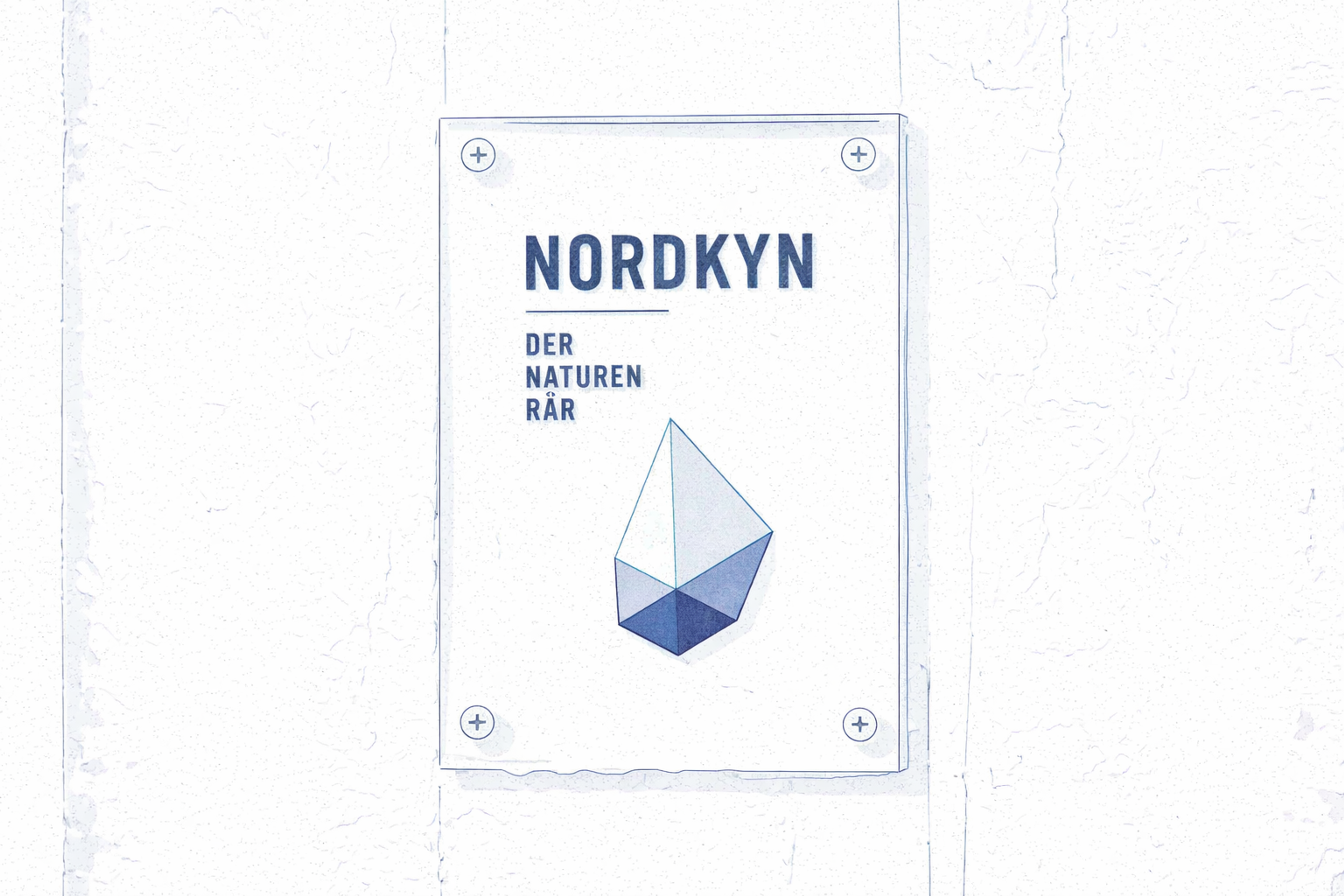
Visit Nordkyn
Concept. The logo’s outline changes with live weather data (wind direction/temperature), so the destination’s identity literally behaves like its climate. The static mark is just a snapshot; the system is the idea: “shaped by the elements.”
Why it works. This is an index in pure form: the symbol points to something real (meteorology) rather than depicting fjords or snowflakes. The base geometry stays constant enough to be recognized, while the variable contour provides endless, meaningful variation. That balance keeps distinctiveness high and cliché low.
Visit Nordkyn
Part 10: Building and Growing Your System
A solid logo gives your brand story a steady foundation. Start by mapping the whole family: primary mark, horizontal lockup, monogram, and app icon. Keep positioning clear so they relate the same way everywhere.
Move beyond the mark to flexible icon sets, pattern systems, and motion rules that echo the same tone. Then publish easy-to-follow guidelines: who gets which asset, how to version them, and regulations that flex a bit for different uses but never lose brand strength.
Let the identity grow as markets and media shift. Figure out what keeps brand value alive — maybe a distinctive shape, a color combo, or a piece of negative space — and guard it. Favor slow, steady tweaks over drastic changes. Test any new version with loyal customers before the public sees it, and keep tracking recognition after launch.
After the launch, keep measuring. Look at aided and unaided recall numbers, check brand misattributions in competitor ads, and see if the favicon and app icon stick in users’ minds. Track the jump in click-through rates and brand search volume. If your key attributes haven’t budged in 8 to 12 weeks, re-adjust small elements or color contrasts and re-test with the Recall@1 question.
Brand Identity Elements by Clay

FAQ
How To Create A Logo Theory?
Logo theory is based on design principles, symbolism, and psychology. To create a logo theory, study how shapes, colors, and typography influence perception. Define the emotional and cultural meaning behind each element to ensure the logo communicates the brand’s identity effectively.
How To Create A Logo Concept?
To create a logo concept, start with brand research and define the company’s values, target audience, and unique message. Sketch multiple ideas, explore typography and color options, then refine them into a visual identity that reflects the brand’s essence.
Can ChatGPT Generate Logos?
ChatGPT itself cannot directly generate logo images, but it can create logo ideas, concepts, and prompts. These can then be used in design tools like Canva or AI image generators (such as DALL·E or MidJourney) to create visual logos.
Which Color Is Most Attractive For A Logo?
The most attractive color for a logo depends on the brand’s industry and audience. Generally, blue conveys trust, red signals energy and passion, green suggests growth and nature, and black represents elegance and luxury. The right choice depends on brand identity.
Can Canva Create Logos?
Yes, Canva can create logos using its drag-and-drop design tools and templates. It offers customizable icons, fonts, and colors, making it a popular option for startups and small businesses that need quick, affordable logo design.
Read more:
Conclusion
A logo worth its salt narrates a tale without spelling it out. Inspiration from brand stories and creative approaches helps designers craft memorable symbols that resonate with audiences. Your brand steps into a character in the customer’s story — wise mentor, daring pathfinder, gentle guardian, or any archetypal cast.
Each character hints at its design path: the wise mentor cloaks itself in sharp lines and firm type. The daring pathfinder dances between bold curves and the hint of motion. The gentle guardian wraps itself in soft, encircling shapes that whisper comfort.
Excellent marks crush wide plots into tight shapes. Southwest shares its “travel is love” via a simple heart, skipping the jet. Look at Apple: its journey from a busy fruit to a sleek outline shifts the drama from “computers that care” to “technology that inspires.”
Finish every design quest with a single, crystal-clear line: what feeling should the symbol plant in a viewer’s heart in one heartbeat? If the reply is fuzzy, the tale still needs more sharpening.

About Clay
Clay is a UI/UX design & branding agency in San Francisco. We team up with startups and leading brands to create transformative digital experience. Clients: Facebook, Slack, Google, Amazon, Credit Karma, Zenefits, etc.
Learn moreAbout Clay
Clay is a UI/UX design & branding agency in San Francisco. We team up with startups and leading brands to create transformative digital experience. Clients: Facebook, Slack, Google, Amazon, Credit Karma, Zenefits, etc.
Learn more