
Does your website feel cluttered, chaotic, or just a bit too busy? You're not alone. In the race to fill every corner with content, many sites lose what matters most — clarity.
Here’s the truth: what you don’t add can be just as powerful as what you do.
Enter white space design — the quiet design element that brings balance, focus, and elegance to your site. In this article, you’ll learn how white space utilization helps guide the eye, improve readability, and make your overall design more impactful.
Let’s explore how embracing simplicity can help your website stand out — and work smarter.
What Is Negative Space?
Negative space, also known as blank, is any unused space on a web page. Its main defining feature is that it creates an empty environment outside the main content.
Far from awkward empty spaces on your website, negative space is a key design element that top web design firms utilizes strategic white space to direct the viewer's attention to the desired content and create a seamless user experience.
Negative space in web design is a powerful tool that creates visual tension and adds interest to the page. Negative space creates contrast, draws attention to specific elements, and adds visual appeal.
With strategic white space utilization, designers can create a more organized layout that facilitates easy navigation and an overall improved user experience.
For example, in our version of Slack, we tried to make the design pleasant and not overwhelming for users. This strategic use of blank areas helps to highlight key features and content, creating an intuitive and engaging experience many users.
The white space usage directs the viewer's attention to important elements, enhancing readability and ease of navigation. By minimizing clutter, the design looks aesthetically pleasing and supports the seamless user experience that effectively guides prospective users through Slack's capabilities.
Slack demo by Clay

Using white space principles on your website allows you to reduce distractions by highlighting important elements and creating a visual hierarchy. It also divides content into manageable sections and draws visitors' attention away from non-essential information.
Additionally, it emphasizes critical features like headings, images, or logo designs. The strategic placement of white space between elements creates an airy feel that helps keep visitors focused on the content instead of feeling overwhelmed.
To successfully utilizes white space effectively in web design, designers must consider how much room they have available for each element on the page and prioritize the relative importance of each section.
They should also consider details such as margin size, line height, font size, color palette, typography, art style, background image or texture, and any other design features that could affect the perception of the website’s content.
By paying close attention to these factors and designing with a sense of intentionality and purpose, designers can create a website that effectively uses white space that works harmoniously with its content.
Source: Wikipedia
White Space vs Negative Space: What’s the Difference?
White space. Negative space. Positive space. Are they different? Not really. It’s all the same concept — and despite the name, negative space doesn’t have to be white. It can be any color, image, or texture. What matters is how it’s used, not how it looks.
So why the different terms? It’s all about where they came from.
“White space” comes from the world of print, where empty areas on a page were — you guessed it — white. Meanwhile, “negative space” comes from photography and art, where it refers to the background areas that frame and highlight the subject (a.k.a. the positive space).
Different roots, same powerful principle: white space and strategic emptiness can be a design’s strongest asset.
Advantages of Using Negative Space In Web Design
It’s a common trap: clients (and even some web design teams) feel the urge to fill every inch of a webpage with text, images, animations — you name it. The more, the better… right?
Not quite.
In reality, bombarding visitors with too much at once overwhelms them. It turns your site into a visual maze where key messages get lost, and attention spans vanish.
Even background images, if crammed in without breathing room, can distract more than they delight. When everything screams for attention, nothing gets heard.
That’s why embracing empty space isn’t a design flaw — it’s a design superpower.
Improves the Readability of the Page
Negative space makes your web page easier to read without altering the font or text size. User experience is of the greatest importance when choosing a web designer; make sure they know to avoid clutter, as this can have a disastrous effect on how a customer interacts with your website. Blank negative space design acts as a buffer between different elements, allowing consumers to easily find the content they care about.
Directs the Page Flow
Negative space dictates how users navigate the web page and the entire site. By carefully choosing the placement of negative space, a web designer can create a visual relationship between different page elements.
This means the direction that users move through the site can be controlled. Users could be prompted to explore sections in a particular pattern or to move to a different landing page, depending on the business's goals.
Adds Style and Elegance to the Page
Negative space adds a feeling of sophistication and luxury to a website. Luxury brands work with the best web design agencies in the world to transform a general webpage into one that exudes an air that the product itself is more important than the website it's displayed on.
Very little content is needed to communicate the features of the product. Just think of the "less is more" style choice opted for by many luxury tech, clothing, and car brands, who let the product speak for themselves.
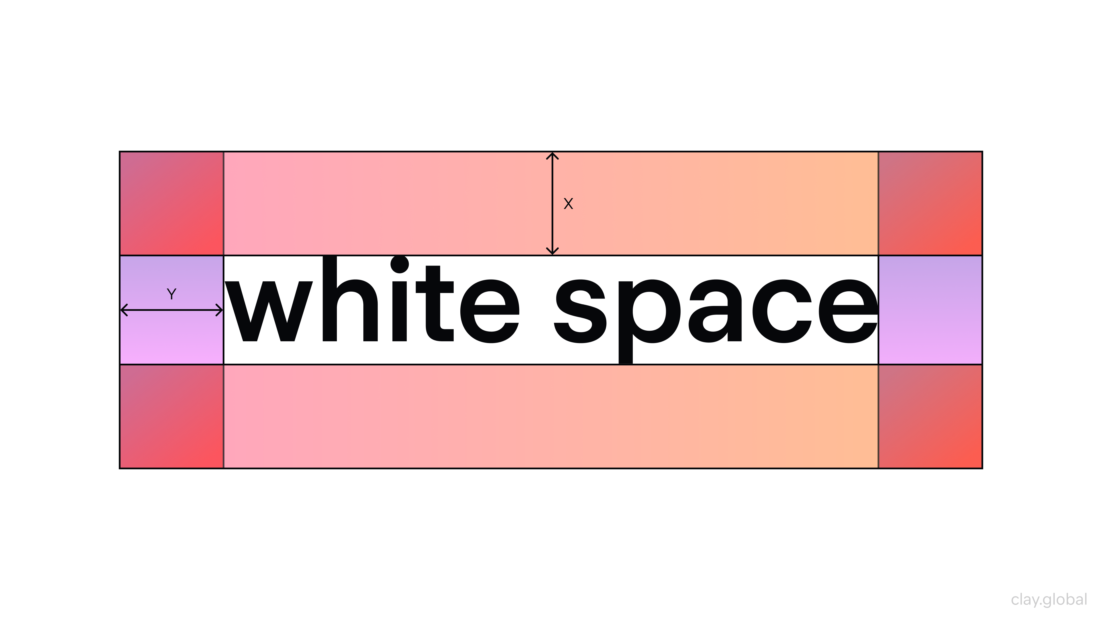
White Space Illustration by Clay
Enhances the Visual Hierarchy
The clever use of negative space enhances the visual hierarchy of the web page. The visual hierarchy is the principle of arranging elements to show their order of importance. Including negative space allows users to focus on the critical elements of their choice and scan various blocks of content in seconds.
Examples of Negative Spaces
Here are some great examples of using negative spaces:
The Guild of Food Writers
The Guild of Food Writers' logo is considered a standout example of negative space in logo design, frequently copied by others. Designed in 2005 by the now-defunct London agency 300million, it creatively incorporates a spoon using the negative space between the nib of a fountain pen.
Source: pinterest

Its minimalist design perfectly encapsulates the Guild’s mission. However, its long-term relevance could hinge on whether future generations still identify with the image of a fountain pen.
LG
LG’s logo cleverly incorporates a human face within the letters "L" and "G," adding a personal touch that humanizes the brand and makes it more approachable.
This design not only highlights the importance of fostering a connection with the audience but also uses familiar shapes to evoke feelings of warmth and relatability.
Source: appypie

By integrating these key elements, LG effectively enhances brand recognition, builds trust, and creates a more memorable identity that resonates with consumers on a deeper level.
Bronx Zoo
The Bronx Zoo logo creatively integrates giraffes and birds into the silhouette of the city skyline using negative space, merging the natural world with the urban landscape in a striking way.
This thoughtful design not only reflects the zoo's mission to bridge the gap between wildlife conservation and city life but also highlights its unique location in the heart of New York.
Source: mavink

By blending these two elements seamlessly, the logo reinforces the idea of the zoo's role as a place where nature and urban life coexist, creating a powerful and memorable visual connection with its audience.
How to Use Negative Space to Create Compelling Websites
An experienced designer can use negative space in a way that supports the overall design of a page. Here are some tips web design firms utilize to create compelling websites using negative space.
Use Negative Space to Break Up the Page
One of the essential visual components in web design is breaking up the web page's content. The best website design firms know users need more information and space to perceive the message. Adding negative space gives users the time to process the information they see on the page.
Negative space can be used to create aesthetically pleasing designs that look modern and sleek. It can be employed as a way of balancing the overall composition of a web page by using white or negative space to bring out key visual elements together.
Negative space also allows designers to guide the viewer’s attention to certain parts of the page by emphasizing certain sections with more blank negative space important and around them. By creating a clear visual hierarchy, users can scan the web page more easily and quickly identify what they are looking for.
Negative Space and SEO
Using negative space also has an advantage when it comes to SEO (search engine optimization).
Since search engine crawlers rely on text-based content to index pages in their database, careful placement of negative space allows designers to strategically place keywords and phrases in areas that will be more visible to search engines.
This helps drive traffic to the website through organic search engine results.
Photo by Myriam Jessier on Unsplash

White Space for User Experience
Furthermore, effective use of negative space can improve user experience by simplifying the design process and making content easier for viewers to consume.
By reducing clutter on a webpage, users are less likely to feel overwhelmed by too much information and instead focus on the most essential elements of the page, such as CTAs (calls-to-action) or text blocks containing pertinent information about services or products offered on that particular site.
Negative Space and Branding
Finally, negative space can help convey brand messaging and values if used consistently across different mediums such as websites, print materials, or social media posts.
Utilizing the space surrounding it successfully creates harmony between all these platforms and provides users with a consistent look and feel from one channel/platform to another; this helps reinforce brand recognition and loyalty among customers and potential leads alike.
Remember that Negative Does not Mean White
Although negative space can be white, it's not a necessity. You can incorporate other colors, patterns, or images if they don't distract from the focus element or subject(s).
Apple is a leading example of how effective use of negative space can help create compelling websites and reinforce brand messaging and values. Apple has been using white space in its user interfaces since its launch of the first iPhone in 2007, which has been essential to its success.
Their minimalist approach emphasizes content by utilizing generous amounts of empty space between elements. This makes it easier for users to quickly scan the page and find the necessary information without feeling overwhelmed.
Photo by Bagus Hernawan on Unsplash

Choose Minimalism
Minimalism in white space has become increasingly popular in web design, as it helps reduce clutter and simplify the page to focus on the most critical elements.
Negative space can give a website a sleek, modern look while providing more breathing room for viewers to take in the content. It also allows designers to use passive white space to create a visual hierarchy that guides readers’ attention toward certain page areas containing pertinent information or calls-to-action (CTAs).
Furthermore, adding white space can also benefit SEO since search engine crawlers rely on text-based content to index pages in their database.
With careful placement of negative space, designers can strategically place keywords and phrases that will be more visible to search engines — helping drive traffic to the website through organic search engine results.
Source: Muzli
Read More
The Bottom Line
Negative space is a significant feature in website design and one of the most powerful tools that can be used to create a quality user experience. By following the advice of the best web design agencies worldwide, you can create a visually appealing website that any viewer appreciates.

About Clay
Clay is a UI/UX design & branding agency in San Francisco. We team up with startups and leading brands to create transformative digital experience. Clients: Facebook, Slack, Google, Amazon, Credit Karma, Zenefits, etc.
Learn moreAbout Clay
Clay is a UI/UX design & branding agency in San Francisco. We team up with startups and leading brands to create transformative digital experience. Clients: Facebook, Slack, Google, Amazon, Credit Karma, Zenefits, etc.
Learn more