By 2026, brand color is less about picking a few attractive swatches and more about designing a color system that performs across product UI, marketing pages, email, social templates, and print in both light and dark environments.
Accessibility has also moved from “best practice” to operational reality: with the European Accessibility Act taking effect on 28 June 2025, many teams now treat contrast, focus visibility, and multi-mode theming as part of brand governance, not a late-stage QA task.
To put the urgency in perspective: audits of the web still routinely surface large volumes of accessibility failures at scale, and low-contrast text remains one of the most common issues. That’s why modern color selection isn’t just taste or trend; it’s a measurable decision tied to usability, compliance risk, and conversion.
What Is a Color Scheme?
A color scheme is a deliberate set of colors that keeps a brand consistent across its logo, website, social content, and packaging.
Most schemes include a primary color, supporting secondary colors, and neutrals. Together, they create harmony and a clear hierarchy across marketing materials.
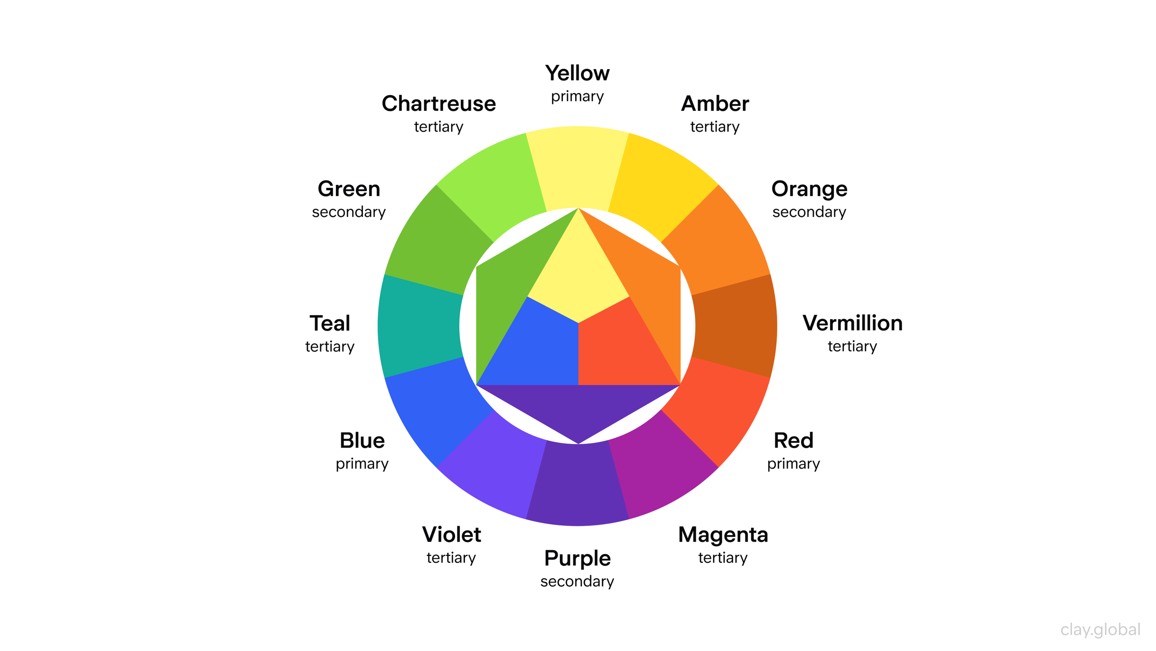
Common approaches include monochromatic (one hue with varied tints/shades), analogous (neighboring hues), and complementary (opposite hues for contrast). The right choice depends on the brand’s personality and the message it needs to communicate.
Understanding the Prime Color Chart
Before choosing a full palette, start with your primary brand color. Blue is often linked with trust and professionalism (common in finance and tech), while red suggests urgency and energy and is used to drive action.
Shade matters as much as hue: lighter tones can feel calmer, darker tones can feel more authoritative.
Other common associations: green (health, balance, sustainability/wealth), purple (imagination, luxury), black (power, sophistication), white (clean, minimal), and yellow (optimism, energy, creativity).
How Many Colors Should a Brand Color Palette Have?
When crafting the brand identity of your business, one of the preliminary steps is selecting the appropriate number of colors for the company logo. However, you shouldn’t go overboard, as the most successful brands navigate between 3 to 5 colors.
The main colors contribute significantly to the psychological impact of a brand's identity, creating a balanced user experience by combining different emotional effects. Here is my approach to tackling this:
- Primary Color: This is the first color the audience associates with the brand. For example, Facebook is known for its blue, while Coca-Cola is recognized for its red.
- Secondary Colors: These do not overshadow your primary color. Instead, they act as supporting shades. These colors can showcase different brand parts or be reserved for special situations.
- Neutral Colors: Black, white, and gray are usually used to help balance the palette while allowing for more freedom with text, images, and borders.
Using the same color consistently across all branding materials enhances brand awareness and identity by creating strong associations and emotional connections with consumers.
Color Wheel
Less is always more, and this notion is backed by evidence. If your brand identity uses too many colors, it is likely to get diluted, causing confusion among the audience. This makes careful selection and limited use of shades vital for better brand recognition.
Core Steps for Color Selection
Assess Values & Aesthetics of the Business: Reflect upon the organization's values, objectives, and image. Choose the colors wisely so that they represent the values accurately to ensure sincerity and consistency in the brand image toward the targeted audience.
Having explicit colour descriptors of the brand makes it easier to work with the design teams and ensures there is no misunderstanding during the selection of the brand colors. Detailed brand guidelines help protect the teams from branding decisions that go against the brand values and identity.
Know the Expectations of the Target Market: Take the time to analyze the age, culture, and values of the audience to be targeted and the colors in the branding to increase their confidence in the brand. Having these colors will definitely enhance the bond.
Analyze the Color Palette of the Rivals: Identify the colors that stand out in the focus area to find trends and avoid monotony. This will ensure their brand is relevant, different, memorable, and not overshadowed by the competition.
Experiment with Combining Colors: Blend colors while considering the accessibility options for people with poor eyesight and color blindness. A blend that maximizes the interface's usability while ensuring it is user-friendly for all should be the target.
Technical Considerations
When working on a color strategy, there are key considerations to keep in mind for your branding to remain robust and continuous across all platforms and mediums:
- Adapting Your Palette: Your palette must be adaptable to work for a website, social media, packaging, and print. A flexible sound palette allows the brand to have a strong visual identity. Think about adding different shades and tones for other brand applications.
- Branding Color Levels: If branding comes to mind, primary and secondary levels must be clear. Primary colors should be the core elements of your brand, used heavily, and second colors should act as accents to enhance the design and ensure visual interest. Maintaining this structure provides a balanced and consistent visual identity.
Documenting color codes in brand guidelines is crucial to ensure that all team members can effectively implement the designated colors and maintain a coherent brand identity. Additionally, adhering to the Pantone Matching System is essential for accurate color representation in branding and marketing materials.
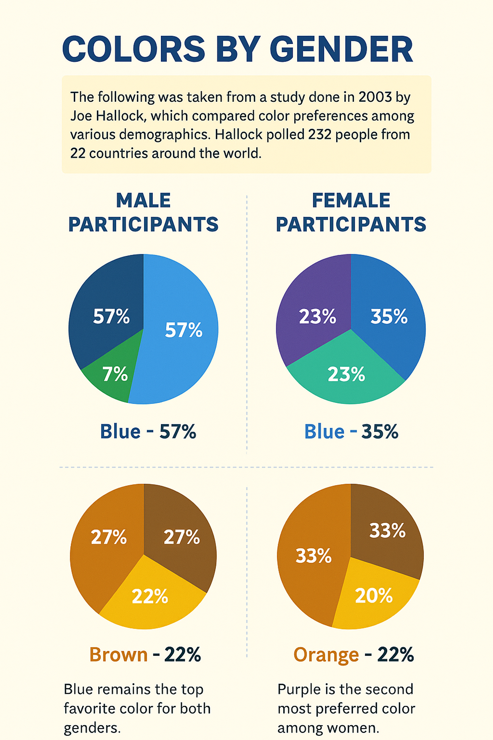
A Chart Comparing Color Preferences by Gender
- Color Adaptation for Screens and Color Print: Colors are omnipresent but can look different, so knowing the difference between what looks good on digital and printed material is key. For digital use, ensure the colors are optimized for RGB, which is for screens, and CMYK, which is for printed pieces, to elevate the accuracy of the piece.
- Code of the Colors and Their Use All Over: It is essential to establish these codes, whether Hex, RGB, or CMYK, for brand integrity in all marketing mediums. These codes ensure accurate color matching of your brands everywhere, from digital platforms to printed forms, building confidence among your audience. This associative thinking makes it easy for the audience to relate these colors with the right brands.
Responsive systems are easier to assemble and maintain, such as brand campaigns or other activities a company might need to do or make in the future. It is one thing for colors to look good and one thing to adapt to a fully functional system. A powerful color strategy sets the stage for your brand’s visual image and communication.
Psychology of Color in Business
Color psychology matters because it shapes brand perception and user decisions through the emotions and associations people attach to color.
When building a brand, choose colors based on the brand goal and audience — not personal preference. For example, blue is often associated with trust and professionalism (common in banking), while red can signal urgency and energy (often used in promotions).
Meanings also vary by culture, so global brands need to validate color choices across markets. Industry conventions influence expectations too (e.g., soft blues/greys in tech; greens and earthy tones in health and wellness).
Color Meaning
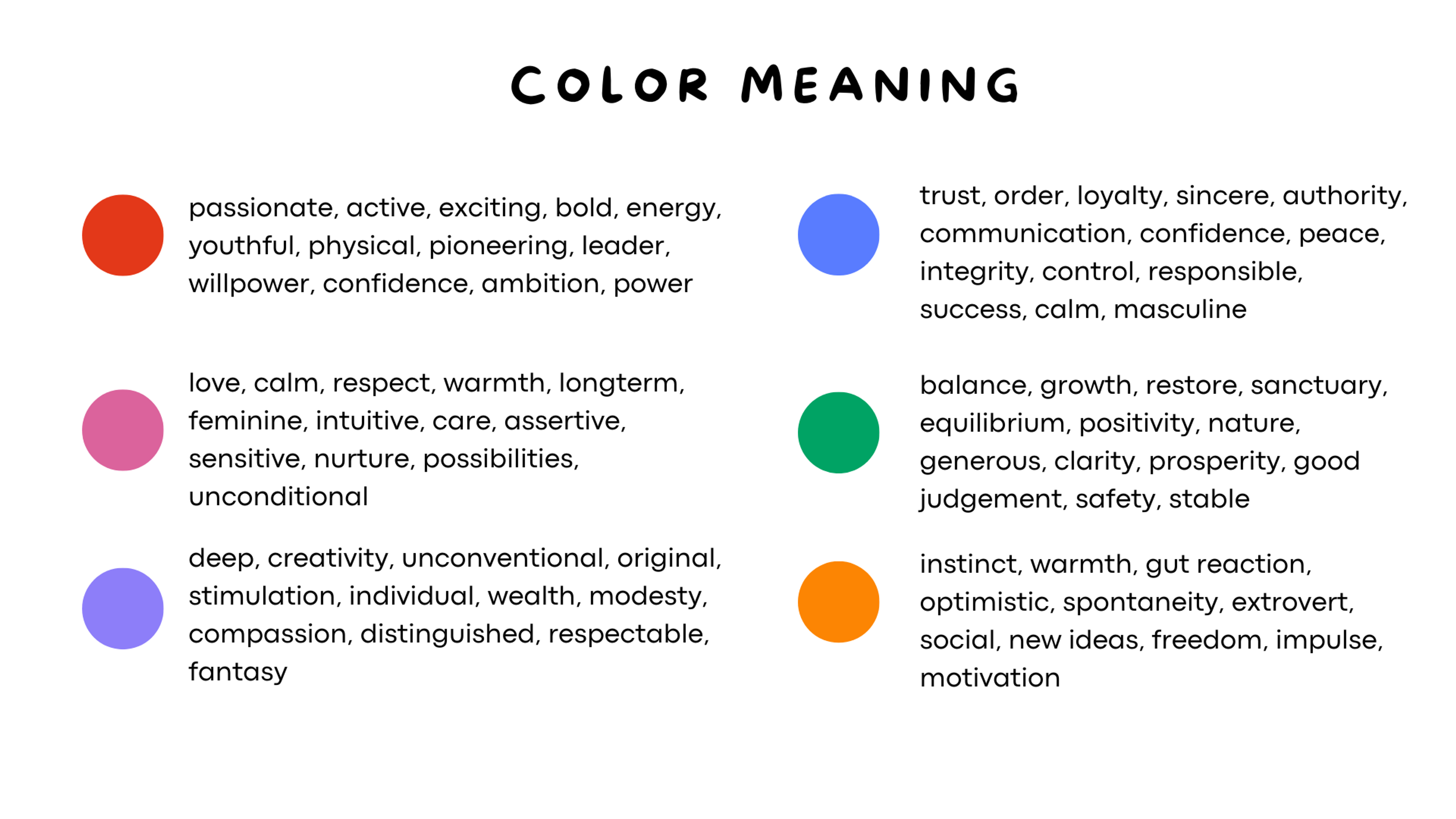
Colors And Their Qualities
How people perceive different colors can be subjective and can be impacted by culture and other factors. That is why you need to understand who your customers are, where they are from, etc.
Understanding the color spectrum is vital for selecting colors that resonate with your brand’s identity, appeal to your target audience, and enhance brand recognition. A bright color palette can evoke feelings of vitality, creativity, and youthfulness, making it an excellent choice for brands targeting a younger audience.
Before choosing the colors you want to use for your branding, you should test them to ensure they are the best choice for your brand identity traits target audience.
- Blue – honesty, competence, trustworthiness, and reliability.
- Red – Attractive, exciting, angry, and loving.
- Green – Money, health, balance, and knowledge.
- Purple – Royalty, respect, creativity, and mystery.
- White – Purity, space, neutrality, and innocence.
- Black – seriousness, sophistication, and intelligence.
- Yellow – Happiness, youth, and adventure.
You need to research and choose your brand and target customers to ensure you make a good decision when choosing the branding colors. You can hire a branding design firm to help you make the correct choices if you need to know which ones to make.
Photo by Mika Baumeister on Unsplash
How to Choose Brand Colors
Choosing brand colors starts with clarity on what your brand stands for and the message you want people to take away. Define your brand identity and personality traits first, then pick a primary color that supports the emotions you want to evoke.
Color choices should be evaluated through the lens of your audience and desired perception, not personal preference. Shared color terminology also helps teams make faster, clearer decisions.
Combinations matter: adding secondary and complementary colors can change meaning and increase complexity, so build a palette that stays consistent across all touchpoints.
Photo by Chris Barbalis on Unsplash

Key factors to consider:
- Target audience: different groups respond differently to colors and shades.
- Budget/medium: printing and production constraints can limit the number of colors realistically achievable.
- Consistency: added colors should support (not compete with) the primary color.
How many colors you use depends on your goals: some brands keep it to one or two core colors, while others use broader palettes to differentiate products. Either way, the palette should be intentional and consistent.
Picking The Colors For Your Brand Identity
There are many valid ways to choose brand colors, since emotional responses to color can be subjective. Tools like color palette generators can help you build a cohesive scheme and maintain consistent branding across channels.
- Keep the palette simple: most brands use up to four primary/secondary colors.
- Start with a base (primary) color that reflects the core brand traits and the message you want people to remember. It will appear everywhere, so it must work across assets and resonate with your target audience.
- Choose an accent color that complements the base color and has a clear purpose tied to your identity, not just “because it looks good.”
- Add neutral colors for backgrounds and layout (often white or gray). If you use darker neutrals (navy/black), make sure they don’t distort how other colors read together.
Finally, test the palette in real use, gather feedback from your target customers, and adjust if it doesn’t land as intended.
An illustrative example of thoughtful color palette integration is our work on Meta’s Terragraph project. We ensured visual consistency across all platforms by developing a custom color palette harmonizing with Meta’s branding, reinforcing brand recognition and trust.
Meta Terragraph Design by Clay
Real-World Brand Examples: Thoughtful Color in Action
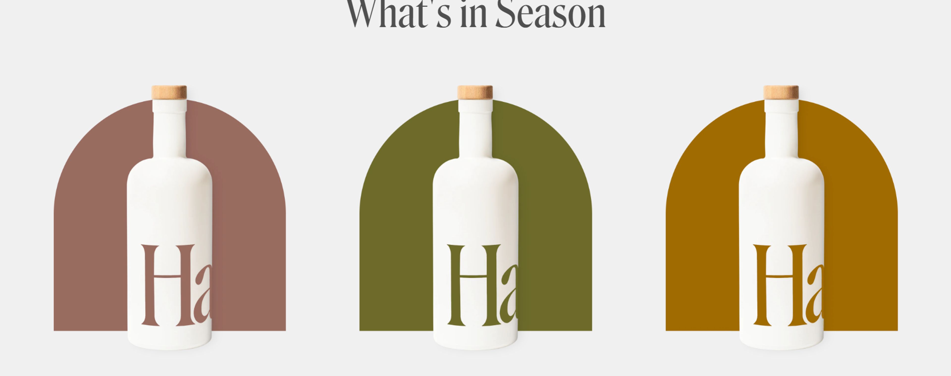
Haus
Haus, a modern aperitif brand, combines warm amber hues with sage green and beige packaging. This palette reflects its all-natural ingredients and artisanal approach while appealing to a design-conscious, health-aware audience.
The colors are subtle yet evocative, setting Haus apart from the traditional deep reds and blacks of the liquor industry. These color choices also reflect Haus's brand's personality traits, emphasizing its commitment to natural, high-quality ingredients and a sophisticated, modern lifestyle.
Color takeaway: Color combinations rooted in nature help communicate craftsmanship and health-consciousness.
Source: drink.haus
Monzo
Monzo, a UK-based digital bank, uses a vivid coral pink for its debit card — a striking and unconventional choice in the traditionally conservative finance space.
While its core digital palette includes blues and dark greys for trust and professionalism, the coral card becomes a powerful visual signature, signaling innovation and youthfulness.
This choice has notably helped increase brand recognition, making Monzo stand out in a competitive market by creating more memorable experiences for consumers.
This choice is a result of strategic brand marketing, where the brand marketing team leverages data and insights to create a color palette that aligns with Monzo’s core values and goals, ensuring the colors resonate with the target audience’s perceptions and emotions.
Color takeaway: A bold accent color can break industry norms and make a lasting impression.
Source: Monzo

FAQ
Which Color Is Best For Branding?
The best branding color depends on your message: blue signals trust, red creates energy, green conveys growth, and black shows luxury.
How To Pick Colors For Branding?
Choose colors that match your brand’s personality, test them for readability, and apply consistent rules across all platforms.
What Is The 60 30 10 Rule With 4 Colors?
It’s a design balance rule: 60% dominant color, 30% secondary, 10% accent, with a fourth used only as a subtle highlight.
What Is The Brand Color Rule?
Limit your palette to 3–5 core colors, define exact codes (HEX, RGB, CMYK), and keep them consistent in all design assets.
How Many Colors Are Too Many For A Brand?
Using more than 5 colors often weakens recognition. Fewer colors keep your brand simple, strong, and memorable.
Read More:
Conclusion
Make sure to use the right colors because they define how good the user experience will be and how strong the brand's image will be. Ensure your brand image is enhanced by blending with your strengths around colors.
Consistency is the trick, as are regular checks for changes in business direction, user negative comments, and industry-first-aided design trends. Under the right conditions, color can positively impact people and their environments, making everything seem better.

About Clay
Clay is a UI/UX design & branding agency in San Francisco. We team up with startups and leading brands to create transformative digital experience. Clients: Facebook, Slack, Google, Amazon, Credit Karma, Zenefits, etc.
Learn moreAbout Clay
Clay is a UI/UX design & branding agency in San Francisco. We team up with startups and leading brands to create transformative digital experience. Clients: Facebook, Slack, Google, Amazon, Credit Karma, Zenefits, etc.
Learn more