

Your brand is already being judged before anyone reads a word you've written.
Within seconds of landing on your site, opening your app, or seeing your ad, people form an opinion, and 55% of that first impression comes from visuals alone.
That's the weight brand identity carries. It's not a logo exercise or a color palette debate. It's the full architecture of how your company shows up: visually, verbally, and experientially, across every single touchpoint.
It builds trust before a single conversation happens. Doing it poorly creates noise you'll spend years and budgets trying to undo.
In 2026, the stakes are higher than ever. AI-mediated search means your brand is being summarized and cited by systems that never "feel" your aesthetic. They extract signals, claims, and credibility.
Agentic AI is reshaping how customers discover and choose brands. And audiences are increasingly skeptical: 84% of consumers say authenticity directly impacts their purchase decisions. Generic positioning doesn't just underperform, it actively alienates.
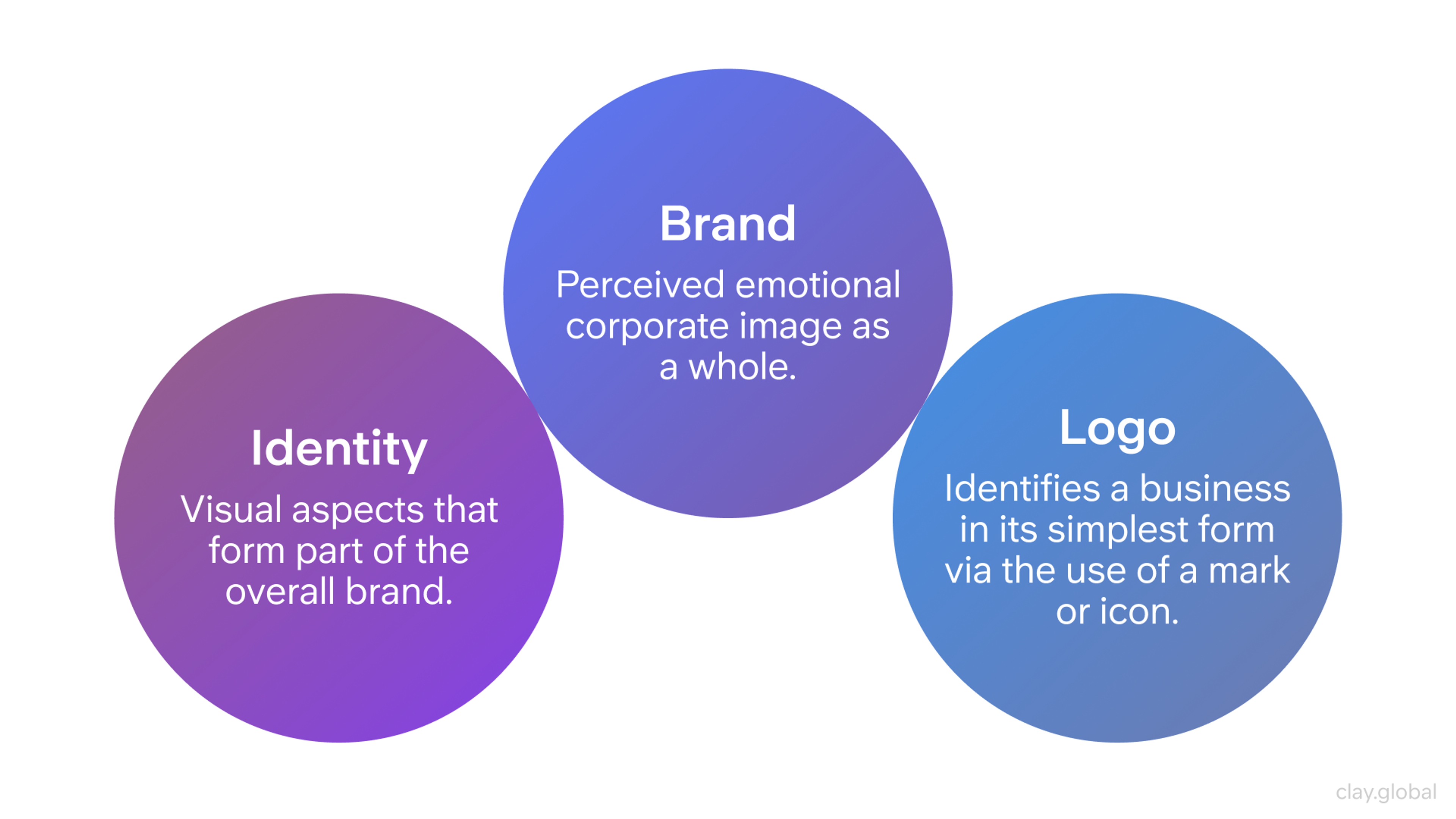
Brand Identity Elements by Clay
Key Takeaways
- Brand identity is not your logo. It's the complete system of visuals, voice, values, and behavior that shapes how people perceive you.
- 68% of companies report that brand consistency adds 10-20% to revenue growth, making consistency a financial strategy, not a design preference.
- Brands with a consistent presentation are 3.5 times more visible than those that aren't.
- The five pillars of brand identity (Purpose, Perception, Persona, Position, and Promoters) work as a system. Weaken one, and the others lose coherence.
- AI is now deeply embedded in brand creation and management, with design timelines shortening by 40-60% in agencies using AI-assisted workflows, though strategy and human judgment remain irreplaceable.
- Brand guidelines aren't bureaucracy. They're the system that prevents your identity from drifting across teams, channels, and years.
What Is Brand Identity?
Brand identity is the deliberate, designed expression of what a company is, expressed through visuals, words, and behavior that others can experience.
That includes your logo, yes. But also your color palette, typography, imagery style, tone of voice, the language on your 404 page, the music on your hold line, and the way your CEO answers questions on LinkedIn.
Every signal, intentional or not, contributes to how people understand and remember you.
Most companies treat brand identity as an aesthetic problem. It's actually a perception management problem. You don't control what people think of you, but you do control every input that shapes their thinking.
Brand identity is the work of managing those inputs with consistency and intention.
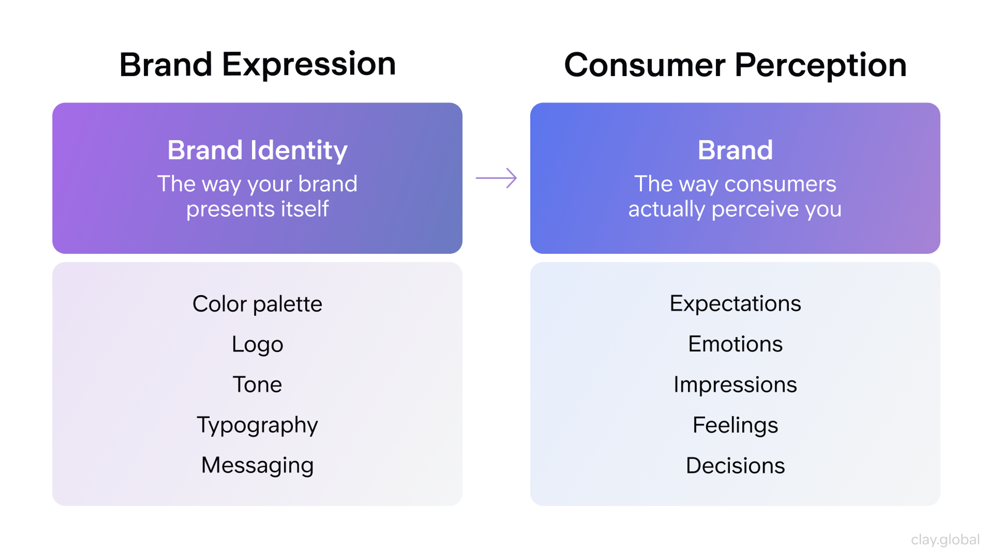
Brand expression vs Consumer perception by Clay
Visual Identity vs. Brand Identity
These two terms are constantly conflated, and confusing them leads to expensive misalignment.
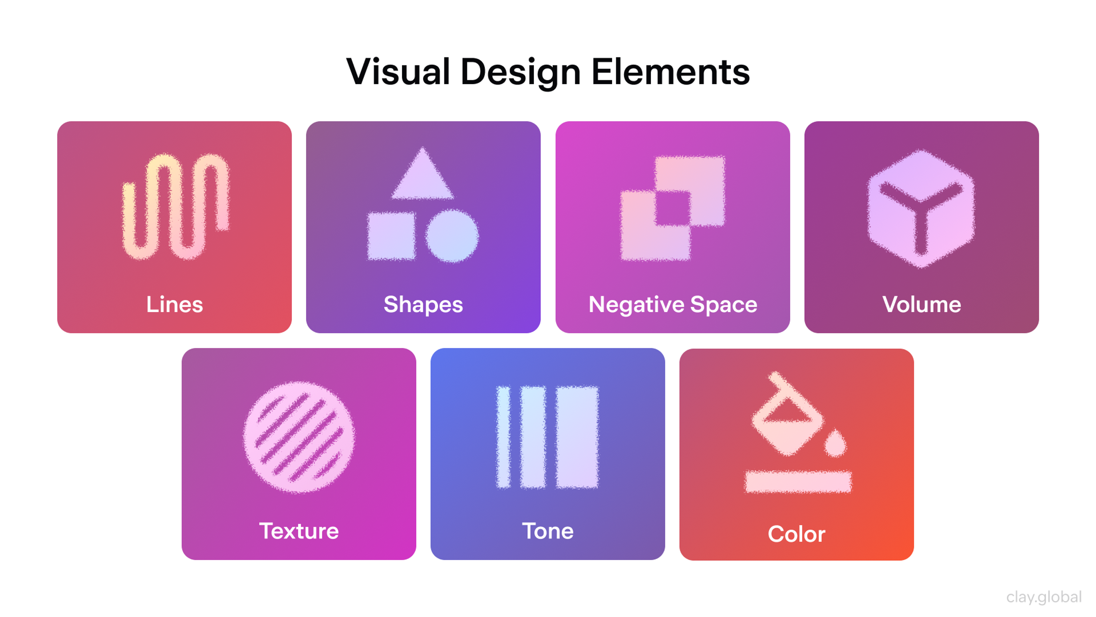
Visual identity is the aesthetic layer:
- your logo
- color system
It creates instant recognition. It's what makes you spot an Apple ad from across a room before you see the logo, or know you're reading a Bloomberg article before the byline loads. Strong visual identity works fast and works quietly.
Visual Design Elements by Clay
Brand identity is the full system that visual identity lives inside. It includes:
- your mission
- the way you communicate
- the promises you make
- whether your product experience actually delivers on them
Visual identity gets you noticed. Brand identity determines whether you're trusted, recommended, and returned to.
Think of visual identity as your brand's face. Brand identity is its character. A beautiful face with no character gets forgotten. Character without a face goes unrecognized. You need both.
Brand Identity vs. Brand Image
Here's a distinction worth internalizing: brand identity is what you intend, and brand image is what people actually receive.
A company might position itself as innovative, modern, and customer-first. But if its onboarding experience is clunky, its support team is hard to reach, and its pricing page raises more questions than it answers, the brand image won't match the brand identity, no matter how much was spent on the logo.
The gap between intended identity and perceived image is where trust breaks down. Closing that gap through consistent experience, honest messaging, and reliable delivery is what turns brand investment into brand equity.
The 5 Pillars of Brand Identity
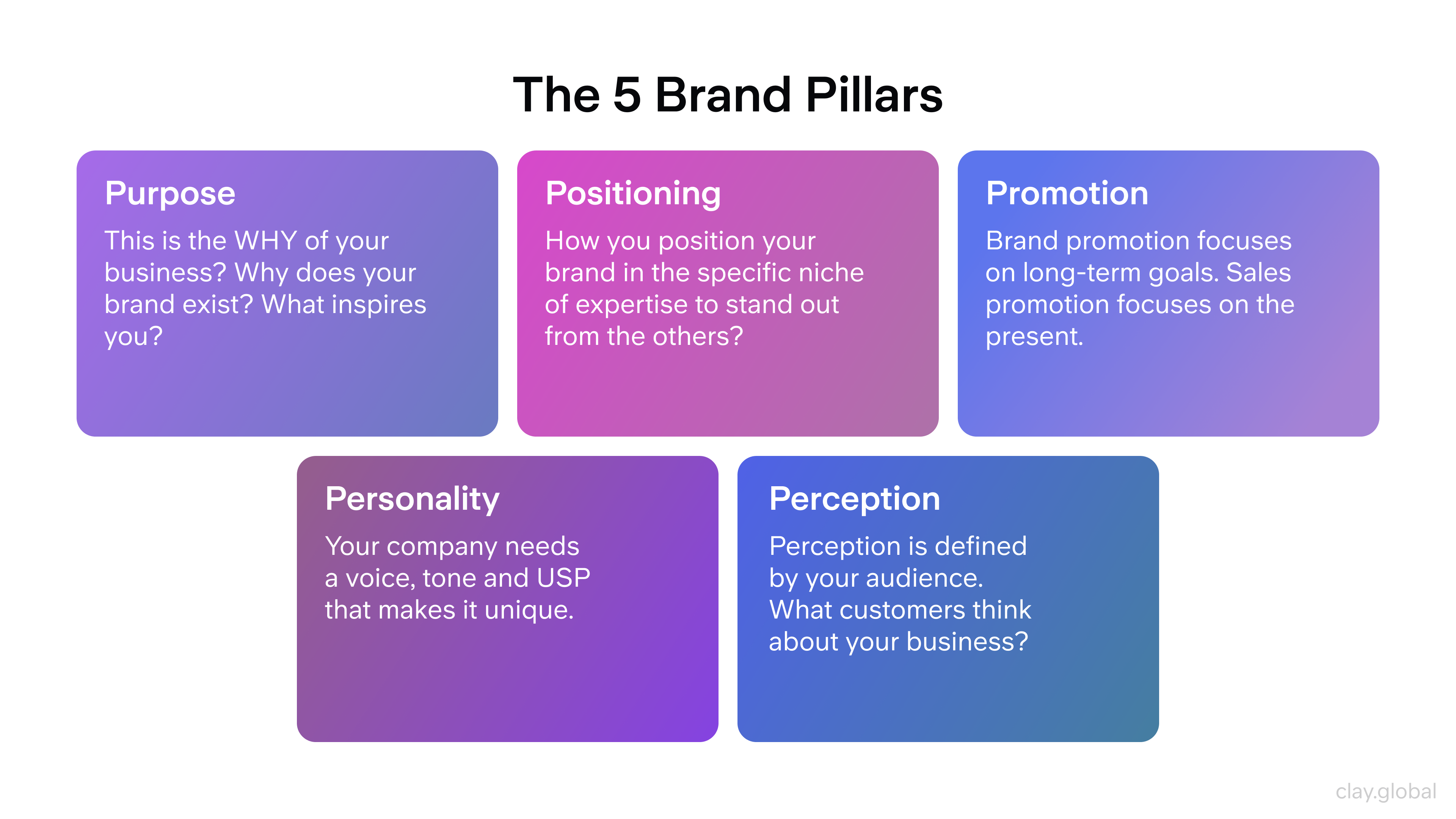
Every durable brand is held up by five foundational pillars. They work as a system: neglect one, and the others are harder to maintain. Nail all five, and you have something that outlasts campaigns, trend cycles, and leadership changes.
The 5 Brand Pillars by Clay
1. Purpose. The Reason Beyond Revenue
Purpose is the answer to the question: why does this company exist beyond making money?
It's not a slogan. It's not a mission statement filed in a Google Doc and never opened again.
Purpose is the underlying conviction that shapes decisions: from what products you build to how you treat employees to which clients you walk away from. It should be specific enough to mean something and broad enough to guide everything.
👉 Patagonia's purpose isn't "sell outdoor gear." It's the active protection of the natural environment, a conviction that has shaped product design, corporate structure, and marketing for decades.
That's a purpose with gravity. It attracts customers who share it, repels those who don't, and gives the team something to orient around when decisions get hard.
Your purpose doesn't need to be world-saving. It needs to be true.
2. Perception. How People Talk About You When You're Not in the Room
You can design a perfect brand identity, brief every employee, and publish a tight brand book. None of it matters if the actual customer experience tells a different story.
Perception is built through accumulation: every touchpoint, every review, every interaction with support, every second of load time on your website.
The brand that customers encounter in practice is the brand they remember and repeat. That's the brand that generates (or kills) word of mouth.
According to the 2025 Edelman Trust Barometer, companies that align their brand promise with their delivered experience achieve up to 3.5x revenue growth compared to those that don't. The gap between promise and delivery is expensive.
3. Persona. Your Brand's Character
If your brand were a person at a dinner party, how would it talk? What would it find funny? What would it push back on?
These aren't abstract questions. They have direct implications for every piece of copy, every social post, and every customer interaction your team produces.
User Persona Example by Clay

👉 Brand persona gives your identity a voice and a manner:
1.
Nike is the relentless coach who refuses to let you make excuses.2.
Mailchimp is the approachable friend who happens to know a lot about email marketing and makes the whole thing feel less intimidating.3.
Duolingo is the unhinged owl who will guilt you into practicing Spanish.
Each of these personas creates a distinct, recognizable emotional register.
The key is specificity. "Professional but approachable" describes approximately every brand that has ever existed. A real persona has edges: things it wouldn't say, topics it leans into, a specific way of landing a point.
4. Position. The Stake You Drive in the Ground
Positioning answers the question: compared to everything else in the market, what unique ground does this brand occupy?
It's not about being better in general. It's about being distinctly better for a specific audience in a specific way.
👉 Tesla doesn't compete with Toyota on reliability. They compete on aspiration, technology, and the feeling of being early to the future of transportation. That positioning is precise enough to attract devotees and explicit enough to filter out misaligned buyers.
Weak positioning tries to appeal to everyone. Strong positioning accepts that not everyone is the audience, and that specificity is what makes a brand memorable.
5. Promoters. The People Who Sell You When You're Not Around
The healthiest sign of a strong brand isn't the size of your ad budget. It's the number of customers who recommend you without being asked.
Promoters are genuine advocates who believe in what you do. They're the compounding return on every investment in trust, experience, and identity.
They write reviews, share content, bring colleagues into the fold, and defend your reputation when things go wrong. They're worth more than any campaign because they're credible in a way that paid media can't replicate.
Writing Style and Formatting by Clay
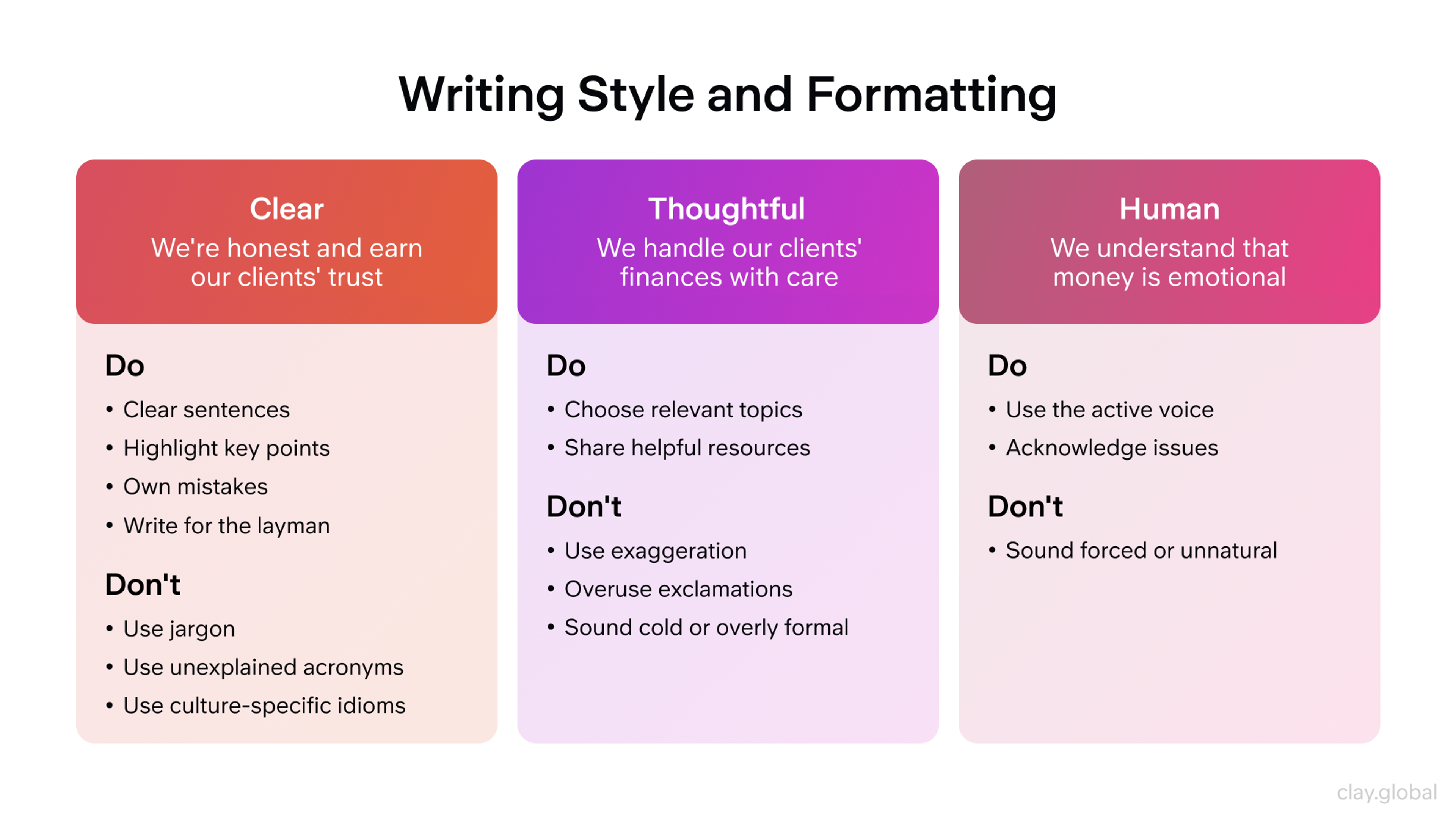
A 2025 Deloitte report found that companies leading in brand-led personalization are three times more likely to exceed their revenue targets. The brands generating the most promoters aren't the ones with the biggest budgets. They're the ones who consistently deliver experiences that feel personal and worth talking about.
Why Brand Identity Is a Business Asset
There's a persistent tendency to treat branding as a cost: a budget line that gets cut when things get tight. The data makes a different argument.
68% of companies report that consistent branding contributed 10–20% to their revenue growth. Brands with consistent presentation across channels are 3.5 times more visible than inconsistent ones.
A longitudinal Harvard Business Review study tracking 900 Fortune 1000 companies found that brands maintaining consistent identity frameworks for seven or more consecutive years posted profit margins averaging 18.6%, more than twice the 8.9% average of brands that underwent three or more major rebrands in the same period.
Consistency, in other words, compounds. Every repetition of a coherent visual and verbal identity deposits something into a recognition account that pays out over years, not quarters.
Beyond recognition, strong brand identity reduces friction across the entire business. Customers who already trust a brand require fewer touchpoints to convert and return more often. 65% of a company's revenue comes from returning customers, and repeat purchase behavior is built on trust, which is built on consistent brand experience.
Acquisition costs drop. Customer lifetime value rises. The economics of a trusted brand compound in the same direction as the recognition does.
The Benefits of a Strong Brand Identity by Clay
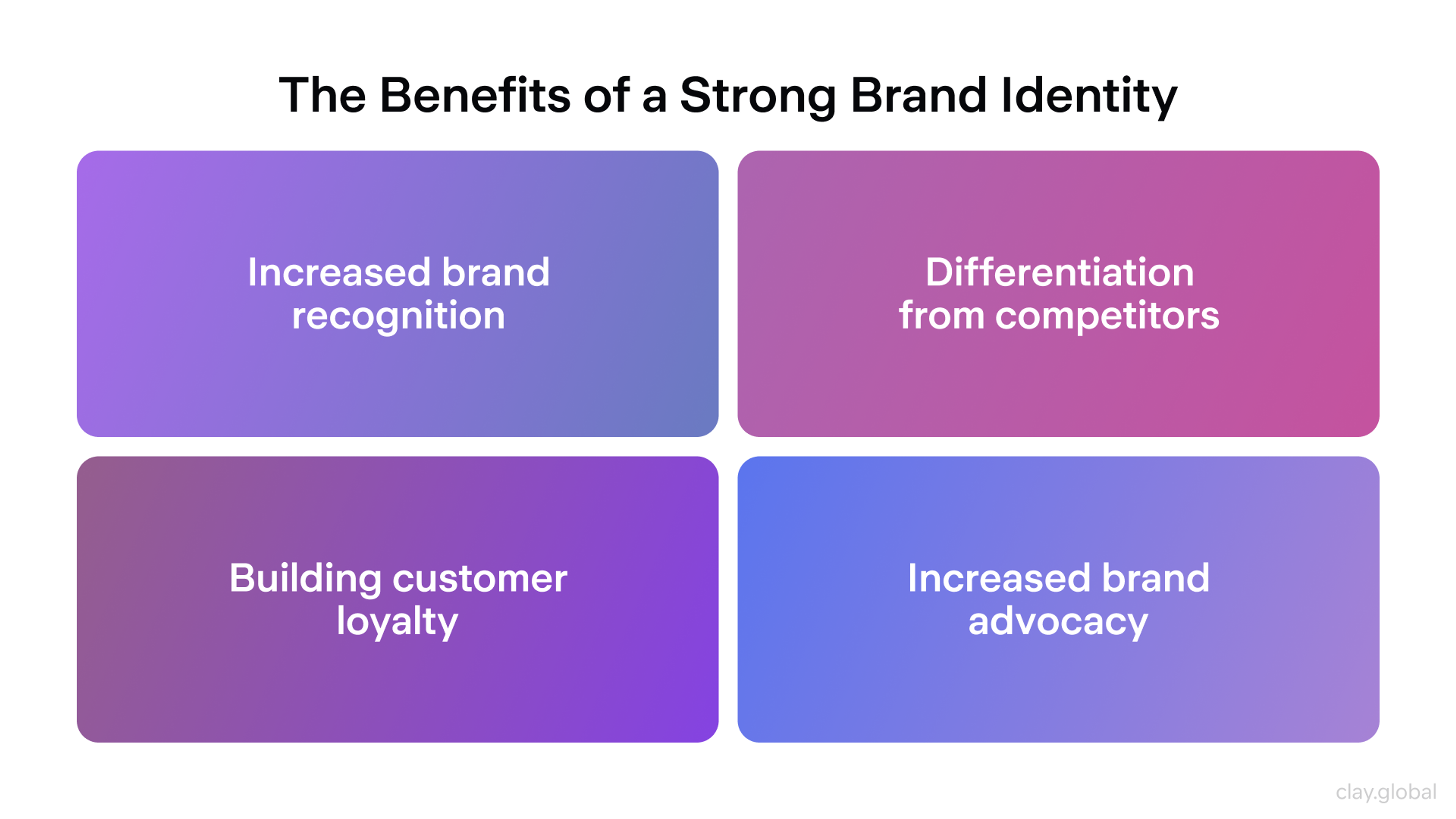
There's also a competitive argument. Most markets are crowded. Most competitors offer comparable products at comparable prices. In those conditions, brand identity is often the deciding factor, not because customers consciously weigh it, but because trust and familiarity shape decisions before rational analysis kicks in.
81% of consumers say they must trust a brand before making a purchase. Trust isn't transferred in a single ad. It's built through consistent experience over time.
Getting the brand right from the start carries meaningful financial advantages, too. A brand identity that misses its audience requires a rebrand, and rebrands are expensive, disruptive, and often damage the recognition equity that was slowly building.
Investing in rigorous research and strategy upfront is cheaper than correcting course after launch.
The Visual Elements of a Strong Brand Identity
Visual identity is the part of your brand that works before words do. Before someone reads your headline, they've already registered your color palette, felt the weight of your typography, and formed an impression of your design language. That impression takes less than a second and persists long after the conscious mind has moved on.
Here's what a strong visual identity system is actually made of.
Logo
A logo's job isn't to be beautiful. It's to be recognizable, scalable, and appropriate for the context it operates in. It needs to work at 16px as a favicon, at six feet on a trade show banner, in full color, and in black and white. The most effective logos are simple enough to be absorbed instantly and distinctive enough to be remembered after a single exposure.
Simplicity isn't a cop-out. It's a discipline. Every element you add to a logo is another thing the viewer has to process, remember, and reproduce in their mind. The brands with the most recognized logos in the world have almost universally reduced, simplified, and refined their way to icon status.
👉 For example, the Target bullseye used two colors and a circle, while the Nike swoosh used a single curved line.
Color
Color is the most emotionally immediate element of a brand's visual identity. It bypasses language and speaks directly to feeling, which is why using a signature color increases brand recognition by up to 80%.
A strong color palette does two things simultaneously: it creates immediate recognition, and it signals something true about the brand's personality.
Color Wheel Illustration by Clay
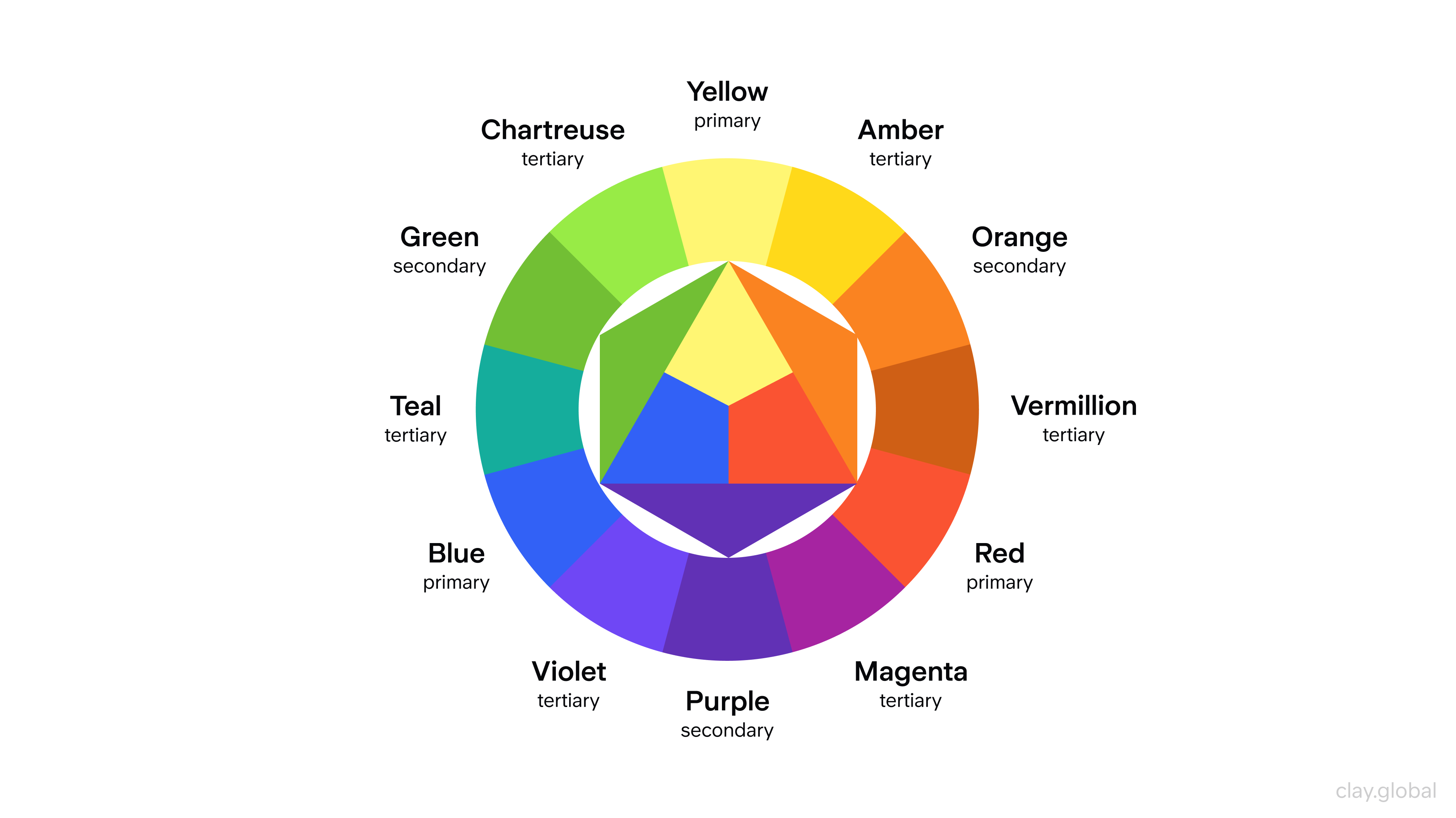
👉 Tiffany blue signals luxury and feminine refinement before you've read a word. John Deere's green and yellow signals utility and agricultural heritage. These colors work because they've been applied consistently over decades and were chosen deliberately with a specific emotional intent.
A complete color palette includes a primary brand color, secondary colors for variety and hierarchy, and specific guidance on use across digital and print contexts.
Typography
Typography is your brand's voice made visible. The difference between a geometric sans-serif and a high-contrast serif isn't just aesthetic. It signals something about the brand's personality, its intended audience, and its relationship with tradition or modernity.
Typography Anatomy by Clay
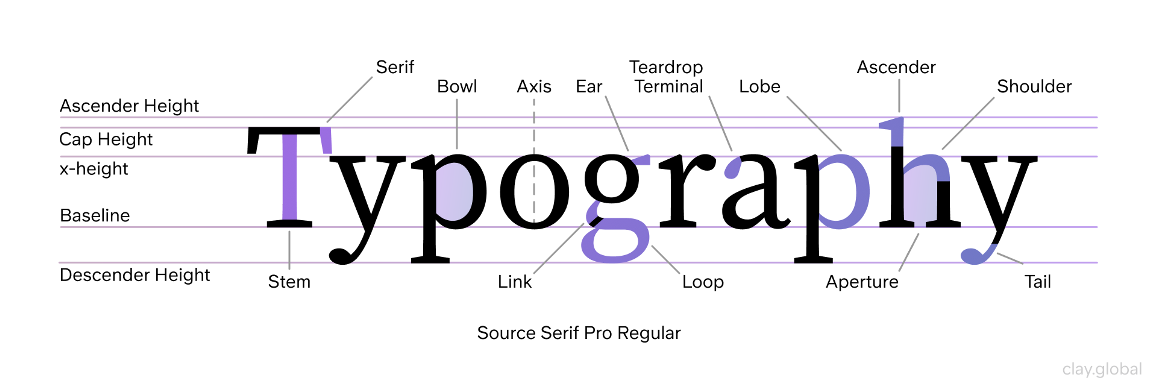
Choose typefaces that feel authentic to your brand's character, and use them consistently. A mismatch between typography in your marketing materials and your product interface is a small but cumulative signal of disorganization that erodes trust at the edges.
Imagery and Illustration
The photographic and illustrative style you use is often the most immediately expressive part of your visual identity, and the most frequently ignored in brand guidelines.
Whether you shoot in natural light with real people or use highly produced, conceptual imagery tells customers something different about who you are and who you're for.
Define your image direction explicitly:
- subject matter
- lighting style
- color treatment
- aspect ratio
- the presence or absence of people
- emotional register
Without this definition, your visual identity fragments the moment different team members or agencies start producing content independently.
Layout
How you arrange elements on a page shapes perception before content does. A layout that feels cluttered signals chaos, but one that feels considered signals confidence.
Different Types of Layout Structures by Clay

Whether your brand leans editorial, minimal, or expressive, the layout style should be defined and applied consistently across every format in which your brand appears.
Grid
A grid is the underlying structure that gives your layouts coherence. It determines spacing, alignment, column widths, and how elements relate to each other. Brands that maintain a consistent grid system feel organized and deliberate, even when the content is complex.
Grid Structures by Clay
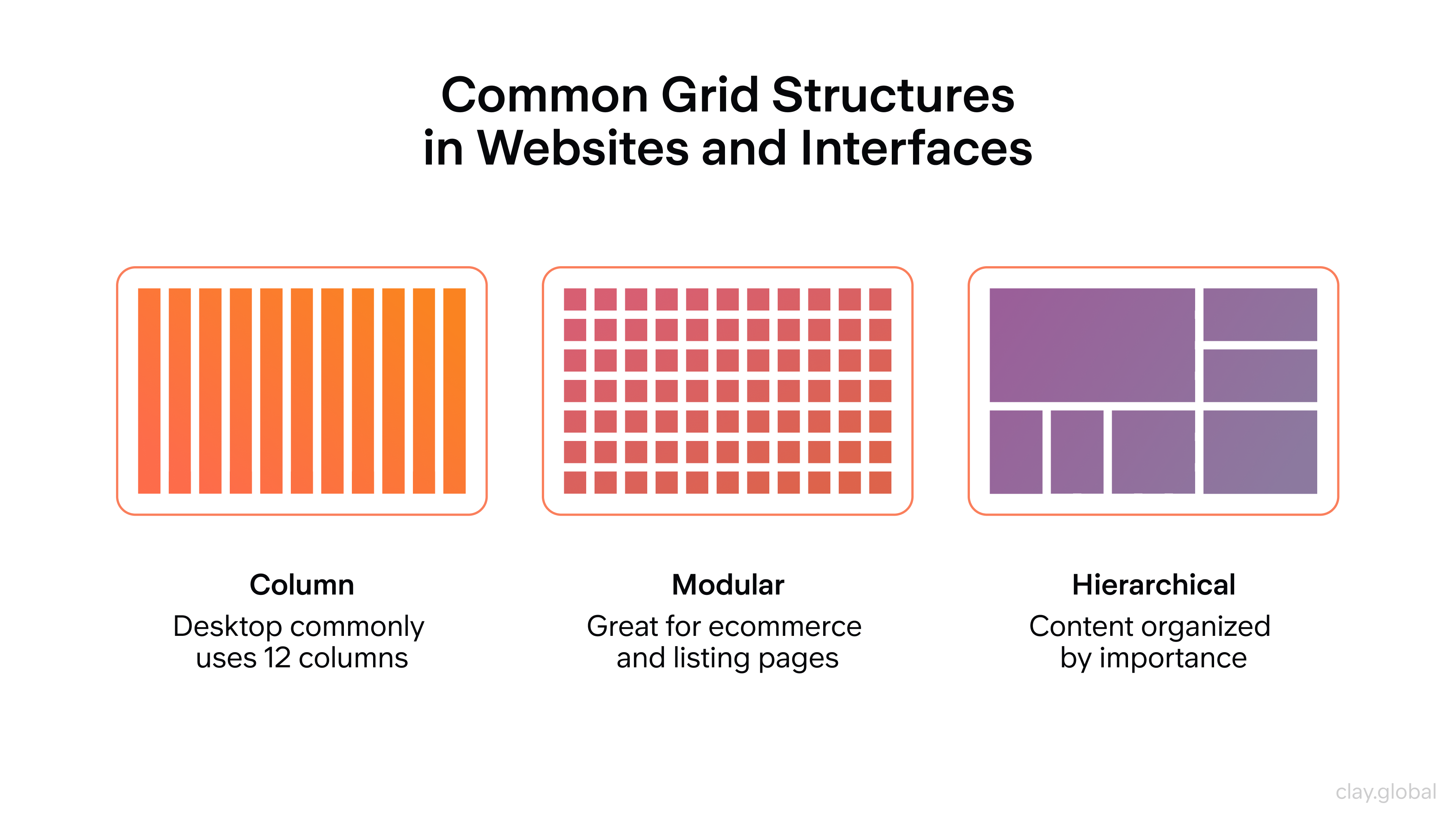
Without one, designs produced by different people or teams drift apart quickly, and the brand starts to feel inconsistent at a structural level most audiences can't name, but everyone can feel.
White Space
White space is not empty space. It's breathing room, and it's one of the clearest signals of brand confidence. Brands that feel premium almost always use more of it: wider margins, more distance between elements, less competing for attention at once.
White Space Illustration by Clay
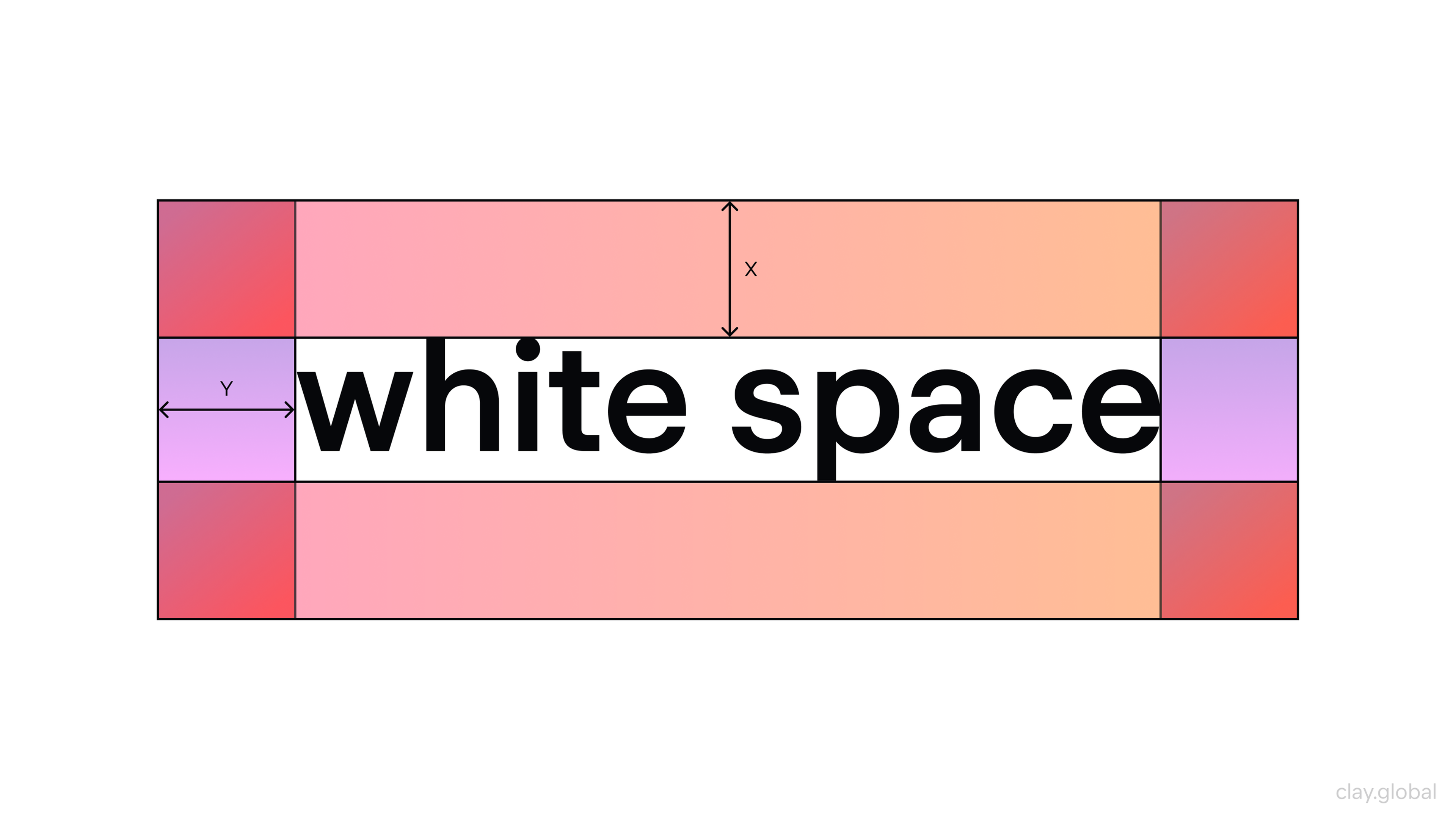
Brands that feel energetic or accessible often use denser compositions. Neither is wrong. What matters is that the choice is intentional, defined in your guidelines, and applied consistently.
How to Build a Brand Identity in 7 Steps
Step 1: Start With Why, Not What
Before you open a design brief, write a clear articulation of why your company exists beyond its product or service. This is the foundation everything else is built on, and skipping it creates a brand identity that looks fine but feels hollow.
Your purpose statement should be specific enough to exclude things. If it could describe any company in your category, it's too generic.
If it describes only you, your specific conviction, your particular way of seeing the problem you solve, you have something worth designing around.
Step 2: Know Your Audience Better Than They Know Themselves
Brand identity isn't about what you want to say. It's about what your audience needs to hear, see, and feel to trust you. That requires research, not guesswork.
Map your target audience across three layers:
- Demographics: who they are, where they live, what they earn, what stage of life they're in.
- Psychographics: what they value, how they think, what they believe about the problem you solve.
- Behavioral patterns: where they spend time, how they make decisions, what triggers their trust, and their skepticism.
The intersection of these three layers reveals not just who to target but how to speak to them and what to promise. Pay particular attention to how they talk about the problem you solve.
The language your audience uses is the language your brand should use, not the language of your internal roadmap.
Step 3: Define Brand Personality Before Brand Aesthetics
Most brand identity projects start with visual exploration and add personality later. This is backward.
Brand Personality Examples by Clay
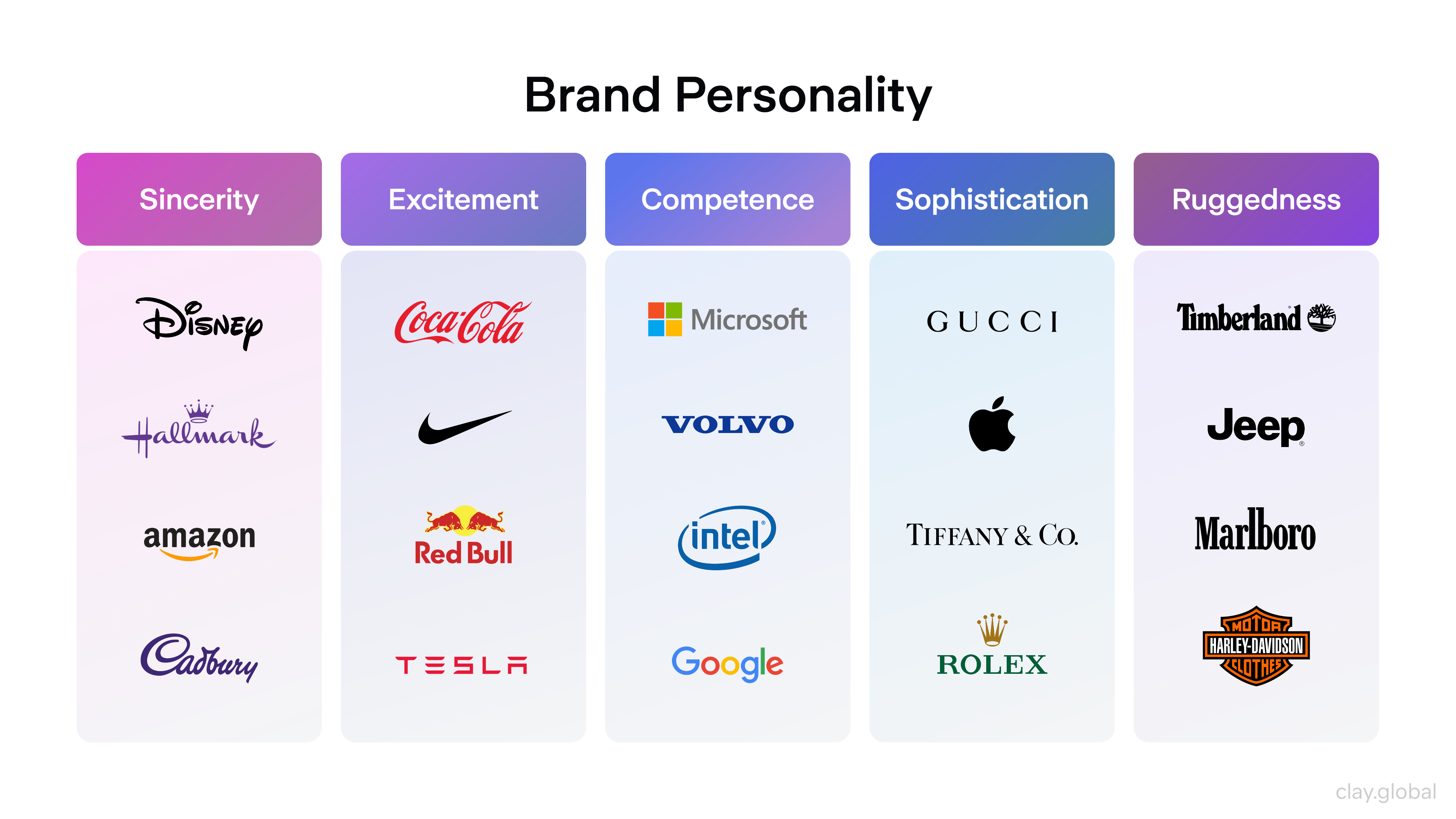
Your brand's personality, its character, its tone, its values, its sense of humor or lack thereof, should be the brief that shapes every visual decision. If you've established that your brand is direct, irreverent, and technically rigorous, that should inform your type choice as much as your copy.
Personality first, aesthetics second.
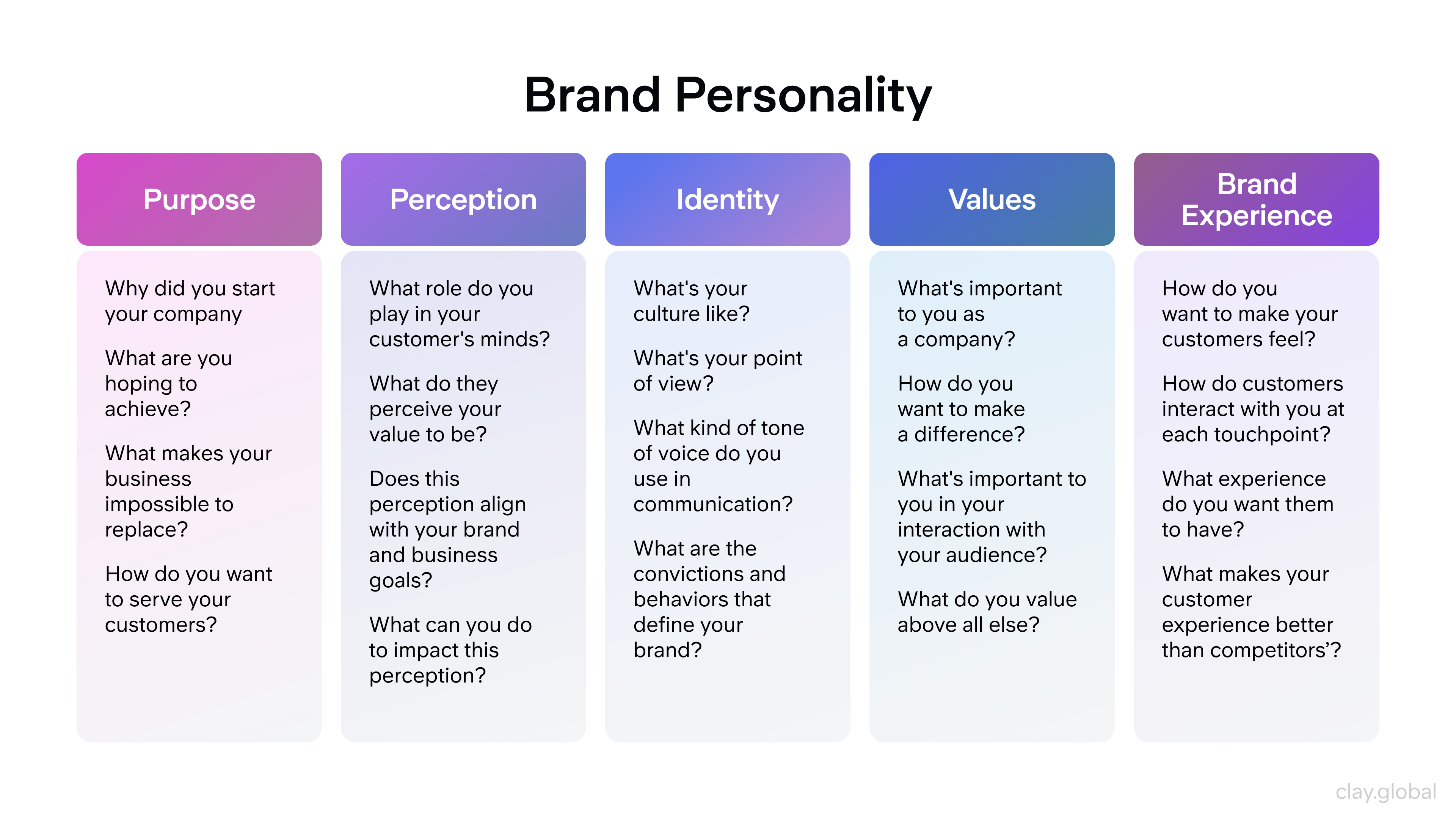
Define your brand persona with specificity: not just the adjectives that describe it ("bold," "approachable"), but the adjectives that explicitly don't describe it ("corporate," "earnest"). The exclusions are often more clarifying than the inclusions.
Brand Personality by Clay
Step 4: Build Your Visual Identity System
With personality and positioning defined, visual identity development has a clear brief to work from. This is where concepts translate into logos, color systems, type hierarchies, and imagery direction.
The goal isn't to create beautiful assets in isolation. It's to build a system: a set of elements that work together across every context your brand will appear in, and that can be applied by different people in different formats without losing coherence. A strong visual identity system includes guidance, not just assets.
Test your visual identity under real conditions before finalizing it:
How does the logo hold up on a mobile screen?
Does the color palette work in both dark and light environments?
Does the typography remain legible at small sizes?
A system that only works in ideal conditions isn't a system.
Step 5: Establish Your Brand Voice
Your brand voice is how your personality expresses itself in language. It governs not just what you say but how you say it: the vocabulary you use, the sentence structures you prefer, the level of formality you maintain, the specific things you'd never say.
A complete brand voice document includes tone (the emotional register of your communication), vocabulary guidance (words you use, words you avoid), and specific examples across contexts: a social post, a customer support reply, an error message, a rejection email.
Top 10 Brand Tone of Voice Examples by Clay
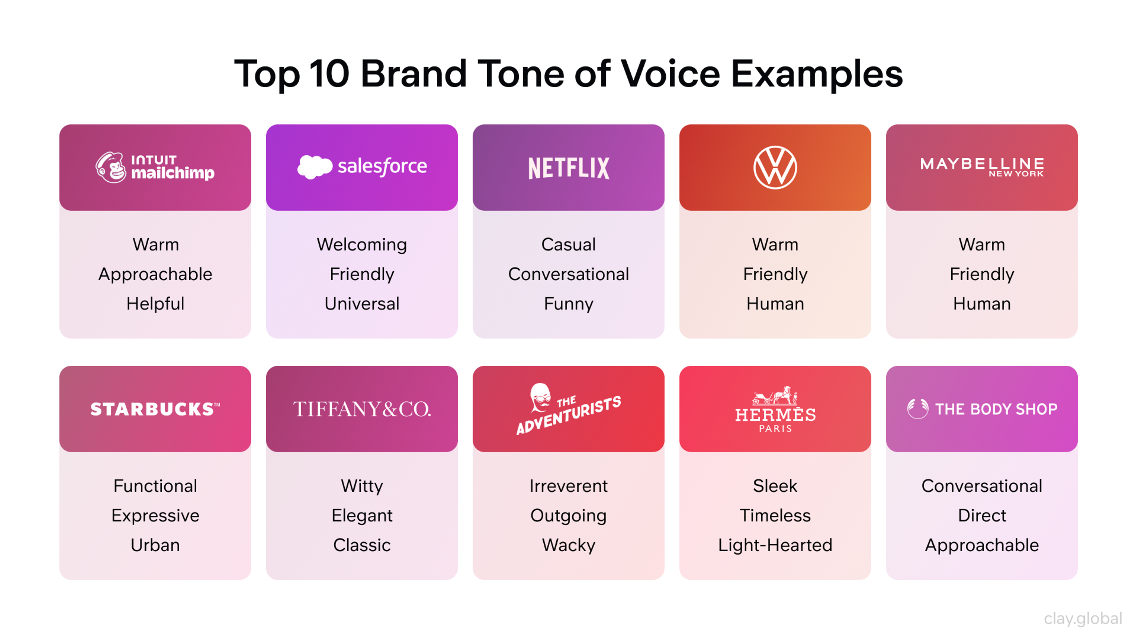
The error message is worth particular attention, because it's where most brands revert to corporate formality and break the personality they've built everywhere else.
Brand voice consistency is especially critical in 2026, as AI tools increasingly generate content at scale. Training those tools on a well-documented brand voice, rather than leaving them to default to generic registers, is now part of responsible brand management.
Step 6: Document Everything in a Living Brand Guide
A brand system that only exists in the designer's head dies when the designer leaves. Document your identity in a brand guide comprehensive enough that someone joining your team tomorrow could apply it accurately from day one.
Streetbeat Brand Guidelines by Clay
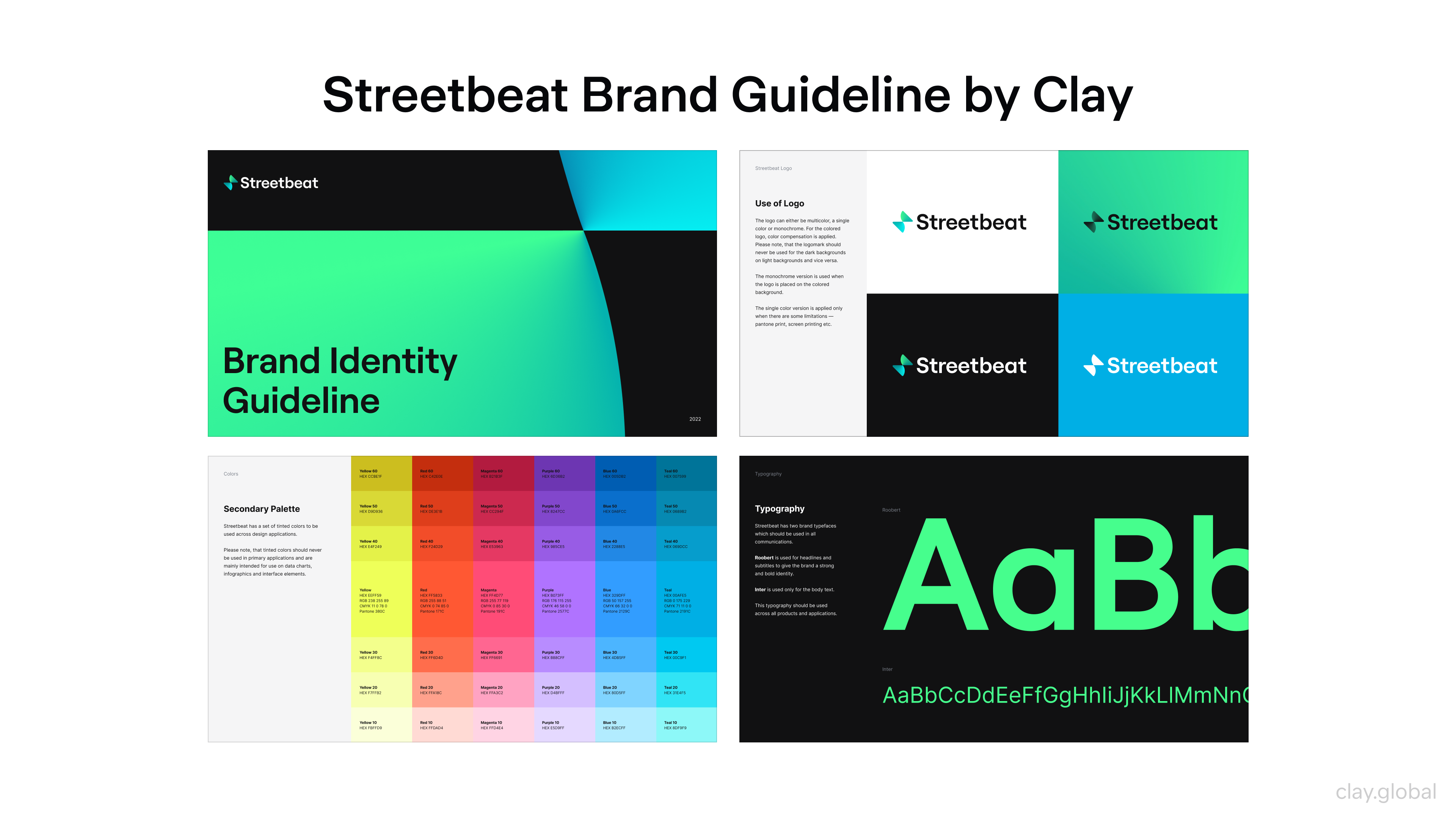
A complete brand guide covers:
- Logo usage rules, including clear examples of what not to do
- The full color palette with hex, RGB, and CMYK values
- Typography hierarchy with size and weight specifications
- Imagery direction with examples and counter-examples
- Tone of voice guidelines with sample copy across contexts
- Specific guidance for key channels: social, email, paid, product UI
The "living" part matters. A brand guide published once and never updated becomes a relic within 18 months. Assign ownership, build in a review cycle, and update it when your product, audience, or market conditions shift.
Step 7: Apply, Measure, and Adapt
A brand identity isn't finished at launch. It's activated. Implementation is where most of the value is created or destroyed, because even the strongest identity becomes noise if it's applied inconsistently.
Roll out brand training across every team that creates customer-facing content: marketing, product, sales, and customer support. Establish feedback loops that surface inconsistencies.
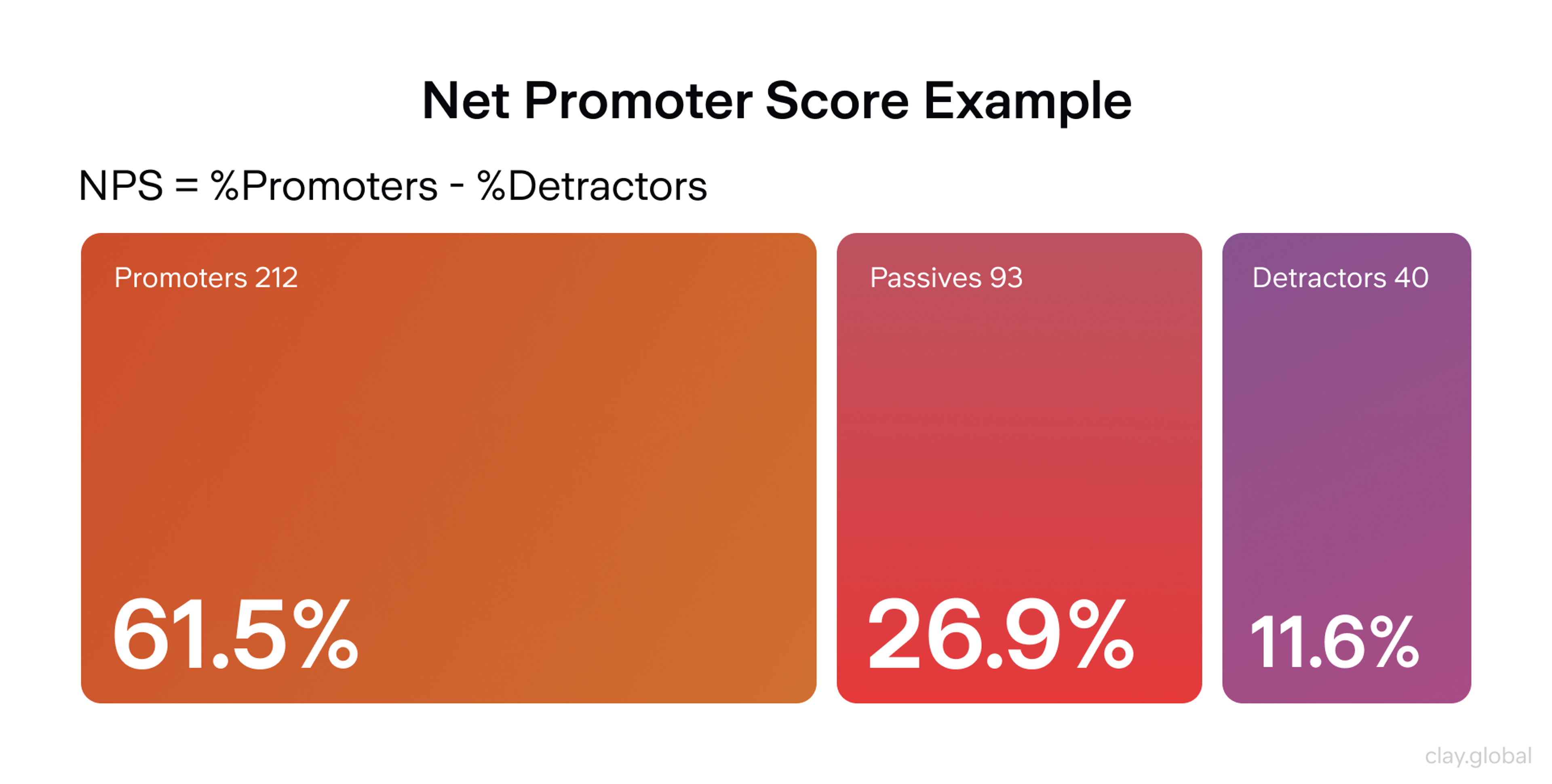
Measure brand performance through recall surveys, NPS tracking, engagement analysis, and sentiment monitoring, then use that data to refine, not just to report.
Net Promoter Score (NPS) by Clay
👉 Adaptation doesn't mean constant reinvention. Brands like Apple, Nike, and Hermès evolve their visual systems in small, deliberate increments while keeping core identity elements stable across decades.
Consistency is the compound interest of brand investment. Protect it.
If you’re looking for inspiration or partners in world-class brand identity work, several agencies have won awards for brand identity design recently:
- Clay – Known for strategic, digital-first brand systems in tech, fintech, and Web3.
- KIND – a Norwegian agency delivering bold, concept-driven identities across industries.
- Dentsu Creative – Integrates branding with cultural relevance and systemic thinking.
- Mower – U.S.-based agency blending strategy with emotional intelligence in identity work.
AI and Brand Identity in 2026
Artificial Intelligence has changed how brand identities are built, maintained, and experienced. The pace of that change accelerated significantly in the past 18 months.
On the creation side, AI-assisted design workflows are now standard at forward-thinking agencies. Design timelines have shortened by 40–60% in studios that have embedded AI tools into their process. Not because AI replaces designers, but because it dramatically accelerates the exploration and iteration phase.
Designers can quickly test dozens of visual directions, see how they perform across applications, and bring more fully realized options into client conversations earlier. The result is a more thorough, more informed process, often with better outcomes than traditional linear workflows.
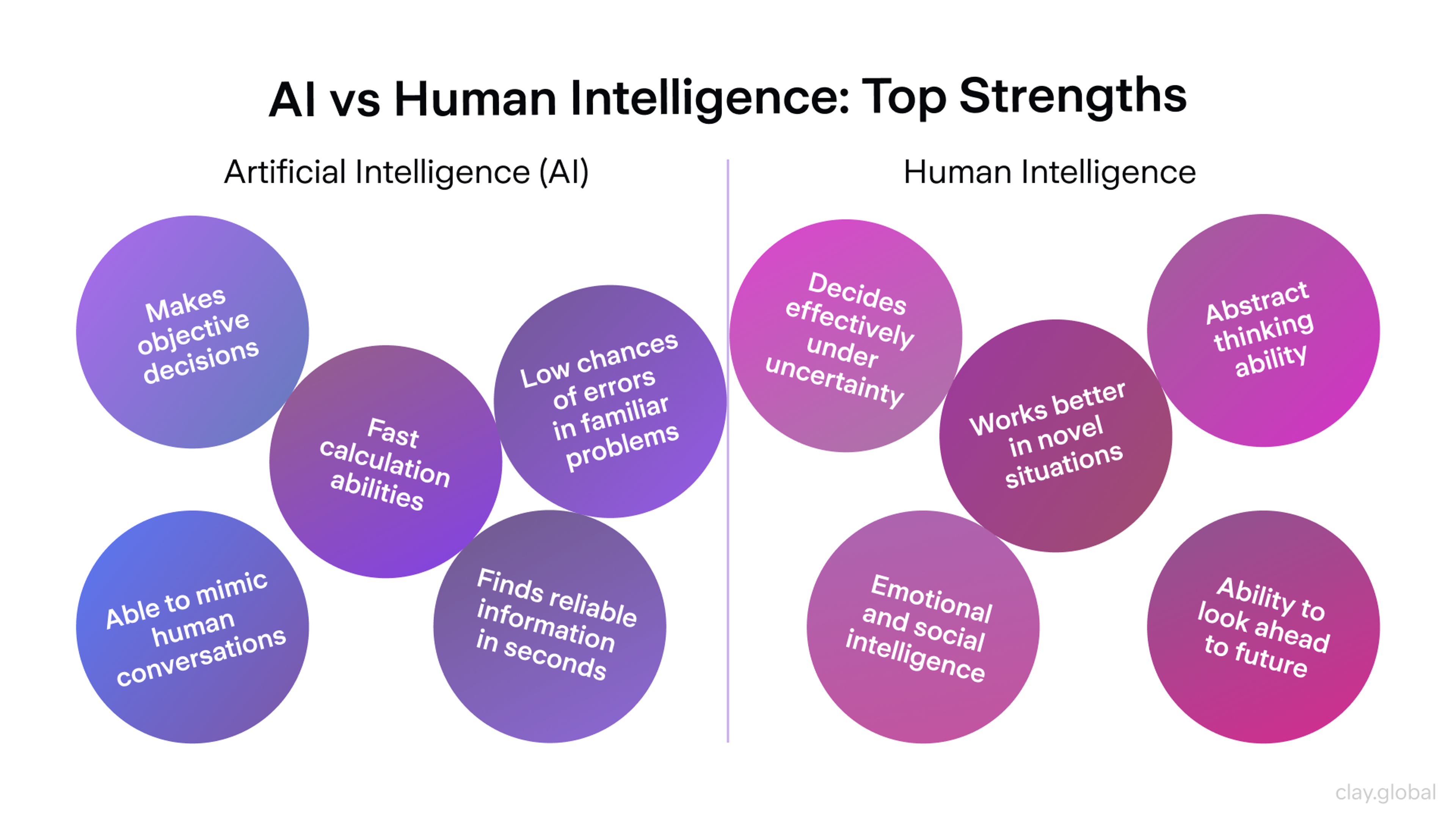
AI vs Human Intelligence by Clay
The generative AI in the creative industries market is projected to grow from $4.06 billion in 2025 to $5.38 billion in 2026, a 32.3% compound annual growth rate. This isn't a niche experiment. It's infrastructure.
Tools now embedded in professional brand workflows include:
- Figma (with AI plugins): The industry standard for collaborative interface and identity design. Since Config 2025, AI plugins have made it significantly faster to generate icons, layout systems, and component libraries within a defined brand system.
- Claude Design: Launched in April 2026, it allows product managers, founders, and marketers to generate complete interactive prototypes without opening Figma or briefing a designer. The expansion of who can produce design work is the more significant shift, not just the speed.
- Midjourney: The benchmark for concept-stage image generation. Most valuable at the moodboarding and creative direction phase, where its aesthetic quality helps teams define visual direction before production begins. The
--srefstyle reference parameter lets teams lock a visual style across multiple generations, making it practical for campaign-level consistency. - Canva AI 2.0: Now integrated directly with Claude and ChatGPT, allowing designs generated in those environments to flow into Canva for editing and distribution. For brand teams that run content production in Canva, this is a meaningful expansion of its role.
- Adobe Firefly: Production-safe generative image creation, commercially licensed. Used by teams that need Midjourney-level creative exploration but require assets that are clear to use in paid media and print.
The key distinction of all of these tools is that they accelerate execution and exploration, but they don't replace strategy. An AI tool that generates logo concepts still needs a human who has defined the purpose, audience, and positioning to evaluate which directions are worth developing.
Brand strategy is still a human job. Brand production is increasingly a human-AI collaboration.
There's a governance dimension too. As AI tools become easier to use, more people across the organization can generate branded content, creating a risk of inconsistency. Nearly 70% of marketers report having integrated AI into their workflows, but only 8% describe their setup as systemic. The rest are running experiments without the guardrails to protect brand coherence at scale.
Clear brand guidelines, locked templates, and simple approval processes aren't bureaucracy in this environment. They're the mechanism by which brand consistency survives AI-accelerated content production.
Brand Identity and AI-Mediated Discovery
There's a second, less-discussed way AI is reshaping brand identity: through how brands are discovered and summarized.
AI-generated answers in Google's AI Overviews, Perplexity, ChatGPT, and other answer engines now stand between many searches and the brands being searched for. These systems don't experience your color palette or feel your typography.
They extract claims, credibility signals, and semantic consistency. They summarize what your brand appears to stand for based on your content, your third-party mentions, and the coherence between your stated positioning and your actual behavior across the web.
Facts & Myths about AI by Clay
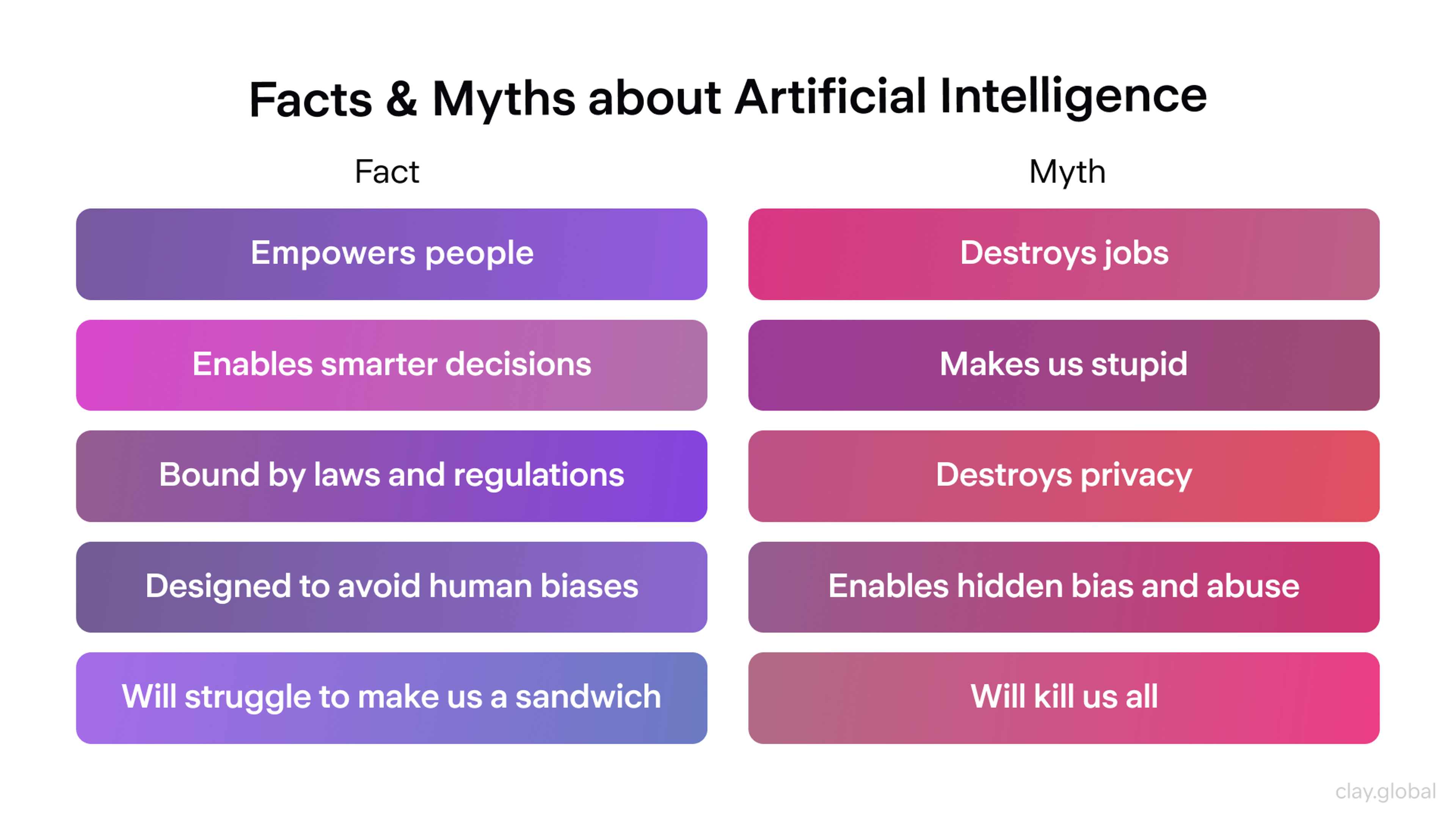
This means your brand identity needs to be legible to AI systems, not just to human visitors. Practically speaking:
- State your positioning explicitly in your content rather than implying it aesthetically.
- Build third-party credibility through expert perspectives, citations, and reviews that corroborate your claims.
- Ensure consistency between what you say on your homepage and what customers say in reviews. Inconsistency between these signals is now a discoverability problem, not just a reputation one.
Building Brand Guidelines That Actually Get Used
Brand guidelines are only valuable if people use them. Most don't. Only 30% of brands have guidelines that are widely accessible and actually applied across their organization. The other 70% have a PDF somewhere that was reviewed at launch and never opened again.
The problem is usually one of accessibility and usability, not intent. A 200-page PDF is a legal document, not a working tool. The teams producing your brand's actual customer touchpoints, including marketing, product, sales, and customer support, need guidelines they can consult quickly and apply immediately.
Build your brand guidelines as a living system, not a static document:
- A centralized, searchable asset library where every team member can find the correct logo file, the current color hex codes, and the approved typography settings in 30 seconds without emailing the design team.
- Use-case specific guidance rather than abstract rules. Don't just say "use primary blue for CTAs." Show what a compliant CTA button looks like, what a non-compliant one looks like, and what to do when you can't use the primary color.
- A clear review process for off-brand content, with named owners and realistic timelines. Brand consistency doesn't maintain itself. It requires someone whose job includes catching drift.
- Regular updates tied to product and market changes. When your product evolves, your brand guide should reflect that. When you enter a new market segment, your imagery and tone guidance may need to expand. Build in a six-month review cycle at a minimum.
Brand asset management tools such as Bynder, Frontify, or Canva's brand kit have made it substantially easier to enforce consistency at scale. The investment in a proper asset management system pays back quickly in reduced design revision cycles and fewer off-brand materials reaching customers.
Our Case Studies
Theory is only useful if it translates into outcomes. Here's how the principles in this guide have been applied in real brand identity work.
Wealth is a fintech brand operating in estate planning, a category historically dominated by heavy, institutional visual language. The identity challenge was building trust while signaling a genuinely different approach.
Wealth Identity by Clay
Vivid greens and yellows (colors uncommon in financial services) were paired with a versatile typography system to create something that felt modern without losing the credibility signals the category demands.
The result is a brand that resonates emotionally with a user base that finds traditional estate planning aesthetics alienating.
Streetbeat is an investment platform where complexity is the core product challenge. The identity needed to communicate sophistication without intimidating new investors. Bold typography, a dynamic rotating logo, and a system of isometric illustrations work together to signal both the depth of the product and its accessibility.
Streetbeat Rebranding by Clay
Crucially, these elements are consistent across all platforms. The brand doesn't feel different in the app than it does in the marketing materials, which is where many fintech brands break down.
PalmPalm is a sanitization brand that needed to occupy lifestyle territory rather than clinical or utilitarian positioning. Drawing visual inspiration from Venice Beach, the brand's geographic and cultural home, the identity uses sun-soaked color, organic shapes, and a logo that references both the place and the product.
PalmPalm Branding by Clay
The consistency of this visual language across packaging, social media, and the website positions PalmPalm in a category of its own rather than competing on the functional tier of the sanitization market.
CafePay is a payroll platform for the restaurant industry. The challenge was building credibility in a niche where trust is paramount, while making the brand feel distinctively warm rather than generically corporate.
CafePay Branding by Clay
A custom serif logotype conveys craft and timelessness, while a bespoke logomark subtly references a clock, a meaningful detail in a product category organized entirely around timing. The cohesion between mark, type, and product purpose is what makes this identity work.
What connects these projects is a shared commitment to starting from positioning, not aesthetics.
In each case, the visual decisions were made in service of a clear brand thesis, and that thesis is what makes the resulting identities coherent rather than merely decorative.
We've built brand identities for fintech companies, crypto platforms, and consumer brands across every stage. If yours is next, let's talk.
Read More
- Branding Case Studies by Clay
FAQ
What is brand identity, and why does it matter for small businesses?
Brand identity is the complete system of visual, verbal, and experiential signals that shape how people perceive a company: its logo, color palette, typography, tone of voice, and the consistency with which those elements appear across every touchpoint.
For small businesses, it matters because it creates recognition and trust without requiring scale. A small brand with a clear, consistent identity outperforms a large brand with a fragmented one on the metrics that matter most: recall, referral, and repeat purchase.
How long does it take to build a brand identity?
A serious brand identity process, including discovery, strategy, visual development, and documentation, typically takes six to twelve weeks for a focused project, and longer for complex or enterprise-scale brands.
The temptation to compress this timeline by skipping the strategy phase is almost always a false economy: visual work built on unclear positioning needs to be rebuilt once the positioning is clarified.
What's the difference between a logo and a brand identity?
A logo is a single element within a broader brand identity system. Brand identity includes the logo, but also encompasses color palette, typography, imagery direction, tone of voice, brand voice guidelines, and the rules for how all of these elements are applied across contexts.
A logo without a supporting system is like a font without a language: it's a raw material, not a communication.
How much does brand identity design cost in 2026?
The range is wide and reflects genuine differences in scope and strategic depth. Templated solutions and AI-assisted platforms can produce basic brand assets for a few hundred dollars, appropriate for early-stage testing or sole traders. Mid-market branding agencies charge $15,000-$80,000 for a full identity system, including strategy.
Specialist agencies working with established companies or complex brand architectures work in the $100,000-$500,000 range. The relevant question isn't what branding costs. It's what an unclear or inconsistent brand costs over time in lost conversions, diluted trust, and eventual rebrand expenses.
How do you measure whether a brand identity is working?
Through a combination of quantitative and qualitative signals. Quantitative metrics include brand recall scores (measured through surveys), NPS, customer lifetime value trends, conversion rates across branded vs. non-branded channels, and the ratio of direct and return traffic to paid.
Qualitative signals include how customers describe your brand unprompted, the accuracy with which they can articulate your positioning, and the consistency of their descriptions across different customer segments. Track these regularly and look for changes that correlate with branding interventions.
What is brand consistency, and why does it matter?
Brand consistency means applying the same visual elements, tone of voice, and positioning across every channel, context, and piece of content your company produces. It matters because recognition is built through repetition.
Inconsistent brands make every touchpoint feel like a first impression, eliminating the cumulative trust that repeat exposure builds. 68% of companies report that consistent branding added 10–20% to their revenue growth, making consistency one of the highest-ROI brand investments available.
When should a company rebrand?
Rebranding is warranted when there's a genuine strategic shift: entering a new market, targeting a fundamentally different audience, correcting a positioning that has become misleading, or recovering from significant reputational damage.
It's not warranted because leadership has grown bored with the visual identity, because competitors have refreshed their look, or because the brand feels "old" without evidence that customers agree.
What is a brand style guide, and do you need one?
A brand style guide is the document (or living digital system) that defines the rules for applying your brand identity. It specifies logo usage, color values, typography hierarchy, imagery direction, and tone of voice guidelines.
Yes, you need one, but its value depends almost entirely on whether it's actually used. A brand guide that only the design team has access to provides minimal protection against brand drift. Build for accessibility and usability, not comprehensiveness.
How does brand identity affect SEO and discoverability in 2026?
More directly than most brands realize. Consistent brand signals, meaning coherent positioning across your website, your content, your third-party mentions, and your social presence, are how AI-powered search systems and answer engines construct their representation of your brand.
A brand that says one thing on its homepage and another in its blog content creates inconsistent signals that AI systems resolve by defaulting to generic or unreliable summaries. Clear, consistent positioning, explicitly stated, is now as much an SEO consideration as a brand one.
What's the role of brand voice in a world where AI generates a lot of content?
Brand voice is more important in an AI-content environment, not less. As AI tools generate increasing volumes of branded content at scale, the risk of voice drift grows significantly: content that looks on-brand but sounds like no one in particular.
Brands with precisely documented voice guidelines, including sample copy across different contexts and explicit guidance on what the brand would never say, are the ones that can use AI tools without diluting their identity. Treat your brand voice documentation as training material for both humans and AI systems.
What's the difference between brand identity and brand strategy?
Brand strategy is the thinking that precedes identity design: positioning, audience definition, competitive differentiation, purpose, and long-term direction. Brand identity is the designed expression of that strategy, the visual and verbal system that communicates the strategic choices to the world.
Strategy without identity has no surface. Identity without strategy has no foundation. The most common source of brand identity failure is attempting to solve a strategy problem with a design solution.
How do you maintain brand identity consistency across a large team?
Large teams need brand infrastructure, not just inspiration. That means:
- a single, authoritative source for all brand assets with version control
- role-specific guidance for different teams (the marketing team needs different brand guidance than the product team)
- approval workflows that catch off-brand work before it reaches customers
- a brand owner with real authority to enforce standards
Quarterly brand audits, reviewing a sample of customer-facing materials against the brand guide, are the fastest way to catch drift before it becomes systemic.
Can a brand identity be too rigid?
Yes. A brand identity system that is so restrictive that teams can't adapt it to real-world contexts often gets abandoned in favor of improvisation, which produces the inconsistency that the rigidity was designed to prevent. The goal is a system with enough structure to create coherence and enough flexibility to work across the contexts the brand actually operates in.
Define what must always be true (logo integrity, primary color, core voice), what should usually be true (secondary colors, preferred imagery style), and what can vary based on context (content format, secondary type applications).
What makes a brand identity feel human rather than corporate?
Specificity. Corporate brands tend toward the generic. They use the visual and verbal language that signals credibility in their category, which means they look and sound like everyone else in their category. Human brands are specific about their point of view, their aesthetic choices, their voice, and the edges of their personality.
They're willing to exclude people who aren't the right fit in order to be unmistakable to the people who are. Authenticity registers as specificity: the sense that a real perspective, a real set of values, and a real aesthetic sensibility are behind the identity, not a committee consensus.
Final Thoughts
A brand identity isn't a project you complete. It's a commitment you maintain. The research is consistent: brands that show up the same way across every touchpoint, every year, compound their recognition and trust into something competitors with bigger budgets find hard to overcome.


About Clay
Clay is a UI/UX design & branding agency in San Francisco. We team up with startups and leading brands to create transformative digital experience. Clients: Facebook, Slack, Google, Amazon, Credit Karma, Zenefits, etc.
Learn moreAbout Clay
Clay is a UI/UX design & branding agency in San Francisco. We team up with startups and leading brands to create transformative digital experience. Clients: Facebook, Slack, Google, Amazon, Credit Karma, Zenefits, etc.
Learn more