
Two things changed for startup founders this year, and both raise the stakes on brand.
First, AI made production cheap. Anyone can generate a logo, a color palette, and a landing page in an afternoon, which means visual polish no longer sets you apart.
When every competitor can produce a clean, competent-looking site in minutes, competent stops being a differentiator. The risk now isn't looking bad, but rather looking like everyone else.
Second, discovery moved. People increasingly ask AI tools what to use instead of scrolling a page of blue links. Similarweb data shows ChatGPT's web visits grew roughly 84% and Gemini nearly ninefold between late 2024 and early 2026.
When someone asks an AI for the best tool in your category, your brand is either in that answer or invisible, and the thing that decides which one is how clearly you register as a recognizable brand.
So branding matters more in 2026, not less.
If you want outside help, it's worth seeing how the best branding agencies for startups approach it.
Key Takeaways
- AI commoditized visual production, so distinctiveness and a clear point of view now matter more than polish.
- Discovery is shifting to AI answers, and brand recognition decides whether you get surfaced.
- Positioning is the human strategy work AI can't do for you, so start there.
- Consistency builds both human trust and the entity signals AI systems rely on.
- Authentic proof and voice cut through a market flooded with generic AI content.
- Your website is the front door AI sends people to, so it carries more brand weight than ever.
Why Branding Is Your Moat Now
For years, a startup could stand out on execution. Ship a slicker product page, hire a sharper designer, and you'd feel a step ahead. AI erased most of that edge. Generative tools hand every founder the same quality floor, so a polished look is now the baseline, not the advantage.
What AI can't hand you is a point of view. It can't decide what you believe, who you're for, or why you exist. Those choices are the part of a brand that stays yours, and in a market where the surface layer is commoditized, they're the only durable way to be different. Distinctiveness is the moat.
The discovery shift doubles the stakes. AI platforms increasingly act as the front door to a brand rather than a router to a specific page, and citation ecosystems are starting to decide which brands get surfaced inside those answers.
A clear, consistent, well-known brand is what earns a spot in the response. A vague one gets skipped. That makes brand-building a growth channel, not a cosmetic one.
Start With Positioning, Not a Logo
The instinct is to jump to a logo. Resist it, because that's the easy part for AI to fake and the hard part for a brand to fix later.
Value Proposition vs Customer Profile
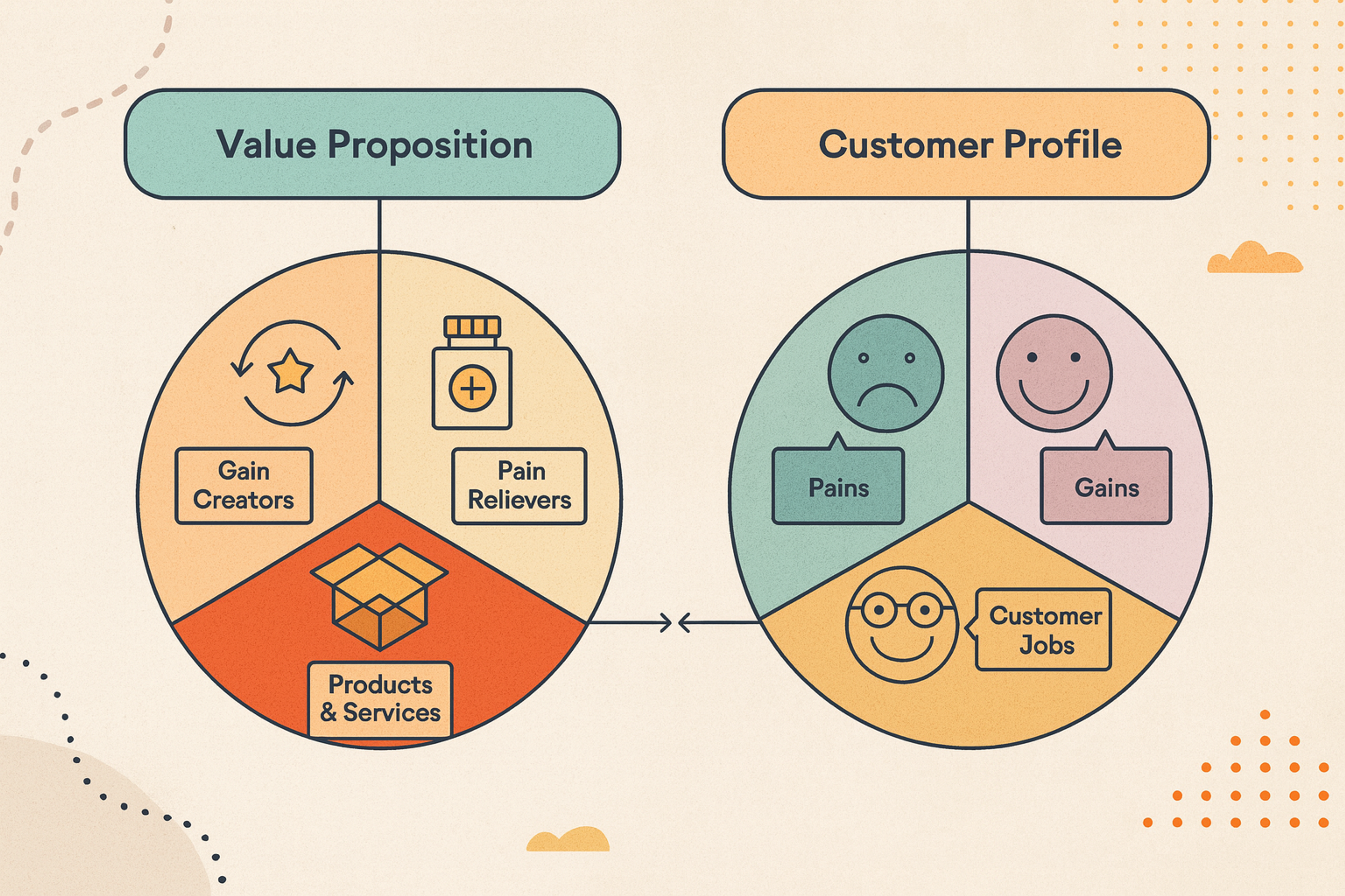
Positioning is where you sit in a customer's mind relative to the alternatives. It answers what you do, who you do it for, and why you're the better choice.
This is the strategy work no tool does for you, and it's what every later decision hangs on.
Write Your Positioning in One Sentence
Before colors, before type, write one clear sentence stating what you offer and to whom. Your value proposition should be specific enough that your ideal customer feels named, and narrow enough that a competitor couldn't paste it onto their own site.
If the sentence could belong to anyone, the brand behind it will feel like no one, which is exactly the trap AI-generated sameness sets.
Test it out loud. If a friend outside your industry repeats back what you do after hearing it once, you're close. If their eyes glaze, tighten it.
Choose Who You're For
Startups try to talk to everyone at once, and the message gets watered down to fit them all. A brand aimed at all audiences connects with none.
Pick a primary audience and build around them: know what they care about, what they fear, and the language they use.
A brand that clearly belongs to a specific group reads as sharper and more confident than one hedging its bets, and confidence is magnetic when you're small and unproven.
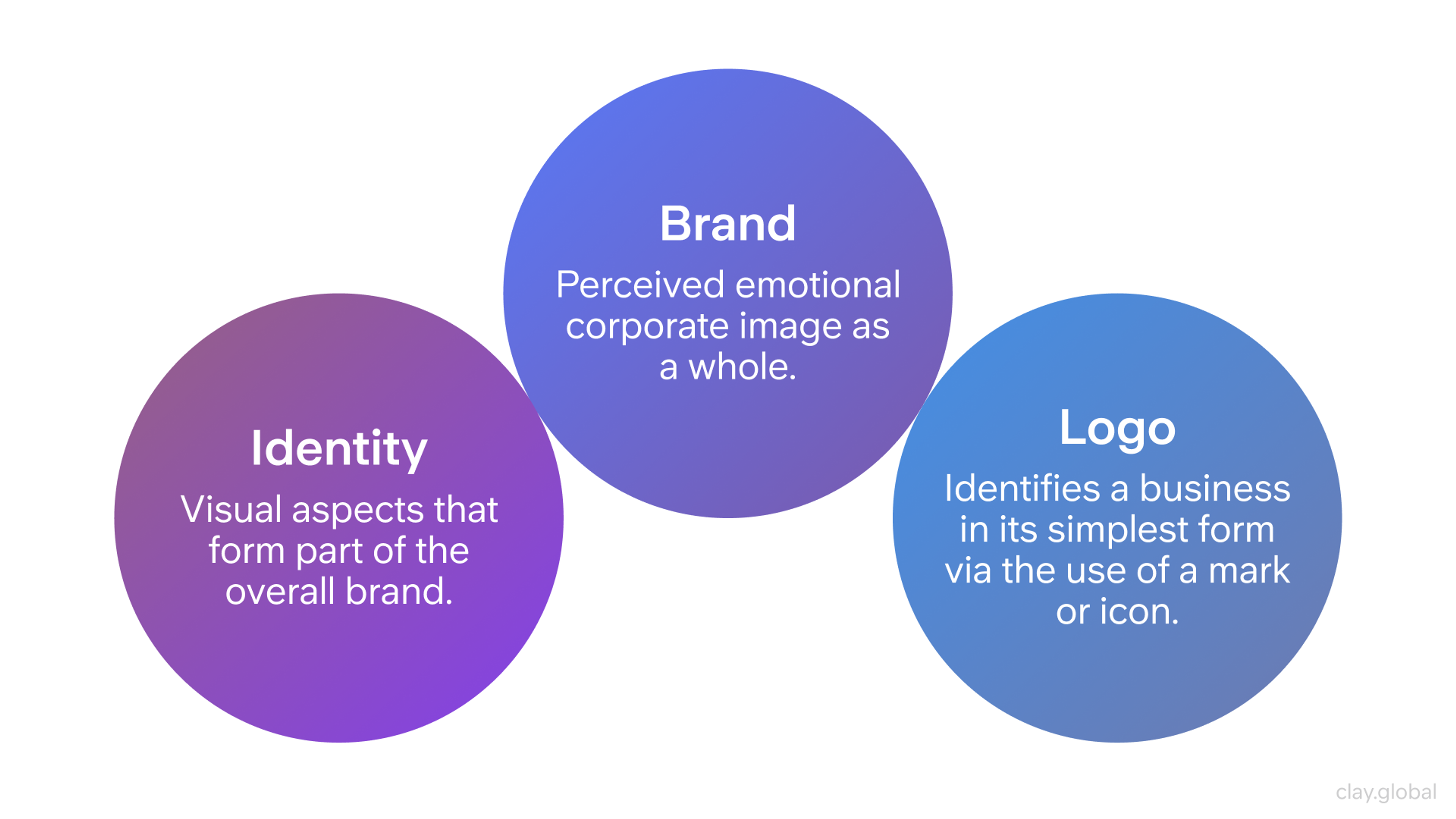
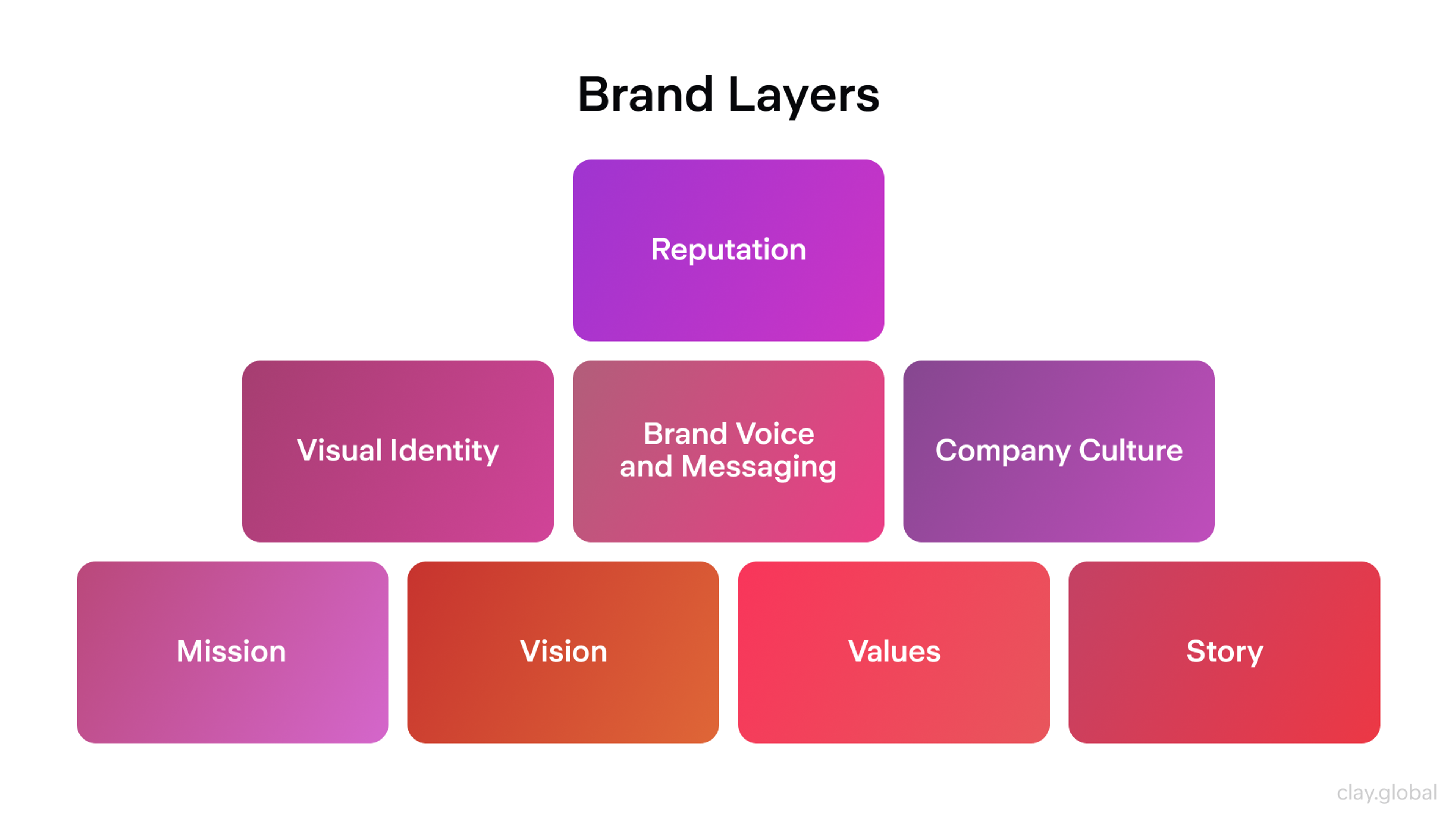
Build a Distinctive Visual Identity
Once you know what you stand for, identity makes it visible. This is the brand identity system of name, logo, color, type, and imagery that turns strategy into something recognizable.
Brand Identity Elements by Clay
In 2026, the goal isn't just coherence. It's distinctiveness, because generic is now the default that AI tools produce.
Design a System, Not Just a Logo
A logo alone is not an identity. Build a small, coherent system any touchpoint can inherit: a primary color and one or two accents, a neutral palette for backgrounds and text, one or two typefaces with clear roles, an imagery style, and a logo that reads at any size.
Color choices carry meaning, so pick a palette that fits your positioning rather than whatever a generator spits out first.
Push for a distinctive element competitors won't share: an unusual color pairing, a specific type choice, a recognizable graphic device. AI tends toward the average of everything it has seen, so deliberately choosing the non-obvious is how you avoid blending in with every other startup that used the same prompt.
Consistency Compounds
Identity only works when applied the same way everywhere: the same colors, type, and voice on your site, your deck, your social posts, and your product. Inconsistency reads as carelessness, and carelessness makes people doubt everything else.
Streetbeat Brand Guidelines by Clay
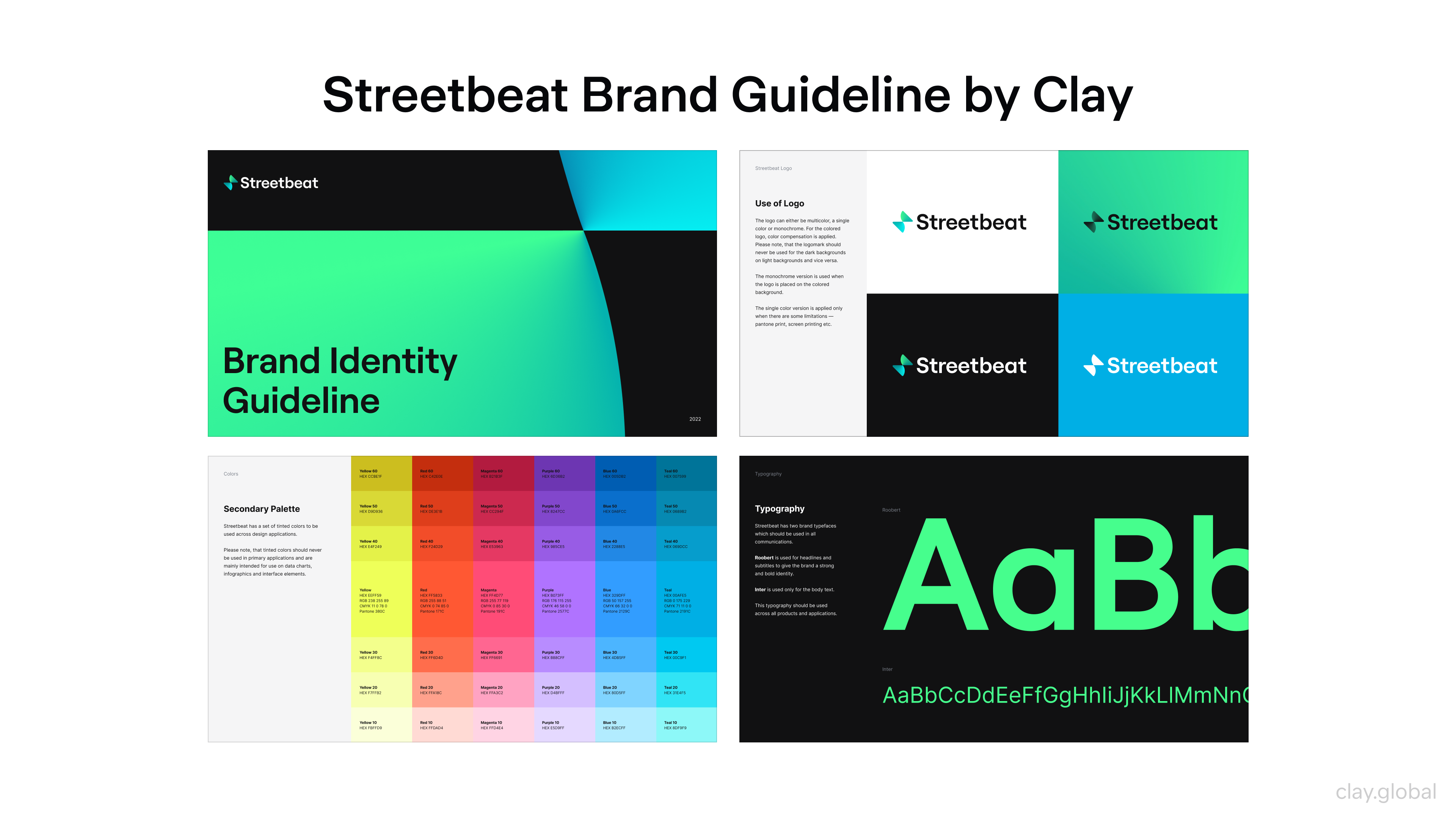
The payoff is measurable. A widely cited Lucidpress (now Marq) State of Brand Consistency Report found that organizations presenting their brand consistently across touchpoints estimated meaningfully higher revenue, on the order of a 23% lift.
Consistency has a second payoff in 2026, too. AI systems recognize entities by pattern, so a brand described the same way everywhere is easier for a model to identify and recommend. Consistency now builds human trust and machine recognition at the same time.
A short brand guide keeps this honest. Two or three pages covering color, type, logo usage, and tone give everyone the same rules to follow as you grow.
Find a Brand Voice AI Can't Fake
Identity is what people see. Voice is what they hear, and in a market drowning in generic AI copy, a distinctive voice is one of the few things that reads as unmistakably human.
Voice is a set of choices: formal or casual, playful or serious, plain or technical. Whatever you pick, hold it steady everywhere you write, from your homepage to your error messages. The reason it matters more now is contrast.
When most content sounds like it came from the same model, a specific, opinionated voice stands out sharply, and it signals a real person behind the brand.
Top 10 Brand Tone of Voice Examples by Clay
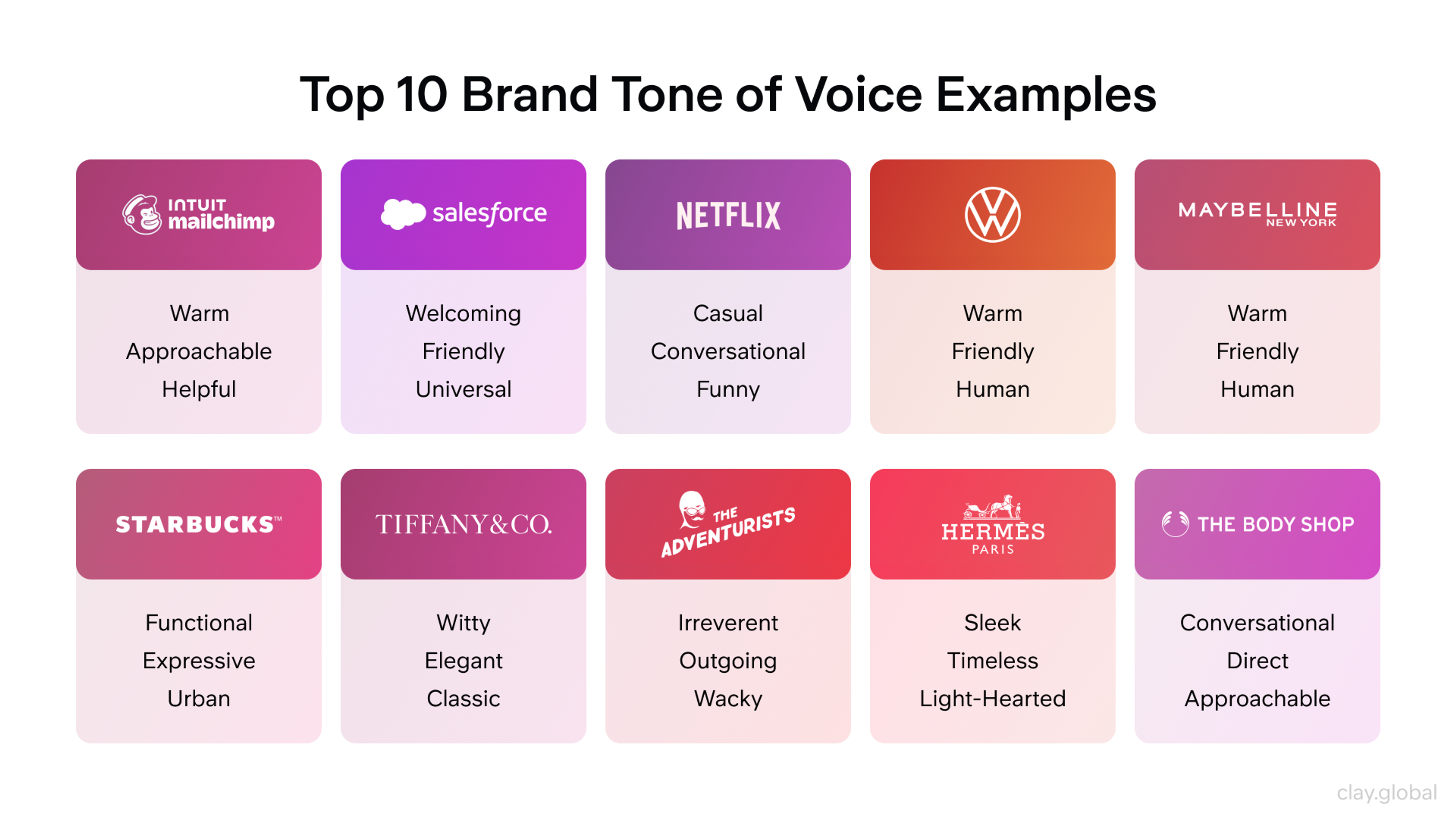
Match the voice to your audience and positioning. A developer tool can be dry and precise. A consumer wellness brand can be warm. The wrong voice feels like a costume, so choose one you can actually sustain, then commit.
Make Your Brand Legible to AI
Here's the part most startup branding advice still ignores. Increasingly, people don't find you by browsing. They ask an AI, and the AI names a few brands. If yours isn't one of them, you never enter the consideration set, no matter how good your site looks.
Getting surfaced isn't about tricking an algorithm. It's about being a clear, credible entity the model can recognize and trust enough to recommend. The signals that drive this look a lot like brand-building, which is good news.
Consistency is the first lever. Describe your brand the same way across every platform: same name, same one-line description, same category. Mixed signals make you harder to identify.
Presence is the second. AI tools lean heavily on a handful of source types when they cite, so being genuinely present and consistently described across the wider web, including the places your industry actually gets discussed, makes you easier to surface.
Clarity is the third. Content that answers real questions in plain language is easier for a model to quote than dense marketing copy, so writing clearly is now a discovery tactic as much as a communication one.
The practical starting move takes ten minutes. Ask ChatGPT, Claude, Gemini, and Perplexity the questions your buyers ask, like "what's the best tool for X," and see whether you appear and how you're described.
That audit tells you exactly where your brand is invisible or misrepresented, and it turns AI discoverability from an abstract worry into a concrete to-do list.
Earn Trust and Credibility
Trust is the currency a startup brand spends, and it's scarcer than ever now that AI content has flooded every channel. People have grown wary of anything that feels generated, which puts a premium on proof and authenticity.
First impressions still form fast. Research by Lindgaard and colleagues found people form an opinion about a web page in roughly 50 milliseconds, and a review of web credibility research found that identical content given a higher aesthetic treatment was judged more credible in 19 of 21 cases. A polished brand still makes people believe your claims more readily.
But polish alone is no longer enough, because everyone has it. What separates you now is proof AI can't invent: real customer results with real numbers, specific case studies, named clients, and a visible founder with an actual point of view.
Generic praise reads as filler. Concrete, verifiable specifics read as real. Lead with those, and place them where doubt tends to surface.
Express the Brand on Your Website
Your website is where the brand stops being guidelines and becomes an experience, and its role has shifted in 2026. When an AI mentions you, it increasingly sends people straight to your homepage, so the site is now the front door of your brand more than a set of deep pages.
And because AI answers absorb more of the research people used to do by clicking around, the visit you do get carries more weight. Strong web design for startups is brand expression under pressure to perform.
Lead With a Sharp Hero
The top of your homepage is your most valuable brand real estate. Use visual hierarchy to guide the eye to your name, your promise, and one clear action, in that order.
Write a headline that names the outcome you deliver, a subheading explaining how and for whom, and carry your brand colors and type through so the identity registers instantly.
Brand Layers by Clay
Show the actual product, not stock imagery. A simplified screenshot or a shot of the product in use makes the promise concrete and keeps your brand from looking interchangeable with every company using the same generated hero image.
Design Around the Journey
People experience your site as a journey, not separate pages, and the brand impression they leave with is the sum of those steps. Plan for the visitor who wants a fast overview, the one ready to act, and the one who wants proof. Clear navigation and purposeful internal links move each of them forward while reinforcing the brand.
Website Navigation Example by Clay
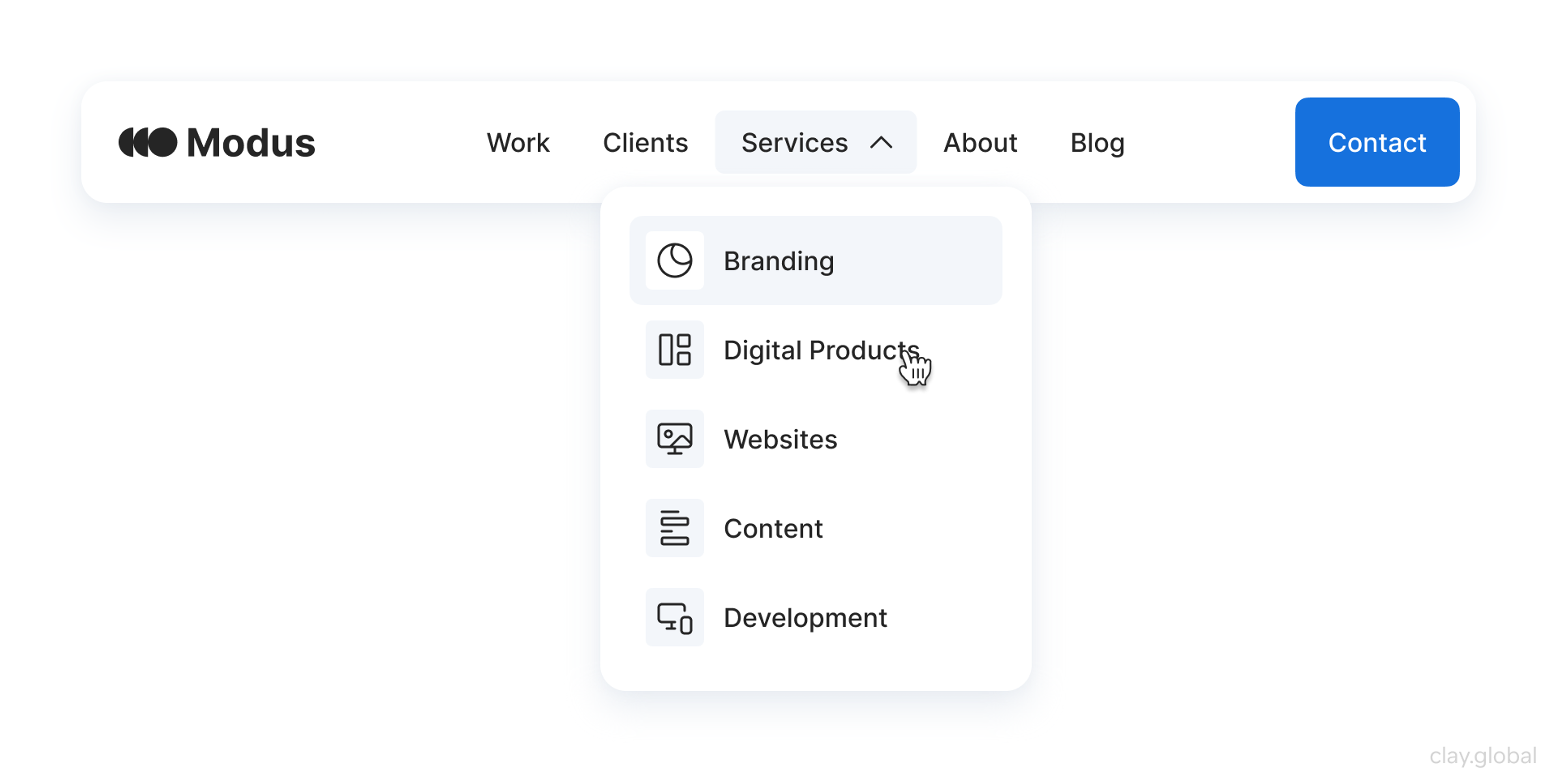
Web designers turn brand rules into reusable components, so the identity holds together as you add pages instead of drifting.
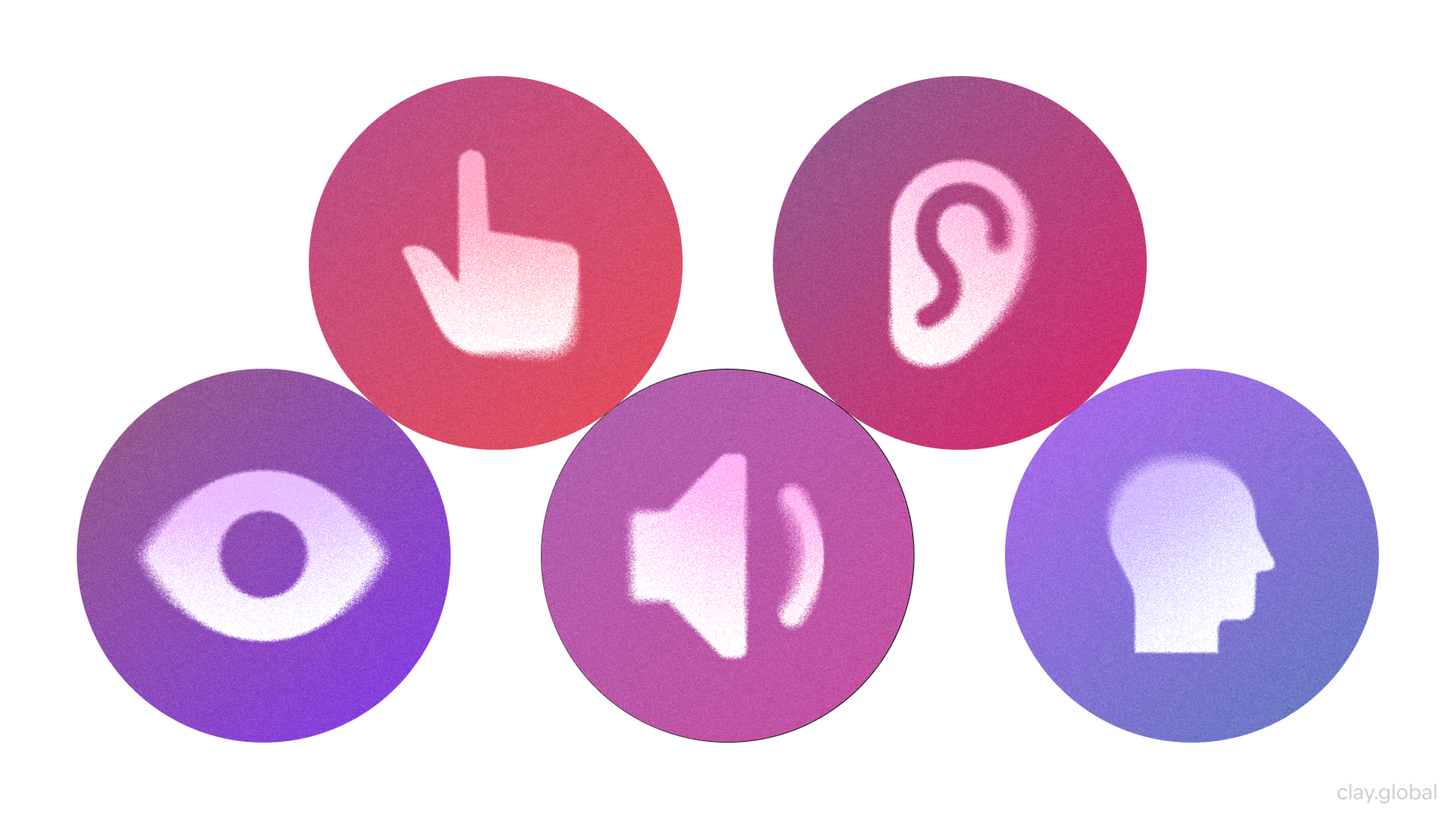
Make Speed, Structure, and Usability Work for You
A slow or clumsy site undermines a brand that looks sharp. Google's research on mobile pages found that as load time goes from one second to three, the probability of a bounce rises about 32%.
Aim for Google's Core Web Vitals: Largest Contentful Paint under 2.5 seconds, Interaction to Next Paint under 200 milliseconds, and Cumulative Layout Shift under 0.1. Design mobile-first, since mobile devices generate more than half of global web traffic, and cover accessibility basics like contrast, tappable targets, and alt text.
Accessibility Elements by Clay
Clear structure and plain language help twice over. They make the site usable for people, and they make your content easier for AI systems to read, quote, and cite when someone asks about your category.
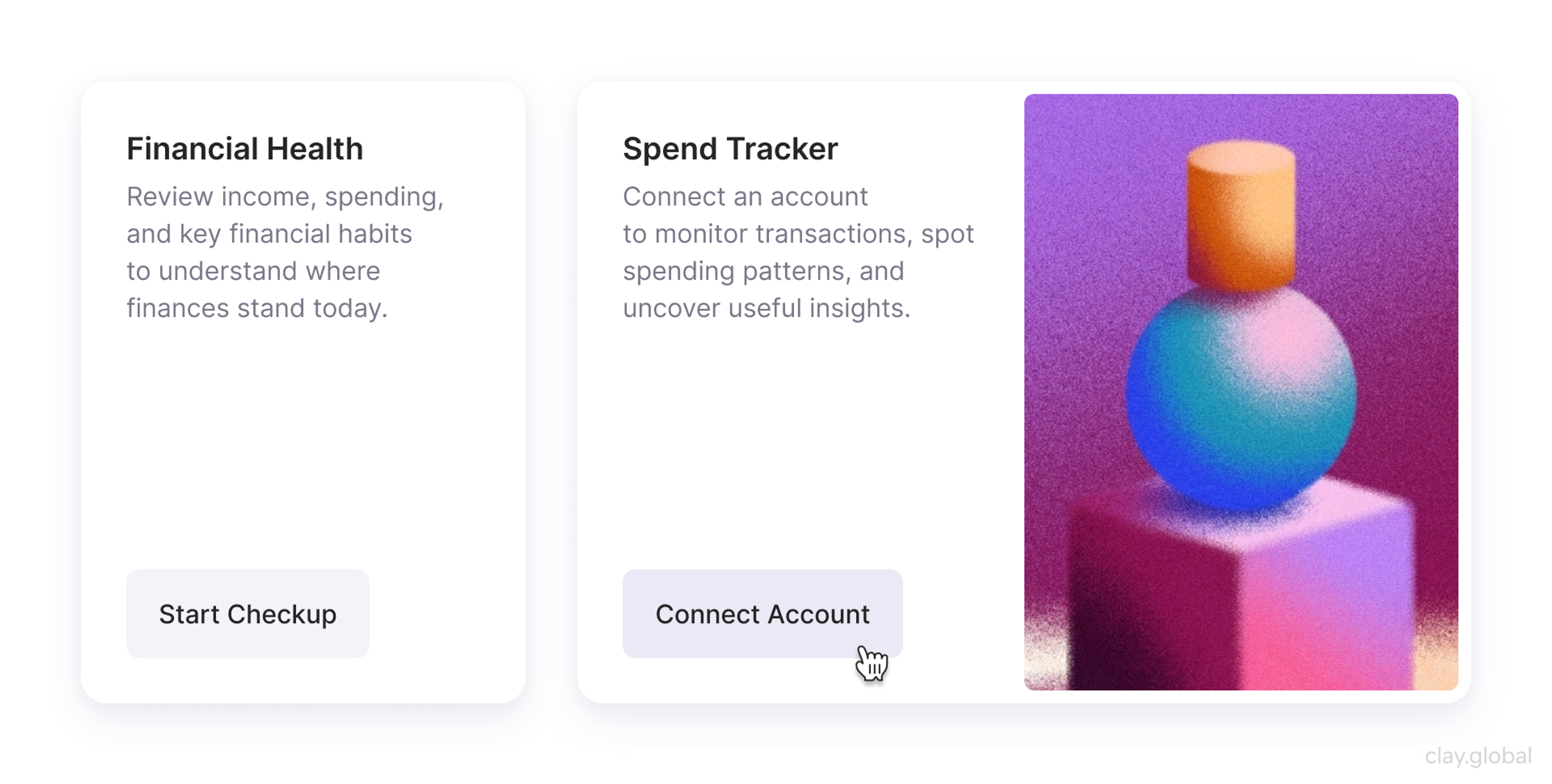
Let Your Voice Show in the Details
Brand voice lives in the small text most teams ignore: button labels, empty states, tooltips, and error messages. Swap robotic phrasing like "An error has occurred" for something human that helps, such as "Something went wrong while saving. Please try again, and reach out if it keeps happening."
Empty States Example by Clay
Keep forms short, too. Baymard Institute found the average checkout shows 23.48 form elements when 12 to 14 is enough, and overloaded forms drive people away. Every field you cut is a small act of respect, and respect is on-brand for almost everyone.
Common Startup Branding Mistakes in 2026
A few patterns sink more startup brands than any design flaw, and AI has sharpened some of them.
- Relying on generated defaults is the newest. A logo, palette, and copy pulled straight from a tool with no strategy behind them produce a brand indistinguishable from a thousand others.
- Trying to appeal to everyone is the oldest, and it still waters a brand down to nothing.
- Ignoring AI discovery is the trap of 2026, where a brand looks great on its own site but never appears when buyers ask an AI for options.
- Treating branding as a one-time logo project lets consistency slip the moment more people start creating content. And chasing whatever style is trending ages fast and says nothing about you.
The fix for all of them is the same. Decide what you stand for, express it distinctively and consistently, make sure it's legible to both people and machines, and protect that consistency as you grow.
From early-stage startups to established platforms, we've built brands that hold up. If it's time to build yours properly, we'd love to hear from you.
Read more
- Clay Global’s Branding and Website for CafePay, a payroll management platform
FAQ
Why does branding matter more in the age of AI?
Because AI commoditized the things that used to set startups apart. Anyone can generate a competent logo and site now, so polish is no longer a differentiator. What's left is strategy, distinctiveness, and trust, which are exactly what branding builds. On top of that, AI answers now shape discovery, and only recognizable brands get surfaced in them.
Can I just use an AI logo generator instead of hiring a brand designer?
You can generate a logo, but a logo isn't a brand. Generators skip the strategy: positioning, audience, voice, and a distinctive system that holds together. They also tend toward generic output, since they average what they've seen. AI tools are useful for execution once the thinking is done, not as a replacement for it.
How do I get my startup to show up in ChatGPT and other AI answers?
Be a clear, consistent, credible entity. Describe your brand the same way everywhere, build a genuine presence across the wider web where your category gets discussed, and write content that answers real questions plainly so it's easy to quote. Start by asking the major AI tools what they say about your category and where you're missing.
What is generative engine optimization and does a startup need it?
Generative engine optimization, or GEO, is the practice of making your brand more likely to appear in AI-generated answers. For a startup whose buyers are starting to research through AI tools, it's worth attention. The good news is that the work overlaps heavily with normal brand-building: consistent identity, credible mentions, and clear content.
How do AI Overviews and AI search affect startup branding?
They move part of the buying journey off your website and into the AI answer, where fewer people click through. That makes two things matter more: being present in those answers at all, and making the visits you do get count. It also rewards brands with strong recognition, since those are the ones AI tends to name.
What makes a brand distinctive when AI makes everything look similar?
A clear point of view and deliberate, non-obvious choices. Since AI output gravitates to the average, the way to stand out is to choose the specific over the generic: a sharp position, an unexpected visual element, and a voice that sounds like a real person. Distinctiveness is now the whole point, not a nice-to-have.
What is startup branding?
It's the work of defining how a young company is understood and remembered: its positioning, personality, visual identity, and voice. It's much broader than a logo, covering everything that shapes how people perceive and trust you, from the homepage to the tone of a support reply.
Should a startup invest in branding early or wait?
Early, at least at a basic level. Every interaction is already forming an impression, and in 2026 an AI may be describing you to buyers before you've even spoken to them. You don't need a big budget, but you do need clear positioning and a consistent identity from the start.
How much does startup branding cost in 2026?
It spans a wide range, from doing the strategy yourself with affordable tools to five or six figures for full agency work. AI has lowered the cost of production, but not the value of strategy, which is where the real difference is made. Match the spend to how central the brand is to how you win customers.
What comes first, brand strategy or visual identity?
Strategy comes first. Positioning, audience, and what you stand for are the raw material the visuals express. Designing a logo or palette before settling strategy usually means redoing the visuals once the positioning becomes clear.
How do you keep branding consistent across channels?
Define a small identity system and a short brand guide, then reuse them everywhere. Shared components and documented rules make consistency the default. That same consistency also helps AI systems recognize you as a single, coherent entity.
Does a startup need a brand style guide?
Even a brief one helps. Two or three pages covering colors, type, logo usage, and voice keep everything aligned as more people contribute, and they're the cheapest way to protect consistency as you scale.
How is branding connected to web design in 2026?
Your website is the main place your brand is experienced, and increasingly the page AI sends people to first. Every layout, color, and line of copy either reinforces your identity or muddies it. Good startup web design is really brand strategy translated into an experience.
How do you make a new startup brand look trustworthy?
Clarity, consistency, and proof. A coherent identity, a fast and polished site, and specific, verifiable results signal a real team behind the brand. In an AI-saturated market, concrete proof matters more than ever, because generic claims now read as filler.
How often should a startup rebrand?
Rarely, and never on a whim. Refresh the brand when your positioning genuinely shifts, your audience changes, or the identity feels dated. Frequent rebranding resets the recognition you've been building, with both people and the AI systems learning to associate your name with a category.
Closing
Branding used to be the finishing touch a startup added once the product worked. In 2026, it's closer to the opposite.
AI handed everyone the same production tools and moved discovery into answers you don't control, so the brand, the part that's distinctly yours, is what's left to compete on.

About Clay
Clay is a UI/UX design & branding agency in San Francisco. We team up with startups and leading brands to create transformative digital experience. Clients: Facebook, Slack, Google, Amazon, Credit Karma, Zenefits, etc.
Learn moreAbout Clay
Clay is a UI/UX design & branding agency in San Francisco. We team up with startups and leading brands to create transformative digital experience. Clients: Facebook, Slack, Google, Amazon, Credit Karma, Zenefits, etc.
Learn more