Your logo is always doing a job, even when you're not thinking about it. Every time someone sees it on a phone screen, a tote bag, or a browser tab, it argues for your brand.
The question is whether it communicates the right thing. It needs to do that quickly enough to stick. The core case for minimalism is built on function, not aesthetics.
A stripped-back logo isn't a lesser logo. It's one that has been edited down to what actually works. People encounter hundreds of brand identities every day. The ones that cut through never try to say everything at once.
Key Takeaways
- Minimalist logos outperform complex ones in recognition speed because simpler images stick faster.
- A logo that scales across every size without breaking sits on the right foundation.
- Minimalism isn't the absence of meaning but the deliberate removal of anything that dilutes it.
- Emotional resonance in a logo comes from relevance and repetition rather than visual complexity.
- Consistency is what makes simplicity compound over time, building recognition that a busy mark never can.
- Designing minimally is hard. It demands clear thinking before anything gets drawn.
- The brands with the longest-lasting logos committed to one strong idea and let time do the rest.
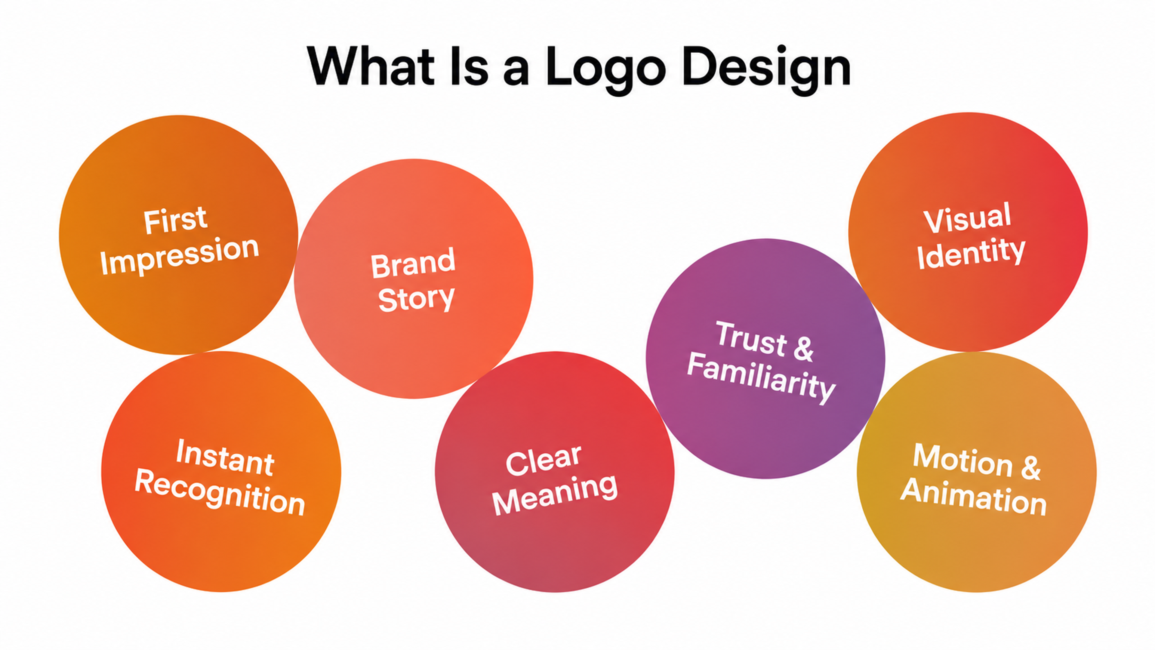
What Is a Logo Design?
A logo is the fastest way to convey your brand story. Before someone reads your tagline or visits your site, the logo has already formed an impression.
A strong mark reflects what a company stands for, not just what it sells. It creates enough familiarity that people begin trusting the brand before they've consciously decided to.
Motion adds another layer because animated logos can make a static mark feel alive. But animation amplifies what's already there. If the base design is unclear, movement alone won't rescue it.
Logo Design Framework
What Is Minimalist Logo Design?
Minimalist logo design is the practice of removing everything that isn't essential. You start with everything you could say about a brand and cut until only what's necessary survives.
What's left is a mark that's fast to read. Most minimalist logos rely on basic geometric forms, a tight color palette, and typography that doesn't compete with the mark itself.
Clay Global's Minimalist Logo Example
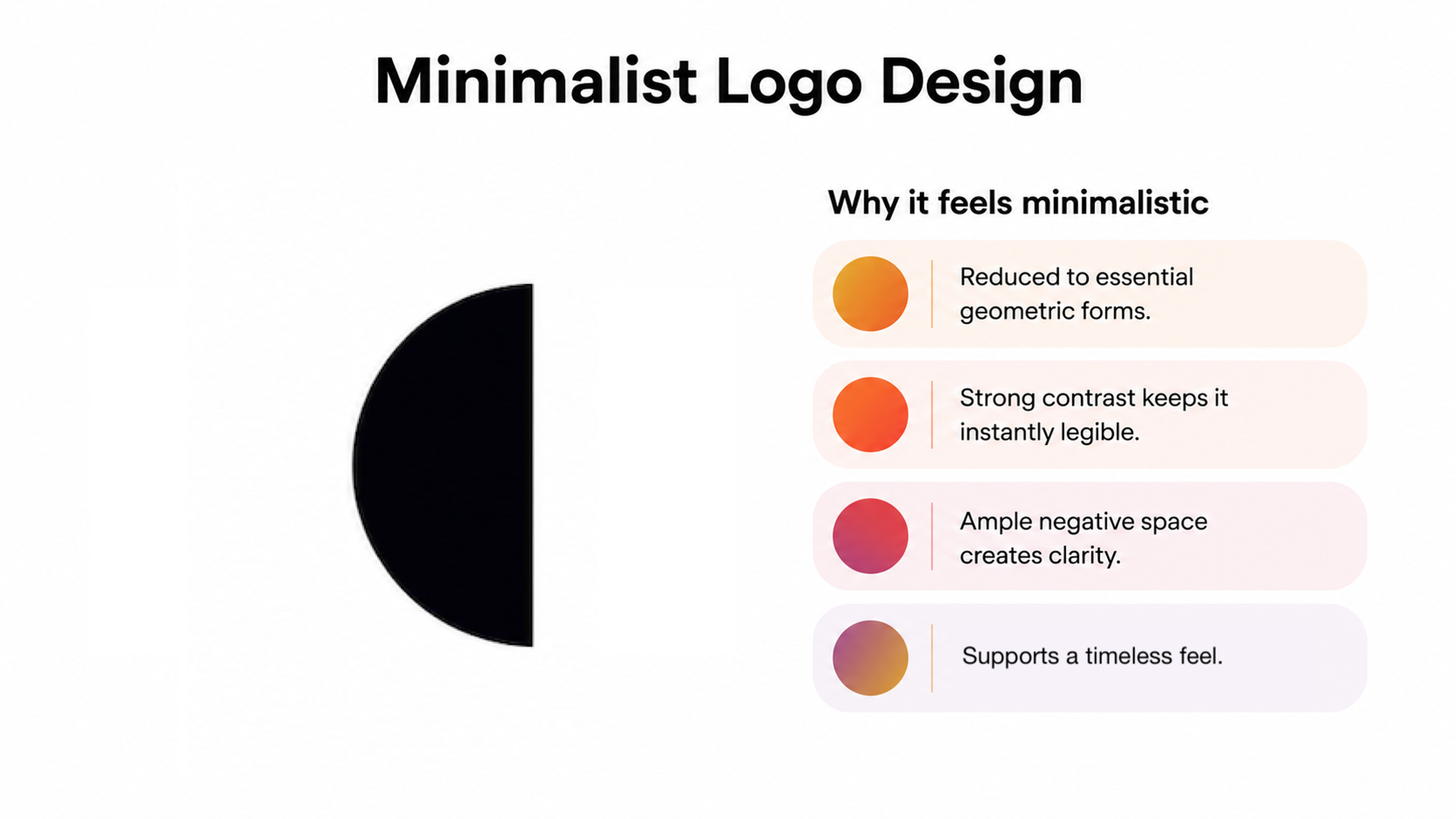
A useful test is to check if the logo reads clearly at 20 pixels. Could you describe it in one sentence and have someone sketch something close? If yes, you're in the right territory. If it takes a paragraph to explain, there's more work to do.
Why Do You Need a Minimalistic Logo?
Minimalist Logo Design Is Easier To Remember
A complicated logo can feel like a long, confusing explanation. It might look impressive, but it can take too long to understand.
That delay can dull your message. A clean, minimalist logo, on the other hand, gets the point across fast. People see it, and they get it with no second-guessing.
The best minimalist logos find a sweet spot. They’re simple enough to remember but still have a strong visual presence. They don’t need flashy tricks to stand out, they work because they’re clear and well-designed.
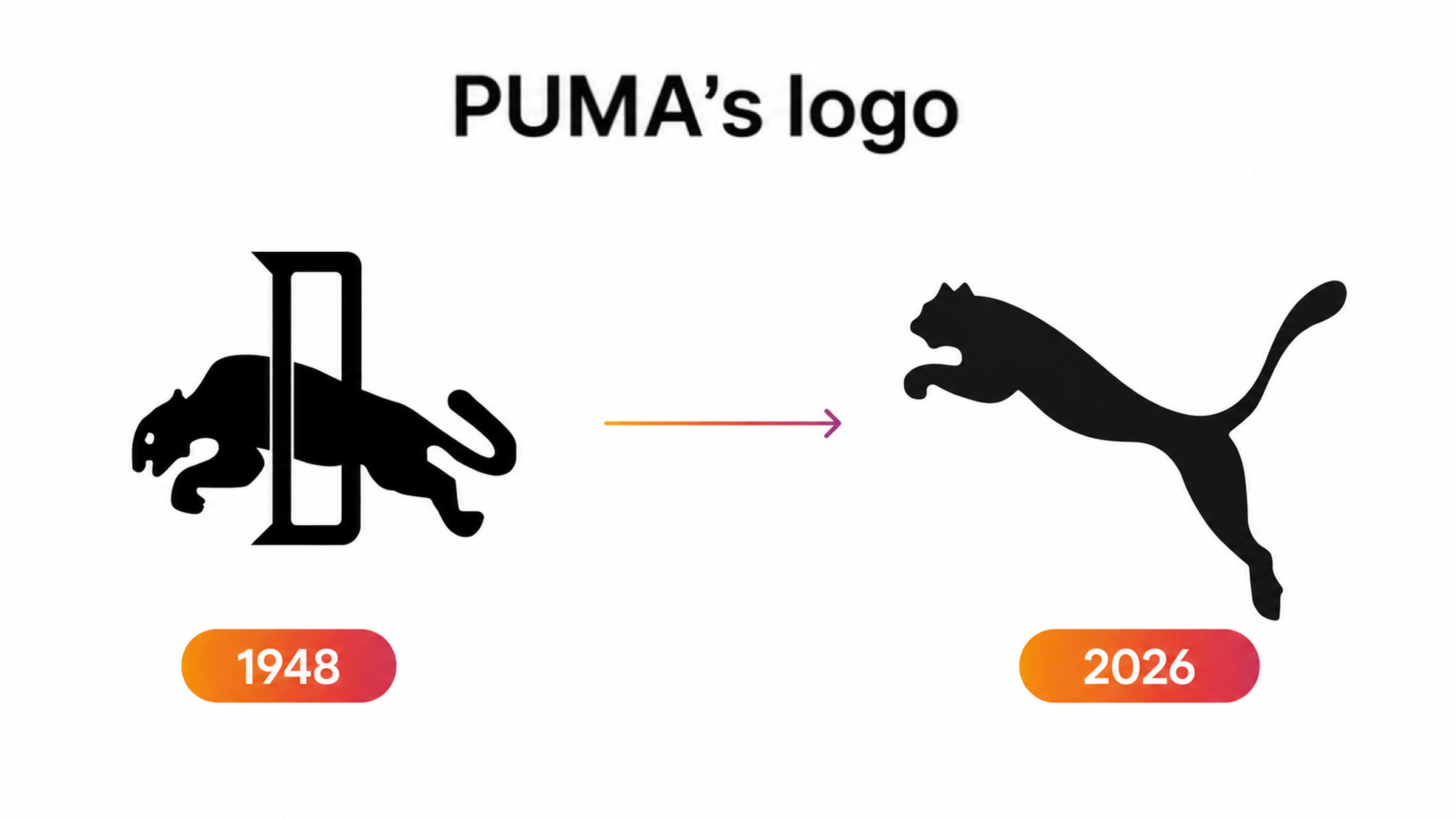
Think about Puma's leaping cougar or Dropbox's open box outline. You didn't need to read the name to know the brand. The logo design has changed a little over time, but it's always stayed true to its core idea. That's what makes it stick.
These logos prove that keeping it simple doesn’t make a logo weaker. In many cases, simplicity is what gives it lasting power.
PUMA’s Logo Evolution
Clearer Brand Messaging
Your logo is more than just a visual. It’s how people recognize and remember your brand. That’s why it needs to be simple, clean, and true to who you are. If it’s too complicated, people won’t connect with it.
Look at Amazon. Their logo is a great example of minimalist design that speaks volumes. The yellow arrow stretches from A to Z, which is not just a fun visual but a clear message. It tells you Amazon offers everything. That smart detail helps people understand the brand in seconds.
Intended Emotional Response
Many people assume that simpler logos feel cold and lack emotion. The opposite is true, but only when the emotional thinking happens before the design work starts.
Emotion in a logo doesn't come from complexity, but from association. McDonald's golden arches are emotionally resonant not because they're sophisticated but because decades of repeated experience made them so.
McDonald’s Logo
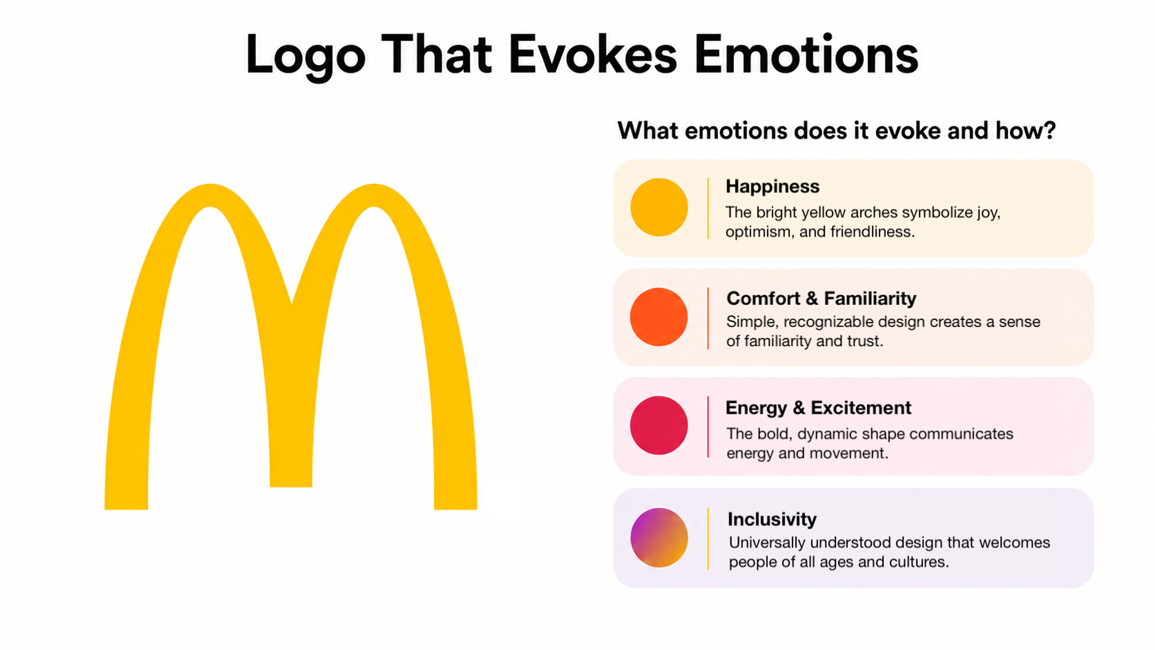
A study published in the Journal of Business Research found that simple logos make brands appear more trustworthy. That's the sense that a brand knows what it's doing and can be trusted to deliver. It’s not a side effect of minimalism, but one of its primary functions.
The Timeless Nature of Minimalist Logos
Complex logos age visibly. You can usually date a heavily detailed logo to within a decade just by looking at it. The stylistic effects that made it feel contemporary become markers of a specific era when the trend passes.
Minimalist logos escape this cycle because they never leaned into it in the first place. Brands consistently moved toward minimalism when they wanted to feel both current and enduring.
Interbrand's Best Global Brands report reinforces this commercially. Brands that score higher on brand clarity see a direct increase in share price. Consistent clarity is what builds lasting brand strength. That means a logo built for clarity isn't just a design decision. It's a business one.
Flexibility and Marketability
A logo lives across dozens of contexts, from websites to billboards, each with different sizes, colors, and background constraints. A minimalist logo handles all of them without compromising. A complex one starts breaking down the moment it leaves the design file.
The most useful test is still to design in black and white first. If the mark works without color, it will work anywhere. Add color only after the shape is fully resolved. It shouldn't compensate for a shape that doesn't hold up on its own.
Streetbeat's rebrand is one of our own examples of this in practice. We took a complex financial brand and distilled it into bold type and a dynamic rotating mark. The result captured not just what Streetbeat does but how it thinks.
Streetbeat Logo by Clay
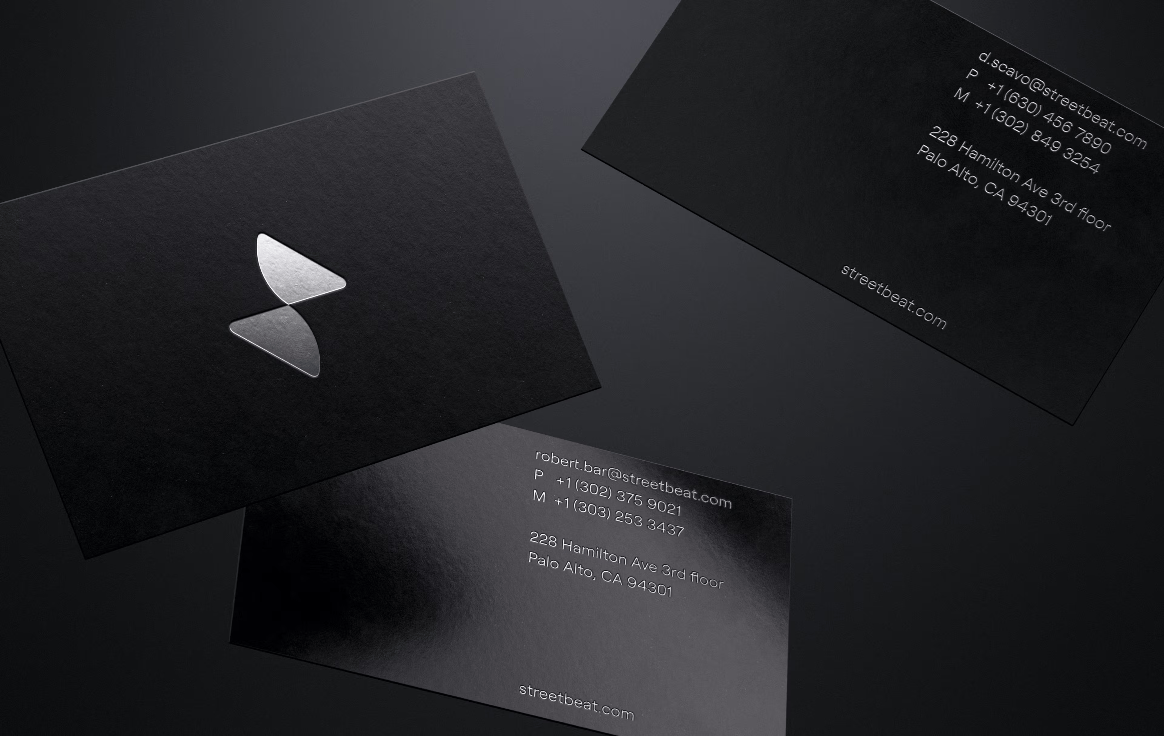
The logo stayed consistent and recognizable across every touchpoint, making the brand feel both trustworthy and built for change. In fast-moving spaces like fintech, that kind of clarity is what turns a logo into a business asset.
A logo is one of the most visible investments your brand will make. At Clay Global, we design logos that last, so yours could become the next Nike swoosh. Let's talk.
Designing a Minimalist Logo
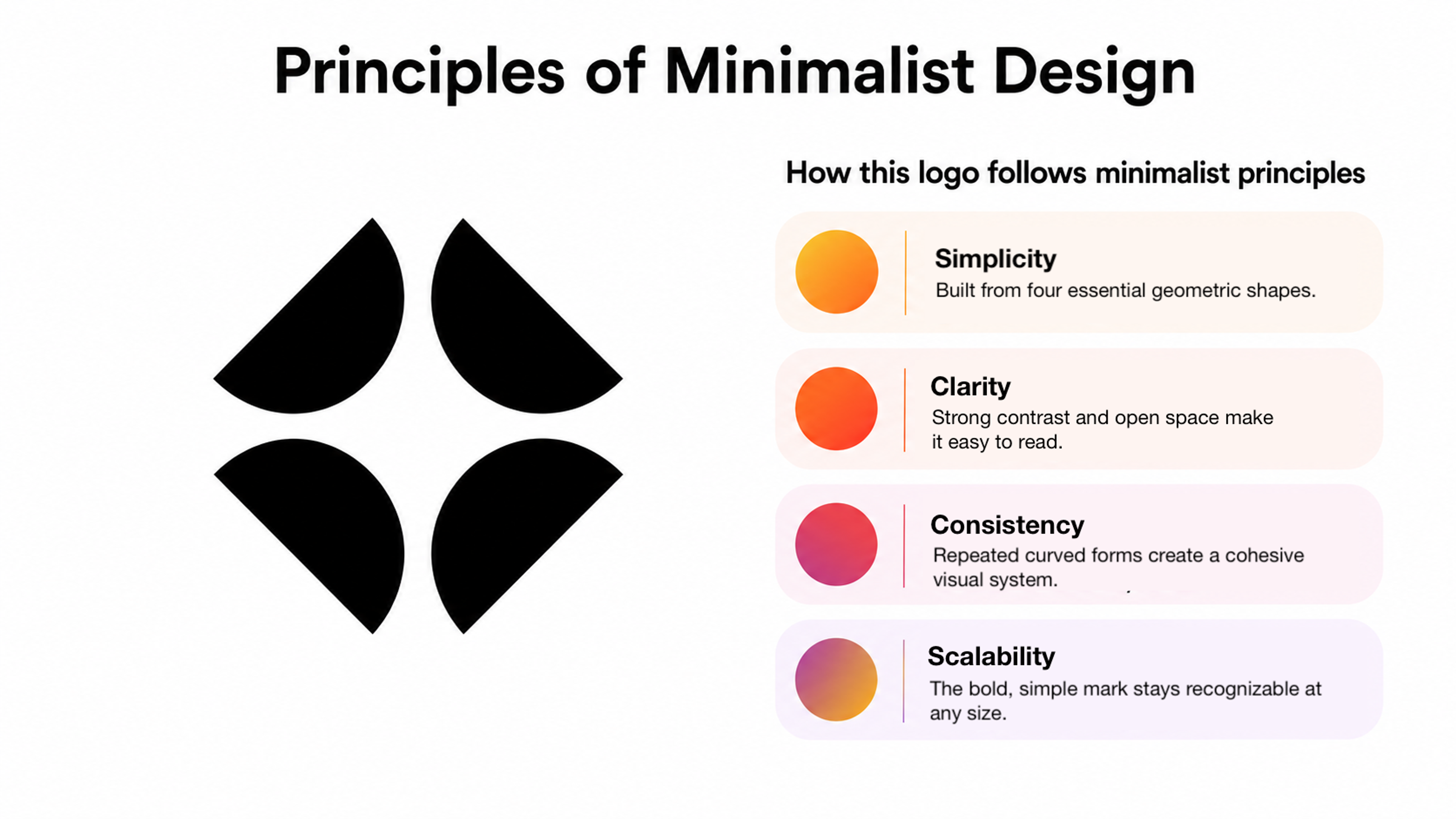
Principles of Minimalist Design
A strong minimalist logo is built on four principles:
- Simplicity makes it easy to recognize and remember.
- Clarity keeps it readable at any size and on any surface.
- Consistency ensures the logo works across every brand touchpoint, including packaging, digital products, and even brand voice.
- Scalability means it works from small icons to large signage without losing meaning.
- Responsiveness ensures it adapts across screens and devices types without losing impact.
Principles of Minimalist Logo Design
Creating a Minimalist Logo from Scratch
Start with the concept. Identify the one thing the brand needs to communicate and sketch it before opening any software. A logo trying to say everything usually says nothing.
Use simple geometric forms. Circles, triangles, and squares reproduce cleanly at any scale and carry strong structural associations. They give the logo structural integrity without limiting creativity.
Constrain your palette. A two-color maximum forces better decisions. More colors add complexity without meaning and create problems on unexpected backgrounds.
Take typography seriously. The typeface carries as much weight as the mark itself. Choose it for what it communicates, not just how it looks.
Iterate with constraints. Test every version, from tiny digital icons to large-format print. Each constraint reveals weaknesses before they become production problems.
Minimal Logo Design Trends and Inspiration
Here are the trends shaping minimalist logo design right now:
- Motion and animation. Logos are increasingly expected to move. A simple mark translates into animation far better than a complex one. That makes minimalism a natural fit for flexible brand systems.
- System thinking. Brands are designing logos to work across dozens of touchpoints. A clean, simple mark is the only kind that scales across all of them without breaking.
- Wordmarks over symbols. More brands are leading with type rather than abstract icons, letting a well-chosen typeface carry the identity.
- Negative space. A hidden meaning within a clean mark adds depth and memorability without adding visual noise.
- Distinctive color accents. Rather than relying on shape alone, brands are pairing a minimal mark with one bold color that becomes instantly recognizable across every context.
- Flat design. Clean shapes and solid colors remain a dominant foundation. The current generation of flat design has matured beyond its sterile early phase. Today it feels contemporary and built to last.
What connects all of these is the same underlying logic. A simple mark gives each of these approaches more room to work.
Ready to go minimal but not sure where to start? Let our team handle all the work. Get in touch.
Read more
- Brand Identity for Wealth, an Estate and Tax Planning Software, by Clay Global
FAQ
Does minimalism work for every type of brand?
Minimalism works as a principle of clarity, focus, and scalability for virtually every brand. But how that principle is applied varies depending on context.
A heritage institution or luxury fashion house may carry earned complexity because it's loaded with meaning built over decades.
The real test isn't if the mark is simple, but if every element is earning its place.
If you're not sure where yours stands, there are many experienced branding design agencies to choose from, so you can find one that fits your vision.
Can minimalist logos still look distinctive? Won't they all start to look the same?
It's a risk worth taking seriously. When too many logos converge on the same shapes and neutral palettes, they lose the differentiation they were designed to provide.
Distinctiveness in minimalist design comes from specificity. A particular angle, an unusual weight, or a color slightly off-convention can make a mark stand out.
What's the difference between a minimalist logo and a logo that's just underdeveloped?
An underdeveloped logo feels incomplete, as if it stopped before the thinking was done.
A minimalist logo feels fully resolved.
The difference shows up in the details around spacing, proportion, curve quality, and how well the mark holds up under pressure. Minimalism requires more precision, not less. There's nowhere to hide a slightly off letterform when the design has been stripped back to its essentials.
How does a minimalist logo perform in dark mode and across variable digital contexts?
It’s one of the strongest practical arguments for minimalist design. A clean mark with a limited palette adapts easily to dark mode without losing visual integrity.
Complex logos with gradients or fine detail often fail on non-white backgrounds. They require multiple logo versions that become increasingly difficult to manage consistently over time.
When should a brand consider rebranding to a more minimalist logo?
The most common signals are a logo that doesn't reproduce well at small sizes or requires constant workarounds in different contexts.
A logo that feels visually dated or no longer reflects the brand's current positioning gives the same signal.
Among major brands, the average redesign cycle runs roughly every seven years.Among major brands, the average redesign cycle runs roughly every seven years. The real driver should be a strategy that works for long-term relevance, not the calendar.
Does the choice between a symbol and a wordmark matter for minimalist logos?
A standalone symbol only works when the brand has built enough recognition to carry meaning without supporting text. New brands almost always need a wordmark or a lockup.
Ask yourself if someone seeing just the symbol would know what it stands for. If the answer is no, a wordmark or full lockup is the right call.
Minimalism applies equally to how that typography is treated.
How does AI affect minimalist logo creation?
AI design tools have made it faster to generate logo options and explore variations at scale. A significant share of new logos is now created with AI assistance.
The practical implication is that AI tools produce clean geometric options reasonably well but tend toward convention. They give you something that looks like a minimalist logo without necessarily encoding a specific brand idea.
Getting to something that captures a brand's clear identity still requires strategic thinking before any tool opens.
How should a brand handle different logo versions without losing consistency?
The primary mark should work on its own before you begin creating variants. Once it does, those variants should be variations, not new logos.
The icon version of a lockup logo is the same idea, optimized for a different container. The brand needs a clear hierarchy of which version is primary, secondary, and minimum viable.
Establishing rules about when each is used and applying them consistently builds the recognition that makes minimalism pay off.
What role does negative space play, and how do you avoid making it feel like a gimmick?
Negative space works when it reveals something true about the brand. It creates a second reading that makes the logo richer without making it busier.
It fails when applied for cleverness alone, with no connection to what the brand means.
Start with the core idea and ask if negative space can express it more efficiently than a solid form can.
How do you know when a minimalist logo is finished?
The mark is finished when removing anything further would lose meaning, and adding anything would introduce noise.
That balance is easier to describe than to find, which is why testing against real constraints is essential.
The mark should survive a single color, very small sizes, and unplanned backgrounds. It should still read clearly as a thumbnail. When it passes those tests, the work is done.
Does a minimalist logo still work when a brand needs to signal prestige?
Yes, but the interpretation of minimalism shifts in that context.
Prestige brands like Chanel or Rolex show that a simple mark carries enormous weight when applied consistently across decades. The simplicity itself signals confidence, because only a brand that doesn't need to prove itself can afford to say so little.
For newer brands, restraint signals confidence and expertise. The key is choosing details that carry the right associations.
How does minimalist logo design hold up as brands expand into new markets or product categories?
A well-constructed minimalist mark has a significant structural advantage because its simplicity makes it adaptable.
A symbol tied to one specific product becomes awkward when the brand moves beyond it. A simple geometric mark or resolved wordmark doesn't carry those limitations.
Apple's logo never needed updating across decades of new products because it was always about the brand, not the product. That's the payoff of designing for identity.
Final Thoughts
The hardest part of minimalist logo design is having the confidence to remove everything that isn't essential. Most briefs arrive loaded with every quality a brand wants to express, but a logo carrying all of them becomes a negotiation rather than a statement.
The most recognizable logos in the world were built on one idea, executed precisely. If your logo creates friction or fails to scale, the answer is rarely to add more. Ask what it needs to say and remove everything that isn't that.

About Clay
Clay is a UI/UX design & branding agency in San Francisco. We team up with startups and leading brands to create transformative digital experience. Clients: Facebook, Slack, Google, Amazon, Credit Karma, Zenefits, etc.
Learn moreAbout Clay
Clay is a UI/UX design & branding agency in San Francisco. We team up with startups and leading brands to create transformative digital experience. Clients: Facebook, Slack, Google, Amazon, Credit Karma, Zenefits, etc.
Learn more