
Good design should feel effortless. When a website works well, people don’t think about the interface. They move through it naturally, understand what matters, and find what they need without friction.
Visual hierarchy is what makes that possible. It’s the way a page communicates priority through size, contrast, placement, spacing, and typography. A clear hierarchy tells users what to look at first, what to read next, and what to do.
This matters because first impressions happen fast. Within a fraction of a second, users decide whether a site feels credible and easy to use. Strong visual hierarchy doesn’t just “look nice” - it reduces confusion, lowers cognitive load, and helps people take the right action.
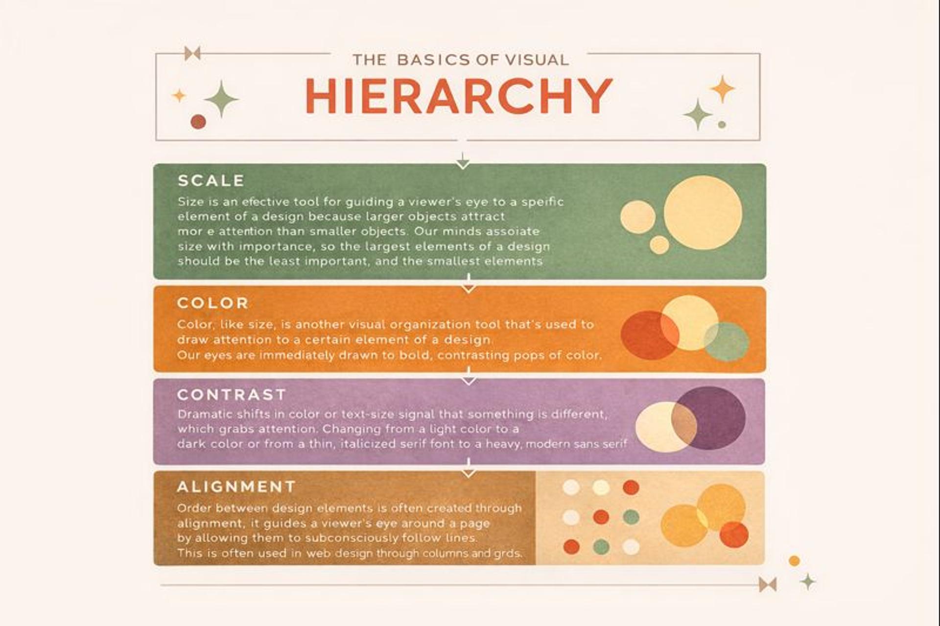
Basics of Visual Hierarchy in Design
What Visual Hierarchy Really Means
Visual hierarchy controls how attention moves across a page. Designers shape this flow with a small set of signals:
Size suggests importance. Contrast creates focus. Spacing groups related items. Alignment builds structure. Typography clarifies levels of meaning.
People rarely read pages top to bottom. They scan. On many layouts, attention often follows patterns similar to an F or Z shape, but the exact path depends on the device, the content type, and what the user is trying to accomplish. The goal isn’t to force one scanning pattern. It’s to make the page understandable at a glance.
When hierarchy works, users don’t have to think about navigation or layout. They can scan headlines, spot key cues, and quickly decide where to go next.
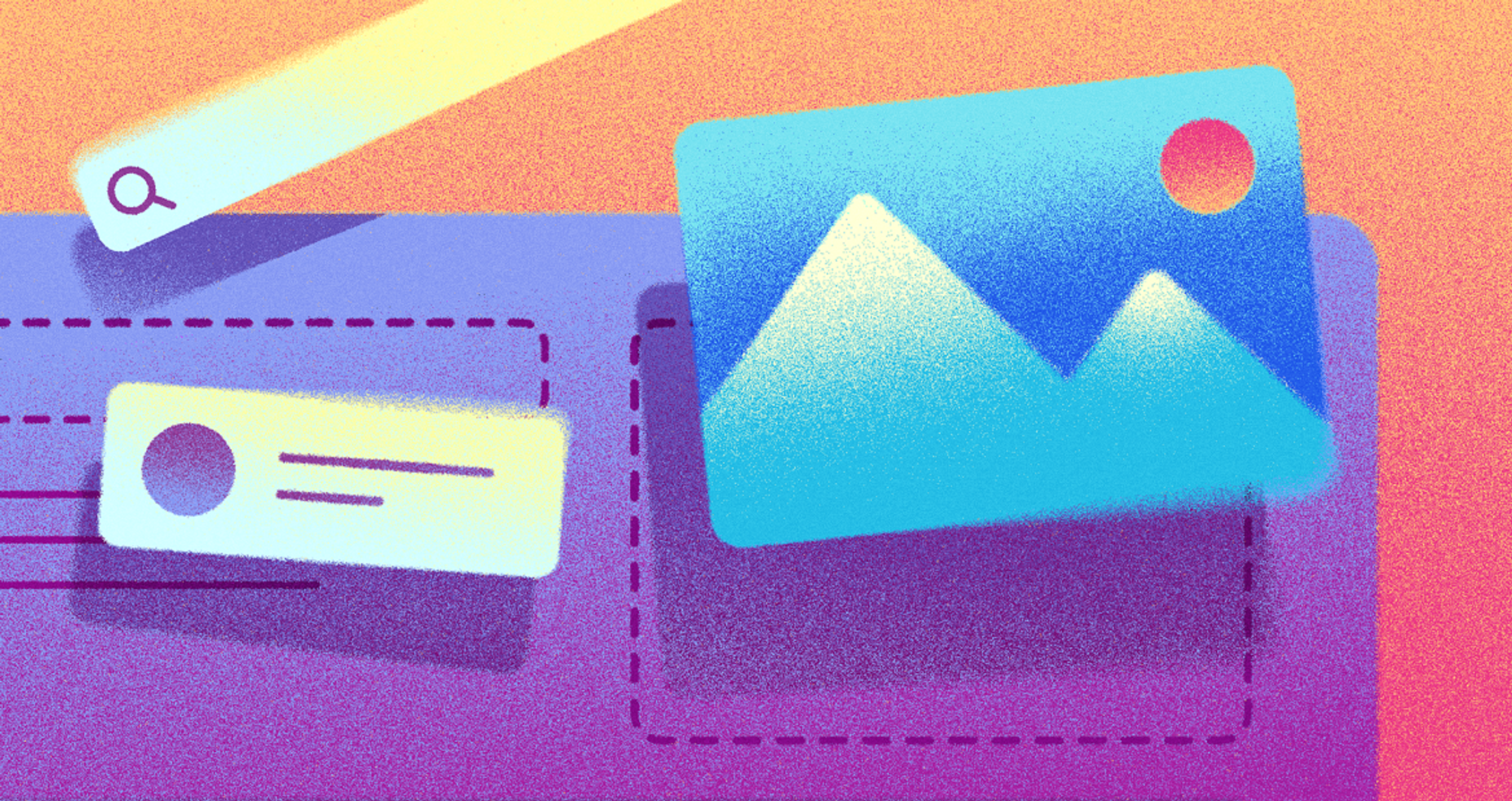
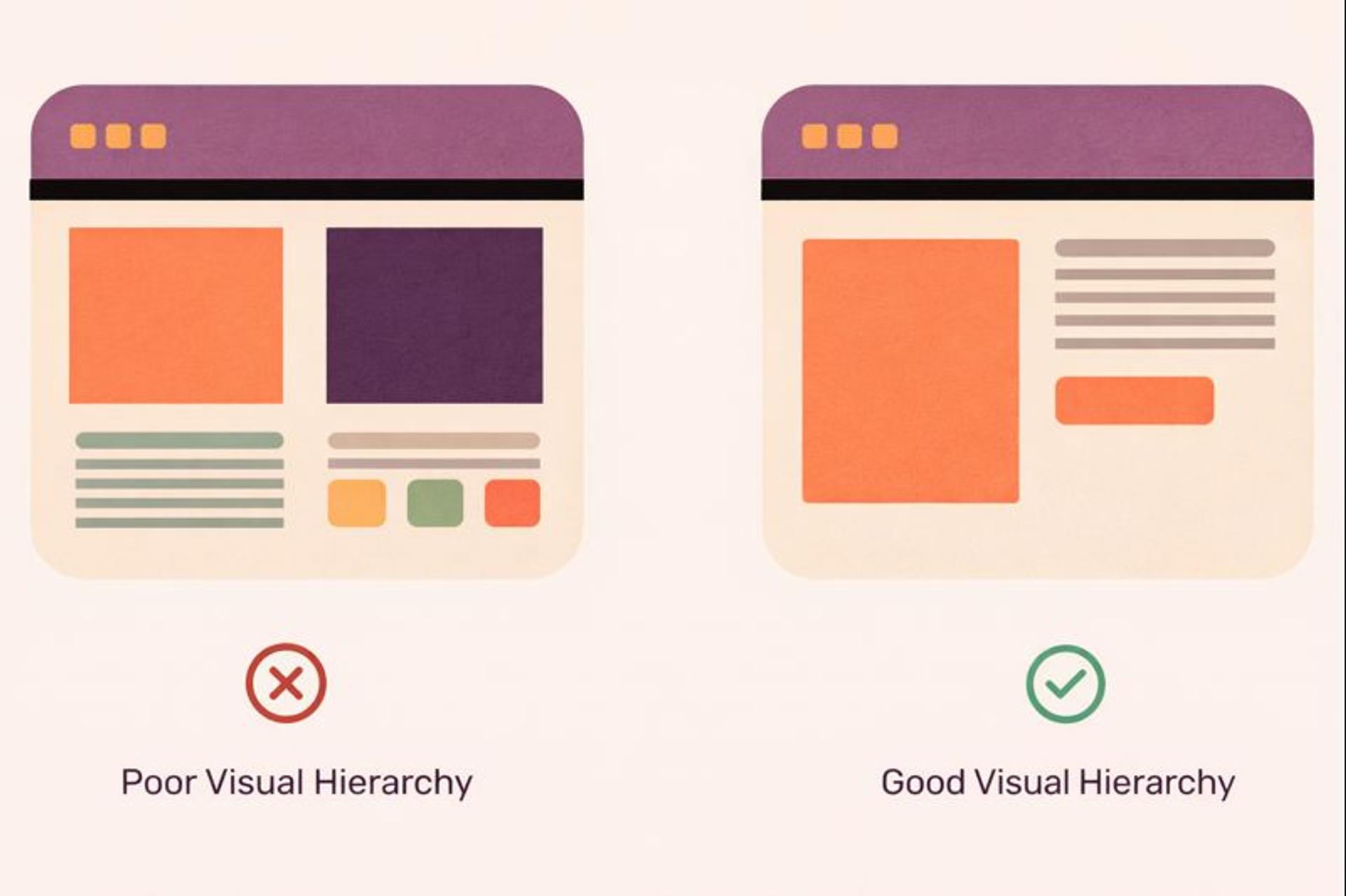
Poor vs Good Visual Hierarchy
Visual Hierarchy vs. Website Hierarchy
These two ideas are often mixed up.
Visual hierarchy is how you prioritize information on a single screen: which headline dominates, which message follows, which button is primary.
Website hierarchy (information architecture) is how pages and sections are organized across the whole site: navigation structure, categories, and the relationship between pages.
They support each other. A site can have a solid structure but still feel confusing if each page lacks a clear visual priority.
Why It Matters for Business
Visual hierarchy directly affects outcomes. Every design choice influences whether users stay or leave, click or ignore, buy or abandon their cart.
Good hierarchy builds trust through clarity and familiarity. When users recognize predictable patterns - where the headline sits, how buttons look, how sections are grouped - they feel confident moving through your site. Consistency across pages strengthens that comfort and reduces decision fatigue.
Hierarchy also shapes conversion by controlling the “path” to action. The best-performing pages usually make one action feel obviously primary, while keeping secondary options available but quieter.
Consider crypto websites or product pages from brands like Apple. The layout typically follows a simple story: one dominant visual, a clear headline, a small set of benefits, then a focused call to action. The point isn’t minimalism for its own sake. It’s disciplined prioritization.
Google shows the same principle in a different way: a large, centered search box and very little competition for attention. The hierarchy supports the primary task and removes everything else from the foreground.
For example, the Marqeta website uses 3D graphics, clear contrast, and bold alignment to draw attention to key features. The design works well on all devices, blending strong visuals with easy usability to keep users engaged.
Marqeta Website by Clay
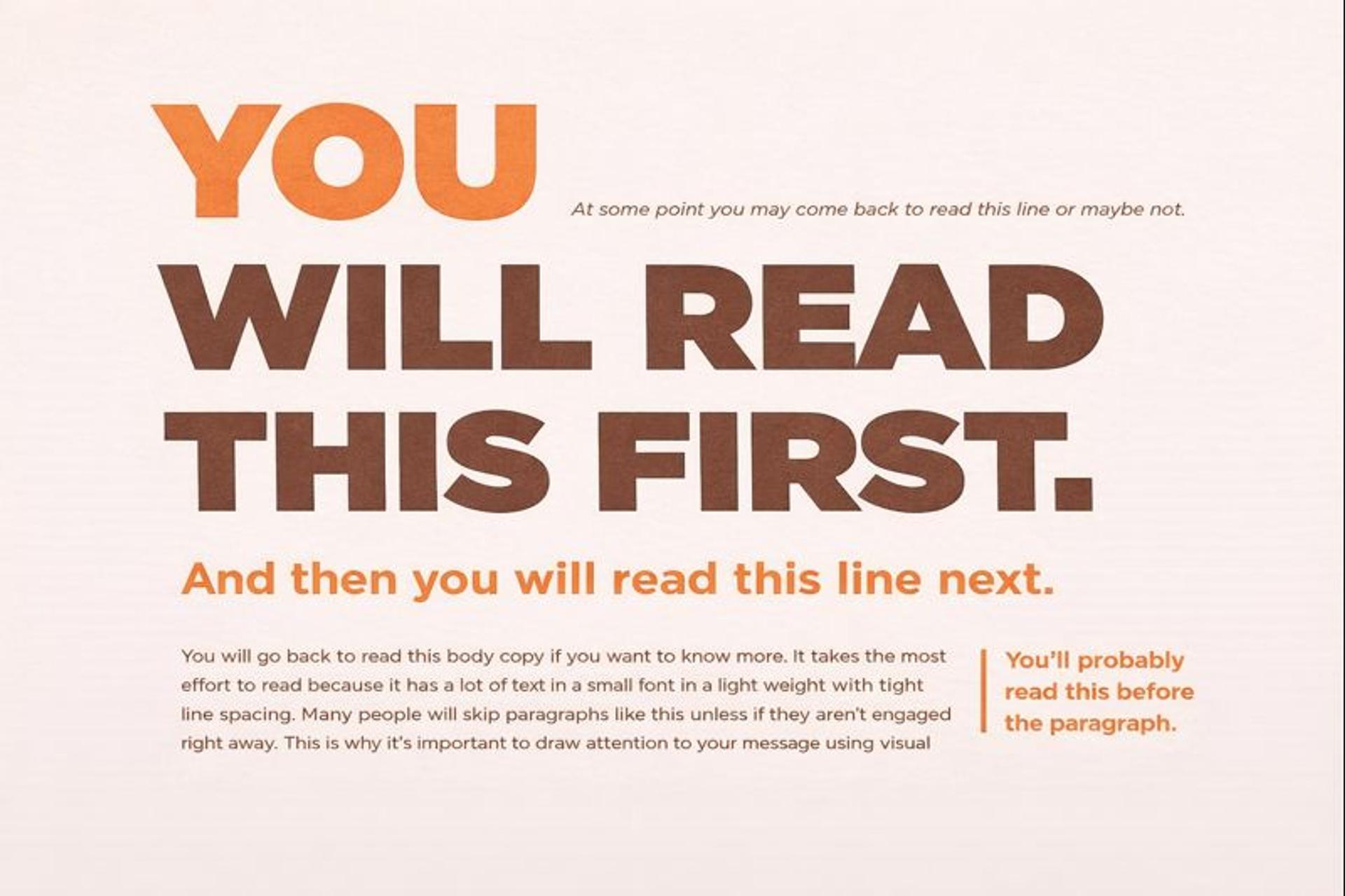
Building Hierarchy Through Size and Scale
Size is the fastest signal your brain processes. Large elements attract attention first, so scale is often the backbone of hierarchy.
Headlines should clearly differ from subheads, and subheads should clearly differ from body copy. What matters most is the relationship between sizes, not exact pixel values. When those relationships are consistent, the page feels intentional. When they clash, the page feels noisy - even if users can’t explain why.
Good scale creates emphasis without drowning everything else. Your goal is a readable priority ladder, not a shouting match.
Airbnb listing pages are a useful mental model: photos are prominent because they drive the decision. Price is visible because it’s essential, but it doesn’t overpower the experience. Details stay secondary but remain easy to scan.
Visual Design Principles by Clay
Using Contrast to Direct Attention
Contrast works like a spotlight. A bright button against a quiet background pulls focus instantly. The key is restraint: every high-contrast element should earn attention.
Color is the most obvious form of contrast, but it’s not the only one. Size, weight, shape, borders, texture, and motion can all create separation. Used well, contrast makes important elements easy to find. Used everywhere, it cancels itself out.
A practical rule: if everything is high contrast, nothing is.
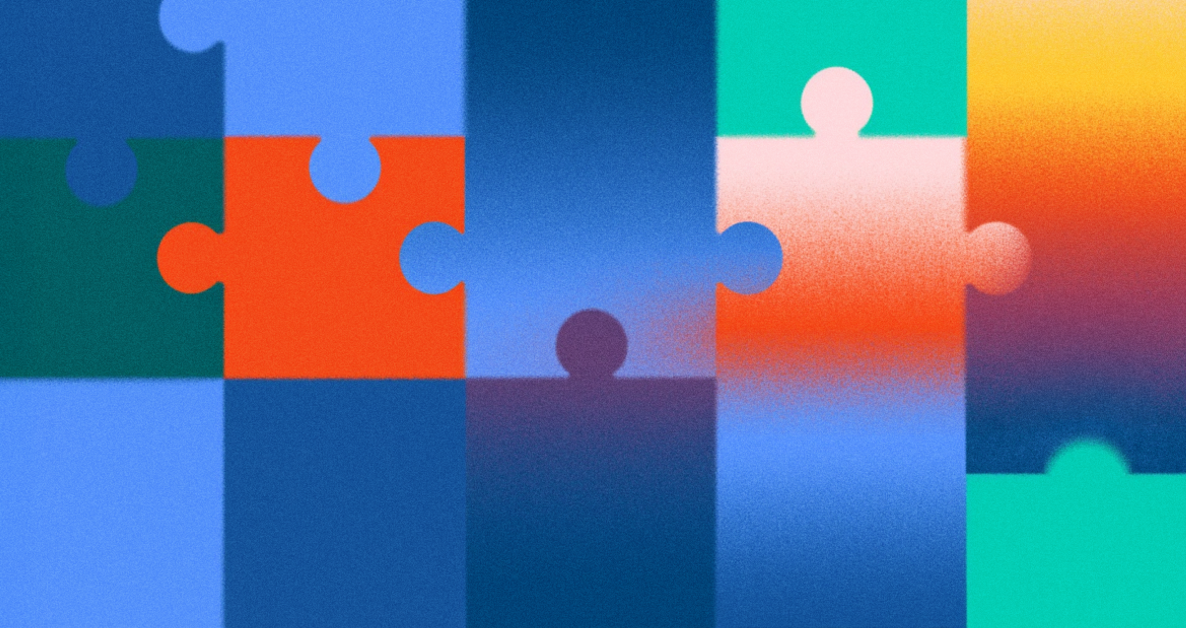
Visual Hierarchy Example
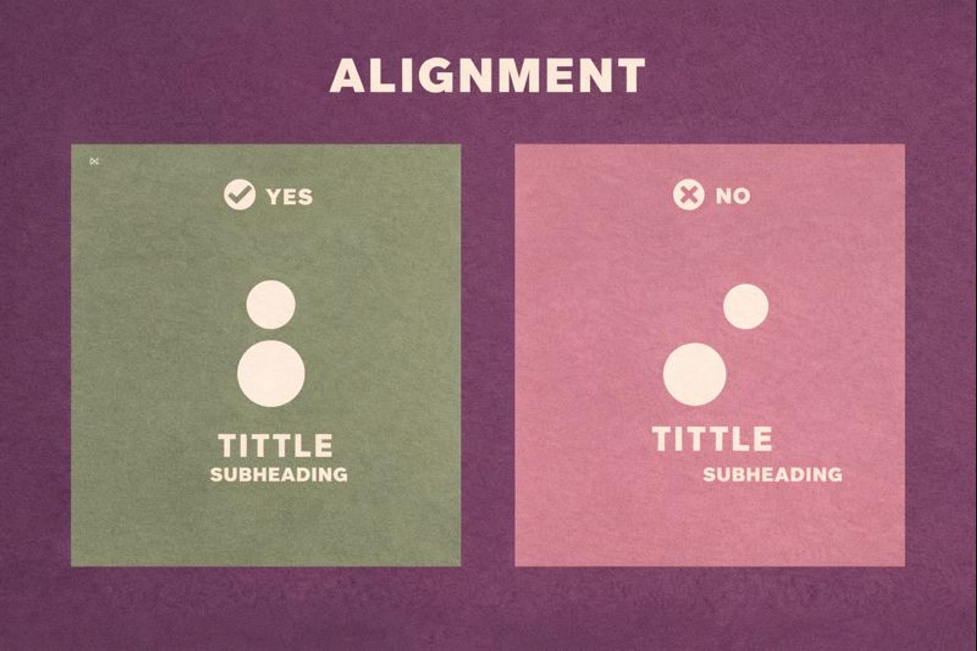
Alignment Creates Order
Alignment is the invisible framework that makes a page feel professional. When elements line up, users process the layout faster because their eyes follow predictable paths.
Grid systems provide a structure where each element has a clear place. This is why tools like CSS Grid, Flexbox, and design systems in Figma are so useful: they help you maintain consistent alignment and spacing across layouts and breakpoints.
Misalignment creates subtle friction. Even small inconsistencies can make a site feel less trustworthy or harder to scan.
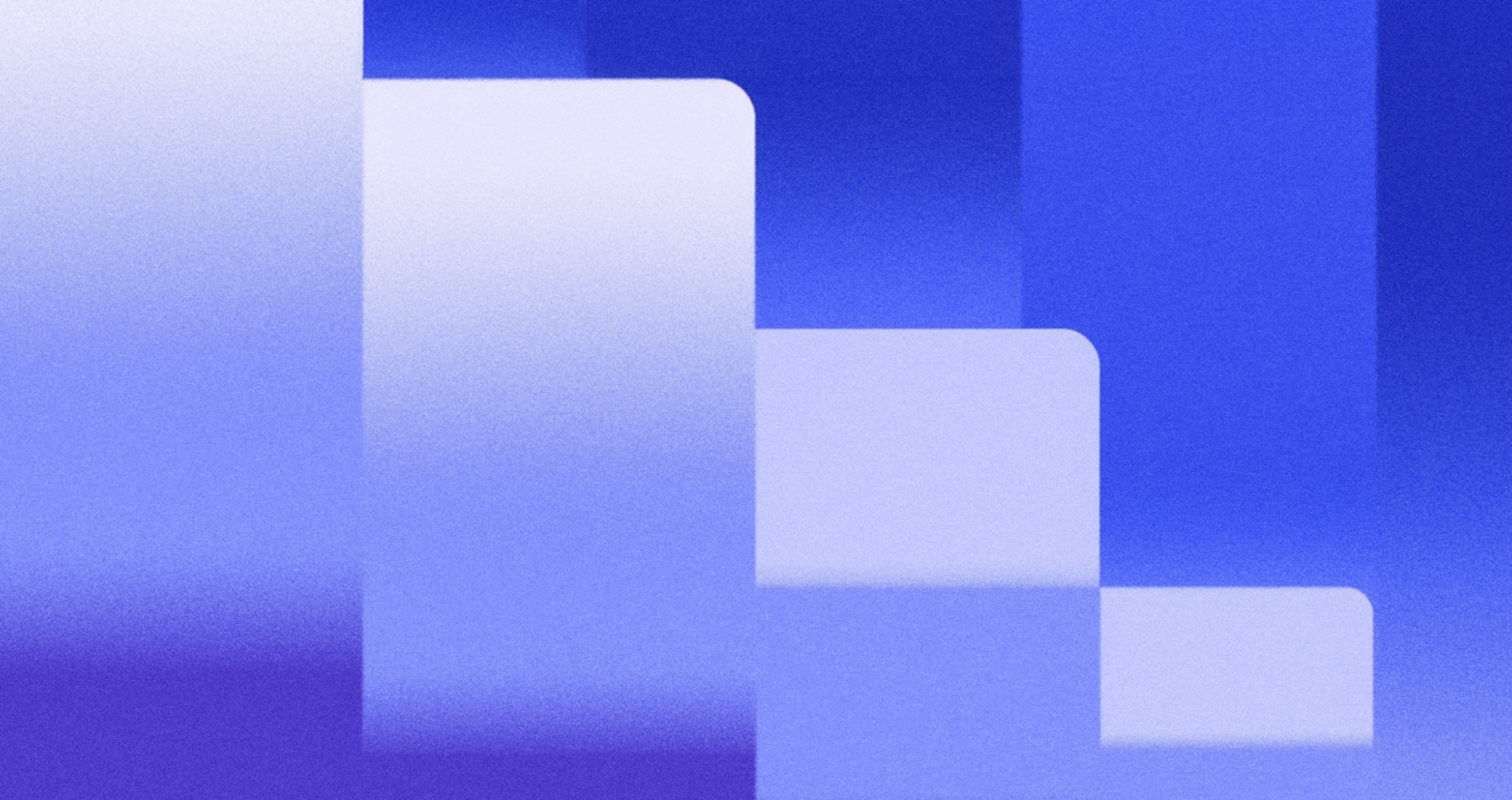
Good vs. Poor Alignment
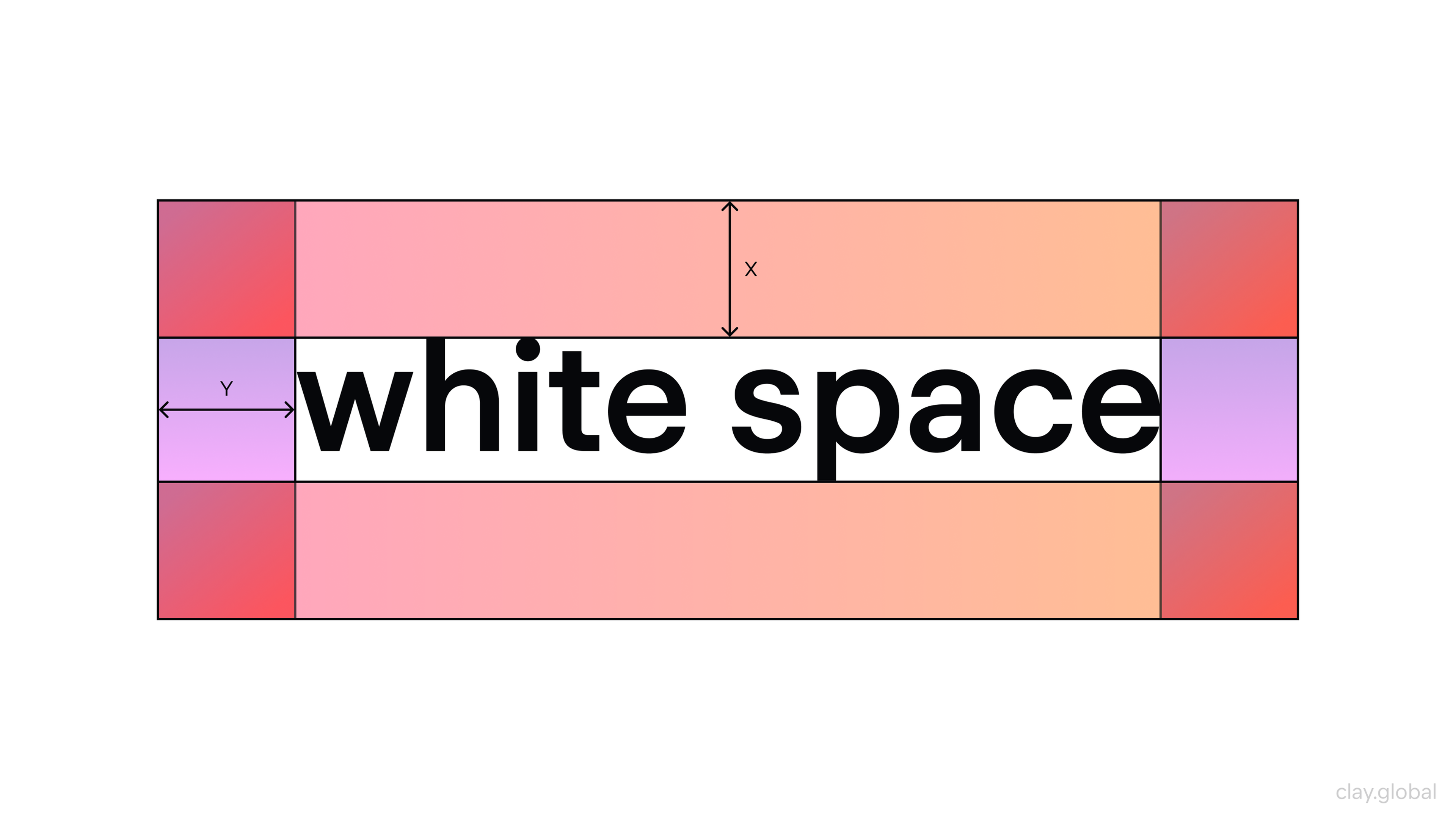
Positive and Negative Space Amplifies Important Content
White space isn’t wasted space. It’s what gives content room to be understood.
Negative space creates emphasis through absence. When key elements have generous space around them, they stand out without needing extra decoration. It also reduces cognitive load: dense layouts force the brain to parse too many messages at once.
Amazon product pages are a good example of “dense but prioritized.” Even when the page contains many competing elements, the buy box is isolated enough to remain clearly primary.
White Space Illustration by Clay
Grouping Through Proximity
Proximity is one of the most reliable ways to communicate relationships. Items placed close together feel related. Items separated by space feel distinct.
Designers use proximity to create groups without extra borders or labels: form fields that belong together, feature lists that share a theme, navigation sections that make sense as a set. It’s clean, modern, and easier to scan than layouts packed with boxes and lines.
This also supports accessibility. Clear grouping helps users with cognitive load challenges understand structure without extra effort.
Visual Cues Guide User Behavior
Visual cues indicate where users should look and what actions they should take. Arrows suggest direction. Icons represent actions. Colors indicate status or importance.
Color Wheel by Clay
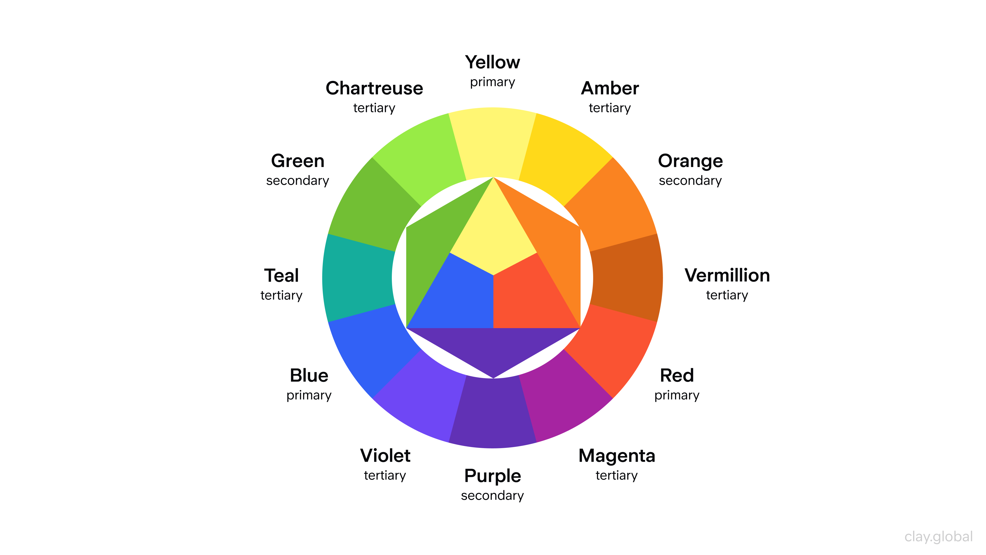
These signals help users navigate without needing to read every word. Leading lines and implied movement are essential design fundamentals that guide user attention and behavior by directing the viewer's eye through the layout and emphasizing key information.
Effective cues feel intuitive because they build on shared cultural understanding. A magnifying glass means search. A shopping cart means purchase. A hamburger menu means navigation. Users recognize these symbols instantly across different sites.
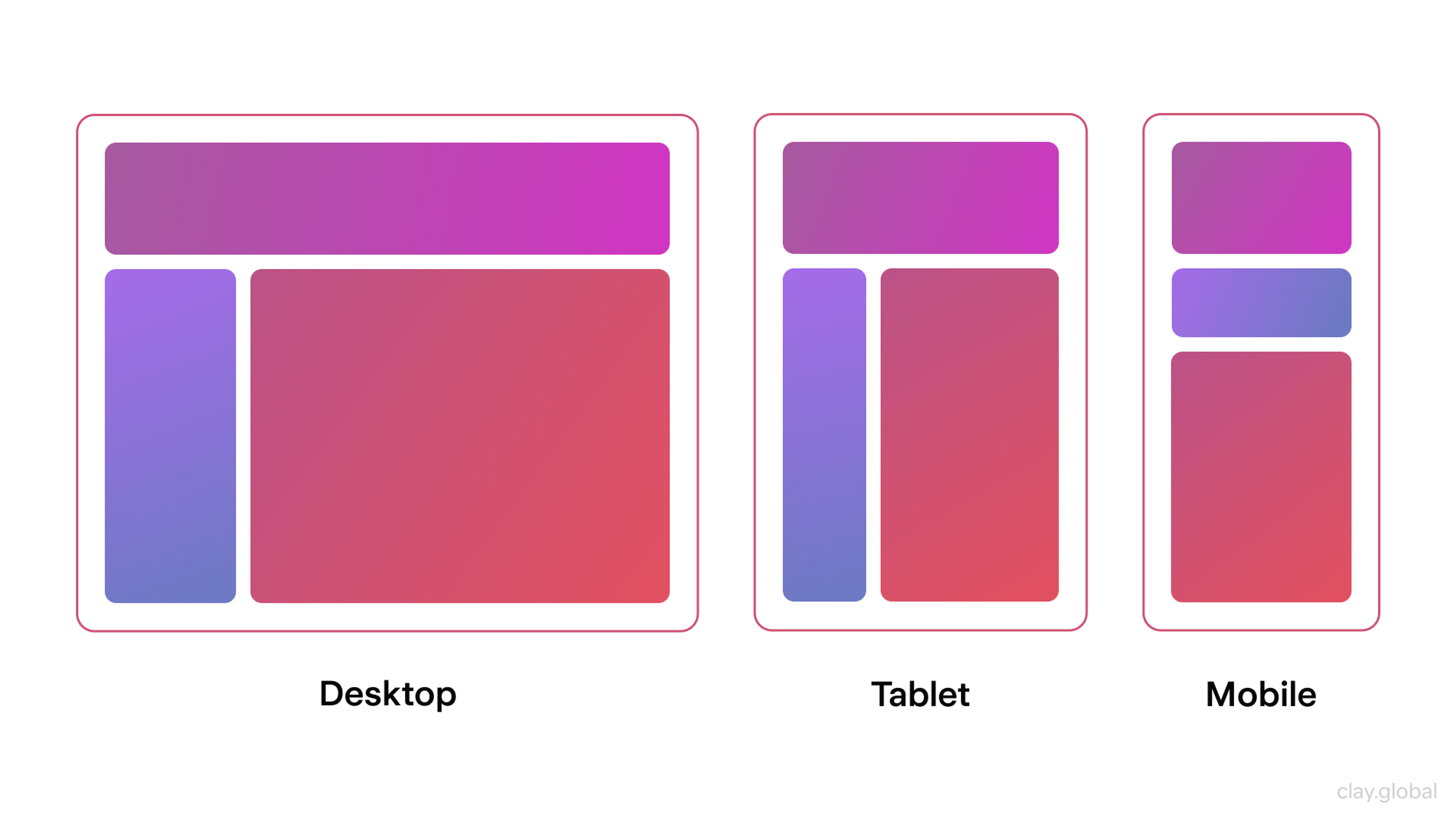
Making Hierarchy Responsive
Hierarchy must survive different screen sizes. What works on desktop can collapse on mobile if you rely on subtle differences.
On small screens, you often need stronger prioritization: fewer competing elements, clearer typography levels, and more deliberate spacing. Sometimes you must change the order of content so the most important information appears earlier.
Accessibility becomes even more important on mobile. Don’t rely only on color for meaning. Keep tap targets comfortable. Maintain readable contrast and font sizes. Ensure interactive states remain obvious.
Performance also affects hierarchy. Slow pages lose attention before hierarchy can do its job. Optimize media, minimize heavy scripts, and use lazy loading where it helps.
With mobile traffic representing a large share of visits, responsive hierarchy isn’t optional. It’s a baseline expectation.
Responsive Design by Clay
Testing Validates Hierarchy Decisions
Even experienced designers can’t fully predict behavior. Testing shows what actually happens.
Heatmaps reveal where users click and how far they scroll. Eye-tracking can expose attention patterns. A simple squint test helps you evaluate whether the page still shows clear priorities when details blur.
A/B testing is especially useful for hierarchy: button emphasis, headline scale, spacing, section order, and content density. It removes guesswork and turns design decisions into measurable outcomes.
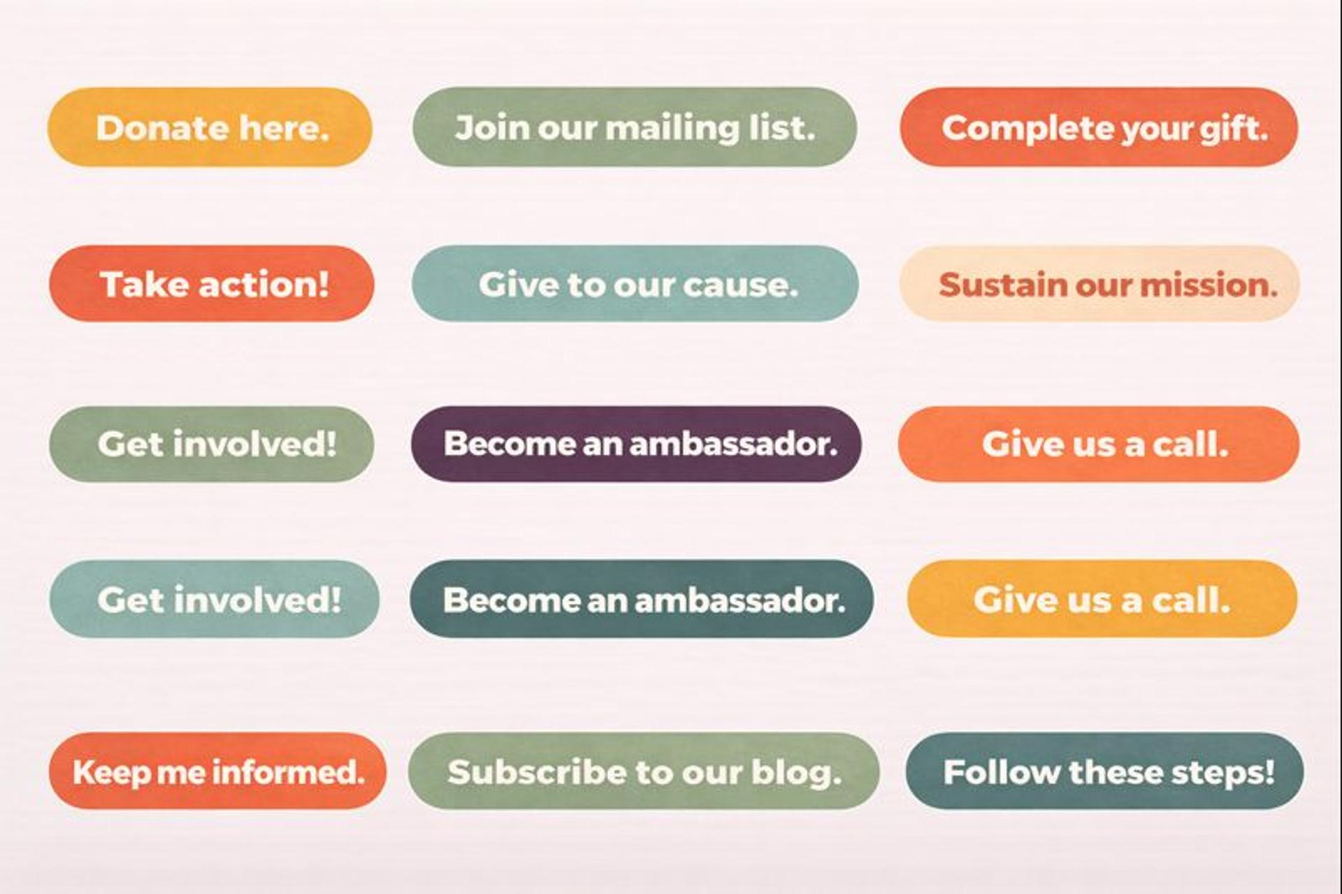
CTA Buttons
Read more
FAQ
What Is A Website Hierarchy?
It is the structured order of pages and content from most important to least important. A clear hierarchy helps users and search engines understand where to find information and which actions are most important.
What Does Hierarchical Mean In Web Design?
It means arranging elements so the eye knows what to look at first, second, and third. Size, contrast, spacing, color, and placement create a visual hierarchy that aligns with business goals and user tasks.
What Is The Difference Between Hierarchy And Layout?
Hierarchy is the priority of information. Layout is the physical arrangement on the screen. A layout places items, while hierarchy decides which items should stand out within that layout.
What Are the Four Types of Website Structures?
Hierarchical or tree for most sites, sequential for step-by-step flows, matrix for cross-linked reference content, and database-driven or dynamic for extensive catalogs with filters and search.
What Is An Example Of Hierarchy Design?
A homepage with a bold hero headline and primary call to action at the top, secondary benefits in mid-page cards, and tertiary links in the footer. Typography scale, color contrast, and spacing make the primary action the most noticeable.
Conclusion
A visual hierarchy combines multiple principles that work in harmony. Size establishes importance. Contrast creates focus. Alignment provides structure. White space offers clarity. Proximity shows relationships.
Cues guide behavior. Responsive design maintains consistency. Testing validates everything. Understanding and applying visual hierarchy principles, as well as each design principle, is essential for practical web design.

About Clay
Clay is a UI/UX design & branding agency in San Francisco. We team up with startups and leading brands to create transformative digital experience. Clients: Facebook, Slack, Google, Amazon, Credit Karma, Zenefits, etc.
Learn moreAbout Clay
Clay is a UI/UX design & branding agency in San Francisco. We team up with startups and leading brands to create transformative digital experience. Clients: Facebook, Slack, Google, Amazon, Credit Karma, Zenefits, etc.
Learn more