Introduction to UX A/B Testing
A/B testing, or split testing, is a way to see which version of a design works better. It compares two versions — called “A” and “B” — to find out which one leads to better user engagement and satisfaction.
UX designers use A/B testing to understand what users like and how they interact with different designs. These insights help improve the overall user experience.
With the help of analytics tools, designers can track how people use each version of a webpage. They can see what works, what doesn’t, and use that data to make smarter design choices. This makes it easier to create a better, more effective product.
A/B Test Example

Benefits of A/B Testing
The biggest benefit of A/B testing is that it gives UX designers hard data to guide their decisions. Instead of guessing, they can rely on real numbers to see what’s working and what needs to change.
This data-driven approach helps designers spot problems quickly and make better choices to improve the user experience. By running tests often, they can keep fine-tuning their designs and make their products easier to use, improving usability.
A/B testing is also useful for marketing teams. It helps them test different ideas across emails, ads, and websites to boost engagement and return on investment (ROI). When teams work together and share results, they can make stronger, more confident decisions.
Types of A/B Tests
UX designers use different types of A/B tests when running usability tests:
1.
Usability tests examine how well each version works by tracking data like task completion time and success rate. By comparing version A to version B, UX designers can spot problems and fix them to improve the user experience.2.
Layout tests: In layout tests, designers test different page layouts to see which one users prefer. They check how people move through the page and which setup makes things easier to find or use. Over time, running several layout tests helps fine-tune the design to boost user satisfaction and performance.3.
Feature comparison tests: These tests focus on individual features. Designers compare how different features perform on the same page to see which ones users like more. This helps them decide which features to keep, improve, or remove — to create a better experience across all devices.
Split Test vs A/B Test: What's the Difference?
People often use the terms “split testing” and “A/B testing” as if they mean the same thing. While they are closely related, there are small but important differences between them.
Split Testing
Split testing usually means showing different groups of users completely different versions of a webpage or design. These versions can be very different — for example, two totally separate landing pages. Split testing works best when you want to test big changes like layouts, overall design, or new messaging styles. It helps you see which approach your audience responds to better.
A/B Testing
A/B testing is a more focused type of split testing. It compares two versions of the same page, but with just one element changed. You might test a different headline, a new button color, or a different call to action (CTA). This helps you understand how a small change affects user behavior. A/B testing is great for fine-tuning your design and improving performance without starting from scratch.
Split Test vs A/B Test

Both methods are useful. Use split testing for big changes. Use A/B testing when you want to improve small details and boost results.
Process for Implementing an A/B Test
If you want to start A/B testing, this simple framework will help you get going.
First, gather data using tools like Google Analytics. Focus on pages or features that get a lot of traffic — these are your best opportunities for fast results.
Also, look at pages with high bounce rates or places where users often drop off. These are likely areas that need improvement. You can also use heatmaps, surveys, and social media feedback to find other spots worth testing.
Before running a test, decide what success looks like. Your goal could be getting users to click a button, sign up for a newsletter, or complete a purchase. These goals will help you measure whether your new version performs better than the original.
Once your goal is clear, start brainstorming test ideas. Think about what changes might help you reach your goal and why. Then, rank your ideas based on two things: how much impact they might have and how hard they are to build or launch.
You can change almost anything on a page — from button colors to layout to hiding navigation tools. Most A/B testing tools come with simple visual editors, so you don’t need to code. Before going live, run a quick test to make sure everything works correctly.
Once your test is active, your visitors will be randomly shown either the original version or the new one. Track their actions to see which version performs better. Watch how people interact with the page and compare the results to your goal.
Be patient. Good data takes time, especially if your audience is small. Wait until you have enough visitors to get results that are trustworthy and statistically significant.
When the test ends, review the results. A/B testing tools will show you which version did better and whether the difference is real or just random. Always check that the results are valid before making any big changes. Trusting strong data helps you build a better site or app with confidence.
If your new version wins, celebrate! Use what you’ve learned to improve other parts of your website. A successful test can lead to even more great ideas — so keep experimenting to boost your results.
If the test doesn’t work out or shows no clear winner, that’s okay, too. Every experiment is a chance to learn. Take what you’ve discovered, think about what to try next, and keep testing.
Progress comes from trying, learning, and improving.
UX A/B Testing Questions to Ask Before You Start
1.
What are we testing, and why?
Clarify the specific elements (e.g., headlines, CTA buttons, layouts) you're testing and ensure there’s a clear reason behind each decision. Are you optimizing for conversions, engagement, or something else?2.
What metric will define success?
Identify your primary KPI (Key Performance Indicator) for the test. Is it conversion rate, click-through rate, bounce rate, or something else? Make sure everyone agrees on what success looks like.3.
How long should the test run?
Define the duration of the test. How will you ensure the test runs long enough to achieve statistically significant results but not so long that it wastes resources?4.
What sample size is necessary?
Ensure you have enough traffic to reach a meaningful sample size. A sample that is too small might lead to inconclusive results.5.
How will we handle external factors?
Consider factors that could impact test results (e.g., seasonality, promotions, external traffic sources) and plan for how to account for these in your analysis.6.
How will we segment the audience?
Determine if you'll run tests across all visitors or target specific segments (e.g., new vs. returning visitors) to ensure you're testing the right group for your goals.7.
What happens after the test?
Have a plan for what happens after the test concludes. Will you implement the winning variation? How will you communicate findings to stakeholders?
Best UI/UX A/B Testing Tools to Use
A/B testing plays a vital role in fine-tuning the user experience, and choosing the right tool can truly set your efforts apart. Optimizely is one of the standout options in this space, offering a powerful platform for running complex tests, personalizing content and experimenting with different designs.
Its easy-to-navigate interface, combined with advanced analytics, lets you test, track, and tweak in real-time, helping you make data-driven decisions faster. Whether testing new website layouts, refining user journeys, or tailoring content for specific audiences, Optimizely ensures you always make choices based on solid data.
Another strong contender is VWO (Visual Website Optimizer), which shines with its features like split URL testing, multivariate testing, and heatmaps, giving you a clearer picture of how users interact with your site. VWO’s intuitive visual editor is a game-changer, letting marketers and designers test ideas without diving into code.
Source: vwo.com

Plus, its in-depth reporting provides valuable insights into how your tests impact conversions, helping your team pivot quickly with confidence. And for those looking for a more budget-friendly, scalable option, Google Optimize is a great place to start.
As a free tool that integrates effortlessly with Google Analytics, it’s an excellent choice for teams getting into A/B testing but looking for a simple, expandable solution.
Analyzing UX A/B Testing Results
When it comes time to analyze results from an A/B test, there are a few key factors that must first be taken into consideration before drawing any conclusions:
- What were the initial goals set before launching?
- How much traffic was generated towards each variation?
- What were user engagement rates like across all variations?
- How did success rates differ between variations?
- Did any unexpected trends emerge that could potentially impact future decisions?
Once these questions have been answered, it is possible to interpret the data collected thus far accurately and statistically significant results.
Through this process, UX designers will know exactly what changes need to be implemented based on information provided by A/B test results.
It also gives them insight into how well certain features perform under certain conditions, allowing them to refine designs more efficiently over time.
A/B Testing Mistakes to Avoid
A/B testing is indispensable for elevating business metrics and maximizing incoming revenue. This process requires great planning, patience, and accuracy, and skimping on any of these could harm your enterprise.
To ensure that you don’t make silly mistakes when running your tests, here’s a list of some common missteps to remember: Creating multiple versions of a campaign variable is crucial to assessing performance and optimizing conversion rates.
A/B Testing Mistakes to Avoid

Number One Misstep: Neglecting to Map Out Your Optimization Plan
Before beginning an A/B test, a hypothesis must be crafted. This initial step provides direction for the following steps and determines what should be altered, why it needs to change, and the expected results.
If you establish a false assumption from the onset of your experiment or test hypothesis, your likelihood of achieving success decreases significantly.
Instead of just taking someone else’s word for it and implementing their test results as is onto your website, you should consider why not doing this may be beneficial.
Every website has different goals, target audiences, traffic sources, and optimization methods, meaning that the same tactics that worked on one site may have vastly different outcomes when applied to yours.
Don’t forget: what was successful for them might not necessarily yield a 40% uplift in conversions for your business! Additionally, testing elements rendered in the customer's browser can enhance user experience and interaction with web elements directly within the client's environment.
Avoid the #2 Pitfall: Assembling Too Many Variables for Testing
Industry veterans repeat one thing: don’t conduct too many tests simultaneously. Examining numerous website components makes it hard to recognize which factor affected the test’s achievement or misfortune.
The more elements tested in one variation, the more traffic needs to be on that page to yield reliable results, so prioritizing and organizing your tests is essential for successful A/B testing.
Multivariate testing, a sophisticated methodology for optimizing conversion rates, evaluates multiple content elements simultaneously to identify the best combinations of design or content elements. This leads to enhanced user engagement and improved sales outcomes.
Don't Make the Error of Skimping on Statistical Significance
When personal intuition and feelings are considered when forming hypotheses or objectives for an A/B test, it can be doomed to failure. Nevertheless, you must allow the experiment to run its complete duration so that it reaches its statistical significance - no matter how successful or unsuccessful it is. This will always provide valuable insights and help plan future tests more effectively.
The Next Mistake to Avoid: Ignoring External Factors
Tests should be conducted in corresponding periods to achieve statistically significant results and reliable outcomes.
It is erroneous to contrast website activity on days when traffic is exuberant compared to when it gets the least attention due to external aspects such as promotions, holidays, and more.
Since this comparison does not contemplate equal factors, there's a higher risk of arriving at an irrelevant finding.
A/B testing & SEO
If done correctly, A/B testing can significantly increase your website's search rank without risk. However, Google has outlined some cautions to ensure you don't accidentally sabotage yourself by using an A/B testing tool inappropriately (e.g., cloaking). To ensure the safety of your site and its ranking on SERPs, it is essential to follow these best practices when conducting an A/B test.
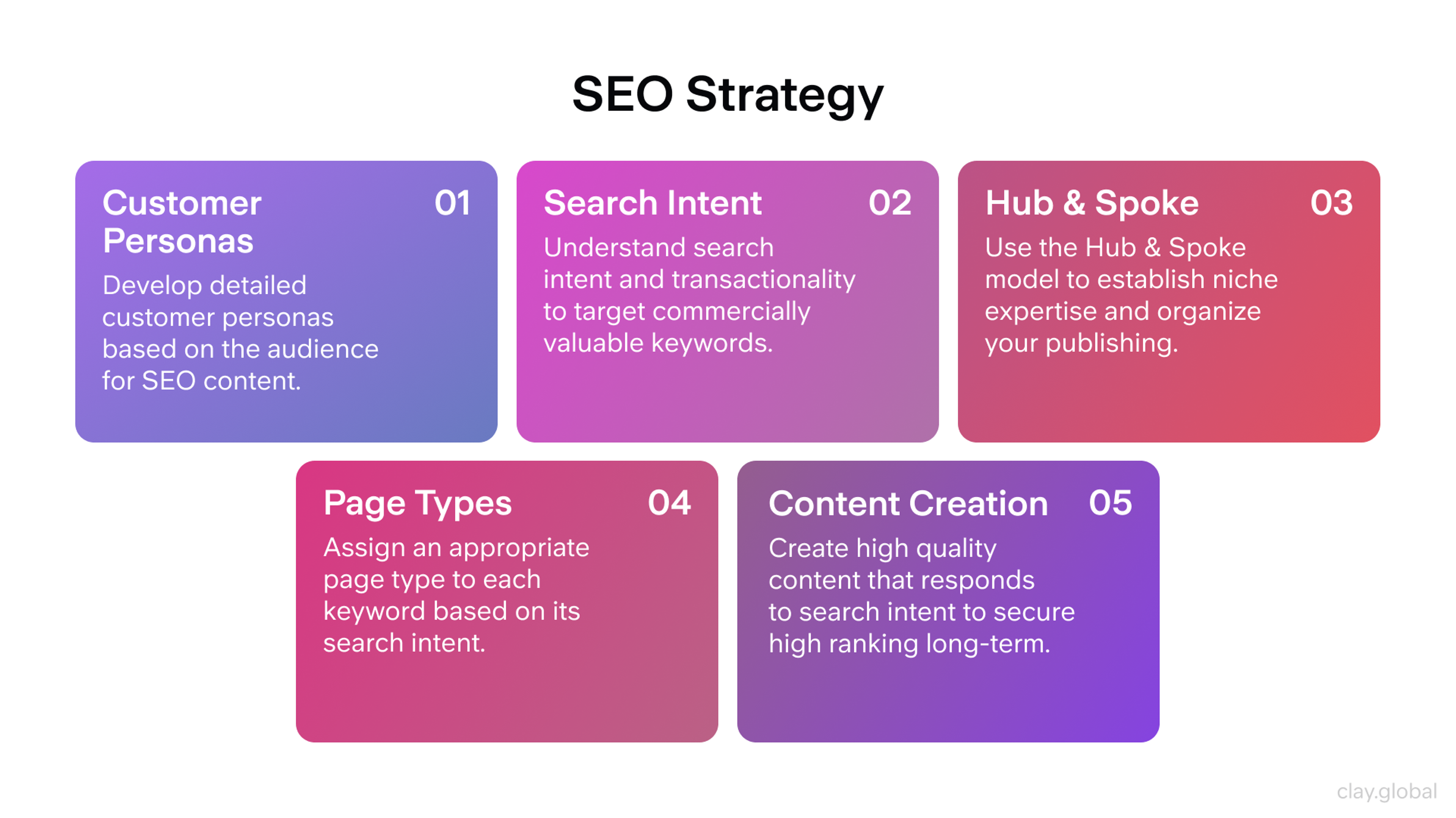
SEO Strategy by Clay
- Abstain from cloaking: Cloaking exhibits search engines other than what a traditional visitor would see. If done, your site might be downgraded or even expelled from indexed lists - this could have dire consequences for your business. To dodge cloaking and guard against it, avoid misusing guest segmentation to show Googlebot diverse content dependent on user agent or IP address.
- To prevent Googlebot from becoming overwhelmed and confused by multiple URLs on the same page, incorporate rel="canonical" into your split tests. This attribute will direct all variants back to their original version, simplifying the process for you and Googlebot.
- Instead of a 301 (permanent) redirect, use 302 (temporary) when running tests to reroute the original URL to a variation. Doing so alerts search engines such as Google that it is only temporary and should keep indexing the first link rather than the testing one.
Great A/B Testing Case Studies
HubSpot: Site Search
To find out which approach would bring in more engagement for their site search tool, HubSpot conducted an A/B/n test. Three different versions were developed:
- Variant A - the search bar was placed prominently with placeholder text altered to "search by topic";
- Variant B - identical to version A, but just limited to the blog page;
- Variant C again features a visible search bar labeled "search the blog."
They hypothesize that making the website search bar more visible, with appropriate placeholder text, will encourage users to interact with it, leading to higher blog lead conversion rates.
HubSpot Search 1

HubSpot Search 2

The outcomes were remarkable! All three variants outshined the original, with variant C leading at an impressive 3.4% conversion rate and a 6.46% user engagement boost from the search bar feature.
Fill Your Bag vs. Add to Shopping Cart
If you're looking to up your e-commerce game and increase conversions, look no further than using "add to bag" on your button copy. Numerous flourishing fashion and accessories labels have adopted this phrase because it's so successful - but could it also benefit you? Don't brush off the possibility yet; investigate how “add to bag” can work magic with your marketing campaign and unique website!
Conversion Fanatics experimented with comparing "add to cart" performance against "add to bag" for one of their clients.
Add to Bag and Add to Cart Bottoms

The hypothesis is that transforming the button text from “add to bag” to “add to cart” will increase the number of people who click on it and convert.
Result:
Add to Bag/Cart Comparison
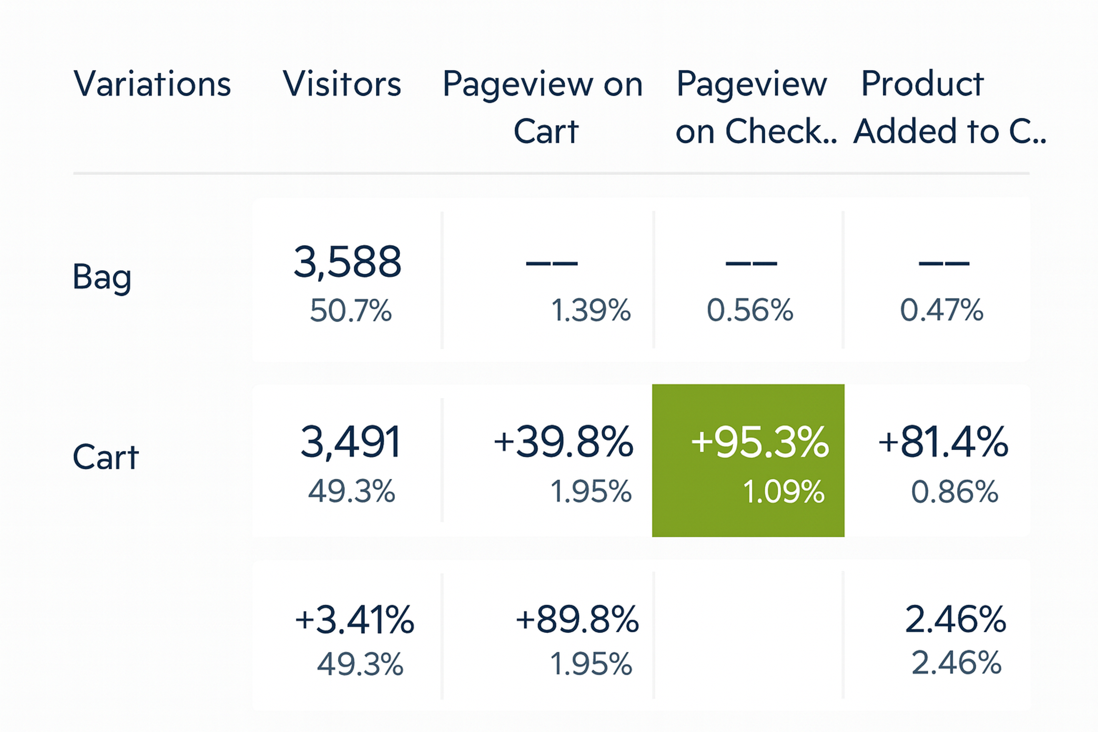
Analyzing the data from this particular call-to-action ecommerce store, it is evident that simply changing the "add to cart" text resulted in a remarkable 95% increase in pageviews on their checkout page.
Moreover, purchases and Add-to-Carts skyrocketed by 81.4% and 22.4%, respectively! This illustrates how modifying just one or two words can produce a big lift — so why not test out different shop cart button texts for your website? You never know what kind of impact small changes could have!
Read More
Conclusion
Using A/B testing methods when designing interfaces helps optimize user behavior and experiences across multiple platforms while ensuring products remain effective over long periods. Incorporating this testing into UX design strategies proves invaluable when striving to create high-quality experiences that best serve the target audience(s).

About Clay
Clay is a UI/UX design & branding agency in San Francisco. We team up with startups and leading brands to create transformative digital experience. Clients: Facebook, Slack, Google, Amazon, Credit Karma, Zenefits, etc.
Learn moreAbout Clay
Clay is a UI/UX design & branding agency in San Francisco. We team up with startups and leading brands to create transformative digital experience. Clients: Facebook, Slack, Google, Amazon, Credit Karma, Zenefits, etc.
Learn more