Most bad interfaces don't start as bad code. They start as a decision nobody sketched first.
A team jumps straight into Figma, builds something that looks finished, and only then realizes the flow doesn't work. By that point, changing it feels expensive, because it looks done, even when it isn't.
UX sketching exists to catch that mistake while it's still cheap to fix: a handful of rough marks on paper or a whiteboard, made before anyone commits real time to a direction.
Key Takeaways
- UX sketching is the fastest, cheapest way to explore multiple design directions before committing to one.
- Sketches, wireframes, and prototypes serve different jobs. Mixing them up wastes time at every later stage.
- The best sketching sessions generate several variations of one idea, not one polished version of it.
- Sketching fails on pixel-critical or compliance-heavy interfaces where the constraints matter more than the concept.
- Digital sketching tools like FigJam and Miro have replaced paper for most remote teams, and AI tools now turn a sketch straight into a working wireframe.
- A short, well-run sketching session prevents the kind of late, expensive rework that shows up once development has already started.
What UX Sketching Is
UX sketching is the practice of quickly and roughly drawing an idea before building it. It's not about artistic skill. A sketch can be three boxes and an arrow, as long as it captures the shape of an idea clearly enough for someone else to react to it.
Sketching sits at the very front of the design process, before layout decisions get locked in and before anyone opens a design tool with intent to finish something. That timing is the entire point.
A sketch is disposable by design. You can throw ten of them away in an hour and lose nothing but a few minutes, which is exactly why sketching works so well for testing ideas that might turn out to be wrong.
That disposability has real cost implications. A study of design decisions on two large aerospace development programs found that early design decisions cost roughly five times more to change once they'd already shaped later work, compared to catching the same problem earlier in the process.
The study comes from engineering, not software design specifically, but the underlying logic holds across disciplines: the earlier you can test and discard a bad idea, the less it costs you to be wrong. Sketching is the cheapest point in the whole product lifecycle to find out you're wrong.
Sketch vs. Wireframe vs. Prototype
Every UX guide walks through this comparison, and most of them stop at definitions. What actually matters is knowing which one to reach for and when.
A sketch captures an idea. It has no real layout logic, no interaction detail, and no commitment. Use it when you're still deciding what the screen should even do.
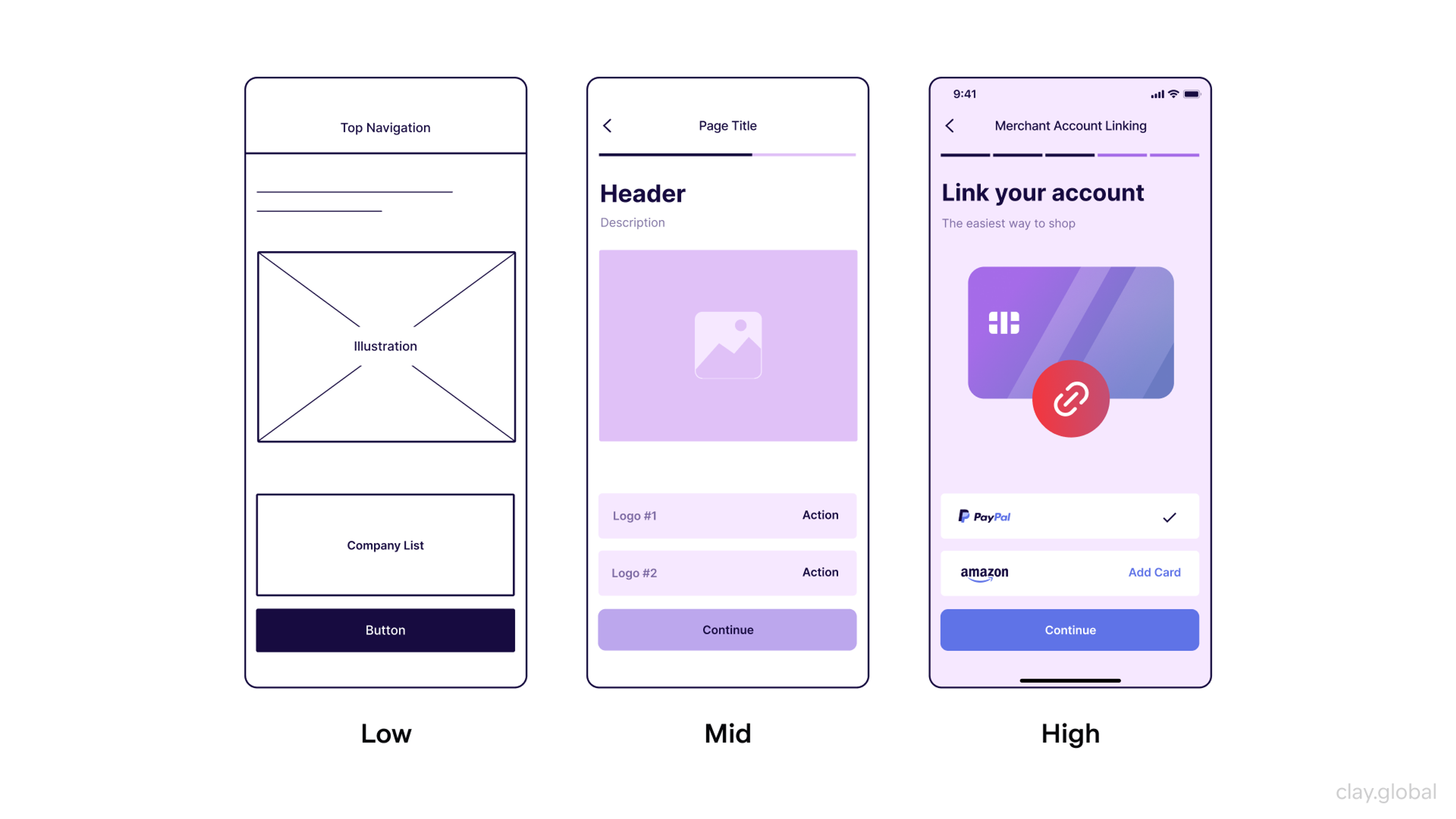
A wireframe captures structure. It defines where content sits, how sections relate, and what the information hierarchy looks like, still without color, type, or final copy. Use it once you've picked a direction from your sketches and need to lock in layout before anyone starts building.
Low, Mid, and High-Fidelity Wireframe Examples by Clay
A prototype captures behavior. It simulates how a user actually moves through the product, which makes it the right tool for usability testing, not for early idea generation.
Mockup vs Wireframe vs Prototype by Clay
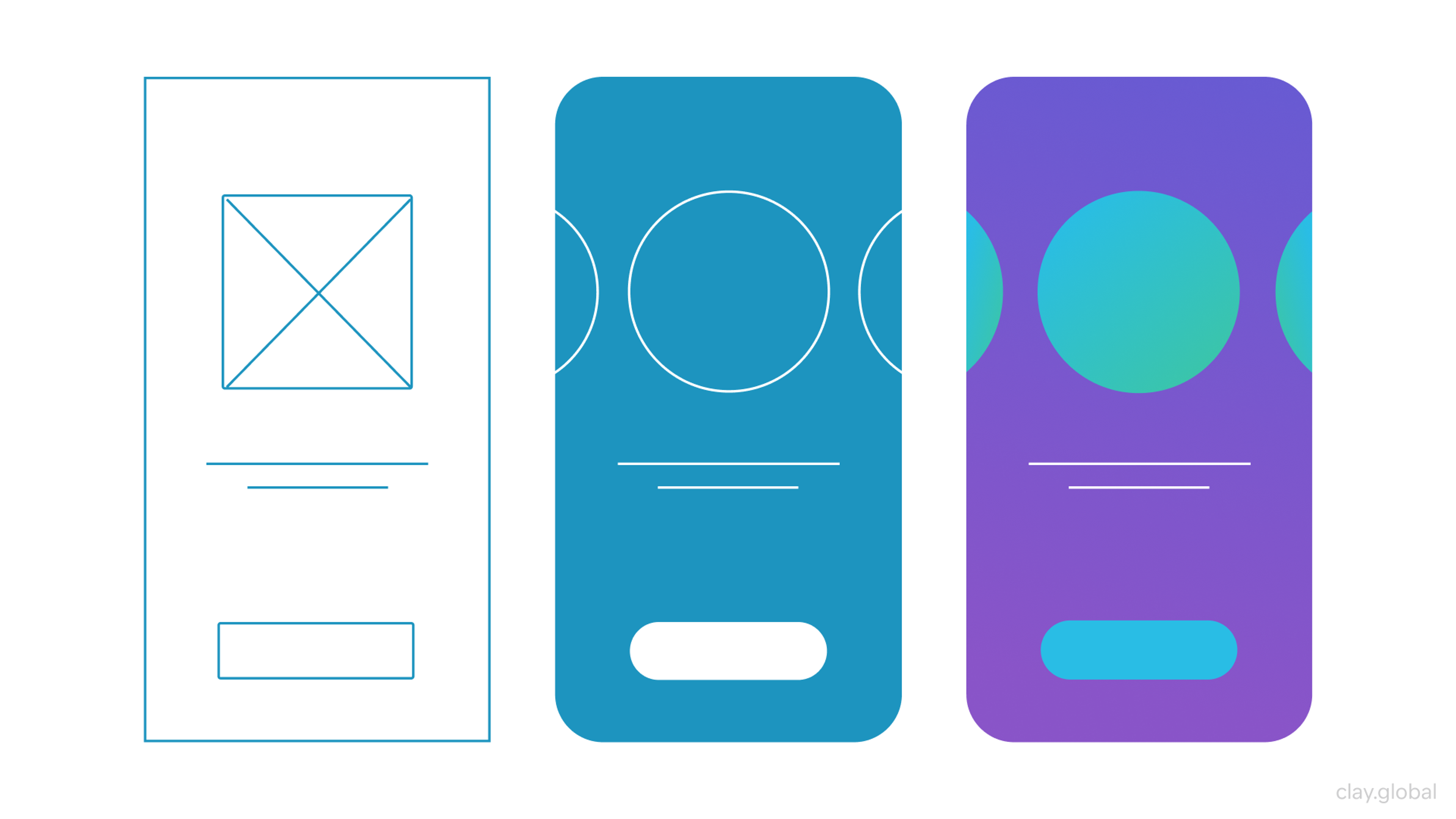
The failure mode almost every team hits at least once: skipping straight to a wireframe or prototype because sketching feels like a step for beginners. It isn't.
Skipping it just means your first "idea" is whatever you happened to build first, tested against nothing.
How to Run a UX Sketching Session
A sketching session works best with a clear sequence, a hard time limit, and more than one person in the room.
1. Frame the Problem Before Anyone Draws Anything
Start by stating the specific problem in one sentence: what does this screen or flow need to accomplish, and for whom? Skipping this step is the most common reason sketching sessions produce nothing useful.
Without a clear problem statement, people sketch whatever's already in their head instead of exploring the actual decision in front of them.
2. Generate Variations, Not One Polished Idea
Sketch the same concept three or four different ways before picking one. A fast way to force this: run a Crazy 8s round, folding a sheet of paper into eight panels and sketching eight distinct variations of one screen in eight minutes, one minute per panel.
The time pressure is the point. It stops anyone from over-thinking a single direction and forces genuinely different ideas onto the page instead of eight versions of the same one.
Beyond speed drills like that, try a flowchart version, a storyboard version, and a straightforward screen-by-screen version of the same user journey.
UI Sketching Examples
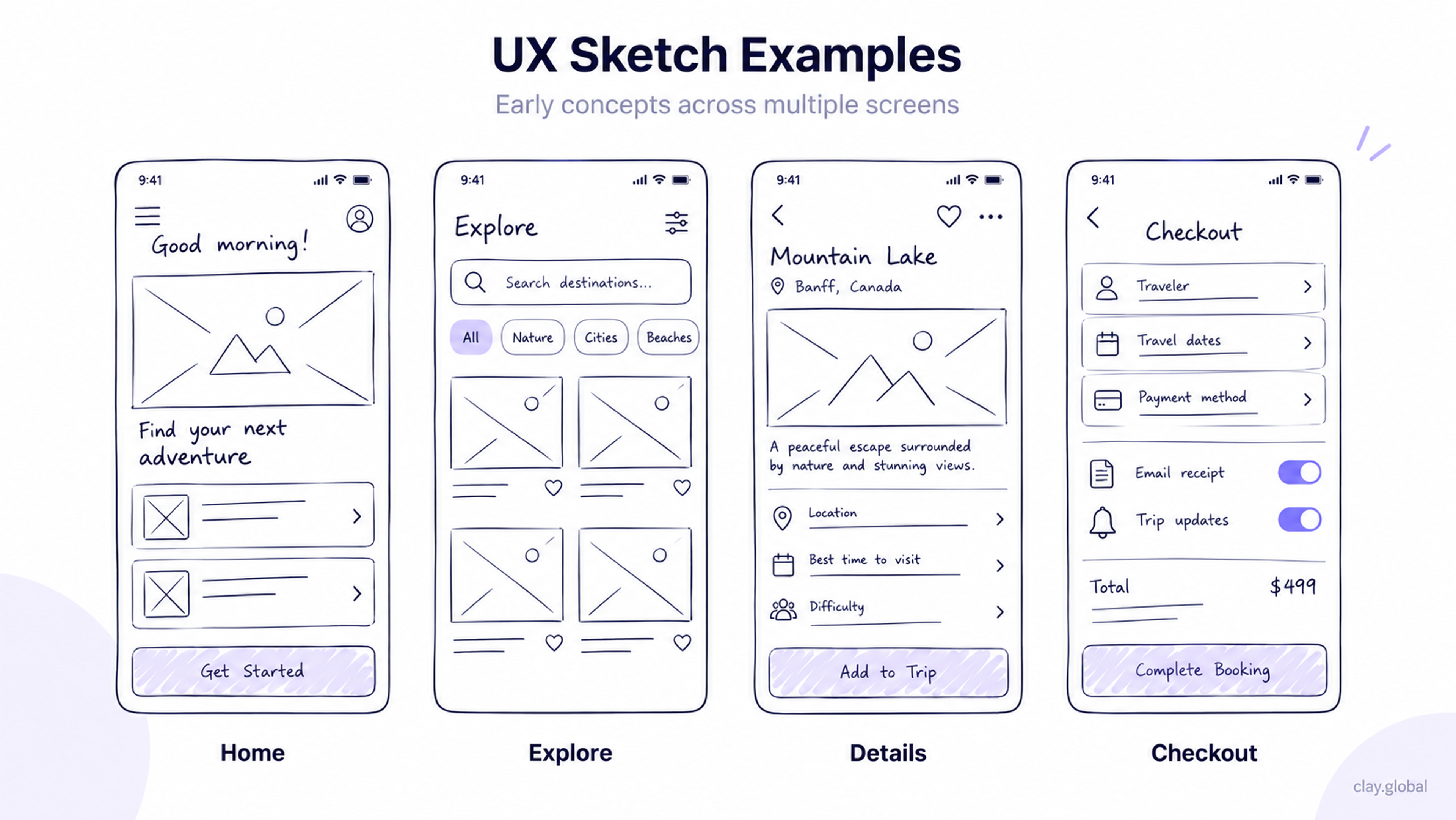
Each format surfaces different problems:
- A flowchart exposes logic gaps
- A storyboard exposes emotional and contextual gaps
- A screen-by-screen sketch exposes layout gaps
You won't catch all three by sketching the same format three times.
For interfaces with multiple states, layer them in one sketch rather than drawing separate versions: default, hover, error, and empty state, stacked or side by side. This catches inconsistencies between states before they turn into actual bugs.
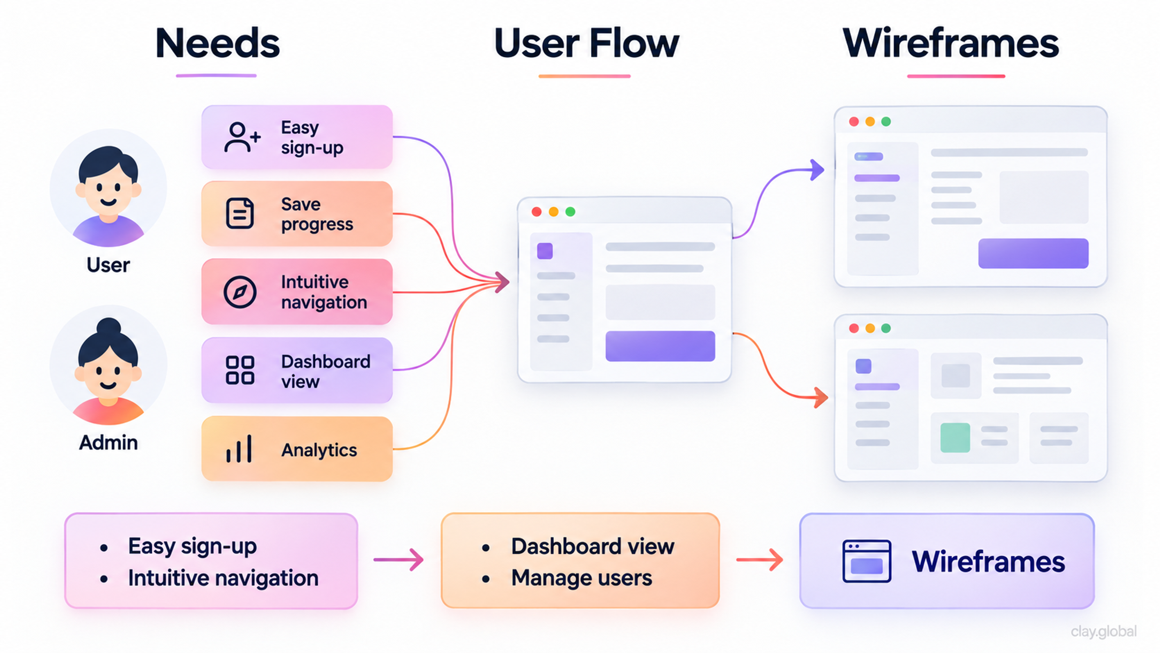
3. Map the Sequence, Not Just the Screen
Sketch the full interaction, starting one screen before the one you care about and ending one screen after it. Label transitions, timing, and what triggers each change.
A single screen sketched in isolation hides exactly the kind of problem that only shows up once a user is moving through a real sequence: a button that changes meaning between screens, a state that never gets explained, a step that assumes information the user doesn't have yet.
This is roughly the approach Clay's design team took while building Eden, an AI-powered real estate platform. The brand and product decisions moved through several rounds of early concept exploration before settling on the platform's current direction: an emotional, calmer alternative to the transactional feel of most real estate search tools.
Getting to that point took testing several conceptual directions against the same core question (does this feel like searching listings, or does it feel like imagining a life) before committing engineering time to any one of them.
Eden Case Study by Clay Global
From Google's wearable experience to Snapchat’s AR try-on lenses, we've helped teams across every industry design products people actually want to use. Let's talk about yours.
When Sketching Isn't the Right Move
Sketching earns its place in most design processes, but not in every one. Skip it, or shorten it dramatically, in these situations:
1.
Pixel-critical interfaces, like a financial dashboard where exact alignment and data density are the whole point, don't benefit much from loose sketches. Jump to a structured wireframe instead, where you can actually test information density.2.
Compliance-heavy flows, like anything touching payment forms, medical data entry, or accessibility requirements defined by WCAG, need the constraints in front of you from the start. Sketching a payment flow without those constraints produces ideas that get thrown out the moment someone checks them against the actual requirements.3.
Small, well-understood changes, like adjusting an existing button's copy or resizing a component that already works, don't need a sketching pass. Sketching exists to explore uncertainty. If there's no real uncertainty, skip straight to the fix.
Whiteboard Diagram of User Flows
Tools for Sketching in 2026
Paper and a pen still work, and for solo ideation, they're often faster than opening any app. But most sketching today happens on a screen, for one simple reason: most design teams aren't in the same room.
FigJam and Miro have become the default for collaborative sketching. Both give a team a shared, infinite canvas where several people can sketch, comment, and vote on directions in real time, whether they're sitting three feet apart or three time zones apart. Neither tries to be a polished design tool, and that's the point: the friction of a "real" design tool is exactly what slows sketching down.
Sketching doesn't have to happen live, either. A shared canvas works asynchronously just as well as it does in a scheduled session: one person drops a sketch and a short note on the problem it's solving, and teammates in other time zones add their own variations or comments whenever their day starts.
The one requirement that live sketching doesn't need but async sketching does is a clear written problem statement attached to the board. Without it, an async sketch shows up with no context, and nobody knows what question it's actually trying to answer.
AI has added a new step to the sketching workflow rather than replacing it. Uizard's wireframe scanner takes a photo of a hand-drawn sketch and turns it into an editable digital wireframe, closing the gap between paper sketching and a structured layout in seconds instead of an hour of manual redrawing.
Visily works the other direction, turning a written prompt into a rough UI layout that a team can then sketch over and adjust. Neither tool replaces the thinking that happens during sketching. What they replace is the tedious redrawing step that used to eat up time between a good sketch and a usable wireframe.
The one thing worth flagging clearly: AI-generated layouts are only as good as the prompt or sketch behind them, and they tend to default to generic patterns unless someone pushes back on the output. The judgment about what the interface needs to do still comes from the human sketching session, not the tool that cleans it up afterward.
Common Sketching Mistakes to Avoid
Polishing too early. The moment someone starts adding real colors or precise spacing to a sketch, the room stops treating it as disposable. People get attached to work that looks finished, even when it isn't, which quietly kills the willingness to throw an idea away.
Sketching alone when the decision affects a team. A solo sketch reflects one person's mental model of the problem. Sketching with even one other person in the room surfaces disagreements about the actual problem, rather than just the visual solution, and those disagreements are far cheaper to have now than after a wireframe is built.
Skipping sketching under deadline pressure. This is the mistake that costs the most, and it happens constantly. Teams under a tight deadline reason that they don't have time to sketch, so they build the first idea that comes to mind. That's exactly backward. A rushed team has less room to absorb the cost of a wrong turn later, which makes the fifteen minutes spent sketching more valuable, not less.
What Sketching Buys a Team
Clay's redesign work for Grayscale, a cryptocurrency investment platform, is a useful case in point. The brief called for a site that felt trustworthy to traditional finance professionals while still feeling current to crypto-native users, two audiences with very different visual expectations of the same product.
Grayscale Case Study by Clay
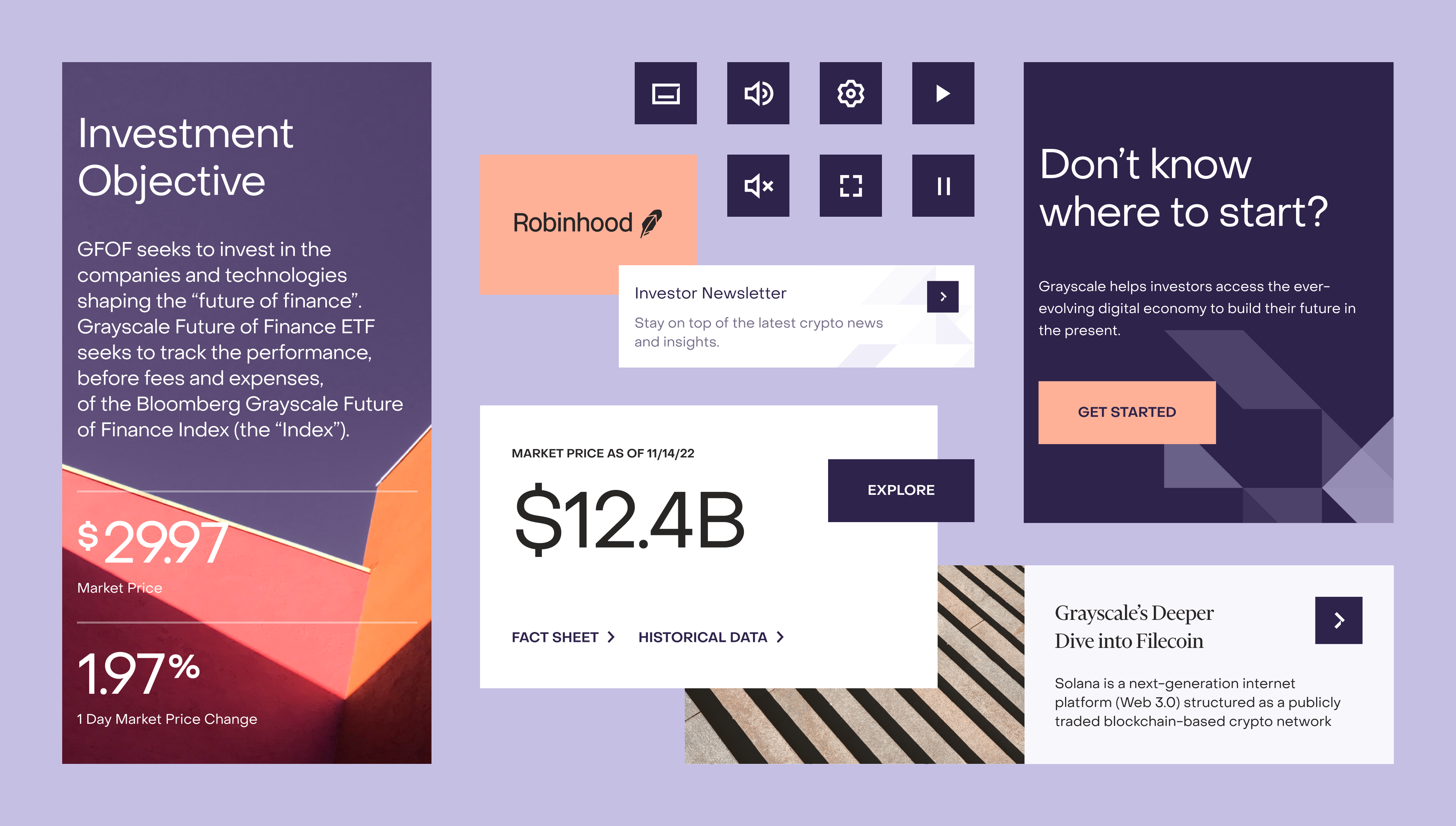
Early concept work explored several distinct visual directions (from bold and futuristic to restrained and minimalist) before the team landed on the grounded, modular approach that shipped. Settling that direction early, before any product-specific landing page was built out, meant the modular components carried cleanly across the main site and every individual product page that came after.
That's the actual payoff of sketching: not the drawings themselves, which nobody keeps, but the bad ideas it lets you rule out before they cost anything to rule out.
Ready to build a web layout that performs across every device and keeps users engaged? Let our team take it from wireframe to launch. Get in touch.
Read More
- Clay Global’s Digital Design Case Studies
FAQ
What is UX sketching in simple terms?
UX sketching is a fast, rough drawing of a design idea, made before any structured layout or interactive prototype exists. It's meant to explore possibilities, not to look finished, and it's usually thrown away once the team picks a direction.
How is UX sketching different from wireframing?
A sketch explores what an idea could be. A wireframe locks in how that idea is structured once you've already picked a direction. Sketches are informal and disposable. Wireframes define layout, hierarchy, and content placement with enough precision that a developer or stakeholder can rely on them.
Do I need to be good at drawing to sketch UX ideas?
No. UX sketches are usually boxes, arrows, and short labels. The goal is communicating an idea clearly enough for someone else to react to it, not producing something that looks polished.
How long should a UX sketching session take?
Most sketching sessions work best kept short, often 15 to 30 minutes for a single flow or screen. Longer sessions tend to drift toward polishing individual sketches instead of generating more variations, which defeats the point.
What is layered sketching?
Layered sketching means drawing multiple states of the same interface, like default, hover, and error, in one sketch instead of separate ones. It surfaces inconsistencies between states before they become real bugs in a build.
Should sketching happen alone or with a team?
With a team whenever the decision affects more than one person's work. Group sketching surfaces disagreements about the actual problem early, which is far cheaper to resolve at the sketch stage than after a wireframe or prototype already exists.
When should a team skip UX sketching?
Skip it, or shorten it, for pixel-critical interfaces where exact spacing and density matter more than the concept, for compliance-heavy flows where the constraints need to be present from the start, and for small, well-understood fixes where there's no real uncertainty to explore.
Can AI tools replace UX sketching?
Not the thinking part. Tools like Uizard and Visily speed up the step between a rough sketch or prompt and a usable digital wireframe, but the judgment about what the interface should actually do still has to come from a human sketching session first.
What's the best tool for remote UX sketching?
FigJam and Miro are the most common choices for distributed teams, since both offer a shared canvas that supports real-time sketching, commenting, and voting without requiring everyone to be in the same room.
Can UX sketching work asynchronously?
Yes, as long as whoever starts the sketch attaches a clear written problem statement to it. A shared digital canvas lets teammates add variations or comments whenever they're online, but without that context, an async sketch just looks like an unexplained drawing to everyone who sees it after the fact.
What is a Crazy 8s exercise?
Crazy 8s is a timed sketching drill: fold a page into eight panels and sketch eight distinct variations of one screen in eight minutes, one minute per panel. The tight time limit forces genuinely different ideas instead of one idea refined eight times.
Is paper sketching still relevant?
Yes, especially for solo ideation or the very first pass at an idea. Paper has no loading time and no interface of its own to think about, which keeps the focus entirely on the idea. Most teams move to a digital canvas only once more than one person needs to see and build on the sketch.
What's the biggest mistake teams make when sketching?
Skipping it under deadline pressure. Teams that feel too rushed to sketch tend to build the first idea that comes to mind, which is exactly the situation where a wrong early decision costs the most to unwind later.
How many sketch variations should you make before choosing one?
There's no fixed number, but three to four distinct approaches to the same problem is usually enough to reveal real trade-offs without spending so much time exploring that the team never commits to anything.
The Bottom Line
UX sketching isn't a formality before the "real" design work starts. It's the cheapest testing ground a team has, a place to be wrong quickly and often before any of it costs real time or code.
The teams that get the most out of it treat sketches as disposable on purpose: fast enough to make in minutes, rough enough that nobody gets attached, and specific enough that a bad idea gets caught before it turns into a wireframe, a prototype, or a shipped feature that has to be quietly fixed later.

About Clay
Clay is a UI/UX design & branding agency in San Francisco. We team up with startups and leading brands to create transformative digital experience. Clients: Facebook, Slack, Google, Amazon, Credit Karma, Zenefits, etc.
Learn moreAbout Clay
Clay is a UI/UX design & branding agency in San Francisco. We team up with startups and leading brands to create transformative digital experience. Clients: Facebook, Slack, Google, Amazon, Credit Karma, Zenefits, etc.
Learn more