
Imagine two websites in the same industry, with similar products and comparable traffic, where one converts, and the other doesn't.
The difference comes down to layout, how space is organized, where the eye is directed, and whether a visitor can find what they're looking for without thinking hard.
A strong layout works invisibly, giving users what they need and leaving them with a positive impression.
Key Takeaways
- Layout shapes the user's entire experience before a single word of copy registers.
- Strong layouts are built on clear visual hierarchy, consistent navigation, and a logical content flow.
- Reading pattern frameworks like F and Z map how attention travels across a screen.
- Responsive design is no longer optional. It's the baseline expectation for every device type.
- Grid systems give you structure and flexibility at once, especially across varying screen sizes.
- The most common layout mistakes are also the easiest to fix.
- Testing and iteration matter as much as initial design decisions. The layout is never truly finished.
What Is a Website Layout?
Web layout describes the visual arrangement of all the elements on a page, from headers and navigation menus down to footers and everything in between. Good layout makes navigation feel effortless and puts information exactly where users expect to find it.
This is especially important for crypto and Web3 platforms, as users need to navigate any possible complex data and transactions. A well-designed layout makes the website easier to use and helps more people understand the technologies.
Many people overlook the need for good web design. Of course, there's a lot involved with developing a site, but good design should always be a core consideration. Remember that visitors to your site interact with the myriad individual pages that comprise it.
Visitors to your site will only take the actions if you direct them through intuitive design. When designing for visitors, treat them as if they won't be pleasant to work with.
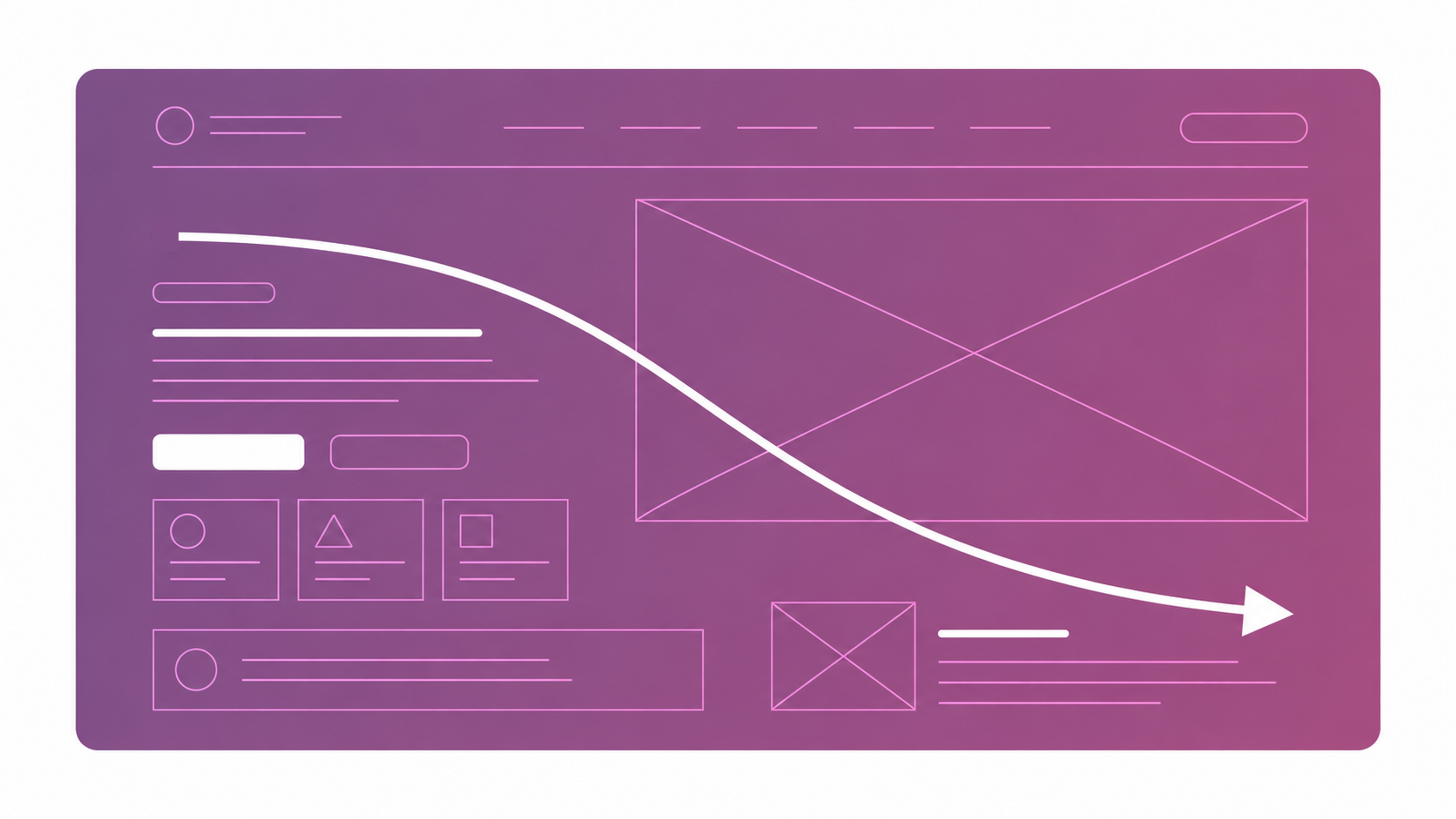
Different Types of Layout Structures by Clay

While developing the framework for a new page, basic design principles should include balance, contrast, unity, and visual hierarchy. These principles can be used for page layouts. A good designer will use these tools for the user's benefit, improving the overall quality of a web page's design.
The implementation of CSS Grid improves the adaptability of web page design. CSS Grid has the functionality to aid in the design of great websites.
Essential Components of a Website Layout
Every web layout is built from the same core components. Each one plays a specific role in how users move through a page and what they take away from it.
Components of a Website Layout
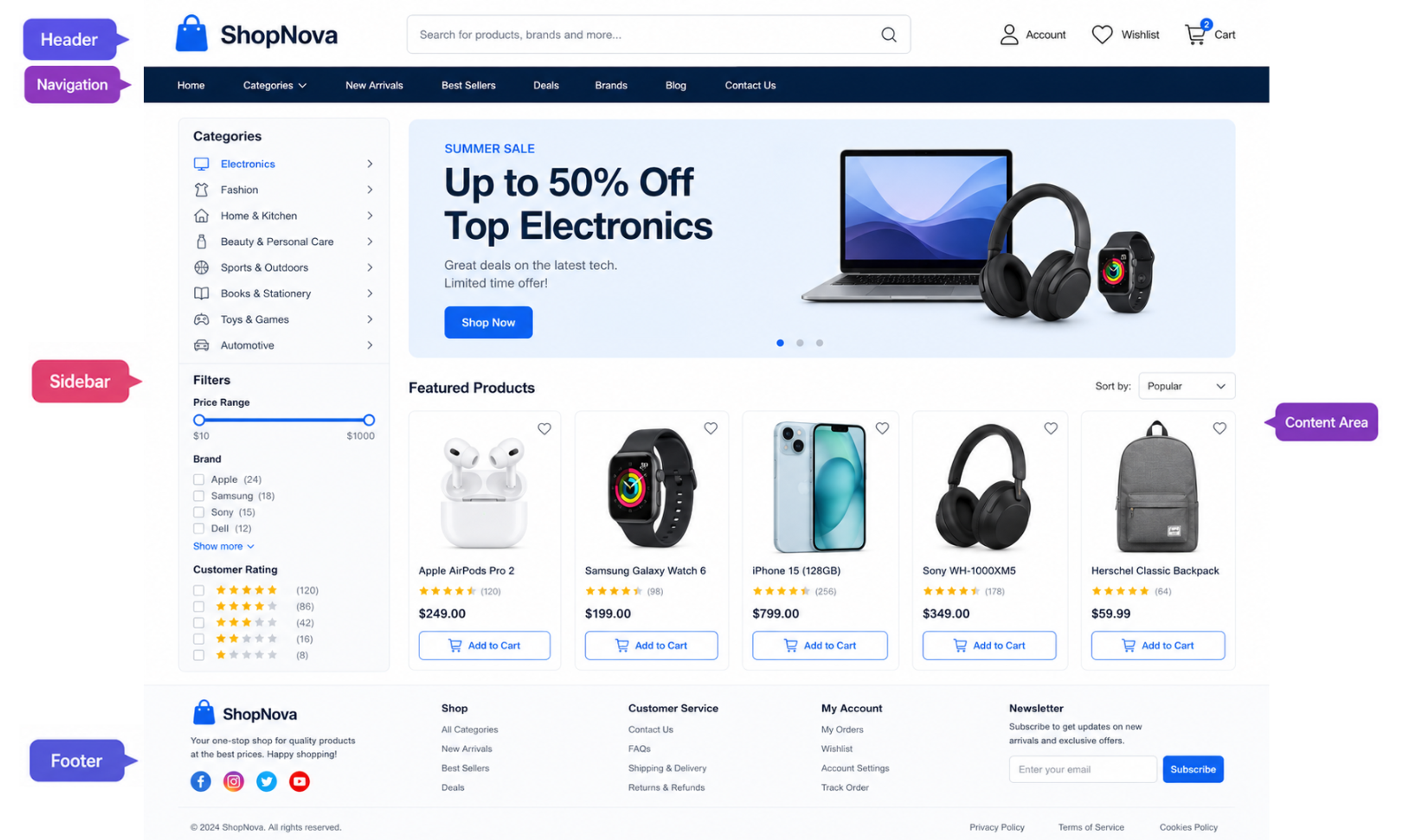
Here is how they work and why each one matters.
Header
The header is the first thing visitors process. It sets the brand tone and links to the pages users are most likely to need.
A strong one has a clear logo, a legible navigation structure, and doesn't try to do too many things at once.
Navigation
Navigation is the system that enables exploration. Every other layout decision rests on it.
It can live at the top, along the side, or behind a hamburger icon on mobile, but regardless of format, it needs clear labels and consistent behavior across pages.
Content Area
The main content area is where the site's actual value lives. The design job here is to make that value easy to absorb, and visual hierarchy is how that happens.
Users scan before they read, moving down a page looking for an entry point, a headline that matches their intent, or a subheading that signals relevance.
If the hierarchy is clear, built through contrast in type size, weight, color, and spatial grouping, they find it quickly. If every element looks similar, they see a wall and leave. Paragraph rhythm and image placement serve this goal. Each element should occupy space proportional to its importance.
Sidebar
Sidebars are optional sections on web pages that display additional information to support the main content, such as related posts, ads, or secondary navigation.
When deciding whether to include a sidebar, consider whether the information will be useful to users and enhance their experience.
If you decide to use a sidebar, ensure it does not overpower the rest of your design but complements it.
Footer
The footer is usually located at the bottom of every webpage. It contains links such as Contact Us, About Us, and a sitemap, as well as social media icons for easy access to online platforms.
A good footer design should be organized so visitors can find any page quickly without having to scroll through menu after menu.
Most Popular Website Layouts
Multiple Column Layout
Multi-column structures let you present more content above the fold and create a stronger visual hierarchy than a single-column layout can.
Viewport Illustration by Clay

The trade-off is complexity, as multiple columns require careful management for responsive design across devices.
Works best for:
- News, media, and e-commerce sites where content density is the point
- SaaS product pages comparing features or pricing tiers
- Any layout where users need to scan across categories rather than read linearly
Asymmetrical Layouts
Asymmetrical design breaks the expectation of symmetry to create something more dynamic and memorable.
Asymmetrical Layout Example
Placing elements off-center draws attention to specific content in a way that feels intentional rather than formulaic and is most effective for brands with a distinctive visual identity.
Works best for:
- Creative agencies, studios, and portfolio sites
- Fashion and luxury brands where visual personality is part of the product
- Campaign microsites built around a single story or launch
Full-Screen Layouts
Full-screen web design templates make the most of every inch of screen space to create an immersive user experience.
Mission Control Full-Screen Layout Example
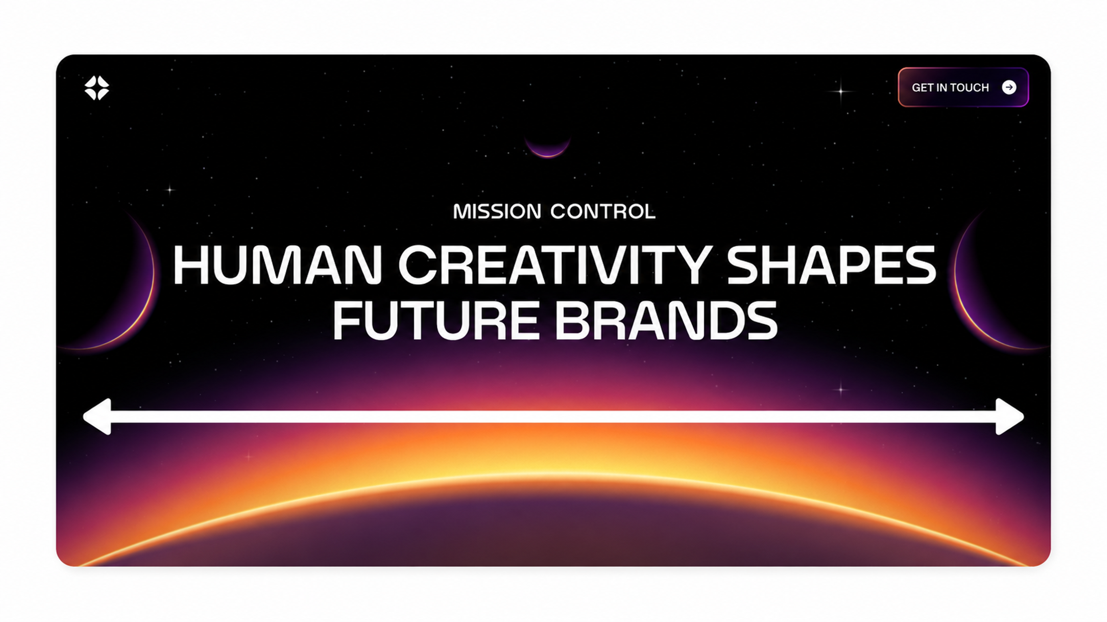
Such designs often include large, high-resolution images that fill the entire width and height of the screen, as well as videos with minimal text and navigation elements.
Works best for:
- Brand homepages where the visual does the storytelling
- Photography, film, and travel websites
- Product launch pages for hardware or physical goods
Modular Layouts
Modular design organizes content into discrete, repeatable units, such as cards, tiles, and grids.
Structured Modular Layout Example by Clay

That consistency creates a predictable, scannable experience while giving teams the flexibility to scale or rearrange content without a full page rebuild.
Works best for:
- E-commerce product listings and marketplaces
- News aggregators and content-heavy dashboards
- Any site that needs to add, remove, or reorder content regularly
Magazine Layout
The magazine layout applies editorial design logic to the web. Typographic hierarchy and content grouping create a reading experience that feels curated rather than generic.
Modern Magazine Layout Example by Clay
Works best for:
- Editorial publications and content-driven blogs
- Brand journals and long-form storytelling sites
- Cultural institutions, museums, and arts organizations
F Layout
The F-pattern maps how users actually scan web pages, with a horizontal sweep across the top, a shorter sweep across the upper middle, then a vertical scan down the left edge.
F-Layout Example by Clay

The F layout places important content, especially CTAs, along those natural axes of attention.
Works best for:
- Text-heavy pages like articles, documentation, and blog posts
- Search results and directory listings
- Any page where users are scanning for a specific answer rather than reading in full
Z Layout
The Z-pattern moves top-left to top-right, then diagonally down to bottom-left, then across to bottom-right, making it useful for storytelling and landing pages.
Z-Layout Example by Clay
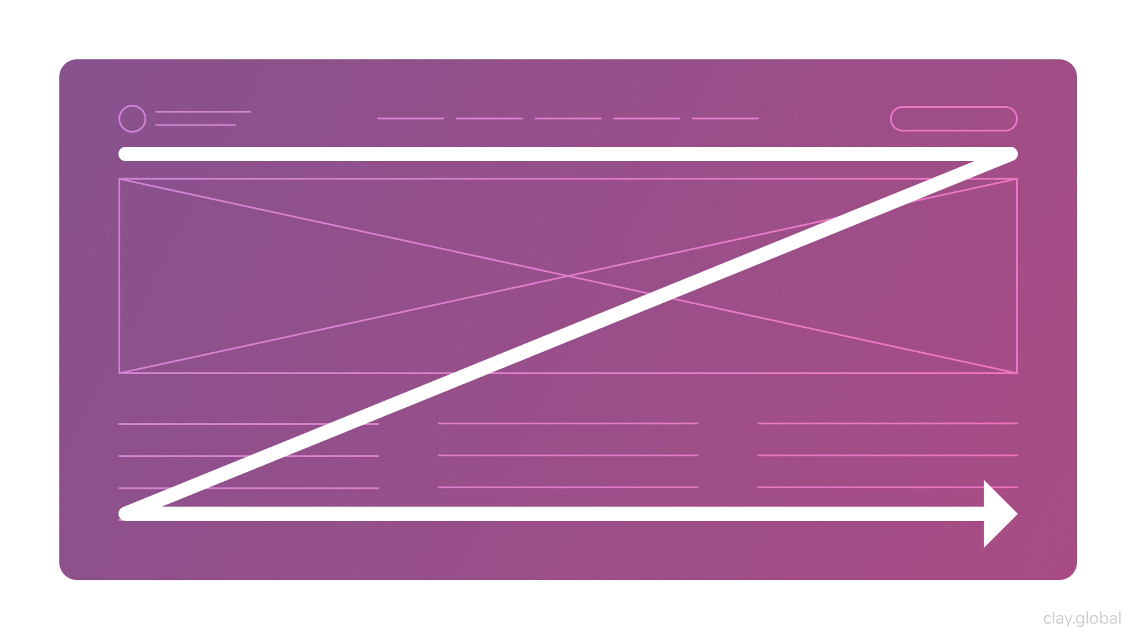
Place your brand and strongest hook at the top-left and your primary CTA at the bottom-right, where the eye lands at the moment users are most primed to act.
Works best for:
- Landing pages with a single conversion goal
- Homepages that lead users toward one primary action
- Ad-driven pages where the path from hook to CTA needs to be short
Grid Layout
Grids are the invisible architecture of most well-designed pages, with rows and columns that turn alignment, proportion, and spacing into deliberate choices rather than guesswork.
Grid Structures by Clay

They scale reliably across screen sizes and create visual harmony that users sense before they can name it.
Works best for:
- Almost any site as the underlying structural layer
- Design systems and component libraries where consistency across pages matters
- Multi-device products where the layout needs to adapt without breaking
Single-Column Layout
Single-column layouts flow all content vertically, full-width, with no ambiguity about where to look next.
Single-Column Layout Example by Clay

They work well for long-form editorial and mobile-first contexts. The tradeoff is less flexibility to create visual contrast and a risk of monotony on larger screens without careful typographic variation.
Works best for:
- Long-form articles, essays, and newsletters
- Mobile-first products where simplicity is a feature
- Onboarding flows and step-by-step processes where focus matters
Best Practices for Web Page Layout Design
The web design tips that hold up across every project come back to the same core principles. At every stage of the process, layout is where those principles get tested in practice.
Responsive Design
Responsive layout is the default expectation. 90% of B2B buyers expect websites to feel as polished as the best consumer products they use, including mobile responsiveness.
The vast majority of websites have now implemented responsive design. For those that haven't, the damage shows up in search rankings, since Google's mobile-first indexing means your mobile layout is effectively your primary one.
Consistency
A layout that changes behavior or appearance unexpectedly from page to page breaks user trust.
Visual consistency, meaning a shared color system and navigational patterns, tells users they're somewhere familiar that behaves the way they expect.
Style guides and component libraries exist precisely to protect this consistency at scale.
Accessibility
Accessibility in layout is an ethical, practical, and legal requirement.
Accessibility Elements by Clay
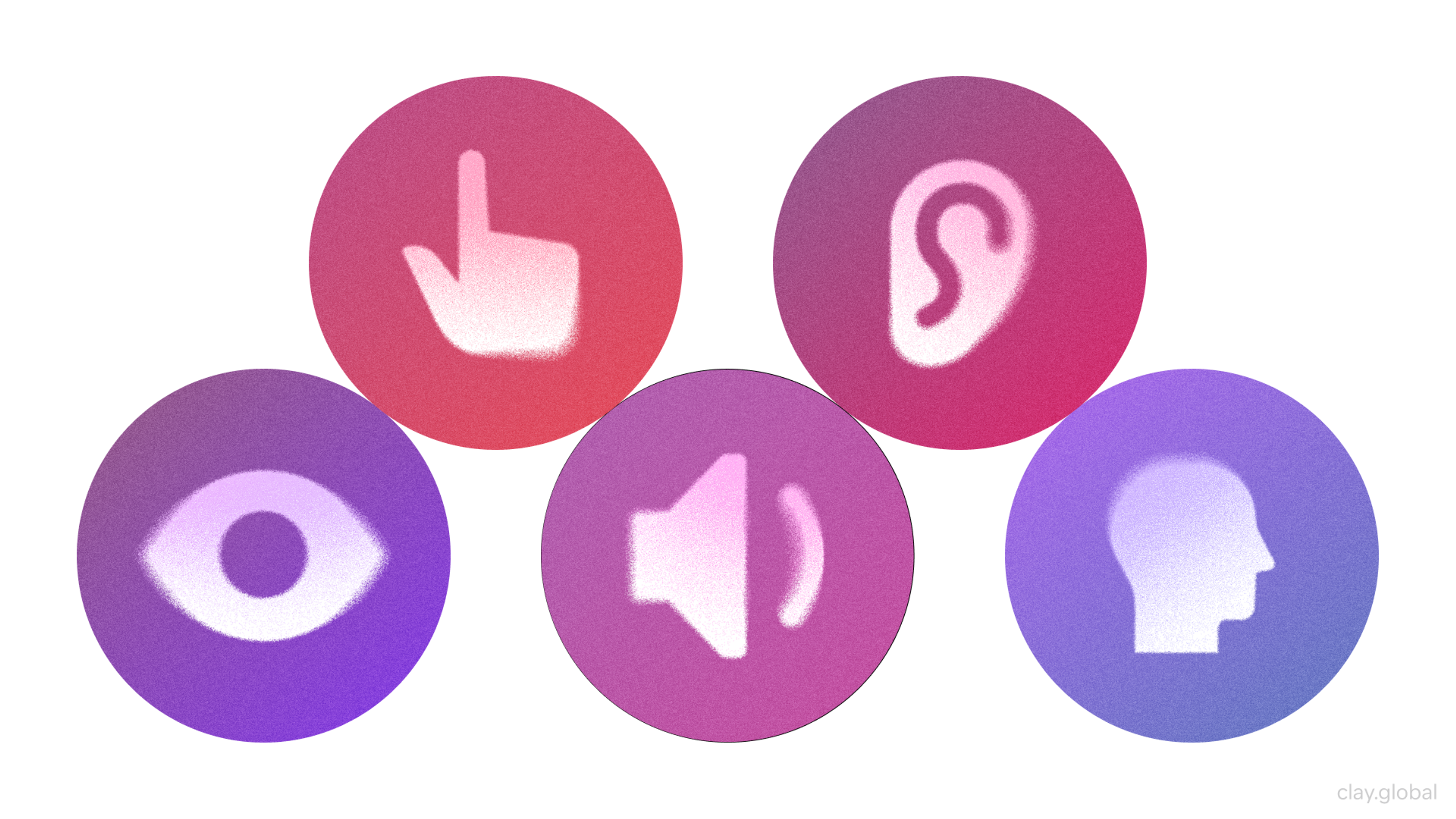
WCAG sets the standard, covering sufficient color contrast, text that scales without breaking structure, keyboard-navigable interfaces, and clear focus indicators.
Building accessibility from the start costs far less than retrofitting it later.
Performance
Think about the last time you waited more than a few seconds for a page to load. The cause is often structural, as render-blocking scripts and oversized assets compound with each additional component.
Lazy loading off-screen assets and a lean critical rendering path are the most common fixes at the layout level.
How to Design a Website Layout
To take your web layouts to the next level, consider these advanced tips:
Typography
Limit your type system to two or three font families, establish a clear scale for headings and body text, and check contrast ratios against WCAG standards.
Line length matters too. The readable range is 45 to 75 characters per line, a detail easy to overlook and costly to ignore.
Color Scheme
Color communicates brand personality and triggers emotional responses before users consciously process it. Warm tones create energy, cool tones create calm, and high contrast creates urgency.
The most common mistake is applying color inconsistently, which fragments the visual experience across pages.
Visual Elements
Best practice means serving images in modern formats. WebP and AVIF offer smaller file sizes than JPEG or PNG at comparable quality, which translates directly to faster load times.
Visual Design Elements by Clay
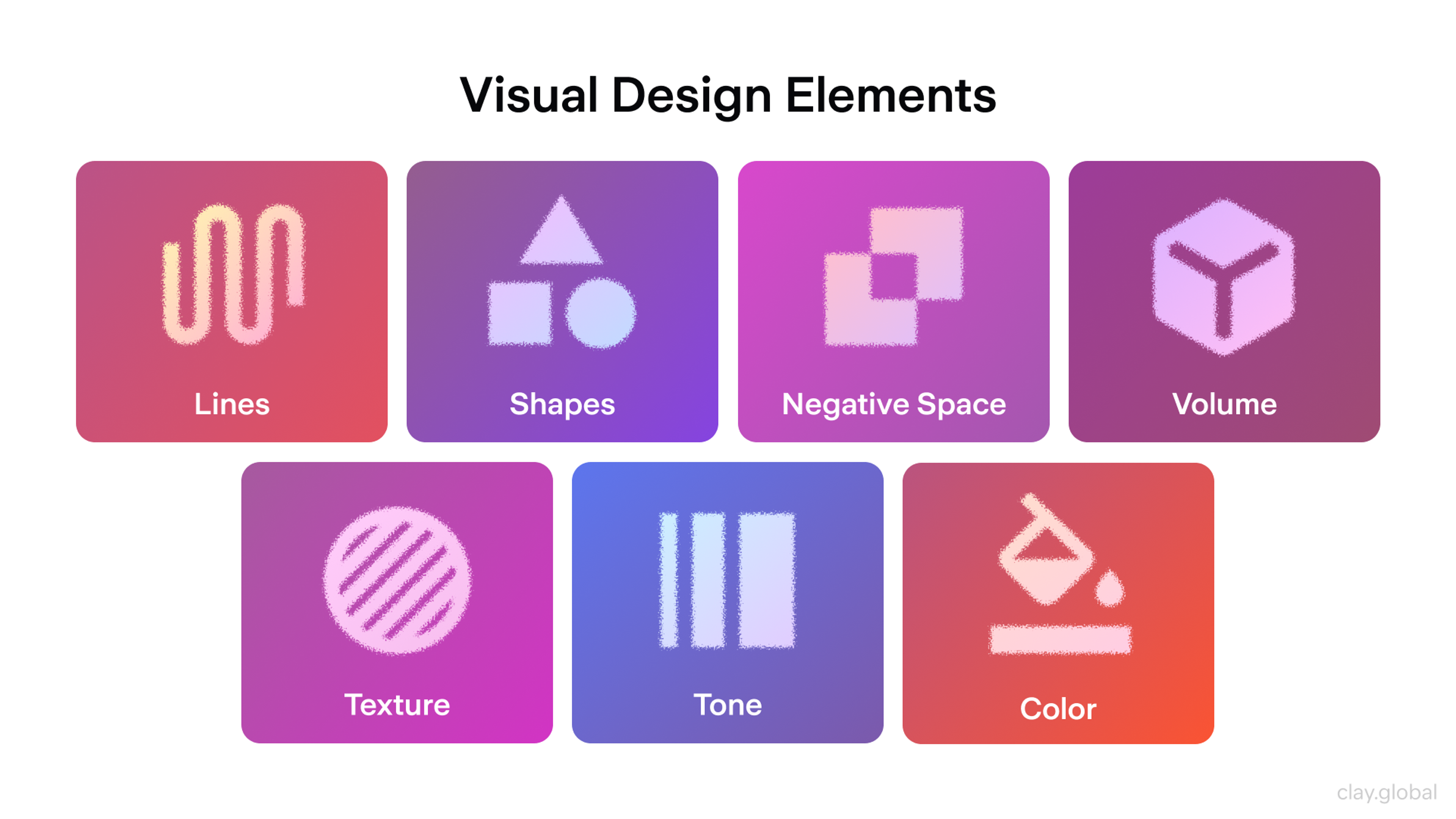
SVGs handle anything that needs to scale cleanly across screen densities. Every non-decorative image also needs descriptive alt text, both for screen reader users and search engine indexing.
Clay Global is a web design agency trusted by Slack, Yahoo, and Meta. Learn more about us here.
Common Mistakes
Most of these mistakes come from moving too fast, skipping testing, or optimizing one part of the layout without considering how it affects the rest.
Cluttered and Overcrowded Layout
Clear and simple design is what's left when everything unnecessary has been stripped away.
The discipline is identifying what's essential, cutting everything else, and using whitespace to give important elements room to breathe.
How to fix it: Audit each page for elements that don't directly support the user's goal on that page. If it doesn't earn its place, remove it.
Poor Visual Hierarchy
Navigation fails in two ways. The first is label mismatch, where menu items in the internal language don't match how users think, creating hesitation. Task-oriented labels fix that quickly.
Genuine contrast between what matters most and what supports it is all that's needed.
How to fix it: Squint at your page. If nothing stands out immediately, your hierarchy needs more contrast in size, weight, or color between primary and secondary elements.
Inconsistent Layout and Branding
Different typefaces, spacing systems, and navigation patterns across pages make a site feel unfinished. Users notice inconsistency even when they can't articulate it. A documented design system, even a lightweight one, prevents this.
How to fix it: Define a small set of reusable components and apply them everywhere. Even a one-page style reference shared across the team eliminates most drift.
Neglecting Responsive Design
Non-responsive layouts cascade beyond visual breakage. Desktop-sized images get served to phones, unnecessary scripts run, and load times inflate, triggering a drop in both rankings and conversion. Under Google's mobile-first indexing, the mobile version is the one that counts.
Responsive Layout Example by Clay
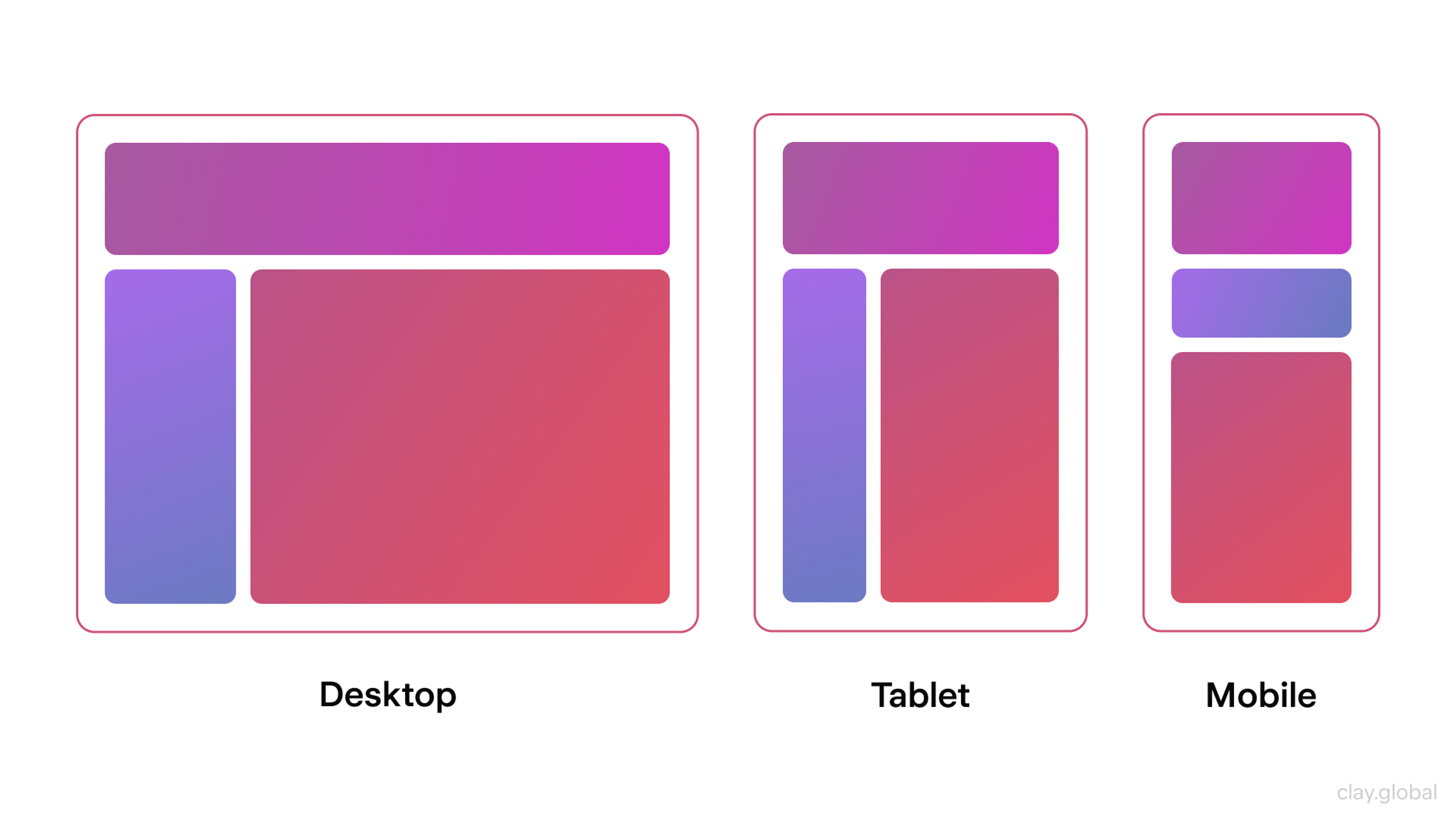
Average mobile bounce rate rose 54% in 2025, with half of all mobile users exiting after viewing just one page. You have a fraction of a second to establish visual credibility, and if your layout isn't working on mobile, you're losing half your visitors before they've read a word.
How to fix it: Test every page on a real mobile device, not just a browser preview. Pay particular attention to navigation, forms, and CTAs, which break most often on smaller screens.
Poor Navigation and Information Architecture
Navigation fails in two ways. The first is label mismatch, where menu items in the internal language don't match how users think, creating hesitation. Task-oriented labels fix that quickly.
The second is structural depth. Architecture that is too shallow or too deep buries content or flattens it, and neither serves users.
How to fix it: Run a simple card sorting exercise with five people outside your team. The gaps between how they group content and how your navigation is structured will tell you exactly what to fix.
Ignoring Accessibility
The vast majority of homepages contain detectable accessibility errors.
The frame that matters is experiential. It shows up as users who can't complete a purchase because a form won't accept keyboard input, or who abandon because text disappears into its background.
Accessibility built in from the start costs far less than any retrofit.
How to fix it: Run your pages through a free tool like WAVE or Axe. Most accessibility errors are mechanical and fixable in a single pass once you can see them.
Overuse of Animations and Pop-ups
Animations earn their place when they communicate something, like a state change or a transition.
If you use them reflexively, they compete with content. Pop-ups can be effective for time-sensitive offers, but users should always have an obvious way to dismiss them.
How to fix it: For every animation on the page, ask what information it communicates. If the answer is nothing, remove it. For pop-ups, set a delay and frequency cap so they don't fire on every visit.
Slow Loading Times
The discipline of keeping pages fast matters more than most teams realize.
Slow sites lose visitors before a single word registers, and the revenue impact compounds with every second of delay.
The most common layout issues are unoptimized images and scripts that load even when the user doesn't need them.
How to fix it: Run your page through Google PageSpeed Insights. The report will surface the largest contributors to load time and rank them by impact, so you know where to start.
Lack of Whitespace
Whitespace is active. It separates elements, creates breathing room, and guides the eye. Designs that use it deliberately feel controlled.
How to fix it: Increase padding and margins incrementally until the page feels calm. Most designs need more whitespace than the designer's first instinct suggests.
Failing to Test and Iterate
A layout isn't finished at launch. Heatmaps, session recordings, and A/B tests reveal how real people interact with your structure, and the results frequently differ from what seemed obvious during design. The feedback loop is how layouts improve rather than stagnate.
Good layout comes from understanding why each component exists and what it's trying to accomplish for the person on the other side of the screen.
Get the structure right, keep it consistent, make testing a habit, and the rest follows.
How to fix it: Pick one page, install a free heatmap tool like Hotjar or Microsoft Clarity, and let it run for two weeks. The patterns that emerge will give you a concrete starting point for the next iteration.
Website Page Layout Examples
Here are some real-life examples of well-designed web layouts:
Medium
Source: Medium
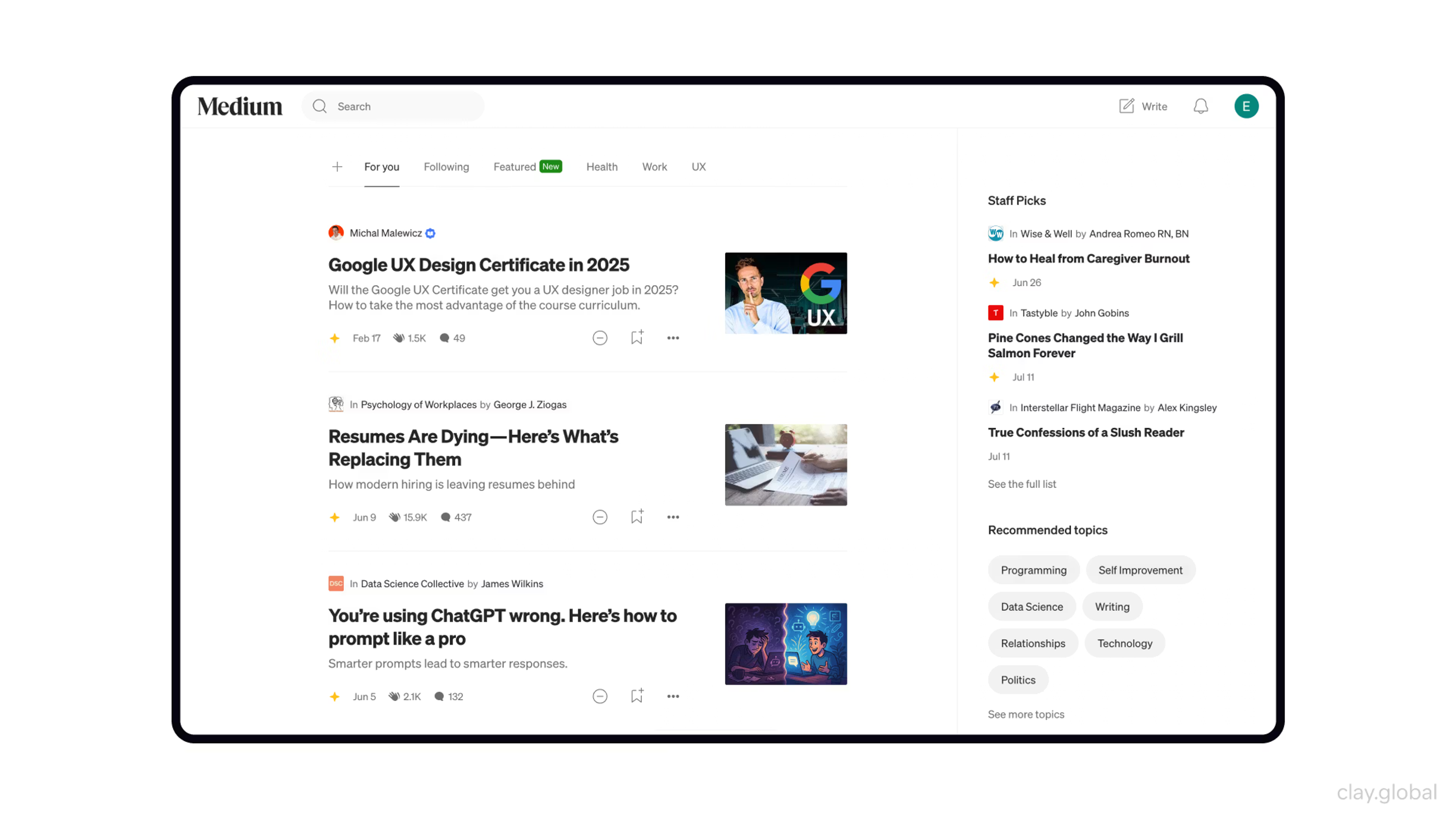
A widely used digital publishing platform, Medium has a very neat, content-oriented layout.
The home page provides featured stories, trending topics, and personalized recommendations for the user based on their interests.
Article pages are designed so that there is no distraction from reading long-form content, which is facilitated by enough whitespace.
Carefully selected typography enhances readability, while images and pull quotes add much-needed visual interest.
Bottega Veneta
Bottega Veneta abandons the homepage conventions most luxury brands rely on. There are no campaign carousels, promotional banners, or pop-up overlays.
The layout places product collections and the brand's editorial journal, Issued by Bottega, on equal footing, treating content and commerce as the same thing rather than separating them.
Product pages use large single images with minimal surrounding text, letting whitespace carry the hierarchy.
Source: Bottega Veneta
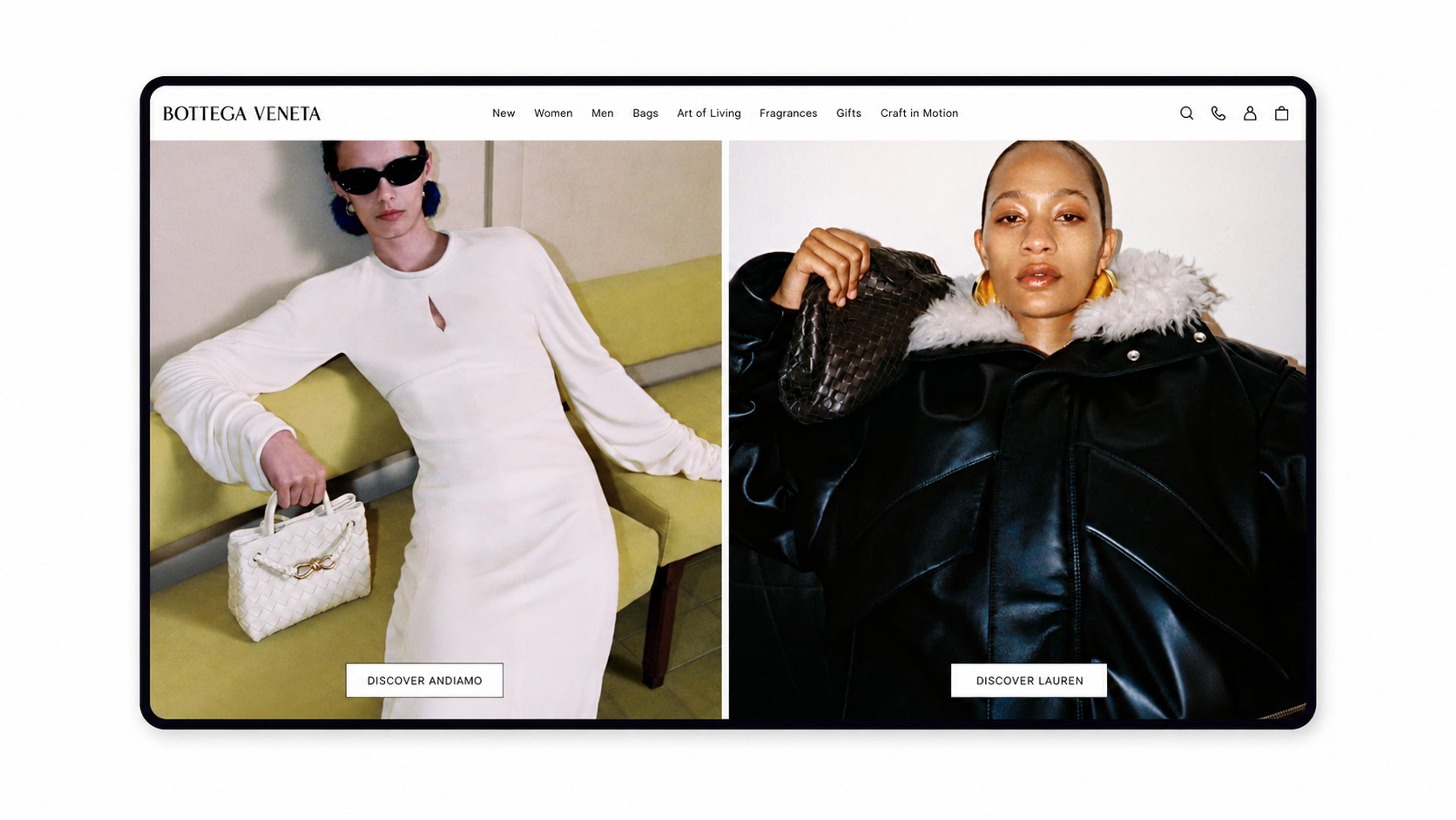
Navigation stays fixed, minimal, and consistent across every page, so the layout never competes with the content.
Squarespace
Squarespace’s homepage features a sleek, modern design with a focus on creativity. A full-screen video background showcases different website templates and designs that change as you scroll.
Source: Squarespace
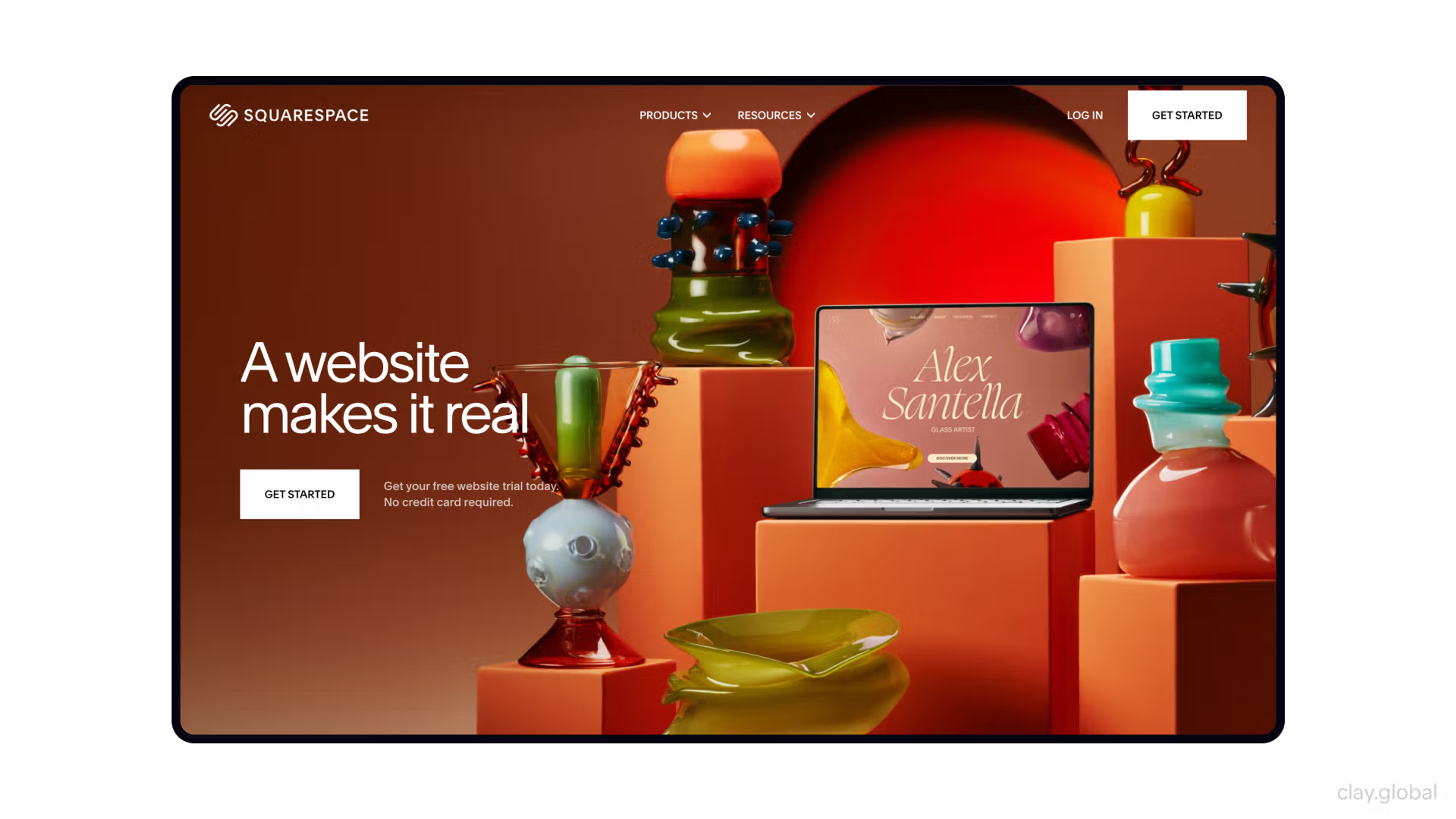
Key features are shown after scrolling further down, along with customer examples, before a clear call to action to start a free trial.
Whitespace usage, clean typography, and a consistent color scheme create a sophisticated look.
Tipalti
The next example is our client's site. We redesigned Tipalti's marketing website, from content structure and wireframes to visual design and a scalable design system, covering a product suite spanning accounts payable, global payments, procurement, and employee expenses.
Source: Tipalti
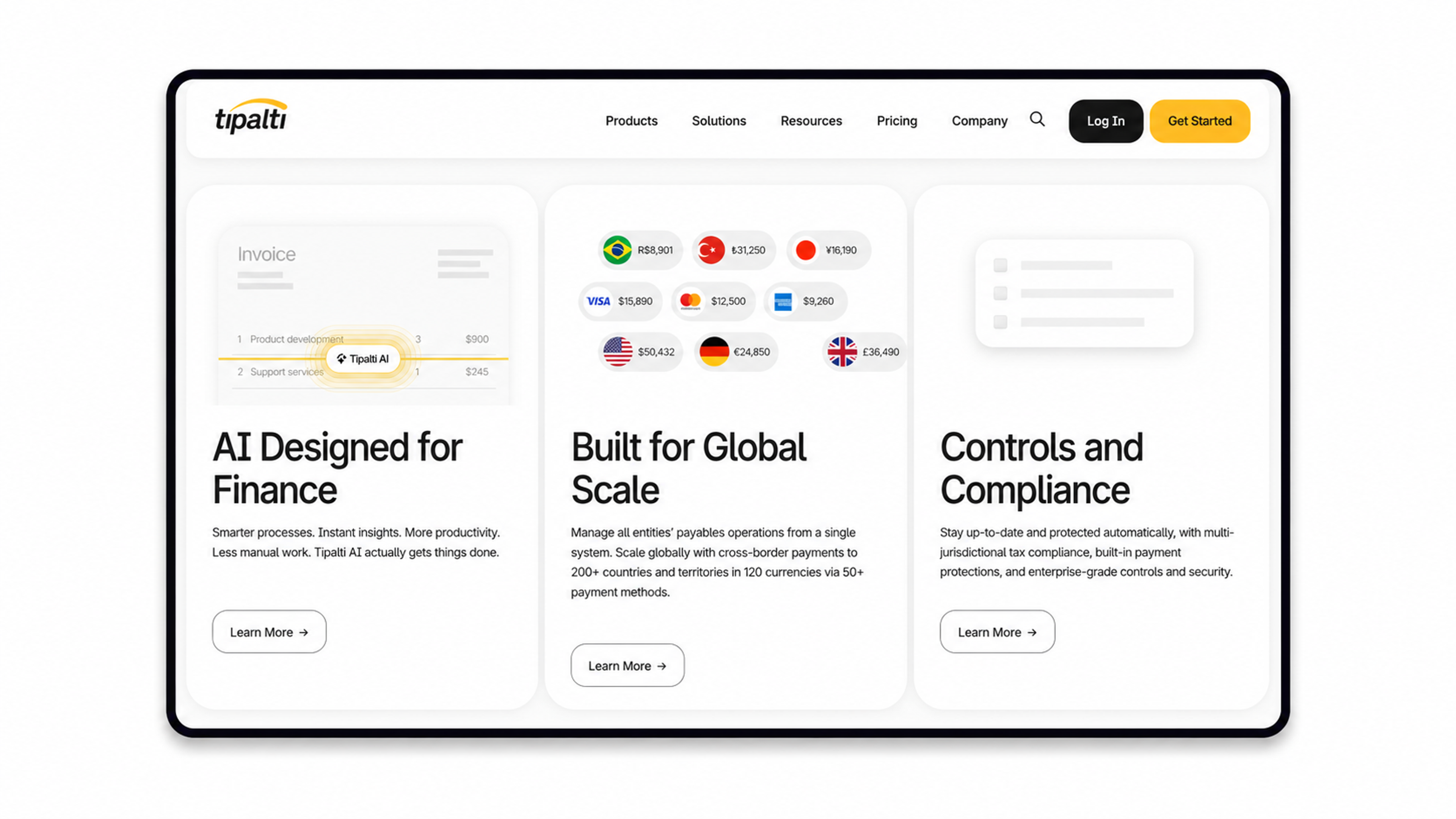
The layout achieves this through a structured navigation hierarchy that keeps users oriented across a large, multi-page site, paired with a modular system in which every section follows the same visual logic.
Responsive behavior is built into each component rather than applied as an afterthought, so the structure adapts from desktop to mobile without losing hierarchy.
Ready to build a web layout that performs across every device and keeps users engaged? Let our team take it from wireframe to launch. Get in touch.
Read more
FAQ
What's the difference between a web layout and web design?
Web design covers all visual and experiential decisions across a site, from typography and imagery to the overall brand tone.
Web layout is a subset that addresses how elements are organized on each page.
Layout defines the architecture. Design fills it with meaning. Layout tends to drive usability more than design does, since it governs whether users can find information regardless of how good the visuals look.
How many columns should a web layout use?
It depends on content type and screen size.
Three columns suit dense sites like news or e-commerce. Two work well for documentation or pages with a sidebar. A single-column layout is best for mobile or focused reading.
Most modern grid systems default to 12 columns at the code level, giving designers the flexibility to combine them into any configuration the content requires.
What is visual hierarchy in web layout, and how is it created?
Visual hierarchy arranges elements to show which ones matter more, answering where the user should look first, second, and third. It's created through contrast in size, weight, color, position, and whitespace.
Larger elements draw the eye first. Anything isolated on the page commands attention, and high-contrast elements read before muted ones.
A strong hierarchy makes the intended reading path feel obvious without users noticing it was designed.
How does layout affect SEO?
The relationship between SEO and web design is most visible at the layout level. Heavy layout assets slow load times, penalizing Core Web Vitals scores.
Rankings drop under mobile-first indexing when the mobile layout is poor, and inaccessible structures can reduce crawlability.
Logical heading hierarchies help search engines parse content. And layouts that keep users engaged longer send positive signals to search algorithms that rank pages.
What's the relationship between layout and conversion rate optimization (CRO)?
Layout shapes CRO by controlling where attention goes and how easy it is to act.
Where you place your CTA, how you structure your form, and how closely your evidence supports the action you want users to take are all layout decisions.
Z-pattern layouts work well for landing pages because they guide users toward a CTA at the natural end of a visual journey.
How should the layout handle very long pages?
Sticky navigation keeps key links accessible while users scroll. Section anchors or progress indicators help them know where they are.
Breaking content into visually distinct sections stops the page from feeling like one long blur.
For very long editorial or documentation pages, a sticky table of contents lets users jump directly to the section they need.
How do layout choices differ for B2B versus B2C websites?
B2B layouts prioritize information density and trust signals, as users are deliberate researchers who need easy access to pricing and case studies.
B2C layouts, especially e-commerce, focus on quick discovery and a good experience, with large imagery, a visual-first structure, and clear paths to purchase.
The underlying layout principles are the same. The emphasis shifts based on how users make decisions.
How should the layout adapt for AI-driven traffic?
AI-driven visitors often land directly on interior pages rather than homepages, already intent-focused.
Each page needs a self-contained layout that establishes context, credibility, and a clear next action, without assuming the user arrived through structured navigation.
Visible trust signals and prominent CTAs on every key page matter more when you can't rely on a homepage to do that work first.
Whether you work with an in-house team or a web design agency, making sure your layout is adapted for AI-driven traffic is one of the more pressing decisions to get right in 2026.
What role does grid spacing (gutters and margins) play in perceived quality?
Consistent gutters between columns create rhythm and visual predictability. Well-calibrated margins prevent content from pressing against screen edges. The relationship between element size and surrounding space communicates craft.
When spacing is inconsistent or too tight, a page registers as cluttered even if the individual elements are well-designed.
Spacing is one of the fastest signals users process.
How should the layout be approached when building for international audiences?
Text length varies significantly between languages.
German can run 30% longer than English, breaking fixed-width assumptions. Right-to-left languages require mirrored layouts. Fluid systems handle these variations far better than pixel-fixed structures.
Testing with actual translated content is the only reliable way to catch failures before launch.
Final Thoughts
Most layout problems are the result of adding too much, testing too little, or treating structure as an afterthought once the visual design is done. The good news is that the same predictability that makes bad layouts easy to diagnose also makes good ones reproducible.
The principles in this article have been the foundation of good web design for years. Visual hierarchy, responsive grids, readable type, accessible structure.
Trends shift constantly, but the layouts that hold up are always built on the same structural thinking. What changes is how they're applied as screens multiply, users arrive from more directions, and the margin for a poor first impression keeps shrinking.
Good layout comes from understanding why each component exists and what it's trying to accomplish for the person on the other side of the screen.

About Clay
Clay is a UI/UX design & branding agency in San Francisco. We team up with startups and leading brands to create transformative digital experience. Clients: Facebook, Slack, Google, Amazon, Credit Karma, Zenefits, etc.
Learn moreAbout Clay
Clay is a UI/UX design & branding agency in San Francisco. We team up with startups and leading brands to create transformative digital experience. Clients: Facebook, Slack, Google, Amazon, Credit Karma, Zenefits, etc.
Learn more