
Teams deliver products quickly when they tap into proven UI solutions and speak the same design dialect. When the answers are recorded, they squabble less over colors, margins, and button styles. Cross functional teams especially benefit from using design systems and pattern libraries, as these tools streamline workflows and improve communication between designers, developers, and other stakeholders.
Still, “design system” and “pattern library” are sticky and interchangeable, confusing folks who want a quick starting point. Different companies and different teams may use these terms differently or have unique needs, which adds to the confusion. This article neatly untangles the words, maps out how the user interfaces parts work in concert, and hands you a rollout plan you can kick off today.
Key Takeaways
- System vs. library: umbrella (tokens, components, guidelines, governance) vs. parts catalog.
- Benefits: faster shipping, consistency, accessibility, and helps ensure a consistent user experience across products and teams.
- Design and development: design systems unify design and development processes, enabling efficient collaboration and scalability.
- Token-first: name decisions so design maps cleanly to code.
- Governance: clear owners, contribution rules, versioning.
- Path: start with a library, scale to a system; track reuse and time-to-ship.
What Are Design Systems?
A design system is the playbook all teams use to build an app, site, or dashboard the same way every time. It packs color swatches, fonts, spacing rules, buttons, icons, web grids, mobile grids — you name it — then tells everyone how to use, change, and test those bits the right way.
Systematic design principles underpin the structure of design systems, ensuring consistency and scalability across digital products.
It lives online and stays updated, and the code that renders the buttons knows the final color. That means design and dev work like a twin engine, heading the same way. One link, one truth, one team speed.
Design systems support the entire product's lifecycle, from initial design to ongoing updates, helping design teams and product teams maintain quality and efficiency.
During a multi-year partnership, we built an overarching design system for Corsair and expanded its digital product portfolio — designing desktop software, mobile apps, and interfaces for specific devices. The system was established to guide both ongoing and new product development across platforms as they build their own design system for a diverse range of digital products.
Corsair design system

Outcomes you can expect. A slate of wins rolls in when teams bring a design system from the idea board to the source code. Shadow copy screens shrink, launch dates shorten, and blue-to-green ratios across devices cut to single digits.
Designers sketch to an understood vocabulary, devs push buttons that code knows how to draw, and marketing types pick seamless text everywhere. Design systems provide the building blocks for creating cohesive digital products, streamlining workflows for design teams and product teams alike.
What Are Pattern Libraries?
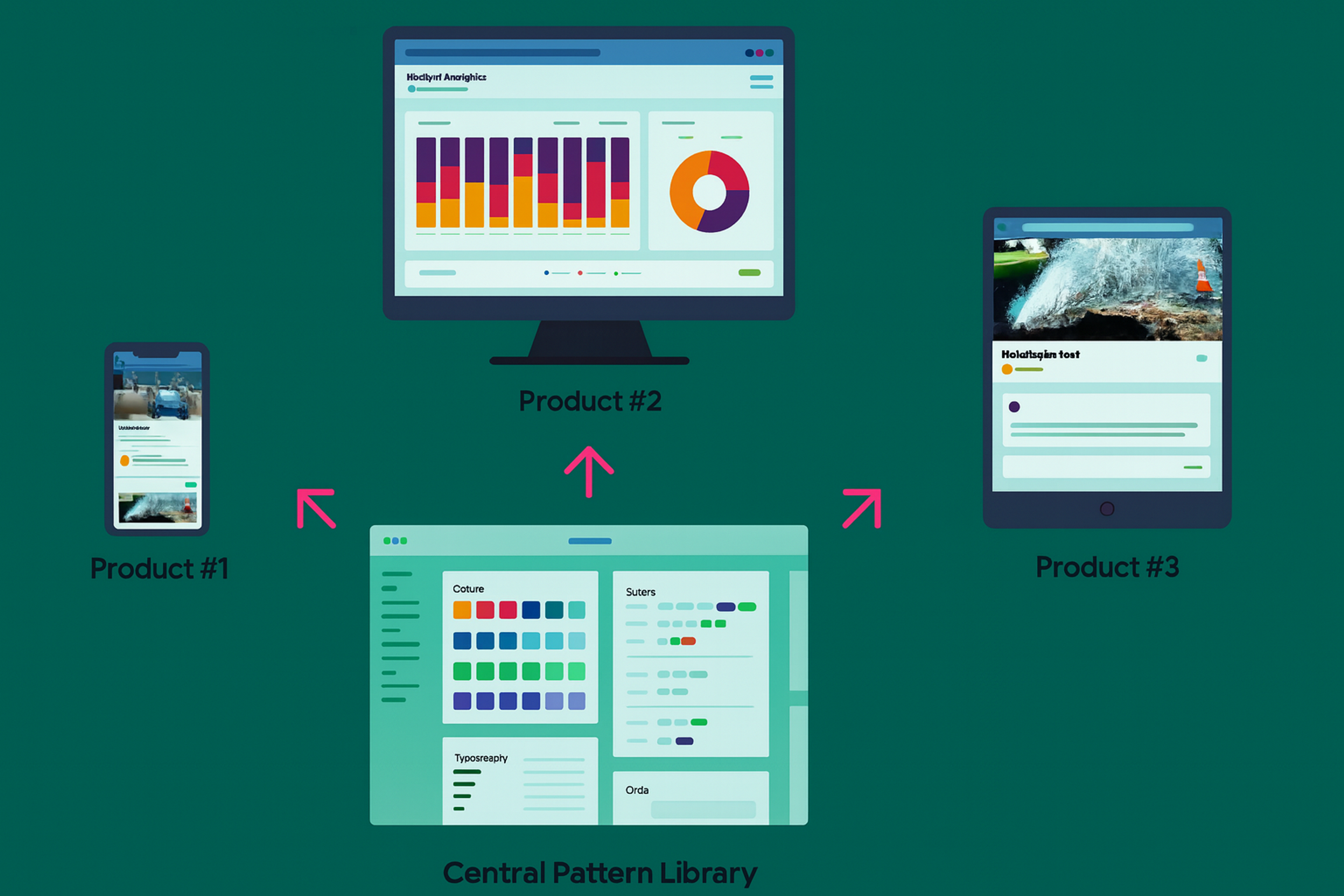
Think of a pattern library as a speed team’s stash of standard-fuel coils. Button, input, subtitle, hero header, all color-safe and column-true, each tagged “Use on forms.” They clip at a dashboard’s skeleton and finish quarter-speed.
A pattern library can be an organization’s own pattern library or built upon existing pattern libraries, serving as a design pattern library that contains recurring solutions, UI patterns, and reusable patterns. Pattern libraries are used by large organisations and different engineering teams to ensure consistent patterns and a visually cohesive visual appearance across various devices and screen sizes, supporting a consistent user experience.
Pattern libraries can nest inside big design systems or pop up alone when getting it loaned is the priority. They work like a bamboo skeleton ready to absorb grease, swap cells, and grow mobile. Light in paper, meaty in function.
What Are Pattern Libraries?
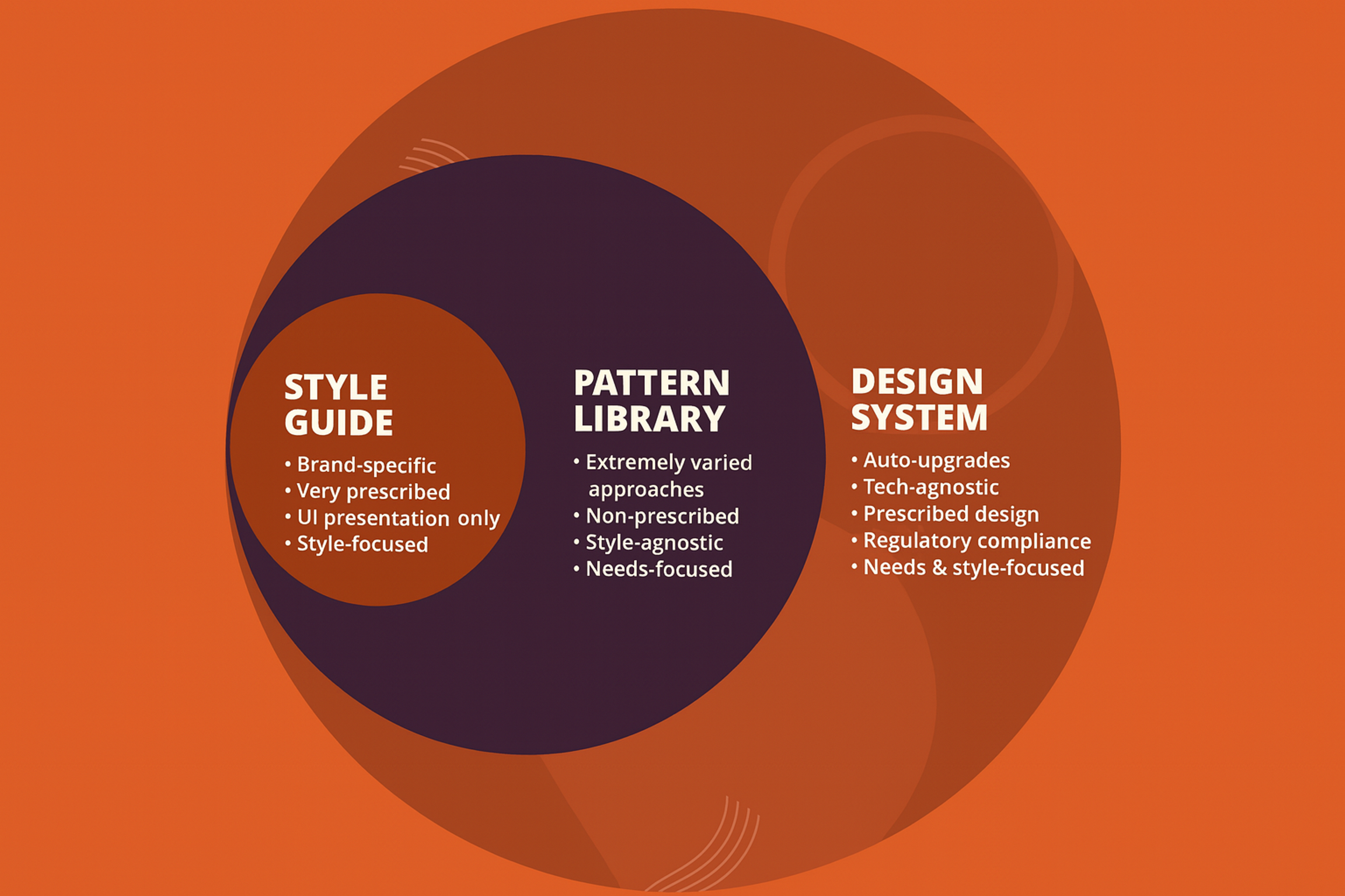
Style Guide vs. Pattern Library vs. Design System
Team structure first, glossary second, library and rules follow.
- Style guide: Rules for brand (how pink, type, voice live in confirmed text).
- Pattern library: Common bits, repeatable (head, hero, input with examples, how they change when active, how they feel when voice on).
- Design system: The umbrella: principles + tokens + components + guidelines + tooling + governance.
A design language serves as the foundation that unifies style guides, pattern libraries, and design systems, ensuring consistent visual and behavioral standards across products.
Designers and engineers now treat style guides and isolated libraries of patterns and components as smaller parts of a bigger design system framework. The framework layers on strategy and operations to help teams execute their vision.
Style Guide vs. Pattern Library vs. Design System
Why Design Systems and Pattern Libraries Matter
For companies, systems accelerate timelines, raise product quality, and limit design-to-engineering waste. For teams, a standard system creates a shared vocabulary and dependable components. Design systems help designers and developers collaborate more effectively, improving how teams work by streamlining communication, ensuring consistency, and enabling efficient reuse of components.
For users, a uniform system offers safe, consistent, and accessible experiences that nurture trust. Studies summarize speed, scale, consistency, and less repeated work as top gains. Design systems support the entire product's lifecycle, making them especially valuable for digital products by providing a comprehensive framework that enhances efficiency and user experience throughout development and maintenance.
Anatomy of a Modern Design System
Today’s systems work from tokens, establishing tiny, named values that encode design intent across every step.
Careful design efforts are required to establish and maintain these foundational elements of a design system.
Foundations (Design Tokens)
Design tokens are small, labeled values such as color and brand. Primary, font.size.sm, or radius.lg. These tokens replace fixed hex numbers and pixel sizes, letting named variables travel into code everywhere, supporting on-the-fly theming and quick adjustments. Consult our guide to design tokens for an in-depth overview.
Foundations (Design Tokens)

Components and Patterns
Standard components like buttons, text fields, and modals use design tokens. They define states, variants, and accessible behavior. Designers group these parts into common flows, like sign-in or error messages. Components are often developed as coded components to ensure consistency between design and implementation.
We call these flow patterns. Good documentation shows how each piece is built. It explains when to use it and when not to. It also includes copy-ready code that teams can adapt. When a new component is needed, it should be created within the established guidelines of the design system.
Guidelines
Clear guidelines cover interaction behavior, content standards like voice, tone, and microcopy, platform rules, and accessibility checks. Make content standards a priority. Teams often skip them, yet they drive quality and alignment.
Tooling and Docs
You need a docs site, continuous integration for component packages, and pipelines to sync design tokens to code. Advanced systems automate token export, component builds, and changelogs. This lets teams upgrade safely.
It's essential to keep your documentation and component libraries up to date to ensure consistency and prevent outdated or unused components from causing issues.
Governance and Contribution
A design system won’t stick without intentional upkeep. Assign design owners, outline a step-by-step contribution path, set review checkpoints, and nail down the release workflow. Decide how you’ll phase out outdated patterns, how to tell the organization about the changes, and how to share those decisions.
Effective governance requires input from product teams, different departments, and cross functional teams to ensure broad adoption and alignment.
Set service-level agreements (SLAs) that promise how quickly design bugs will be fixed and how to get support. Offer open office hours for questions and regularly check who uses which patterns.
SLA

Competitor content consistently points out that design systems operate more strategically and abstractly than a mere library, which is why solid governance is a must.
When a Pattern Library Is Enough
When your team is small — one platform and one product team — speed matters most. A simple pattern library is enough. Pick a tight set of core components. Document how to use them. Ship fast. Small teams may also benefit from creating their own pattern library tailored to their specific needs, ensuring consistency and efficiency from the start.
As you grow to more platforms or teams, needs change. Theming and brand rules appear. A component-only library becomes too narrow. You now need design tokens and cross-platform standards. Add content guidelines and a clear way to govern decisions. Together, these elements form a full design system.
A Practical Rollout Plan
First, audit your interface. Collect a set of screens representing your products’ variety across all platforms. Consolidate duplicates and outliers to see where the design consistency fades. The audit should include a review of individual components to ensure each part of the interface is consistent and up to standard. After that, define your design principles. Write four to six guiding statements that clarify the intended look, feel, and behavior.
- Extract Tokens: Normalize your design tokens by harmonizing color scales, spacing values, typography ramps, corner radii, elevation scales, motion parameters, and then label them semantically, like “color.surface.default”.
- Build Core Components: Implement the essential components: Button, Link, Input, Select, Checkbox, Radio, Textarea, Tooltip, Modal, Toast, and Tabs. Document all interaction states and accessibility guidelines.
- Ship a Minimal Docs Site: Launch a lightweight documentation site that features a token overview, a component library, usage guidelines, code snippets for each component, and a simple changelog.
- Set Up Contribution and Versioning: Define a pull request workflow, establish code review criteria, set a release schedule, and adopt semantic versioning with clearly flagged breaking changes.
- Measure and Iterate: Monitor component adoption and trim variants that add no value. Hold regular alignment meetings with design, engineering, content, and QA, and incorporate their feedback into the development backlog.
Measuring Impact
Quantitative measures include the time it takes to use system components versus building bespoke ones, the rate of component reuse, the reduction in one-off variants, the level of accessibility compliance, and the design-to-development handoff time.
Tracking the use of recurring solutions within the design system can also help measure its effectiveness, as these common patterns indicate consistent and efficient problem-solving.
Qualitative measures include fewer discussions over fundamental design choices, fewer components that look similar without justification, and cleaner code handoffs.
Common Pitfalls
One frequent mistake is delivering documentation that does not match the code. If components behave differently from the docs, teams will lose trust in the library. Always tie documentation to the version of the released package and automate documentation embeds. Another common issue is shipping excessive variants. If real user needs do not validate a design variant directly, it should not make it to the library.
Ignoring content and accessibility criteria is a recipe for failure. UI copy language, focus order, HTML landmarks, and ARIA roles don't count as extras. Add explicit checklists to every component page — refer to our accessibility-in-design-systems primer for the template.
No governance. If no one owns the library, no review gates exist, and no deprecation policy is enforced, a pattern library will inevitably decay into a dusty parts bin without telling how the components, or the problems they embed, will travel into new products.
FAQs
What Are Design Systems?
Living frameworks of tokens, components, and guidelines — plus governance — that help teams design and ship consistent, accessible interfaces at scale.
What Is a Pattern Library?
A curated set of reusable UI components and interaction patterns with usage guidance, often nested inside a larger design system.
How Are Design Systems Different from a Style Guide or Pattern Library?
Style guides cover brand and editorial standards. Pattern libraries document reusable components. Design systems unify both with tokens, code parity, guidelines, and governance.
Read more:
Conclusion
Design systems and pattern libraries serve different purposes and shouldn't be confused. Libraries hand you components; systems bundle those parts with tokens, usage guidelines, and governance to ensure consistency persists and scales.
This article walks you through launching with the smallest scope that is still meaningful, evolving the library responsibly, and measuring tangible gains in speed, quality, and accessibility, score by score and sprint by sprint.

About Clay
Clay is a UI/UX design & branding agency in San Francisco. We team up with startups and leading brands to create transformative digital experience. Clients: Facebook, Slack, Google, Amazon, Credit Karma, Zenefits, etc.
Learn moreAbout Clay
Clay is a UI/UX design & branding agency in San Francisco. We team up with startups and leading brands to create transformative digital experience. Clients: Facebook, Slack, Google, Amazon, Credit Karma, Zenefits, etc.
Learn more