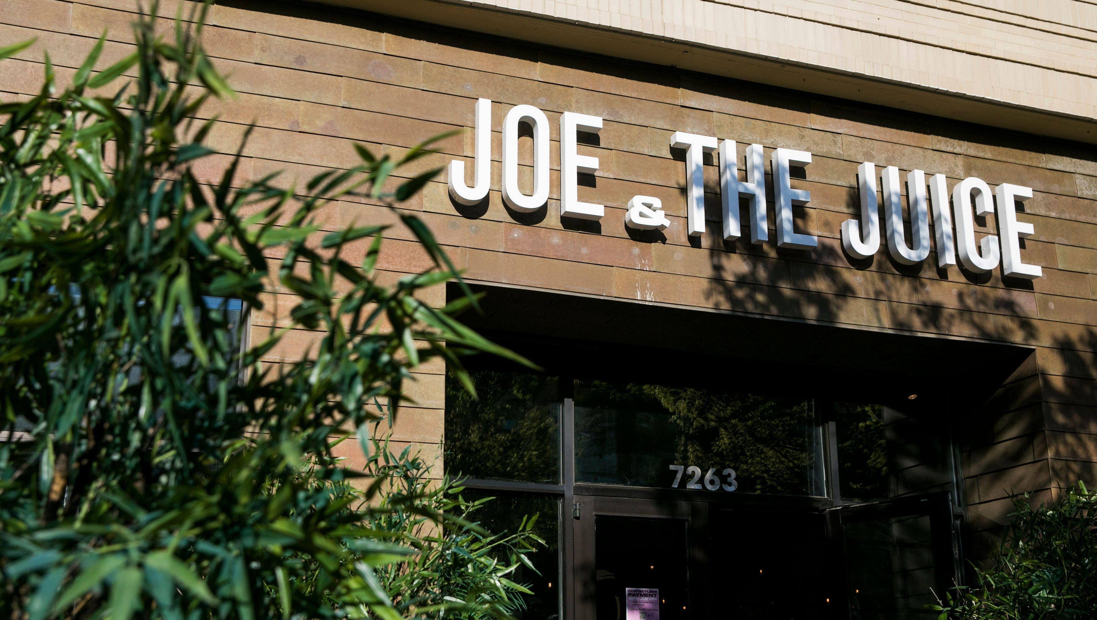
The significance of choosing a font for the audience cannot be disputed, as some argue that a brand needs more than a logo. It is more than just a way of differentiating between different forms of writing.
Selecting the right brand font reflects personalities, feelings, and meaning and dramatically affects how a particular group engages or feels about a brand.
Thus, in this piece, we will focus on why the right choice of typography is paramount, the common types of fonts, their specificities, and the ways to apply them to your brand.
Apart from the fact that you are branding a new entity or rebranding an existing one, you ought to appreciate the significance of fonts in terms of brand positioning. Selecting appropriate fonts for body copy is crucial to enhance readability and convey brand identity effectively.
Fonts Power
Understanding Brand Identity
A brand’s identity is the visual representation of its values, mission, and personality. It encompasses various elements, including the logo, color palette, typography, and imagery. A strong brand identity helps to establish trust and recognition with the target audience.
When you choose fonts for your brand, you are selecting a key component of your brand identity. The right brand fonts can convey professionalism, creativity, or modernity, depending on your brand’s personality.
By carefully selecting and consistently using your brand fonts, you can create a cohesive and memorable brand identity that resonates with your audience.
What Is a Brand Image?
A brand image is the perception that consumers have of a brand. It is shaped by the brand’s visual identity, messaging, and overall customer experience. A positive brand image can lead to increased loyalty, advocacy, and ultimately, revenue growth.
Typography plays a significant role in shaping the brand image. For instance, using a serif font can convey tradition and reliability, while a sans serif font can suggest modernity and simplicity.
By aligning your brand fonts with your desired brand image, you can influence how consumers perceive your brand and build a strong, positive reputation.
Understanding Font Psychology
Fonts are not only a component of written languages but also influence people's perception of the brand, which is their intended purpose. Different typefaces evoke uniqueness in users.
Font Psychology
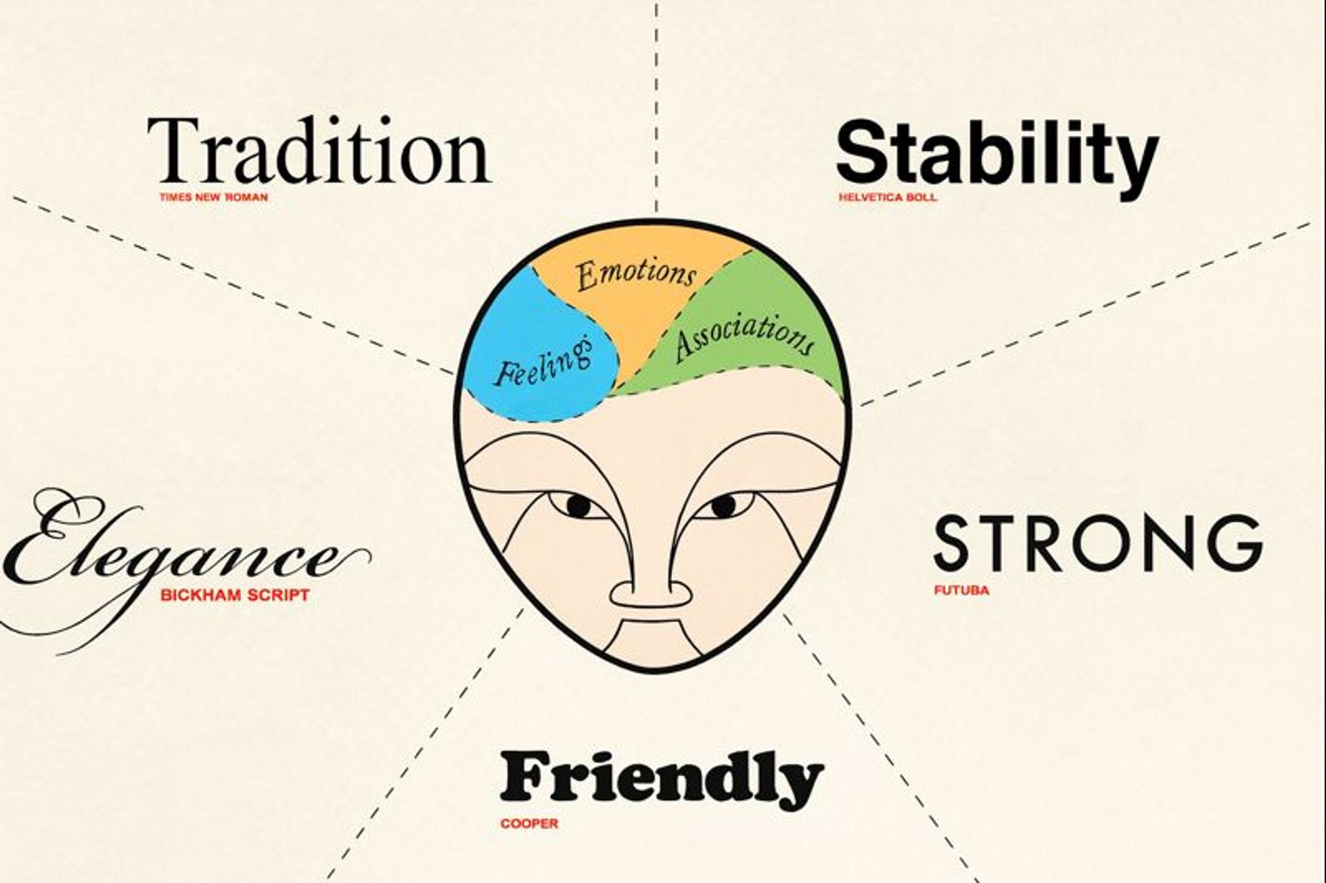
Thus, sleek letter types of typography like Times New Roman, a serif font, usually encourage uniformity due to the perception that this font is reliable and safe to be adopted by legally, financially, or academically driven companies.
But in the case of Arial or Helvetica, whose style is sans serif, are modern, clean, and legible. They are best used by technology-oriented companies and brands who want to be seen as young.
Web font selection plays a critical role in ensuring these choices align with digital readability and accessibility standards.
Script letter types are mainly and purposely used because of their ornate and handwritten features, and they are primarily employed for artistic purposes and elegance. This is normal, where there are either good or luxury things.
Display types are large and eye-catching, and owing to their decorativeness, they manage to convey the spirit of imagination and, therefore, can successfully perform the task of the main titles or logotypes that should be special.
Decorative fonts are meant for creative writing and graphics only and are kept for advertisement or any bold depiction. However, saturation of their use ultimately leads to messiness and hinders visual connection.
Based on this understanding, it will become easier to adopt a certain typeface that best represents the brand's pictured attributes and values.
Regarding audience appeal, you can equally increase your earning potential if you change the fonts from the fonts that represent the business image you want to create when you target the audience.
Typography vs Font
While often used interchangeably, typography and font are two distinct concepts in design. Typography is the broader art and technique of arranging type to make written language legible, readable, and visually appealing.
It encompasses everything from line spacing and letter alignment to hierarchy, scale, and the emotional tone of the text. Typography is about the overall design system behind how text communicates.
A font, on the other hand, refers to a specific style or weight of a typeface — like Helvetica Bold or Times New Roman Italic. It’s the actual file or tool used to display the text on a screen or in print. Think of typography as the craft, and fonts as the tools used within that craft.
In short, typography is the strategy and aesthetic, while a font is the functional building block that brings it to life. Both are crucial in shaping how content is perceived, influencing everything from branding to user experience.
Types of Fonts
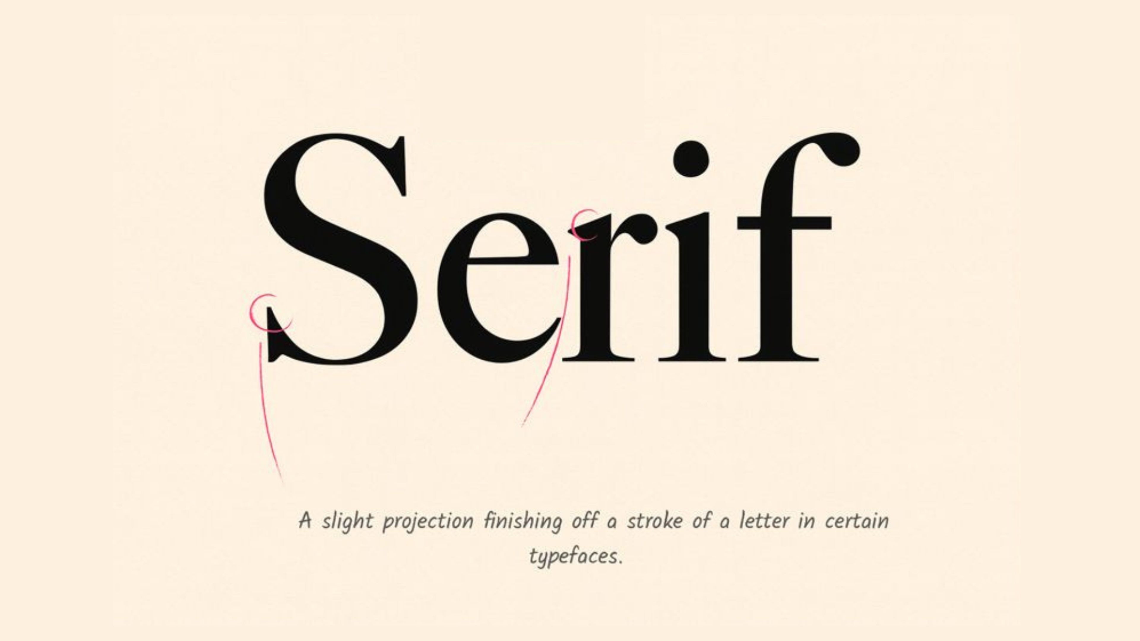
Serif
Serif fonts have small lines that extend from the main letter strokes. These aren't just decoration. They help your eyes move along lines of text and create feelings of trust.
Popular serif fonts include Times New Roman for formal documents, Georgia for digital reading, Garamond for elegant looks, and Baskerville for sophisticated brands.
Use serif fonts for legal firms, banks, schools, publishers, and any business where trust matters most. These fonts have been used in books and newspapers for centuries. This history creates connections with authority and reliability in people's minds.
Banks put serif fonts in annual reports to show stability. Universities use them for diplomas and official papers. News organizations choose them for articles because readers trust the familiar, authoritative feel.
Serif Font Example
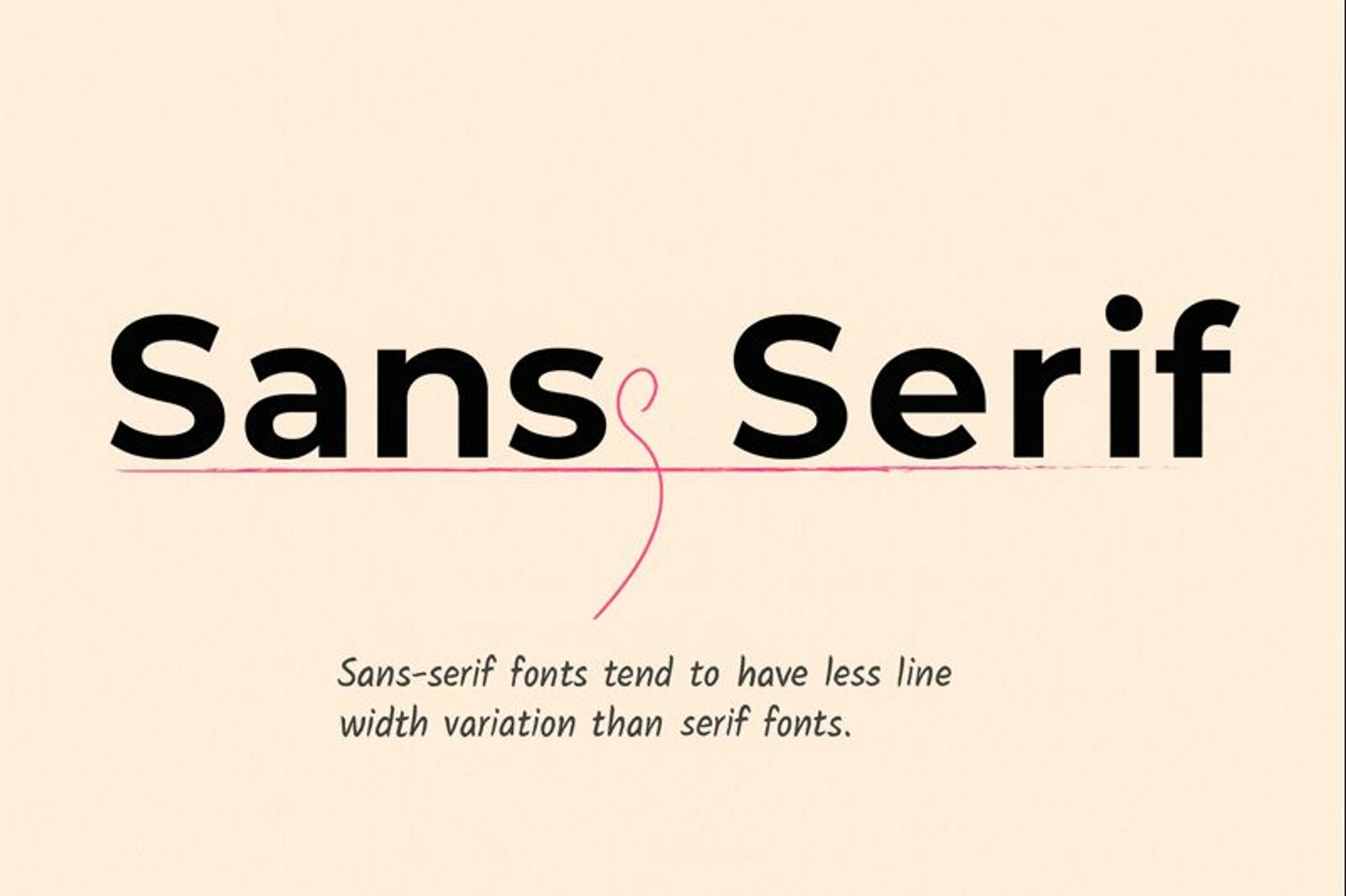
Sans-serif
Sans-serif means without serifs. These fonts have clean lines without extending strokes. They work well for modern digital design.
Popular sans-serif fonts include Helvetica for classic Swiss design, Arial for wide compatibility, Open Sans for web and mobile, and Montserrat for geometric modern looks.
Use sans-serif fonts for tech companies, startups, healthcare organizations, modern retail brands, and any business wanting to appear current and approachable.
Sans-serif fonts read clearly on screens at any size. They feel friendly without being casual, professional without being stuffy. Their simplicity makes them work well across different platforms and uses.
While serif fonts can look blurry at small sizes on screens, sans-serif fonts stay clear. This makes them perfect for websites, mobile apps, and any digital interface where easy reading matters most.
Sans-Serif Font Example
Script
Script fonts copy cursive handwriting, from formal calligraphy to casual brush lettering. They add personality but need careful handling.
Popular script fonts include Brush Script for casual looks, Lobster for fun approaches, Pacifico for relaxed feelings, and Allura for formal elegance.
Use script fonts for wedding planners, beauty brands, fashion companies, restaurants, artisan businesses, and luxury services where personal connection matters.
Script fonts feel human in our digital world. They suggest handmade quality and emotional connection. Used sparingly, they make your brand feel warm and personal.
Important warning: Script fonts are hard to read in small sizes and can look unprofessional if overused. Save them for headlines, logos, or special accents. Never use them for body text.
Font Example
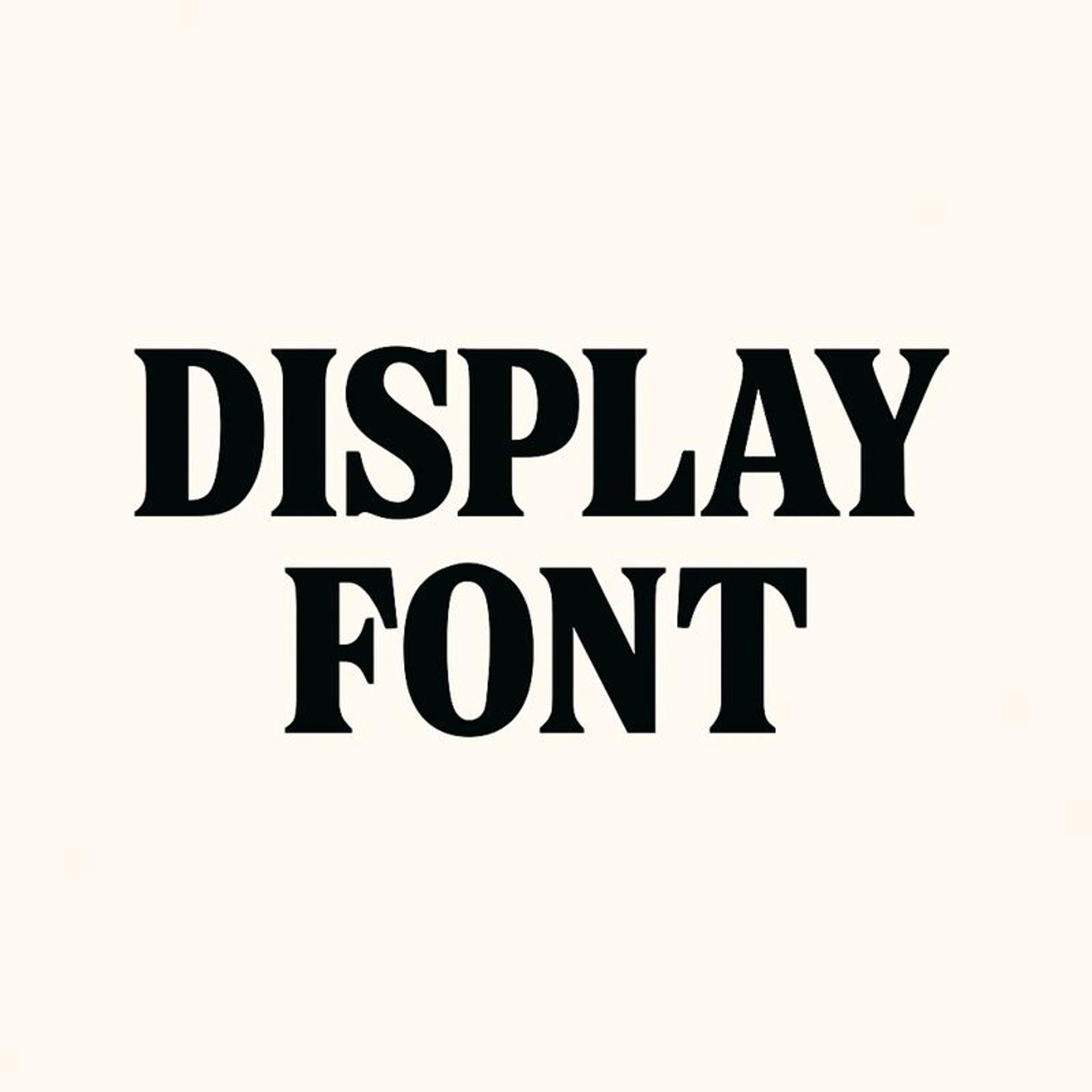
Display
Display fonts grab attention. They're bold, unique, and often highly decorative. Think of them as the personalities of the font world.
Display fonts have high contrast and dramatic styling. They're made for large sizes and have unique personality. They don't work for body text.
Use display fonts for entertainment companies, creative agencies, fashion brands, children's businesses, and any brand needing to stand out in crowded markets.
Display fonts break through noise. They're memorable and distinctive. When used correctly, they make your brand unforgettable.
Usage rules: Display fonts should be used sparingly. Think logos, headlines, or key phrases. Using them for paragraphs creates visual chaos and hurts readability.
Display Font
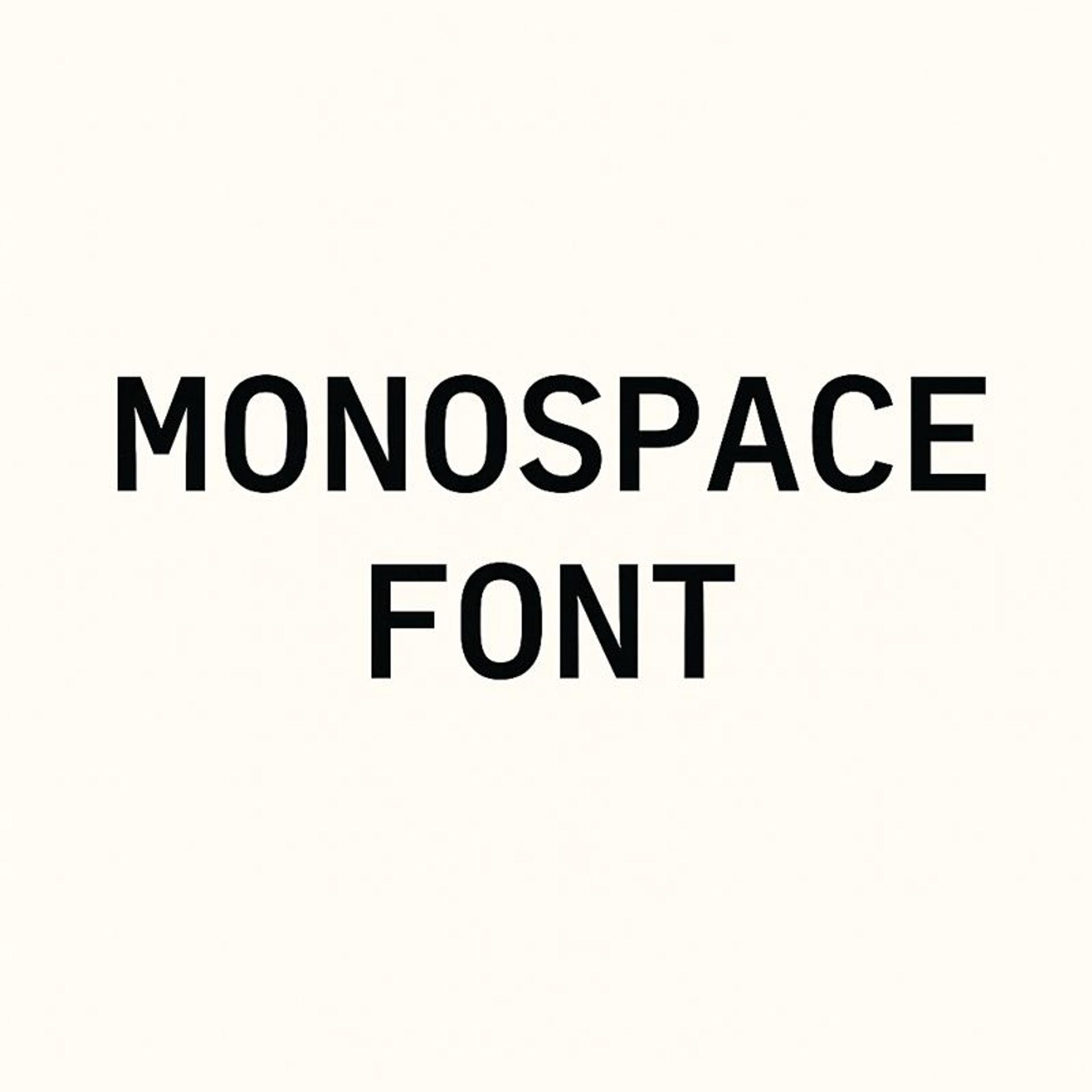
Monospace
Monospace fonts give each character the same space, creating a typewriter look. Fonts like Courier appeal to tech companies and brands wanting precision or nostalgia.
Geometric fonts are built from simple shapes like circles and squares. Examples include Futura and Avenir. They feel structured and modern, perfect for brands emphasizing innovation.
Monospace Typecase
Best Fonts for Branding
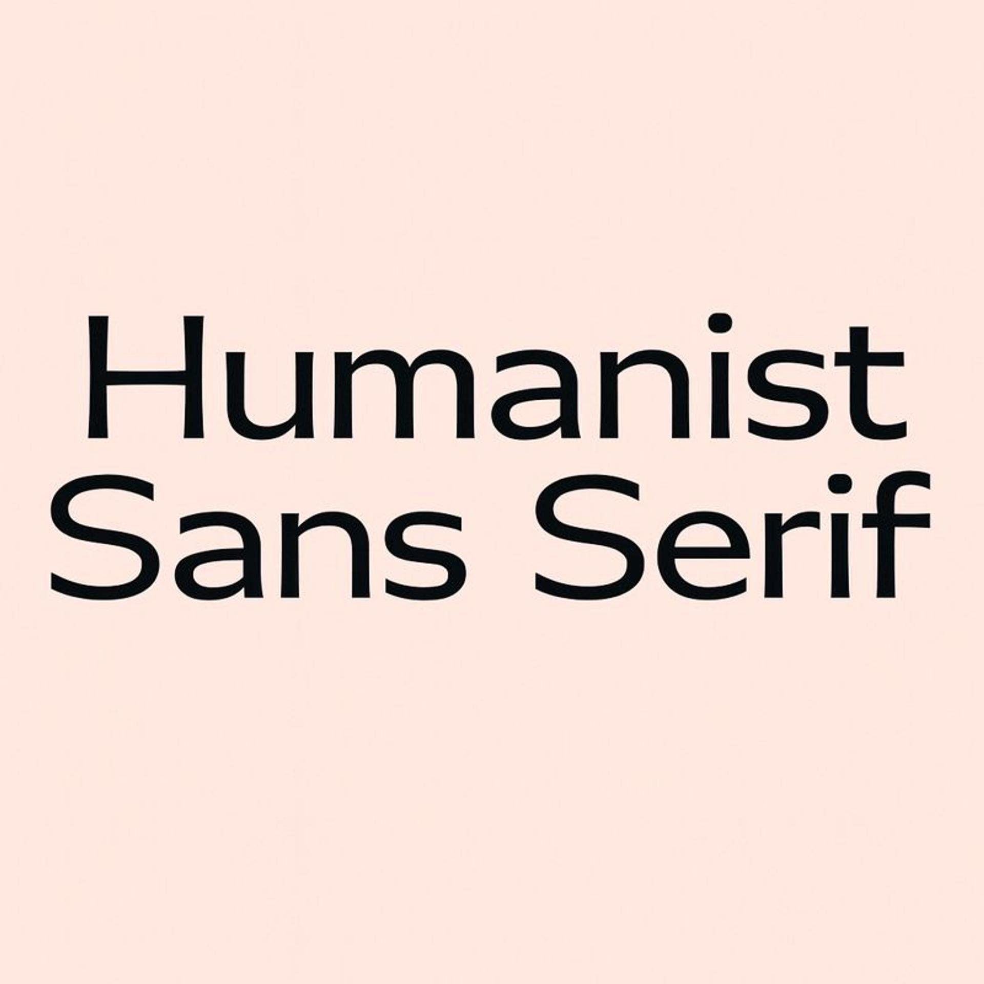
Humanist Fonts
Humanist fonts are typefaces inspired by traditional calligraphy and the natural movement of the human hand. They often feature organic, flowing strokes and varied line widths, making them highly legible and friendly in tone.
Ideal for both digital interfaces and print, humanist fonts strike a balance between professionalism and approachability — commonly seen in UI design for their readability and warmth. Popular examples include Gill Sans, Myriad, and Open Sans.
Humanist Font
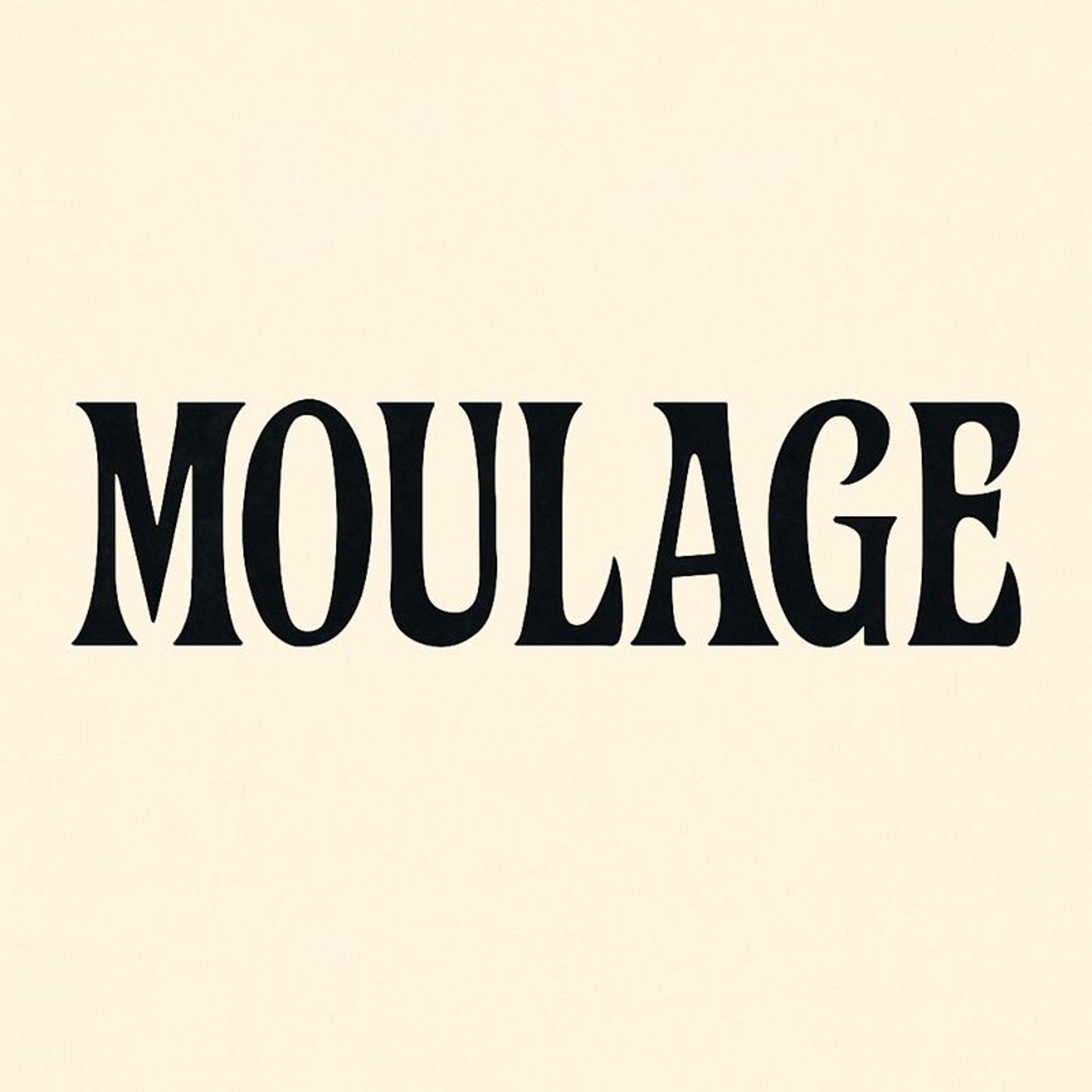
Moulage
Moulage is a decorative, display-style typeface known for its elegant and expressive design. It often features high contrast between thick and thin strokes, with artistic curves and flourishes that give it a distinctive, almost theatrical feel.
Moulage is best used in large formats — like headlines, posters, or editorial layouts — where its dramatic personality can shine. It's not ideal for body text, but it’s perfect when you want to make a bold, stylish impression.
Moulage Font Example
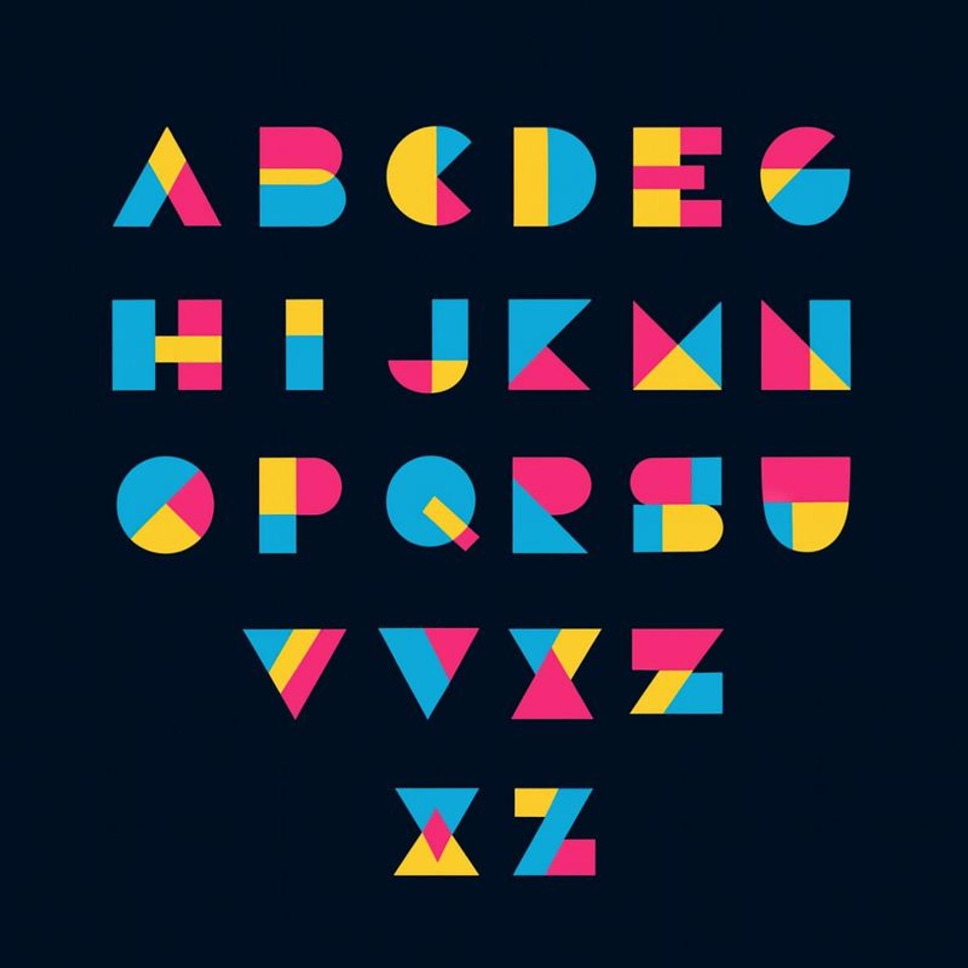
Geometric Fonts
Geometric fonts are typefaces built around simple shapes like circles, squares, and triangles, giving them a clean, modern, and minimalist appearance. Their symmetry and precision make them popular in tech, branding, and digital design where clarity and structure are key. Fonts like Futura, Avenir, and Montserrat are classic examples, often used to convey innovation, efficiency, and sophistication.
Geometric Font
Factors to Consider When Selecting Brand Fonts
Careful research is also needed if your fonts capture and reflect the essence of your products and strike a chord with the consumers you are targeting.
Brand Identity, Personality, and Values
Your typefaces must also fit into and extend your brand's character and values. Ask yourself which traits you wish your brand association to take, such as professionalism, congeniality, modernity, or luxury.
For example, a new-directed technology firm may decide to use a modern sanserif font for simplicity in innovation, while a high-end model launches a fashion business and uses sophisticated-looking script typefaces.
Target Audience
Understanding your target audience is crucial in choosing the letter font. Different demographics have different reactions towards different font types.
For legal purposes, a younger audience may be interested in bolder, more daring, artistic display fonts, while an older audience will most definitely prefer serif fonts. A little bit of audience analysis will let you know the preferred font styles of the audience you are targeting.
Industry Norms
Other than creativity, industry standards and norms also affect your selection of fonts. Although it is pretty necessary to be original, the audience may need clarification and discomfort, which is often a result of extreme change in the artistry after being too original. For instance, banks would use a serif type because it has a sense of reliability and professionalism.
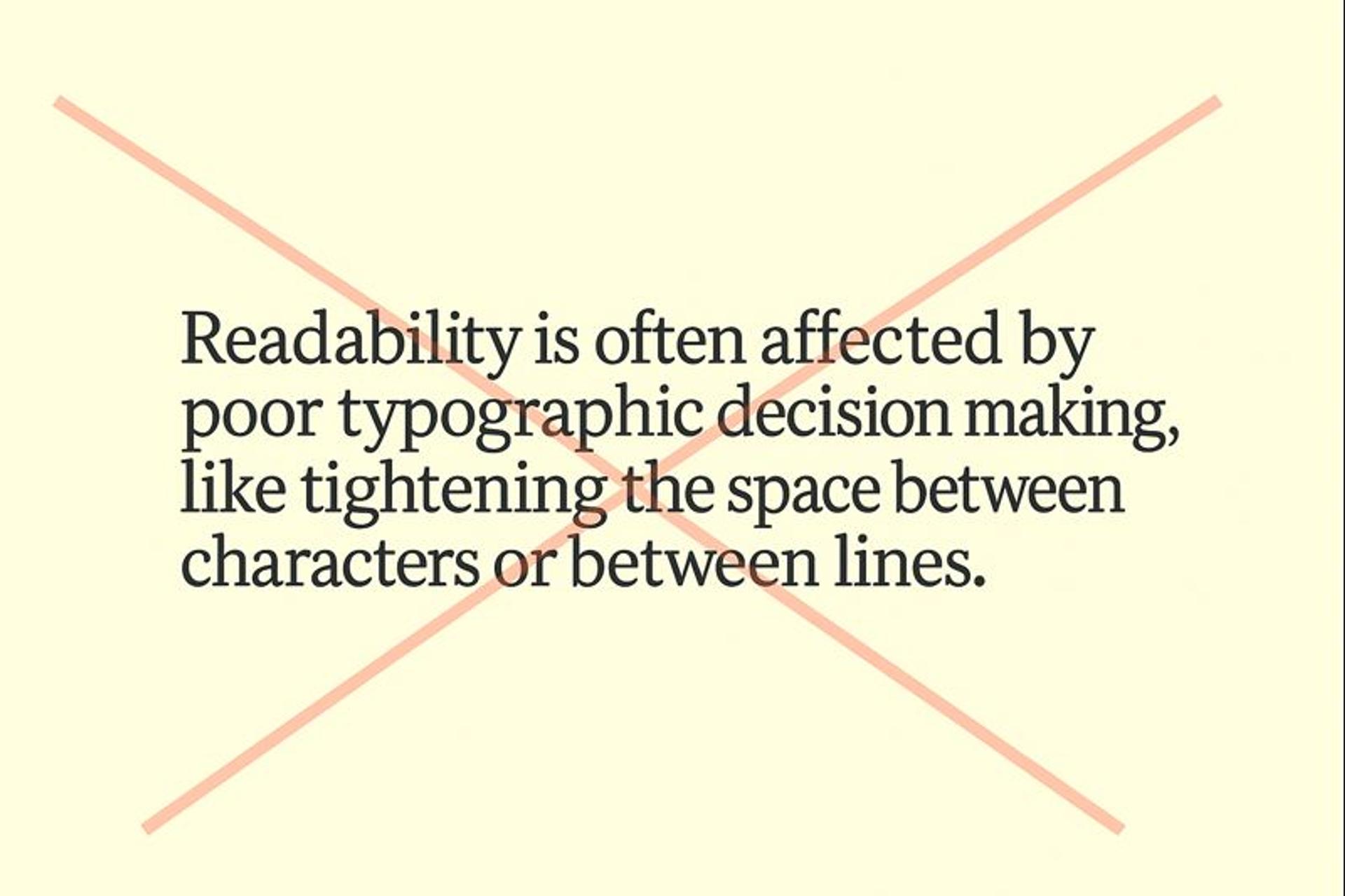
Legibility and Readability
However pleasing and beautiful a font has the potential to be, it should never compromise on its Legibility and Readability on any given medium.
For example, consider the document's font size and the fonts' spacing and thickness to ensure their visibility in print, web, and tablets. Don't use poorly designed fonts for many of your body texts. It is unnerving when long paragraphs are strenuous to look at.
Legibility and Readability
Versatility Across Different Mediums
The fonts selected should cross over beyond the electronic screen into printed material and other applications, too. A typeface that suits the online platform may not work well in a pamphlet.
Evaluate your type styles across a number of usage scenarios to verify that their effect and visibility are preserved no matter what face is used in documents.
Therefore, external factors are essential upon consideration, which cannot only be branded with such font, helping to unify all the audiences but also bring all the impressions about a brand across all touch points.
Creating a Typography Hierarchy
Primary fonts handle your main headlines and brand recognition elements. They should be distinctive enough to be memorable but readable enough for frequent use.
Secondary fonts manage body text, subheadings, and most of your written content. They need excellent readability and should complement your primary font without competing for attention.
Accent fonts add personality to special elements like quotes, captions, or call-to-action buttons. Use them sparingly to maintain impact.
Make Fonts Work Together
Your fonts should work as a family, not fight for attention. Choose fonts that share similar proportions and heights, stroke weights and contrast, and overall personality and mood.
Avoid pairing fonts that are too similar or too different. The sweet spot is fonts that complement each other while serving distinct purposes.
Create Consistent Rules
Make clear guidelines for when and how each font is used. Headlines always use Primary Font at specific sizes. Body text uses Secondary Font with consistent spacing. Accent elements follow predetermined rules.
Consistency creates professional polish and helps audiences understand your content structure without thinking about it.
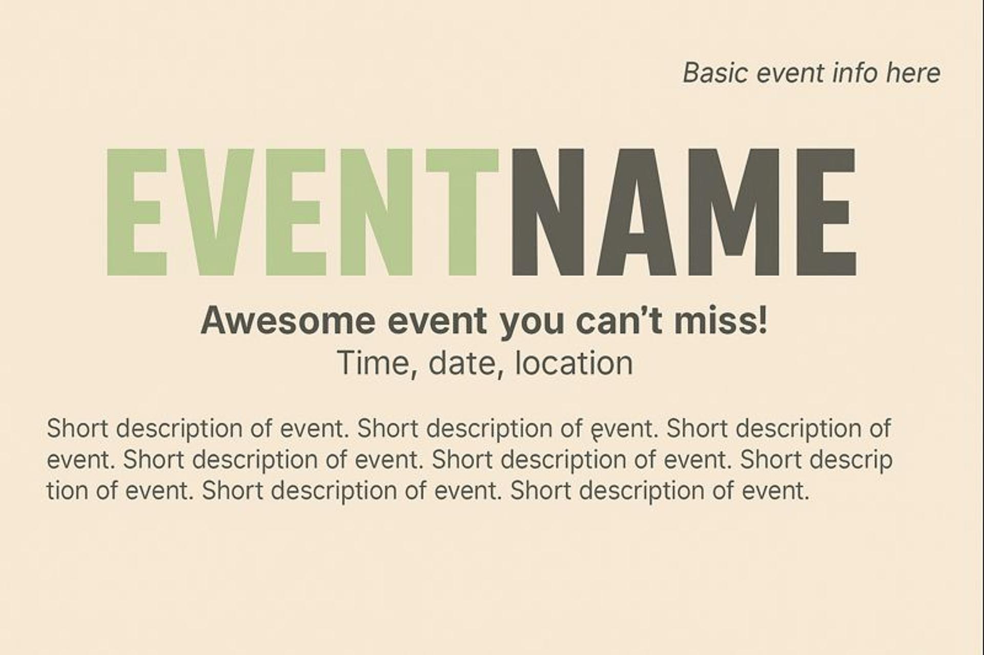
Typographic Hierarchy on the Invitation Card
How Many Fonts Should a Brand Have?
When it comes to building a cohesive brand identity, less is more — especially with fonts. Most successful brands use two to three fonts: a primary font for main headings and brand recognition, a secondary font for body text and readability, and sometimes a tertiary font for accents or highlights.
Using too many fonts can confuse users and weaken brand consistency. Each selected font should serve a clear purpose and complement the others in tone and style. Whether you're aiming for sleek minimalism or bold expressiveness, your fonts should work together to support your brand’s voice and visual identity.
The goal is clarity, cohesion, and personality — without the clutter.
Tools and Resources
Font Foundries and Libraries
Font foundries and libraries are excellent solutions to searching and acquiring new types of fonts. Filing such as Adobe Fonts, Google Fonts, and Linotype contain many beautiful fonts that can be used for personal and commercial purposes.
When you create books, especially on these platforms, and want to buy fonts, these platforms often have search filters that enable you to look for fonts according to specifications, for instance, styles, popularity of the design, or even in the case of the designer, which makes it easier to search for your brand adequate typeface.
Source: fonts.adobe

Software for Testing and Comparing Fonts
When choosing the right fonts, testing the specific features of typefaces usually includes testing them in various situations. There are systems like FontPair and Typecast, which allow the user to play around with font combinations to know how certain combinations will fare in the design.
Furthermore, tools including Sketch, Figma, and Adobe XD allow performing and testing typefaces within the program and checking how they work in print or on the web. In many of these applications, one can find means to modify the kerning, line height, and other related effects to perfect the choice.
These components and resources will help you make the search, tests, and use of the right fonts for your brand and project much more effective.
Case Studies
Grasping the relationship of typography to its audience through practical examples is very appealing. Below are a few semi-popular case studies that highlight successful font usage or attempts at redesigning the font:
Walmart
In 2008, Walmart was exposed to the effects of rebranding, and among the changes was the employment of a sans serif typeface, Myriad Pro.
This was part of the brand extension program, which aimed to reduce the organization's branding inconsistencies regardless of the audience's engagement level.
Walmart's target audiences appreciated the functional and restrained simplicity of Myriad Pro, which helped the brand convey its values of being cheap yet lovely.
Source: turbologo

Mailchimp
Similarly, 2018 brought changes in branding for Mailchimp, using the Cooper Light typeface as a potential new direction for the company. This serif font added a fair share of the brand's playfulness and humaneness, with promises in the thick strokes and fuzzy forms.
It helped showcase Mailchimp's friendliness and creativity, which collaborated with email marketing platforms. The new type was effectively integrated into relative and independent layouts, including online and printed ones.
Source: 1000logos

Cornerstone
Our collaboration with Cornerstone resulted in a revamped SaaS marketing website that enhances usability through thoughtful visual identity, 3D design, custom illustrations, and typography.
By integrating motion design and a cohesive color scheme, the site streamlines Cornerstone's wide range of offerings and creates an intuitive and engaging interface. Dynamic iconography and clear typography reinforce the modern brand image, making the user experience memorable and accessible.
Source: Cornerstone website
FAQ
What's the Difference Between Typography and Fonts?
Typography is the broader art of arranging text to make it easy to read and visually appealing. It includes everything from font selection to spacing, hierarchy, and layout. A font is simply the specific typeface file you use, like Helvetica Bold or Times New Roman Italic. Think of typography as the strategy and fonts as the tools that bring that strategy to life.
Which Fonts Work Best for Logos?
For logos, choose fonts that are distinctive, scalable, and timeless. Sans-serif fonts like Helvetica or Futura work well for clean, modern brands. Custom display fonts can create unique personality but require careful design. Avoid overly trendy fonts that might look dated quickly, and ensure your logo font remains readable at small sizes like business cards or social media profiles.
Are Free Fonts Good Enough for Professional Brands?
Free fonts can work for professional brands, but quality varies significantly. Google Fonts offers excellent free options with proper commercial licensing. However, premium fonts often provide better craftsmanship, unique character, and extensive font families. The key is ensuring any font, free or paid, has proper commercial licensing and meets your brand's quality standards.
Read More
Conclusion
Typography is one of the most powerful tools for forming a brand's visual identity and image. Knowing the intricacies of typeface, such as font styling and formatting, coherence, and rights, may also strengthen branding's effectiveness.
Following best practices and using the means at hand may help curb this challenge and ensure typographic selections are appropriate for potential users.
However, there are known best practice guides, and it is possible to think outside the box and add extra fun to the font selection. On the other hand, typography consists of the arts and sciences, as not every letter design produces an effective brand and captures the company's narrative.
Now that you know your audience's needs and preferences, feel free to change, adjust, and test textures until you find the most suitable one.

About Clay
Clay is a UI/UX design & branding agency in San Francisco. We team up with startups and leading brands to create transformative digital experience. Clients: Facebook, Slack, Google, Amazon, Credit Karma, Zenefits, etc.
Learn moreAbout Clay
Clay is a UI/UX design & branding agency in San Francisco. We team up with startups and leading brands to create transformative digital experience. Clients: Facebook, Slack, Google, Amazon, Credit Karma, Zenefits, etc.
Learn more