
You may be in talks with a UX/UI design company to understand why UI guidelines are necessary to create a compelling user interface. The answer is simple: UI design guidelines provide a standard structure and simple language that helps designers, developers, and users create and use a consistent UI experience.
After reading this, you’ll know why UI guidelines are important and how they can help your team create a successful user interface.
What Are UI Guidelines?
UI guidelines define standards for consistent, usable, and accessible interfaces. They cover typography, colors, buttons, icons, and interactions to create a clear user experience while aligning with brand identity.
Companies like Apple and Google use systems such as Human Interface Guidelines and Material Design to help teams build cohesive products across platforms. This consistency improves usability and strengthens brand recognition.
Benefits of UI Guidelines
Developing a user interface can be challenging, but UI guidelines give designers and developers a clear set of rules. This helps ensure that the final product is consistent and easy to use. UI guidelines also help reduce cognitive load by simplifying design and maintaining consistency.
UI guidelines are more relevant when different teams work on the same project because they maintain communication between everyone and point them to the finish line.
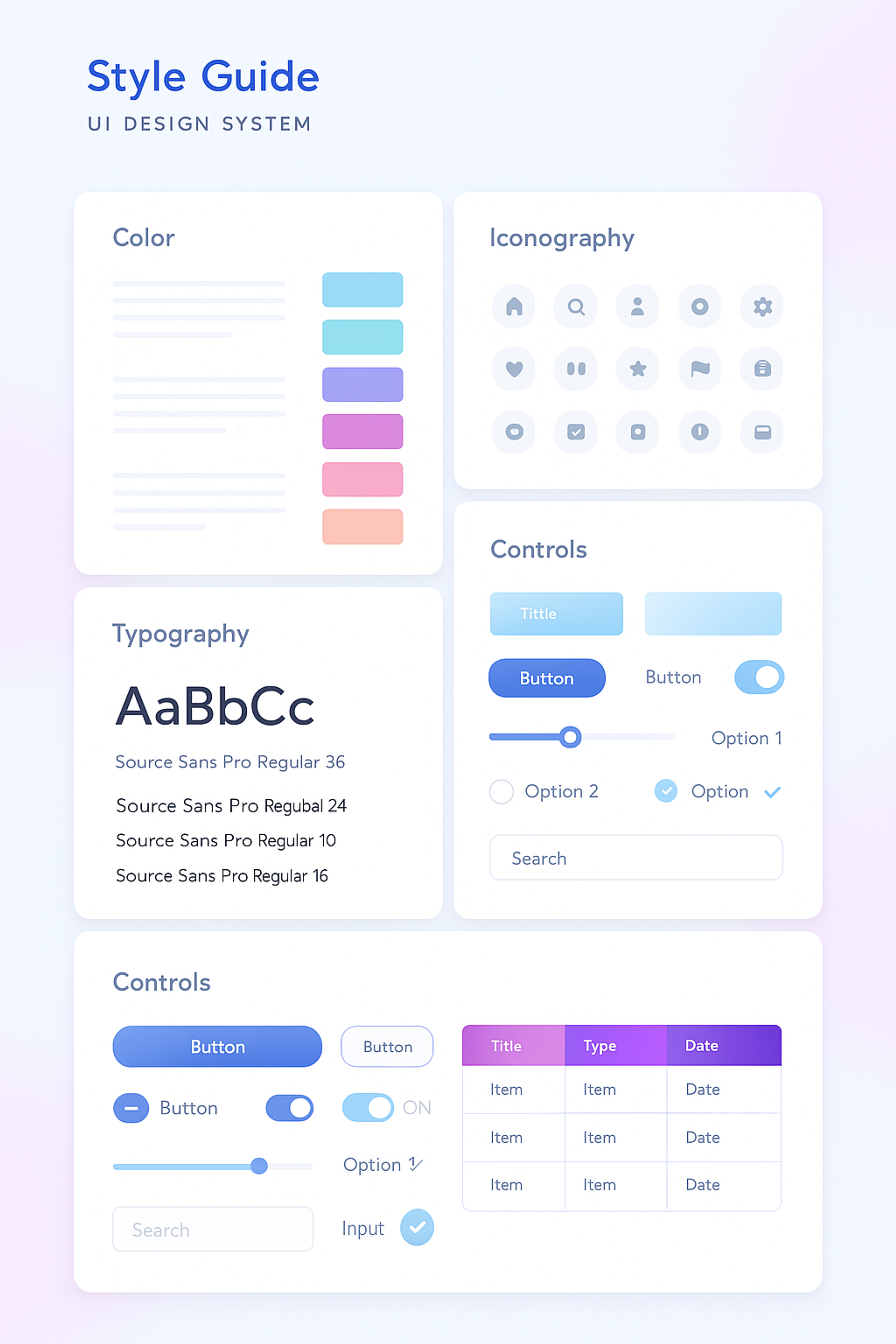
UI Kit Example
UI guidelines not only improve accessibility but also aid in user experience by giving clear directions to developers and designers on how the interface should be.
Maintaining proper contrast ratios is crucial to enhance accessibility for individuals with vision impairments. A well-designed UI that is easy to use regardless of ability level leads to a superior UX for all users involved.
Types of UI Guidelines
Using simple, straightforward language in user interfaces significantly enhances clarity and ensures all users can easily understand the content, regardless of their background or technical expertise. This approach not only improves accessibility but also fosters a more inclusive experience for diverse audiences.
Additionally, implementing underlining or other visual cues to differentiate link text from regular text is crucial. Relying solely on color to indicate links can lead to confusion, particularly for individuals with color blindness or other visual impairments.
Style Guides
A style guide is the most fundamental type of UI guideline, serving as a cornerstone for design consistency. It outlines a platform's general layout, color schemes, and typography choices, ensuring that all visual elements align with the brand’s identity.
In the case of Interos, we developed a comprehensive style guide that included refined logos, dynamic typography, and a structured pattern system that reflects the company's expertise in supply chain risk management.
This guide ensures consistency across the brand's digital presence, utilizing data-driven infographics, adaptable iconography, and cohesive design elements. By establishing such detailed guidelines, we ensured that Interos can maintain visual harmony and clear communication, reinforcing trust and security in all user interactions.
Interos UI Guidelines by Clay

Content Guidelines
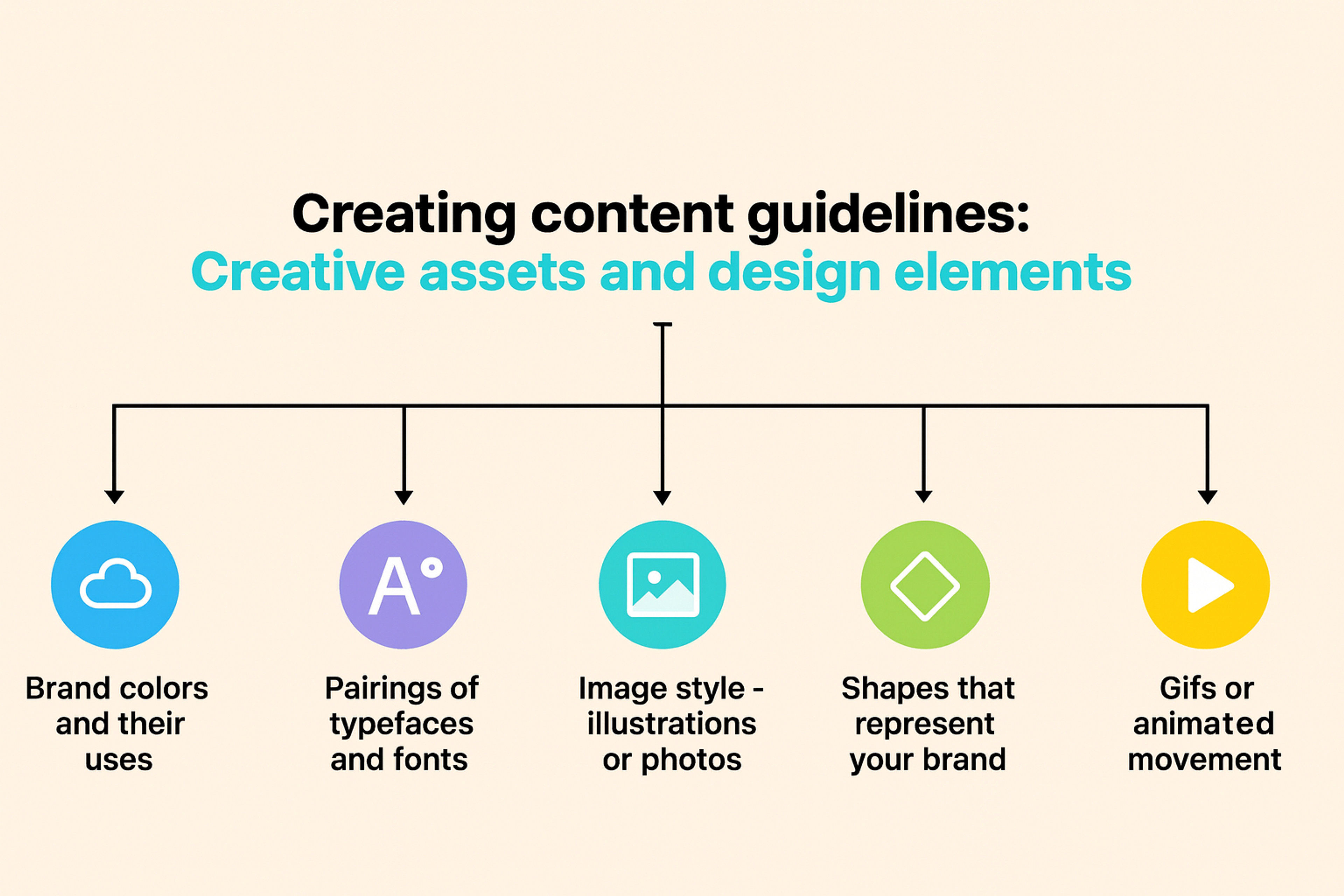
Content guidelines delve deeper into the specifics of the content that should be included in the user interface. They provide comprehensive rules for formatting text, including font sizes, line spacing, and paragraph structure.
Content Guidelines for Creative assets
Accessibility Guidelines
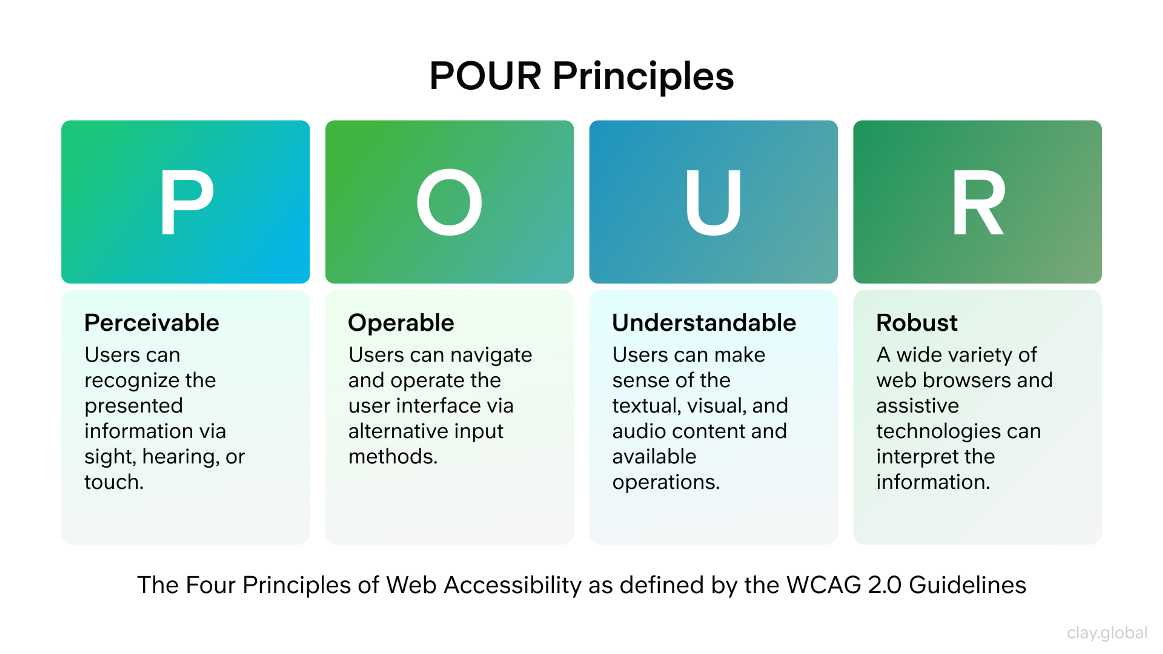
Accessibility guidelines are essential to ensure that the user interface is usable by people of all abilities, including those with disabilities. These guidelines encompass a variety of measures, such as ensuring that screen readers can accurately read text and that users with visual impairments can easily navigate the interface.
POUR Principles by Clay
The status bar is critical in this context by providing essential information like journey progress, operational results, and connection statuses. This keeps users informed during tasks that require waiting or processing. This continuous flow of information is vital for maintaining user engagement and satisfaction.
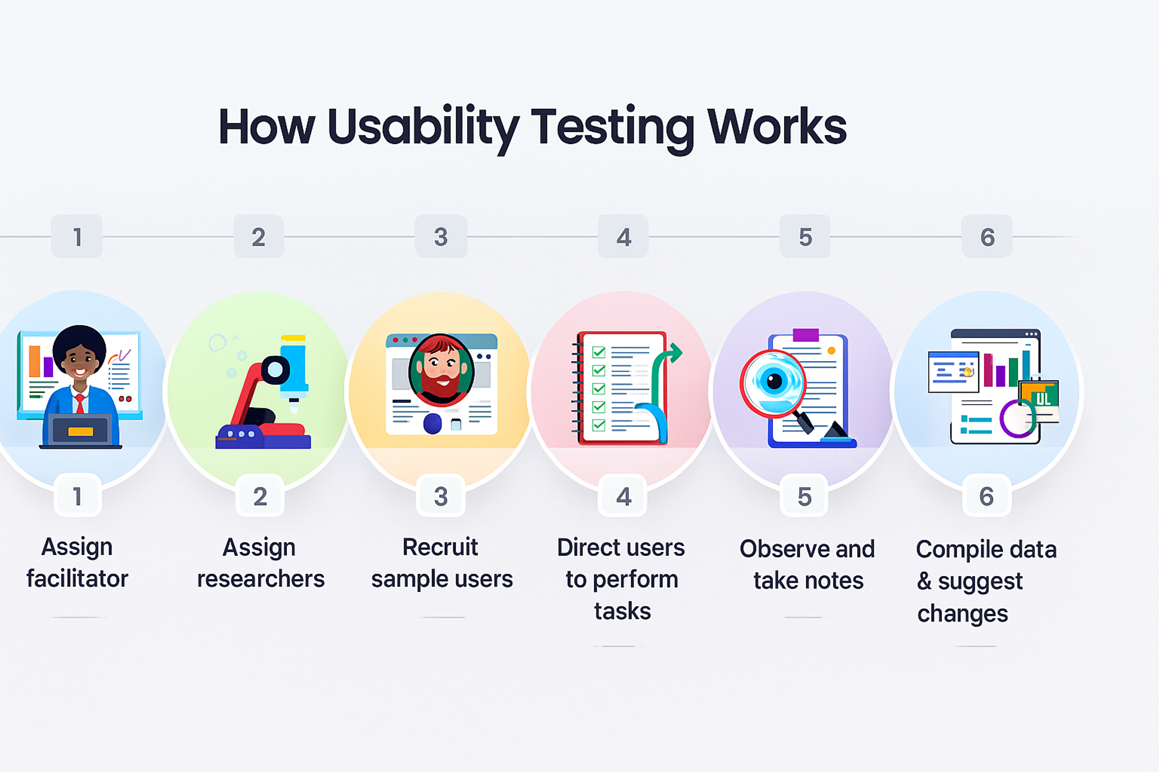
Usability Testing Guidelines
Usability testing guidelines provide a structured framework for assessing and evaluating the user interface, ensuring it meets high functionality and user satisfaction standards.
This process involves observing real users as they interact with the interface to identify any challenges or obstacles they encounter. Testing should verify that the user interface is not only easy to use but also fulfills the specific needs and expectations of the target audience.
This might include assessing the intuitiveness of navigation, the clarity of instructions, and the overall aesthetic appeal of the design.
How Usability Testing Works
UI Components and Visual Elements
Let’s explore the must-have parts of a user interface. Instant feedback when someone presses a button or moves through a form is key to making the experience feel easy and smart. Feedback can appear in different ways — perhaps the button changes color, a gentle sound plays, or a smooth animation shows that the action worked.
These parts form the core of any UI, and your UI guidelines detail them all. Fast, clear reactions to users’ improvements improve the whole experience. When actions feel recognized and people can see what to do next, they feel more in control. This builds trust and happiness, so using the app is a pleasant journey.
Buttons
Buttons are the go-to item for any app when users need to send info, confirm a choice, or move smoothly to the next screen. Where we put these buttons is super important. They need to be in spots that match the users’ expectations and fit the natural flow of the interface, so people always know what will happen next.
Button Anatomy
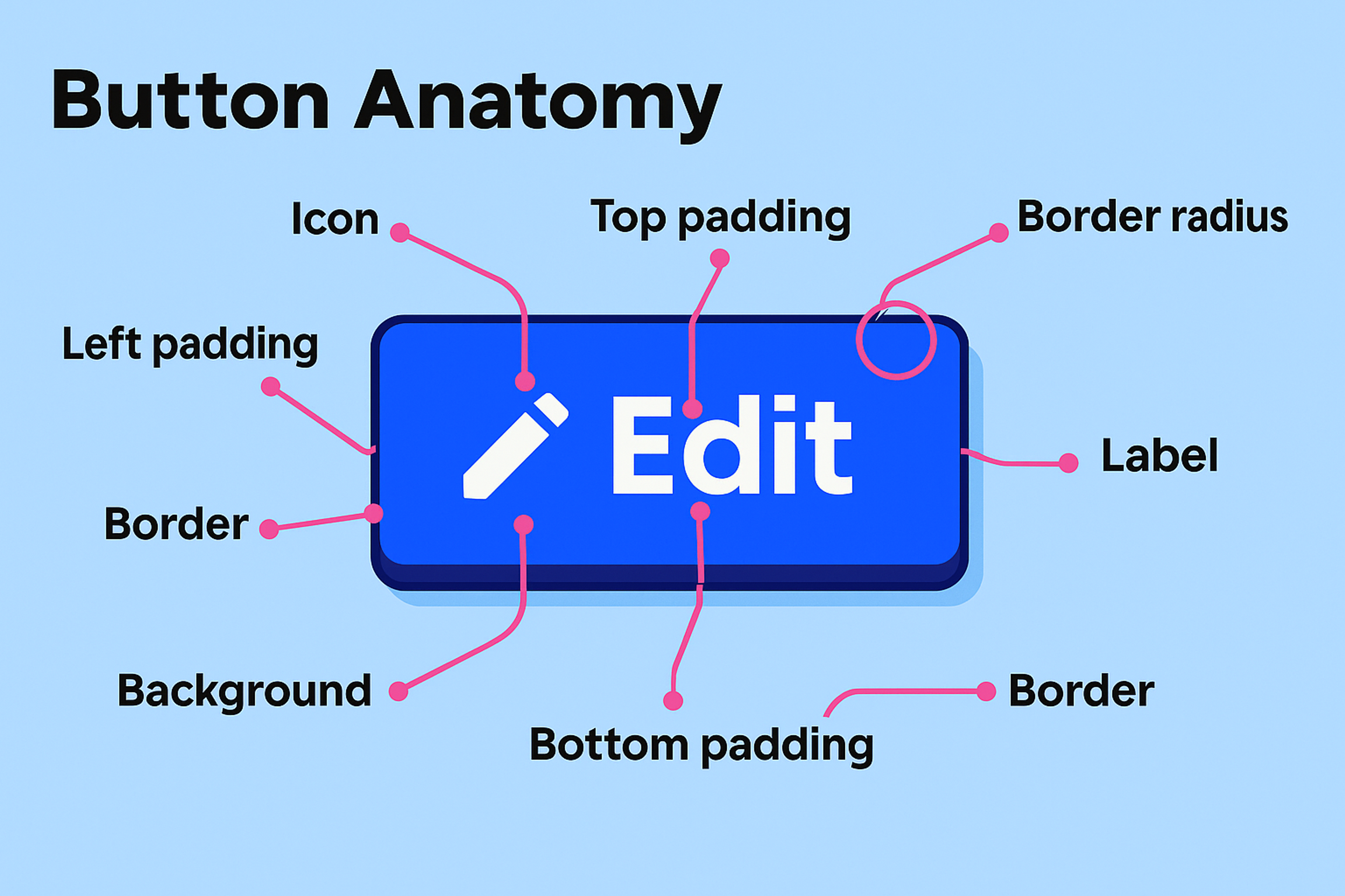
Each button should feature short text that exactly matches what the button does. This makes sure that when users click or tap, they already know the result.
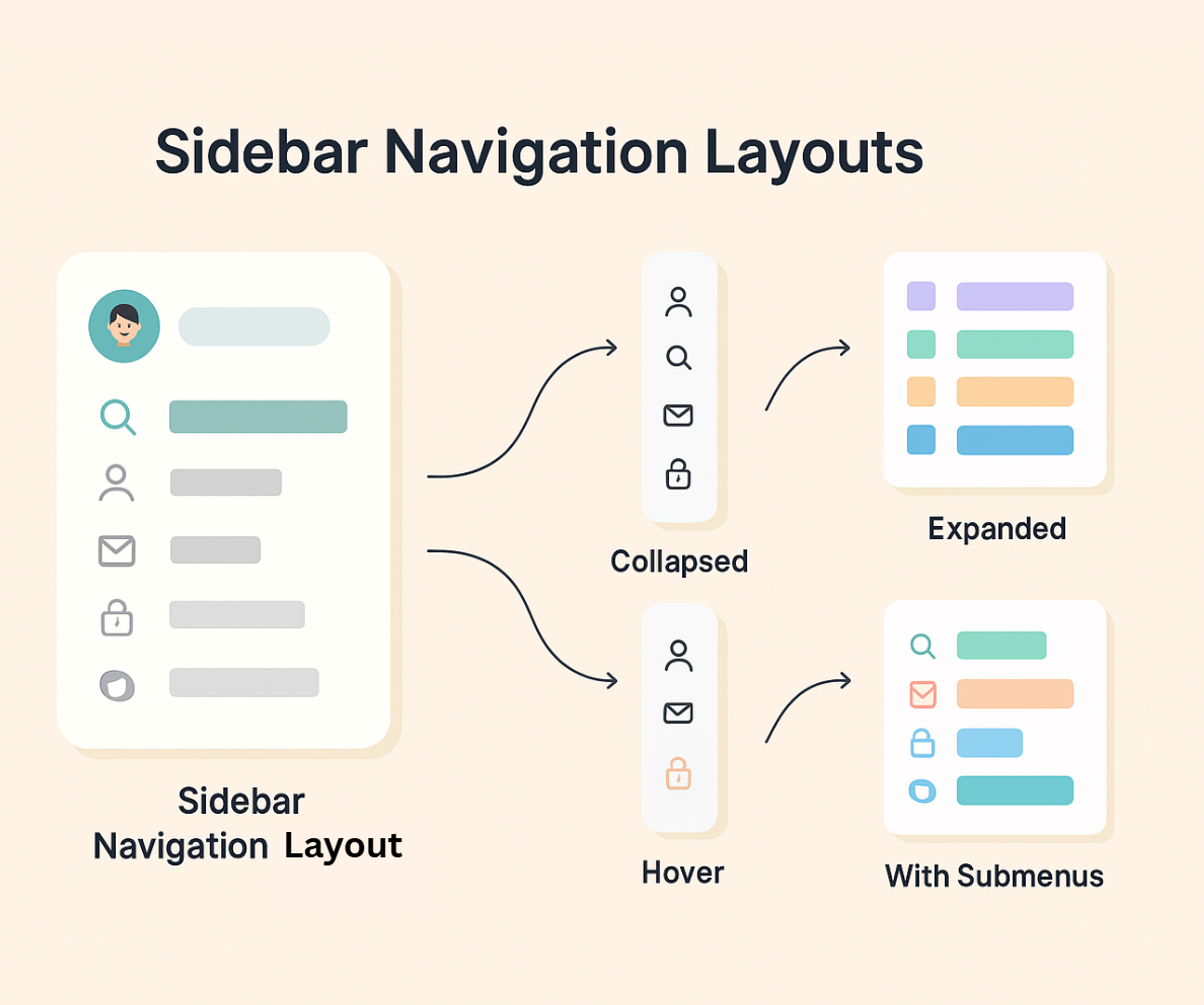
Menus
Menus help users move easily across pages or reach other functions within a web app or site. Menu items must be grouped in a way that makes logical sense, so users can locate what they want without second-guessing their choice.
Sidebar Navigation Layout
Forms
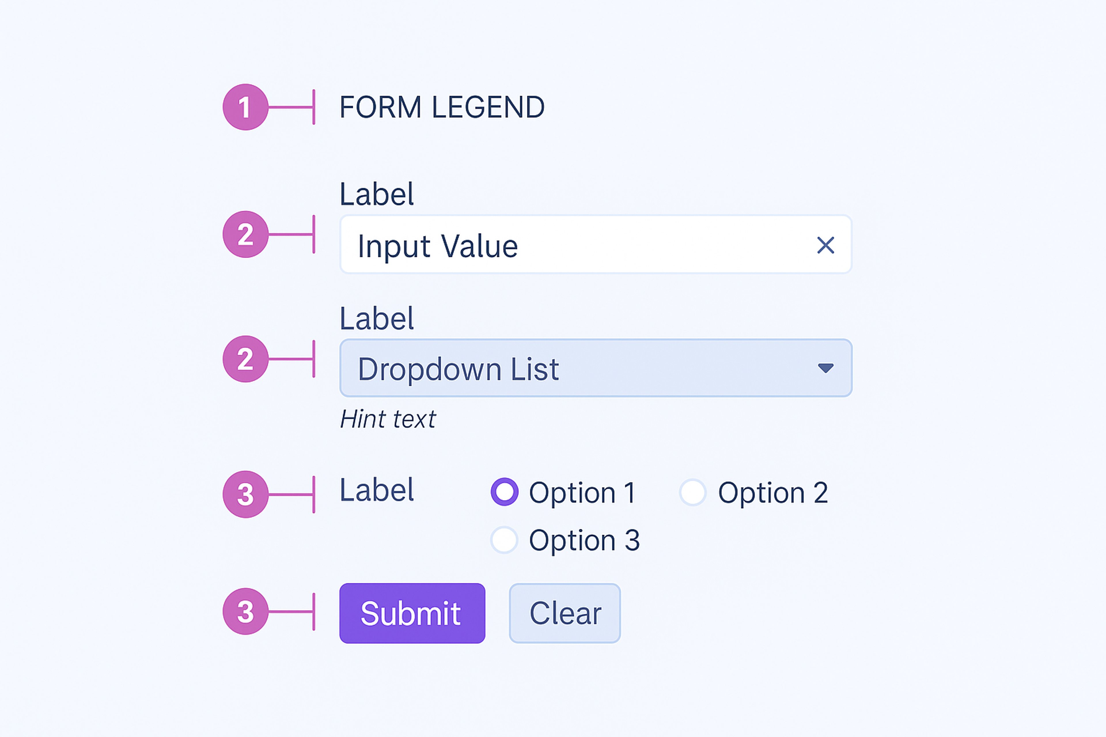
Forms gather information, whether someone is joining a newsletter, offering feedback, or placing an order. When designing a form, place clear, brief labels beside each field, so users instantly know what information they should provide. If any field needs special instruction, add simple text that guides them without confusion.
Input Forms
Tables
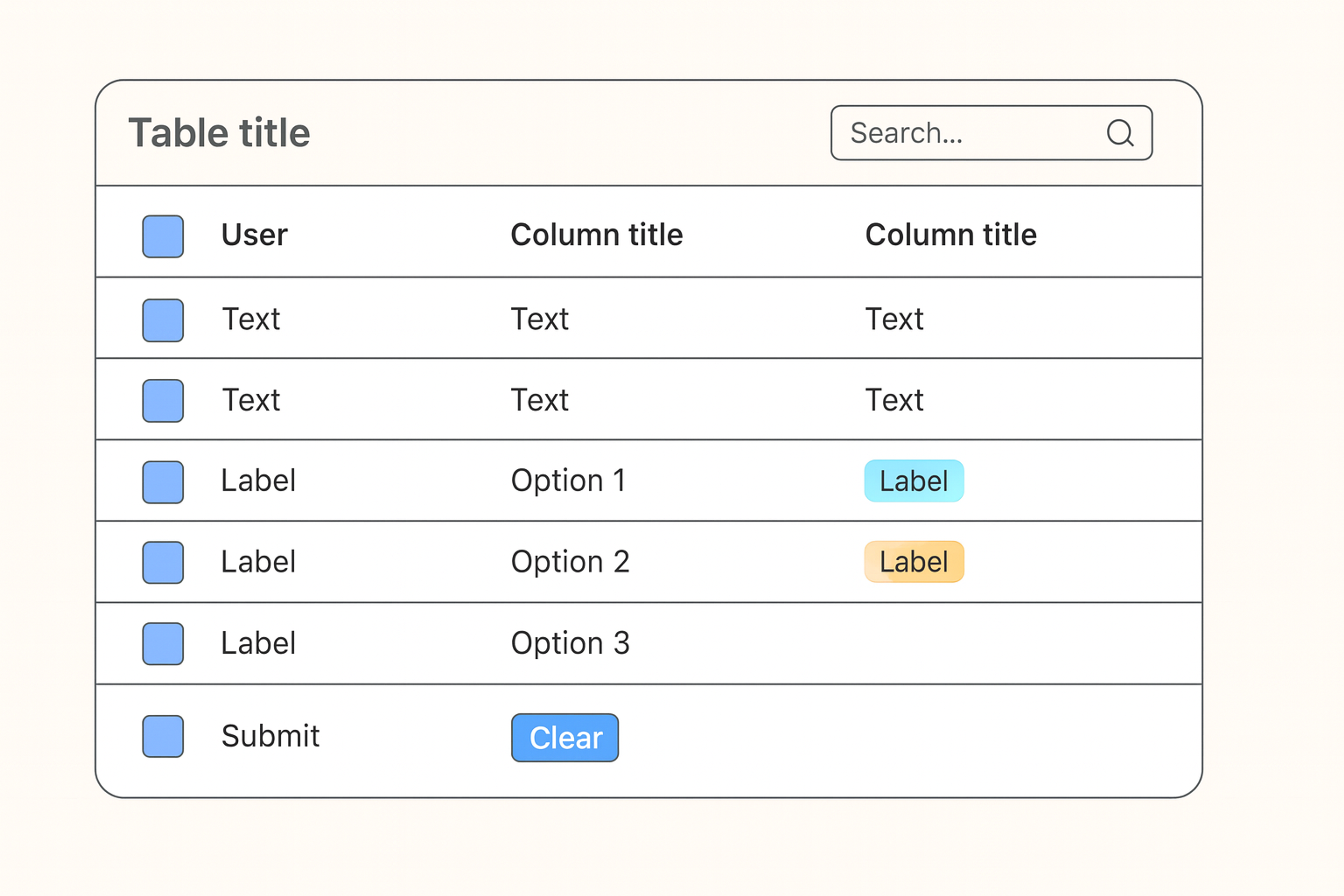
Tables present information neatly so users can spot patterns or compare figures at a glance. For a table to be effective, give each column a simple heading and make sure the arrangement clearly shows the data.
Build options for sorting, filtering, or searching to let users interact with the data. Most tables feel incomplete without these features, and they help people find the details they need even faster.
This makes the site easier to use and helps visitors stay interested in the content.
Table Example
Three Essential Parts of Great UI Guidelines
Part 1: Design System Components
Your design system holds all the building blocks of your interface. These components work together to create bigger, more complex designs.
- Build Reusable Components: Create interface pieces that work in multiple places. Buttons, forms, and navigation should look and act the same everywhere. This saves time and creates consistency.
- Manage Your Components Well: Set up clear processes for creating, testing, and updating components. Good systems balance new ideas with stability. Your team needs to know who owns what and how changes happen.
- Use Design Tokens: Design tokens store your design choices in one place. Colors, spacing, and fonts become named values you can use anywhere. When you change a token, everything updates automatically.
Part 2: Interaction Patterns
Interaction patterns show users how to use your interface. They make your product feel predictable and easy to learn.
- Create Consistent Interactions: Users should know what happens when they click, tap, or scroll. Set standards for hover effects, loading states, and error messages. Consistency builds trust.
- Add Meaningful Motion: Animation and micro-interactions guide attention and provide feedback. They should feel natural and helpful, not decorative. Good motion makes interfaces feel responsive and alive.
- Handle Interface States Clearly: Your interface needs to show what's happening at all times. Users should know when something is loading, when actions succeed, and when errors occur. Clear communication prevents confusion.
Part 3: User Experience Rules
User experience rules help you make design decisions based on what actually works for people.
- Follow Core Design Principles: Make your interface clear, consistent, and helpful. Users should understand what they can do and what will happen next. These principles guide every design choice you make.
- Use Real User Research: Test your designs with real people. Their feedback shows you what works and what doesn't. Good guidelines grow from understanding your users, not just following trends.
- Test Everything: Set up ways to check if your designs actually work. Measure how well people can complete tasks. Use this data to improve your guidelines over time.
Best Intuitive Interfaces Examples
Art Bridges
Our Art Bridges project exemplifies the power of an intuitive interface, making art exploration effortless and engaging for users of all backgrounds. The design prioritizes simplicity and clarity, ensuring that navigation feels natural from the first interaction. Thoughtful use of hierarchy and whitespace guides users seamlessly through the platform, reducing cognitive load.
Interactive elements are placed strategically, while smooth transitions enhance the browsing experience. By balancing aesthetic appeal with usability, the interface creates a frictionless journey, allowing users to focus on discovering and engaging with art rather than figuring out how to navigate the site.
Art Bridges intuitive interface by Clay
Canva
Canva is a user-friendly design platform that makes content creation accessible to everyone, even without graphic design experience. Its intuitive drag-and-drop interface allows users to create professional visuals in minutes.
A key strength is its well-organized template system, which simplifies navigation. Users see recommended templates first, with easy-to-browse categories and a clear sidebar for sorting.
A purple indicator highlights active selections, while popular templates are more prominent, making it easy to find relevant designs. This smart visual hierarchy enhances usability, streamlining the design process.
Source: canva.com

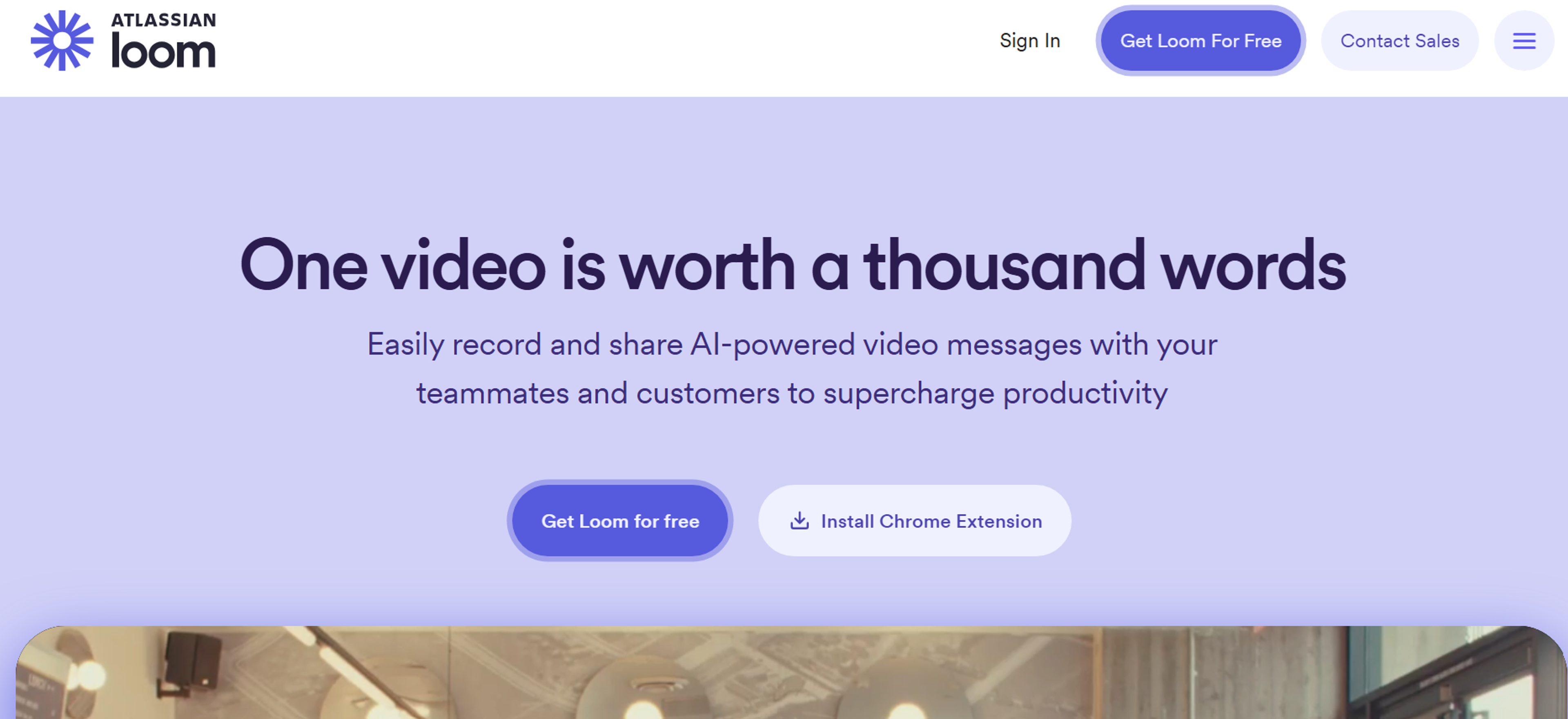
Loom
Loom is a simple and fast video recording tool designed for effortless use. With a minimalist interface, users can quickly select screen, camera, and recording settings without needing tutorials.
Its intuitive editing tools refine recordings instantly, and videos can be downloaded or shared with ease. The interface features a clean design, with Loom’s signature purple buttons highlighting key actions like Record, Share, and Upgrade.
A light background and subtle grey toolbar enhance readability, while hover states with info bubbles provide helpful guidance. With a streamlined experience and user-friendly prompts, Loom makes video creation seamless for beginners and pros alike.
Source: loom.com
Measuring Your Success
Track the Right Things
- Focus on User Outcomes: Your measuring stick should show how well users are reaching their own goals. Watch task success rates and user satisfaction, not just how pretty the design looks. Numbers that focus on user achievement matter most.
- Monitor Team Productivity: Solid guidelines should speed up design and coding while keeping them steady. Check if your team is delivering more work and higher quality over time. When processes speed up without sacrificing excellence, your guidelines are working.
Improve Continuously
- Learn from Real Usage: Real user data is more honest than assumptions. Observe how guidelines are used and which small tweaks users follow. This feedback loop reveals real victories, not the ones the creators expected.
- Stay Current with Best Practices: Interface design never stands still. Regularly incorporate the latest research and fresh design patterns to give your users an edge. Out-of-date data is the enemy of future success; fresh insights sharpen your guidelines.
Read more
Conclusion
Clear UI guidelines help teams build consistent, intuitive, and accessible interfaces. They should define core principles, organize UI elements, and support regular testing and updates based on user feedback.
Strong guidelines improve usability, engagement, and overall user satisfaction while keeping the interface relevant over time.

About Clay
Clay is a UI/UX design & branding agency in San Francisco. We team up with startups and leading brands to create transformative digital experience. Clients: Facebook, Slack, Google, Amazon, Credit Karma, Zenefits, etc.
Learn moreAbout Clay
Clay is a UI/UX design & branding agency in San Francisco. We team up with startups and leading brands to create transformative digital experience. Clients: Facebook, Slack, Google, Amazon, Credit Karma, Zenefits, etc.
Learn more