
Creating a blockchain logo means striking a balance between trust and innovation. People want safety and transparency but crave speed and new ideas. Your logo must feel calm yet adventurous, like a sturdy boat racing ahead.
People often respond emotionally to a well-crafted crypto logo’s design and color. Familiar elements such as recognizable colors or shapes can make complex technology like blockchain feel more approachable and trustworthy.
This article takes you from brainstorming to the moment you hit “upload.” The final mark should work just as well in a tiny wallet icon, a dark dashboard, or a glossy press kit.
Purpose and Reader Promise
In blockchain, a logo conveys professionalism and is way more than just a picture. It shouts, “Count on us, and watch us move.” When you keep that promise, users spot your logo faster and feel less unsure, while partners say “yes” more quickly. This article gives you a step-by-step roadmap: research, sketch, test, launch. Whether you’re a founder, brand lead, or designer, you’ll find the tools to create a strong mark in the real world.
For visual benchmarks of crypto brands done well, browse real product-focused case studies at our crypto page. Use them to pressure-test your own choices in dark UI, tiny sizes, and motion.
Clay Crypto Page

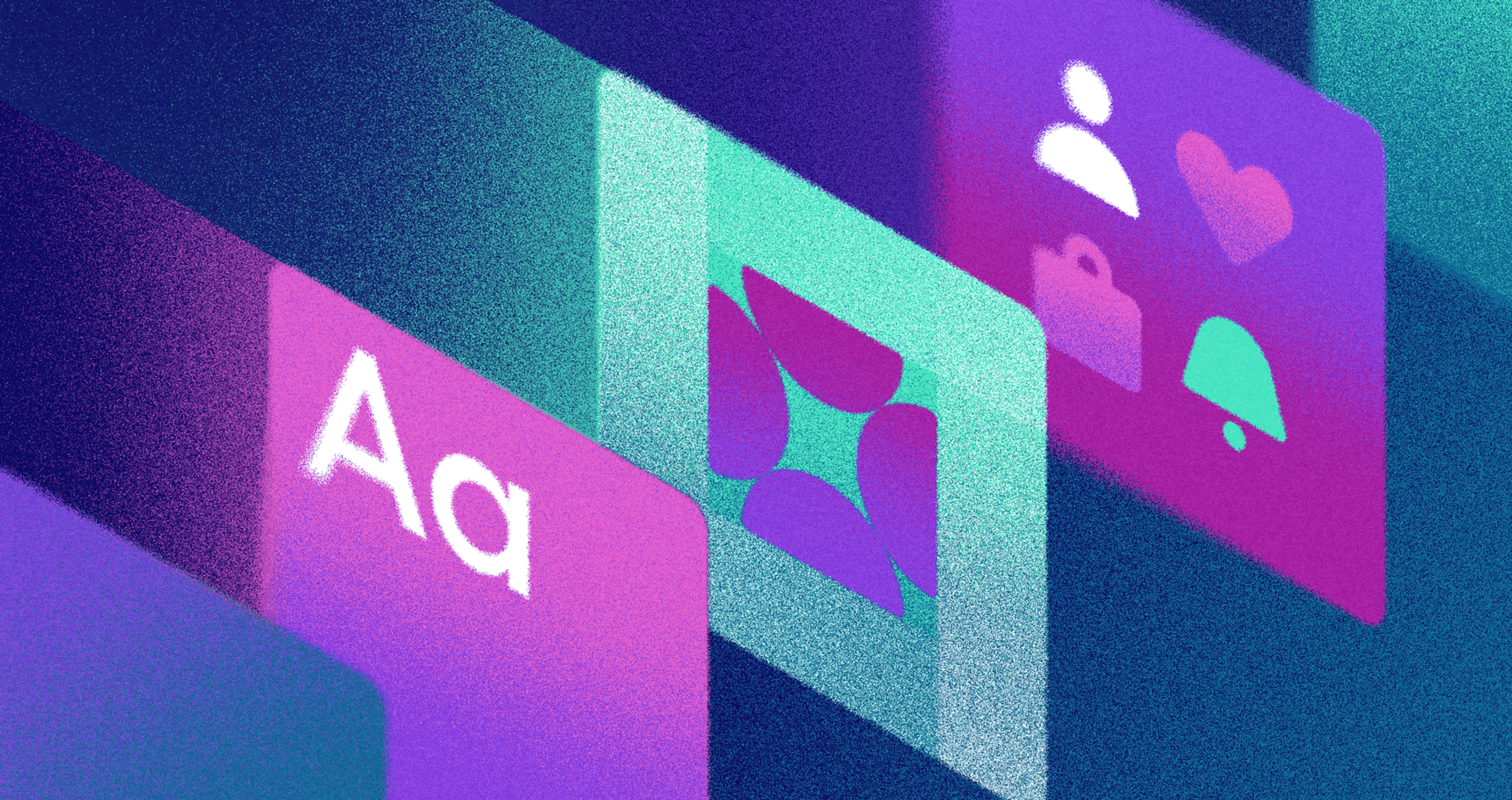
Understand the Context
Listen first before designing anything. Honor the doubt: the buyer who lost NFTs in the last mint, or the trader who woke to a market cave-in. Show your track record, your audit, your wallet. Counter the noise with honest noise, and live with GitHub open and in public.
Study Rivals and Claim White Space
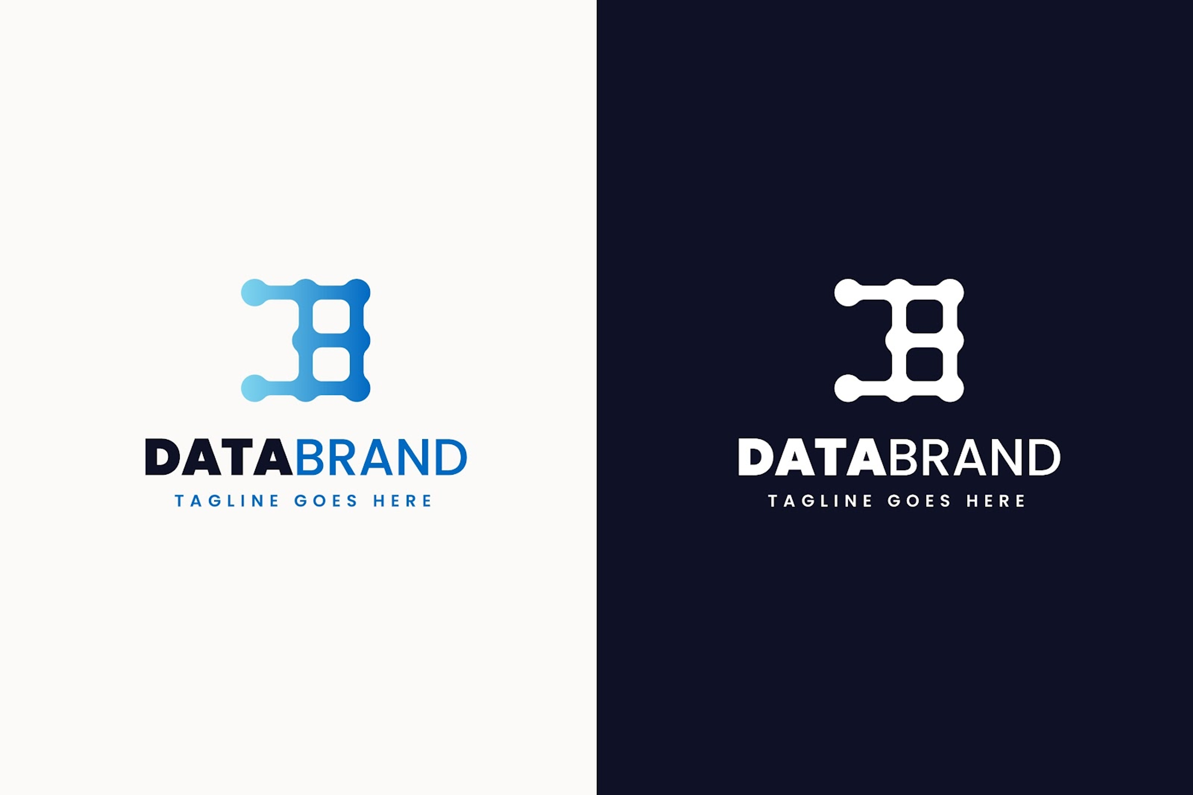
Head out and lay out competitors and adjacent brands on a tiny canvas. Grab a sketch and spread them across trust versus innovation, and noise versus silence. Notice which symbols keep showing up — padlocks, chains, cubes, hexagons, neon glooms. Look at this example:
Logo Example
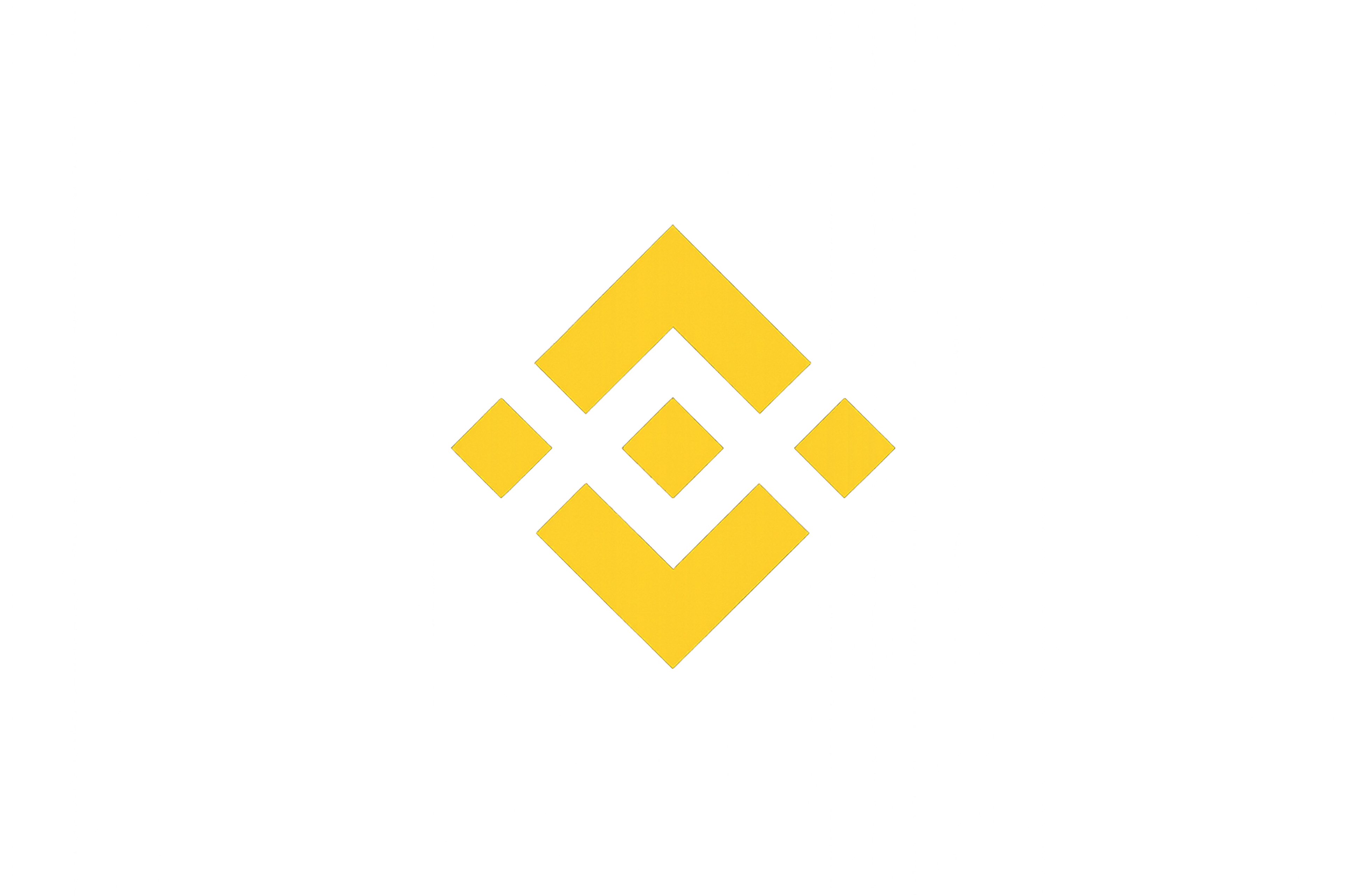
These logos are often composed of geometric shapes, and the careful composition of these shapes can set a brand apart by creating a professional and recognizable visual identity.
They’re in obvious territory. Use a breadboard shape, not a fake copy. Write one guiding line that shows a fresh angle. Sample line: “Strong core, one fluid hue, dark background, no jeans-lock spoke.” Stick that line onto your monitor and never turn it away.
Treat Constraints as Requirements
Jot down every dark surface that will hold your logo: wallet rows, explorer tiles, exchange grids, mobile docks, bookmarks — yes, that too, and PDFs, and tiny device marks. Decide the smallest size that still lets a letter dance. Mark safety breathing walls.
There are a number of ways a well-designed logo or monogram, including considerations for typography, can be adapted for use across business cards, web design, and social media, highlighting its versatility in branding applications.
Set the motion to a whisper, and ensure a muted option is on the shelf. Get your light, dark, and monochrome packs ready, color-blind at the center, not the edges. Check contrast early, delighted users later. If every piece reacts the same way, trust clicks into place.
Take a look at this example of our work with Dfinity in dark colors:
Dfinity Visual by Clay
Explore Concept Territories
Pick three to five strong directions. One is an abstract badge with interlocking curves that signal security. Another is a network path that resolves into a forward arrow. A third is a simple grid module that can repeat into a pattern. A tiny, crisp tick can hint at time or validation. A letterform with bold negative space can also work.
Learn essentials from this logo:
Logo Example
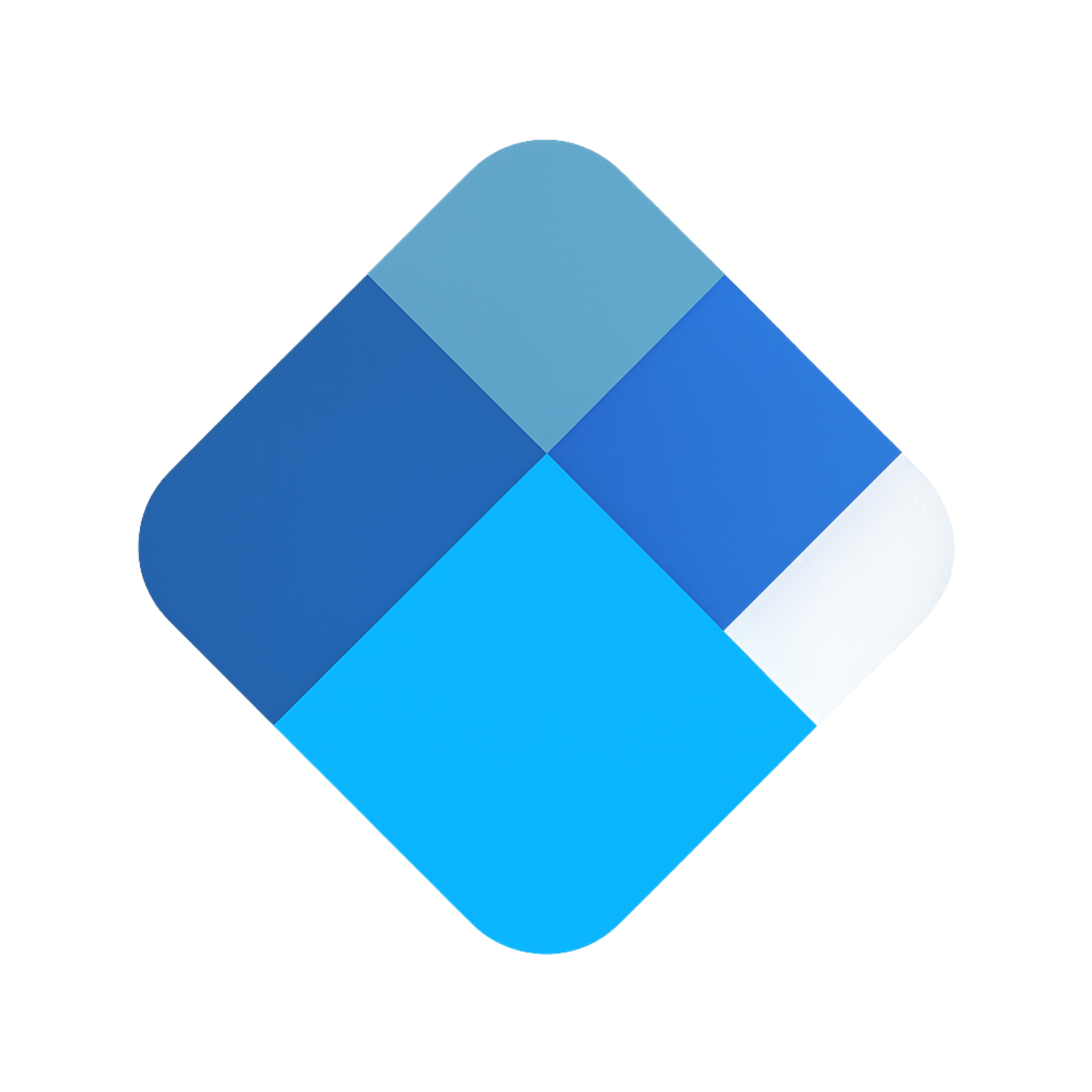
It sits on a 45-degree square grid. Large blocks make a diamond, with one small tile as an accent. Shared angles and even corner radii create calm order. The layout feels balanced but leans to the upper right, which reads as progress.
Color steps from dark to bright suggest depth and a path. It holds at 16×16 because it avoids thin lines and tiny gaps. The modules can repeat to build a subtle network texture in motion or headers. The lesson is simple: pick a grid, set clear ratios, add one motion cue, and keep one accent piece you can theme.
Keep your sketches clean and spare. If an idea needs long notes to explain it, it will fail when small. Test color, scale, and tap targets early, even on a 16×16 canvas.
Shape Language and Geometry
Start with a core grid: choose circular, square, or isometric. Keep ratios strict. Symmetric layouts build trust, while gentle, intentional asymmetry feels alive. Limit stroke variation to one or two weights.
Prevent minuscule gaps that will blur or fill when assets are downsampled. Precisely tune corner radii; a tiny chamfer can sharpen on dark displays. Validate each decision in both light and dark modes. Lock the design only when it survives that dual scrutiny.
Color that Says “Trust + Innovation”
Root the palette in stable colors: deep navy, soft slate, and rich ink black, with a hint of blue for vibrancy . Complement with a single vivid accent, such as vibrant cyan or electric teal. Since many crypto screens are dark, design for that environment first, then check light modes for consistency.
Conduct a micro-swatch test: scatter the accent on crowded tables and chart edges. Adjust luminance and saturation instead of switching the hue if the mark disappears or merges. Use gradients only to convey actual change, such as a flow direction or a state shift.
Typography and the Wordmark
Select the type that fits the brand’s purpose, not the latest trend. Use a humanist sans for warmth and clarity, a geometric sans for crisp accuracy, or a controlled mono face to imply engineering.
When customizing a wordmark, raise the x-height and widen apertures so legibility is strong even at small sizes. Set kerning at 12 to 14 pixels, not just in ample proofs. Anticipate the actual scripts that will appear. If your audience requires Cyrillic or Arabic, evaluate them in the first round. Review accent marks to ensure they hold their shape at small sizes.
Symbol, Wordmark, and Lockups
Know where each element excels. Place the symbol in space-tight UIs and round social avatars. Rely on the wordmark for letterhead, invoices, and any legal uses. Use the combination lockup on key home pages and press materials.
Source: freepik.com
Document safe zones, the most petite allowable sizes, and the conditions that switch between the primary, stacked, and simplified icons. Create a monochrome version for emboss, deboss, and any official marks.
Motion with Purpose
Animate to affirm a brand reality. A square settling reinforces certainty, a tick completes a task, and a guided micro-path suggests motion. Keep the file small. I prefer SVG for static or lightweight controlled motion, or Lottie for light vector movement.
Always offer a reduced-motion version for users with accessibility needs. Keep the motion meaningful and terminate quickly so clarity, not distraction, is the result.
Build a Coherent System
Carry the primary logo into supporting graphics — patterns, icons, and diagrams. Patterns should mirror the logo’s geometry but stay soft behind charts. Icons must follow the same grid, stroke weight, and rounded corner rules.
Diagrams — nodes, blocks, and connectors — must present the same visual family. A unified system lifts quality perceptions and guides partners to apply the brand correctly.
Prototype in Real Contexts
Skip judging ideas only on presentation decks. Place the mark in the contexts it will appear: wallet lists, blockchain explorers, exchange tiles, favicons, app icons, social profile pictures, and browser tabs. Conduct five-second tests with unbiased users.
Ask what mood the brand conveys and which mark feels most trustworthy. Run A/B tests for slight variations on avatars and exchange-store tiles. Stress the logo in one-color printing and at small sizes. Launch the design only after a thorough review and the weakest scenario performs comfortably.
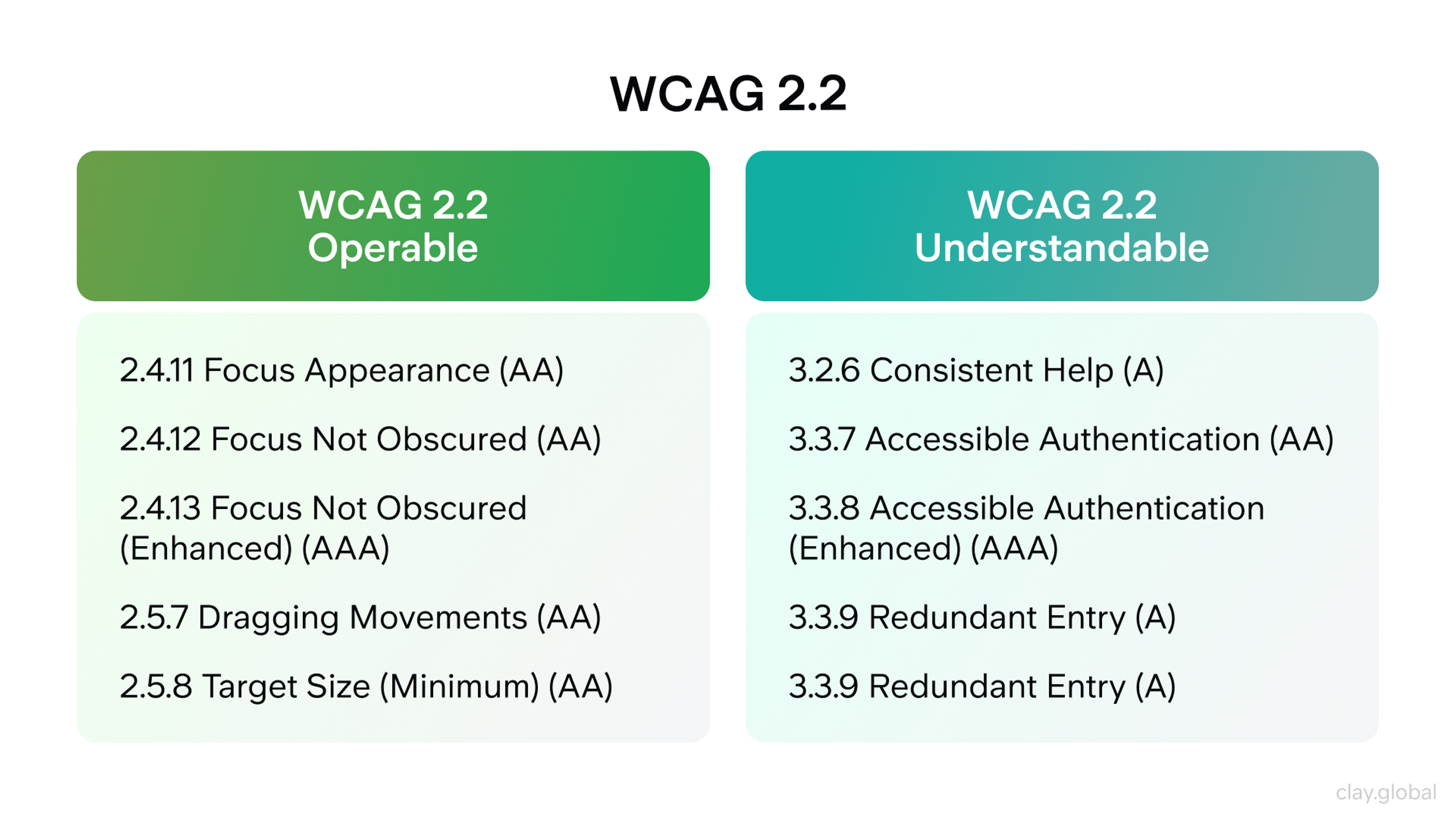
Accessibility and Inclusivity
Check all text and icons against WCAG contrast ratios. Simulate color-vision deficiencies to see if states merge, then swap color pairs that blur. Ensure that accent marks and non-Latin characters render clearly in the primary wordmark.
WCAG 2.2 by Clay
Supply simple “do/don’t” before-and-after visuals. By documenting clear, actionable rules, we reduce support questions and strengthen trust with partners.
Legal and Governance
Start by running trademark searches in your top product classes and countries. Lock in font licenses for web, mobile, and desktop use. Skip any assets in the gray zone that could block future store distribution.
Assign a single owner for brand decisions, track changes through version numbers, and keep one authoritative file for assets and guardrails. Treat your brand work the same way a software team treats code: one version file, one changelog, and one set of documented rules everyone references.
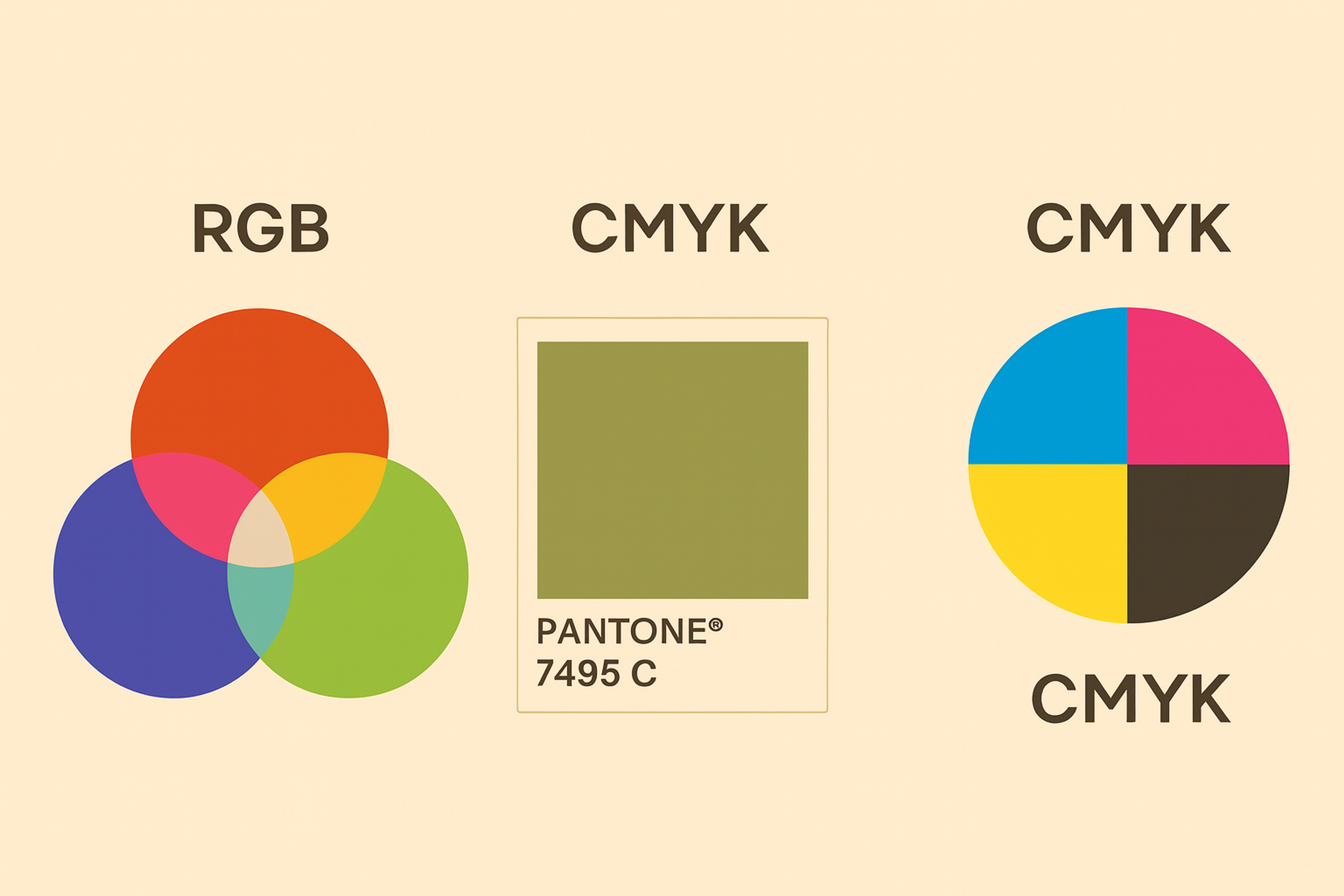
Production Assets
Produce a clean, single master SVG with each layer clearly named. Export raster versions for social icons, app icons, favicons, and thumbnails at multiple resolutions. Define color in HEX, RGB, CMYK, and spot if necessary. Include a full range of tints and shades for light and dark effectiveness.
Different Colors
If animations are part of the design, deliver the SVG and Lottie files and a no-motion version for devices that reduce motion. Attach a brief read-me file that lists where to get the latest version, how to request exceptions, and a compact changelog of changes made since the last release.
Brand Guidelines
Make the guide short enough to finish in a coffee break and specific enough to keep partners on the mark. Share the mark’s story and the mistakes it avoids. Show logos side by side to clarify spacing, minimum sizes, and lockups.
Paint by numbers for color use, animation speed, and actual samples in the product. Wrap it with a quick-start: a zip with the files partners open most, the smallest size they can ever use, and the top three traps they should never fall in.
Rollout
Prep the internal teams first: design, product, support, and biz. Package a partner kit with predictable avatars, logos, and press cover images. Coordinate PR, docs, SDKs, repos, and store images on the exact launch date. The first two weeks define the line; keep it clean here, and you shave months off the back end.
Maintain and Evolve
Keep a line open for feedback from partners and the user community. Run a light audit each quarter to score the mark on the product’s roadmap. Permit minor tweaks for reading at a distance or legibility for neurodiverse users; ban every trendy shift. Stable brands earn stable trust.
Common Pitfalls
- Literal locks and cubes that blur at small sizes and look like everyone else.
- Pretty gradients that die in dark UI or at 20×20 px.
- Slide-only testing that ignores wallets, explorers, and favicons.
Success Metrics
Focus beyond aesthetics. Gauge brand recall and trust levels before and after rollout. Monitor the correct partner signal and speed of adoption. Scrutinize support logs for impersonation incidents and user confusion. Inside the product, track icon selection percentages and click-through rates on strategic surfaces. The data confirms whether the promise stands.
FAQ
Who Is The Owner Of Blockchain?
No one. Public blockchains are decentralized networks run by many independent nodes. The code is open-source and changes only when a majority agrees through the network’s governance rules.
Who Controls The Blockchain?
Control in the blockchain is distributed among validators/miners, node operators, and — on some networks — token holders who vote on upgrades. Consensus protocols decide which transactions are valid. No single company or person is in charge.
Is Blockchain The Same As Bitcoin?
No. Blockchain is the underlying ledger technology. Bitcoin is one application of it — a digital currency that uses a blockchain to record transactions.
Who Is The Biggest Blockchain Company?
There isn’t a single “biggest” across all measures. Depending on the metric (users, revenue, funding, or role), major players include exchanges (e.g., Coinbase, Binance), enterprise providers, infrastructure studios (e.g., ConsenSys), and analytics firms (e.g., Chainalysis).
Does Elon Musk Support Blockchain?
He has publicly discussed and invested in cryptocurrencies, but blockchain networks operate independently of any individual’s support. Adoption and changes are determined by the community and consensus rules, not by one person.
Read more:
Conclusion
A well-crafted blockchain mark endures the most challenging conditions: small, dim, quickly scanned, and omnipresent. Begin with a disciplined strategy. Use uncomplicated geometries set on a precise grid. Ground the palette in trust, then add one vibrant accent to signal progress.
Validate it in live environments. Record thorough documentation. Finally, it must be safeguarded with clear guidelines and encrypted certificates. Commit to this, and the mark communicates dual assurance: “You are secure here” and “We are driving the future” — and users will trust it.

About Clay
Clay is a UI/UX design & branding agency in San Francisco. We team up with startups and leading brands to create transformative digital experience. Clients: Facebook, Slack, Google, Amazon, Credit Karma, Zenefits, etc.
Learn moreAbout Clay
Clay is a UI/UX design & branding agency in San Francisco. We team up with startups and leading brands to create transformative digital experience. Clients: Facebook, Slack, Google, Amazon, Credit Karma, Zenefits, etc.
Learn more