A static mark doesn't do enough anymore. Not on TikTok, not on a splash screen, not in the three seconds before your landing page paints. The question isn't whether brands should animate their logos, but whether the animation is doing any work.
Motion design has been shown to lift engagement metrics by up to 157% compared to static content. That only holds when the motion means something.
A bouncing logo with no reason to bounce is worse than a flat one because it makes the brand look restless instead of inert, which is arguably worse. Your audience has seen too much Adobe After Effects to be impressed by spin for its own sake.
What follows is the how, the when, and the why of animated logos in 2026: the principles that separate purposeful motion from visual noise, the tools that actually produce brand-grade work, and the examples setting the bar.
Key Takeaways
- Static logos still function, but animated ones earn measurably more attention, only when the motion ties to a clear brand idea.
- Motion design can lift engagement by up to 157% compared with static content, while misused animation can actively damage brand perception.
- A logo impression forms in roughly 10 seconds, while motion should clarify that impression rather than complicate it.
- The best animated logos work at 16px and 1600px, loop cleanly, and settle into a static state that still holds up.
- Social feeds, landing pages, and video end cards are where animated marks pay off. Business cards and formal collateral don't need them.
- DIY tools like Canva handle quick loops. After Effects, Rive, and Lottie are where brand-defining animations happen.
Why Animated Logos Matter
Ten years ago, an animated logo was a novelty, as it was mostly reserved for television bumpers and Pixar opening credits. Today, it's table stakes for any brand with a digital footprint.
Research by Renderforest found that 75% of consumers identify a brand by its logo alone, and that first impressions form in about ten seconds. Those two numbers (impression speed and recognition rate) are what motion multiplies.
A logo that moves gives your audience more to encode, more to remember, and more reason to pause a scroll.
Source: freepik
The shift is cultural, not just technical. People now meet brands through surfaces that expect motion: app splash screens, loading states, video end cards, and social post reveals.
A static wordmark in a video feed reads as absent rather than confident. Not dated, exactly. Just missing.
Motion Turns Recognition into Memory
Recognition and memory aren't the same thing. A logo might be recognizable yet remain on the edge of someone's attention rather than moving to the center.
A well-built animation solves that. It adds a second hook: the shape itself, plus the way it arrives. Think of the Pixar lamp bouncing onto the "I." The wordmark would be recognizable without it. You remember it because of it.
This matters more as attention compresses. Websites with subtle motion cues saw an average 12% increase in click-through rates, according to Adobe research cited in recent motion UI reports. This is a number that's easy to dismiss until you multiply it by a year of conversions.
It Signals that the Brand Is Current
A logo that never moves reads as if nobody has touched it. Fair or not, that's the perception.
Animation is the cheapest signal a brand can send that it's paying attention, that it has a design system fit for modern channels, that it ships work, that it cares how it shows up.
The animation doesn't need to be dramatic. A breathing effect. A one-second reveal. A subtle morph on hover. These are enough to lift a brand from "fine" to "current."
It Compresses Brand Strategy into 3 Seconds
Every strong animation carries an idea.
A logo that assembles from pieces says: built with intention.
A logo that transforms says: adaptable.
A logo that pulses says: alive, responsive, constant.
When we designed the Streetbeat mark, the animation had to sell the brand's thesis. The product stays ahead of market shifts rather than reacting to them. The motion wasn't decorative. It was the argument, compressed into a loop.
That's the bar. If your animation doesn't say anything about the brand, cut it or start over.
Streetbeat Logo by Clay
Design Principles for Animated Logos That Don't Embarrass You
Most animated logos on the internet are bad. Not because motion is hard, but because most brands animate without a set of principles. Here are the ones that separate a real animated mark from a tacky one.
Simplicity Scales. Complexity Doesn't
Your logo will render at 16 pixels in a browser tab and 1600 pixels on a trade show banner. Every detail you add is one that either survives both scales or collapses at one.
Start with the fewest moving parts that still carry the idea. If the mark only needs to rotate, rotate.
Don't stack a rotation with a color shift and a particle burst because the software lets you. Clutter at small sizes reads as glitchy, and at large sizes, it reads as trying too hard.
Test your animation at the three sizes that matter: favicon, mobile splash, hero. If anything breaks, strip it back.
Motion Must Earn Its Place
Every frame should answer the question: why is this moving? If the answer is "because movement catches the eye," redesign. That's not a reason, but a simple excuse.
Good motion has three jobs:
- Reinforce the brand's personality
- Guide attention to the wordmark
- End in a resting state that works as a still image
The third job is the one most brands miss. Your animated logo has to loop or settle into a static form that holds up on its own, because 80% of the time it'll be paused.
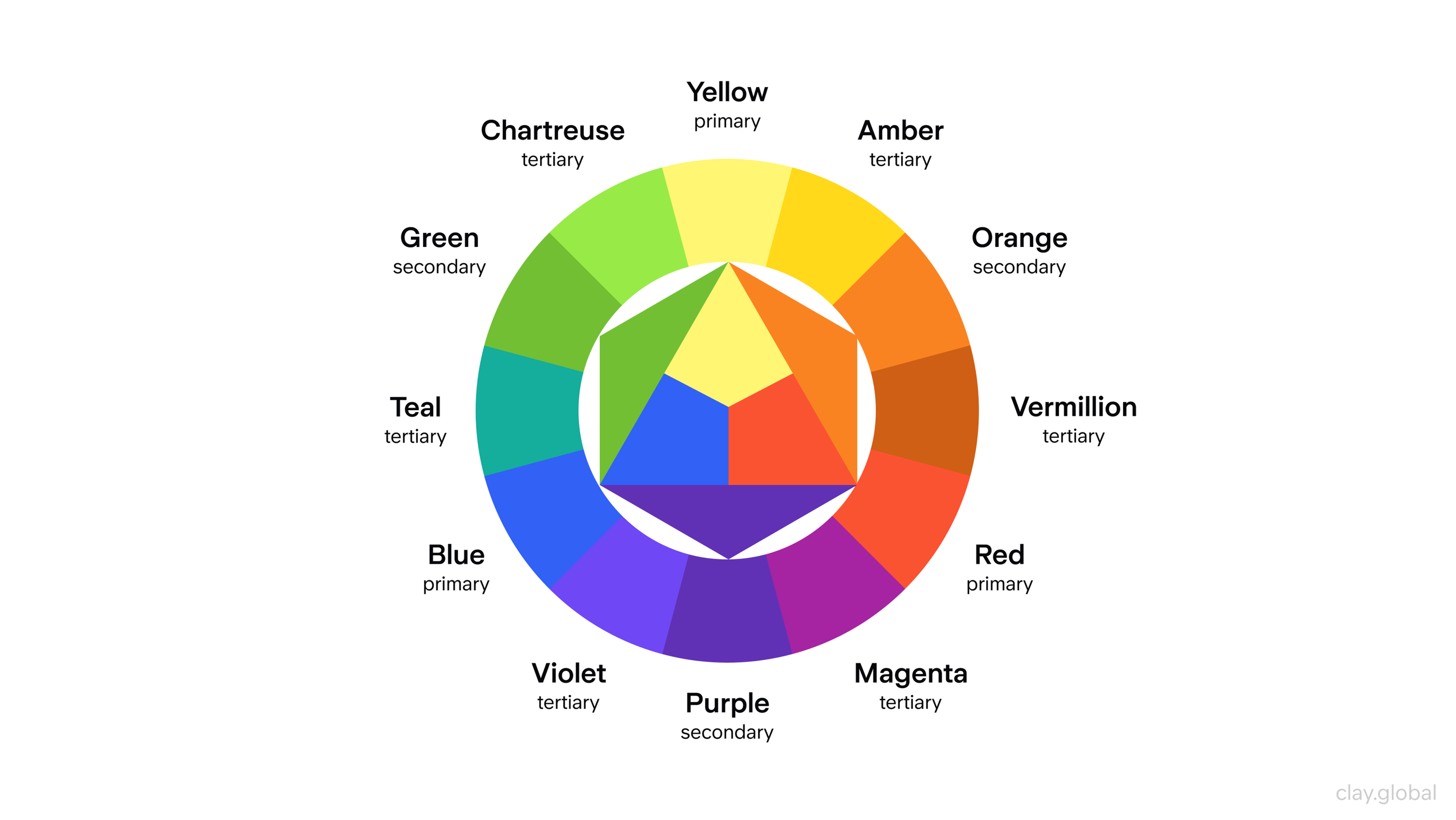
Color and Typography Carry the Brand Forward, not the Motion
The animation doesn't get to reinvent your color system. If the brand uses navy and warm off-white, the animation should use the same colors - not a rainbow gradient, since gradients are on trend this quarter.
Limit the palette to two or three brand colors drawn directly from the system. If the logo contains type, verify that it remains readable in every frame.
Color Wheel Illustration by Clay
Letters that morph into abstract shapes mid-animation are a common mistake. When the wordmark disappears, so does the recognition.
Keep typography anchored to your brand voice: a playful brand in a courier font with a serious pace reads as an identity crisis.
Pace Matches Tone
Fast animations signal energy, urgency, and playfulness.
Slow ones signal confidence, craft, and premium.
A law firm that animates its mark in 0.3 seconds looks like a startup pretending to be a law firm. A meal-kit brand that takes 2.5 seconds to assemble its logo looks like it doesn't understand its audience.
Most effective logo animations land in the 1.2-2 second range. Long enough to register, short enough not to frustrate.
Test both the isolated loop and the animation in context (a homepage reveal, a video end card, an app splash), because pacing that feels right in isolation often reads as sluggish in use.
Where Animated Logos Actually Earn Their Keep
Not every brand surface benefits from motion. Here's where it pays off, and where it doesn't.
Social Media Feeds
Static posts don't compete in a video feed. An animated logo used as a reel cover, Instagram Story sticker, or watermark on short-form video gives the brand a second chance to land.
Format matters as much as motion. Export to MP4 for video-native platforms, GIF or animated WebP for embedded contexts like email signatures and Notion docs.
Keep file sizes tight (under 1MB where possible) because slow-loading animations land worse than static ones.
Source: freepik
Landing Pages and Splash Screens
This is where animated logos do their best work. A brand mark that assembles as the page loads fills what would otherwise be empty milliseconds before content paints, while setting the tone for everything that follows.
Constrain yourself here. Motion should orient, not distract.
The animation should finish before the page becomes interactive (not after), and it shouldn't replay on every route change.
Nothing kills goodwill faster than a splash screen that won't let you through. Prioritize user experience over showmanship: if the motion competes with the first CTA, the motion loses.
Video Ads and End Cards
A three-second animated end card is one of the highest-ROI uses of motion in brand design. It closes a video, reinforces recognition, and gives you a clean moment for a call to action.
The format rewards restraint. Your mark should land and hold, not keep moving under the voiceover or CTA text. If the logo is still animating when the viewer is trying to read "sign up," the motion is working against you.
Where Motion Doesn't Belong
Don't animate your logo on business cards, in email signatures for formal correspondence, or in any context where attention is already yours.
Motion exists to earn attention. Using it where attention is already given makes your brand look restless.
How to Build an Animated Logo
You have three paths: DIY with templates, use professional motion software, or hire someone who does this for a living. Pick based on the stakes.
The DIY Path: Canva, Adobe Express, Renderforest
These tools work for brands that need a quick loop for social or internal use. You'll get a dozen preset animations, easy MP4 and GIF exports, and a finished product in under an hour.
The tradeoff: everything built from a template looks built from a template. If the brand is trying to differentiate on design quality, these tools will work against you.
Good for early-stage startups validating an idea. Bad for brands whose animation will carry a product launch.
Source: freepik
The Professional Path: After Effects, Rive, Lottie
Adobe After Effects remains the industry standard for logo motion. It gives you keyframe-level control over every element, every transition, every easing curve. The learning curve is real (plan for weeks, not hours), but the output quality is what separates brand-defining animations from "nice try."
Rive and Lottie are worth knowing. Lottie exports animations as JSON files that render natively in web and mobile apps at any resolution, with tiny file sizes, usually under 20KB for a logo-scale animation. If the animated mark needs to live inside a product and not just in marketing collateral, this is almost always the right format.
Hiring a Motion Designer
For brand-defining work, hire.
Expect $500 to $5,000 for a single animated logo from an experienced freelancer and well into five figures from a studio.
The range reflects how much strategy happens around the animation itself: research, brand alignment, multi-format deliverables, and revisions.
Look for motion designers with brand animation portfolios rather than film or explainer video work. Those are different disciplines.
A brand motion designer understands the logo has to survive dozens of applications, not just one hero shot.
A Minimum Viable Process
Whether you DIY or delegate, the workflow is roughly the same.
First, export the logo in layers. Each element you want to animate must live on its own layer: icon, wordmark, accent, and any secondary mark.
Next, decide the story in three words. What does the motion say about the brand? If you can't answer, don't animate yet.
Storyboard the sequence on paper before opening the software. What enters first? What settles last? What's the final held state?
Then animate, test, and cut 20%. Most first drafts have too much motion: after the full pass, delete one out of every five movements. The result is almost always better.
Finally, export for every real context. MP4 for social and video, Lottie or SVG for web, GIF for email, static PNG for fallback. If there's no fallback asset, the job isn't finished.
Three Animated Logos Worth Studying
Discord
Discord's rebrand of its Clyde mascot is a masterclass in scaling animation with a brand. The original Clyde lived inside a speech-bubble frame: a choice that tethered the brand to its gaming roots.
Source: freepik
When Discord grew beyond gaming, the design team stripped the frame and gave Clyde a subtle breathing motion. Alive, but neutral enough to work for product teams, study groups, and casual servers.
The lesson: the animation has to carry the brand into its future, not lock it in its past.
WWF
The World Wildlife Fund panda is one of the most recognizable marks in the nonprofit world. The animated versions work because the static design was built for simplicity: high contrast, few shapes, clean silhouette. That meant the logo could walk, wave, and interact with environmental elements while staying unmistakable.
The lesson: animated marks are downstream of static marks. If the static logo is busy, no amount of motion will fix it.
Pixar
The Luxo Jr. lamp bouncing onto the "I" in Pixar is the template for how brand animation should work. It's short. It has a clear narrative: a small character with personality, landing somewhere intentional. It reinforces the core Pixar thesis (storytelling through character) in under three seconds. And it ends in a static composition that works as a stand-alone wordmark.
The lesson: the best animated logos are miniature films. They have a beginning, middle, and an end that leaves you somewhere.
Our work on the Cornerstone project applies a similar principle to character animation for brand identity, letting the mark carry a story without overstaying its three seconds.
Cornerstone character
Read More
FAQs
How long should an animated logo be?
Most effective animated logos run between 1 and 3 seconds. Anything shorter and it doesn't register; anything longer and it starts to feel like a short film nobody asked for. The sweet spot for social and web use is about 1.5 seconds.
What file format should I export an animated logo in?
Depends on the use. MP4 for video platforms and social feeds, GIF or animated WebP for email and chat, Lottie (JSON) for web and mobile apps, and a static PNG or SVG fallback for cases where motion won't play. Export all of them at once so you're never scrambling later.
How much does it cost to animate a logo?
Template tools run from $0 to around $100. Freelance motion designers typically charge $500 to $5,000, depending on complexity. Studio-grade brand animations from a full-service agency start around $10,000 and can climb into six figures for major rebrands with multi-format deliverables.
Can I animate a logo without professional design software?
Yes. Canva, Adobe Express, and Renderforest offer template-based animated logo makers that require no motion design experience. The output will look template-y, which is fine for early-stage or internal use, but won't differentiate a brand at scale.
Will an animated logo slow down my website?
Only if you build it badly. A Lottie or SVG-based animation is typically under 20KB, lighter than most hero images. Avoid large MP4 or GIF files for page-level use, and serve a static fallback for users with slow connections or reduced-motion accessibility preferences enabled.
Do animated logos work on mobile?
Yes, when built mobile-first. Keep the animation short, the file tight, and the motion subtle enough that it doesn't fight for attention on a small screen. Test on an actual phone, not just in a desktop preview: things that look great on a 27-inch monitor often feel frenetic on a 6-inch one.
Should my animated logo loop?
Usually not. Loops work for persistent contexts like loading states or livestream overlays, but for most uses (video end cards, landing pages, social posts) the animation should play once and settle into a static hold. Endless loops read as filler.
What's the difference between a logo animation and a motion graphic?
A logo animation is a short, branded sequence centered on the logo itself. A motion graphic is a broader animated asset, often longer, often featuring multiple elements, and often used for explainer content. Logo animations are a subset of motion graphics, focused on brand recognition rather than extended storytelling.
Do I need different animations for different platforms?
In practice, yes. The animation that works for a 15-second Instagram story isn't the same as the one that works for a 2-second website splash. Most brands design a single hero animation, then produce platform-specific cuts: a full reveal, a shortened loop, and a static hold.
Can I trademark an animated logo?
Yes. Animated logos can be registered with the USPTO and equivalent offices internationally, though the filing process is more involved than for static marks. You'll need to submit a video file showing the animation and a written description of the motion as part of the application.
What are the current trends in animated logos for 2026?
Responsive logos that adapt to context, 3D-to-2D hybrid motion, kinetic typography reveals, and minimalist loops under one second. The common thread is restraint: the era of maximalist logo intros died somewhere around 2023.
How do I know if my animated logo is actually working?
Measure recall, not engagement. Engagement can be spiked with gimmicks. Recall proves the animation is doing its job. Show the logo to a small audience, wait two weeks, and ask them to describe it. If they can, the motion is earning its keep. If they can't, it's decoration.
Should every brand have an animated logo?
No. A brand with minimal digital surface area (a local trades business, a private legal practice, a legacy manufacturer selling B2B) probably doesn't need one. A brand whose audience lives in feeds, apps, and video platforms almost certainly does.
Can AI tools animate logos well?
For template-grade results, yes. For brand-defining work, not yet. AI is excellent at generating motion variations quickly, making it a useful ideation tool. It's still weak at the strategic layer: understanding why a brand moves the way it does, not just that it moves.
How often should I update my animated logo?
Treat the animation the way you treat the static logo. If the brand identity is stable, the animation should be too: a new one every six months dilutes recognition rather than building it. Revisit the motion when you refresh the visual system, not more often.
The Bar, Restated
The question isn't whether to animate your logo. It's whether the animation says anything.
Motion without meaning is decoration, and decoration doesn't build brands. Before you animate, answer the question every strong mark answers: what does this movement prove about who we are? If the answer is nothing, the logo is better off still.
If the answer is something worth holding onto, that's when motion starts earning its place.

About Clay
Clay is a UI/UX design & branding agency in San Francisco. We team up with startups and leading brands to create transformative digital experience. Clients: Facebook, Slack, Google, Amazon, Credit Karma, Zenefits, etc.
Learn moreAbout Clay
Clay is a UI/UX design & branding agency in San Francisco. We team up with startups and leading brands to create transformative digital experience. Clients: Facebook, Slack, Google, Amazon, Credit Karma, Zenefits, etc.
Learn more