Your logo has seconds to do its job. That's the average time someone spends looking at a logo before their eyes move on. In that narrow window, your mark either registers as worth a second look, or it disappears into the noise.
Most logo problems are subtler. Shapes that don't hold up at small sizes, colors that signal the wrong idea, type that's technically legible but utterly forgettable. The good news is that nearly every common weakness can be diagnosed and fixed with a clear-eyed process.
Key Takeaways
- Research your audience and competitors before touching a single design element. Instinct without context produces generic work.
- Color does more psychological heavy lifting than any other element in your logo. Choose them with intent.
- Simplicity is a functional requirement for logos that stick in memory.
- Memorability comes from being clearly distinct, not from being complex.
- Recognition depends on fast visual processing. If people have to decode your logo, they won't.
- A logo that works on a mobile screen at 32px is actually good
What Is a Logo?
A logo is a graphic mark for a business, and typically the first visual signal your brand sends to the world.
It may combine a symbol and a wordmark, or strip back to just one. What matters is that it functions as a shorthand for everything your brand stands for.
Logos Examples by Clay
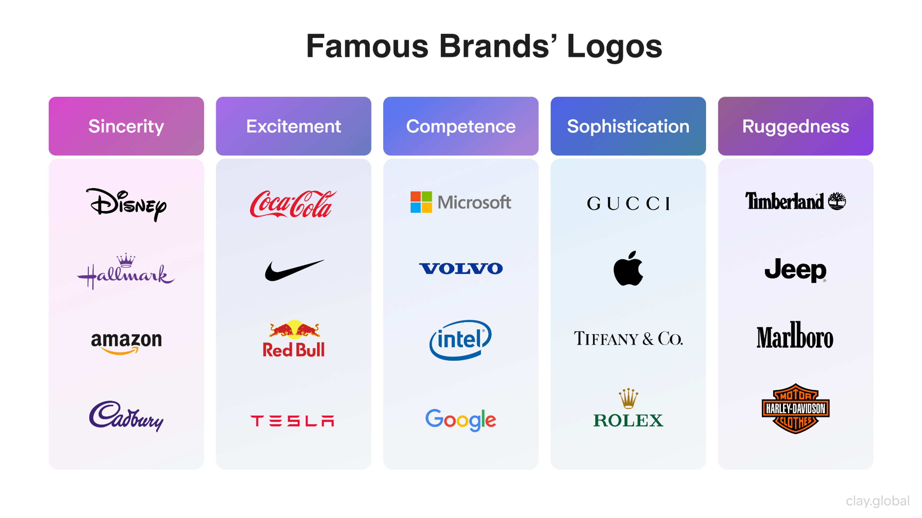
Abstract marks are geometric or conceptual symbols with no literal meaning. Especially common in tech, crypto, and AI-native companies, they scale cleanly without locking a brand into a literal image that may date quickly.
At its best, a logo is a compressed argument about why your brand belongs in someone's life.
What Should a Logo Include?
Strong logos combine typography, a graphic element (or a deliberate absence of one), and a color palette that works together as a coherent system.
The trap most logo projects fall into is optimizing each element in isolation, a beautiful font here, an interesting symbol there, without asking whether they read as one unified mark.
The most enduring logos share three traits. They're simple to reproduce from memory, specific enough to be unmistakably yours, and they hold up whether they're printed at two inches or scaled to the side of a building.
Why Logo Design Matters for Brand Identity
A well-designed logo does measurable work. 75% of consumers recognize a brand by its logo, and its consistent use is linked to a 23% increase in revenue.
It means your visual mark is the single most reliable trigger for brand recall you have, and one that pays back every time it appears, for free.
Brand Identity Elements by Clay
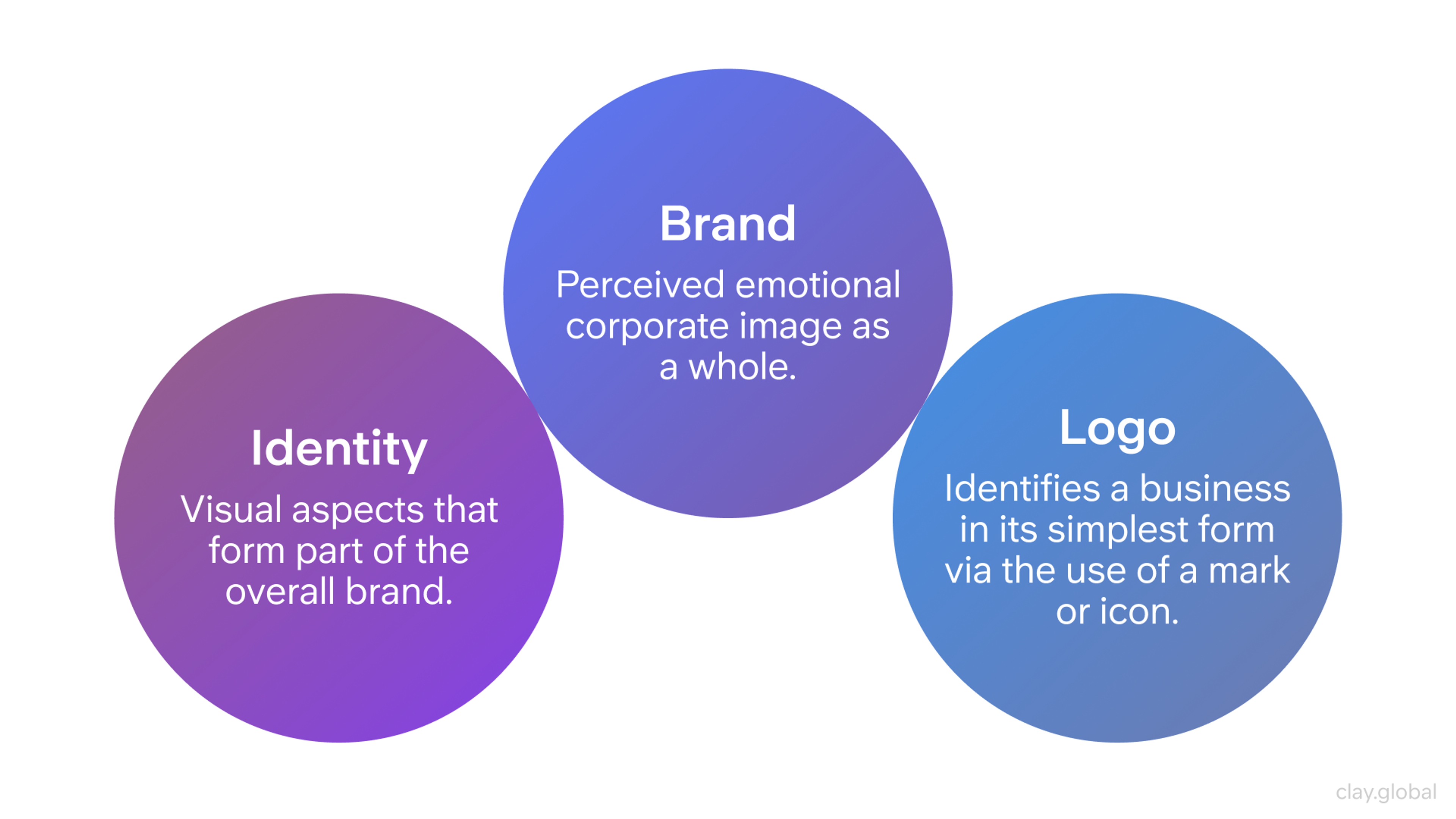
Beyond recognition, logos shape trust faster than almost any other signal. People form their first impression of a brand in seconds, and a poorly considered mark, one that feels generic, dated, or misaligned with the product, creates a trust deficit.
How Much Does Logo Design Cost?
The range is wide. A freelance designer early in their career might charge $600-$1200 for a complete logo package. Senior independents typically run $2,500-$8,000. A studio working with a scaling startup will often charge $10,000+ for a full identity system. Enterprise rebrands at the BP or Pepsi level can run into the hundreds of thousands.
What you're paying for is the experience to know what will hold up five years from now. Budget accordingly, and don't mistake cheapness for efficiency.
How to Improve Your Logo in 5 Steps
Do Research
No design decision should happen in a vacuum. Most brand failure stories make it clear that skipping the research is where things go wrong.
Before you touch the logo, you need to understand three points:
- What your audience actually values
- How your competitors' logos look
- Where your current logo is failing you
Pull up five or six competitors and look at their logos side by side. What patterns emerge in colors, shapes, and typographic styles? Now ask yourself which of those patterns your audience expects, and which ones are just category clichés you can break deliberately.
Talk to real customers if you can. Ask them to describe your brand in three words, and what they wish it stood for. Their answers will tell you far more than what people inside the room think about what your logo needs to communicate.
Data-driven audience research takes that further. Surveys, search trends, and social listening can show you not just how people feel about your brand, but which visual associations they already carry into the category.
That context shapes every color and forms the decision that follows. Patterns in user behavior data are often where the sharpest logo briefs begin.
The goal is to understand the visual language of your space well enough to know when to speak it and when to break it.
Choose the Right Colors
Color is psychology, and it operates before conscious thought kicks in.
Color Wheel Illustration by Clay
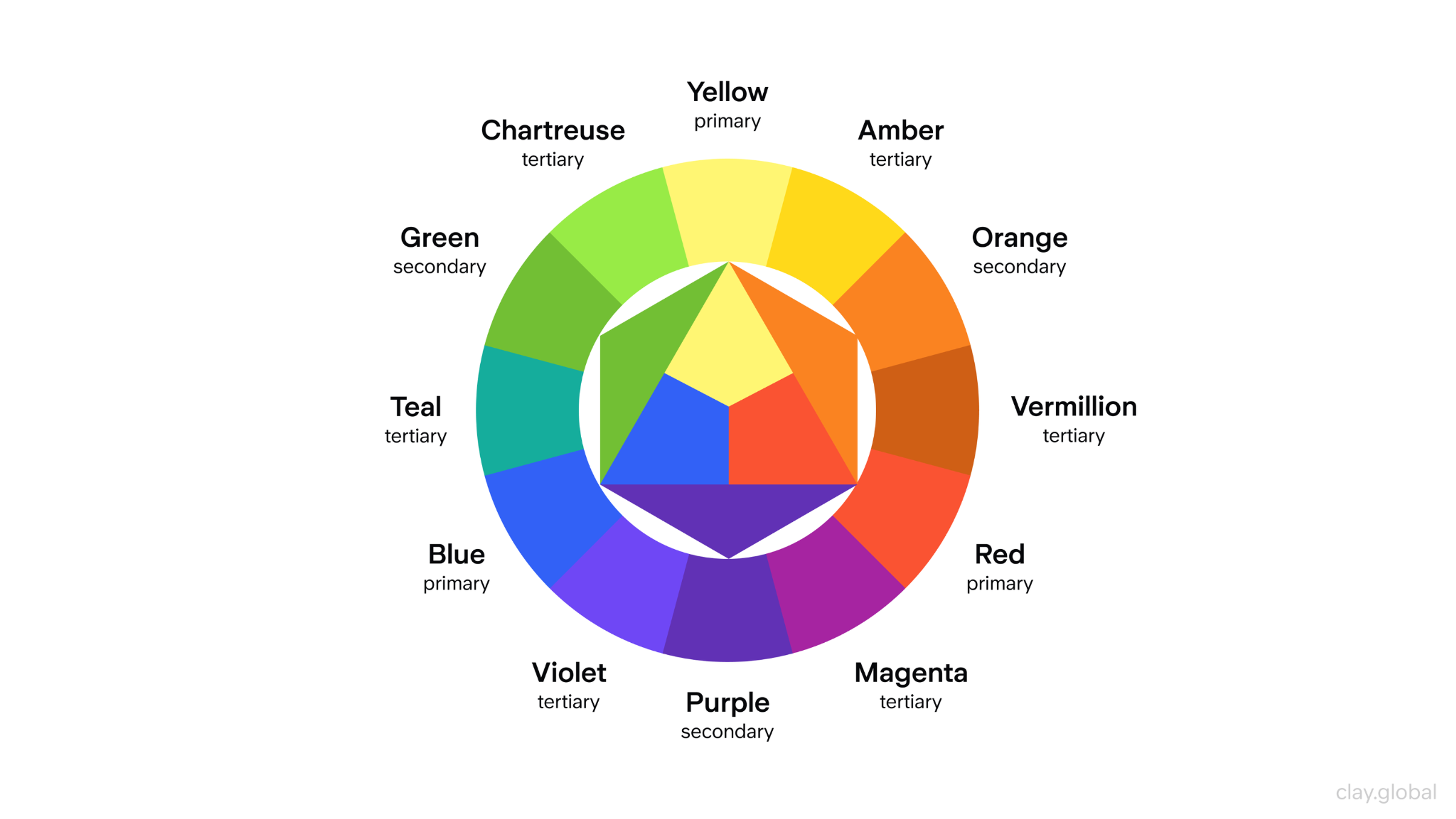
A signature color can dramatically increase brand recognition, which explains why the strongest brands treat their palette as a business decision, not a style preference.
Each color carries cultural and emotional associations that shift by context and audience:
- Blue signals trust and competence, which is why the majority of Fortune 500 logos use it across finance and healthcare
- Yellow reads as optimistic and approachable, but loses authority fast
- Red creates urgency and energy
- Green has shifted from nature toward growth and responsibility, as sustainability has moved up the consumer agenda
- Black communicates sophistication and control
The mistake is choosing based on personal preference rather than what your audience actually needs to feel when they encounter your brand.
A few practical rules:
- Keep your palette to two colors at most
- Make sure your primary color works in pure black and white
- Test it on both light and dark backgrounds
- Check that your colors meet accessibility contrast standards
Simplify Your Logo
Complexity is the enemy of recognition. A logo with too many elements (gradients stacked on detailed illustrations stacked on decorative typefaces) creates cognitive friction. People can't process it quickly enough to form a memory.
In 2025, the share of newly registered logos using color-first, simplified design approaches jumped to 41% of all new registrations, a clear signal that the field has caught on.
Simpler marks outperform intricate ones in long-term recognition and brand recall. The brands that people can recall years later (Apple, Nike, and FedEx) are almost always the ones that had the discipline to cut rather than add.
Simplification means removing what competes with your core message. Ask yourself. If you had to describe your logo in one sentence to someone who couldn't see it, what would you say? If that sentence takes more than ten words, there's too much happening.
Simple Logo Advantages
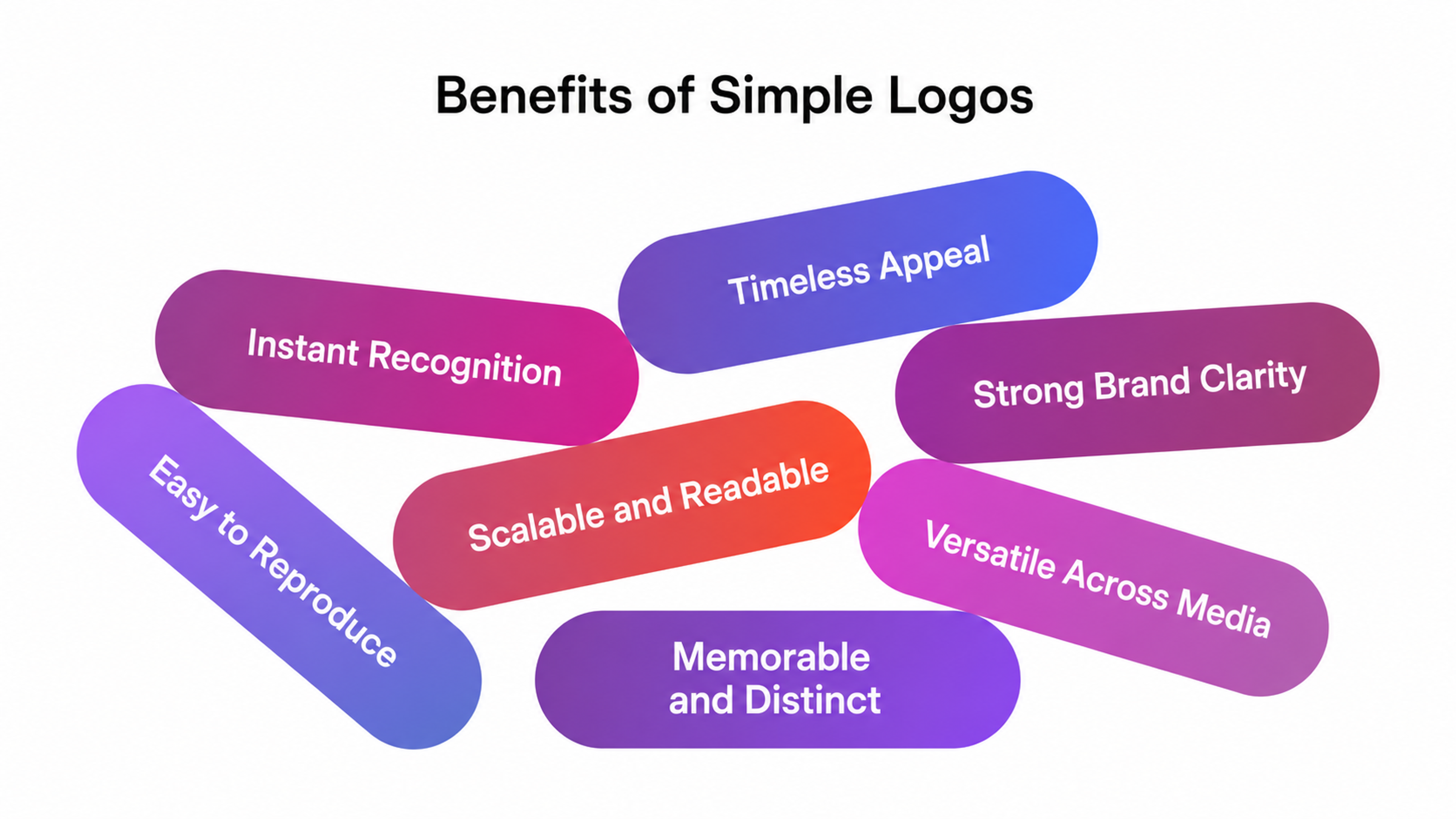
The benefits show up practically. Simpler logos are less likely to age poorly as design trends shift. Complexity is often what forces a rebrand five years in, and simplicity is what lets a mark last twenty.
Make It Memorable
Memorability and simplicity are related but not the same. A simple logo that looks like every other simple logo in your category is invisible.
Distinctiveness is the engine of memorability. That means your brand identity needs a quality that makes it unmistakably yours, whether that's a custom letterform or a symbol that's conceptually specific to your brand rather than generic to your category.
Storytelling is what makes that quality stick. A mark rooted in a real brand narrative gives people something to hold onto beyond the shape itself.
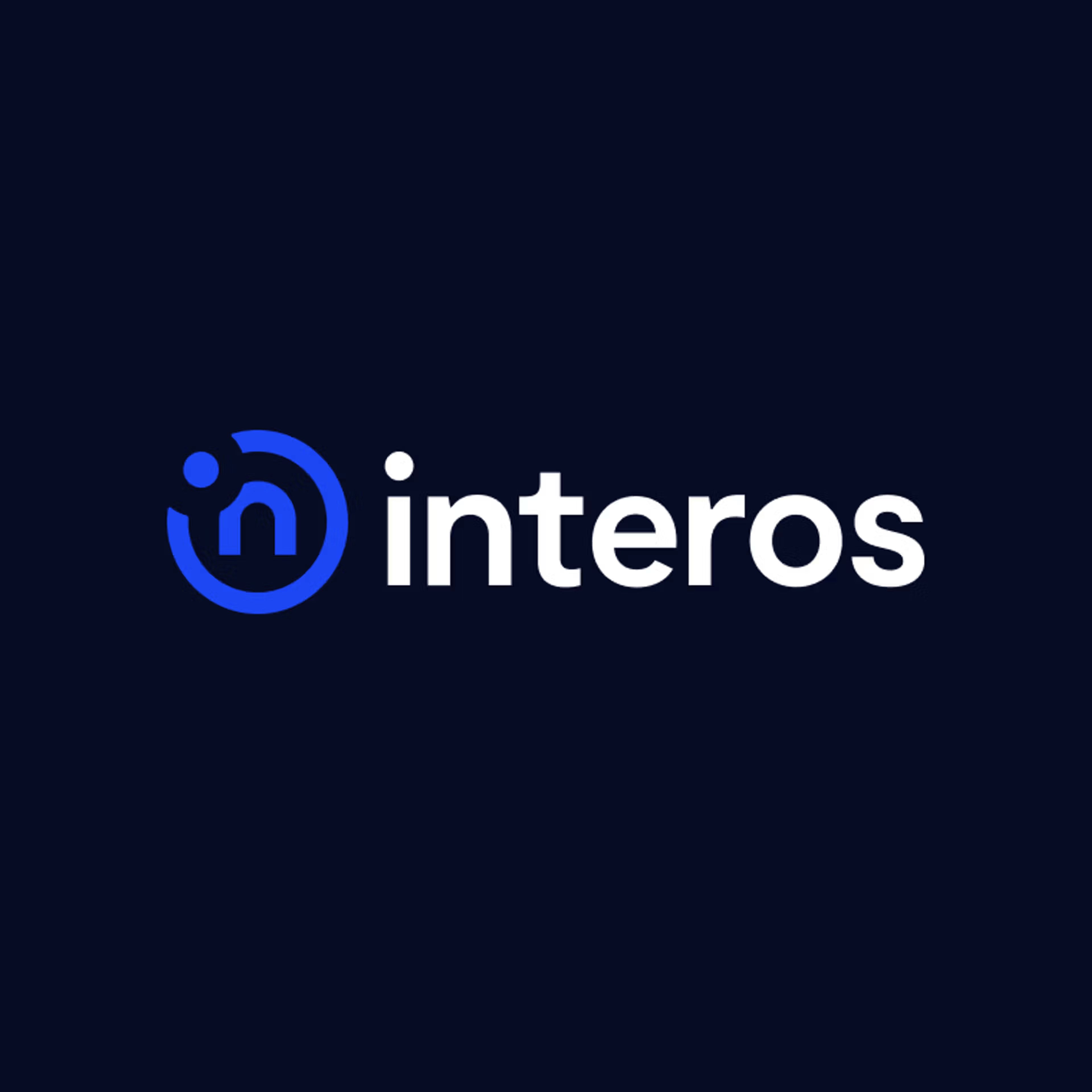
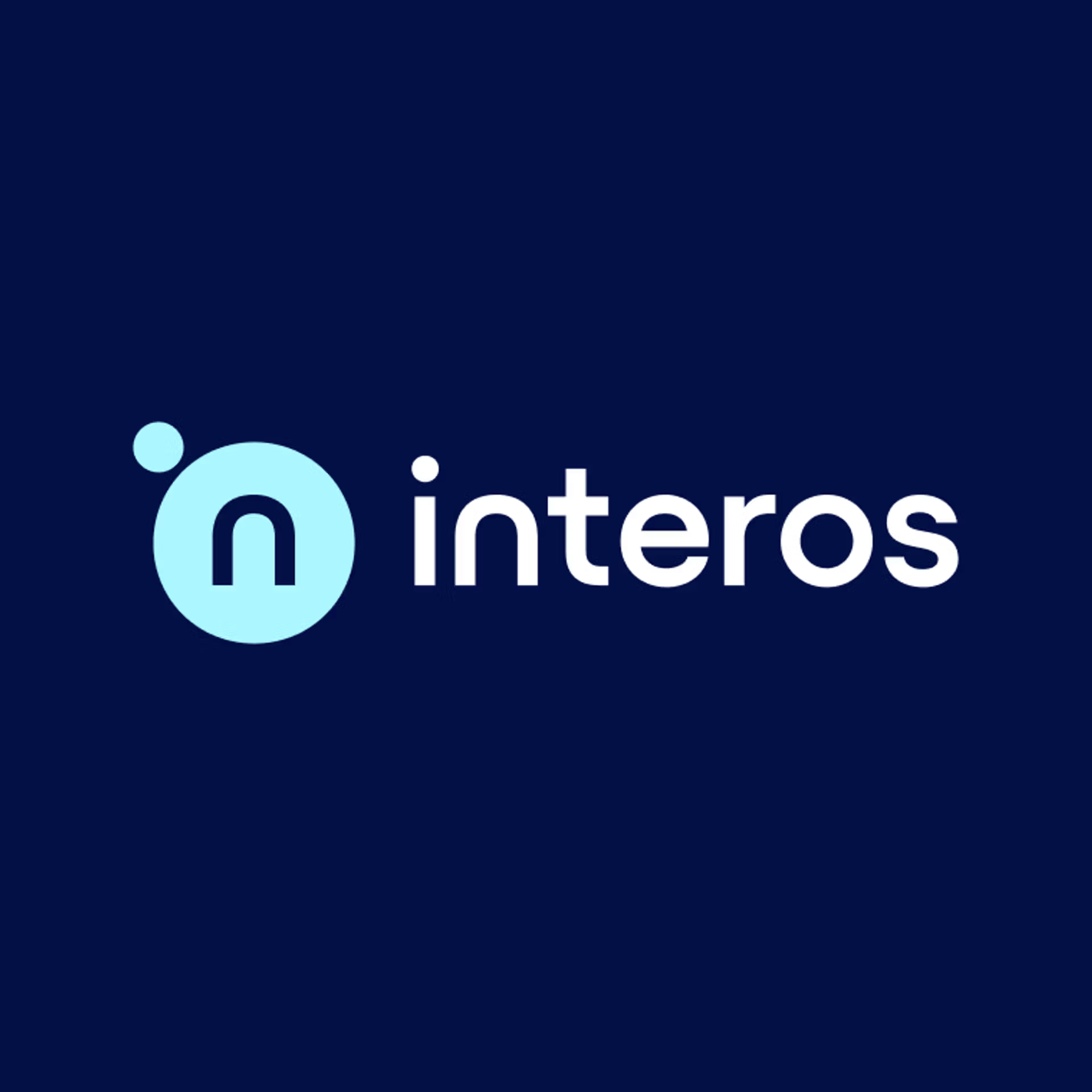
Look at the Interos rebrand we did at Clay Global as an example. The old mark was functional but forgettable. It could have belonged to any B2B tech company. We committed to a specific geometric identity that immediately signals precision and interconnection. Its simplicity makes it easy to reproduce and remember, and the concept is specific enough that it's impossible to confuse with anyone else.
Strong logos also build attachment over time. Each positive interaction a customer has with your brand deepens what your mark means to them. That's why consistency matters. Every time your logo appears in a new context, it either strengthens the memory or muddies it.
Strong logo work doesn't happen by accident. Clay Global is a branding agency helping startups and established brands get it right. Learn more about what we do.
Test for Recognizability
Recognizability is where the work gets verified. Design in isolation will always flatter your choices.
Seeing your logo in context, on a mobile screen, in a social feed, on a product, at a small size, in black and white, in dark mode, will tell you the truth.
Run a simple recognizability test. Show your logo to five people who don't know your brand for three seconds, then remove it and ask them to describe what they saw. What they remember is what your logo actually communicates. Anything they can't describe is what you still need to fix.
Additional Logo Best Practices
Beyond the five steps, these logo design tips cover the finer details that separate a competent mark from one that holds up everywhere.
Balance and Harmony
Balance doesn't mean symmetrical. Most top global companies actually use asymmetrical logos, going against the common assumption that symmetry is what audiences prefer.
What audiences actually prefer is visual coherence, a mark where every element feels like it belongs, where nothing fights for attention, and where the whole reads faster than the sum of its parts.
Harmony is about relationships. How your typeface interacts with your symbol, how much breathing room exists between elements. Even a strong individual element can undermine the final mark if the relationships between them are off.
Designing for Mobile
Mobile-first applies to logo design just as much as it applies to web design. The majority of brand interactions now happen on screens smaller than six inches, and a logo built only for desktop contexts will show its weaknesses fast.
One Logo Across Different Mobile Interfaces
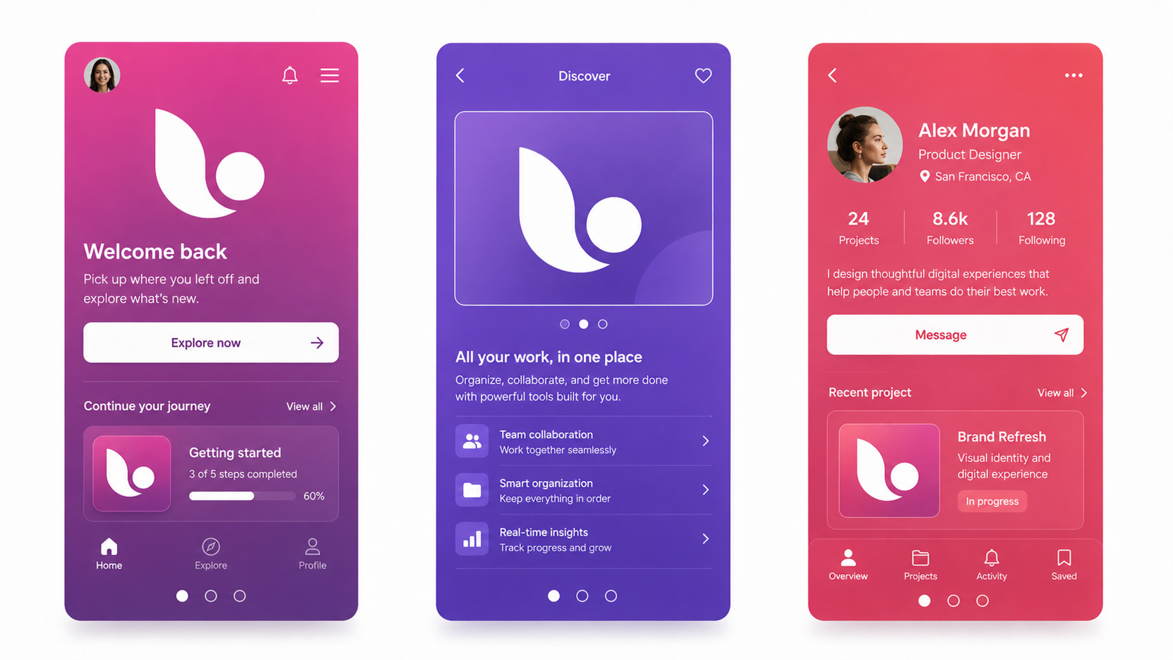
The practical standard is to design the small version first. Test at 32px. If the mark holds its identity at that size, if someone can still tell it's yours and not a competitor's, it will almost certainly hold up everywhere else. If it blurs or loses its character, that's a design problem.
Flat, clean marks outperform detailed ones on small screens.
Letterforms need enough weight to stay legible where slight imprecision becomes visible.
Gradients that look rich at large sizes often create artifacts or muddy tones on lower-resolution displays, so build the mark to work without them first.
Dark mode is no longer an edge case. The majority of mobile users have it enabled at least part of the time, which means a logo designed only for white backgrounds has a real blind spot.
Build both light and dark versions from the start, and include a responsive mark, a simplified symbol or monogram, for contexts where the full lockup is too large to render clearly.
Using Shapes and Negative Space
Shapes communicate before the brain processes the brand name. Circles suggest continuity and community. Squares imply stability and reliability. Triangles signal direction, energy, and motion. These associations are grounded in how the visual system processes form.
Negative space is one of the most underused tools in logo design. It adds a layer of meaning without adding visual weight.
The FedEx arrow hidden in the negative space between E and x is the most-cited example, but the principle applies at every scale.
Look for opportunities to encode meaning in the space your mark isn't occupying.
Look At Popular Logos
Looking at successful logos is useful only if you're analyzing the right details.
Ask what they communicate, how they do it, and what makes them still effective ten years after their creation.
Muji
Muji's logo contrasts with pointlessly flashy retail branding.
MUJI’s logo
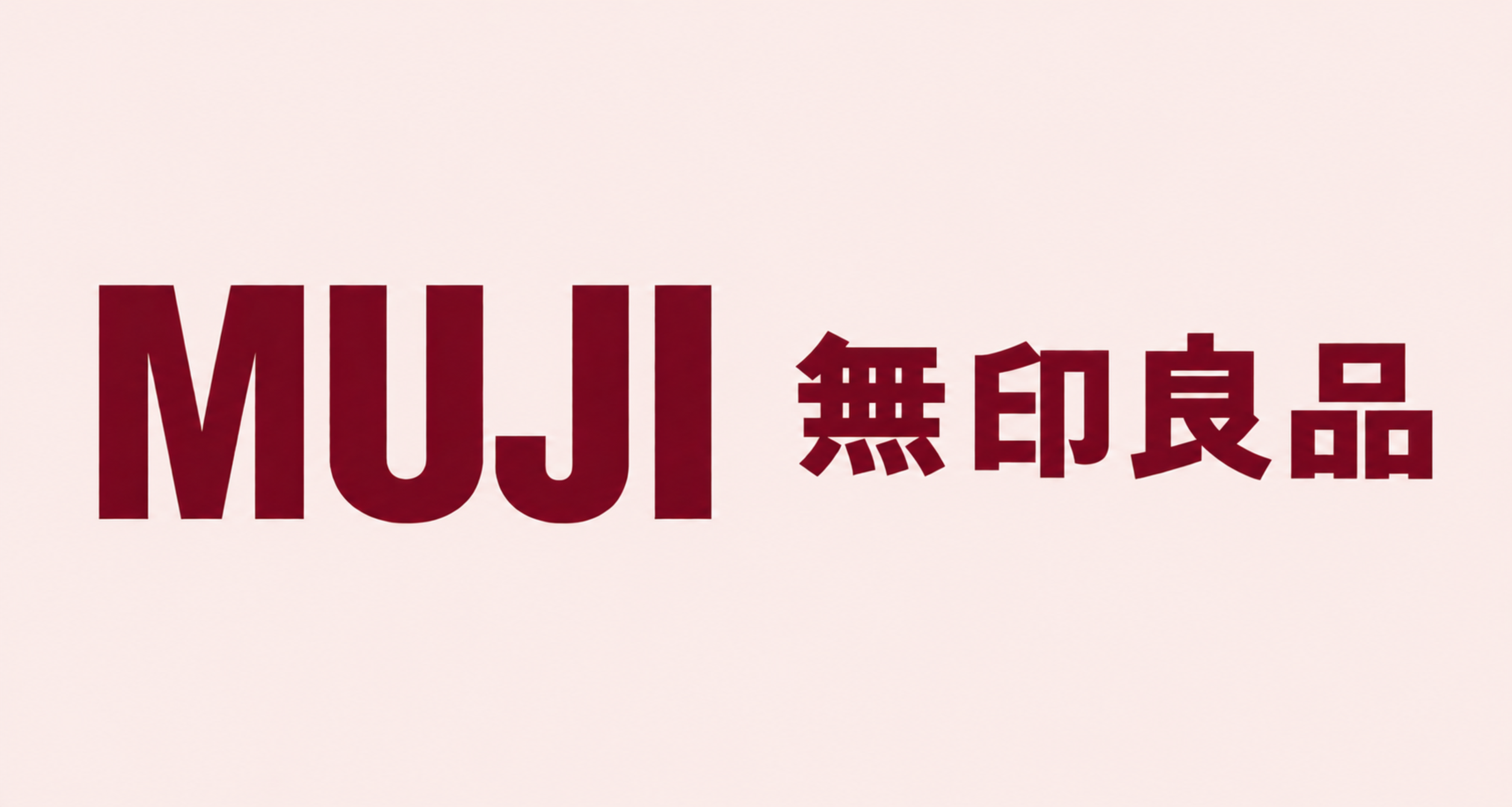
The Japanese lifestyle brand uses a minimal sans-serif Japanese font with a tiny Roman type "MUJI" under it.
As 'Muji' stands for 'no brand, quality goods,' this logo showcases the brand's philosophy of no branding. This logo stands for simplicity against pointless consumer excess.
OREO
OREO is one of the rare cases where the logo and the product are inseparable. The embossed design on the cookie itself is the real mark, and the packaging logo echoes it.
OREO’s logo
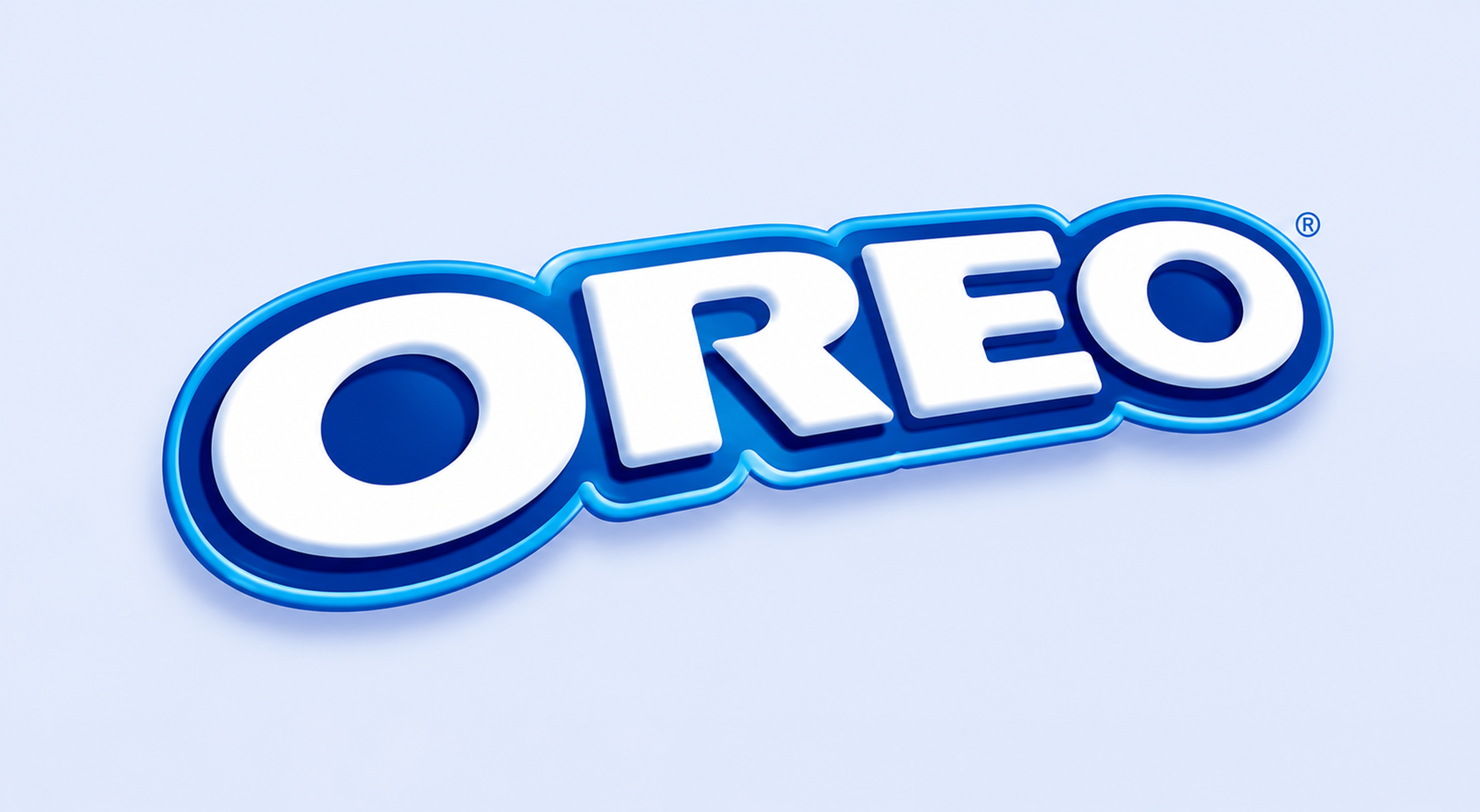
The blue is distinctive enough to own the category, and the wordmark has stayed close to its original form for decades.
What makes it worth studying is that the brand's visual identity was baked into the product long before anyone talked about brand consistency, and that physical familiarity makes the logo feel instantly recognizable even when stripped of context.
With 10 years of experience, we at Clay Global know what makes logos last. Let's build yours.
Read more
- Branding for Streetbeat, an AI-Powered Investment Platform, by Clay Global
FAQ
What's the difference between a wordmark, a lettermark, and a logo mark?
A wordmark uses the brand name set in a custom or distinctive typeface as the entire logo, like Google or Coca-Cola.
A lettermark takes just the initials, usually when the full company name is too long to render cleanly at small sizes, with IBM and HBO as the classic examples.
A logo mark (or brand mark) is a standalone graphic symbol with no text, like Nike's swoosh or McDonald's golden arches.
Most brands use a combination, a full lockup with both symbol and wordmark, and then define rules for when to use each variation.
How do you know when a logo needs a full redesign versus a refresh?
A refresh is appropriate when the core mark is still sound but feels dated, such as a typeface update, a proportion adjustment, or the removal of gradients.
A full redesign makes sense when the mark no longer matches what the business actually does, when it creates recognition problems at digital sizes, or when the brand has pivoted significantly. The old logo carries the wrong associations.
The trigger is usually strategic.
Does a logo need to work in black and white?
Yes, always. Fax machines and photocopiers are largely obsolete, but the constraint isn't.
A logo that only works in color will fail on embossed materials, stamped merchandise, single-color print runs, newspaper advertising, and in any digital context where color isn't rendering correctly.
Design the mark in black first. If it holds up without color, the color version will be stronger.
How many fonts should a logo use?
One, usually. Two at most, and only if there's a deliberate hierarchy between them, a display font for the brand name, and a cleaner secondary font for a tagline or descriptor.
The goal is to use fonts effectively for your brand. More than two typefaces in a single mark almost always reads as indecision rather than richness.
What file formats do you actually need when a designer delivers a logo?
You need vector files (AI or EPS, and ideally SVG for web use) and rasterized exports at high resolution (PNG with transparent background at minimum 2x and 3x sizes).
You should receive versions optimized for light and dark backgrounds, as well as single-color use.
A proper logo delivery package also includes a brand strategy and guidelines that specify correct usage, minimum sizes, and clear space rules.
How important is it to trademark a logo?
Very, if you plan to operate at scale.
A trademark lets you stop competitors from copying your mark and protects the equity you build in it over time.
The process takes six to nine months in most jurisdictions and involves a clearance search to confirm no conflicting marks exist.
File early, before you've sunk money into brand-building.
Can a logo be too simple?
Technically, yes, but most logos lean toward complexity rather than over-simplification.
Minimalist logos work best when they carry a distinctive quality. A mark that reduces to a generic shape, a circle or a plain initial letter, without that quality fails because it's interchangeable, not because it's minimal.
The test is whether someone can draw a reasonable approximation from memory after seeing it once. If they can, that's a good sign.
How often should a brand update its logo?
There's no fixed cycle. The best logos are designed to evolve slowly rather than require periodic overhauls.
Minor refinements every 8-12 years are common among major brands, adjusting proportions, removing details that clutter at digital sizes, and modernizing type without abandoning the core mark.
Radical redesigns every few years erode the recognition you've built. The goal is a mark that can outlast changing design trends through the quality of concept rather than constant revision.
What role does AI play in logo design now?
AI tools have become genuinely useful for early ideation, generating concept directions, exploring color variations, and quickly producing rough compositional sketches.
Most small businesses now use AI-assisted tools in their logo creation process. To use them well, you need to understand artificial intelligence well enough to know where it helps and where it stops.
Where AI struggles is the strategic thinking that makes a logo meaningfully specific to a brand rather than generically competent.
AI can help you explore options faster, but it can't yet tell you which option is right and why.
What's the most common mistake when designing a logo for a startup?
Designing for where the brand is today rather than where it needs to be in three to five years.
Startups often build overly literal logos, a food app with a fork icon or a fintech company with a piggy bank, which creates problems as the product expands and the association becomes limiting.
The best startup logos are built for brand extension, with enough conceptual room to grow as the business evolves.
How does color psychology actually work in practice?
Color associations shift across cultures, industries, and audience demographics.
Blue reads as trustworthy in finance but cold in food. In food retail, red signals appetite and urgency, while the same color reads as aggression in financial services.
Start by looking at what colors dominate your category, decide whether you want to fit in or stand out, and then choose accordingly.
Cultural context matters too, because white signals purity in Western markets and mourning in some East Asian markets.
What's the minimum viable logo system for a brand just starting?
You need at least three elements. A primary lockup (symbol plus wordmark), a horizontal version for wide applications, and a standalone mark or monogram for contexts where the full lockup is too large.
Add light and dark versions of each. That's six files minimum, and it handles almost every situation you'll actually face without requiring a complex brand system.
Final Thoughts
A logo doesn't need to be expensive to be effective. What it needs is precision, with every typographic choice earning its place by contributing something specific to how your brand is understood and remembered.
The five steps here are a process for eliminating what makes logos fail. Unclear strategy, arbitrary color choices, unnecessary complexity, generic shapes, and marks that haven't been tested where they'll actually live.
If you're uncertain whether your current mark is doing its job, that uncertainty is itself useful data. A logo that makes you hesitate probably makes customers hesitate too. Start with the research, and go from there.

About Clay
Clay is a UI/UX design & branding agency in San Francisco. We team up with startups and leading brands to create transformative digital experience. Clients: Facebook, Slack, Google, Amazon, Credit Karma, Zenefits, etc.
Learn moreAbout Clay
Clay is a UI/UX design & branding agency in San Francisco. We team up with startups and leading brands to create transformative digital experience. Clients: Facebook, Slack, Google, Amazon, Credit Karma, Zenefits, etc.
Learn more