
User experience reigns supreme in website design, and breadcrumbs are a soft spot. Like in the classic fairy tale, these aides assist the user in navigating through the pages by linking them to the respective pages and providing a clear breadcrumb path of the site structure.
‘Breadcrumbs’ are not just visually appealing. They help streamline navigation, reduce page backtracking, and enhance SEO as they map your site’s content.
What Are Breadcrumbs?
Breadcrumbs are a secondary navigation tool meant to improve user experience by indicating the user’s current location within an application or website’s hierarchy.
The term comes from the classic fairy tale of Hansel and Gretel, where breadcrumbs were used as a path that could be retraced to aid in navigating backward or upwards within a website’s digital structures.
Breadcrumb trail displays show the user's path from the homepage to the current page, ensuring no steps are missed in the navigation experience.
Source: yoast.com

Breadcrumb navigation is a horizontal trail of links near the top of a page, often separated by >. It shows the path to the current page and lets users jump to higher levels.
Breadcrumbs became popular after Windows Vista and are now a standard UX pattern. They can also support SEO by clarifying site structure.
Breadcrumbs help users orient themselves and navigate faster.
Why Do Your Visitors Need Breadcrumb Navigation?
- Enhancing User Experience Through Intuitive Navigation: Knowing where you are matters on any site. Breadcrumbs show your spot in the structure and guide you. A clear, linear trail reduces confusion. It helps visitors who arrive through deep links. They can move up levels without using the back button.
- Driving Business Performance and Engagement: Breadcrumbs can boost business metrics and engagement. Many e-commerce sites see lower bounce rates after adding them. They make it easy to return to earlier pages. People explore more and stay longer. Page depth often grows as users browse new categories.
- Ensuring Accessibility and Inclusive Design: Breadcrumbs also support accessibility and inclusive design. Built well, they can meet WCAG 2.1 AA expectations. Screen reader users can follow a clear, linear path. Keyboard navigation works as expected. People with cognitive disabilities gain helpful orientation.
- Supporting Conversion Optimization Strategies: Breadcrumbs aid conversion-focused journeys, too. History-based trails help users backtrack with confidence. They cut steps between category levels. Context stays clear during multi-step tasks. Shoppers can jump back to categories without losing their place.
- Implementing Best Practices for Maximum Impact: Many tools can add breadcrumbs, but they only work well with solid information architecture. Breadcrumbs should not replace the main menu. Primary navigation must remain the key wayfinding tool. Use short, clear labels that match the site hierarchy.
- Industry Validation and Measurable Results: Breadcrumb navigation was developed and is best served with tools by Baymard Institute Google Search Central, and Moz has shown in their research how breadcrumbs help users understand a site's hierarchy. The data significantly enhanced usability metrics, search performance, and conversion rates.
Types of Breadcrumbs in Web Design
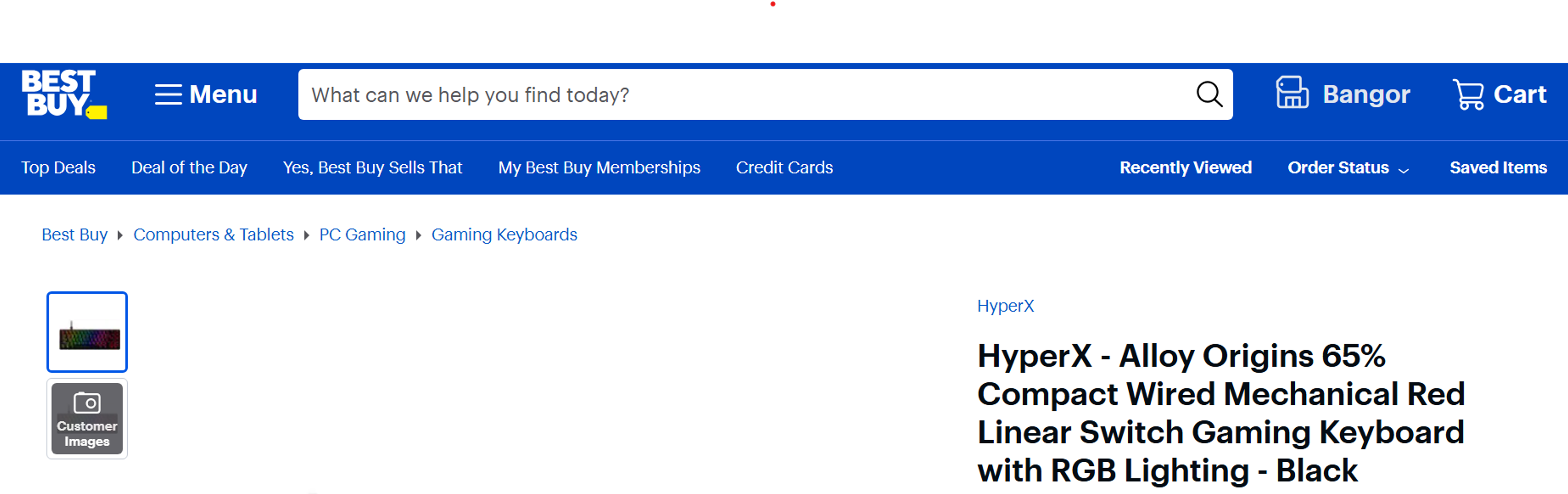
- Hierarchy-Based Breadcrumbs: These breadcrumbs show where you are in the site. They let you jump to higher categories. You get context and easy paths to related sections.
Source: bestbuy.com
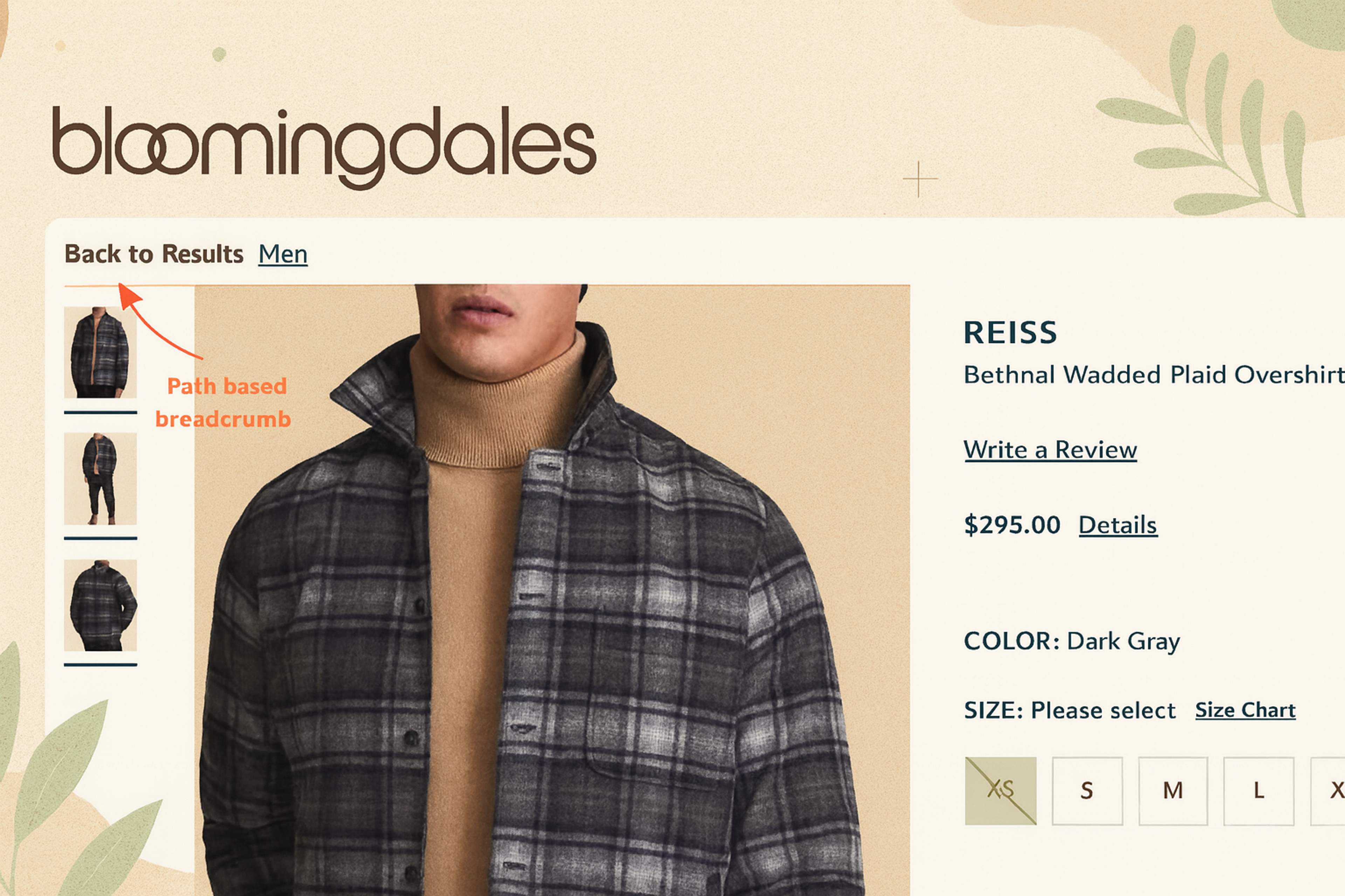
- Path-Based Breadcrumbs: These show your actual path through the site. They work like a guided history. They help when you reach a product through many filters. You can return to filtered results without losing your settings.
An Example of Path Based Breadcrumb Navigation
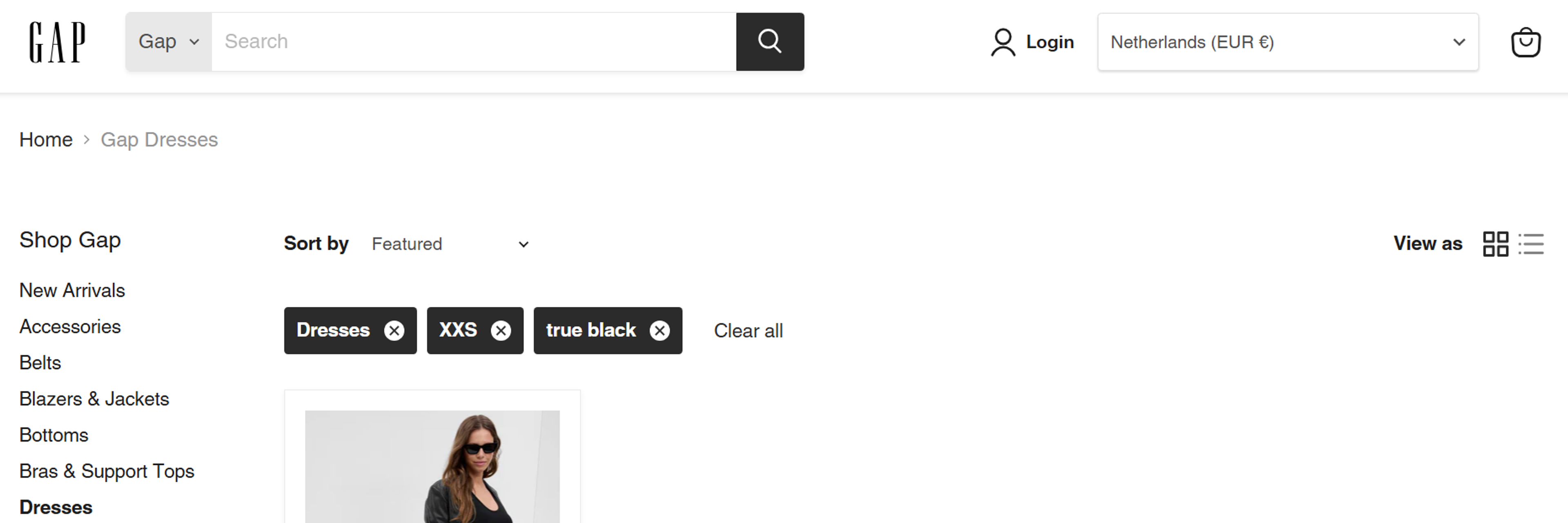
- Attribute-Based Breadcrumbs: These appear often in e-commerce. They show chosen filters like size or color. Shoppers can view and change selections while browsing categories or search results.
Source: shopgap.com
How to Add Breadcrumbs to Your Website
Breadcrumbs improve navigation and user experience. Plan the design, development, and SEO together. Include the home page in the trail.
Choose the type that fits your structure. Use location-based for hierarchy, path-based for journeys, or attribute-based for filters.
Add clean markup and CSS. In WordPress, place breadcrumbs near the top, under the main navigation.
Use structured data so search engines read them correctly. Many SEO plugins handle this for you.
Test on different devices and screen sizes. Make sure the trail looks clear and works smoothly everywhere.
How Do Breadcrumbs Help in Improving SEO?
Breadcrumbs improve user experience and SEO. They map how your pages connect and guide visitors.
Search engines read this structure more easily. They index pages faster and more accurately. You often gain better crawl coverage and visibility.
Add structured data to your breadcrumbs. They can then appear as navigation links in search results. Clear snippets build trust and earn more clicks.
SEO Breadcrumbs
Breadcrumbs also reduce bounce rate. People find paths to related pages and keep exploring. Session time and page depth often rise, which sends positive signals to search engines.
Overall, breadcrumbs boost usability and discoverability. They give your site a clean structure and a real competitive edge.
Breadcrumb Navigation Best Practices
Following a couple of best practices is paramount to enhancing user experience with breadcrumb navigation. Although navigation is one of the simplest website elements, these best practices will profoundly improve clarity, usability, and optimization.
- Show the Complete Path: Breadcrumb trail displays must accurately and thoroughly demonstrate the user’s navigation path to the current page from the homepage. Avoid skipping levels, as users should be able to see and retrace each step.
- Begin with the Homepage: Visit the homepage first. This provides a reliable starting point for users and helps increase navigation within your site.
- Use Familiar Separators: The well-known ‘greater than’ symbol ( > ) should be used to separate links. It is informative and neat, and it indicates a good hierarchy. Other symbols, such as arrows (→) or colons (:), can be used, but remember to prioritize clarity.
- Place Breadcrumbs at the Top: Breadcrumbs should be on the top of the page, below the navigation bar, and directly above the content title. They act as auxiliary navigation tools.
Source: columbia.com

- Make Them Easy to See: Because breadcrumbs are often overlooked, use contrasting colors to enhance visibility. Minimal space does not lessen the importance of visibility in usability.
- Bold the Current Page: Bold the last word segment of the breadcrumb to clarify the user’s positioning. Bold text (and no hyperlink) accentuates the current page whilst avoiding confusion.
- Don’t Link the Final Item: The last breadcrumb describes what page the user is on. If forming a link is done because it’s customary practice, then it becomes superfluous. Why make things more complicated than they need to be? Simplistic and direct answers are the most useful.
- Skip Breadcrumbs on the Homepage: Breadcrumbs assist in navigation from any page to the homepage, not vice versa. Only breadcrumbs on the homepage serve no purpose other than adding visual disorder to an otherwise clean interface.
- Use Clear, Full Page Titles: Use clear and descriptive titles for your breadcrumbs so users will not be uncertain about all the links. If there is not ample space, ellipses can be used to truncate, but ‘you are here’ is vague and unnecessary.
- Match the URL Structure: These breadcrumbs should follow the same hierarchy as the site’s available URL. Following a system helps users become more acquainted with the presented structure and reduces confusion due to differing navigation cues.
Following these best practices in breadcrumbs will make navigation easier, increase engagement, and streamline your website and user experience for smoother navigation journeys. It’s a minor feature that can lead to huge advantages.
3 Best Examples of Breadcrumb Navigation
Serena & Lily
In our redesign of Serena & Lily’s e-commerce platform, we focused on enhancing user navigation and overall experience. While the case study highlights improvements such as immersive product feeds and streamlined customization options, it does not specifically mention the implementation of breadcrumb navigation.
Breadcrumbs are a secondary navigation aid that displays a user’s location within a website’s hierarchy, allowing for easy backtracking and improved site structure comprehension. Although not detailed in this particular case, incorporating a breadcrumb path can further enhance user experience by providing clear pathways through complex site architectures.
Serena & Lily website designed by Clay
Brooklinen
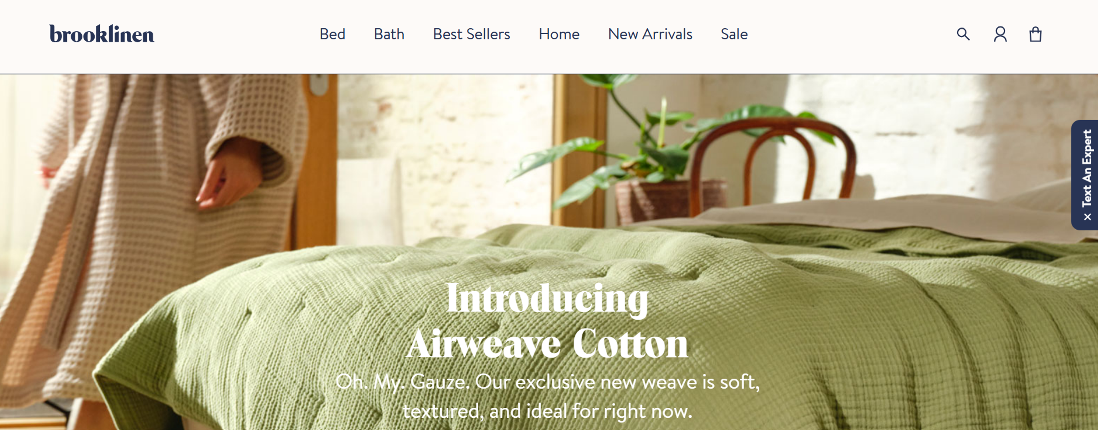
Brooklinen, a brand that specializes in home essentials, has a unique breadcrumbs navigation strategy on product pages that is both clean and effective. While the homepage seen in the image doesn’t have breadcrumbs, whenever users start navigating through categories like “Bed” or “Bath,” they are led through well-structured, hierarchy-based breadcrumbs.
Source: brooklinen.com
Read more:
Conclusion
To sum up, design elements may seem trivial, but in this case, breadcrumbs do not fall flat when it comes to affecting user experience. Providing users with a clear path of navigation and breadcrumbs reduces friction. It improves usability while making the website feel more intuitive, especially for content-rich or e-commerce websites.

About Clay
Clay is a UI/UX design & branding agency in San Francisco. We team up with startups and leading brands to create transformative digital experience. Clients: Facebook, Slack, Google, Amazon, Credit Karma, Zenefits, etc.
Learn moreAbout Clay
Clay is a UI/UX design & branding agency in San Francisco. We team up with startups and leading brands to create transformative digital experience. Clients: Facebook, Slack, Google, Amazon, Credit Karma, Zenefits, etc.
Learn more