A website can look great and still fail if nobody finds it. In 2026, SEO isn’t something you “add later” - it’s built into how a site is designed. Structure, speed, mobile layout, accessibility, and content hierarchy all shape how search engines read your pages and how users move through them.
This matters even more in crypto and Web3, where trust is fragile and products are often complex. People scan fast, bounce faster, and search engines reward pages that explain things clearly. Good SEO-friendly design helps you communicate credibility, guide attention, and make key information easy to find.
This article explains how web design choices affect rankings, what to prioritize first, and how to avoid common layout and content mistakes that quietly hurt organic traffic.
What Makes an SEO-Optimized Website
SEO-optimized web design means building sites that look great and rank well. Search engines like Google need to understand your website content. Users need to enjoy their experience. Both matter equally.
SEO Stages by Clay
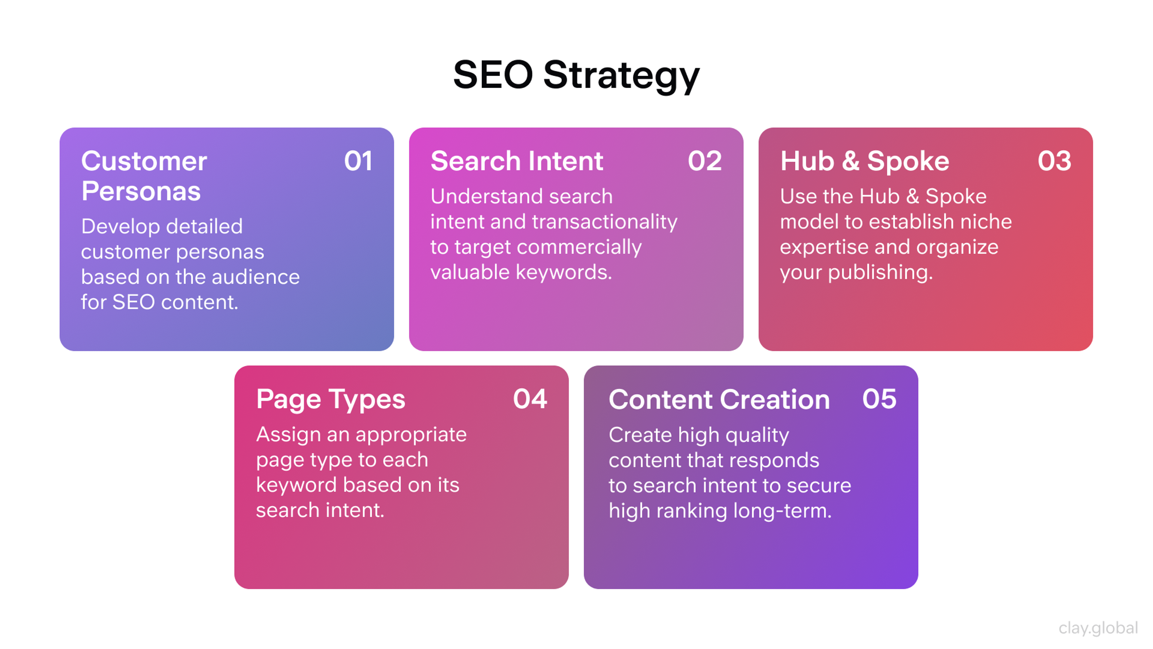
Think of it as a two-way conversation. Your design speaks to visitors through visuals and navigation, and the site's design contributes to both user experience and search rankings. Your structure speaks to search engines through clean code and proper organization. When both conversations go well, your site performs better.
Mobile responsiveness is essential. Your site must work smoothly on phones, tablets, and desktops. Loading speed matters too. Slow sites lose visitors before they even see your content.
Content organization makes a huge difference. A clear website structure is important for both users and search engines. Organizing website content in a user friendly way helps users navigate and helps search engines understand the site.
Clear headings help both users and search engines, and optimizing individual website pages and web pages improves SEO. Relevant keywords placed naturally guide people to what they need. Well-written meta descriptions tell search engines what each page offers.
Sites built this way show up higher in search results. More people discover them without paid advertising. Visitors find what they need faster, which builds trust in your brand.
Why This Approach Changes Everything
Combining SEO with design creates websites that work harder for your business. Search engines can easily crawl and understand your pages. They know who needs your content and when to show it.
This matters especially in competitive markets like blockchain and Web3. Platforms launch daily in these spaces. An optimized site helps you stand out when people search for solutions. By combining SEO and design, you increase online visibility and improve your search engine rankings, making it easier for your audience to find you.
Better visibility means more qualified visitors. These people actively look for what you offer. With an effective SEO strategy, you can increase search engine rankings and help your site appear higher in search engine results. They arrive ready to engage, not just browse. That difference drives real business results.
Building Traffic That Converts
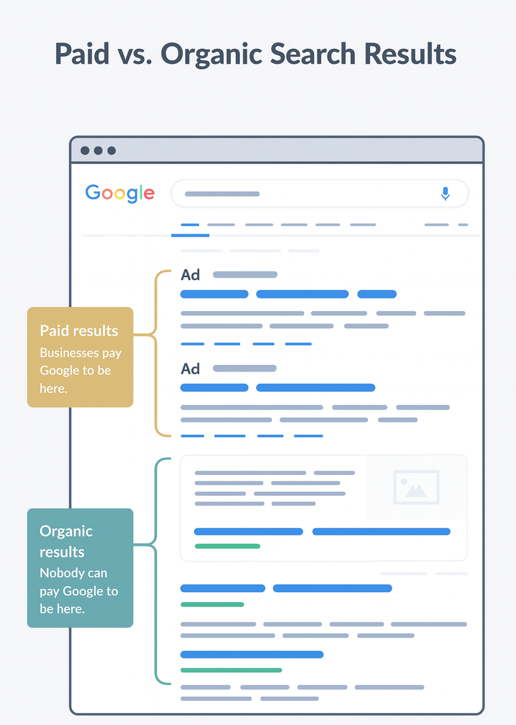
Organic traffic comes from search results, not paid ads. Organic search results are the listings on search engine results pages (SERPs) that are not paid advertisements. These visitors find you because they need something you provide. That makes them more valuable than random clicks.
Search rankings directly impact how many people see your site on search engine results pages. Optimizing your page's content for relevant search queries helps improve your position in organic search results. Second and third place get progressively fewer. Ranking higher brings substantially more visitors.
Quality matters as much as quantity. People searching for specific solutions are high-intent users. They come with clear goals. If your site meets their needs, they stay longer and engage more deeply.
This targeted traffic compounds over time. It builds brand awareness, increases conversions, and drives sustainable growth. Each visitor who finds value becomes a potential customer or advocate.
What Are Serps
Smart Marketing Economics
SEO delivers better returns than most marketing channels. Paid ads work only while you keep spending. SEO builds value that lasts.
Even small businesses with limited budgets can see results. An effective marketing budget and a well-defined marketing strategy can help maximize the impact of SEO efforts, ensuring resources are used efficiently. You need basic website knowledge and the right tools.
Team members with SEO training can make meaningful improvements through content optimization, speed enhancements, and mobile-friendly design. Integrating content marketing with SEO efforts can further improve results by boosting audience engagement and enhancing your digital presence.
These changes attract visitors who genuinely want your products or services. That focus creates stronger customer relationships and long-term growth. The investment pays off through consistent organic traffic that doesn’t disappear when budgets tighten.
Creating Better User Experiences
High rankings mean nothing if people leave immediately. How visitors interact with your site matters just as much as finding it.
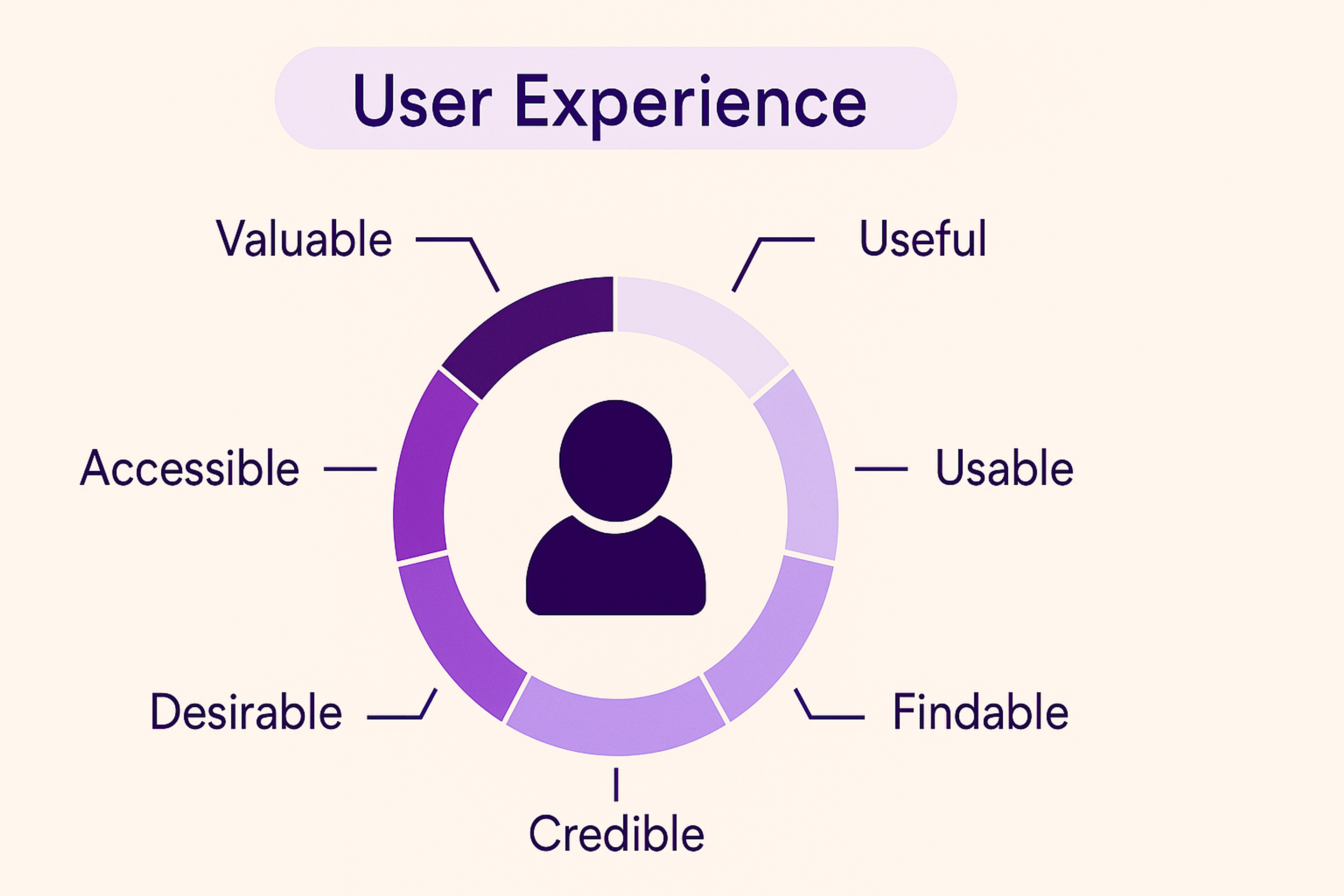
Sites that load quickly, work well on mobile devices, and provide clear navigation keep people engaged. A clear structure and strong visual hierarchy help users navigate the site efficiently, making it easier for them to find relevant information.
Designing for your target audience ensures the site is visually appealing and meets their specific needs and preferences. These factors influence both user satisfaction and search rankings. Google tracks metrics like bounce rate and time on page when determining quality.
When you improve the technical foundation, everything else improves too. Users find information faster. They spend more time exploring. That engagement signals to search engines that your content deserves higher visibility.
User Experience Graph
Core Elements of SEO-Friendly Design
Clean Code Foundation
Your site’s code affects everything that happens next. Clean, well-organized code is a best practice in website development for both performance and SEO, helping search engines crawl pages efficiently. It also makes updates and maintenance simpler for developers.
Messy code creates problems that slow down your site. It introduces bugs that frustrate users. Clean code minimizes these issues while improving performance across the board.
Security Through HTTPS
HTTPS encrypts data between your site and its visitors. This protects sensitive information like passwords and payment details. Users notice the padlock icon in their browser and feel safer.
Search engines prioritize secure sites in rankings. Google explicitly favors HTTPS as a ranking signal. Beyond SEO benefits, security builds trust with your audience.
Optimized Visual Content
Images make your site engaging but can slow it down dramatically. Compress images without losing quality using tools like TinyPNG or ImageOptim. This maintains visual appeal while protecting load times.
Alt text serves two purposes. It helps visually impaired users understand images through screen readers. It also gives search engines context about your visual content. Write descriptive alt text that includes relevant keywords naturally.
Optimized images improve overall site performance. They help pages load faster and rank better. They also capture traffic from image search results.
Strategic Meta Information
Meta titles and descriptions are your first impression in search results. Title tags are a crucial part of on-page SEO and directly influence how your site appears in Google search results. They appear before people click through to your site. Make them compelling and informative.
Include primary keywords in your title tag to signal relevance and optimize it for both users and search engines. Write descriptions that summarize your content while encouraging clicks. Phrases like “learn more” or “get started” create gentle calls to action.
Well-crafted meta information, including optimized title tags, increases click-through rates. More clicks signal popularity to search engines. That popularity can boost your rankings further.
Connected Content Architecture
Internal links create pathways between your pages. They help visitors discover related content. They also help search engines understand how your information connects.
Link from blog posts to service pages naturally. This guides users deeper into your site while distributing SEO value throughout your structure. Make sure to link to important pages so both users and search engines can easily discover and prioritize them within your site hierarchy. Pages that might otherwise go unnoticed gain visibility through strategic linking.
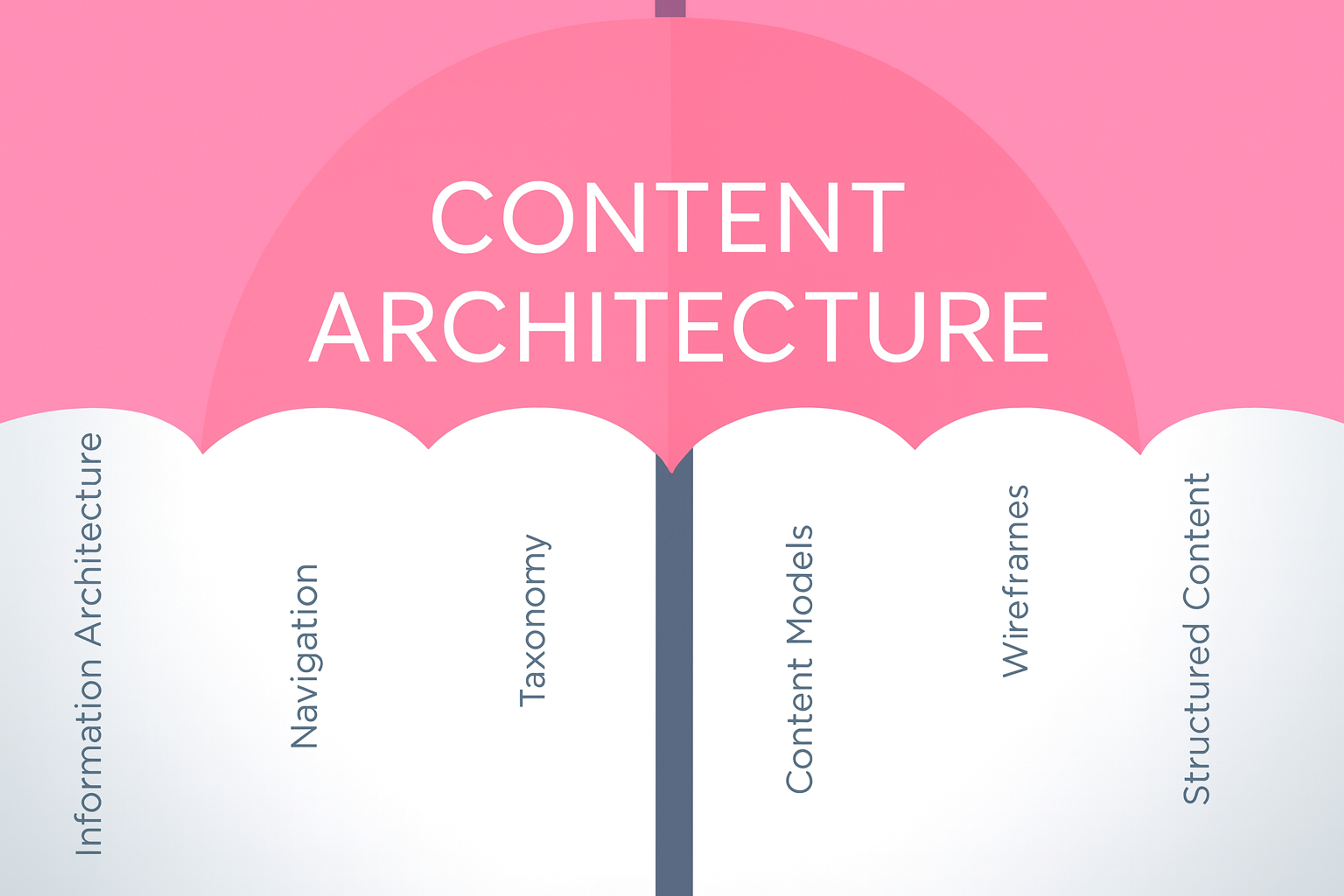
A logical site structure and well-organized site's content improve SEO performance by making navigation easier and supporting better crawling and indexing. Thoughtful internal linking improves navigation and search performance. It shows search engines which pages matter most and how they relate to each other.
Content Architecture Elements
Mobile-First Design Philosophy
More people browse on mobile devices than desktops now. To meet the needs of mobile users, it’s essential to ensure your site is optimized for any mobile device. Sites must work flawlessly on smaller screens. Responsive design adjusts automatically to any screen size.
Mobile-friendly sites rank higher in search results. Google uses mobile performance as a primary ranking factor. Poor mobile experience means lower visibility, even if your desktop site works perfectly.
Test your site on actual devices regularly. A visually appealing website on mobile devices enhances both user experience and SEO. What looks good on your computer might not translate well to phones. Real-world testing catches problems before they affect rankings or user satisfaction.
Voice Search Optimization
Voice search changes how people find information. They ask complete questions instead of typing keywords. Your content should answer these natural language queries.
Include conversational phrases and question-based content. Instead of targeting "best pizza," address "where can I find the best pizza near me?" This matches how people actually speak to devices.
Voice search continues growing as smart speakers and mobile assistants become more common. Optimizing for this trend positions your site for future search behavior.
Social Integration
Connect your website to your social media presence. Share buttons make it easy for visitors to spread your content. Follow buttons help build your social audience.
Social signals indirectly benefit SEO. Shares increase visibility and drive traffic back to your site. Active social engagement shows your brand is relevant and trustworthy. User generated content, such as reviews and testimonials, also acts as social proof, enhancing brand credibility and positively influencing SEO.
Make social connections obvious but not intrusive. Visitors should easily find ways to engage on other platforms without those elements dominating your design.
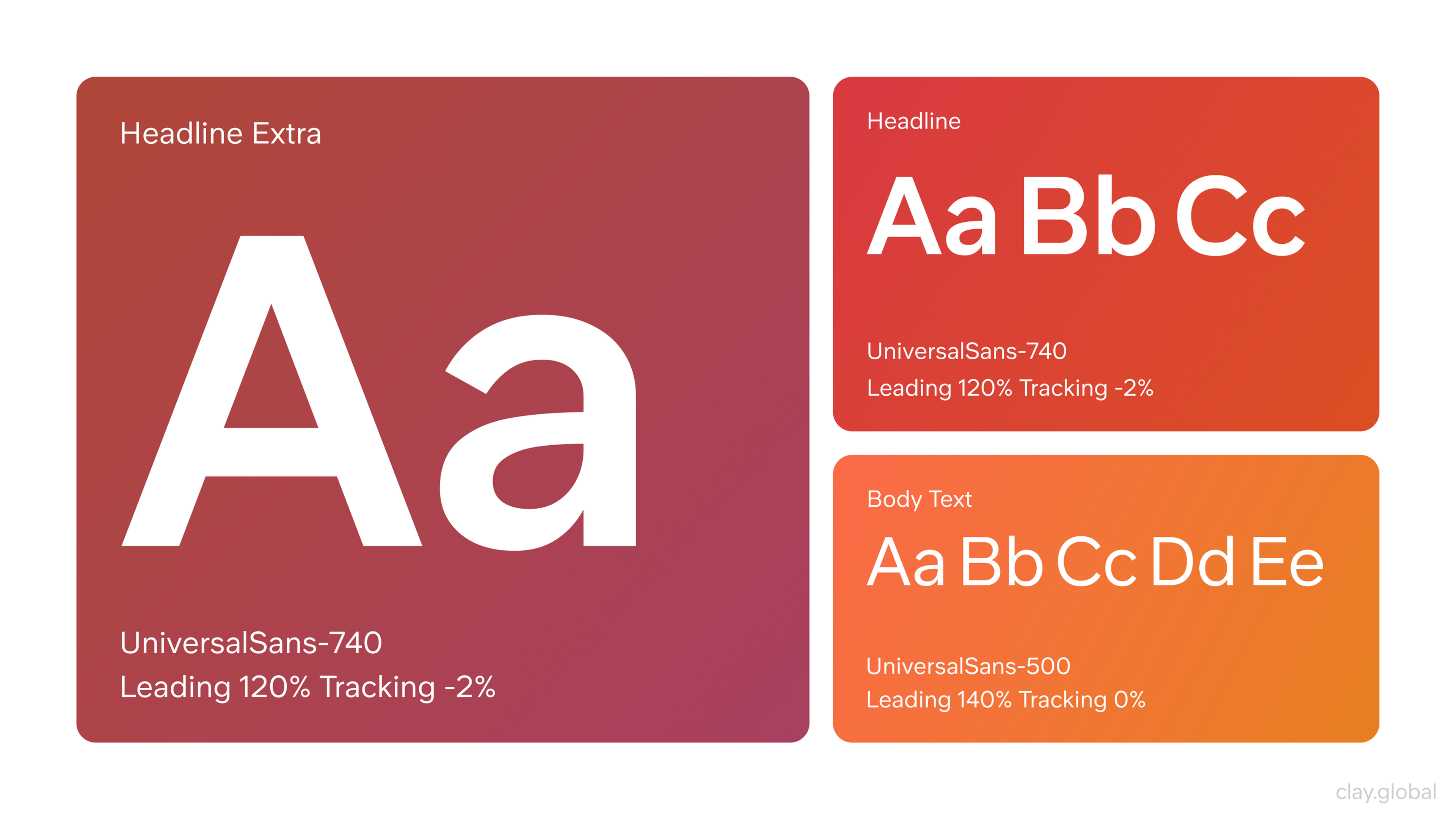
Typography and Visual Hierarchy
Choose fonts that work across all devices. Complicated or decorative fonts can become unreadable on small screens. Simple, clear typography ensures everyone can easily consume your content.
White space improves readability and reduces visual clutter. It guides attention to important elements. Generous spacing makes content feel more approachable and professional.
Good typography encourages people to stay longer on your pages. Longer visits signal quality to search engines. Design decisions that improve readability indirectly improve rankings.
Typography Illustration by Clay
How SEO Design Grows Your Business
Visibility and Lead Generation
SEO-optimized design makes your business discoverable. Effective search engine optimization improves your site's position in search engine results, making it easier for potential customers to find you. By optimizing for search engine visibility, you attract more qualified leads.
Better structure, faster speeds, and quality content help your website perform well in search engine listings and consistently attract organic traffic. You show up when people search for solutions you provide.
This visibility generates qualified leads. These aren’t random visitors. They actively seek what you offer. Higher visibility in search engine results means more opportunities to connect with potential customers.
Long-Term Sustainable Growth
SEO creates foundations that last. Unlike campaigns that end when budgets run out, SEO improvements continue delivering value indefinitely. A well-planned SEO strategy ensures your site continues to grow and adapt over time. Your site becomes more adaptable and scalable over time.
This approach reduces the need for constant redesigns. Your site maintains high rankings without ongoing investment in paid traffic. Resources spent on SEO compound over months and years.
Credibility and Trust
First impressions shape how people perceive your brand. Professional, well-designed sites signal competence and reliability. Users associate quality design with trustworthy businesses.
An optimized site doesn’t just rank higher. It creates positive experiences that build confidence. Visitors who trust your site are more likely to become customers. They spend more time engaging with your content and exploring your offerings.
To further boost your website's authority and trustworthiness, it's essential to build quality backlinks from other websites. Quality backlinks signal to search engines that your site is credible and relevant, which can improve your rankings and overall E-E-A-T.
Common SEO Design Mistakes
Ignoring On-Page Fundamentals
Page titles, headings, and meta tags help search engines understand your content. Without these basics, your site struggles to rank for relevant searches. Each page needs proper optimization to compete effectively.
Use keyword research and keyword research tools to select the best terms for each page, ensuring your titles and meta tags target the most effective keywords. Additionally, seo tools can help identify optimization opportunities and track your progress.
Don’t skip these fundamentals assuming design alone will carry your site. Technical elements work alongside visual appeal to drive results.
Weak or Thin Content
Search engines prioritize valuable, relevant content. Sites with thin or generic information rank poorly. Focus on creating content that genuinely helps your audience solve problems.
Good Contenet Scheme
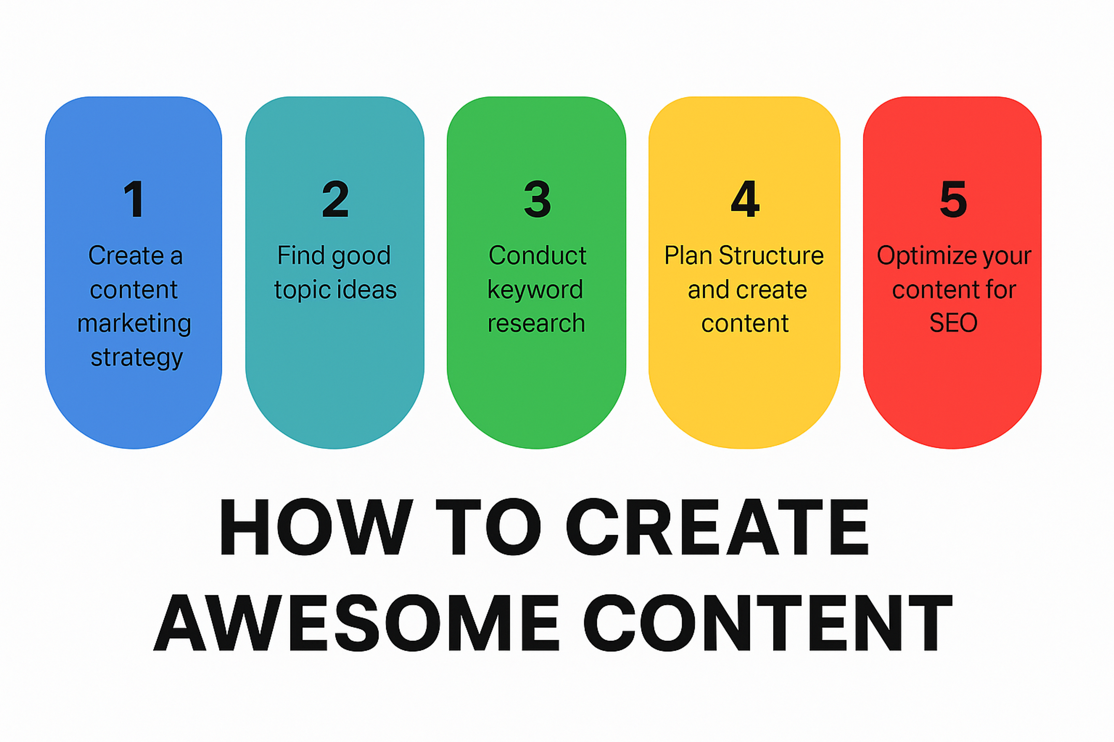
When creating websites, ensure your website's content is high-quality, relevant, and aligns with Google's E-E-A-T guidelines. Well-structured site's content not only improves SEO but also enhances user engagement and trust.
Quality content demonstrates expertise and builds authority. It keeps visitors engaged longer and encourages them to return. Invest time in creating substance that sets you apart from competitors.
Technical SEO Neglect
Behind-the-scenes technical elements determine whether search engines can properly access your site. Secure HTTPS encryption, proper tagging, and fast load speeds all contribute to rankings.
Involving skilled web developers in the website development process is essential, especially when launching a new website, to ensure technical SEO is addressed from the start. Ignoring these technical factors limits your visibility regardless of content quality. Make technical SEO a priority from the beginning, not an afterthought.
Measuring What Matters
Track your performance using tools like Google Analytics and Google Search Console. These platforms show exactly how your site performs in search results and how visitors behave once they arrive. Monitor individual website pages and web page performance to assess your site's performance and identify areas for improvement.
Focus on metrics that reveal real impact. Bounce rate shows whether people immediately leave or stay to explore. Lower bounce rates suggest your content meets visitor expectations.
Keyword rankings track visibility for terms that matter to your business. Steady improvement means your SEO efforts are working. Watch these rankings over time rather than obsessing over daily fluctuations.
Conversions matter most. Are more people signing up, buying, or contacting you? These actions show whether your traffic actually helps your business grow. Increased conversions validate your strategy.
Click-through rate reveals whether your search listings attract attention. Higher CTRs mean your titles and descriptions compel people to click. This metric directly impacts how much traffic your rankings generate.
Monitor these metrics regularly but not obsessively. Look for trends over weeks and months. Make adjustments based on patterns, not isolated incidents.
FAQ
Q: What Are SEO-friendly Web Design Services and Who Provides Them?
SEO-friendly web design services combine clean code, fast load times, mobile optimization, semantic structure, and content hierarchy to improve visibility on search engines. These services ensure that websites are not only visually compelling but also built to rank and perform.
Top providers include Clay, Mission Control, WebFX, Thrive Internet Marketing, and Coalition Technologies. These agencies combine technical SEO, UX design, and web development to deliver high-performing, search-optimized sites across industries from e-commerce and SaaS to healthcare, education, and professional services.
Q: Is Web Design Part of SEO?
Web design is not technically part of SEO, but it directly impacts SEO performance. A well-designed site improves user experience, site speed, and mobile responsiveness — all of which are important SEO ranking factors.
Q: How Do I Redesign My Website Without Losing SEO?
To redesign without losing SEO, maintain URL structures, implement 301 redirects, preserve meta data, and ensure your new site remains mobile-friendly and fast-loading. Use tools like Google Search Console to monitor performance.
Q: Does Page Layout Affect SEO?
Yes, page layout affects SEO. Clear structure, proper use of headings (H1, H2), and content hierarchy help search engines understand your page and improve crawlability and user experience.
Q: Do Web Designers Do SEO?
Some web designers offer basic SEO services like optimizing page speed and mobile design, but in-depth SEO typically requires a specialist. Collaboration between designers and SEO experts yields the best results.
Read More:
Conclusion
Great websites balance visual appeal with technical excellence. SEO and design must work together from the start, not as separate afterthoughts. Mobile responsiveness, speed, navigation, and compelling content form the foundation.
When you integrate SEO into every design decision, you create sites people can find and actually want to use. Traffic increases. Engagement grows. Conversions improve. That's how smart web development drives real business results.


About Clay
Clay is a UI/UX design & branding agency in San Francisco. We team up with startups and leading brands to create transformative digital experience. Clients: Facebook, Slack, Google, Amazon, Credit Karma, Zenefits, etc.
Learn more

About Clay
Clay is a UI/UX design & branding agency in San Francisco. We team up with startups and leading brands to create transformative digital experience. Clients: Facebook, Slack, Google, Amazon, Credit Karma, Zenefits, etc.
Learn more


