
A header on a website with well-placed header elements is essential because it helps make a good impression on visitors at first glance. It is the first element they will visually encounter, and its importance is irrefutable as it draws users in, directs them, and creates a mood in anticipation of user experience.
The header’s layout, aesthetics, and purpose can alter the users’ view of the business and impact their decision of whether to continue browsing. Practical guidelines for drafting such a header reinforce user satisfaction, enhance their commitment, and improve the company’s reputation.
Source: clay.global
What Is a Website Header
Your website header sits at the top of every page like a helpful guide. It holds your logo, main menu, and often contact info or search tools.
Think of it as your site's control panel. Visitors arrive and look up first to understand where they are and where they can go. A good header answers both questions instantly.
Headers stay the same across all your pages. This consistency helps people navigate with confidence. They know they can always find the main sections of your site.
Your header also carries your brand. It's often the first place visitors see your logo and get a feel for your company. The colors, fonts, and style you pick here shape expectations for everything else.
What Is Website Header Design
Creating a site header is said to design the top part of the webpage, which usually has some essential parts such as the logo, menus, emails, if any, and even the search box. A common practice is to have a left-aligned logo, which creates a clean and visually appealing layout.
This part is generally designed conservatively because it seeks to cater to such details that assist in grasping the intention of the web and how one would maneuver through it.
Cancers of the header design are such attention-seeking features that are prone to misuse rather than balance their beauty and usefulness after coming up with a beautiful header.
Factors like typography, color, and arrangement of the elements are done in a manner that is in sync with the organization’s brand to enhance uniformity.
To conclude, the essence of designing a website’s header is to ensure an effective first contact convinces the visitors to stay on the website for a particular duration.
What Does a Header Look Like?
Transparent Headers
Transparent headers sit over content or background images without blocking them. This creates a modern, polished look that creative and tech brands love.
The see-through effect works best with strong visual content. You need high-quality images or videos as backgrounds. Header elements must still be easy to read.
Transparent headers need careful attention to contrast. Your logo and menu text must stay visible across different background images or videos.
This header type blends your header with page content smoothly. It makes the whole design feel more connected and visually striking.
Source: Netflix
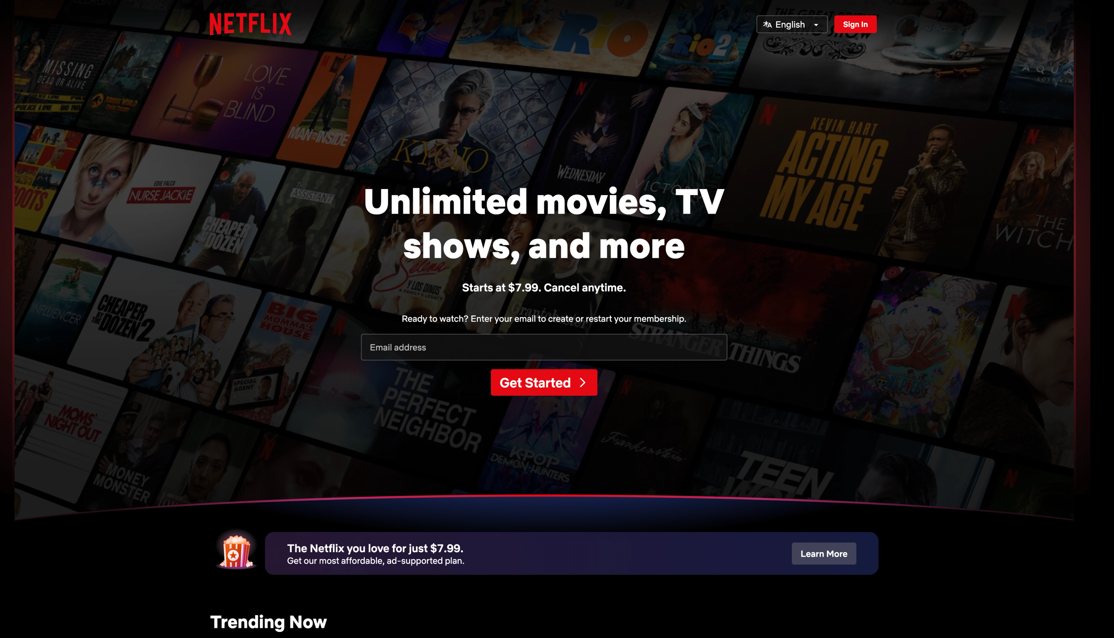
Full-Screen Headers
Full-screen headers take up the whole screen when users first arrive. They create strong visual impact and communicate your brand message clearly.
These headers usually have large background images or videos with text overlay and big action buttons. They're built to grab attention and encourage quick engagement.
Full-screen headers work well for creative agencies, restaurants, and travel companies. These businesses rely on visual appeal to drive decisions. The large format lets you tell stories through pictures.
However, full-screen headers push your main content down the page. Make sure your message is clear and interesting enough to make people scroll down and explore more.
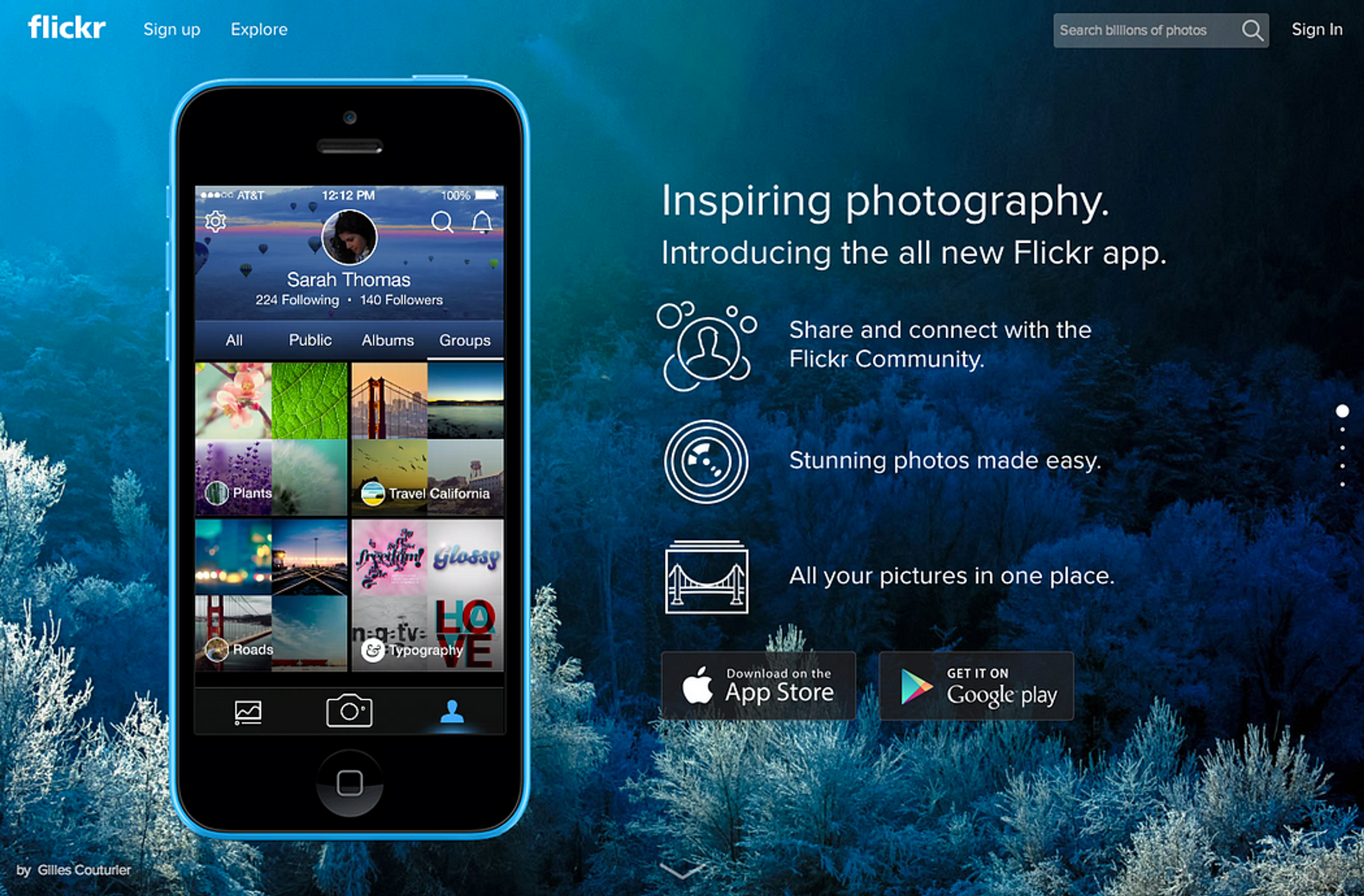
Source: flicker
Animated Headers
Animated headers include moving parts that respond to user actions or page scrolling. These might be hover effects, loading animations, or elements that move as people navigate.
Good animations create engaging experiences that strengthen your brand personality. They work well for creative industries, gaming companies, and brands targeting younger people.
Keep animations useful and fast-loading. Too much motion distracts from your main message and slows page loading. Subtle effects often work better than elaborate animations.
Think about users who don't like motion. Provide ways to turn off animations or keep them minimal by default. Accessibility should always matter in your design.
Header with Hero Image
A header with a hero image can best be described as having a large image or video at the top of the web page. For ecommerce websites, including a shopping bag icon in the header can enhance user experience and facilitate online shopping.
This type of header helps get the user’s first attention and usually has a central headline as well as a call to action that persuades the user to focus on the site’s purpose or offers.
Source: dogbarstpete

Every website header has value, and it can greatly alter the design and effectiveness of a website. The kind of header one settles on will always depend on the website’s objectives, audience, and brand.
Key Elements of an Effective Header
Logo Placement
The aspect of the logo placed on the website header and generally used for branding purposes is indispensable. Incorporating multi-site navigation can enhance user experience by allowing seamless transitions between related sites.
The logo has to be located somewhere uphill, ensuring that most of the pages would have the onion cut. An identically placed logo can reduce the need for marketing and increase the reliability of the users.
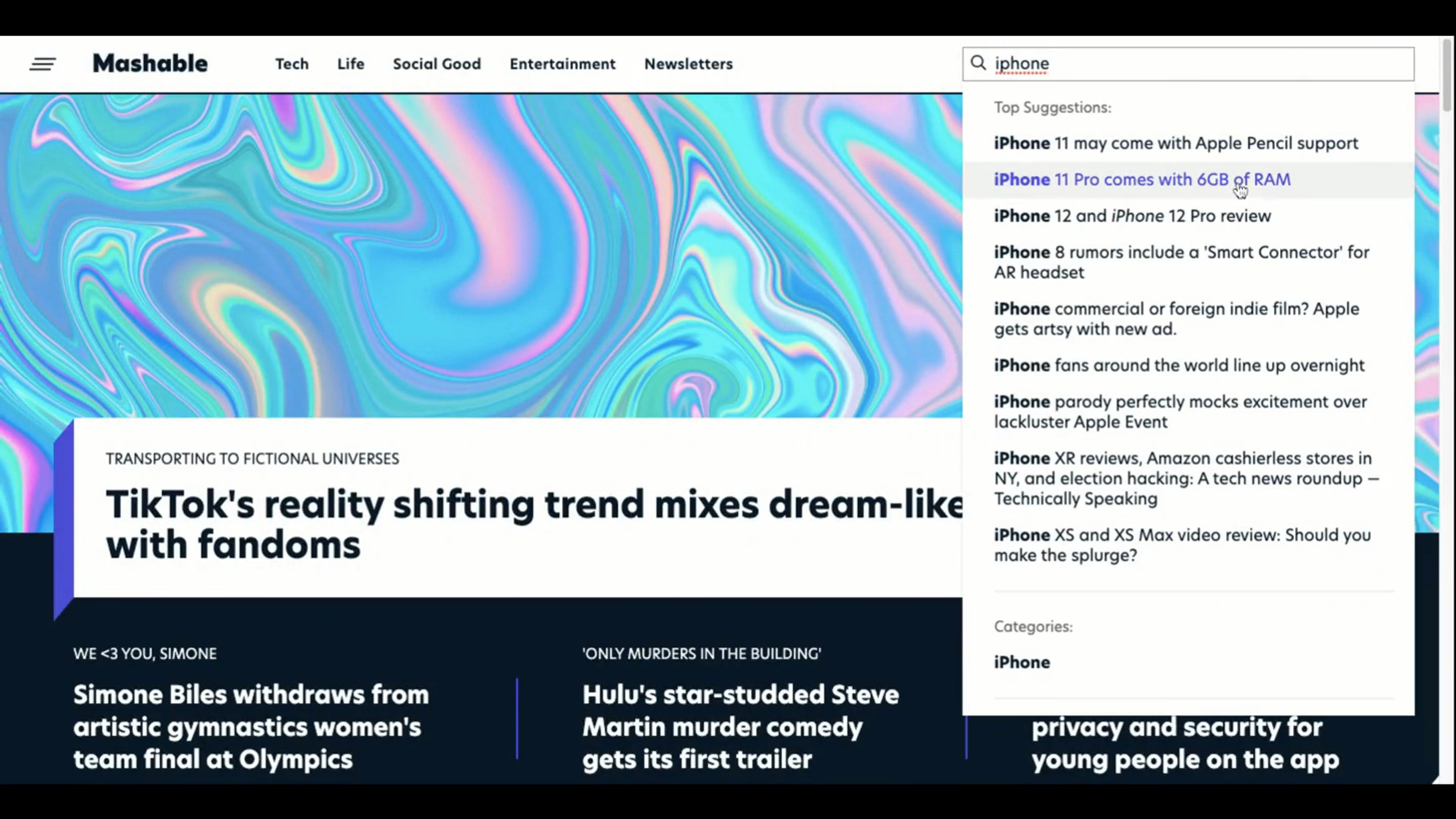
Search Functionality
Adding a search bar to a webpage's header is particularly handy for pages rich in content or products. This feature allows users to stay satisfied and improve their experience when using the app, as they can search for specific topics of interest.
The search bar should be placed strategically and readily available, typically with a magnifying glass symbol. Adopting an intelligent search mechanism helps boost users’ navigation and content retention.
Source: nl.mashable
Header Text
The header text is a pivotal element of a website’s header, serving as the first point of contact between the site and its visitors. It provides essential information about the website and its content, making it crucial for setting the tone and context. The header text should be clear, concise, and easy to read, incorporating the website’s title, tagline, or other relevant information.
When designing the header text, consider the following factors:
- Readability: Ensure the header text is legible, even on smaller screens. Choose a font that is clear and easy to read, and make sure the text size is appropriate for various devices.
- Contrast: The header text should stand out against the background. Use a color that provides sufficient contrast to make the text easily readable and visually appealing.
- Consistency: Maintain uniformity in the header text throughout the website. Use the same font, color, and size to create a cohesive look and feel, reinforcing the brand’s identity.
By carefully designing the header text, you can create a professional and visually appealing website that effectively communicates your brand and message to your audience.
Trends in Header Design
Minimalist Designs
Minimalist headers follow the "less is more" rule. They use clean lines, white space, and only essential parts. This cuts visual noise and helps users focus on what matters.
A typical minimalist header has just your logo, main menu, and maybe one action button. Everything else gets removed. This creates elegance and sophistication.
These headers work great for professional services, creative portfolios, and premium brands. The simplicity shows confidence. You don't need flashy elements to get attention.
Minimalist headers also load faster. With fewer parts to show, users see your content more quickly. This improves their experience.
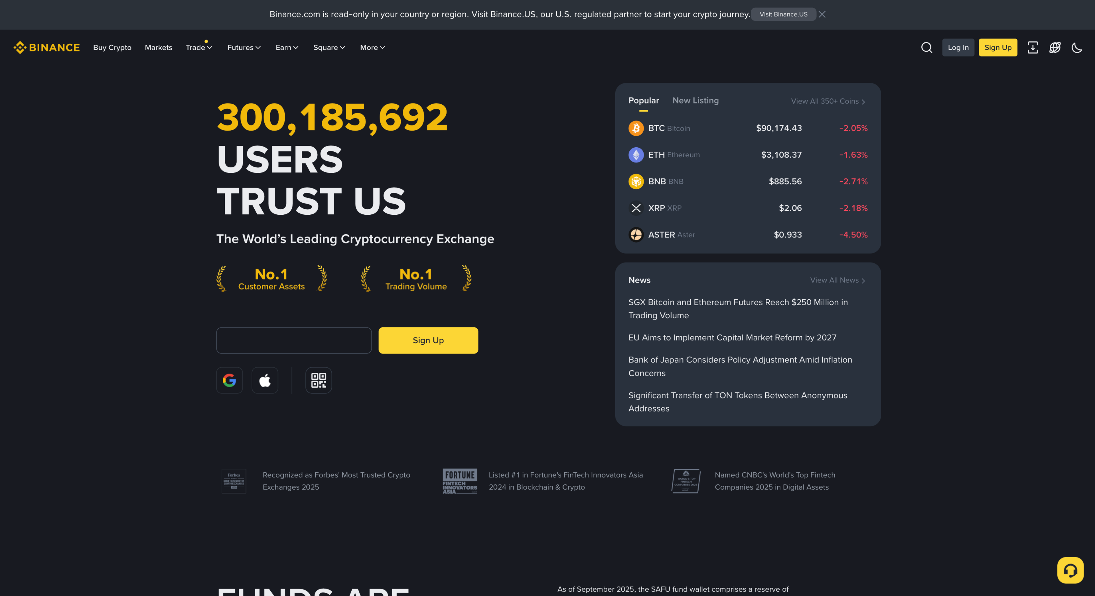
Dark Mode Compatibility
With expanding dark mode usage, creating headers that serve their purpose in both light and dark modes is increasingly popular.
Dark mode compatibility ensures that the audience can read or see the message and satisfy their visual desires, albeit in dimmer situations.
This practice beautifies and makes the design and use of interfaces more convenient for all users.
Source: Binance
Sticky Headers
Sticky headers stay fixed at the top when users scroll down. This keeps navigation available at all times. It's especially helpful on long pages with lots of content.
Users can jump between sections or use key features without scrolling back up. This convenience improves experience and can increase time on your site.
Source: Dribble
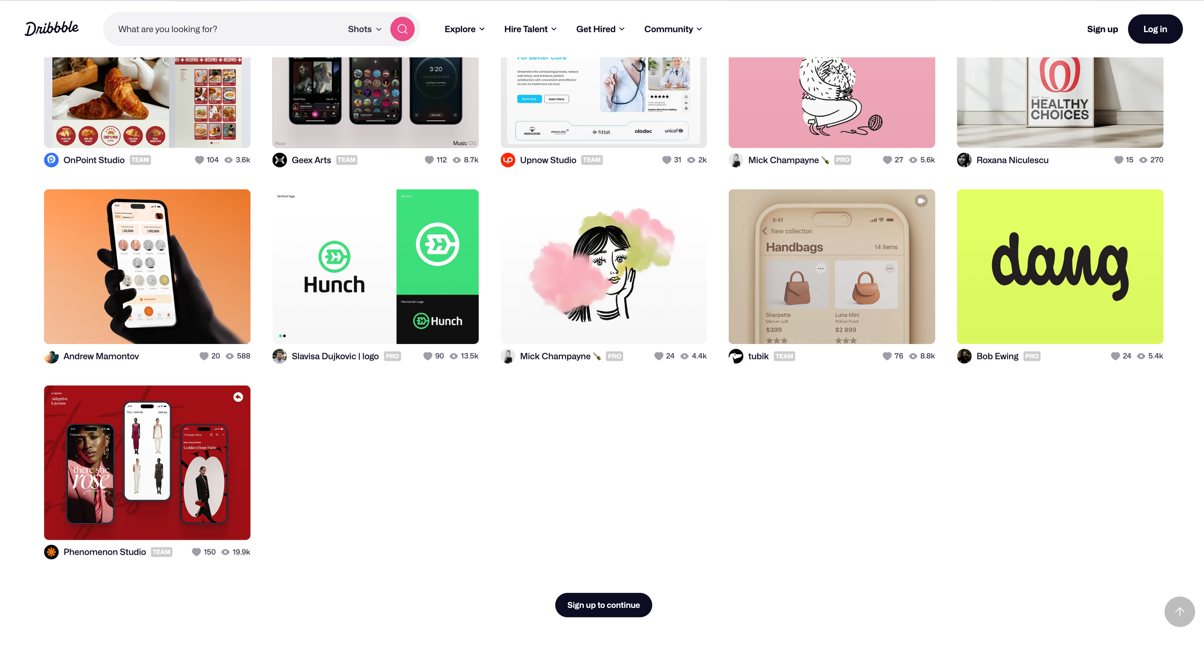
Sticky headers work perfectly for blogs, help sites, and online stores. These sites need constant navigation access while people browse content or products.
When you make headers sticky, keep them thin. You don't want them taking up too much screen space. A smaller version of your main header often works better.
Custom Header Design
A custom header design is a unique and creative way to showcase your website’s brand and personality. A well-designed custom header can help establish your website’s identity and make it stand out from the competition.
When designing a custom header, consider the following elements:
- Color Scheme: Choose a color scheme that reflects your website’s brand and personality. Use colors that are visually appealing and consistent throughout the website.
- Typography: Select typography that is clear, concise, and easy to read. Use fonts that are consistent throughout the website to create a cohesive look and feel.
- Imagery: Use high-quality images or graphics that reflect your website’s brand and personality. Ensure that the images are optimized for different screen sizes and devices.
By incorporating these elements, you can create a custom header design that is unique, visually appealing, and effective in communicating your website’s brand and message.
Some popular custom header design trends include:
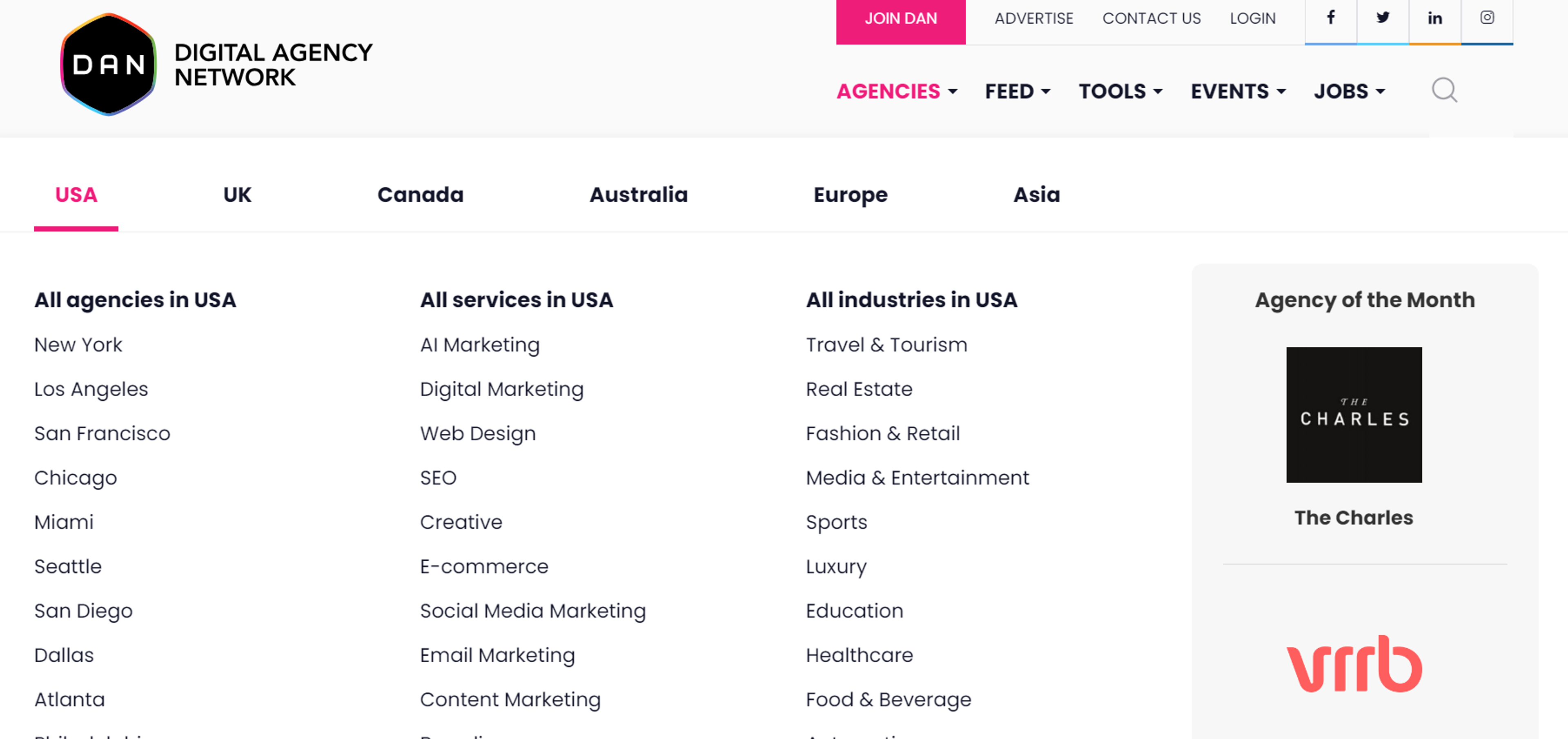
- Horizontal Headers: A horizontal header design spans the full width of the screen, often featuring a logo, navigation menu, and other essential elements.
- Mega Menus: A mega menu is a large, expandable menu that provides easy access to multiple pages and sections of the website.
Source: digitalagencynetwork
- Hamburger Menus: A hamburger menu is a compact menu often used on mobile devices, featuring a three-line icon that expands to reveal the menu.
- Notification Bars: A notification bar is a horizontal bar that provides important information or updates to the user, often featuring a call-to-action button.
By incorporating these trends and elements, you can create a custom header design that is both functional and visually appealing.
Optimizing for User Experience
Load Time Considerations
The time it takes for a user to load the header is critical to the overall experience of the user interface. Long-waiting headers have the potential to aggravate users, which can also result in more excellent abandonment rates.
Source: Image by vectorjuice on Freepik

To avoid this problem, consider removing or minimizing the number of oversized images and videos, coding them more appropriately, and taking advantage of such technologies as lazy loading.
Optimizing images and textures and renting CDNs (content delivery networks) would also help make a header that will perform well within a wide range of devices and networks.
Accessibility Features
Including accessibility features in the header design allows all users, including those with disabilities, to use the user site. Semantic HTML structures the header components to be usable features and critical means.
Provide alt text for such images and ensure that non-text interactive elements like menus, buttons, and the like can be operated from the keyboard.
Choosing readable fonts against high-contrast backgrounds and using ARIA landmarks can make navigation more accessible on a website or application. I imagine that more text can be read to users through screen readers.
Header Examples
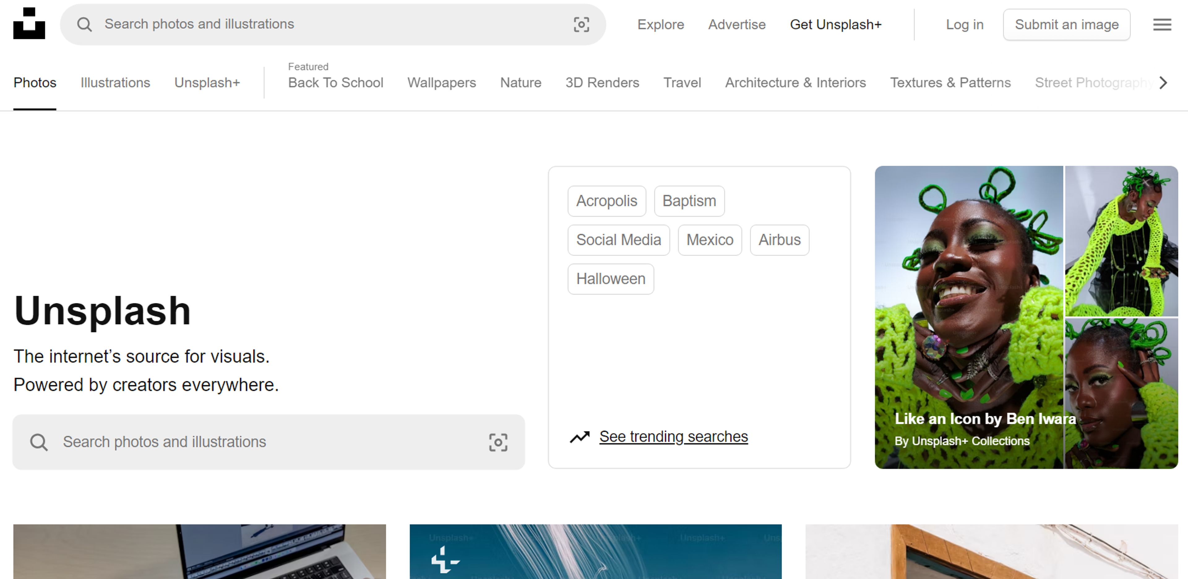
Unsplash
Unsplash's header design can be considered an example of minimalism, which is highly functional. The navigation bar provides essential links directing users to the available photo categories and profiles without looking cramped. The conciseness of the header works hand in hand with the core objective of Unsplash, which is promoting aesthetically appealing images.
Source: Unsplash
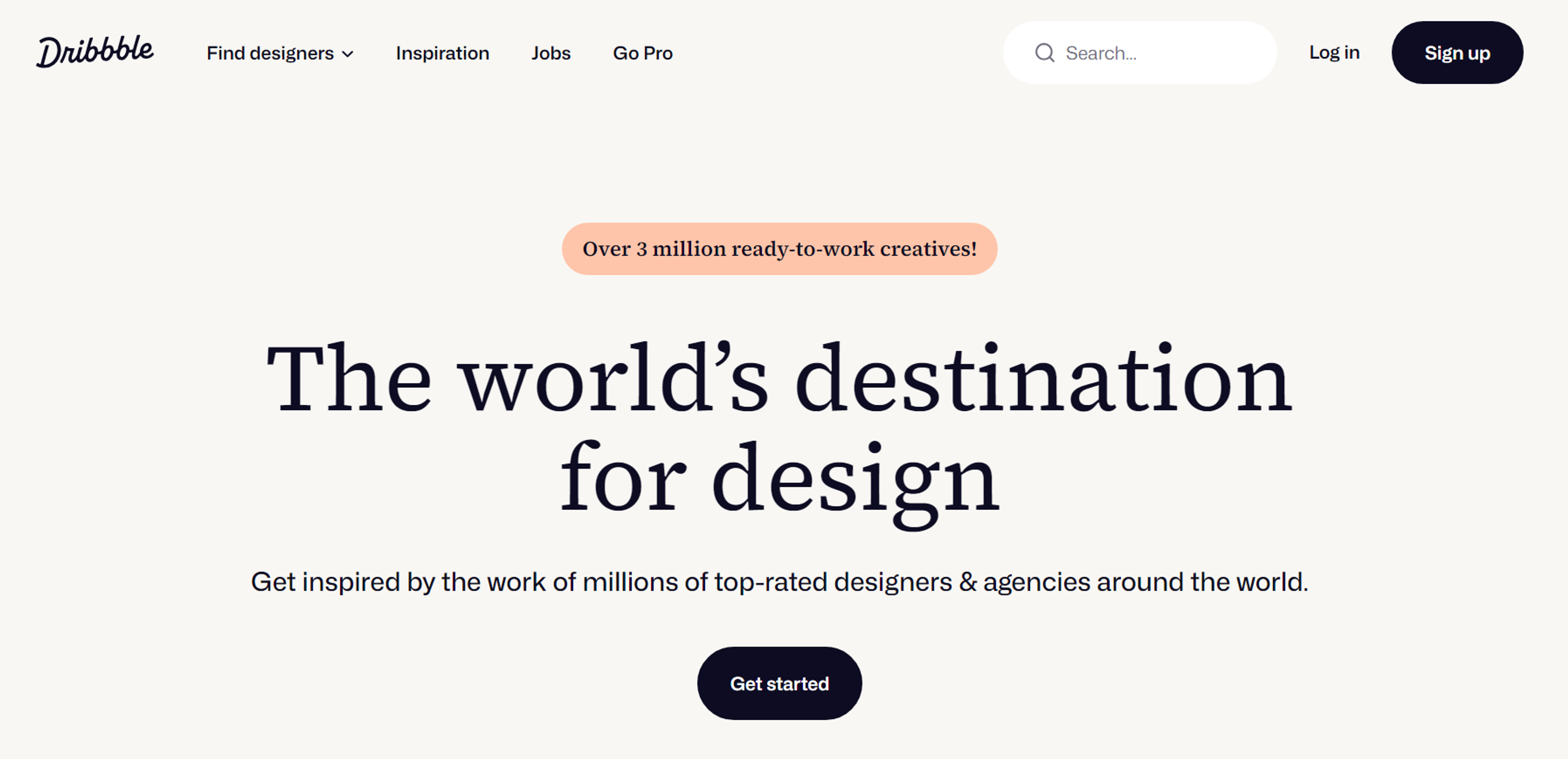
Dribbble
Dribbble's header provides a vibrant and user-friendly navigation experience designed to enhance usability and engagement. It features well-organized links that allow users to effortlessly explore a diverse range of creative works, from illustrations to animations, showcasing the talents of designers worldwide.
The sticky header ensures that these navigation options remain accessible at all times, allowing users to seamlessly browse and interact with the site from any location on a page, enhancing their overall experience.
Source: Dribble
Marqeta
In our project for Marqeta, the website's header plays a pivotal role in making a solid first impression. As the first visual element users encounter, a well-placed and thoughtfully designed header sets the tone for the entire browsing experience.
Its layout, aesthetics, and functionality guide users, creating a mood that influences their perception of the business. A carefully crafted header not only attracts attention but also enhances user satisfaction, fosters engagement, and strengthens the company's reputation.
Marqeta website by Clay
Common Mistakes to Avoid
Overcrowding the Header
One of the most common mistakes in making headers is putting in too many elements, thus causing an overcrowded feel. Header type is occasionally overstated, which creates disorientation in the users, thereby affecting the general cosmetic and functionality of the site.
One has to draw the line by putting up only the necessary links and functionalities, if any. Go simple, and don't load the header with items except the most essential navigation items.
Inconsistent Branding
Creating and sustaining a brand depends on the unity of branding on every single page. Standard practice is ignoring the scope where the rest of the header is different from the design of the other parts of the website about colors and typography, among other designs.
Deviation from these aspects leads to discomfort, which one is reluctant to endure. Ensure that your header complies with the provisions stipulated in the company's branding for the rest of the website's visibility and professionalism.
Poor Contrast and Readability
On the contrary, design headers with less contrast and poor readability can seriously threaten user experience. If the text and other interactive components are too concealed in the background, the site may be hard to operate.
Source: Panjasan, CC BY-SA 3.0 via Wikimedia Commons
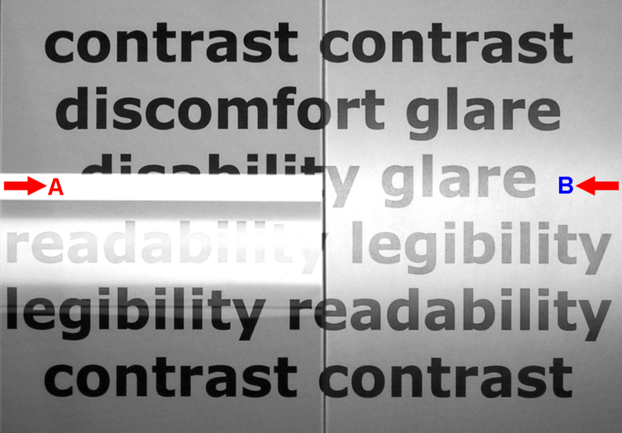
All text should be visible against the document background, and the fonts used should be legible and allow easy and quick reading, irrespective of the screen size. Increased contrast and relatively straightforward fonts increase visibility since the users should be able to locate what they wish quickly.
It is easy to see how the use of these basic principles assists practitioners in making nice, usable headers.
FAQ
What Should Be Included in a Website Header?
Include your logo, main navigation menu, and primary action button. Depending on your business, you might add search functionality, contact information, or account access links. Focus on what users need most to navigate successfully.
Should Website Headers Be Sticky or Static?
Sticky headers work best for content-heavy sites, blogs, and online stores where users need constant navigation access. Static headers suit simpler sites or when you want to maximize content visibility. Think about how your users behave.
How Do I Make My Header Mobile-friendly?
Use responsive design principles and make sure touch targets are at least 44 pixels. Consider hamburger menus for complex navigation. Test on actual mobile devices to see how your header collapses or reorganizes on smaller screens.
Should My Logo Always Link to the Homepage?
Yes, linking your logo to the homepage follows web conventions users expect. It gives visitors a consistent way to return to your main page from anywhere on your site. Think of it as a navigation safety net.
Read more:
Conclusion
Creating an effective website's header requires balancing aesthetics, functionality, and user experience. We’ve explored vital elements crucial to header design, including simplicity, mobile optimization, consistent branding, and readability.
By analyzing successful examples from sites like Unsplash, Medium, Trello, and Dribbble, we’ve seen how well-designed headers enhance navigation and user engagement.
It’s essential to avoid common mistakes such as overcrowding, neglecting mobile optimization, inconsistent branding, and poor contrast, as they can harm user experience and site effectiveness.
By focusing on clean, navigable, and visually cohesive headers, designers can ensure users have a seamless experience every time they visit the site. Integrate these strategies into your design process to create impactful headers that resonate with your audience.

About Clay
Clay is a UI/UX design & branding agency in San Francisco. We team up with startups and leading brands to create transformative digital experience. Clients: Facebook, Slack, Google, Amazon, Credit Karma, Zenefits, etc.
Learn moreAbout Clay
Clay is a UI/UX design & branding agency in San Francisco. We team up with startups and leading brands to create transformative digital experience. Clients: Facebook, Slack, Google, Amazon, Credit Karma, Zenefits, etc.
Learn more