Every logo carries a brand’s promise. Some do it twice: once in what you notice immediately, and again in what you discover after a second look.
Great logos often use negative space, the “empty” area around and between shapes, to hide a second image or idea.
That hidden layer works because our brains are built to search for patterns, separate figure from background, and complete incomplete forms. When the viewer suddenly “sees it,” the logo becomes harder to forget.
How Hidden Meanings Work
Most “secret” logos rely on a few repeatable moves:
- Negative space: the message appears in the gap, not the ink.
- Figure–ground: your brain flips what is foreground vs background until a new form emerges.
- Closure and completion: you mentally finish shapes that are only implied.
- Color: it can steer emotion and attention, but it should never be the only thing doing the work.
A good hidden element stays readable at small sizes, in monochrome, and without a hint.
Baskin-Robbins Hidden Meaning
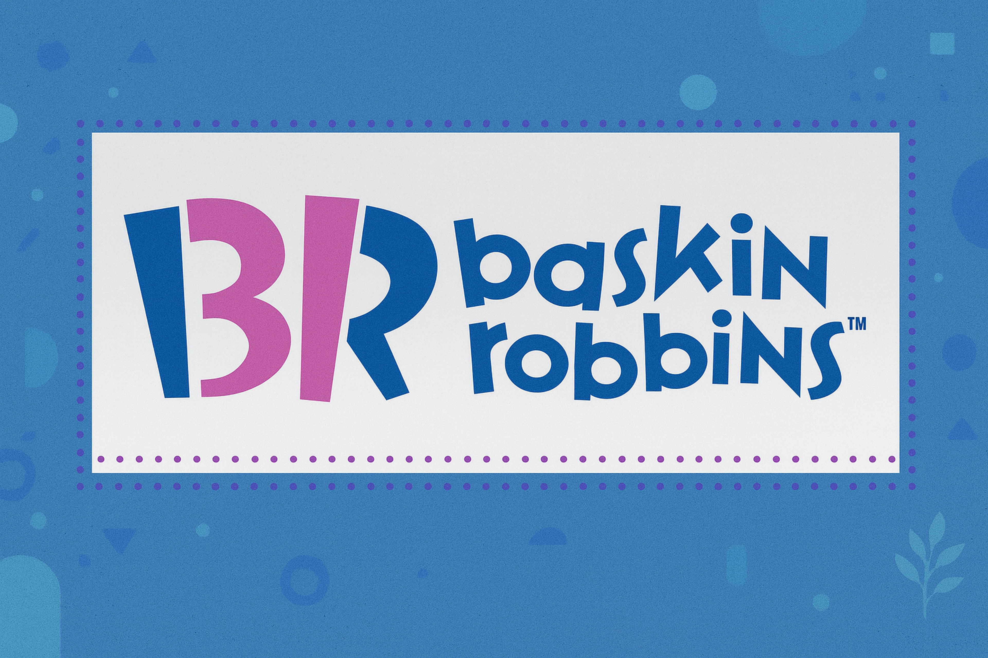
The Baskin-Robbins mark hides 31 inside the “B” and “R,” a compact way to signal variety and the brand’s flavor heritage.
The trick is simple: the number is carved out through negative space, so it feels like part of the lettering rather than an extra symbol.
The bright palette keeps the logo playful and approachable while the hidden number rewards a closer look.
The logo uses pink and blue colors. Pink triggers feelings of fun and playfulness according to color psychology. Blue adds calmness and trust. These colors stayed consistent for over 30 years.
Baskin Robbins Logo
Toyota Hidden Meaning
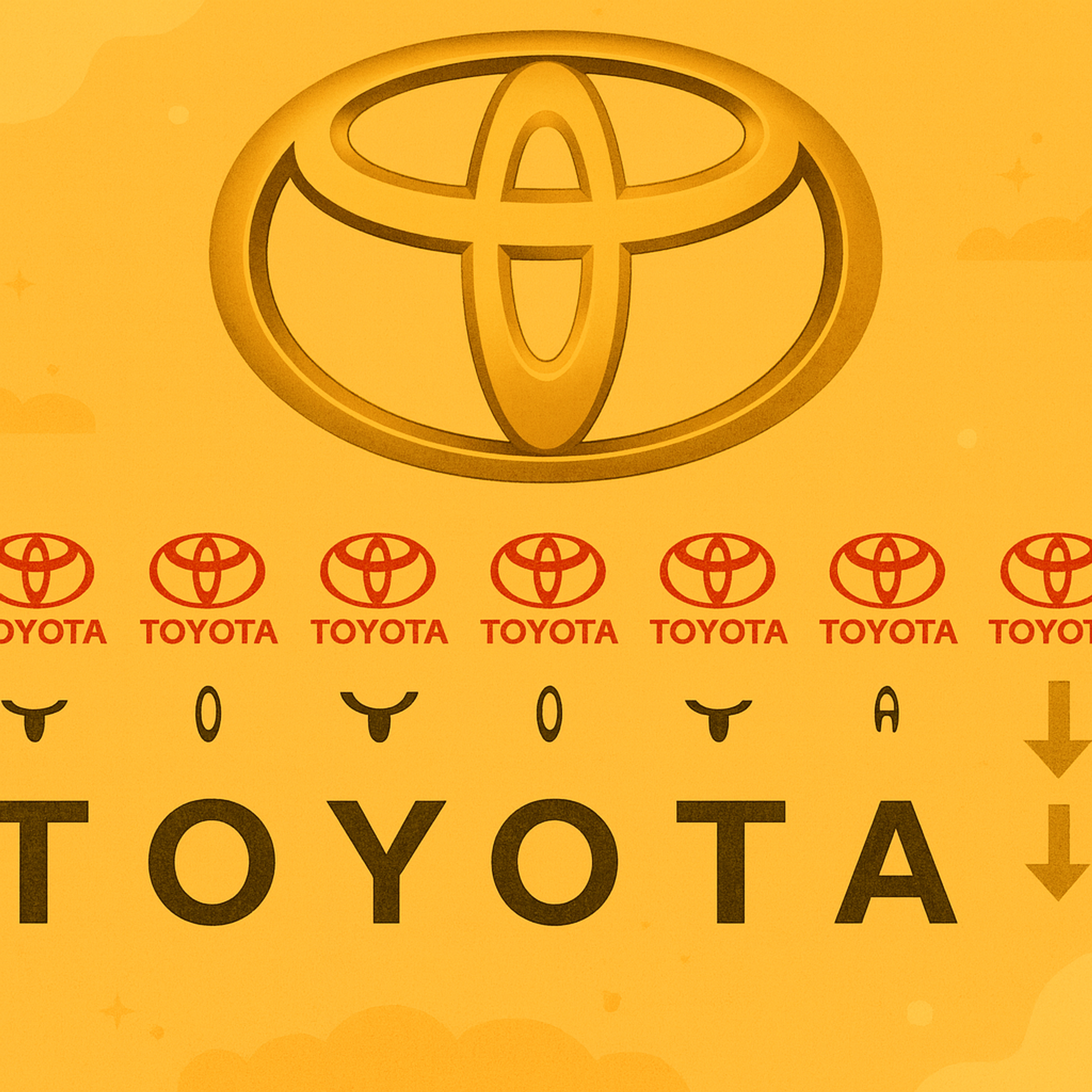
Toyota uses three interlocking ovals to do multiple jobs at once.
The shapes can be read as a monogram that forms the letters of the brand name, while also suggesting connection: two inner forms meeting inside a larger outer frame.
The design is minimal, scalable, and consistent across badges, apps, and signage.
Toyota Logo Hidden Meaning
Tour de France Logo Hidden Meaning
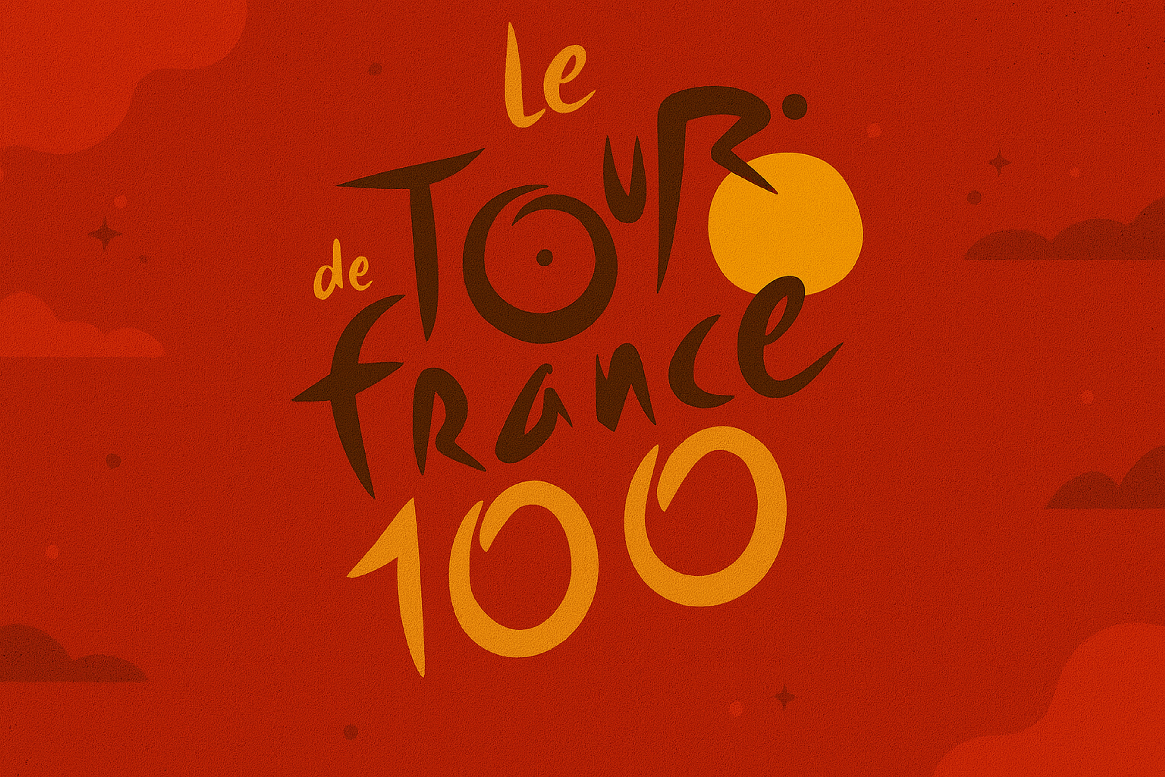
The Tour de France logo embodies the race's spirit in a simple yet effective design. Look closely at the lowercase "r" in "Tour." It forms a cyclist leaning over a bike.
This detail celebrates French cycling tradition. The logo acts as a visual representation of the race's energy and movement, using design elements to convey athleticism and dynamism.
The yellow circle serves two purposes. It represents the summer sun and the winner's yellow jersey. This innovative design links the logo to the race's most recognizable symbol.
Tour dee France Logo
F1 Logo Features Hidden Meaning
The Formula 1 logo builds the “1” from the space between the “F” and the racing stripes.
Speed is implied through slanted lines and tension between shapes, not through literal imagery.
The hidden numeral is legible fast, which matters for a brand seen at high speed and in crowded visuals.
Formula 1 Logo

Beats Hidden Meaning
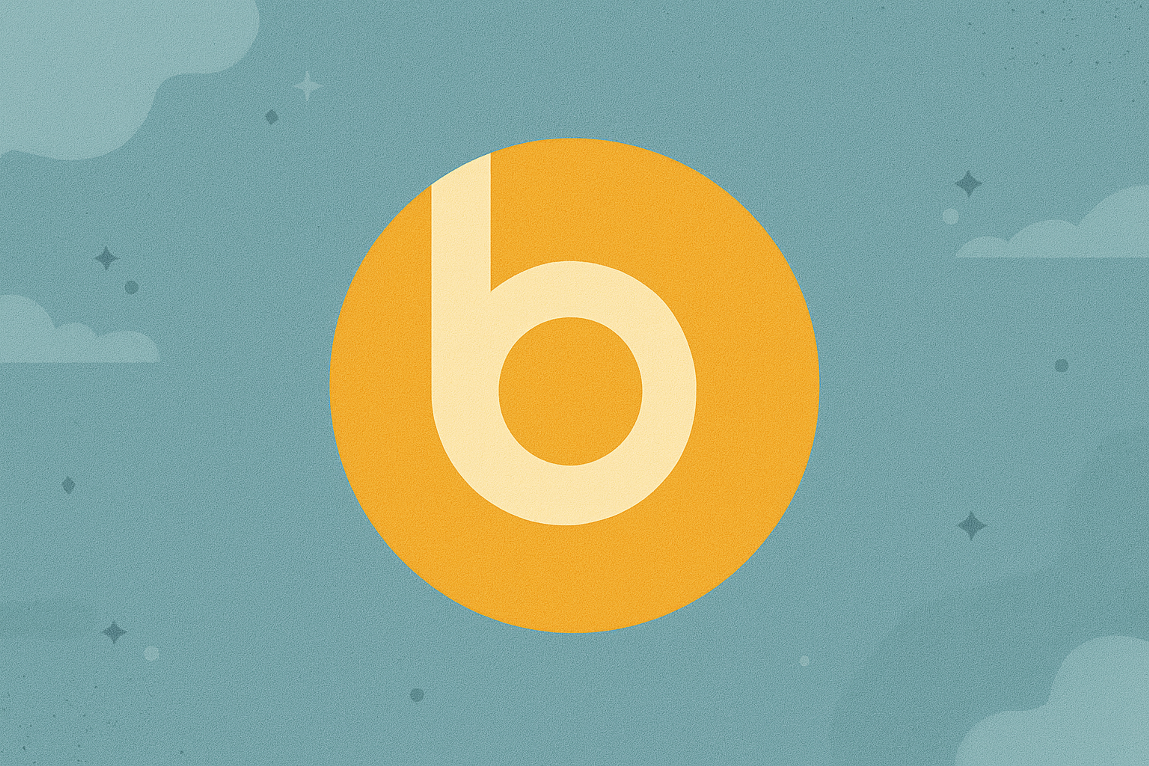
The Beats logo appears simple at first glance. It's a lowercase "b" inside a circle. But turn your head, and it resembles a person wearing headphones.
This visual metaphor perfectly matches the brand. It shows their focus on personal audio experience. The logo also visually communicates their core identity as a sound company, reinforcing their commitment to audio and sound quality.
The smooth, modern design appeals to music lovers who want style and quality.
The negative space technique makes the logo memorable. When people discover the hidden headphones, they form a stronger connection with the brand.
Beats Logo
Toblerone Hidden Meaning
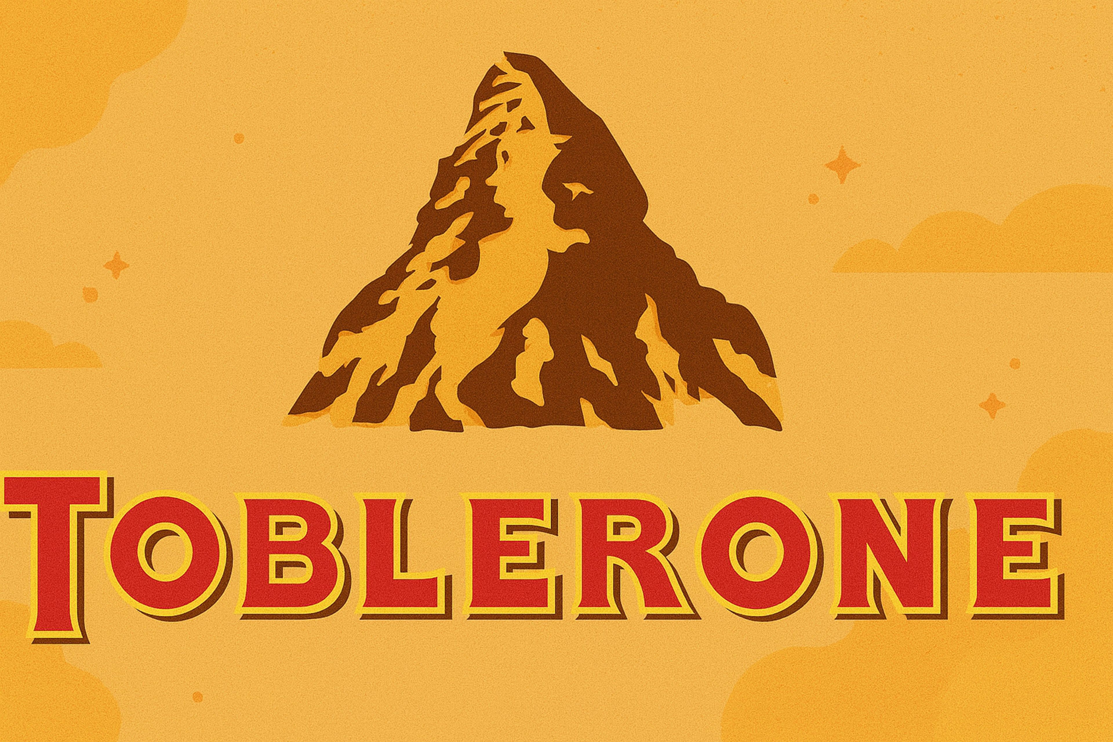
The Toblerone mountain hides a bear as a nod to Bern, tying place identity to packaging. That quiet detail adds heritage without clutter.
The name also layers meaning: founder Theodor Tobler plus “torrone,” pointing to the nougat tradition and the brand’s Swiss roots in Switzerland.
Toblerone Logo
FedEx Hidden Arrow Hidden Meaning
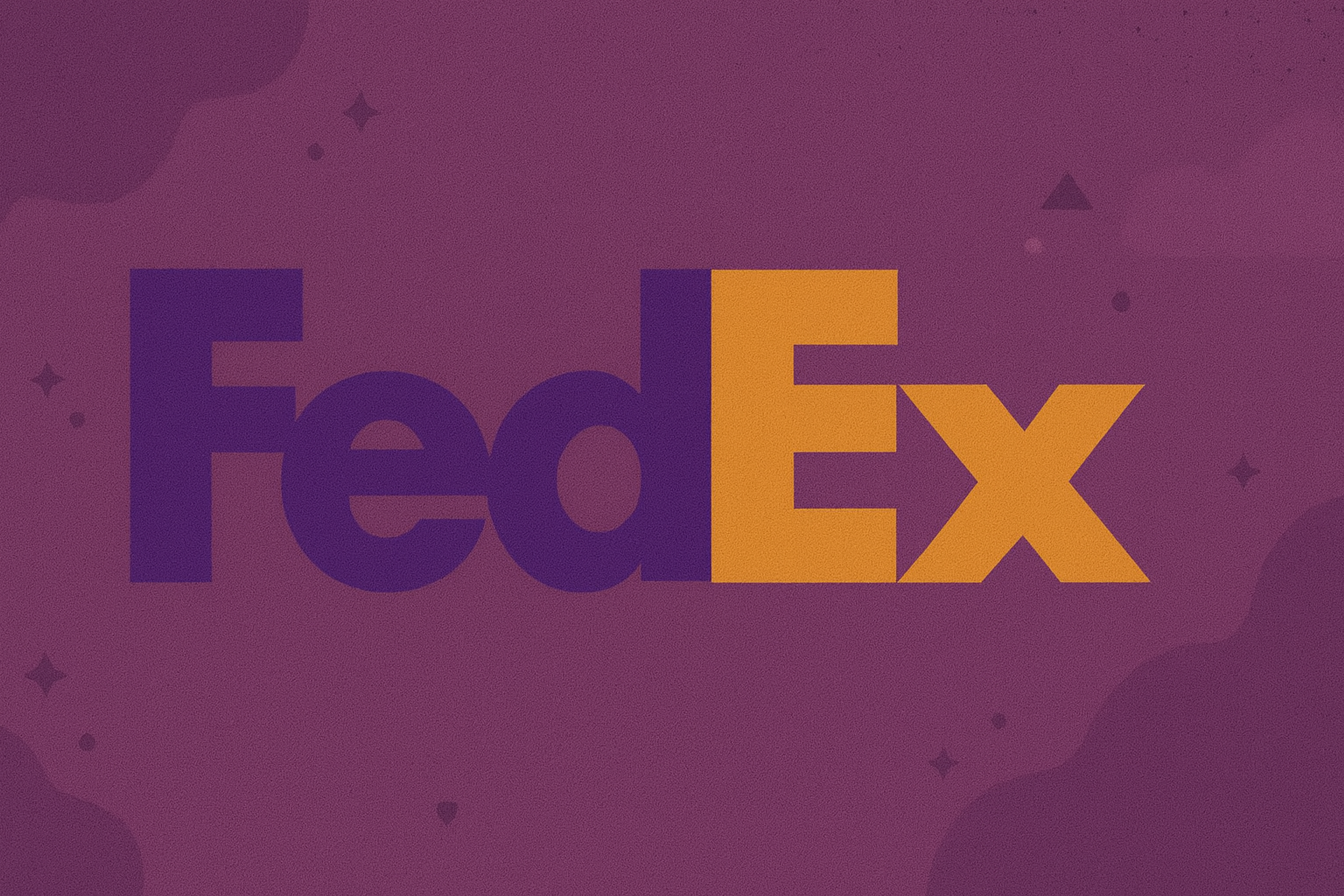
The FedEx wordmark hides an arrow between the “E” and “x.” It’s a textbook negative-space move: the symbol is created by precise letterforms, not by adding a graphic.
The arrow signals direction and momentum, which fits delivery. Compared with the more literal UPS shield, it’s quieter but often more “sticky” once spotted.
FedEx Logo
NBC Hidden Meaning
NBC’s peacock is famous for linking the brand to color television history. The fan of feathers turns a simple icon into a statement about spectacle and variety.
The white gaps between feathers create a clean, symmetric core, so the logo stays readable even as it evolves.
Pizza Hut Hidden Meaning
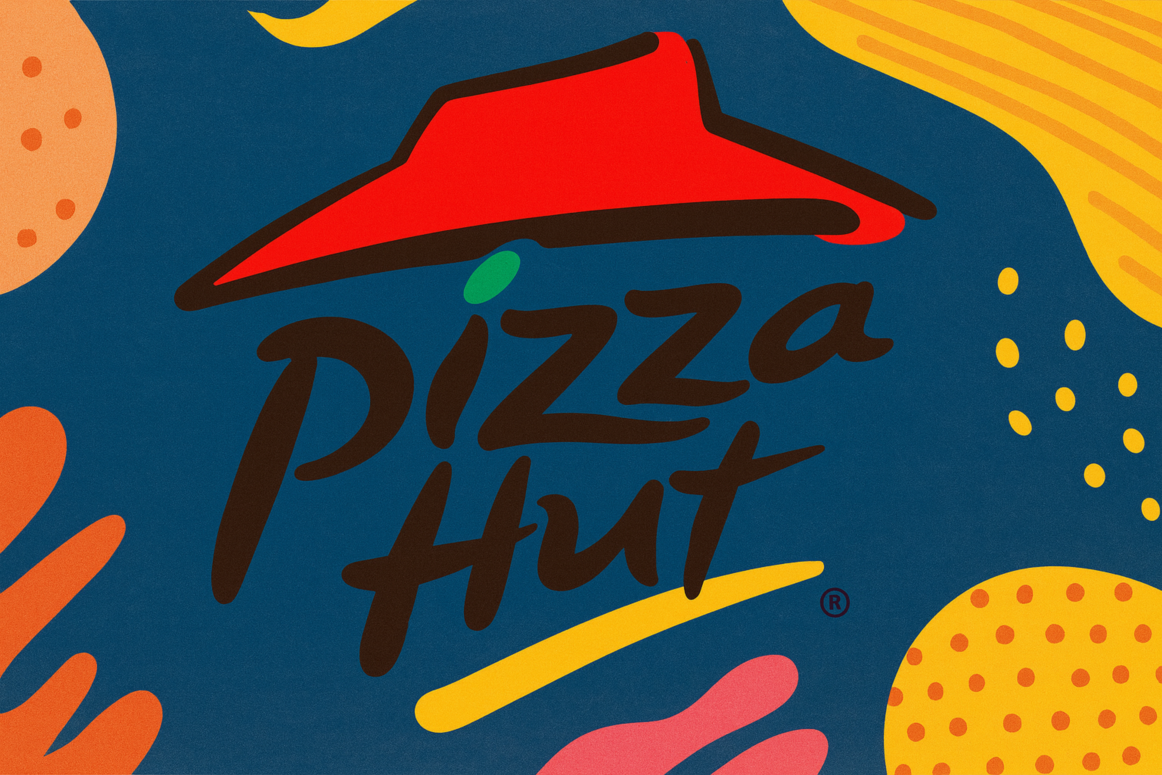
The signature red Pizza Hut logo connects to the company's history. The curved red shape is more than decoration; it depicts a roof.
This design pays tribute to the original Pizza Hut restaurants. The red-topped buildings defined early locations. The roof's shape creates nostalgia and reinforces the brand's heritage.
This element links the modern logo to the past while adapting to current design trends. It helps customers remember the dine-in experience that made Pizza Hut famous.
Pizza Hut Logo
London Symphony Orchestra Hidden Meaning
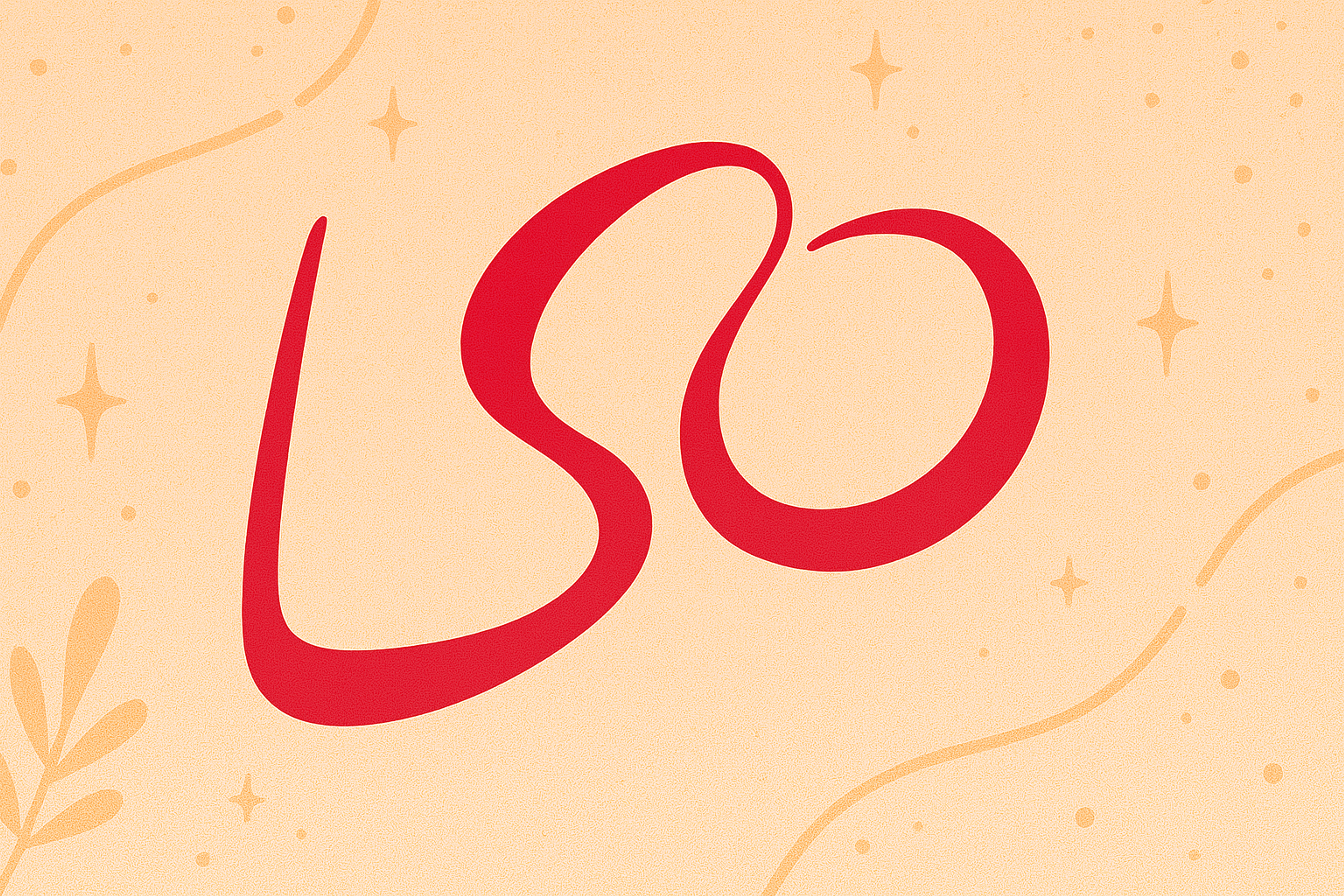
The London Symphony Orchestra logo combines simplicity with artistry. At first glance, it appears to be an abstract, flowing shape. Look closer and you'll see the letters LSO hidden inside.
The letters loop smoothly like a conductor's baton moving through the air. This represents music in motion. It captures rhythm and energy.
The flowing form reflects how classical music is performed, with emotion, freedom, and expression. The design brings passion and creativity to the brand identity.
London Symphony Orchestra Logo
Unilever
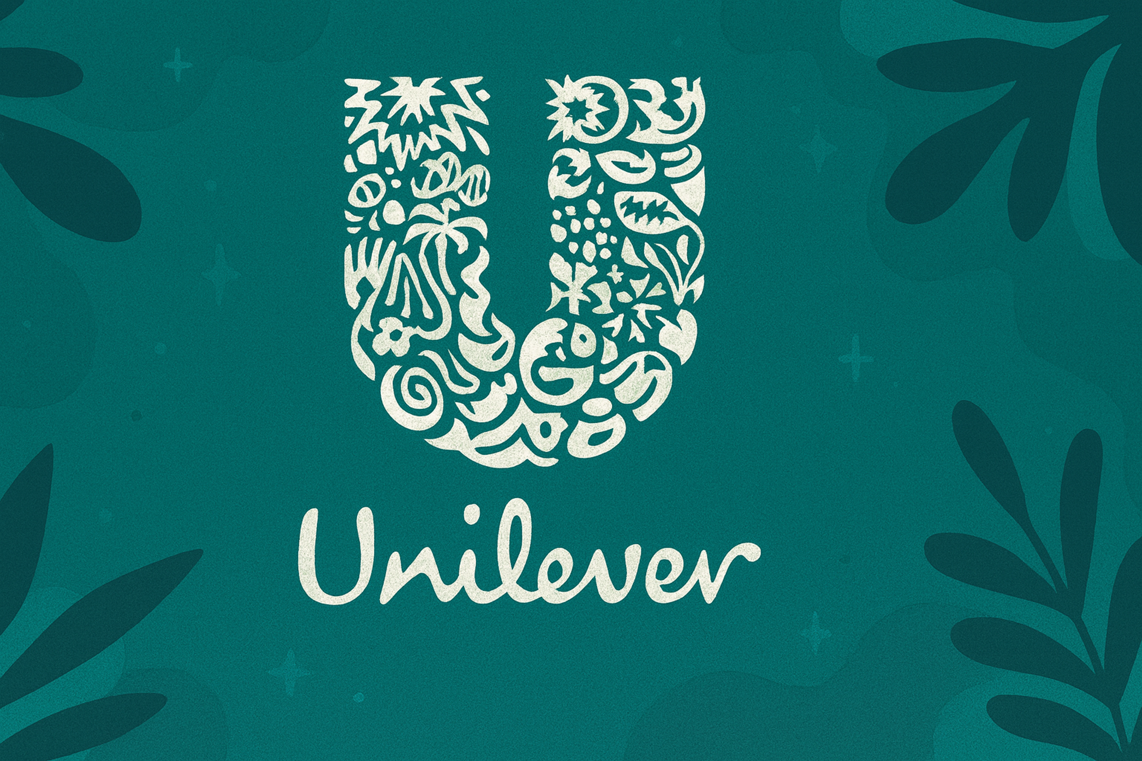
The Unilever logo appears to be a simple "U." Inside are 25 small icons representing the company's various activities.
These symbols show food, beauty, hygiene, nature, and innovation. A leaf represents sustainability. A spoon shows nutrition. A spark suggests new ideas. Together, they tell the story of a company improving daily life.
The blue color builds trust and care. It aligns with Unilever's goal to make sustainable living the norm. This innovative design conveys multiple meanings through a single, clear symbol.
Unilever Logo
Audi
The Audi logo shows four linked rings. Each one represents a company that merged in 1932 to form Auto Union: Audi, DKW, Horch, and Wanderer.
The rings symbolize teamwork and shared strength. They reflect precision in both engineering and design. The clean, modern look highlights Audi's focus on luxury and performance.
Whether in chrome or black, the rings look elegant and powerful. They stand for German quality and ongoing innovation. The four rings have become a symbol of the Audi brand and its reputation for excellence.
Audi Logo

Gillette
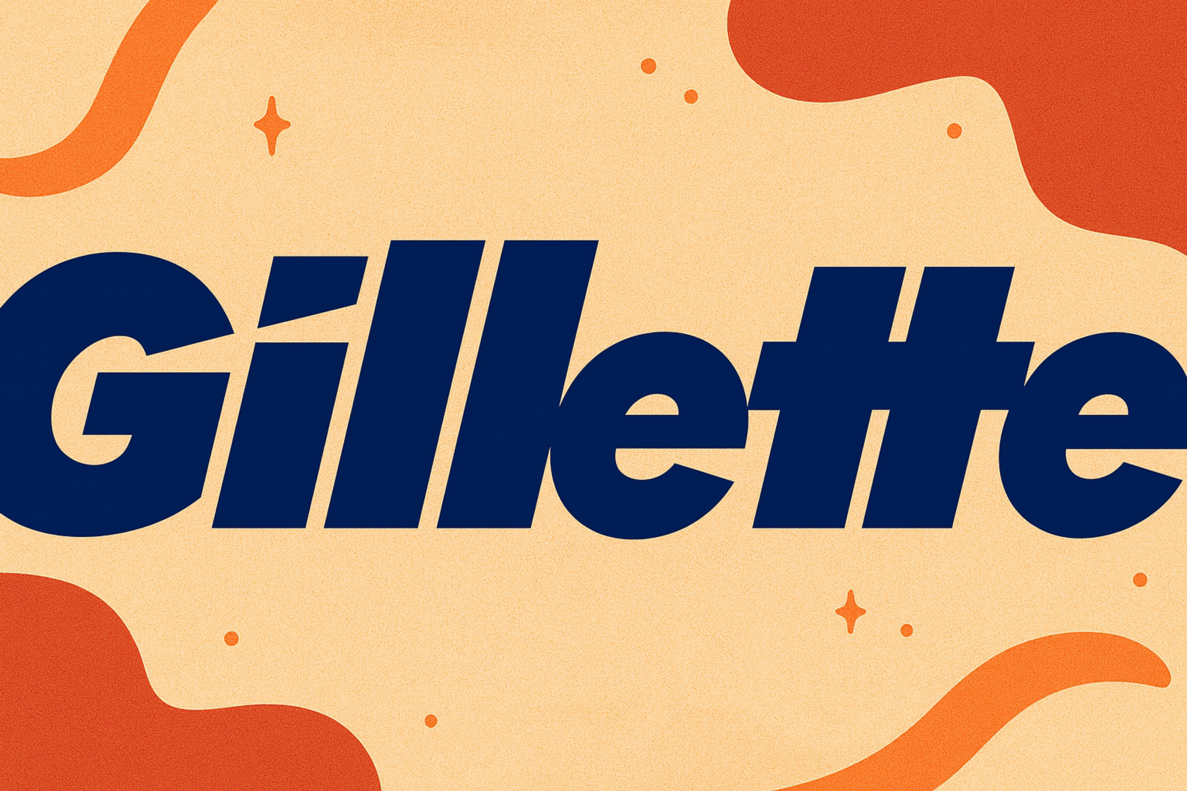
Gillette's logo highlights precision in design. The letters seem plain at first glance, but the G and I are sliced at an angle as if cut by a razor. The detail signals sharp efficiency and modern technology. It reflects Gillette's focus on cutting-edge grooming products.
The blue or metallic silver colors evoke trust and a sense of premium quality. Through a minimal yet robust design, the logo communicates sharpness and precision.
Gillette Logo
What Makes this Work, and What Breaks It
A hidden element helps only when it supports the brand’s story and stays functional. If it disappears at small sizes, needs perfect color, or distracts from legibility, it becomes a gimmick.
The best marks are discoverable, not confusing: you can miss the secret and still understand the logo.
Designers usually get there through iteration: many sketches, strict spacing control, testing in monochrome, and checking the mark at app-icon size before committing.
FAQ
What Are 7 types of Logos?
Wordmarks use the full name, like Google. Lettermarks use initials, like IBM. Brandmarks are symbol-only icons. Combination marks mix text and symbol, like Adidas often does.
Emblems place text inside a badge, like Starbucks. Mascots use a character, like KFC with Colonel Sanders. Abstract marks are non-literal symbols, like the Nike swoosh.
What Is the World's Best Logo?
There isn’t a single “best.” The most praised logos tend to be simple, scalable, and emotionally consistent over time. People often cite the Apple mark as an example of that kind of clarity, but “best” depends on the brand’s goals and context.
What Are the 7 Elements of a Logo?
Shape, color, typography, iconography, spacing, scalability, and originality. You want the mark to hold up in one color, at small sizes, and across different mediums.
What Are Gestalt Principles in Logo Design?
Gestalt principles are psychological rules that guide how the brain perceives visual information. They explain why we see hidden shapes in negative space, because our brains naturally complete patterns and find meaning in visual elements.
Read more:
Conclusion
A logo is a quiet ambassador. Hidden meanings can make that ambassador more persuasive by adding a second layer of storytelling without adding clutter. When the secret supports the brand and survives real-world use, it turns a simple mark into something people remember and want to share.

About Clay
Clay is a UI/UX design & branding agency in San Francisco. We team up with startups and leading brands to create transformative digital experience. Clients: Facebook, Slack, Google, Amazon, Credit Karma, Zenefits, etc.
Learn more

About Clay
Clay is a UI/UX design & branding agency in San Francisco. We team up with startups and leading brands to create transformative digital experience. Clients: Facebook, Slack, Google, Amazon, Credit Karma, Zenefits, etc.
Learn more


