Some websites feel right. You know where to click, what to read next, and how everything connects. This is not luck. It is Gestalt psychology at work, since the human brain naturally seeks patterns and connections.
In 2026, Gestalt principles matter even more because interfaces have become more adaptive and more dynamic. Content changes in real time, layouts respond to context, and AI features introduce new UI states that didn’t exist a few years ago.
Gestalt is also one of the fastest ways to keep clarity across a product ecosystem. Design systems, tokenized UI, and responsive components make it easier to stay consistent, but they also make inconsistency more visible when patterns break.
Understanding Gestalt Principles
Gestalt principles explain how people see and process visual information. They describe our brains' natural patterns when looking at images, layouts, and interfaces.
How users interpret visuals depends on mental models, experience, prior knowledge, and cultural context.
In modern products, visual information includes motion, progressive disclosure, personalization, and system feedback. Users interpret changing states like loading, errors, confirmations, and AI suggestions, so Gestalt principles help keep a stable mental model even in a fluid UI.
Gestalt also supports accessibility and performance: clear grouping lowers cognitive load, strong figure/ground improves focus and readability, and predictable continuity makes navigation feel effortless.
Source: Image by Rosenfeld Media on Flickr
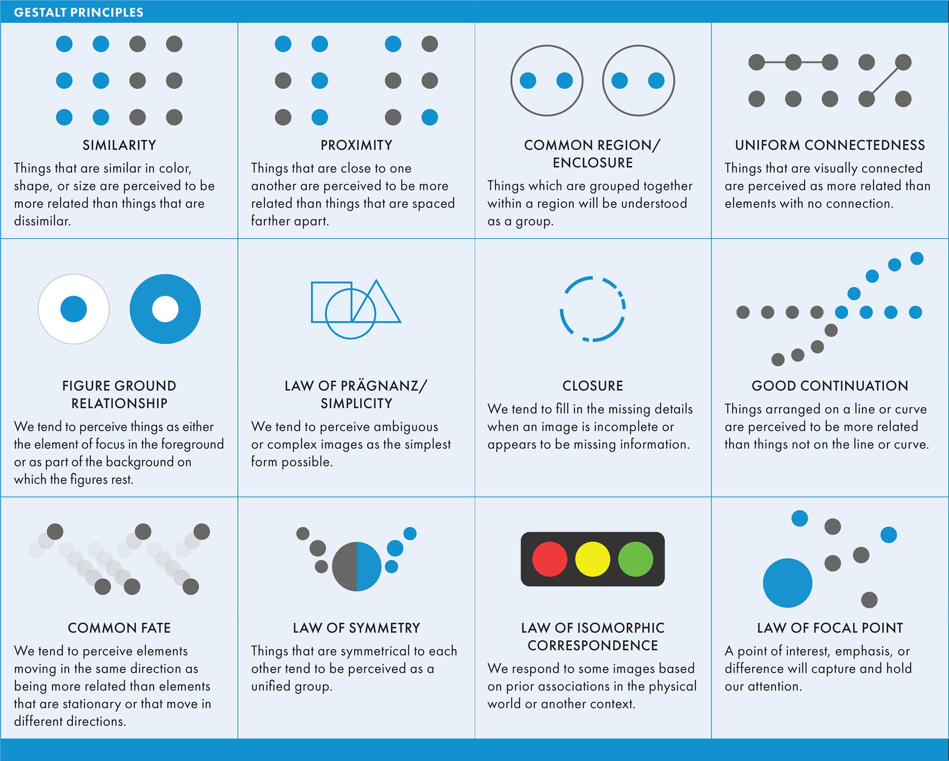
The Five Core Principles
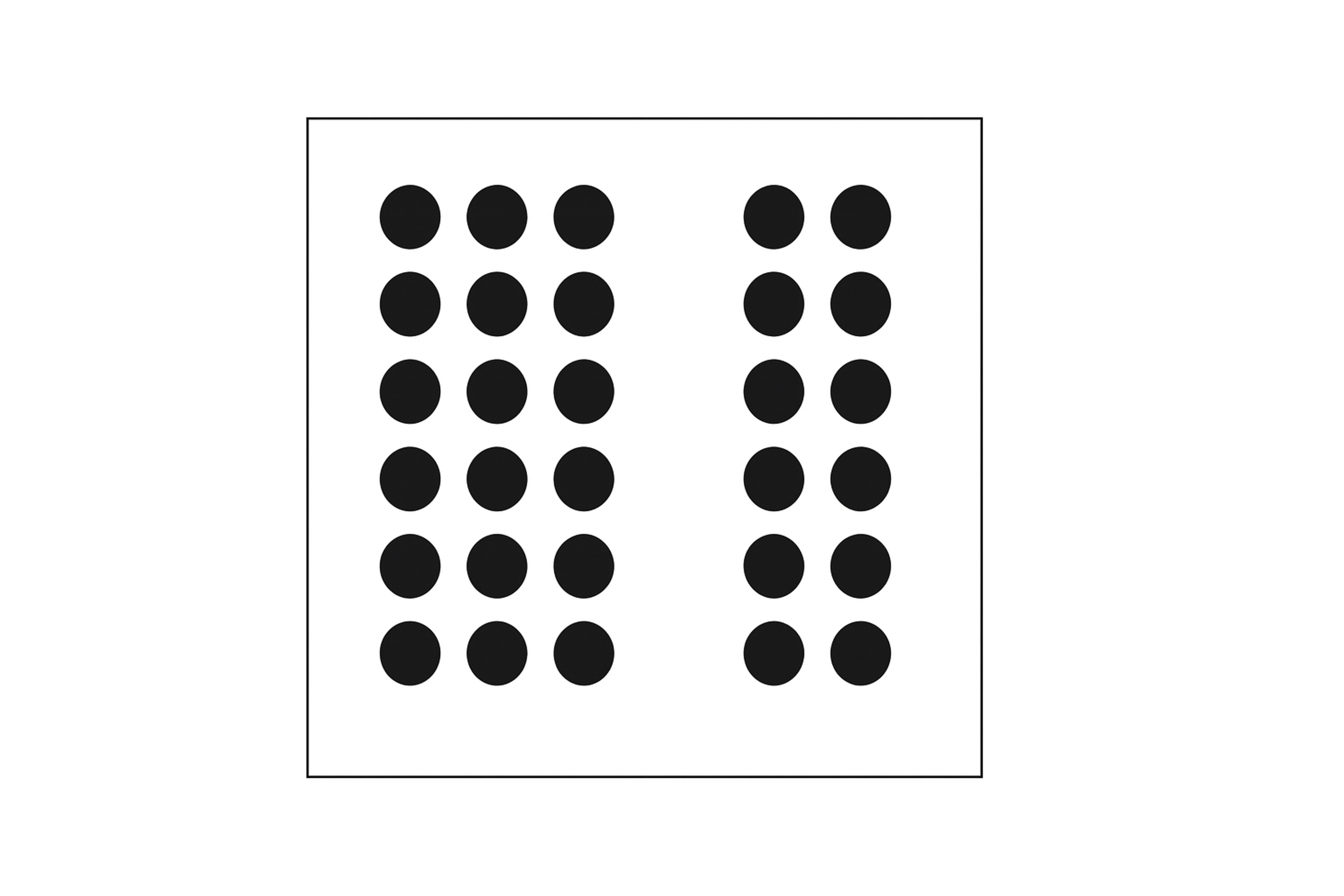
Proximity
Proximity means placing related items close together so people instantly perceive them as one group. This lowers cognitive load and speeds up scanning, which is why things like nav links, form labels with inputs, and product cards by category should sit near each other.
In 2026, proximity also has to survive responsive reflow and dynamic pages where personalization inserts modules. Treat spacing as a system, then test it with real content length, localization, and different UI states so related elements don’t drift apart and the interface stays trustworthy.
Source: Alba Arcalís Martínez, CC BY-SA 4.0 via Wikimedia Commons
Similarity
Use consistent colors, shapes, and sizes to show connections. When elements look alike, users know they serve similar purposes. The similarity principle is fundamental in design, where identical elements are perceived as belonging to the same group.
Brand consistency builds on this principle. All your buttons should share the same style. Icons representing related features should match.
Using consistent design elements, such as color and shape, helps users quickly identify which items belong together and establishes a clear visual hierarchy. And which are part of separate groups. Blue might signal all clickable links, while green confirms success messages.
Source: veeble

Similarity helps users predict how things work. Once they learn one pattern, they can apply it everywhere.
Closure
Our brains complete incomplete shapes automatically. This is known as the closure principle, where we perceive a complete shape even when parts are missing.
For example, in logo design, the closure principle is often used to create memorable logos by leveraging our tendency to fill in gaps, making it an excellent example of this design strategy.
An example is the WWF panda logo, which is a good example of using ambiguous shapes to suggest a complete image. A simple example is seeing a circle even when parts are missing. Designers use this to create cleaner, simpler interfaces.
Loading animations often show partial progress indicators. Users mentally fill in the gaps, helping to understand how individual elements can be represented together. Logos leverage negative space. The hamburger menu icon suggests a list without drawing every line.
Source: Ank Kumar, CC BY-SA 4.0 via Wikimedia Commons

Closure reduces visual clutter while maintaining clarity. You need fewer elements to communicate the same message.
Continuity Principle
Elements flowing in the same direction create a natural path for the eye. According to the continuity principle, arranging visual elements along continuous lines or a straight line helps guide the viewer's eye seamlessly through the design.
Scroll animations pull users down the page, progress bars show steps in a process, and image carousels move horizontally to display multiple items. Each technique uses continuity to maintain focus and rhythm. Aligning elements along parallel lines or curves also helps maintain visual flow and organization.
Source: freesvg

When your design has good continuity, users move through it smoothly. They don't get lost or confused about where to go next.
Figure/Ground
This principle separates foreground from background. The figure-ground principle explains how viewers distinguish objects (the figure) from their surroundings (the ground) using positive and negative space. This use of space helps users focus on what matters most while other elements fade away.
Modal windows dim the background content. Hero sections use bold, stand-out imagery. Popups appear against blurred backgrounds.
The focal point principle often draws attention to essential elements, such as a search bar, by making them stand out against their background. Each technique creates a clear visual hierarchy.
Source: Brocken Inaglory, CC BY-SA 3.0 via Wikimedia Commons
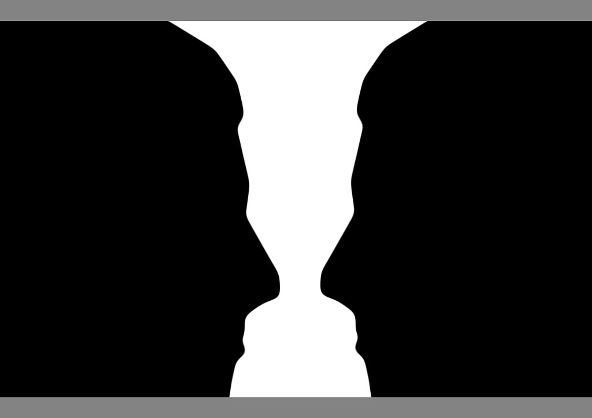
Managing figure/ground relationships prevents overcrowded designs. Users know exactly where to look.
Creating a Visual Hierarchy with Gestalt Principles
Visual hierarchy guides attention to essential elements first. Establishing a focal point is a key design strategy for capturing the viewer's attention. Gestalt principles provide the tools to build this hierarchy effectively.
Start with similarity to group-related items. Use the same colors or shapes to show connections. Apply continuity to lead users through sequences. Help them see the path from start to finish.
Proximity organizes information into digestible chunks. Closure lets you communicate more with less. Figure/ground separates primary content from supporting elements.
These principles work together to create clear pathways through your design. A well-placed call-to-action button can be the focal point in a layout, guiding the viewer's eye to the most essential action. Users focus on critical information without getting distracted by secondary details.
Guiding User Attention
Understanding how people process visual information gives you control over their experience. You can direct their eyes exactly where you want them to go, taking into account their personal experiences. Visual cues on a web page help draw attention to key elements and keep users engaged.
Group related elements using proximity. This makes scanning easier. Create visual flow with continuity. Naturally lead users from one section to the next.
Use figure/ground contrast to highlight important information. Make key elements stand out against their surroundings. Apply similarity to establish patterns users can recognize and follow.
Each principle serves as a tool for directing attention. Use them intentionally to create smooth, intuitive navigation. These techniques guide attention and increase user engagement by making navigation more intuitive.
Implementation Guidelines for Gestalt Principles
Implementation Best Practices
Apply Gestalt principles intentionally: group related elements with proximity and use closure to reduce clutter.
Validate decisions with wireframes/prototypes and real user testing, then iterate based on feedback and users’ mental models.
Keep usability and accessibility strong: clear CTAs, high contrast, logical forms, and WCAG basics (contrast, alt text, keyboard navigation, captions).
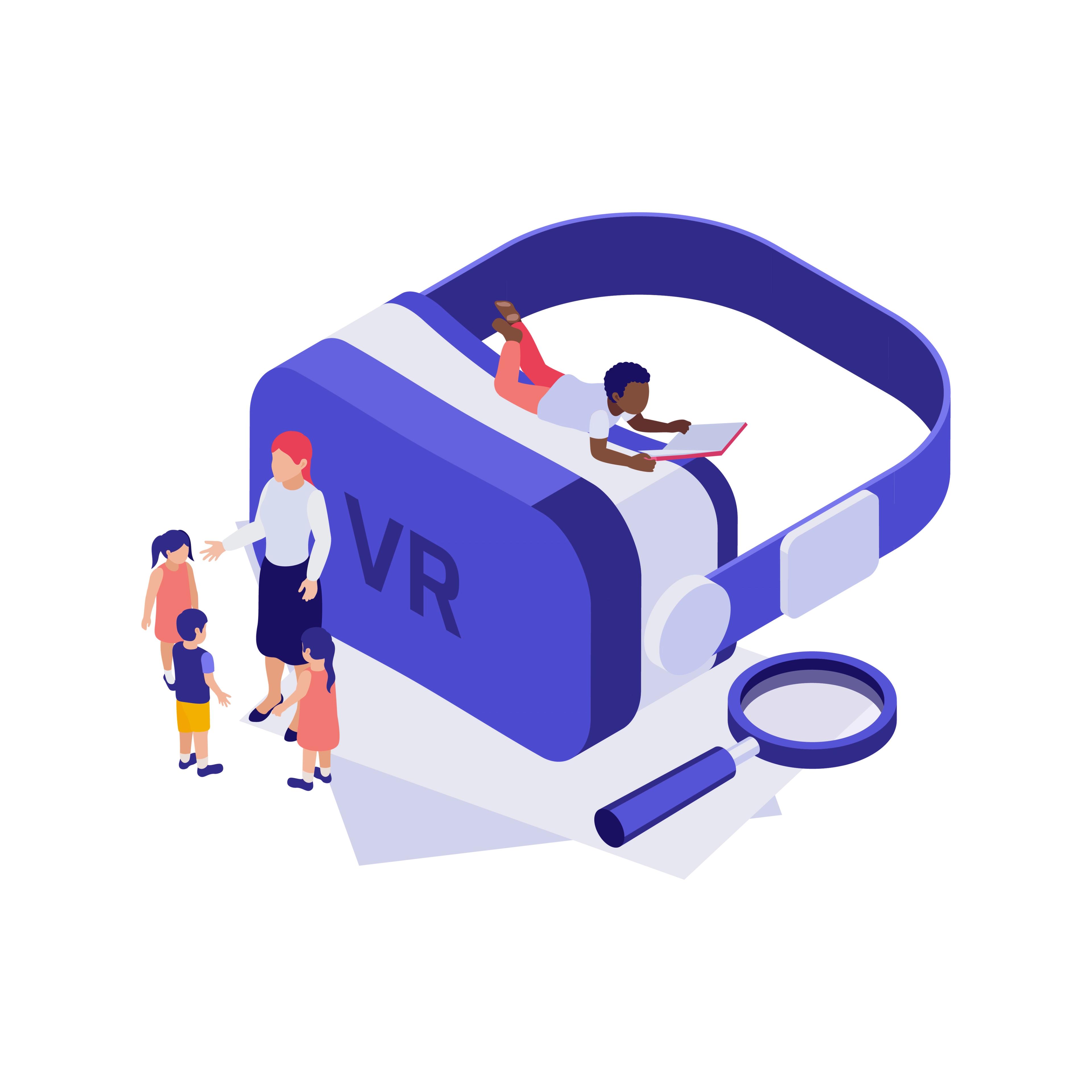
Future Applications
Gestalt principles will keep mattering as interfaces become more responsive and technology-driven.
In VR/AR, they help organize 3D space and relationships so immersive UIs stay clear and usable. In motion-heavy products, the common fate principle is key: elements that move together feel related, while contrasting motion can direct attention.
AI design tools will increasingly embed Gestalt rules into automated layout generation, helping produce coherent, user-centered screens faster.
Source: Image by macrovector on Freepik
FAQ
What Is Gestalt In Simple Words?
Gestalt means "whole," a concept that strongly resonates within the design world. In design, it explains how people naturally group visual elements to see patterns and meaning rather than separate parts.
What Are Gestalt Principles In Design?
Gestalt principles describe how users perceive structure and relationships in visuals. They help designers create balance, clarity, and hierarchy in layouts.
What Are The 7 Laws Of Gestalt?
The main Gestalt laws are Proximity, Similarity, Continuity, Closure, Figure-Ground, Common Fate, and Symmetry. Each explains how humans visually organize and connect elements.
What Is The Gestalt Theory? Explained.
Gestalt theory states that the whole is perceived as more than the sum of its parts. It's how people interpret visual relationships to make sense of complex information.
Read more:
Conclusion
Gestalt principles explain how people naturally perceive and organize visual information, and they give designers a practical framework for building interfaces that feel intuitive, structured, and easy to use.
Use them intentionally, not just for aesthetics. When design matches human perception, it guides attention and makes complexity feel simple.
In 2026, this matters even more because UI has to stay clear under pressure: personalization, motion, real-time updates, and AI-driven states. Gestalt principles help maintain that stability across screens, contexts, and changing content.

About Clay
Clay is a UI/UX design & branding agency in San Francisco. We team up with startups and leading brands to create transformative digital experience. Clients: Facebook, Slack, Google, Amazon, Credit Karma, Zenefits, etc.
Learn moreAbout Clay
Clay is a UI/UX design & branding agency in San Francisco. We team up with startups and leading brands to create transformative digital experience. Clients: Facebook, Slack, Google, Amazon, Credit Karma, Zenefits, etc.
Learn more