
Your brand is a business tool. It shapes growth and influences how people choose you.
This matters for new companies and established ones. A strong brand can lift conversion, retention, and referrals. It can also support pricing power and trust.
Great brands do not happen by accident. Teams build them with clear goals and clear choices. They align what the business needs with what customers feel.
Strategic branding also needs feedback. You measure what works. You fix what does not. Over time, your brand becomes an asset that creates value.
What Strategic Branding Really Means
Strategic branding is not just design. It is a system for building brand value on purpose.
You define what you stand for and who you serve. You choose a clear position in the market. You turn that position into messages, visuals, and experiences.
Then you make those choices consistent. You apply them across the product, marketing, sales, and support. Each touchpoint should reinforce the same idea.
Basic branding focuses on how things look. Strategic branding focuses on what the brand does for the business. It connects brand decisions to outcomes you can track, like conversion, retention, and trust.
Strategic branding also uses psychology. People choose with emotion and justify with logic. When you understand this, you design experiences that feel right. That is how loyalty grows.
Consumer Brand Loyalty Behaviors

The Strategic Branding Framework
To build a brand system, use a simple framework with four layers.
- The Foundation layer defines strategy, mission, and value promise. It sets direction and boundaries.
- The Psychology layer defines personality and emotional cues. It shapes how people feel about you.
- The Execution layer turns the plan into reality. It covers identity, messaging, and digital presence.
- The Optimization layer keeps the brand healthy. It measures perception and performance. It supports continuous improvement.
Each layer supports the next one. Together, they help you build recognition now and brand value over time.
Branding Elements by Clay
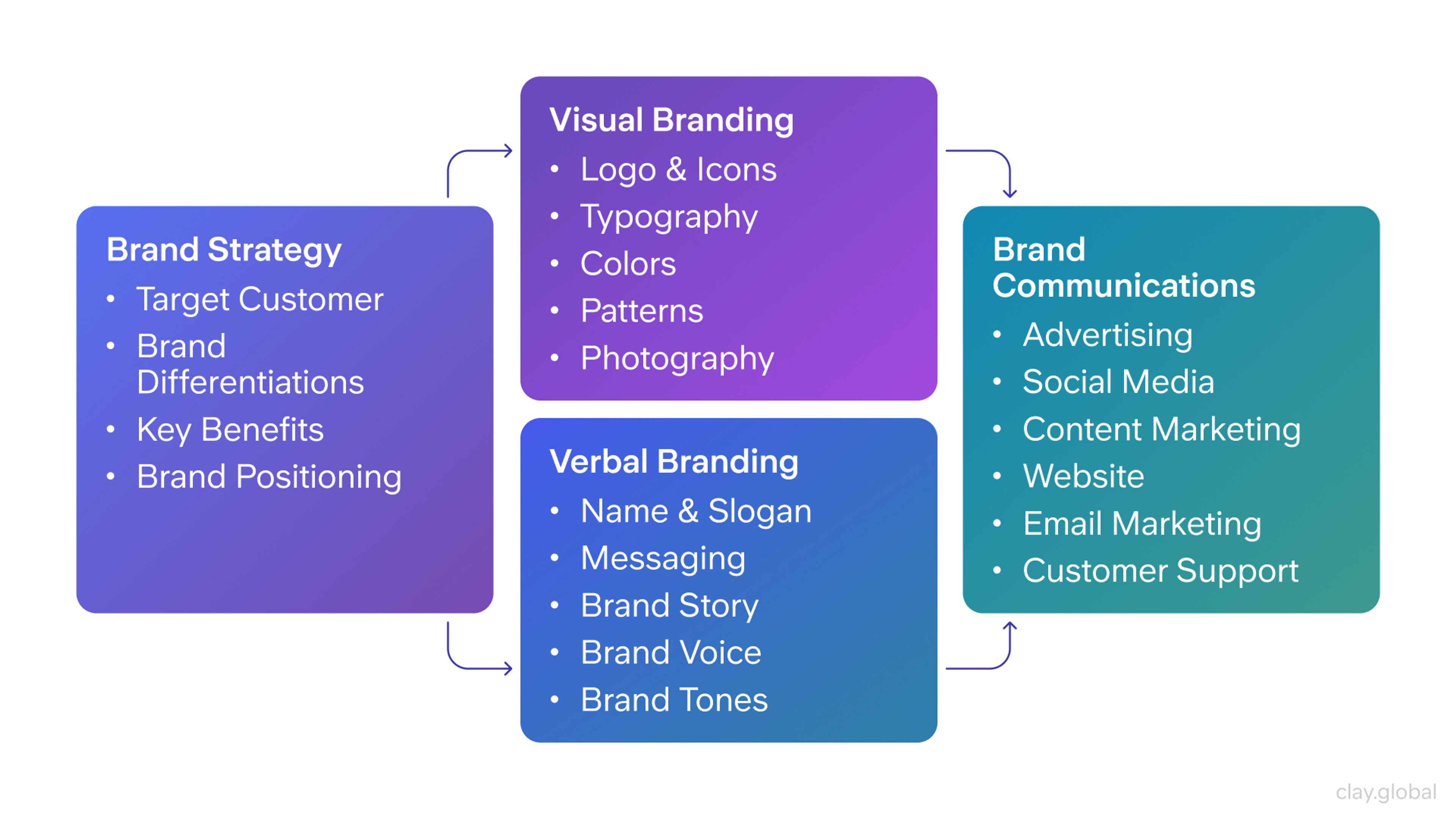
Top 12 Brand Design Tips for Building Customer Loyalty
A business needs more than just a great product to build lasting brand loyalty. A unified identity, compelling branding, and a smooth, satisfying customer experience all shape how people connect with your brand.
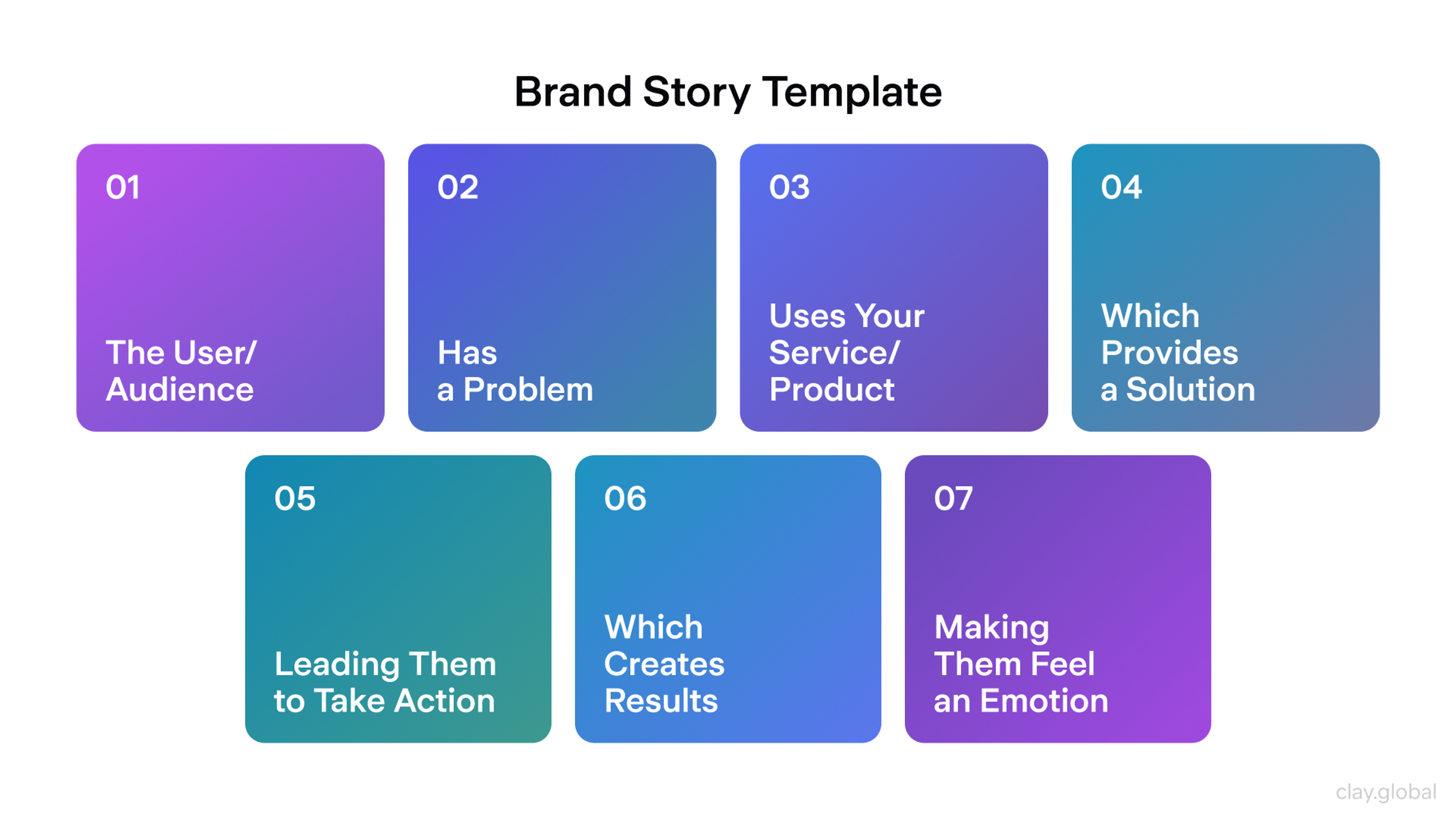
1. Brand Storytelling and Narrative Strategy
Effective brand storytelling requires developing complete narrative strategies. These communicate brand purpose, values, and what makes you different while creating emotional connections that drive brand loyalty.
Strategic Brand Narrative Development
Building compelling brand narratives involves identifying your brand's unique story. You develop characters and themes that connect with your audience.
You create story frameworks that can be adapted across different contexts and media. Strategic narratives support brand positioning while creating emotional engagement.
Content Strategy and Brand Storytelling
Developing systematic approaches to brand storytelling ensures a consistent narrative across all brand communications. This involves creating content pillars that support brand strategy.
You also develop storytelling frameworks that scale across teams and measure narrative effectiveness through engagement and brand perception metrics.
Brand Story Template by Clay
Authentic Story Integration
Authentic brand storytelling requires aligning brand narratives with actual business practices and values. This means making sure that brand stories reflect genuine brand culture.
Narrative promises get supported by brand delivery, and storytelling evolves authentically as brands grow and change.
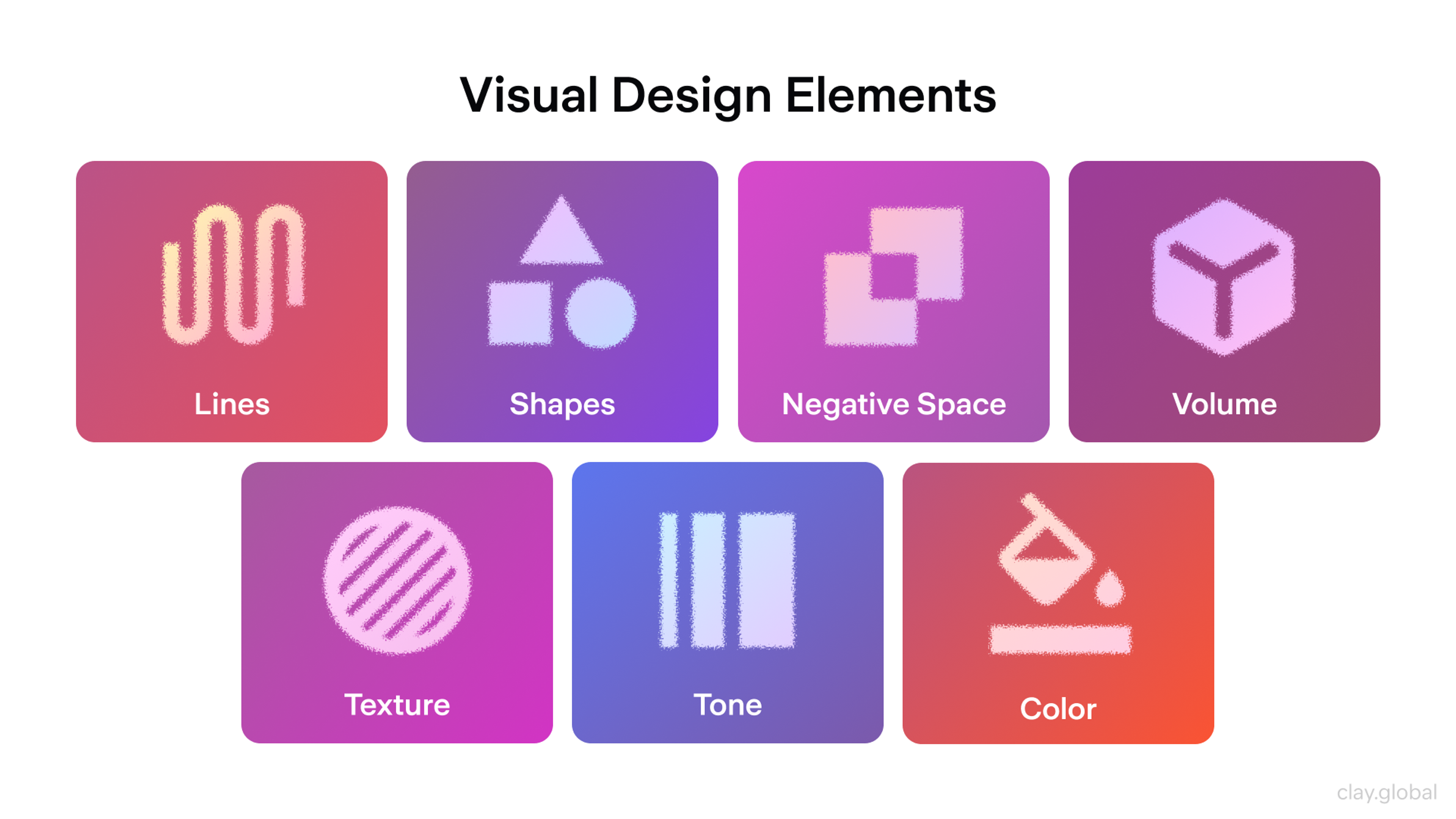
2. Visual Identity and Design Excellence
Strategic branding includes much more than visual design, but exceptional visual identity remains crucial for brand recognition and emotional connection. Strategic visual identity design goes beyond looks to create systematic visual languages that support brand goals.
Visual Design Elements by Clay
Strategic Visual Identity Systems
Developing complete visual identity systems involves creating flexible design languages. These maintain brand consistency while adapting to different contexts and applications.
It includes establishing visual hierarchies, creating scalable design systems, and developing brand visualization techniques that enhance brand recognition.
Advanced Design Methods
Applying design thinking methods to brand development creates more user-centered and strategically effective brand experiences. This systematic approach to design makes sure that visual decisions support both user needs and business goals.
Typography and Visual Metaphor Strategy
Strategic typography choices go beyond looks to support brand personality and improve user experience. Similarly, developing visual metaphors helps communicate complex brand concepts through accessible visual language. This makes your brand more memorable and understandable.
For instance, CafePay’s rebranding approach is an excellent example of doing simple things the right way.
The custom typeface selected for the verb and the logotype of the clock seem more professional than the former, which means that the core business message of the brand became more straightforward to comprehend - the brand deals with payroll management and is pretty reliable.
CafePay webiste by Clay
Using Color Effectively in Design
When setting a color strategy, consider basic color theory, culture, and practical elements to create a cohesive color palette that establishes a strong visual identity.
Consider the accessibility of certain color selections by tabs, how colors are multiplied on different media, and how colors are culturally diversified.
Color Wheel Illustration by Clay
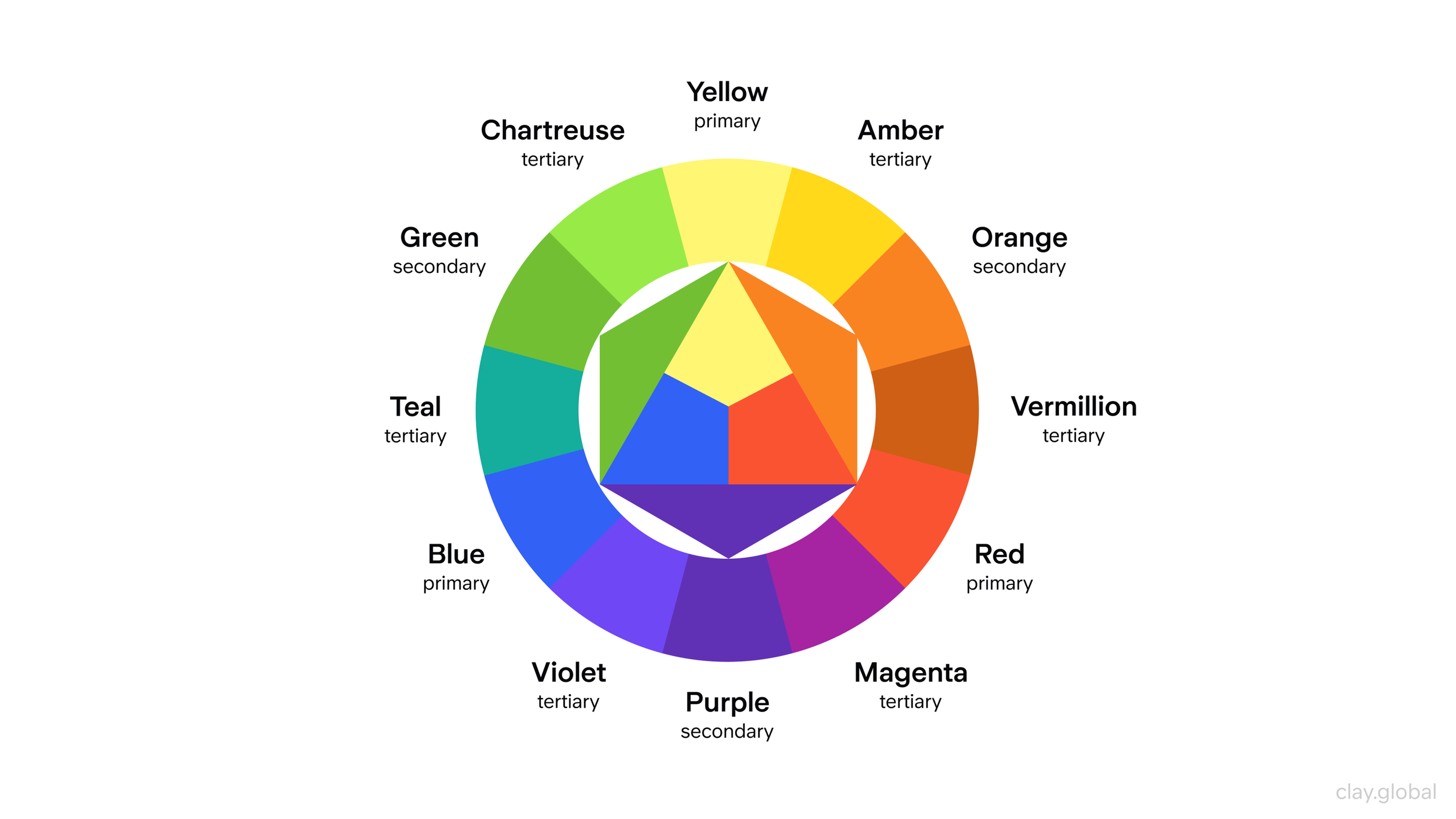
Choosing color also addresses the market - the color schemes of a luxury brand differ from those of a budget brand. Everyday and supportive palettes should be set and modified, along with rules for different applications and situations.
3. Brand Psychology and Emotional Intelligence
Understanding the psychological reasons behind brand preference helps create brands that connect deeply with audiences. Brand psychology combines insights from behavioral psychology and cognitive science to create more effective branding strategies.
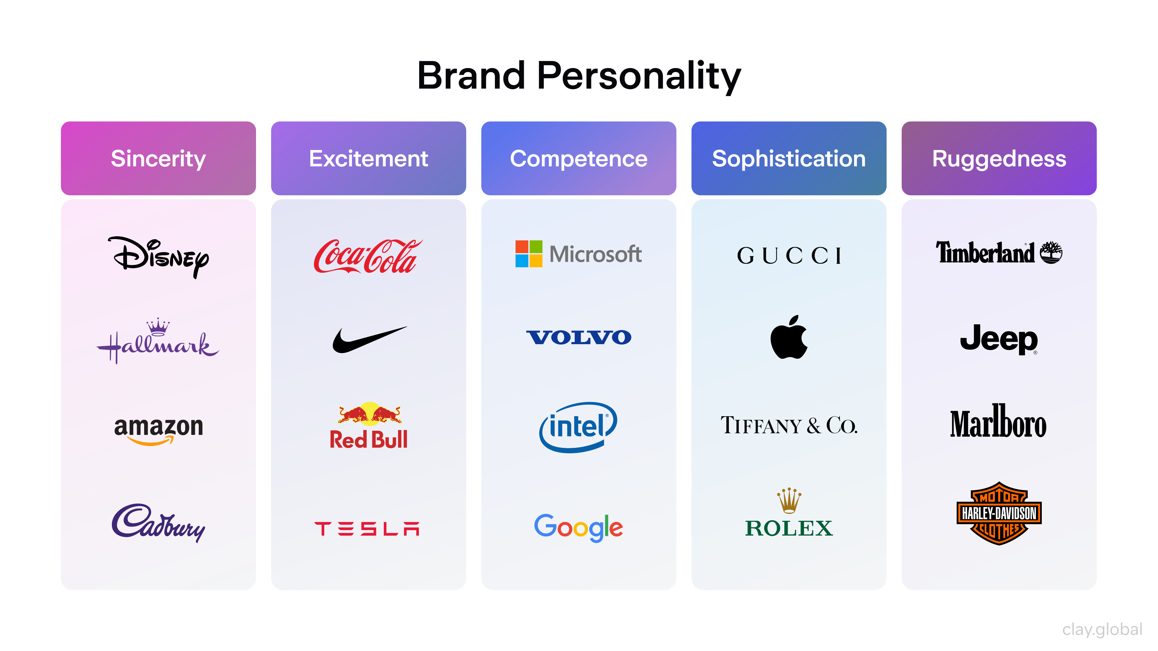
Brand Personality and Types
Brand personality types give psychological frameworks that help audiences instantly understand and connect with your brand. Whether your brand acts like the Hero, Sage, Creator, or another type, this foundation guides all brand communications. It helps create consistent brand personality across all touchpoints.
Brand Personality Examples by Clay
Brand Emotional Intelligence
Developing brand emotional intelligence means understanding not just what your audience thinks but also how they feel and why they make decisions. This involves analyzing emotional triggers and cultural contexts.
You develop brand empathy that lets you respond authentically to audience needs and concerns.
Design Psychology Rules
Every design element triggers psychological responses, including color choice, typography, and layout. Understanding design psychology lets you make intentional choices that support your brand strategy.
You can use color psychology to create emotional impact, typography to express personality, and visual hierarchy to guide decision-making.
Benefits of Emotional Branding

Brands can create such bonds through many touchpoints, such as product design, packaging, customer service, social media, and even community engagement. Effective brand development is essential in creating a cohesive brand identity that resonates with target audiences.
Customers want to feel appreciated and understood, not as a mere number but as an integral and valued part of the brand and its community.
4. Consistency and Brand Guidelines
Brand consistency requires more than style guides. It demands complete brand management systems that make sure you have strategic alignment across all brand expressions while maintaining flexibility for different contexts and applications.
Complete Brand Guidelines Development
Strategic brand guidelines include brand strategy documentation, visual identity standards, communication principles, and application examples across multiple contexts. These guidelines work as strategic tools that help teams make brand-aligned decisions while maintaining consistency.
Brand Management and Control
Implementing effective brand management involves creating organizational processes that support brand consistency. You train teams on brand application and establish quality control systems that maintain brand standards across all touchpoints.
Digital Assets, Online Style Guides, and Online Collaboration

Brand Coordination Systems
Developing brand coordination systems makes sure that all brand expressions work together to strengthen brand positioning and support business goals. This involves coordinating marketing campaigns, aligning internal communications, and maintaining consistency across different business units and locations.
5. Brand Communication and Messaging Strategy
Strategic brand communication requires developing complete communication strategies that deliver consistent brand messaging across all touchpoints while adapting to different contexts and audiences.
Brand Language and Voice Development
Your brand language includes more than tone of voice. It includes your brand vocabulary, messaging frameworks, and communication principles. Developing consistent brand language helps create recognition and build brand trust through predictable, authentic communication.
Strategic Content and Messaging
Brand messaging strategy involves creating systematic approaches to content creation. This reinforces your brand positioning while delivering value to your audience. You develop messaging hierarchies, content pillars, and communication calendars that support both brand building and business goals.
Corporate and Marketing Communication Alignment
Making sure corporate messaging and marketing communication align prevents brand confusion and strengthens overall brand credibility. This involves coordinating internal and external communications. You align leadership messaging with brand strategy and maintain consistency across all organizational communications.
6. Client Security
In today’s world, security comprises much more than protecting data. It involves installing cybersecurity measures, employing governance mechanisms, and allowing customers more control over their data.
A clear mission statement can guide the implementation of security measures that align with the company's values and customer expectations.
Mission Statement vs Vision Statement
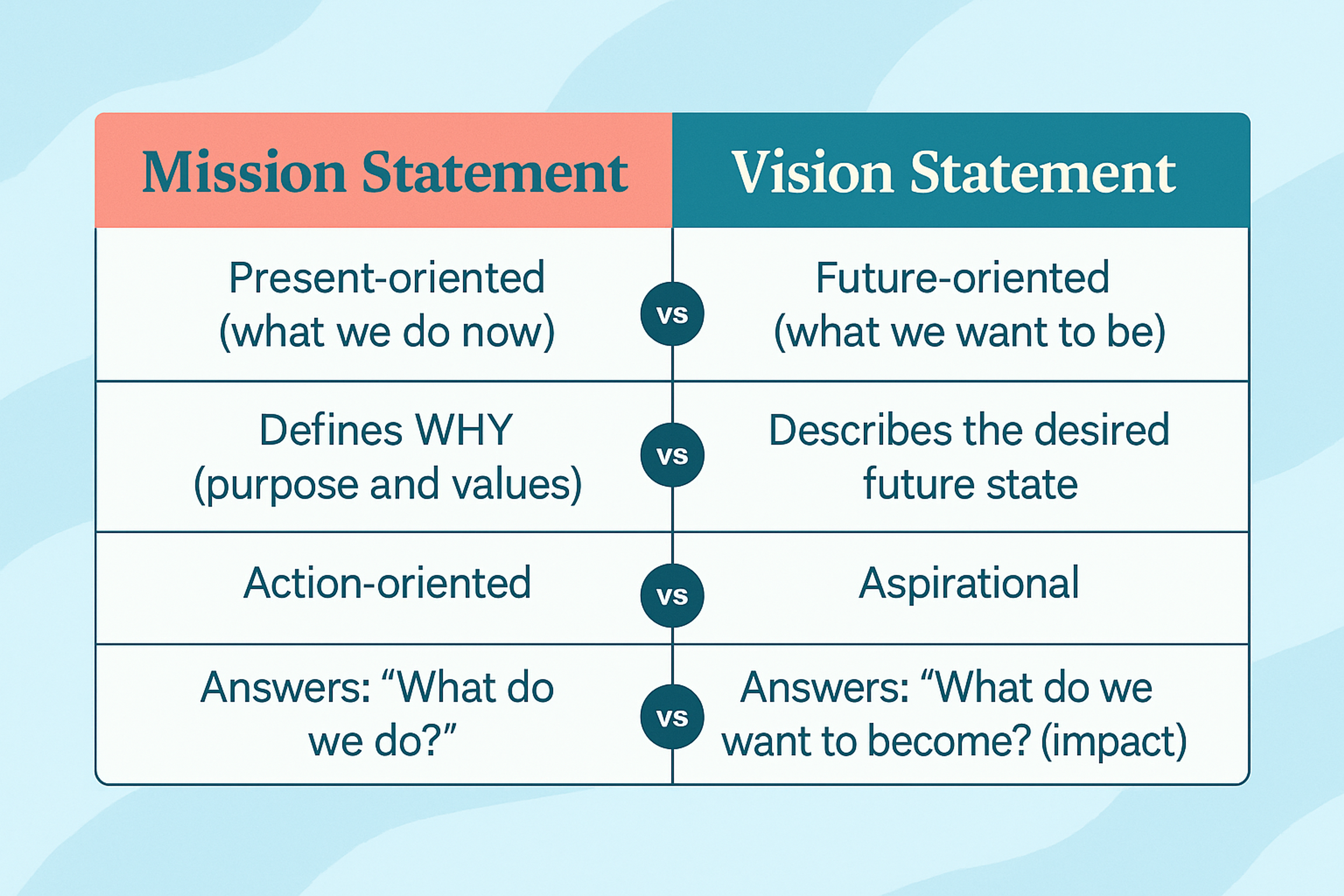
Security will probably entail multi-factor authentication, end-to-end encryption, frequent security audits, and defined data handling practices.
In addition, companies should have appropriate communication strategies regarding security issues and containment measures for anticipated security breaches.
7. Digital Brand Strategy and Presence
Modern branding requires sophisticated digital brand strategies. These create cohesive experiences across all digital touchpoints while using digital-specific opportunities for brand building and audience engagement.
Complete Digital Branding
Digital branding includes more than social media presence. It includes website experience design, digital content strategy, online brand reputation management, and digital customer journey optimization. Strategic digital branding makes sure you have consistent brand experience across all digital touchpoints.
Digital Brand Presence Optimization
Optimizing your digital brand presence involves creating strategic content and optimizing search engines for brand terms. It also includes developing a social media strategy and using digital advertising to reinforce brand positioning.
It requires understanding how different digital platforms affect brand perception and adapting your approach accordingly.
Technology Integration Strategy
Modern brands must integrate branding considerations into technology decisions. This covers everything from website structure to app design to new technology adoption. Technological innovations must support rather than undermine brand strategy and customer experience.
8. Customer Experience and Journey Mapping
Strategic branding requires a complete understanding of the customer journey. You need systematic optimization of brand touchpoints to create exceptional experiences that build brand loyalty and drive business results.
Brand Customer Journey Development
Mapping the complete customer journey from awareness to advocacy lets brands identify optimization opportunities. It makes sure you have a consistent brand experience across all touchpoints. This involves analyzing both digital and physical interactions, understanding emotional journey progression, and optimizing each stage for maximum brand impact.
Brand Touchpoint Optimization
Every customer interaction with your brand gives you a chance to strengthen brand positioning and build brand value. Strategic touchpoint optimization involves checking all brand interactions, finding improvement opportunities, and systematically enhancing each touchpoint to support brand goals.
Experience Design Integration
Integrating brand strategy with experience design creates more cohesive and impactful customer experiences. This involves ensuring that brand personality comes through in user interface design. Brand values are reflected in customer service interactions, and brand promises are fulfilled through actual experience delivery.
9. Brand Measurement and Analytics
Strategic branding requires systematic measurement and continuous optimization based on data-driven insights. Modern brand measurement goes beyond traditional metrics to include complete brand value assessment and predictive analytics.
Brand Value Measurement Systems
Developing complete brand value measurement involves tracking brand awareness, perception, preference, and loyalty. You use both quantitative and qualitative research methods. This includes establishing baseline measurements, tracking competitive positioning, and measuring how brand value impacts business performance.
Brand Sentiment Analysis and Monitoring
Implementing systematic brand sentiment analysis lets brands understand how audiences perceive and discuss their brand across all channels. This involves social media monitoring, review analysis, customer feedback collection, and sentiment trend analysis that informs brand strategy adjustments.
UX Design Metrics by Clay

Competitive Brand Analysis
Regular competitive brand analysis helps identify market opportunities and track competitive positioning changes. You benchmark brand performance against industry standards. This strategic intelligence informs brand positioning adjustments and identifies new market opportunities.
Brand Recall and Recognition Metrics
Measuring both aided and unaided brand recall gives crucial insights into brand memory and recognition effectiveness. These metrics help evaluate brand awareness campaigns, assess brand distinctiveness, and optimize brand elements for maximum memorability.
10. Audience Intelligence and Targeting
Strategic branding requires a deep understanding of audience psychology, behavior, and needs. Modern audience intelligence goes beyond basic demographics to include psychological insights, behavioral analysis, and predictive modeling.
Advanced Audience Insights Development
Developing complete audience insights involves combining traditional market research with digital analytics, social media intelligence, and behavioral data analysis. This creates detailed audience profiles that inform both brand strategy and tactical execution.
Strategic Audience Targeting
Strategic audience targeting involves identifying primary and secondary audience segments and understanding their unique needs and preferences. You develop targeted brand approaches that connect with each segment while maintaining overall brand coherence.
Market Segmentation and Brand Positioning
Advanced market segmentation lets brands identify underserved market opportunities. You develop positioning strategies that appeal to specific segments while supporting overall brand structure and business goals.
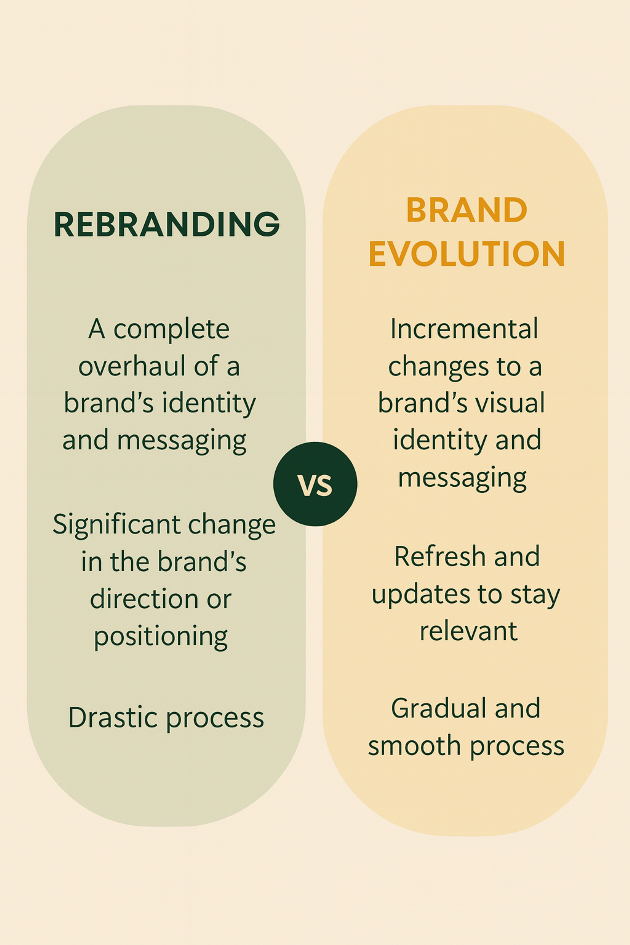
11. Innovation and Brand Evolution
Strategic brands must balance consistency with evolution. They maintain brand value while adapting to changing market conditions, customer needs, and business opportunities.
Brand Innovation Frameworks
Developing systematic approaches to brand innovation makes sure that brand evolution supports rather than undermines existing brand value. This involves creating innovation criteria aligned with brand strategy, testing new brand expressions, and managing brand evolution systematically.
Brand Transformation Strategy
When a significant brand transformation is required, strategic planning makes sure that changes strengthen rather than confuse brand positioning. This involves stakeholder analysis, change management planning, and systematic implementation that maintains brand value throughout the transformation process.
Brand Evolution vs Rebranding
Brand Adaptability Planning
Building brand adaptability into brand strategy lets brands respond effectively to market changes while maintaining core brand identity. This involves creating flexible brand systems, establishing decision-making frameworks for brand adaptation, and developing backup plans for various market scenarios.
12. Relationship Building and Loyalty Programs
Strategic relationship building goes beyond customer service to include complete loyalty strategies that create emotional bonds and drive long-term customer value.
Strategic Brand Relationship Development
Building meaningful brand relationships requires understanding relationship psychology and developing authentic engagement strategies. You create value exchanges that benefit both customers and the brand. This involves mapping relationship progression from awareness to advocacy and optimizing each stage for deeper connection.
Brand Loyalty Program Design
Strategic loyalty programs go beyond transactional rewards to create emotional engagement and community building. Effective programs strengthen brand values, provide meaningful benefits, and create opportunities for deeper brand interaction and advocacy.
Community Building and Brand Advocacy
Developing brand communities creates environments where customers can connect with each other and with the brand in meaningful ways. Strategic community building involves creating valuable content, helping meaningful interactions happen, and empowering community members to become brand advocates.
FAQ
Do Branding Strategies Increase Word-of-Mouth Referrals?
Yes. Customers who have built, maintained, and loved your brand tend to speak about it to the people in their circles. A successful brand, which effectively resonates with the target audience and meets business objectives, drives word-of-mouth referrals. A strong brand identity makes it easier for customers to speak out and recommend your brand easily to their social circles.
How Do Organizations Assess the Impact of Branding on Loyalty?
Customer retention rates, repeated purchases, the net promoter score (NPS), and clients’ engagement with branded content give insight into how effectively branding is driving loyalty.
Ensuring that all team members and external partners are on the same page with your branding efforts is crucial for maintaining consistency and trust.
UX Design Metrics by Clay
Is There a Need for Startups to Focus on Branding to Improve Loyalty?
Absolutely. Even small businesses these days need to focus their marketing efforts on establishing a trusted and recognizable brand to gain customer loyalty in the long run. Even small businesses can benefit from a comprehensive brand kit that includes essential elements like logos, colors, and templates.
A well-organized brand kit not only streamlines accessibility and enhances teamwork but also ensures branding consistency across various platforms, enabling more effective communication and marketing strategies.
How Does Strategic Branding Differ from Basic Branding?
Basic branding focuses on aesthetics, such as logos, colors, and fonts. Strategic branding takes a deeper, more systematic approach. It integrates brand strategy, emotional psychology, customer experience, and analytics to build brand equity and support business objectives over time.
Why Is Digital Brand Presence Essential Today?
Digital presence is where most customers experience your brand first. Strategic digital branding includes website UX, SEO, content strategy, social media, and online reputation. It ensures your brand is discoverable, trustworthy, and consistent across all platforms.
Is Branding Only Important for Consumer-facing Companies?
No. Strategic branding is equally important for B2B, enterprise, nonprofit, and even government organizations. It defines how people perceive your value, professionalism, and trustworthiness, regardless of industry or audience type.
How Much Should a Company Budget for Branding?
Budgets vary based on business size, scope, and needs. Expect to invest in:
- Brand strategy and positioning workshops
- Visual identity design and systems
- Brand guideline creation
- Messaging and tone of voice
- Brand research and testing
- Rollout and internal alignment
Strategic branding is an investment (not an expense) because it increases long-term brand value and competitive differentiation.
What Is Brand Architecture, and Why Is It Important?
Brand architecture defines how your parent brand, sub-brands, products, and services relate to each other.
There are several types:
- Monolithic (Branded House) – Google
- Endorsed – Marriott Courtyard
- Freestanding (House of Brands) – P&G, Unilever
Clear brand architecture helps avoid confusion, supports expansion, and strengthens customer understanding.
How Do I Choose the Right Branding Agency or Consultant?
Look for partners who:
- Ask strategic questions, not just visual preferences
- Show understanding of your industry
- Can explain their process clearly
- Provide case studies and results
- Offer collaborative, insight-driven working methods
- Include research, not just design, in their process
A good brand design agency should challenge assumptions and align branding to measurable business goals.
Read more:
Conclusion
Building a strategic brand requires systematic planning and execution. Start by conducting a complete brand audit that assesses your current brand performance across all twelve elements outlined in this guide.
Remember that strategic branding is an ongoing process that requires continuous attention, measurement, and optimization. The brands that create lasting customer loyalty are those that commit to strategic excellence across all brand dimensions while remaining authentic to their core purpose and values.
Your brand is your most valuable strategic asset. Invest in it systematically, measure its performance carefully, and evolve it thoughtfully to create sustainable competitive advantage and lasting customer loyalty.

About Clay
Clay is a UI/UX design & branding agency in San Francisco. We team up with startups and leading brands to create transformative digital experience. Clients: Facebook, Slack, Google, Amazon, Credit Karma, Zenefits, etc.
Learn moreAbout Clay
Clay is a UI/UX design & branding agency in San Francisco. We team up with startups and leading brands to create transformative digital experience. Clients: Facebook, Slack, Google, Amazon, Credit Karma, Zenefits, etc.
Learn more