You land on a website and start scrolling. Stories appear, images slide into view, and everything feels alive. No clunky buttons or endless page loads. Just smooth movement from one idea to the next. This is long-scroll design at work.
Users scroll naturally when content is engaging and organized with a clear visual hierarchy. With mobile traffic dominant, scroll-friendly design is essential. Understanding both benefits and challenges helps determine whether this approach fits project goals.
What Is Long Scrolling in Web Design?
Long scrolling puts all your content on one continuous page. Users scroll down to see everything instead of clicking through different pages. The page grows longer as more content loads.
This style works naturally on phones and tablets. People already scroll through apps every day. It keeps them focused without extra clicks.
When done well, long scrolling tells a clear story. It guides visitors from one idea to the next without breaking their attention. But too much content can overwhelm them. Keep things simple, organized, and easy to follow.
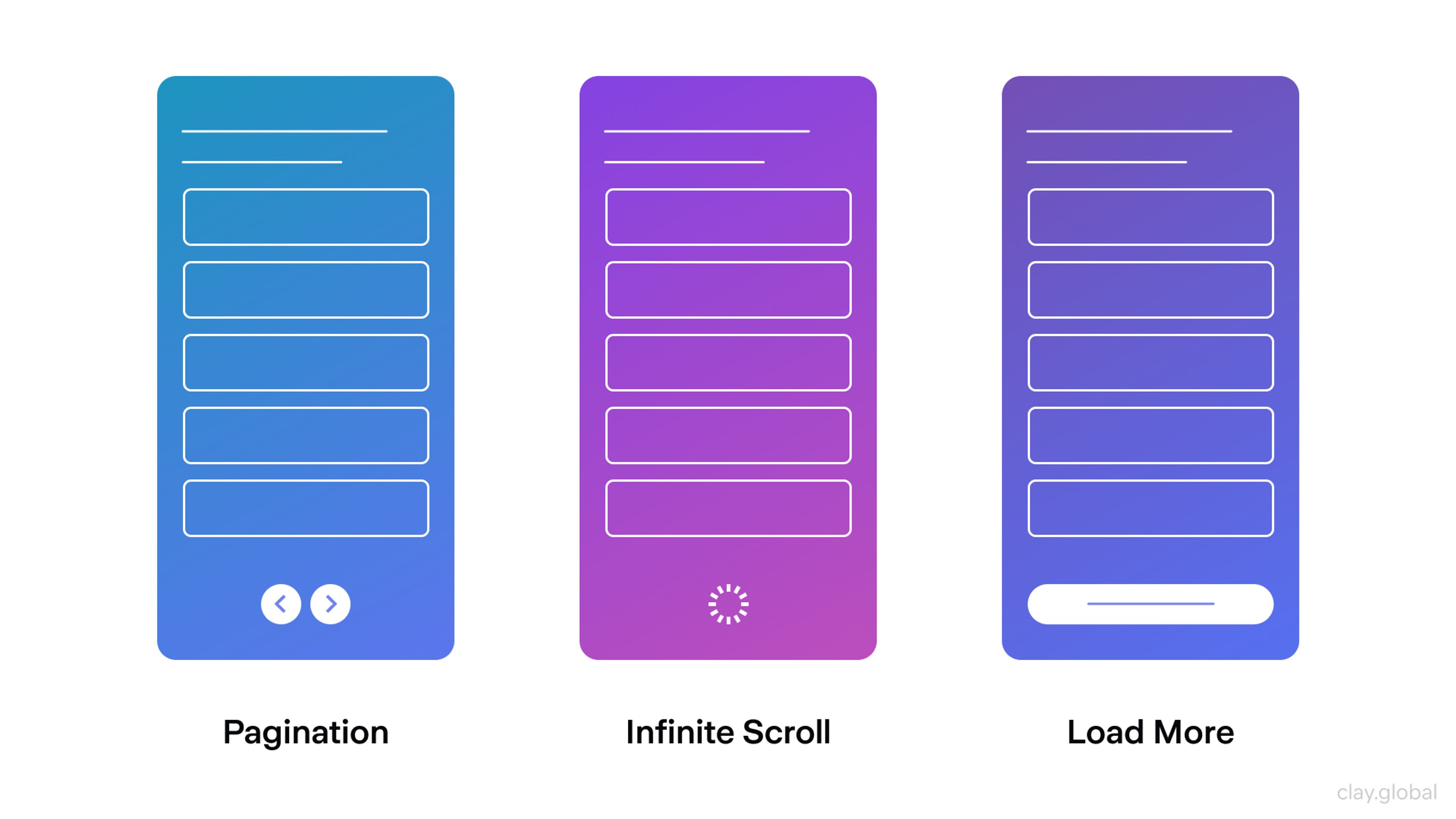
Different Scroll Techniques by Clay
When to Use Long Scroll Websites
Long-scroll websites shine when storytelling matters. They work especially well for photography studios or design agencies that want to show their work creatively. The flowing layout takes visitors on a visual journey. Instead of just displaying projects, the site tells a story that helps people connect with the brand.
Crypto and online stores benefit too. E-commerce platforms like Shopify offer themes specifically designed for long-scrolling product presentations. These templates optimize product discovery and reduce friction in the buying process. When customers don't have to click through pages, they stay engaged and explore more products.
Marqeta Platform Overview
The redesigned Marqeta site shows how this works. It delivers a fluid browsing experience that guides users through complex fintech concepts. The design avoids overwhelming visitors with technical details all at once.
Instead, scroll-based pacing reveals information gradually, letting users absorb ideas at their own speed. The layout shifts between messaging, product capabilities, and interactive elements with deliberate pacing.
Blog posts and long articles also benefit from this approach. Without page breaks, readers stay focused and move through complex topics more easily. The ideas flow better and the experience feels more connected.
Have a look at this beautiful long-scrolling website:
Long-scrolling Example

Pros of Long-Scrolling Websites
1. Easy Navigation
Long scrolling creates a simple, user-friendly experience. Instead of clicking through many pages, people just scroll down to find what they need. This smooth experience keeps them moving and helps them get information fast.
This design works especially well on mobile devices. People can scroll without waiting for new pages to load. A long-scrolling layout keeps things easy and that keeps users happy.
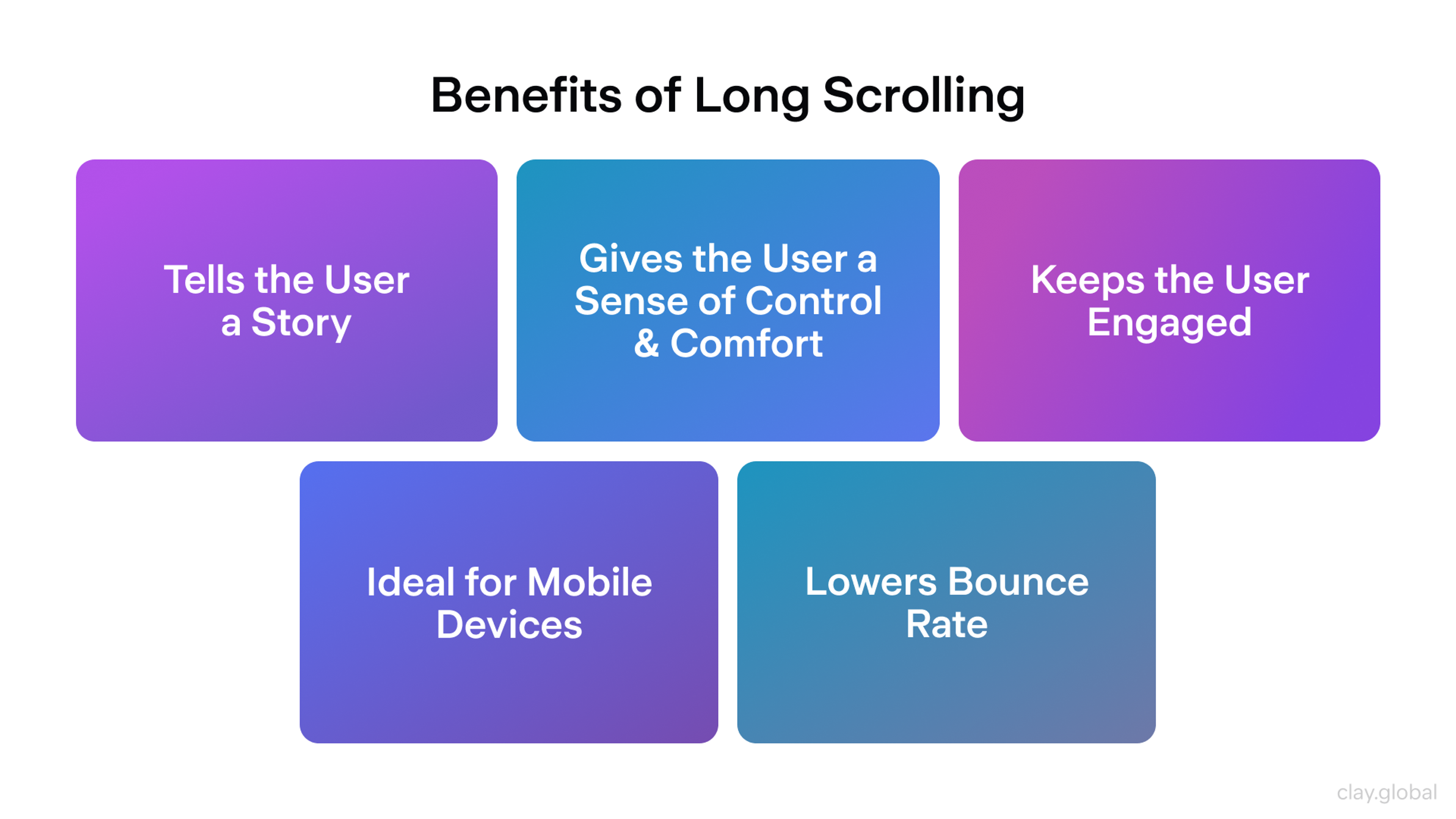
Benefits of Long-Scrolling Websites by Clay
2. Better Engagement
How your website looks affects how long people stay on it. Long scrolling keeps users engaged. When visitors see something interesting like a bold image, a video, or an animation, they keep scrolling. These eye-catching elements pull people in and make them curious to see more.
People who stay longer are more likely to take action. That could mean making a purchase, signing up, or learning more about what you offer. The more engaging your site is, the better your results will be.
3. Great for Storytelling
Storytelling connects with people. A long-scrolling site gives you space to share your story clearly. Modern frameworks like React and Vue make building these smooth scrolling experiences easier. These tools handle complex scroll behaviors efficiently while maintaining performance.
You can walk users through your products, explain how they work, or tell them about your company in a way that feels natural and easy to follow. Instead of squeezing all the details into one short section, you guide users step by step. This helps them feel informed and confident.
4. Easy to Update
One big advantage of long-scrolling websites is how easy they are to change. You can update content, add new sections, or improve the layout whenever needed. If a long block of text feels overwhelming, break it into smaller parts to make it easier to read.
You can also add videos, animations, or interactive tools. These elements often boost engagement and help your brand feel more modern and lively. Visual design platforms like Webflow let designers create professional long-scroll sites without coding. These tools offer responsive templates and animation controls, making implementation faster and more accessible.
Being able to update your site without rebuilding everything saves time and money. This flexibility helps your business adjust quickly when trends shift or markets change.
Cons of Infinite Scrolling Websites
1. Difficulty with Search Engine Optimization (SEO)
Search engines may have trouble loading and crawling all your content. When a page takes longer to load, search engines might not reach the bottom and some of your content could be missed.
This matters because search engine optimization helps people find your site. If search engines can't see all your content, your site may not rank well in search results.
Many successful long-scroll sites include paginated URLs for search engines while showing continuous scrolling to users. This hybrid approach satisfies both user experience and search optimization needs.
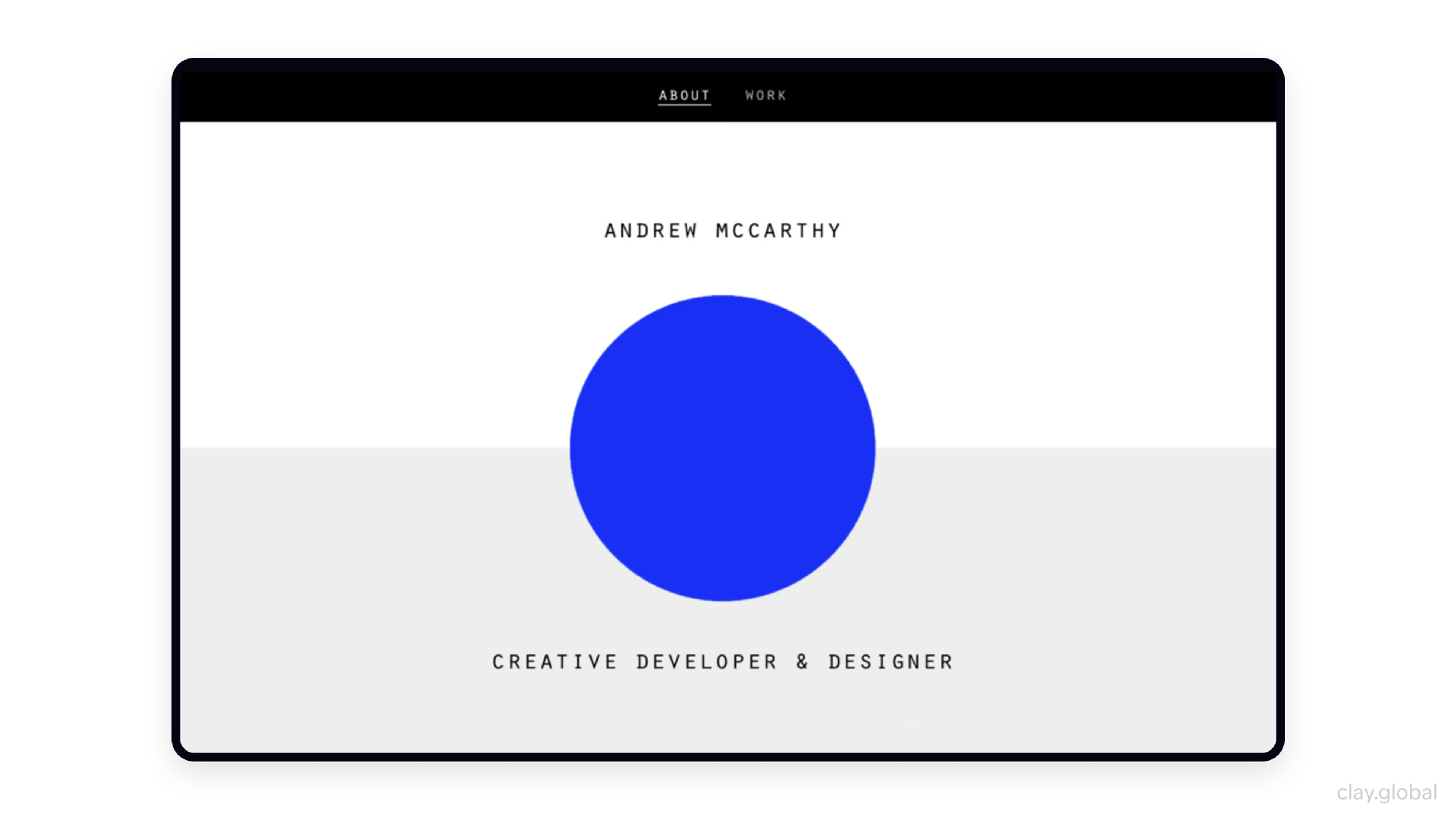
Here you can have a look at another long-scrolling website:
2. More Difficult to Navigate
Navigating long-scrolling websites on mobile devices can sometimes be tricky. If users get confused or can't find what they need, they may leave before contacting you or buying anything.
Make sure users can quickly jump to the section they want without getting lost. Use clear navigation tools or add features like back-to-top buttons. These small design choices make a big difference in how easy your site is to use, especially on a smaller screen.
Good navigation is still important. Users should be able to find what they're looking for without getting lost or frustrated. Adding features like sticky menus, back-to-top buttons, or anchor links can make long pages easier to use. These tools let users jump to different sections quickly, keeping them engaged and helping them stay focused.
3. Pages May Load Slowly
Long-scrolling pages often take more time to load because they hold a lot of content. The more you pack into a single page, the longer it can take to display everything properly. That delay can frustrate users and cause them to leave before they even see what your brand offers.
Make sure your web pages are optimized for speed. Use fewer large images, compress files, and limit plugins. Lazy loading loads images and content only when needed.
Combined with modern tools like the Intersection Observer API, this approach dramatically improves initial page speed. When your site loads faster, users have a smoother experience and are more likely to stick around.

4. Information Overload
Sometimes long-scrolling websites feel like too much. If there's a lot of content all on one page, it can overwhelm users, especially if the layout is cluttered or hard to follow. This can lead to frustration and cause people to leave.
Keep your content well-organized and easy to read. Use clear sections, visual breaks like images or graphics, and enough white space to give the eyes a rest. A clean layout helps users move through your content without feeling overwhelmed.
Designing for Long Scrolling
Designing for long scrolling starts with understanding user behavior and flow through the page. Plan how people will move from one block to the next. Place the most important information at the top.
This keeps attention and encourages continued scrolling. Clear hierarchy makes content easier to follow.
Break content into blocks with headings, subheadings, and images. These guide the eye and support quick scanning.
Use subtle motion such as parallax and smooth transitions. Movement and depth add interactivity and a sense of dynamism.
Optimize for phones and tablets. Users expect a continuous flow without unnecessary breaks. Responsive layouts should adapt cleanly to different screens.
Keep navigation visible while scrolling. This makes movement easier and improves the overall experience.
Provide anchor links for quick jumps to sections. On long pages this saves time.
Add small interactions such as animations, hover effects, and scroll triggers. These sustain interest and invite exploration.
Show progress with scroll indicators or lightweight loading cues. Clear feedback offers orientation and reduces confusion.
Making It Accessible and Fast
Performance and accessibility are key to making long-scrolling websites work well for everyone.
Make sure your site loads quickly. Fast loading keeps users happy and reduces the chance they'll leave before seeing your content. Following WCAG guidelines ensures your site works for users with disabilities. Screen readers help visually impaired users navigate content.
Proper heading structure and landmarks help these users jump between sections rather than listening to everything sequentially. Add keyboard navigation, ensure color contrast meets standards, and test with actual accessibility tools.
Most people browse on phones or tablets, so your site needs to run well on mobile. Focus on fast loading, responsive design, and smooth scrolling. A mobile-friendly site keeps users engaged and coming back.
Sometimes things go wrong, but how you handle it matters. Show clear error messages and simple instructions when something doesn't work. This builds trust and helps users stay on your site.

Long Scroll Website Best Practices
To get the most out of a long-scrolling website, follow practices that improve the user experience and help increase conversions.
Always put the user first. Use clean, simple layouts that are easy to look at. Make sure the information flows in a clear order. Headings and subheadings should guide users from one section to the next. This helps them stay focused and makes the content easier to understand.
More people now browse websites on their phones or tablets. Make sure buttons and links are big enough to tap. The text should be easy to read, and images should be adjusted to fit the screen. A mobile-optimized site keeps users engaged and less likely to leave.
Big blocks of text are hard to read. Instead, use short paragraphs, images, and videos to break things up. This makes the content easier to follow and more enjoyable to explore. When users can quickly scan and understand your message, they're more likely to stick around.
Place bold and clear calls-to-action throughout your page to guide users on what to do next. Whether it's signing up for a newsletter, making a purchase, or exploring more services, the call-to-action should be easy to see and match the content around it. A strong call-to-action can help turn visitors into customers.
Keep an eye on how users interact with your site. Tools like Hotjar reveal exactly how far users scroll and where they lose interest. Heat maps and session recordings show real user behavior, helping you optimize content placement. This data helps you make smart updates like moving key content or adjusting layout to keep users engaged and improve results.
By following these tips, you can build a long-scrolling website that not only looks great but also turns visitors into loyal customers.
Good Examples of Long Scrolling Websites
Some exemplary sites successfully implement the best practices discussed to illustrate the potential of long-scrolling websites. These sites enhance user experience and effectively drive conversions.
1. Apple's Product Pages
Apple’s product pages — like those for the iPhone or MacBook — are perfect examples of long scrolling done well. They use stunning visuals, smooth animations, and detailed descriptions to draw users in. Each section leads naturally into the next, keeping users interested while clearly showing off the product’s features and benefits.
Source: Apple

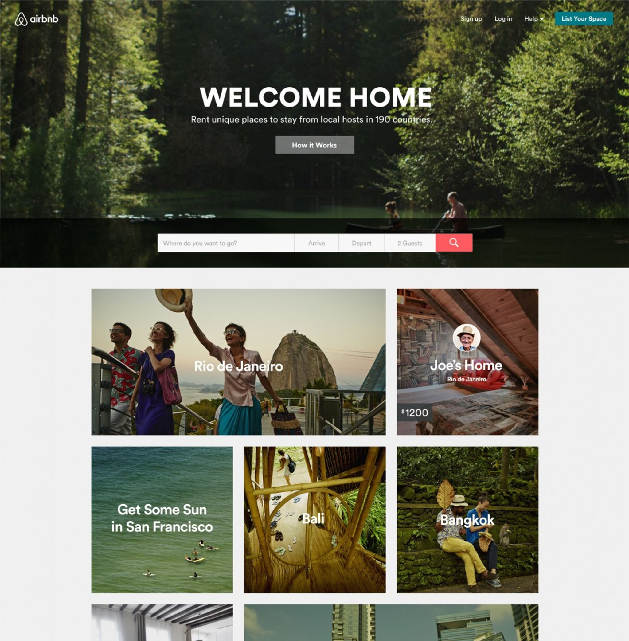
2. Airbnb's Storytelling Pages
Airbnb uses long scrolling to tell powerful stories. On pages like “Host Stories” and “Neighborhood Guides,” they mix text, images, and video to share real experiences. These stories bring the Airbnb community to life and give users a deeper look at places and people around the world.
Source: Airbnb
3. The New York Times' Multimedia Features
The New York Times has created several award-winning long-scrolling articles. One standout example is “Snow Fall: The Avalanche at Tunnel Creek.” This story blends text, photos, videos, and interactive graphics to bring the event to life.
By using long scrolling, the article flows like a story, guiding readers through complex information without feeling overwhelmed. This format makes the content more engaging and easier to follow, showing how powerful long scrolling can be for storytelling and news reporting.
Read More
FAQ
How to Make a Horizontal Scrolling Website?
To make a horizontal scrolling site, design the layout so users scroll left to right instead of up and down. You can use CSS (like overflow-x: scroll) or JavaScript to control the scroll direction.
Many horizontal sites work well for image galleries or portfolios, where layout and flow matter more than lots of text. Just make sure it works smoothly on all devices.
Is Horizontal Scrolling Accessible?
Horizontal scrolling can be accessible, but only if done carefully. Not all users expect to scroll sideways, especially on a desktop. To make it accessible, add clear scroll cues and keyboard support, and make sure screen readers can handle the content. Always test it on different devices and for users with disabilities.
What Is Immersive Scrolling?
Immersive scrolling pulls the user into the experience. As they scroll, they see animations, videos, or images that tell a story. It feels smooth and interactive, almost like watching a short film or going on a journey. It’s often used in storytelling websites or high-end product pages.
How to Make a Website Scrollable?
Most websites scroll by default. But if yours doesn’t, make sure the content is taller than the screen and that the CSS allows scrolling (overflow: auto or scroll). You can also use tools like scrollbars, anchor links, or sticky menus to help users move through your page easily.
What Is Hyperfast Scrolling?
Hyperfast scrolling happens when a page scrolls too quickly, often by accident. It can make content hard to read or control. This might happen due to coding issues, high mouse sensitivity, or poor scroll settings. A good website should scroll at a steady, comfortable speed for all users.
Conclusion
Now that you know the pros and cons of having a long-scrolling website, you can be more confident about deciding what type of website will best suit your needs when speaking to your web designer.
Even though a long-scrolling site can be very beneficial, it still poses many challenges that must be considered. The information in this article should help determine how to move forward with your web design. A properly planned, well-optimized, long-scrolling website can do wonders for your business.


About Clay
Clay is a UI/UX design & branding agency in San Francisco. We team up with startups and leading brands to create transformative digital experience. Clients: Facebook, Slack, Google, Amazon, Credit Karma, Zenefits, etc.
Learn more

About Clay
Clay is a UI/UX design & branding agency in San Francisco. We team up with startups and leading brands to create transformative digital experience. Clients: Facebook, Slack, Google, Amazon, Credit Karma, Zenefits, etc.
Learn more

