
You land on a website and start scrolling. Stories appear, images slide into view, and everything feels alive. No page reloads, no dead-end clicks. Just a continuous flow from one idea to the next. That's a long-scroll design doing its job.
Scroll-friendly layouts have become the default for a reason. Mobile now accounts for over 61% of all global internet traffic, and mobile users expect a fluid experience.
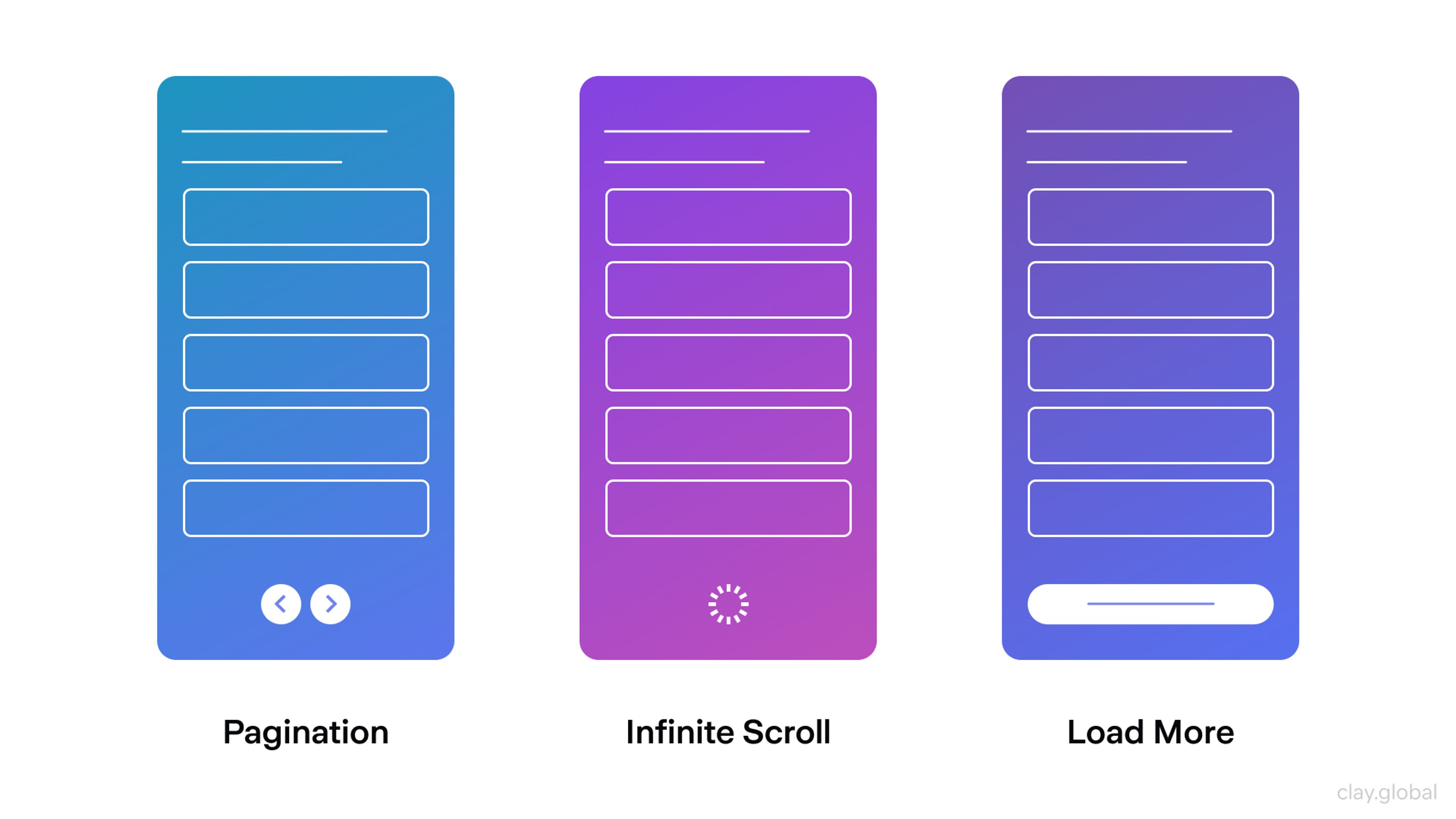
Different Scroll Techniques by Clay
Building a page worth scrolling is not easy, though. As user expectations shift toward more purposeful experiences, the gap between a site that guides naturally and one that is overwhelmed with visual noise is wider than ever.
Key Takeaways
- Long-scroll design works best when storytelling, visual flow, or progressive disclosure drives the page structure.
- Mobile-first execution isn't optional. Sticky navigation, tap-friendly elements, and responsive layouts directly affect whether users stay or leave.
- Treat page speed as a tight budget from day one. It affects both user retention and search rankings through Google's Core Web Vitals.
- SEO needs to be planned at the design stage, not bolted on after. Every major section should be addressable, and critical content shouldn't depend on user interaction to appear.
- Navigation aids like anchor links, back-to-top buttons, and sticky menus prevent long pages from becoming disorienting.
- Motion exists to serve the content. Purposeful animation consistently outperforms heavy visual effects.
- Scroll depth and heatmap data should drive continuous iteration. AI-driven personalization takes that loop further by adapting the page sequence to individual visitor behavior.
What Is Long Scrolling in Web Design?
Long scrolling places all content on a single continuous page. Users move down through sections rather than clicking between separate URLs.
Social feeds have trained people to scroll without friction. A well-structured long-scroll site takes that habit and applies it to a brand experience, guiding visitors from one idea to the next without interrupting their attention.
When to Use Long Scroll Websites
Long-scroll sites shine when storytelling matters. The format lets the brand narrative unfold rather than compete for space.
It works less well for data-heavy tools, large product catalogs, and intranets where users need to reach specific destinations fast.
It fits best for the following industries:
- Photography studios and design agencies use the flowing layout to take visitors on a visual journey, showing work in context rather than dumping it into a grid.
- E-commerce benefits because when customers don't navigate between pages, they encounter more products and stay engaged longer.
- Fintech, crypto, and SaaS companies use scroll-based pacing to reveal complex products gradually, letting each concept land before the next appears.
- Editorial and thought leadership content benefits from continuous scrolling, which removes the need to click through, keeping readers focused.
When our team at Clay worked on the Marqeta redesign, scroll-based pacing was central to the approach. As a fintech platform offering a wide range of solutions, from digital insurance to crypto, Marqeta serves a broad audience.
Marqeta Platform Overview
It was essential to design a layout that could reveal capabilities gradually, letting each option land before the next appears rather than overwhelming visitors with everything at once.
Clay is a web design agency trusted by Slack, Yahoo, and Meta. Learn more about us here.
Pros of Long-Scrolling Websites
Easy Navigation
A single-page layout eliminates the navigation decisions that multi-page sites constantly demand. Users don't need to figure out where information lives, they just keep going. The difference is most obvious on mobile, where thumb-scrolling comes naturally.
Benefits of Long-Scrolling Websites by Clay
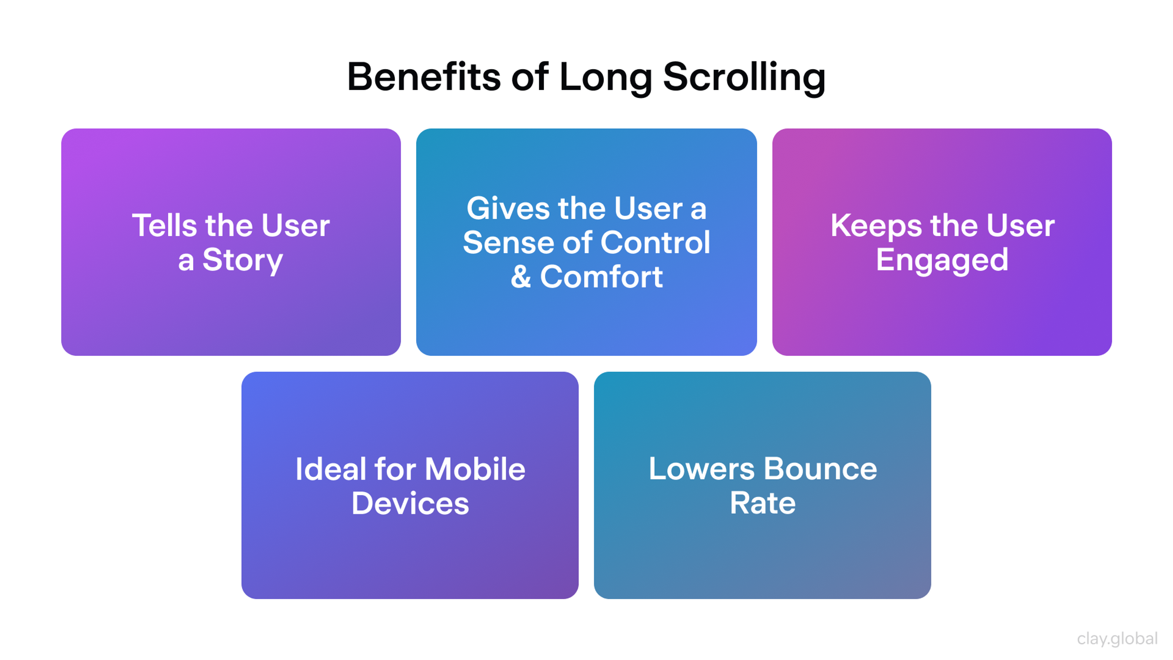
Better Engagement
Visual momentum matters. When users encounter something that captures their attention, they keep moving. It can be an animation, a bold full-bleed image, or an unexpected interactive element that extends the user's commitment to the page.
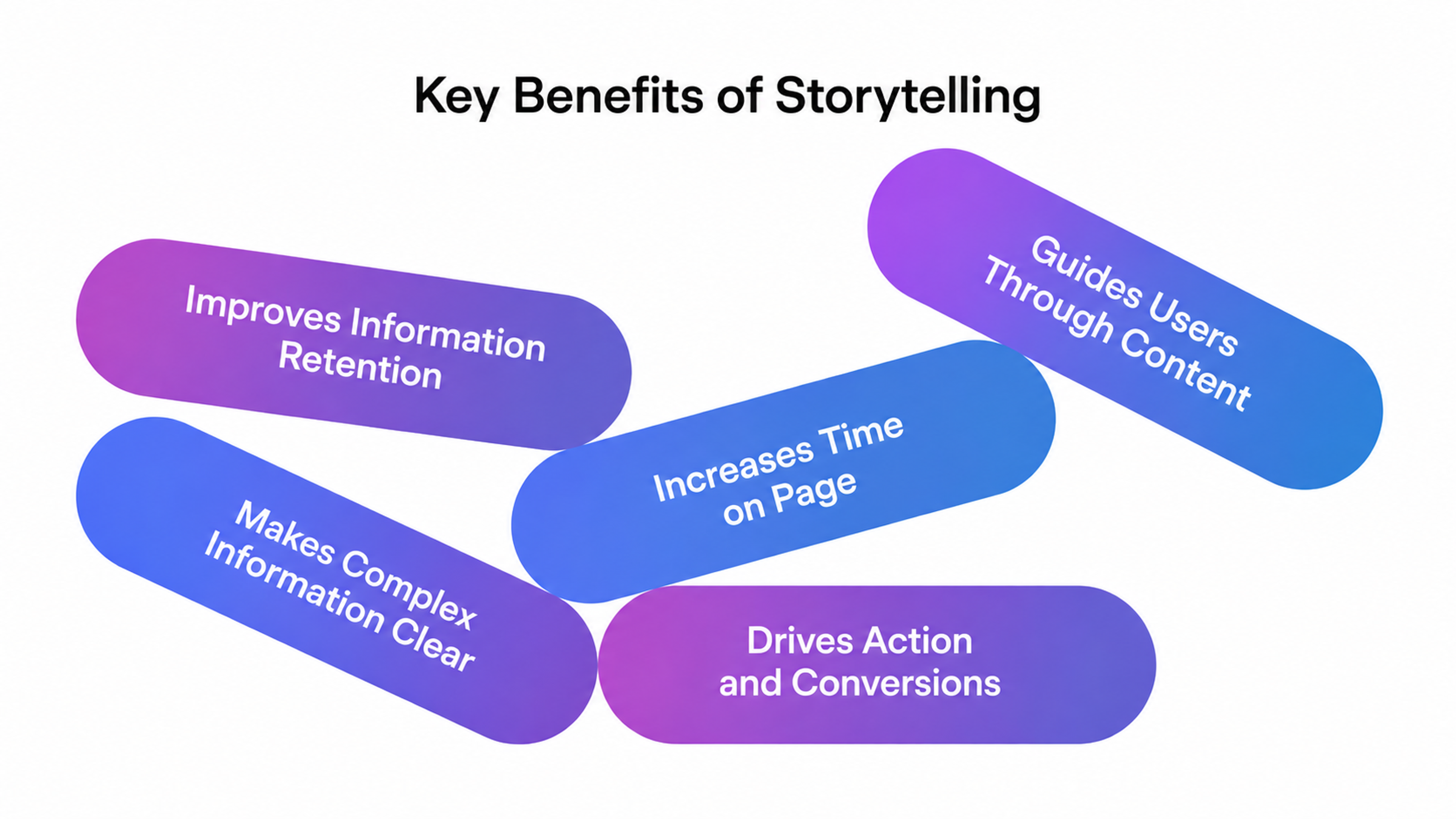
Great for Storytelling
Sequential layout matches how humans process narrative. Modern design platforms handle scroll behaviors through visual controls, giving designers a coherent motion language across the whole page.
The real advantage is psychological. Scroll-based storytelling lets brands control pacing, which works particularly well for product launches and brand campaigns where sequence changes comprehension.
Storytelling Benefits
Easy to Update
Single-page architecture simplifies content management. Adding a section or updating content doesn't require rebuilding navigation or creating new URLs.
Brands that treat their site as a living document, updating based on scroll data and heatmaps, consistently outperform those that launch and leave.
Using scroll patterns and time-on-section to reorder content for different visitors isn't reserved for big-budget brands or specialized agencies. Most modern platforms make it accessible to anyone willing to look at their data and act on it.
Cons of Infinite Scrolling Websites
Infinite scrolling is a pattern where new content loads automatically as users reach the bottom of the page.
Unlike long scrolling, which has a fixed structure users move through from start to finish, infinite scroll has no defined endpoint.
Difficulty with Search Engine Optimization (SEO)
Search crawlers can't always read content that only appears as users scroll. The fix starts at the design stage.
Every section needs its own anchor link, and critical content shouldn't sit behind interactions that require user input to trigger.
More Difficult to Navigate
Long pages without navigation aids become mazes. Every major section should have a unique anchor link, a sticky header should remain accessible throughout, and a back-to-top button should appear after users have traveled past the first few sections.
That is what makes the difference between a site users return to and one they abandon.
Pages May Load Slowly
Content density is the enemy of load performance. Google's Core Web Vitals are a set of standards that measure how fast and stable a page feels to users, and they directly affect search rankings.
Core Web Vitals Components
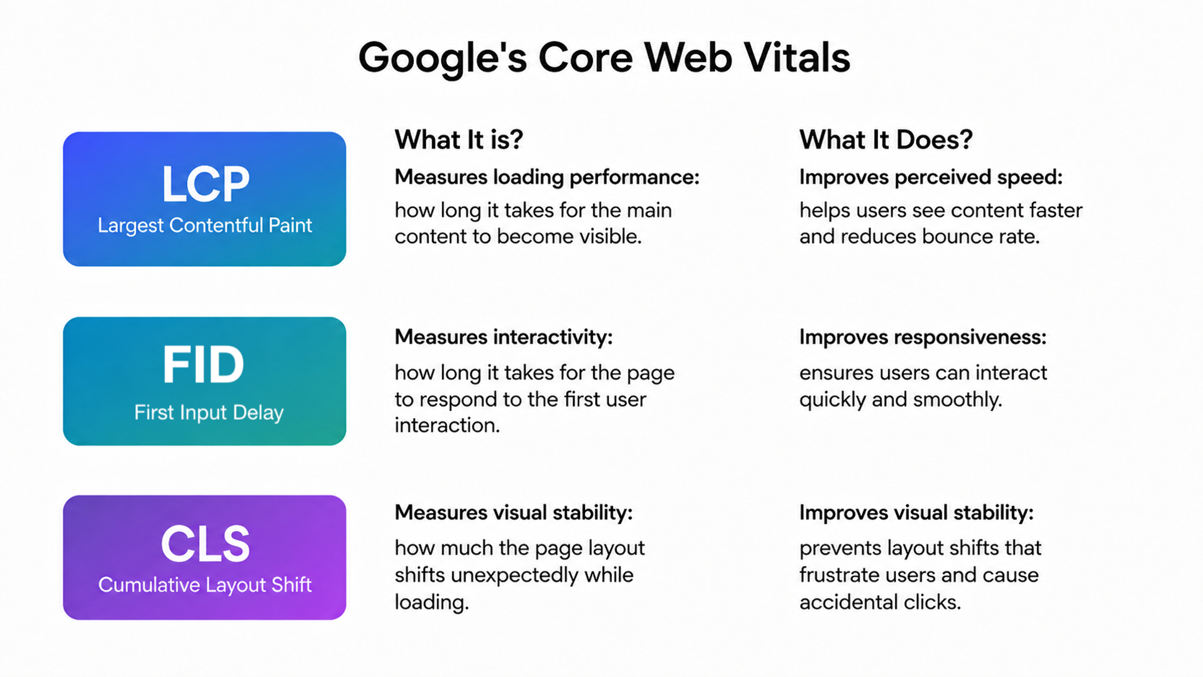
Two matters are most important for long-scroll pages. The main content should load within 2.5 seconds, and the page should respond to user interaction within 200 milliseconds.
Design decisions drive both of these scores. Lazy loading, optimized image formats, and controlled animation complexity are decisions to make during production, not afterthoughts.
Information Overload
Volume without structure is noise. Cluttered designs see higher bounce rates than minimal layouts. White space is the visual grammar that tells users when one idea ends and another begins.
Designing for Long Scrolling
When you design a website that contains long-scroll pages, follow this process from the start:
1.
Write out the sequence of ideas users will move through, from the moment they land to the action you want them to take. Remove any section that doesn’t serve that sequence before design begins.2.
Design the first viewport to establish what the page is about, why it matters, and give users a reason to keep scrolling. Nielsen Norman Group found that users treat above-the-fold content 84% more attentively than below-the-fold content.3.
Assign one idea to each section. Separate sections visually through spacing so users can scan the hierarchy before engaging with the content.4.
Define the role of each animation before adding it. If it has no clear function, remove it. Restrained motion consistently outperforms elaborate effects on content-driven pages.5.
Test on an actual mid-range Android device, the most common mobile platform globally. Confirm the page holds up on a small screen without anything breaking.6.
Add a sticky header with anchor links and breadcrumbs so users can jump to any part of the page at any scroll depth.
Each of these steps is a decision point where the quality of the final page is either built or lost.
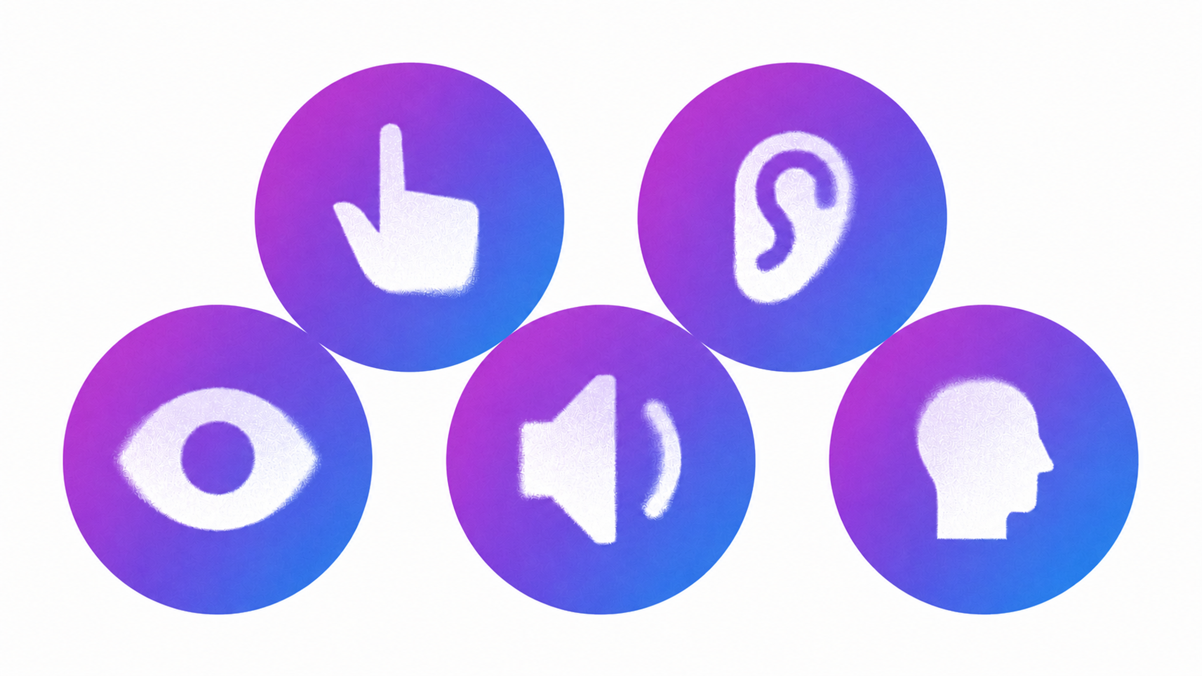
Making It Accessible and Fast
Performance and accessibility are key to making long-scrolling websites work well for everyone.
Accessibility Elements
People who rely on screen readers need a clear heading structure to move through a long page. Without it, even the most visually refined scroll experience becomes impossible to navigate for assistive technology users.
Keyboard navigation must function throughout the entire page, not just in the header and footer. Users who don't use a mouse should be able to reach every section and interactive element without friction.
Color contrast needs to meet WCAG 2.1 AA standards, covering body text, headings, buttons, and any text placed over images or colored backgrounds.
Scroll animations should include a no-motion fallback for users who experience motion sensitivity. The implementation typically takes minutes and makes a significant difference for your audience.
These are design decisions as much as development ones, and they belong in your handoff documentation, not left to be addressed after launch.
On the performance side, every decision should be measured against your page speed targets. A page that loads slowly or shifts layout visually after loading loses users fast, regardless of how good the content is. Long-scroll pages have the most to lose here, given the amount of content they carry.
Long Scroll Website Best Practices
Place the most important message in the first viewport, supported by clear visual signals that reward continued scrolling. Use short paragraphs, images, and video to break up text density, making content easier to scan.
CTAs should appear throughout the page rather than accumulating at the bottom. Users who are convinced in section three won't scroll to section ten to click a button. Each CTA should be contextually relevant. A prompt to book a consultation fits naturally after a case study, not after an abstract brand statement.
Use analytics to see where users actually drop off. Long-form pages with high engagement tend to see scroll depth in the 60–80% range. Drops below 40% signal a structural problem that design or content changes need to address.
For teams ready to go further, that behavioral data also feeds AI personalization, using what users actually do to adapt what they see next. Test on actual devices, because a site that performs beautifully on a MacBook and breaks on a Galaxy A-series phone has failed most of its audience.
Good Examples of Long Scrolling Websites
Stripe's Homepage
Stripe's website is a masterclass in scroll-driven product communication. As you move down the page, each section introduces a new capability.
Source: Stripe
Every block maintains a consistent visual language while standing out enough to hold attention. The result is a genuinely complex financial infrastructure that feels approachable without oversimplifying what the product actually does.
Samsung’s Product Pages
Samsung builds its product pages with long scrolling in mind across its entire lineup. The Galaxy S25 Ultra is a strong example, structured as a series of distinct scroll chapters, each dedicated to a single feature.
Source: Samsung
Nearly every section includes an interactive block where you can tap buttons to explore the product further, turning a standard spec page into a hands-on discovery experience.
Porsche's Model Lineup Pages
Porsche builds its model pages around a single continuous scroll narrative that connects performance, design, and technology without a definitive break between them.
Source: Porsche
The Taycan is a strong example where full-viewport imagery flows into charging infrastructure details, interior walkthroughs, and configurator access. It's one of the few automotive brands whose product pages feel as deliberate as the cars they sell.
Ready to keep users scrolling but need some help? Let our team handle all the work. Get in touch.
Read more
- Wealth branding, website, and digital product by Clay Global
FAQ
What is the difference between long scrolling and infinite scrolling?
Long scrolling has a defined endpoint. Users scroll through a fixed body of content from top to bottom.
Infinite scroll continuously loads new content as users reach the bottom, a common feature in social feeds and catalogs. Infinite scroll suits discovery-oriented interfaces but creates problems for SEO and navigation since there's no addressable endpoint.
There are more scrolling types, such as fixed long scrolling and parallax scrolling, each serving a different purpose.
Does long scrolling hurt SEO?
Only if built carelessly. Crawlers can't always read content that loads dynamically as users scroll.
Structure every major section with its own anchor link, avoiding hiding critical content behind user interactions. Also, align with your developer on SEO requirements before building.
A well-structured long-scroll page ranks just as effectively as a multi-page site.
How long should a long-scrolling page actually be?
Length should match content needs. The right question is whether each section earns its place. If it doesn't move the page forward, cut it regardless of how much content is available.
What's the best way to handle navigation on a long-scroll page?
A sticky header with anchor links to major sections is the baseline. For deeper pages, a floating section indicator lets users jump without scrolling back to the top.
Every major section should have its own URL fragment so users can share or bookmark specific parts.
Should CTAs only appear at the bottom of a long-scroll page?
No. Users who are ready to act early won't scroll all the way to the end. Placing CTAs at the right moment is one of the most direct ways to increase your website's conversions.
They should appear at contextually relevant points, such as after a strong proof point, a case study, or a section that addresses the user's pain point.
Is long scrolling appropriate for B2B websites?
Yes, for the marketing layer. B2B sites benefit from scroll-based storytelling that builds a case methodically through context, problem, solution, proof, and next step.
Where it works less well is dense pricing pages, technical documentation, and authenticated portals where users need to navigate to known destinations efficiently.
Mixing a long-scroll marketing layer with structured utility navigation for logged-in users is often the right architecture.
What tools are best for building long-scrolling websites?
Webflow is the strongest choice for most designers, offering precise control over scroll triggers, animations, and responsive behavior through a visual interface without writing code.
Framer suits more interactive or prototype-heavy builds with a similar no-code motion system.
For teams working with developers, Figma remains the standard for designing scroll interactions before handoff.
How do you test scroll performance across devices?
Google PageSpeed Insights gives a clear performance score with plain-language callouts to act on or hand off to a developer.
Hotjar or Microsoft Clarity provides scroll maps and session recordings that show where users drop off.
Test on actual devices because a mid-range smartphone or tablet handles animation-heavy pages very differently from a laptop on a fast connection.
Can horizontal scrolling work as part of a long-scroll layout?
Yes, when used for a specific purpose within a larger vertical layout. A horizontally scrolling card carousel inside a vertical page is an effective pattern for showcasing multiple items without breaking the vertical flow.
Full-page horizontal scrolling as the primary navigation pattern is harder to execute well because it confuses users who don't expect to scroll sideways.
Horizontal scrolling within a section is generally safer than horizontal scrolling as the main user journey.
How does long scrolling affect bounce rate?
Long-scroll pages typically show higher session duration but can mislead on bounce rate.
A user who reads the entire page without clicking to another URL registers as a bounce in default analytics setups, even if they spent five minutes engaged.
The fix is something to flag to your developer or analytics team. Without this setup, your data will undercount how well the page is performing.
Final Thoughts
Long scrolling is a design decision. It works exceptionally well when content, audience, and execution are aligned, and poorly when any of those three are missing.
The sites that do it best treat the scroll as a medium where motion serves comprehension and data drives decisions.
If your project has a story worth telling and an audience on mobile, long scrolling deserves serious consideration.

About Clay
Clay is a UI/UX design & branding agency in San Francisco. We team up with startups and leading brands to create transformative digital experience. Clients: Facebook, Slack, Google, Amazon, Credit Karma, Zenefits, etc.
Learn moreAbout Clay
Clay is a UI/UX design & branding agency in San Francisco. We team up with startups and leading brands to create transformative digital experience. Clients: Facebook, Slack, Google, Amazon, Credit Karma, Zenefits, etc.
Learn more