
Most websites look fine. They're polished, responsive, and follow roughly the same template. But "looks fine" doesn't convert, retain, or build trust - it just doesn't embarrass you.
The gap between a website that performs and one that merely exists comes down to a set of decisions most teams make too casually: how fast the first screen loads, whether the navigation mirrors how users think, and whether the content earns belief or just asserts it.
Web design in 2026 is less a visual discipline than a product discipline. Aesthetics still matter (they establish credibility in seconds), but they only do their job when everything beneath them is solid.
Key Takeaways
- Start with purpose: every design decision should trace back to what the site is supposed to do
- Performance is a design decision, not an engineering afterthought
- Mobile-first means designing for constraints, not just smaller screens
- Accessibility isn't a checklist item - it's a baseline that improves the experience for everyone
- Your content is the interface; slogans don't convert, specifics do
- A site that isn't maintained becomes a liability; build iteration into the workflow from launch day
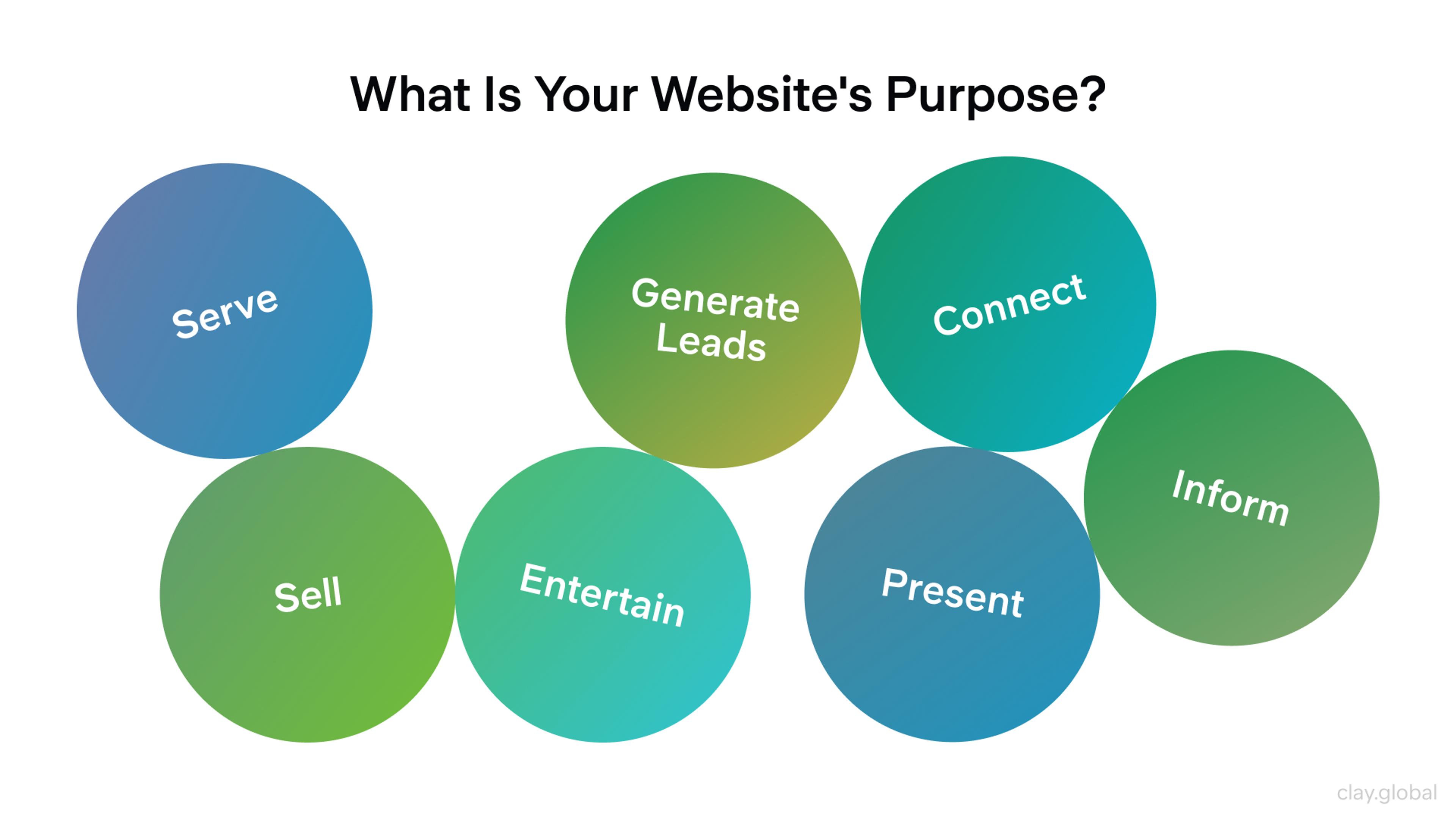
1. Define a Purpose Before You Touch a Layout
The fastest way to waste a design budget is to start with visuals before you've decided what the site is trying to do. Generate leads? Sell directly? Recruit? Educate?
Each purpose changes the hierarchy of every page.
A useful way to pressure-test this: write a one-sentence brief for each key page type.
What does a visitor get here?
Why should they believe it?
What should they do next?
If you can't answer all three cleanly, the page isn't ready to design.
Build your user personas from actual user research, not assumptions about who you'd like your customers to be. The gap between those two things is usually wider than teams expect, and it shows up later as higher bounce rates and shorter session times.
Structure each page around a single primary next step. Secondary options can exist, but they shouldn't compete.
Possible Website Purposes by Clay
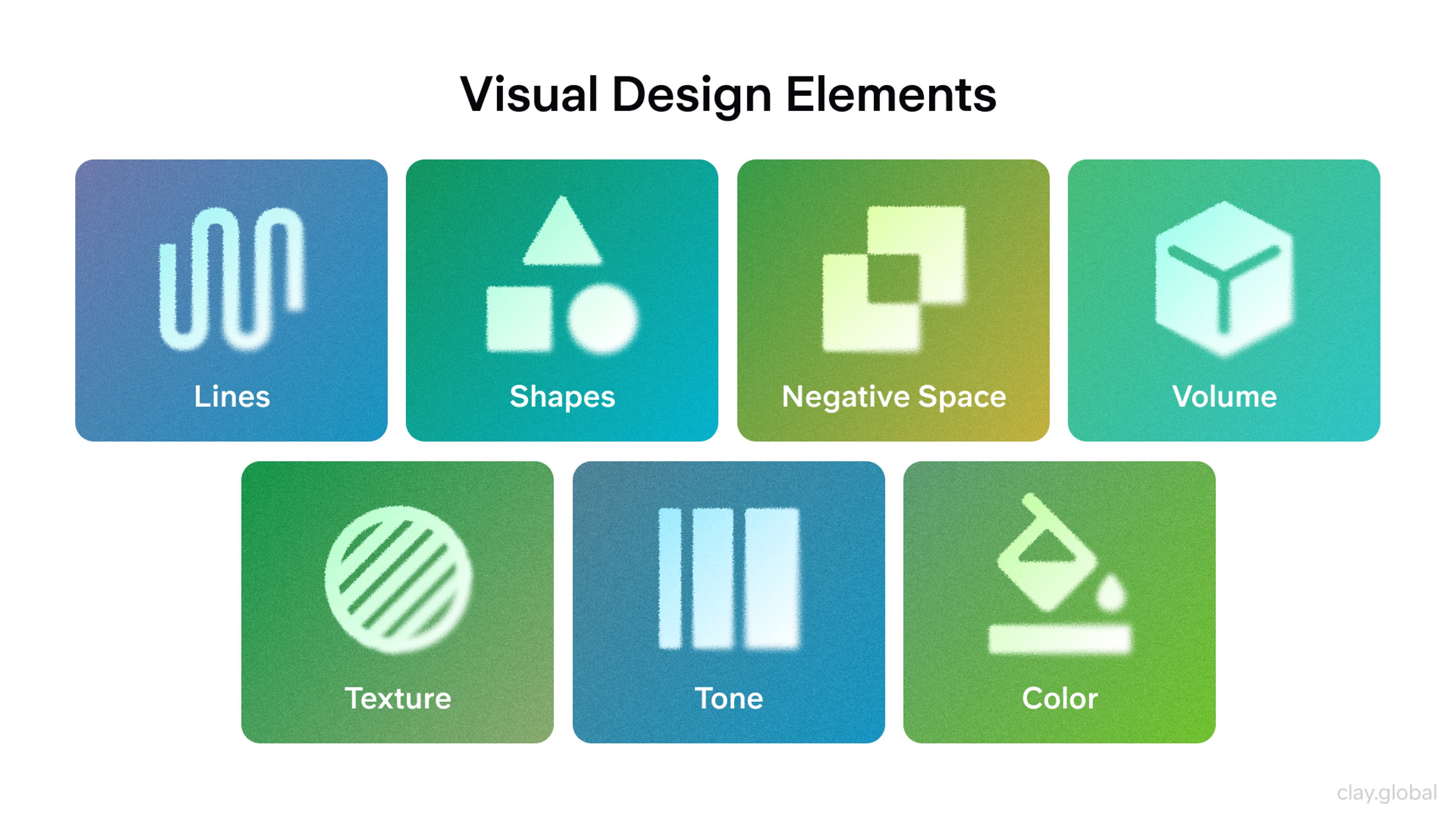
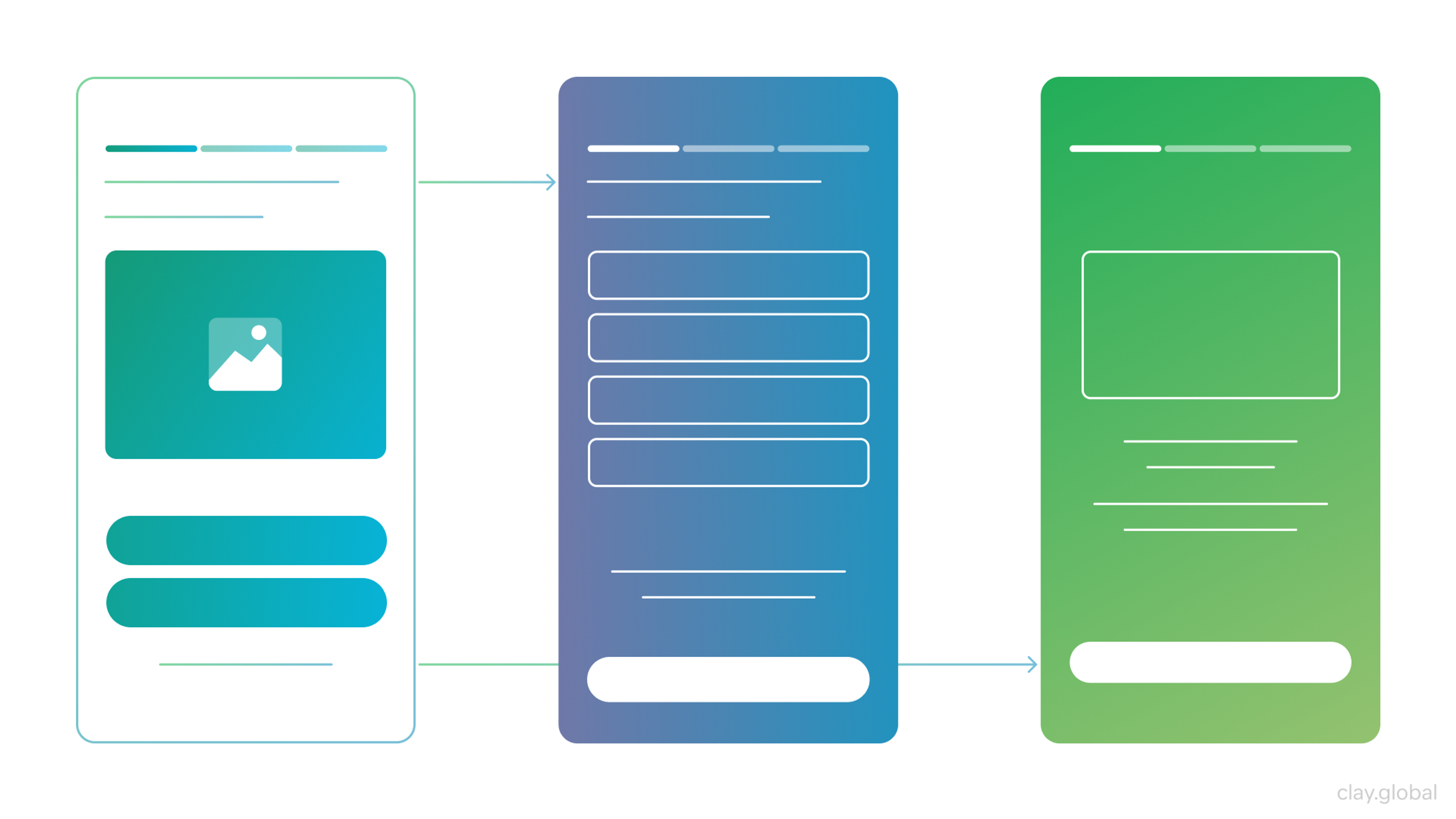
2. Build a Design System, Even a Small One
Originality doesn't come from unusual layouts. It comes from a visual language that's coherent, intentional, and applied consistently across every surface. That's what a design system gives you.
You don't need a hundred components to start. A minimal system covers:
- a spacing grid
- an accessible color palette
- four or five core components: buttons, cards, forms, and navigation
From there, you can build confidently. Without it, every new page is a small negotiation about whether this button should match that one.
Save your brand's personality for the moments that earn it: hero sections, case studies, pricing pages.
Navigation patterns, form inputs, and error states should be predictable. Users don't want to learn your UI, they want to accomplish something.
Visual Design Elements by Clay
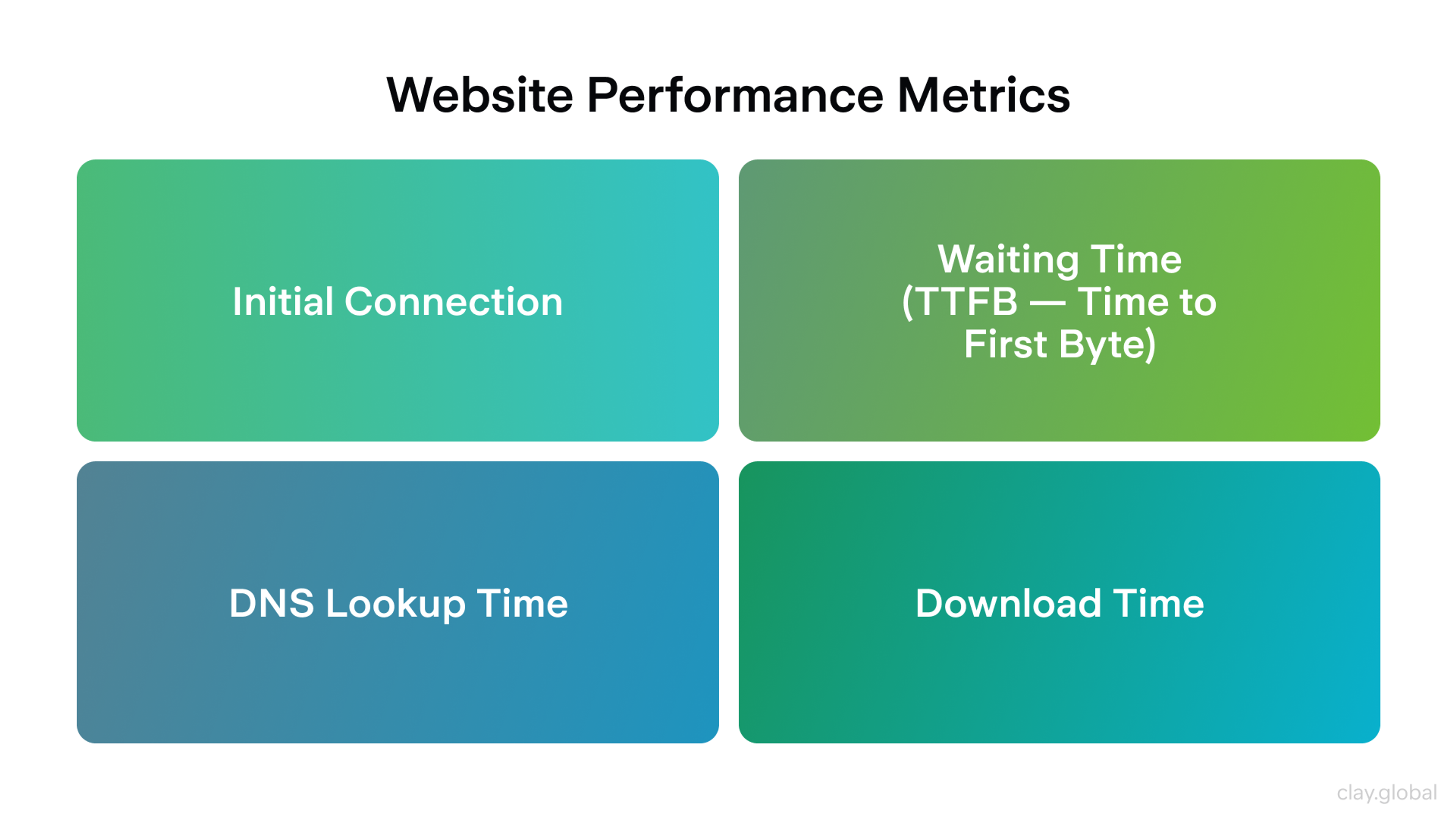
3. Performance Is a Design Decision
Performance is where design decisions have real consequences.
An oversized hero image, a carousel that shifts layout on load, three analytics scripts firing on page one - these are design choices, not just engineering problems, and their cost is paid by the user.
Google's research has consistently shown that as page load time increases from one to three seconds, the probability of a visitor bouncing increases by 32%. That's not a rounding error. It's a real conversion cost tied directly to how you spec the first screen.
The habits that prevent performance debt are straightforward:
- keep above-the-fold content lightweight
- defer non-critical scripts
- avoid layout-shifting animations
- run PageSpeed Insights during development rather than only at launch
A perfect score isn't the target. Removing friction that real users actually feel is.
Website Performance Metrics by Clay
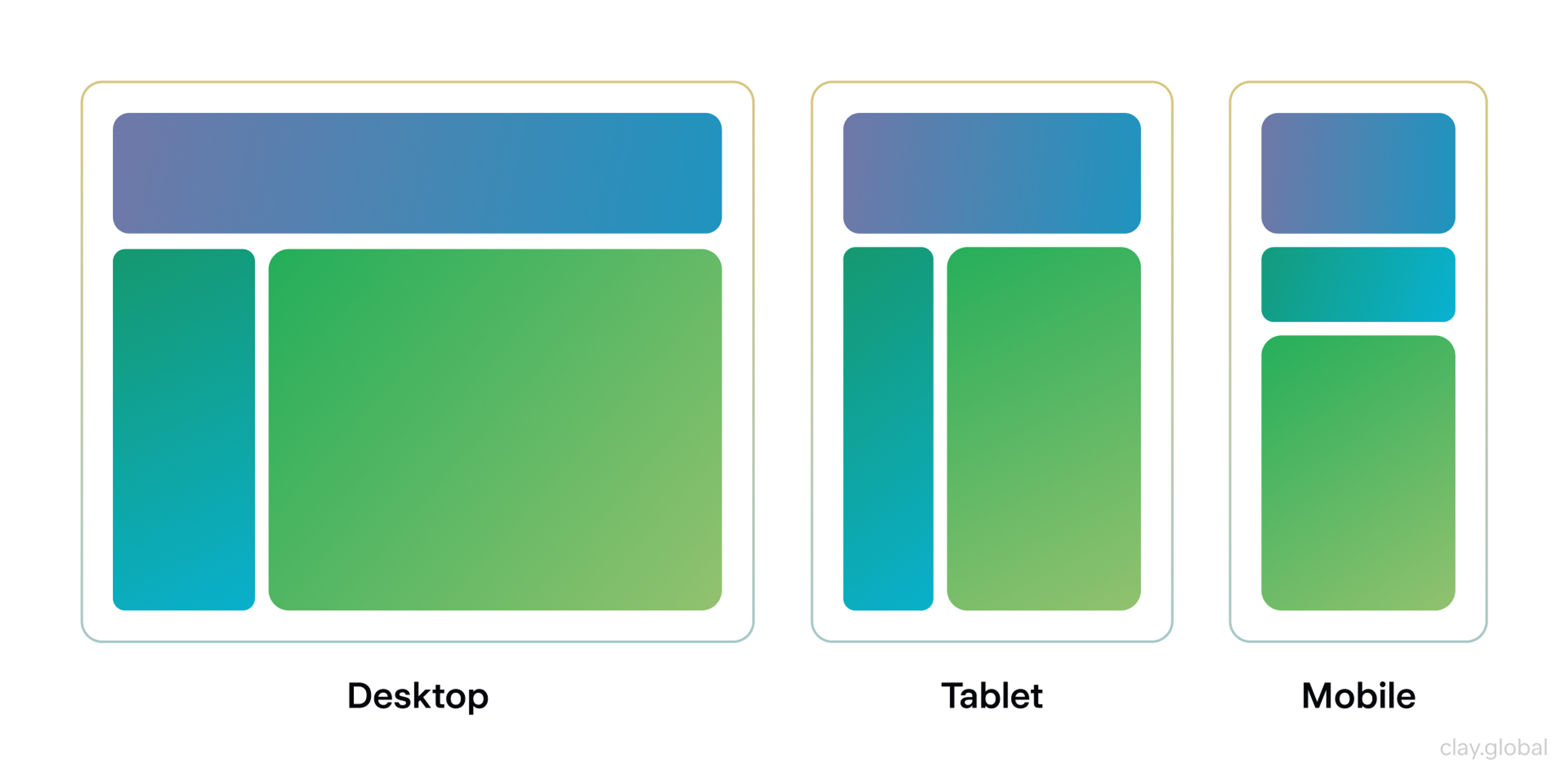
4. Design Mobile-First - and Mean It
There's a meaningful difference between designing for desktop and adapting down, versus designing for constrained conditions and expanding up. The former tends to produce cramped mobile experiences full of exception handling. The latter produces layouts that work everywhere because they were built under the tightest constraints first.
Mobile devices account for roughly 60% of global web traffic, and that share is higher still in many emerging markets. Your visitors are not predominantly sitting at a desk.
Responsive design done well means fluid typography, components that reflow without breakpoint hacks, touch targets that don't require precision, and real content testing, including long headlines, dynamic data, and localized strings.
If your components hold up under those conditions, they'll work anywhere.
Responsive Example by Clay
5. Navigation Should Be Boring in the Best Way
People don't want to admire your menu. They want to find something quickly and move on. The best navigation is invisible, when users move through it without friction, without confusion, and without noticing it at all.
Intuitive navigation is organized around user intent, not your org chart. The labels should reflect what visitors are trying to do, not internal department names.
Website Navigation Design Examples by Clay
Limit top-level options to what can be scanned in a second or two. For content-heavy sites, add a search function, because it's faster than any menu structure.
On long pages, in-page anchors reduce the exhaustion of vertical scrolling. They also signal that the content is organized, that someone thought about the reader's journey, not just the word count.
For Cornerstone, we didn’t make the site too unconventional, or else it would be difficult for customers to navigate the website online, resulting in a terrible experience.
Cornerstone Website by Clay
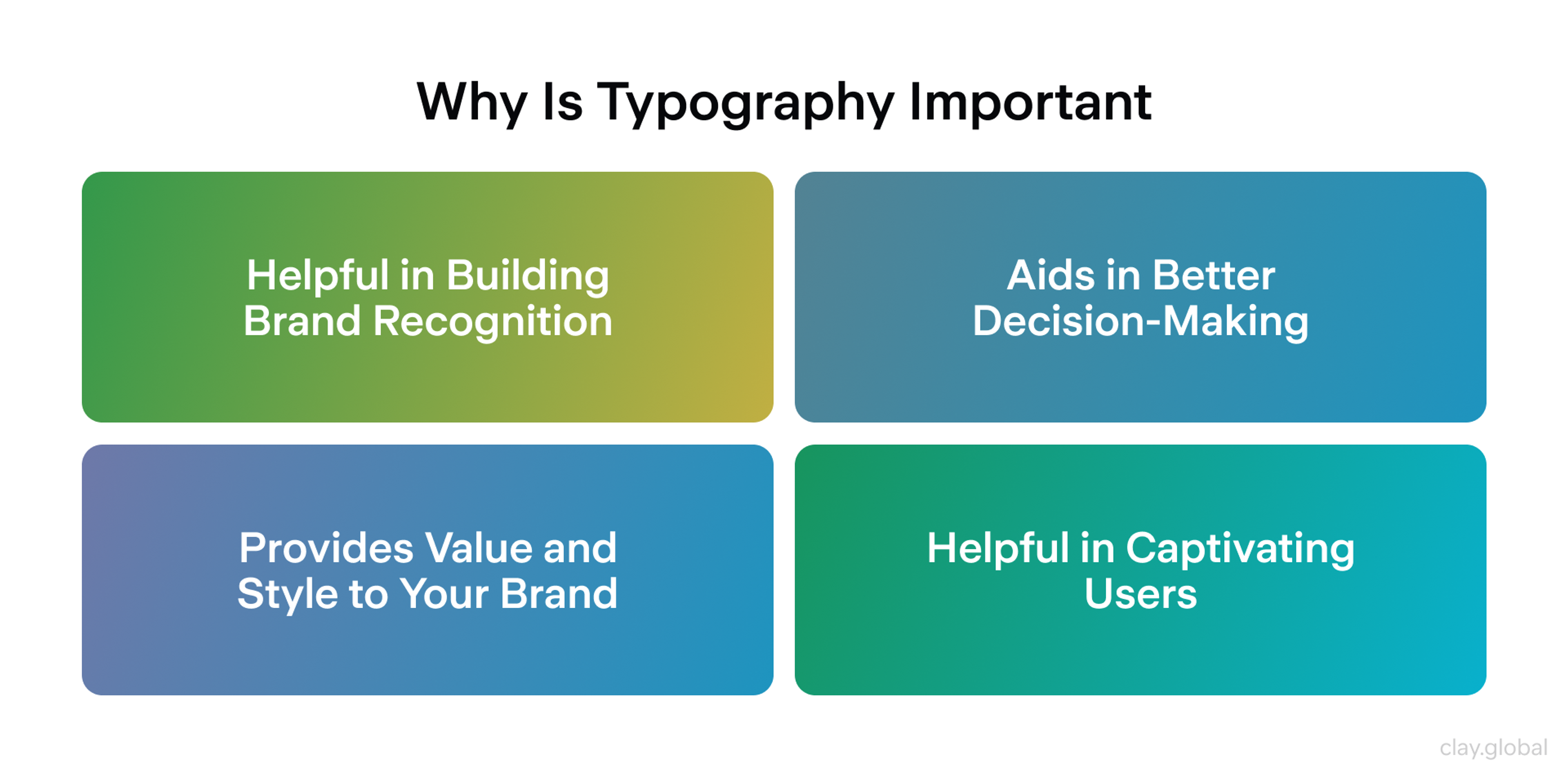
6. Typography Does More Than You Think
Typography is the fastest lever for improving perceived quality and readability.
Most sites don't fail because of poor font selection, but because there's no real system underneath the choices: inconsistent scale, weight used decoratively rather than hierarchically, body text that's too small for comfortable reading across screens.
A practical foundation: one primary typeface, one accent at most. Body text at 16-18px equivalent (scale it relative to viewport, don't hard-code it).
Size and weight establish hierarchy - not just bold italic underline combinations that signal urgency without communicating anything. Limit font variants to reduce payload and prevent FOUT (flash of unstyled text) on slower connections.
If your audience is international, test your type choices across languages before you finalize them. Many fonts look fine in English and fall apart in German, Arabic, or Japanese.
Typography Importance by Clay
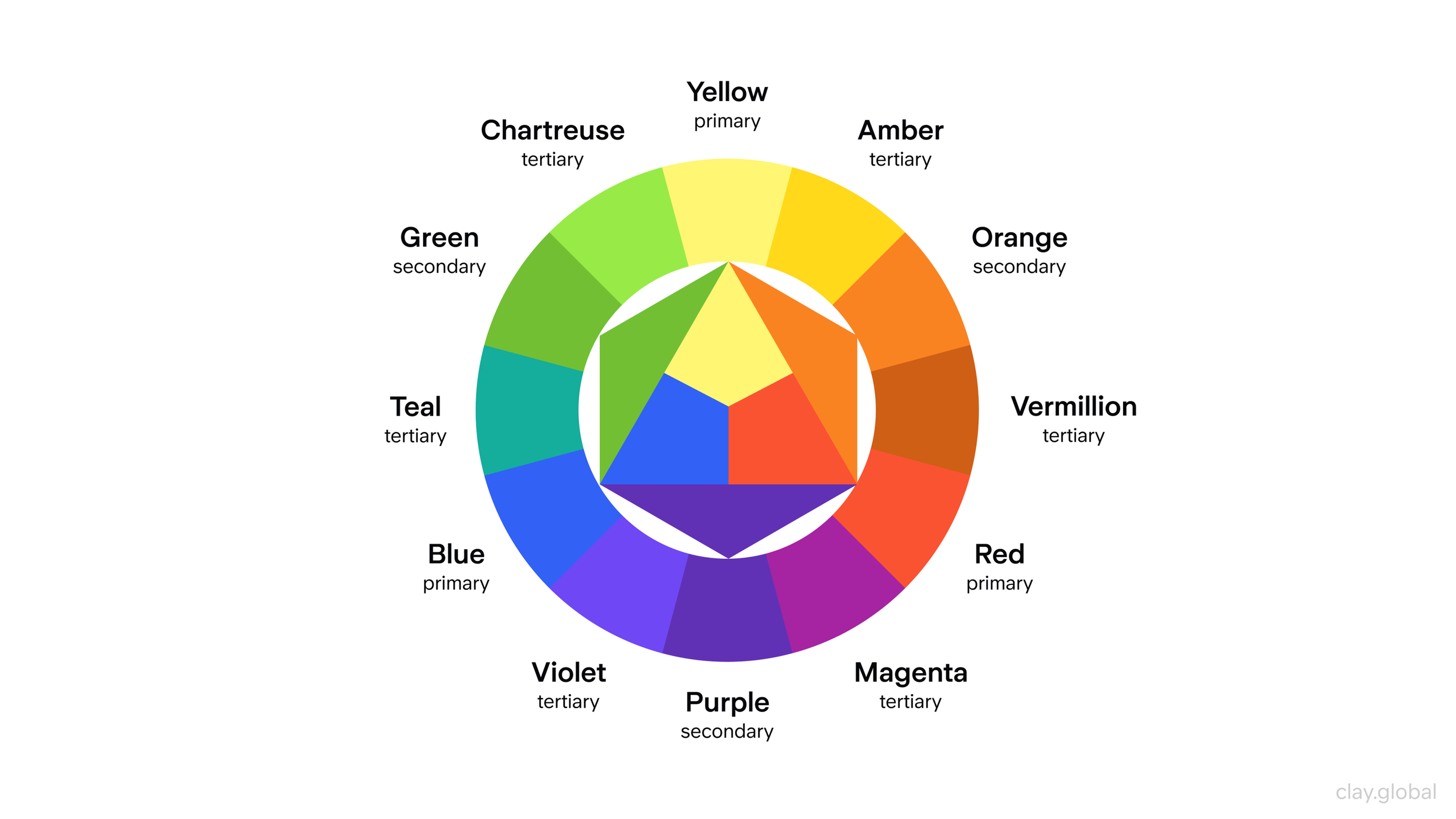
7. Build a Color System
Color guides attention. It signals state: what's active, what's disabled, what's an error, what's a primary action. A color system that only accounts for brand expression will eventually create confusion in the UI.
Build tokens by purpose:
- Surfaces
- Text
- Borders
- Primary and secondary actions
- Feedback states (success, warning, error, info)
The 60-30-10 rule still holds as a starting point (dominant color, secondary color, accent), but the more important constraint is contrast. Every text element should pass WCAG AA at a minimum, and your system should work in both light and dark modes without rebuilding it from scratch.
Don't let brand colors override legibility. The primary action button should be the most visually prominent element in any form or call-to-action section, not competing with four other colorful elements.
Color Wheel Illustration by Clay
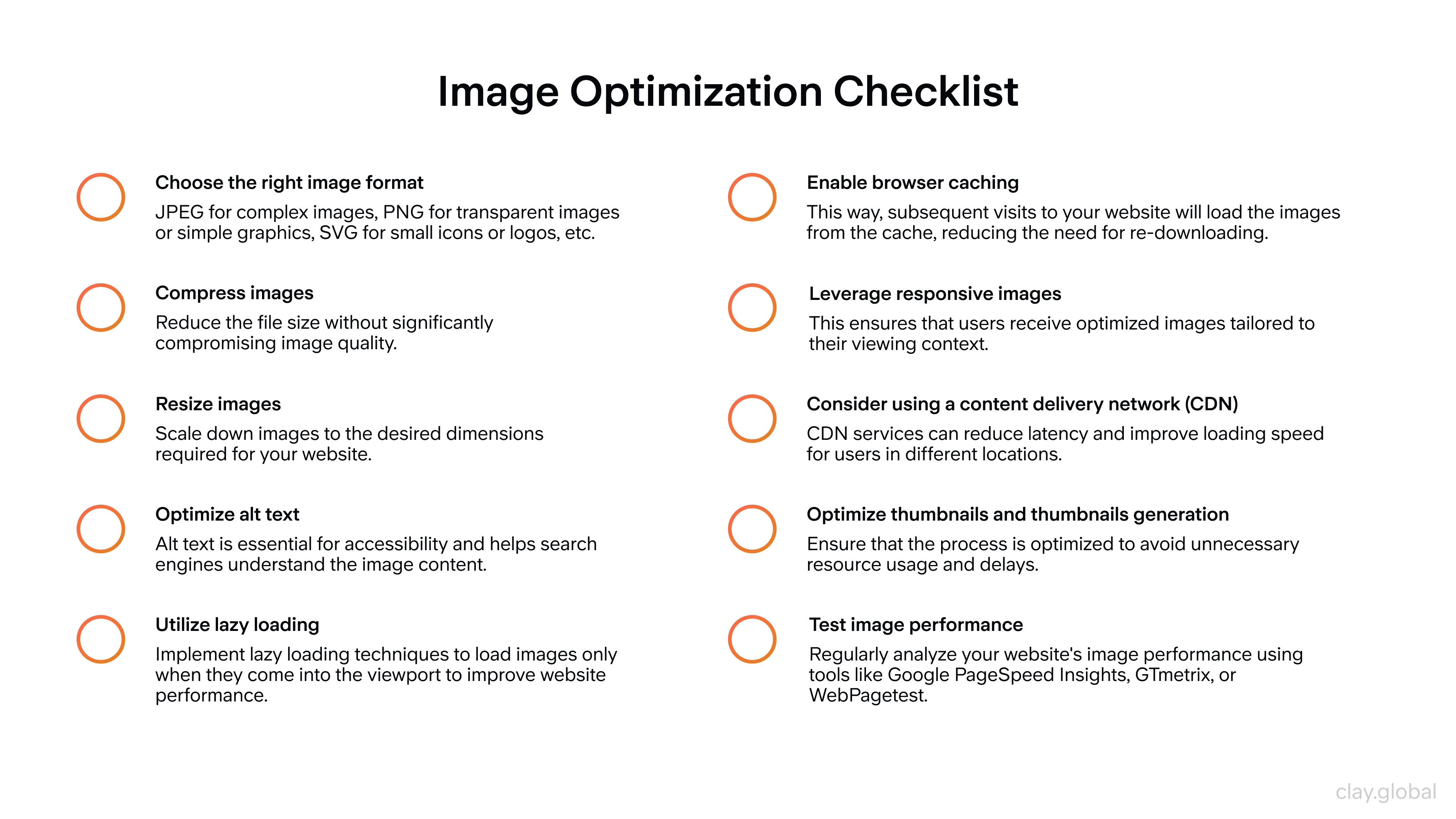
8. Make Imagery and Motion Do the Work
Visuals should explain something, not just decorate. Generic stock photography (the kind with smiling people in open-plan offices) communicates nothing specific and can actively undermine credibility. In 2026, visitors will have seen enough of it to recognize it immediately.
Use real product screenshots, short screen recordings, before-and-after comparisons, and diagrams that show how something works.
If your product is software, show it. If your service produces an outcome, show the outcome.
Motion follows the same principle. Animation should serve comprehension: a transition that shows where something came from, a micro-interaction that confirms an action was registered.
Motion that plays on a loop, delays the presentation of content, or exists purely for visual flair makes experienced users impatient. Also, respect prefers-reduced-motion - for users with vestibular disorders, unexpected animation is more than annoying.
Image Optimization Checklist by Clay
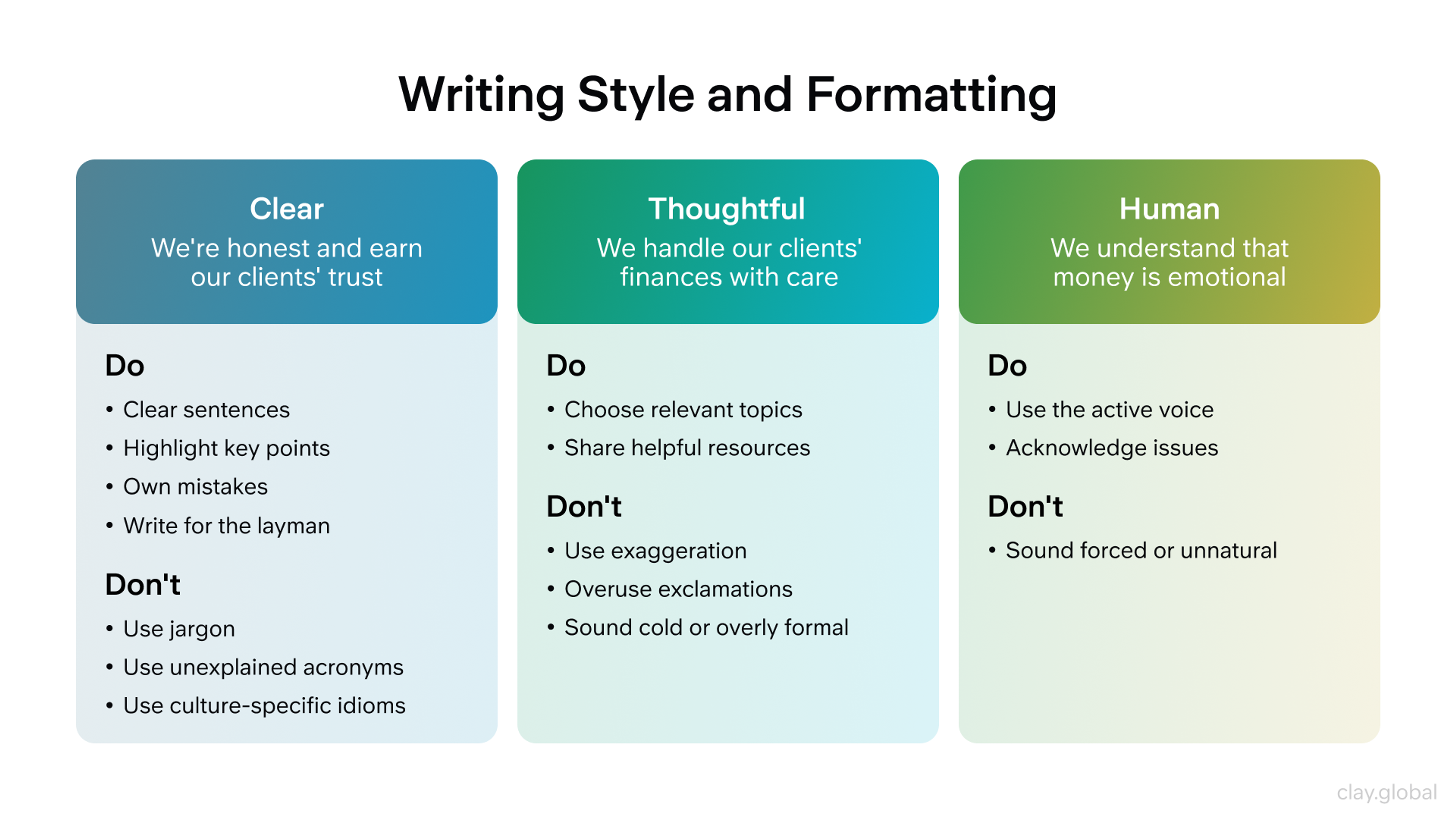
9. Write Content Like a UX Designer
Your copywriters and your UX team need to be working toward the same goals. Content is the interface. Visitors read headings before body text, scan before they commit, and decide within seconds whether the page has what they need.
- Write headings that carry meaning on their own: not clever puns, but clear signals about what follows
- Keep paragraphs short
- Replace vague claims ("industry-leading," "best-in-class") with specifics: numbers, case studies, named outcomes
- Add microcopy near CTAs and forms that tells users what happens next
- Include social proof (testimonials, client logos, review counts) near decision points, not buried in a footer
For articles and documentation, show when the page was last updated. It's a small signal, but it matters to readers who've been burned by outdated tutorials.
Writing Style and Formatting by Clay
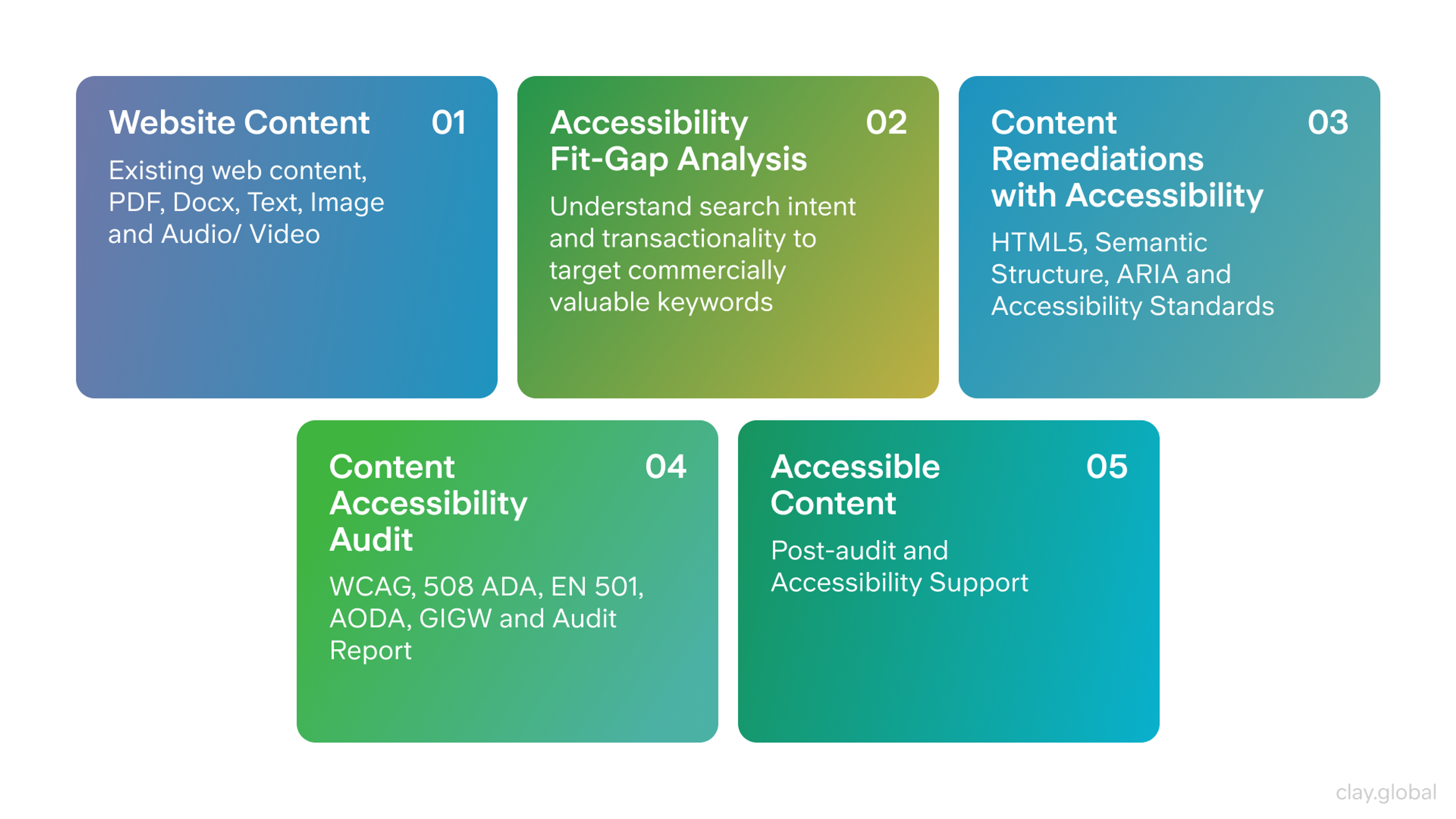
10. Build Accessibility In From the Start
Retrofitting accessibility is expensive and incomplete. The easiest way to approach this problem is to treat it as a baseline constraint from the first wireframe, rather than a compliance checklist at the end.
The WHO estimates that 1 in 6 people globally lives with some form of disability - that's over a billion people!
Accessible design serves them directly and tends to improve the experience for everyone else:
- better contrast benefits users in bright sunlight
- keyboard navigation benefits power users
- clear form labels benefit anyone filling out a form quickly on mobile
The non-negotiables:
- keyboard access for all interactive elements
- visible focus states
- semantic HTML structure
- proper heading hierarchy
- form labels with clear error messages
- alt text for meaningful images
Automated audits catch a fraction of real issues: always follow up with manual keyboard testing on key user flows.
Accessible Content by Clay
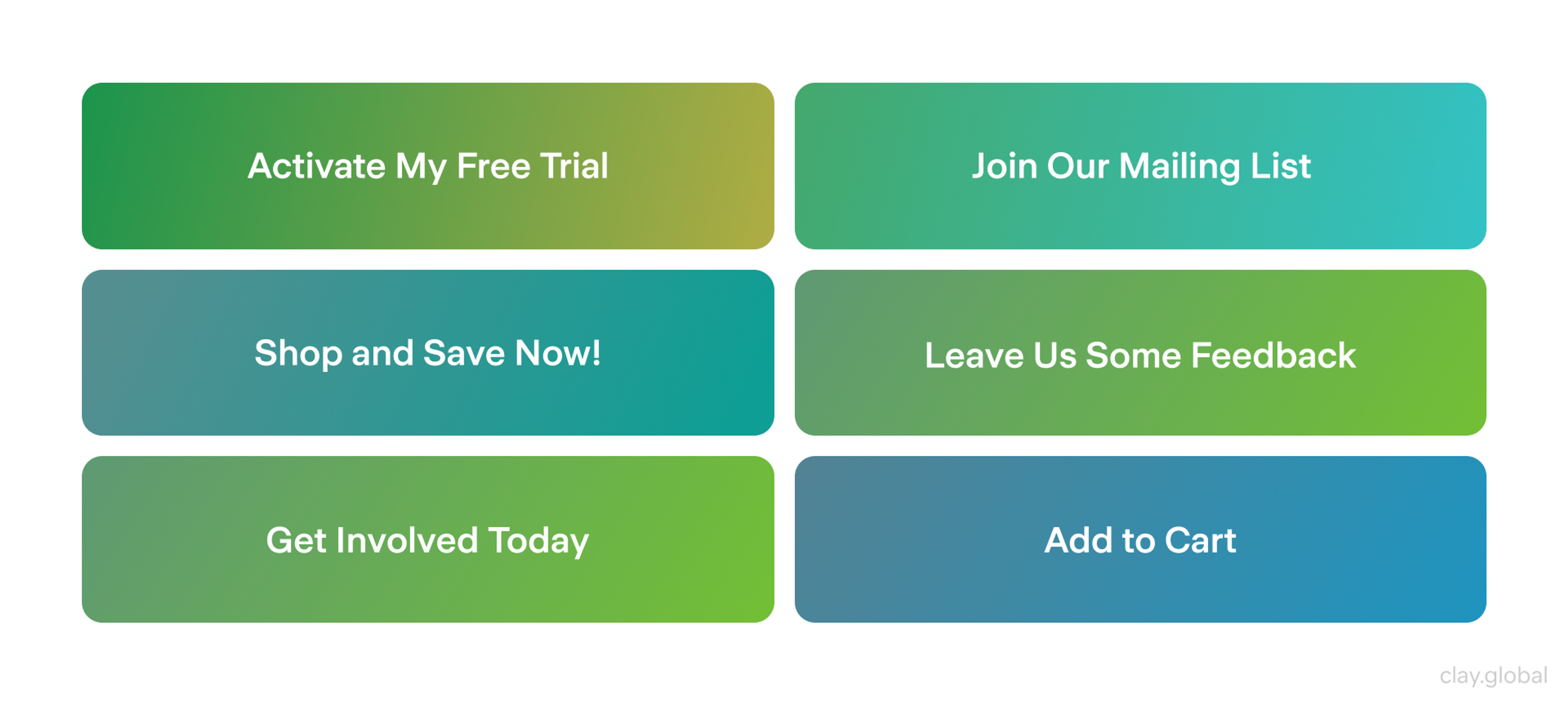
11. Forms and CTAs Should Feel Effortless
Every form is a moment where the user commits. If the experience is frustrating, that commitment evaporates.
- Reduce fields to the minimum required
- Collect additional information progressively, after the initial commitment is made
- Use autofill-compatible input types
- Validate inline, in real time, with error messages written by a human - "Please enter a valid email address" is fine. "Error: field_email invalid" is not
- Make the primary CTA specific: "Get pricing" outperforms "Submit" every time.
One primary CTA per section. Secondary actions can exist, but if they visually compete with the primary one, you've split the user's attention, and the conversion rate will show it.
CTAs and Forms Examples by Clay
12. Discoverability Now Includes AI Search
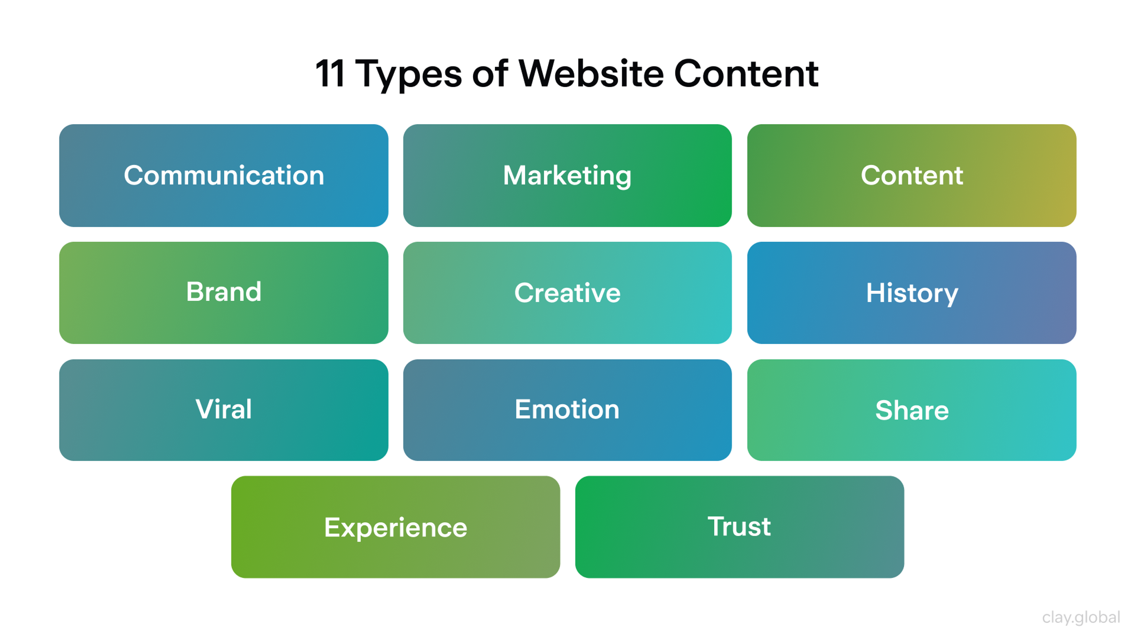
SEO hasn't disappeared. It's expanded. Your pages now need to perform in traditional search results, AI-generated summaries, social previews, and link unfurls across messaging platforms. The underlying requirements overlap more than they diverge.
Clear information architecture and internal linking help both crawlers and users. Structured data that matches your visible content helps search engines and AI systems extract accurate information.
Strong open graph tags and a clear page summary at the top (a short paragraph that states what the page covers) dramatically improve how content is represented when it's shared or cited.
Don't hide critical content behind client-side rendering without a server-side fallback. If the content isn't in the HTML, it might not be indexed, and it definitely won't be summarized accurately.
Types of Website Content by Clay
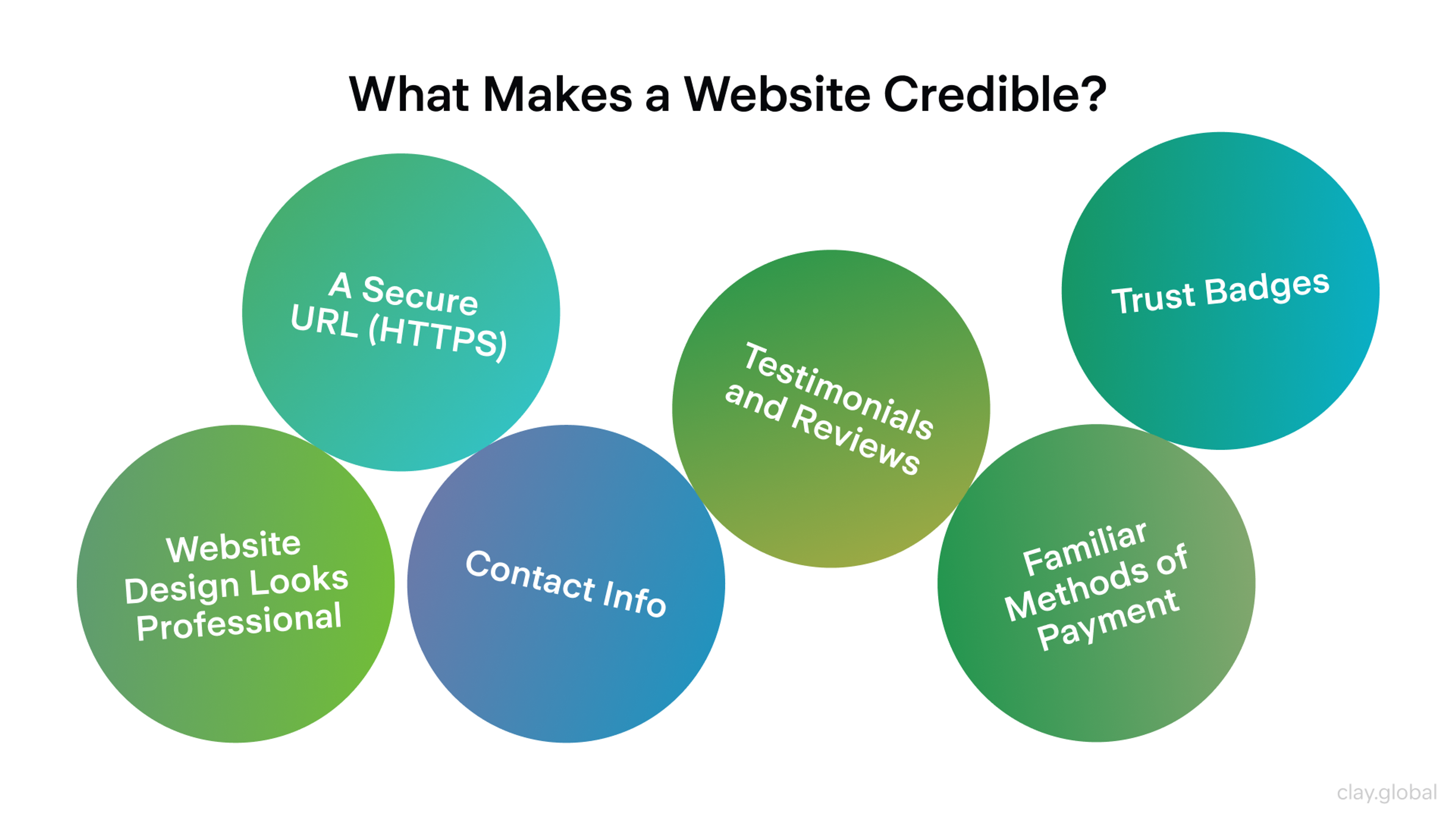
13. Earn Trust Rather Than Signal It
Users are skeptical in ways they weren't five years ago.
Dark patterns, aggressive cookie consent flows, and manipulative pricing have trained people to look for the catch. The absence of those patterns has become its own trust signal.
- Be direct about pricing and terms
- Minimize tracking to what you actually need
- Put privacy copy near data collection points - don't make users read a legal document to find out what you do with their email
- Keep third-party scripts under control. Each one is a potential liability for both performance and user data
A polished interface earns initial confidence. Transparency is what sustains it over time.
What Makes a Website Credible? by Clay
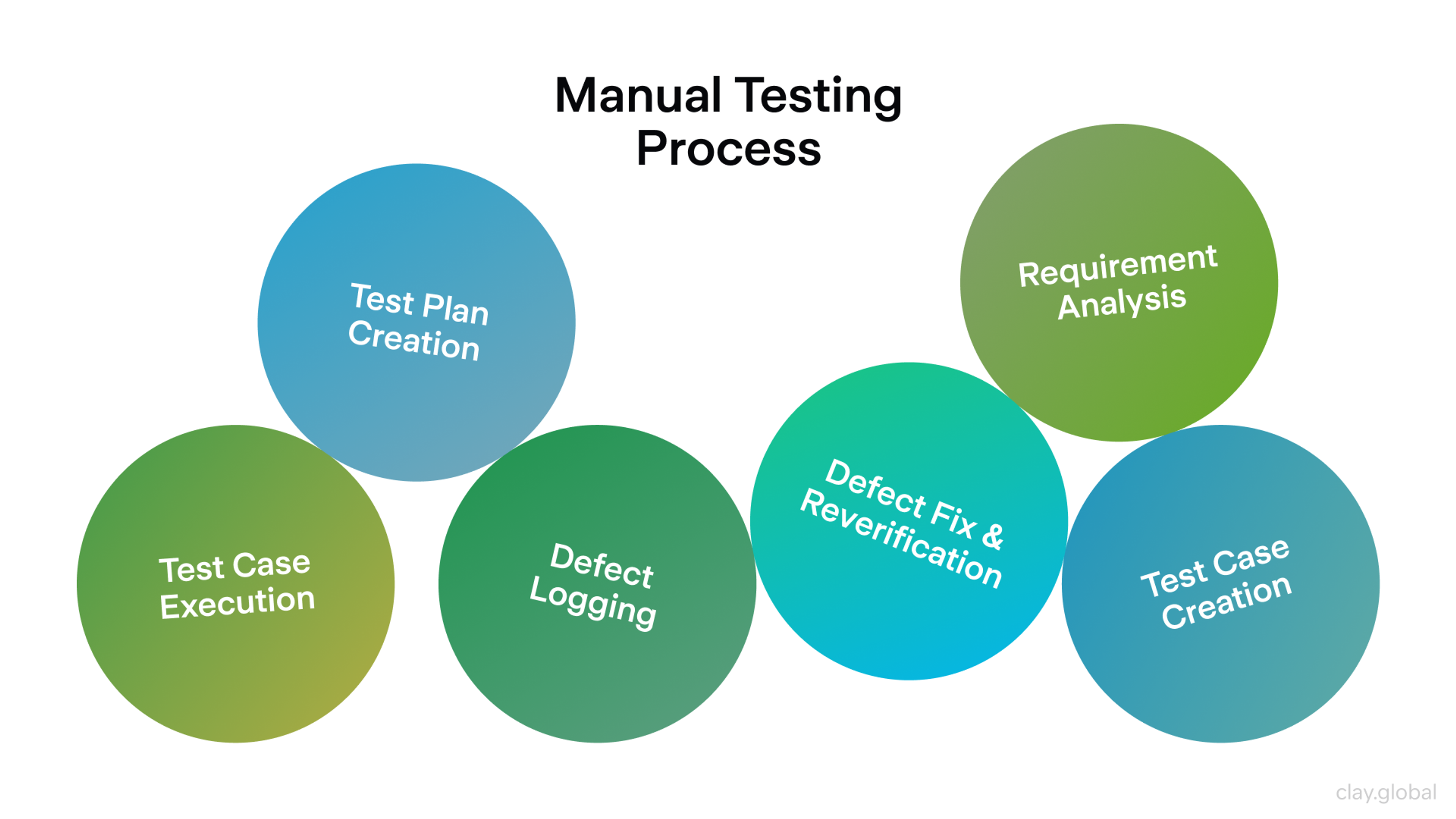
14. Treat the Site Like a Product
Launch is the beginning of a website's life, not the end.
Content drifts, components fragment, and performance degrades as third-party scripts accumulate. What was fast and clean at launch becomes sluggish and inconsistent within two years if nobody's maintaining it.
Build a rhythm into the process.
- Monthly: review top landing pages, fix copy drift, run a performance check
- Quarterly: full accessibility review and keyboard testing on key flows
- Ongoing: keep the design system and component library consistent as new pages are added
Treat the website like a product, and it stays current. Treat it like a project with a delivery date, and it becomes a liability.
Manual Testing Process by Clay
Read More
FAQs
What's the difference between web design and web development?
Web design covers the visual and experiential decisions: layout, typography, color, information hierarchy, and interaction patterns.
Web development implements those decisions in code.
In practice, the two disciplines overlap: developers need to understand how design decisions affect performance, and designers need to understand technical constraints.
The best outcomes happen when both sides communicate throughout the process, not just at handoff.
How many pages should a website have?
As many as your users need, and no more. A tight five-page site for a professional services firm often outperforms a sprawling twenty-page site with thin content.
Quality and clarity beat volume. Start with the pages that map directly to your primary user journeys, and add from there based on actual demand.
What does "above the fold" mean, and does it still matter?
It refers to the portion of a page visible without scrolling. It still matters because it's your first impression and should communicate what you do, who it's for, and what to do next.
But don't sacrifice a natural content flow to cram everything into that space. Users do scroll, they just need a reason to.
How often should I redesign my website?
A full redesign every three to five years is reasonable for most sites. More important is the ongoing maintenance between redesigns: content updates, performance optimization, accessibility improvements, and component updates as the design system evolves. A well-maintained site ages much more slowly than one that's left static.
Is a design system worth the investment for a small company?
Yes, a small design system pays for itself quickly. You don't need a hundred components. Define your typography scale, spacing tokens, accessible colors, and four or five core components. You'll design new pages faster, maintain consistency with less effort, and onboard new contributors without rebuilding decisions from scratch.
What's the right way to handle cookie consent?
Clearly and without manipulation:
- Describe what you collect and why in plain language
- Make it easy to decline non-essential tracking without multiple clicks
- Avoid dark patterns like pre-ticked boxes, fine-print opt-outs, or consent banners that obscure the page
Regulatory requirements vary by region, but the design principle is the same: give users real choice without making it frustrating.
How do I choose between a one-page and a multi-page site?
One-page sites work for simple offerings with a linear story: introduce the problem, explain your solution, show proof, prompt action.
Multi-page sites work better when you have distinct user types, complex product tiers, or significant content volume. If navigation decisions feel forced with one approach, that's a sign to try the other.
What makes a good hero section?
A clear statement of what you do and who it's for, credible evidence (a client logo strip, a specific outcome, a short testimonial), and a single prominent call to action.
Keep it fast-loading: full-bleed video backgrounds are a common performance killer. If your hero communicates nothing without the video, the design isn't working.
How should I approach font pairing?
Start with one typeface and ask whether you actually need a second one before adding it. If you do, pair a neutral body typeface with a more distinctive display typeface for headings.
Test the pairing across languages, weights, and sizes before committing. Most font problems come from inconsistent application of a decent pair, not from a bad choice in the first place.
When should I use animation on a website?
When it communicates something: a transition that shows where an element came from, a loading state that prevents user confusion, a micro-interaction that confirms an action. Not to add visual flair, not on a loop, and not when it delays the presentation of content.
If the animation were removed, would the user lose any information? If not, it might not need to be there.
What's the most important page on a website?
Whichever page your target users land on most. For many sites, that's the homepage. For others, it's a product page, a pricing page, or a long-form article that ranks well in search.
Check your analytics. Then ask whether each high-traffic page is doing its job: clear purpose, credible proof, and a next step that's easy to take.
How do I make CTAs more effective?
Be specific and honest. "Start free trial" outperforms "Sign up" because it sets an expectation. "Get pricing" outperforms "Contact us" because it's more direct about the outcome.
Make the primary CTA the most visually distinct element in its section. Test with real users if conversion rates are disappointing, because often the issue is copy or placement, not the button design itself.
What's a reasonable site speed target?
Aim for a Largest Contentful Paint under 2.5 seconds on mobile (the threshold Google uses to classify performance as "good").
More practically: if your page feels slow to you on a mid-range phone on a 4G connection, it's slow. Test with real devices, not just Lighthouse scores on your development machine.
Should I build with a CMS or go custom?
A CMS is the right choice for most sites where non-technical team members need to update content regularly. Custom builds offer more control over performance and architecture, but require more maintenance.
A headless CMS architecture (where the CMS handles content management and a custom front end handles presentation) is increasingly common for teams that want both flexibility and editorial control.
Conclusion
The sites that hold up over time aren't the ones with the most ambitious visual design. They're the ones that were built around a clear purpose, maintained consistently, and refined based on what users actually do, not what stakeholders assumed they would.
Start there, and the design almost takes care of itself.

About Clay
Clay is a UI/UX design & branding agency in San Francisco. We team up with startups and leading brands to create transformative digital experience. Clients: Facebook, Slack, Google, Amazon, Credit Karma, Zenefits, etc.
Learn moreAbout Clay
Clay is a UI/UX design & branding agency in San Francisco. We team up with startups and leading brands to create transformative digital experience. Clients: Facebook, Slack, Google, Amazon, Credit Karma, Zenefits, etc.
Learn more